Graduates

Hailey Caress

MFA in Graphic Design - 3 Yr Path — Graduate Graphic Design
Course:
Packaging Design 02
Faculty:
Daniel Hoy
Term:
2025 Summer

Bath Shoppe

Bath Shoppe is a conceptual bath and body sub-brand created for Trader Joe’s, expanding the beloved grocery retailer into the self-care market through a line of up-cycled produce-based products. Inspired by the natural benefits of fresh ingredients, the collection transforms fruits, vegetables, and food waste into nourishing everyday luxuries. The Bath Shoppe sub-brand extends Trader Joe’s playful, approachable identity into wellness, positioning the retailer as a more holistic lifestyle destination.

Process:

The project began by exploring the traditions of ancient Roman bathhouses and the ritual of bathing as a daily act of wellness and restoration. Inspired by vessels and pottery, I sketched and developed packaging forms that reference ceramic silhouettes using organic shapes to create products that feel elevated, tactile, and timeless. Each form was then 3D printed, followed by priming, sanding, and hand-painting to achieve a ceramic-like finish. 

Learning Outcomes:

I gained a stronger understanding of brand extension strategy and how to thoughtfully evolve an established identity into a new market category. I gained hands-on experience in physical product prototyping, packaging development, and designing a holistic brand world across print, photography, and product form. This project reinforced the importance of balancing strategy, storytelling, and materiality when creating immersive consumer experiences.

Tags:
Branding,
Packaging,
Research-Based Design
Image
Image
Inspired by the hand-painted signage found throughout their store locations, I reimagined the Trader Joe’s logo by modifying the typeface Lobster to create a playful, expressive mark that feels bold and approachable, yet reflective of Trader Joe’s existing brand identity.
Image
Image
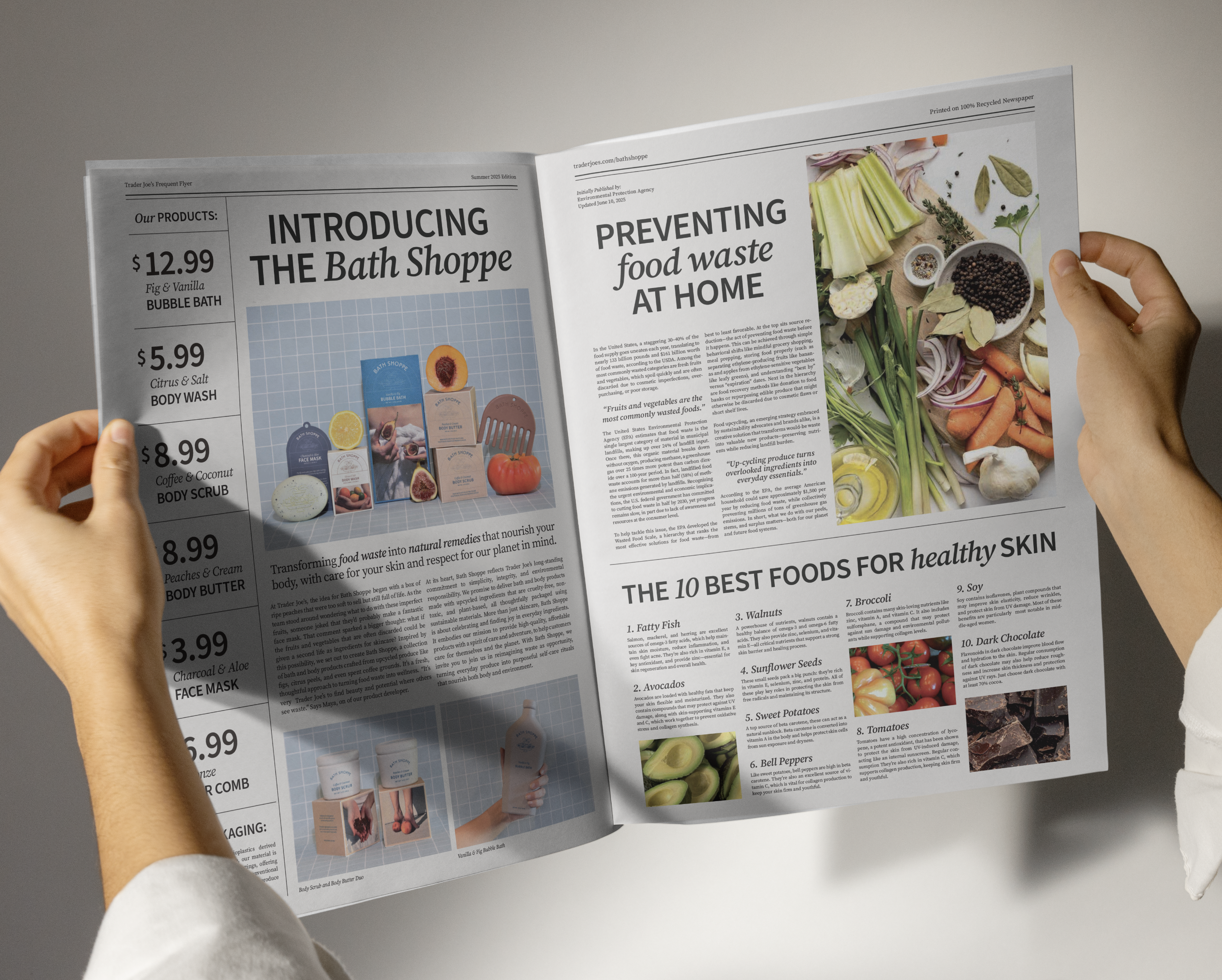
To extend the refreshed identity across Trader Joe’s most recognizable brand touch points, I applied the updated logo to a mini canvas tote and redesigned the Frequent Flyer newspaper. These applications preserve the elements that make Trader Joe’s culturally iconic while modernizing the brand in a way that feels cohesive and contemporary.
Image
Image
Image
Image
The art direction draws inspiration from classical oil-painted still lifes, using sculptural compositions and fresh fruits and vegetables as styling elements as playful visual elements, reinforcing ingredient transparency while connecting the products back to their natural origins.
Image
Image
The lifestyle photography emphasizes the tactile relationship between body and ingredients, to reinforce the sensory, nourishing qualities of the sub-brand.