This rebrand is rooted in the belief that people and marine life share a quiet, meaningful connection. It turns the Aquarium’s mission into a visual world that feels gentle, fluid, and full of curiosity. Soft motion, organic forms, and warm storytelling guide visitors through an experience that feels both peaceful and personal, reminding them that caring for the ocean is another way of caring for ourselves.
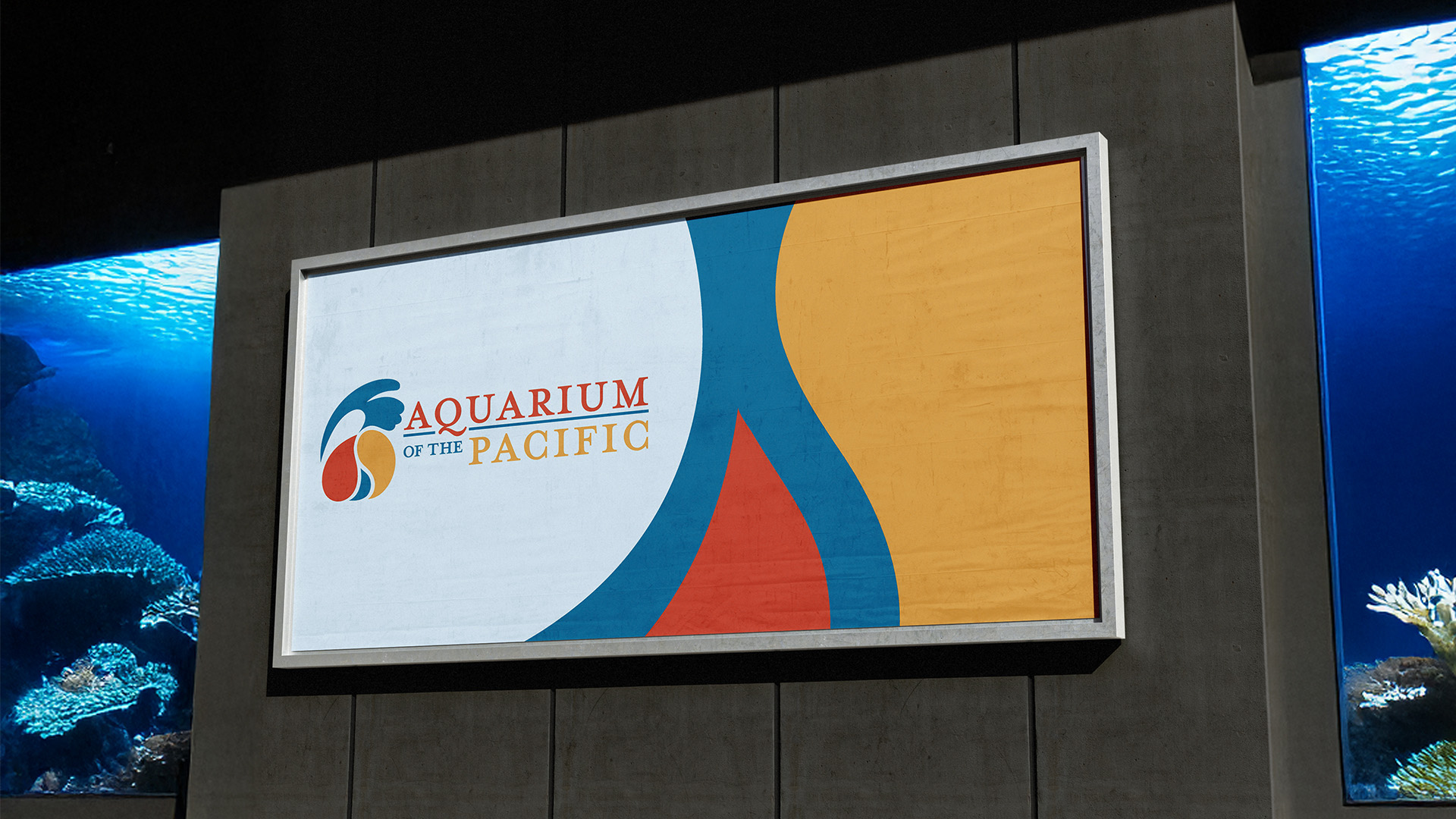
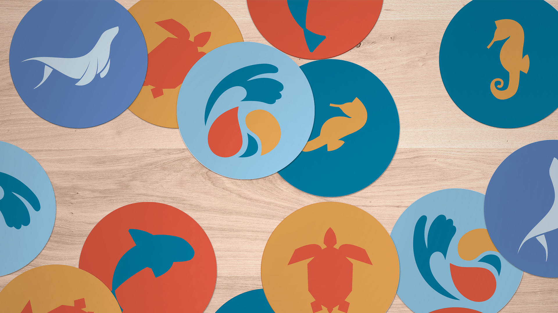
The new logo brings that connection to life through an abstracted fin and hand that cradle one another to form a flowing wave shape. It feels welcoming and expressive, supported by a palette inspired by vibrant sea creatures and a type system that keeps everything clear and approachable.
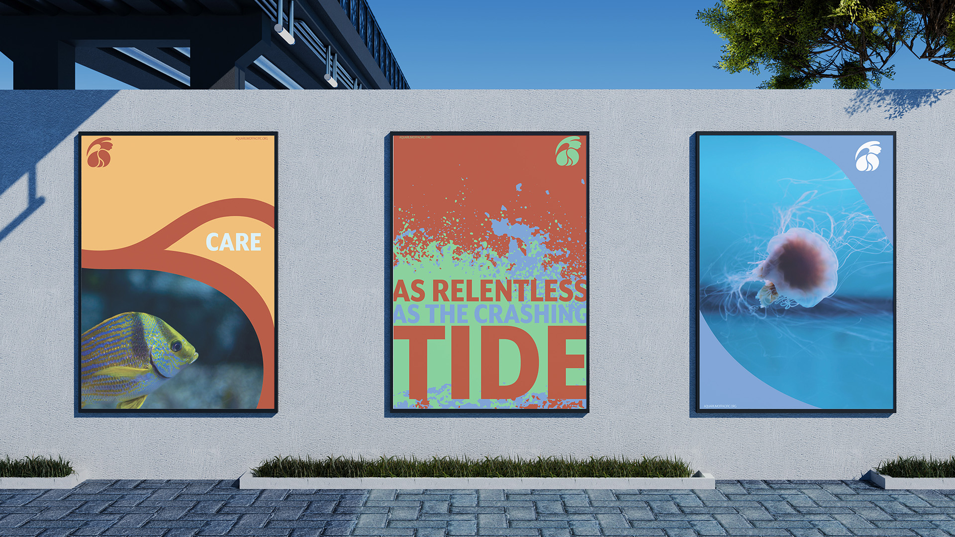
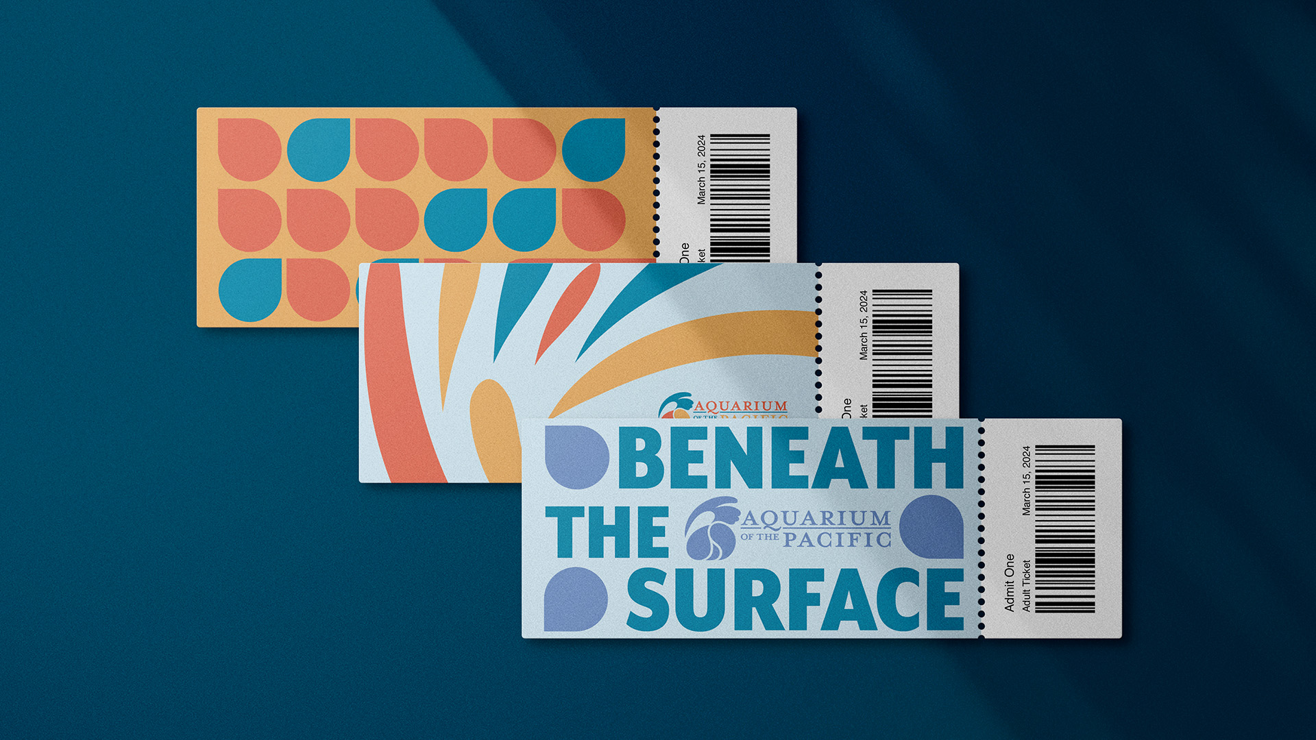
Posters and graphic elements use movement, color, and simple flowing shapes to echo the natural rhythm of the ocean. Droplets, swirls, and soft textures create a unified system that invites viewers to slow down, look closer, and feel a sense of shared wonder with the world beneath the surface.