This rebrand leans into the soothing, take-a-breath feeling at the center of Ion. It treats hair care as a calm little ritual, something that helps people feel cared for in the middle of a busy day. Soft color, thoughtful structure, and clean organization create a system that feels warm, practical, and quietly confidence boosting. The refreshed logotype uses gentle, cradling shapes that echo the comfort of a slow, nurturing routine.
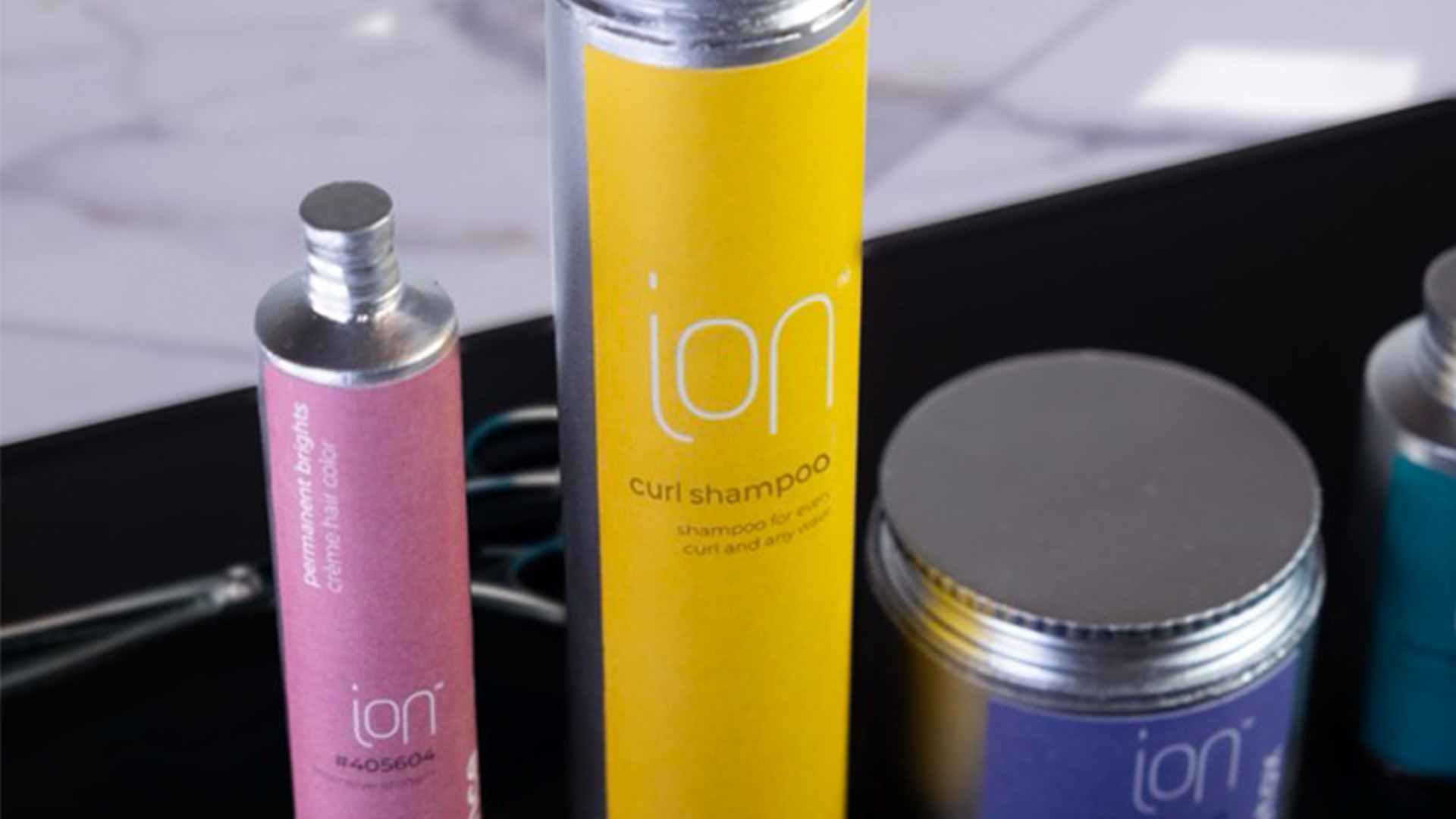
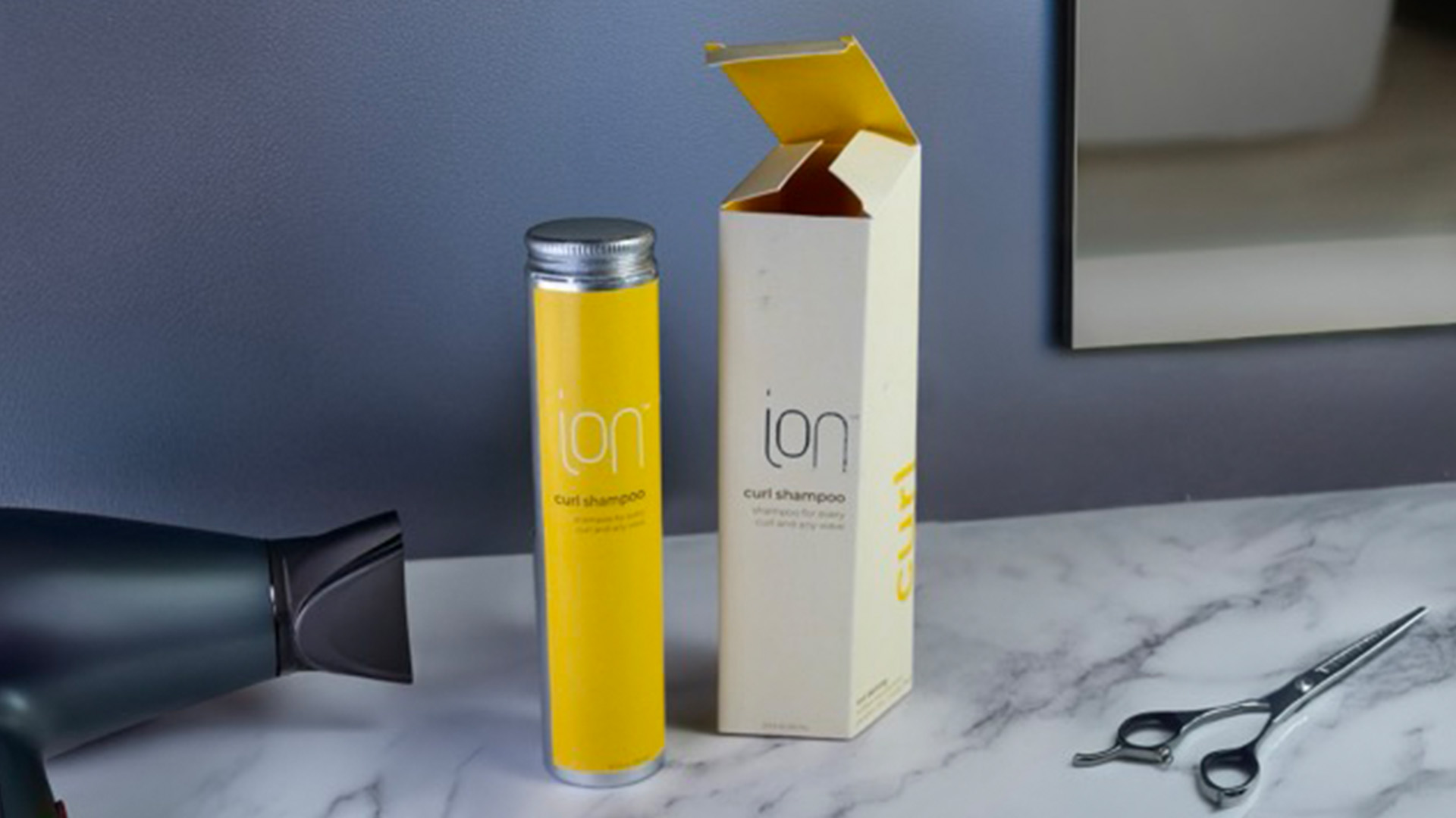
A comforting palette and simple aluminum bottles highlight Ion’s dependable, no-nonsense personality. The forms feel lasting and honest, and the color carried from the box to the bottle keeps the whole system feeling warm even after the outer packaging is gone.
The angled secondary boxes create a welcoming first moment with muted tones on the outside and a brighter wash of color inside. This little reveal of light mirrors the brand’s spirit of gentle care and sets the stage for a routine that feels personal, steady, and genuinely uplifting.