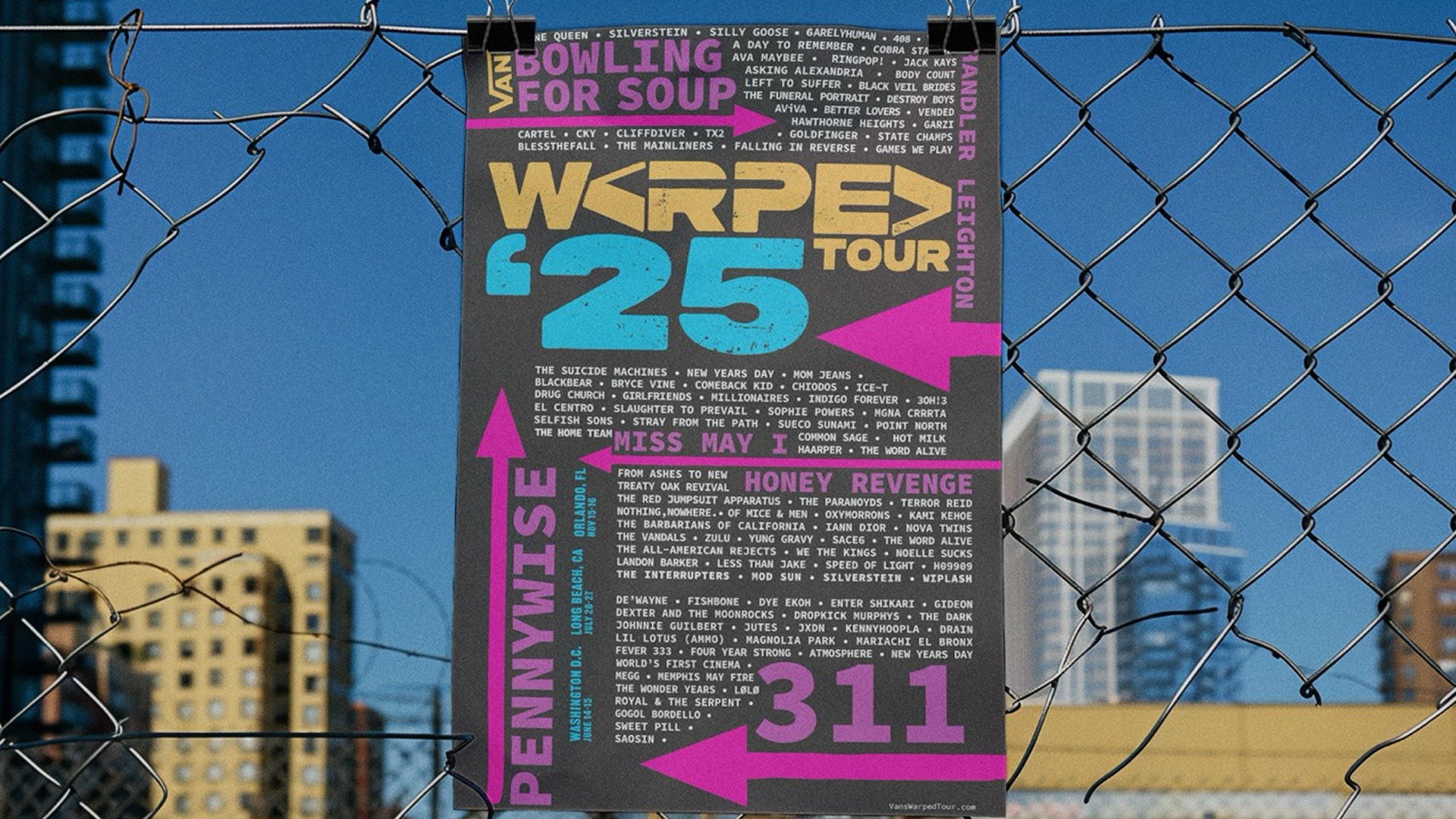
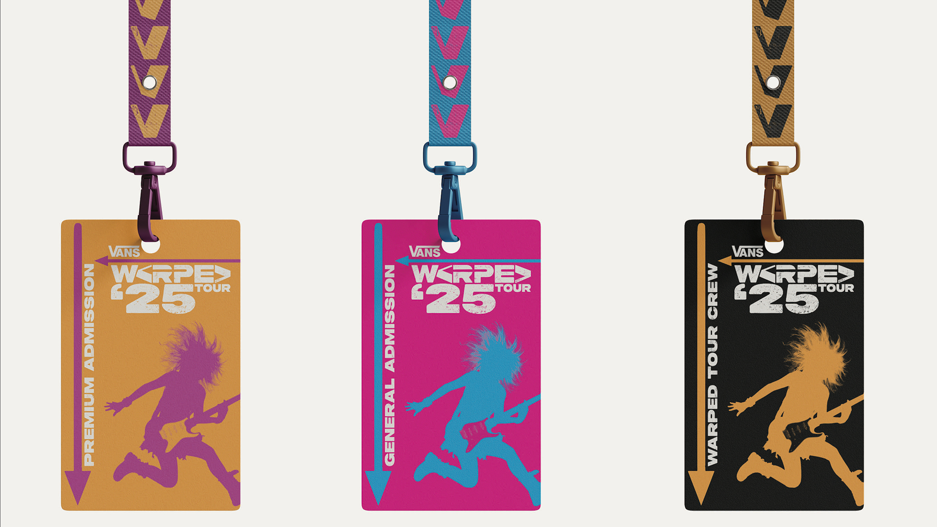
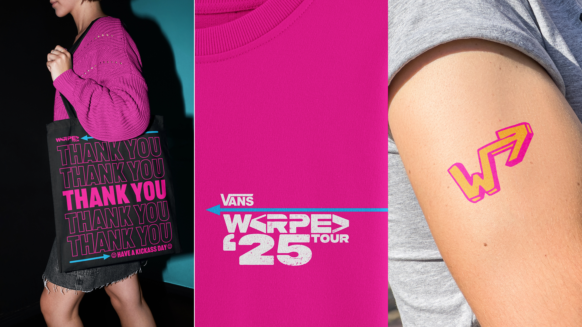
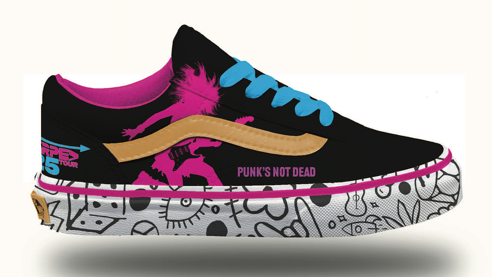
This rebrand brings back the loud, messy joy that made Warped Tour feel like home for so many young punks. It mixes the heart of the 2000s scene with bright color, bold shapes, and the hands on attitude that has always defined the festival. The refreshed logotype uses sturdy geometric letters and hidden arrows to nod to the touring spirit that sets Warped Tour apart.
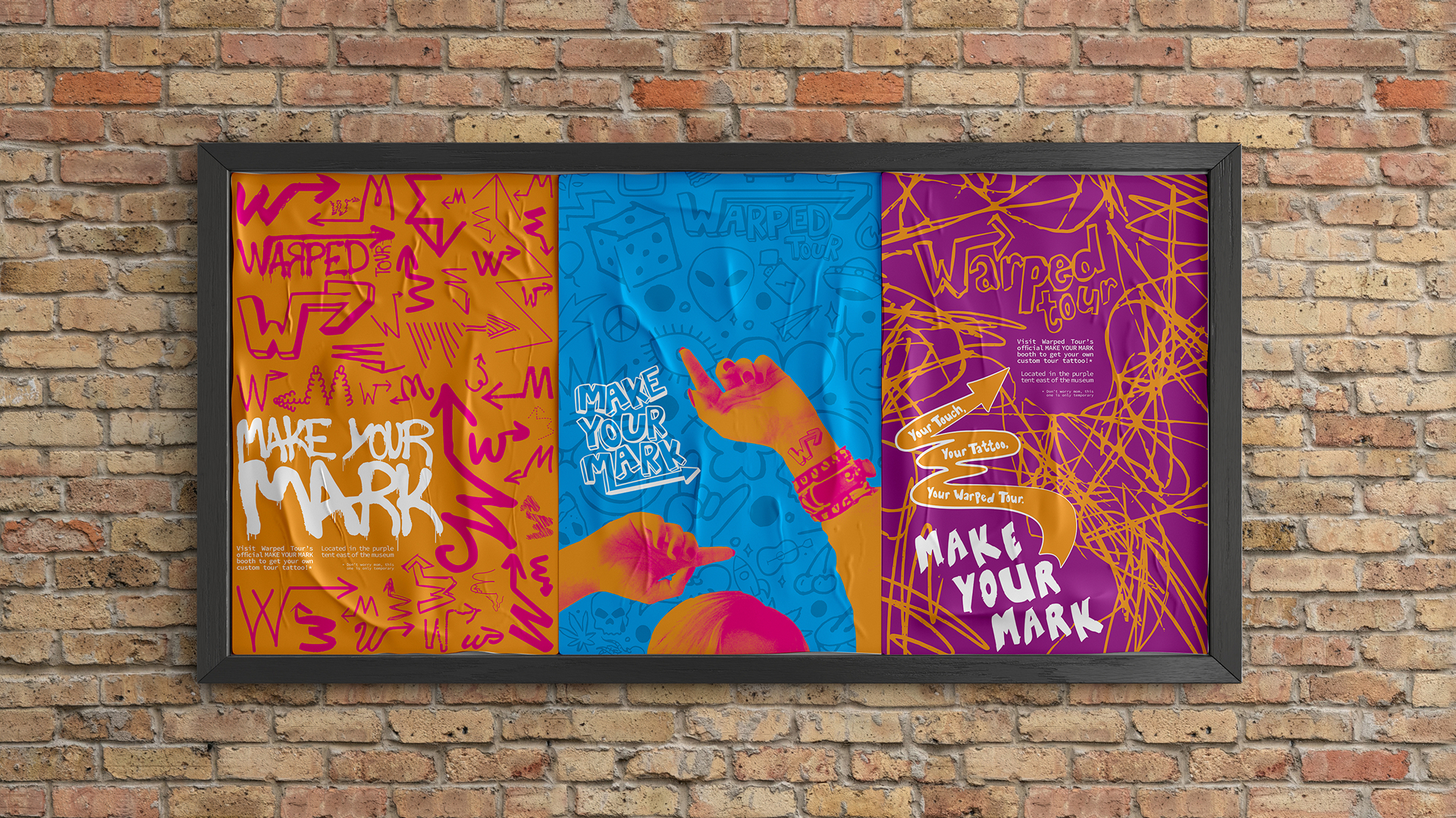
A lively palette and graphics inspired by spray paint, street posters, and DIY print culture help the brand feel active, expressive, and full of motion.
Interactive elements like the Make Your Mark tattoo booth let fans create their own version of the logo, building a sense of community through play and personal expression. A pocket friendly guide book adds warmth and usefulness with artist features, maps, small moments of humor, and posters worth tearing out. Altogether, the identity celebrates both the chaos and the connection that keep the spirit of punk alive.