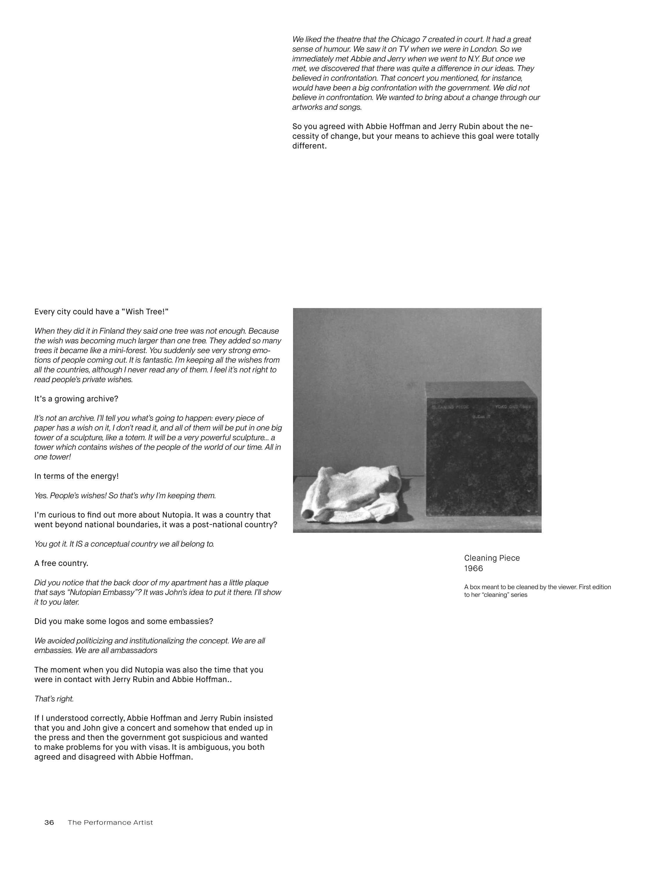
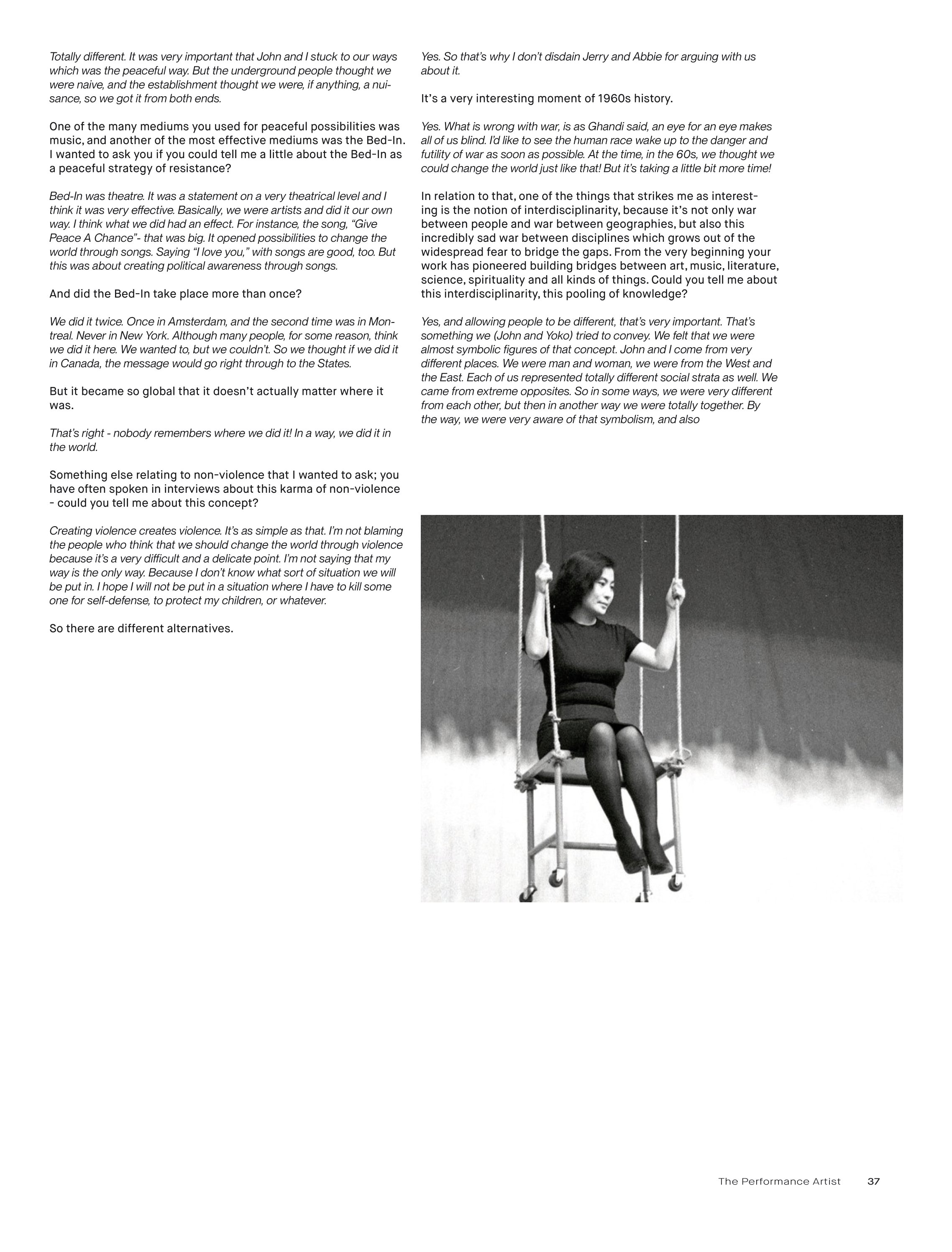
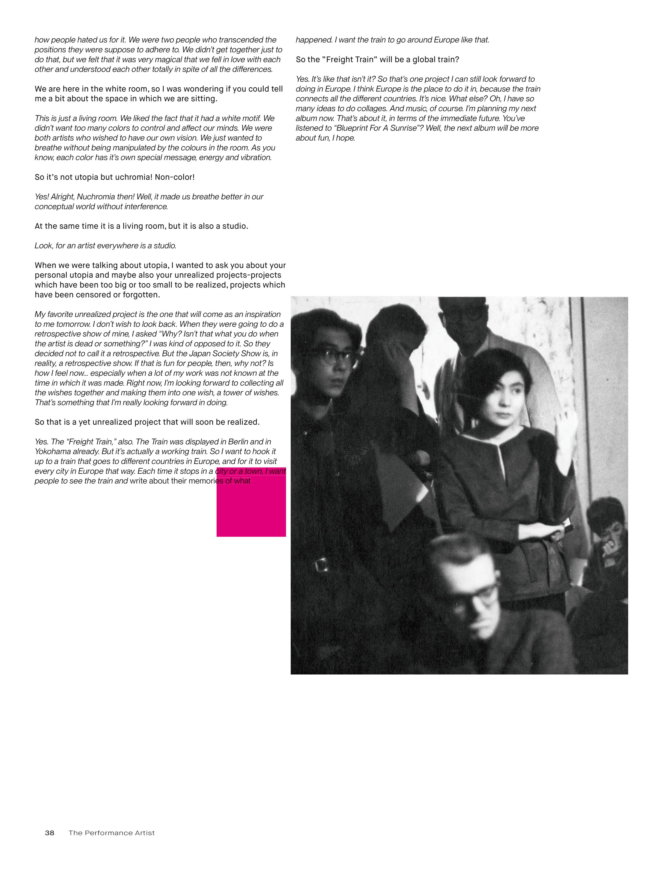
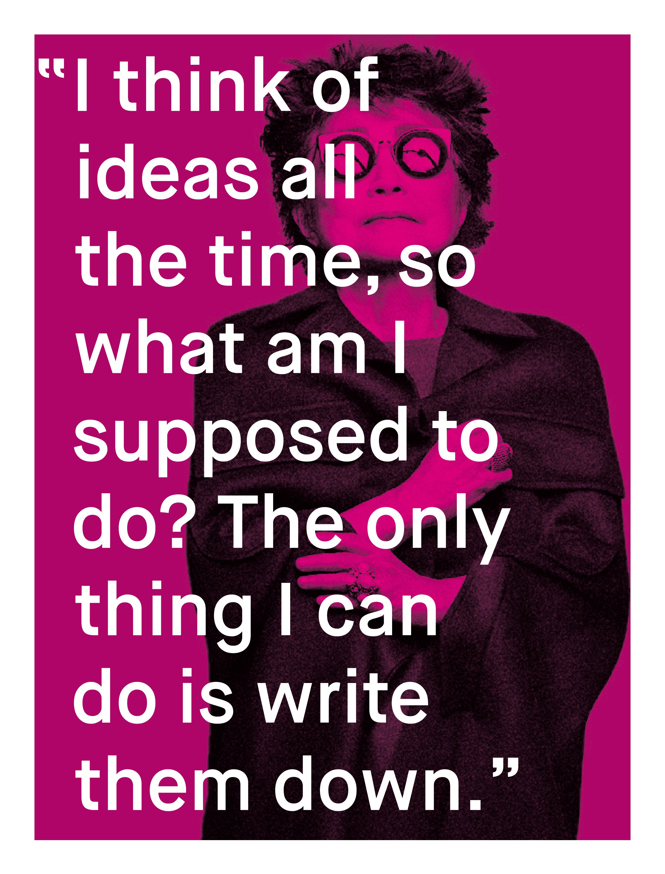
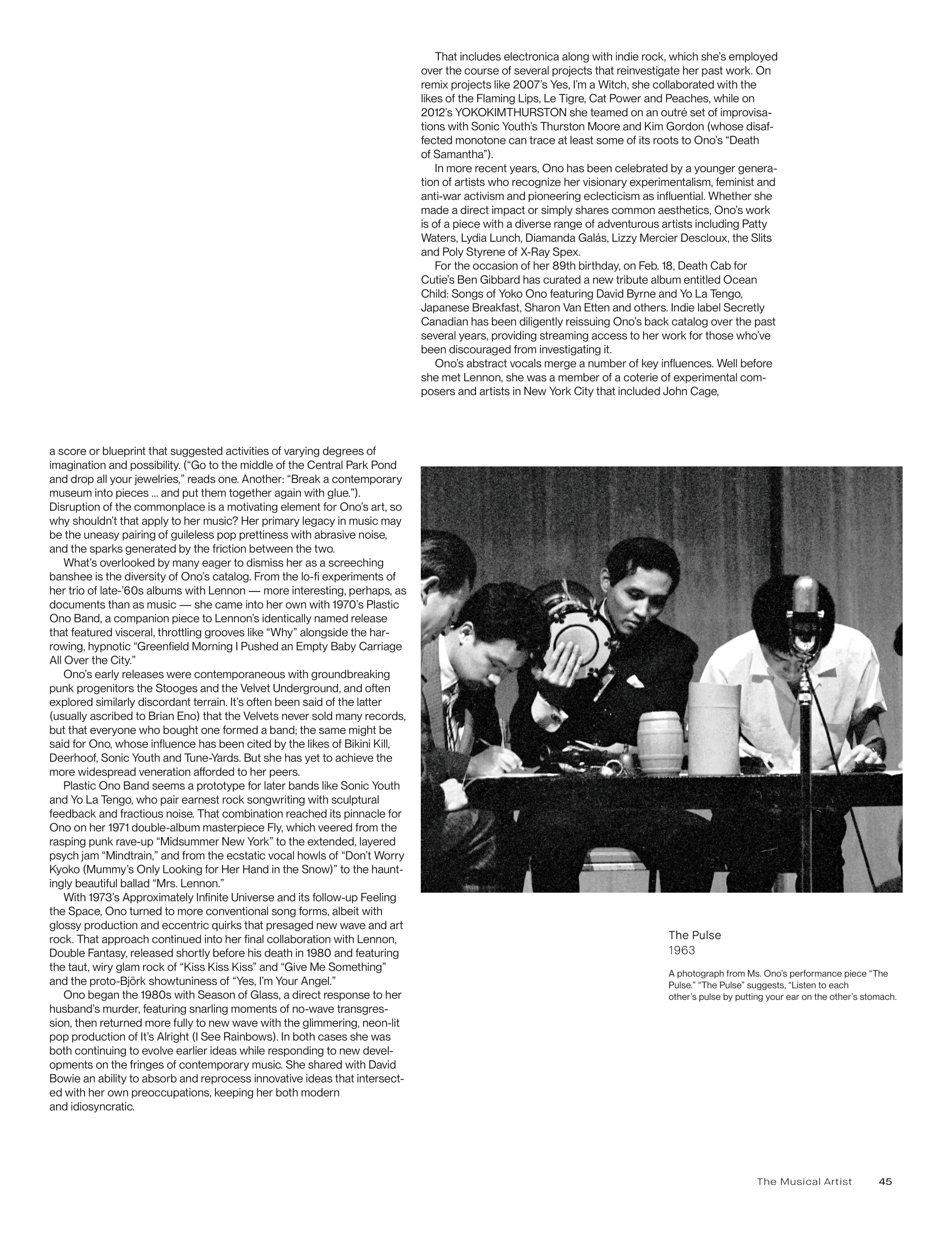
Graduates

Jamal Abdullahi

MFA in Graphic Design - 3 Yr Path — Graduate Graphic Design
Course:
GRFX-555 Graduate Typography 2
Faculty:
Simon Johnston

editorial for yoko ono exhibition

I chose to do a typographic identity for a yoko Ono exhibit that represents her cultural identity, art, and her personality. I My editorial has a heavy emphasis on the vertical as Japanese typography is written top to bottom in kanji. As well, I used the color magenta as a highlight strategically to highlight her use of femininity as a lens to cover issues such as sexism, racism, misogny, peace etc. Her art is very metaphorical so I wanted it to speak through the typography.
Learning Outcomes:
I learned a lot about using the grid, graphical elements, and typographical treatments to tell a story.
Image
Image
Image
Image
Image
Image
Image
Image
Image
Image
Image
Image
Image
Image
Image
Image
Image
Image
Image
Image
Image
Image
Image
Image
Image
Image
Image
Image
Image
Image
Image
Image
Image
Image
Image
Image
Image
Image
Image
Image
Image
Image
Image
Image
Image
Image
Image
Image
Image
Image
Image
Image
Image
Image
Image
Image
Image
Image
Image
Image
Image
Image
Image
Image
Image
Image
Image