Image
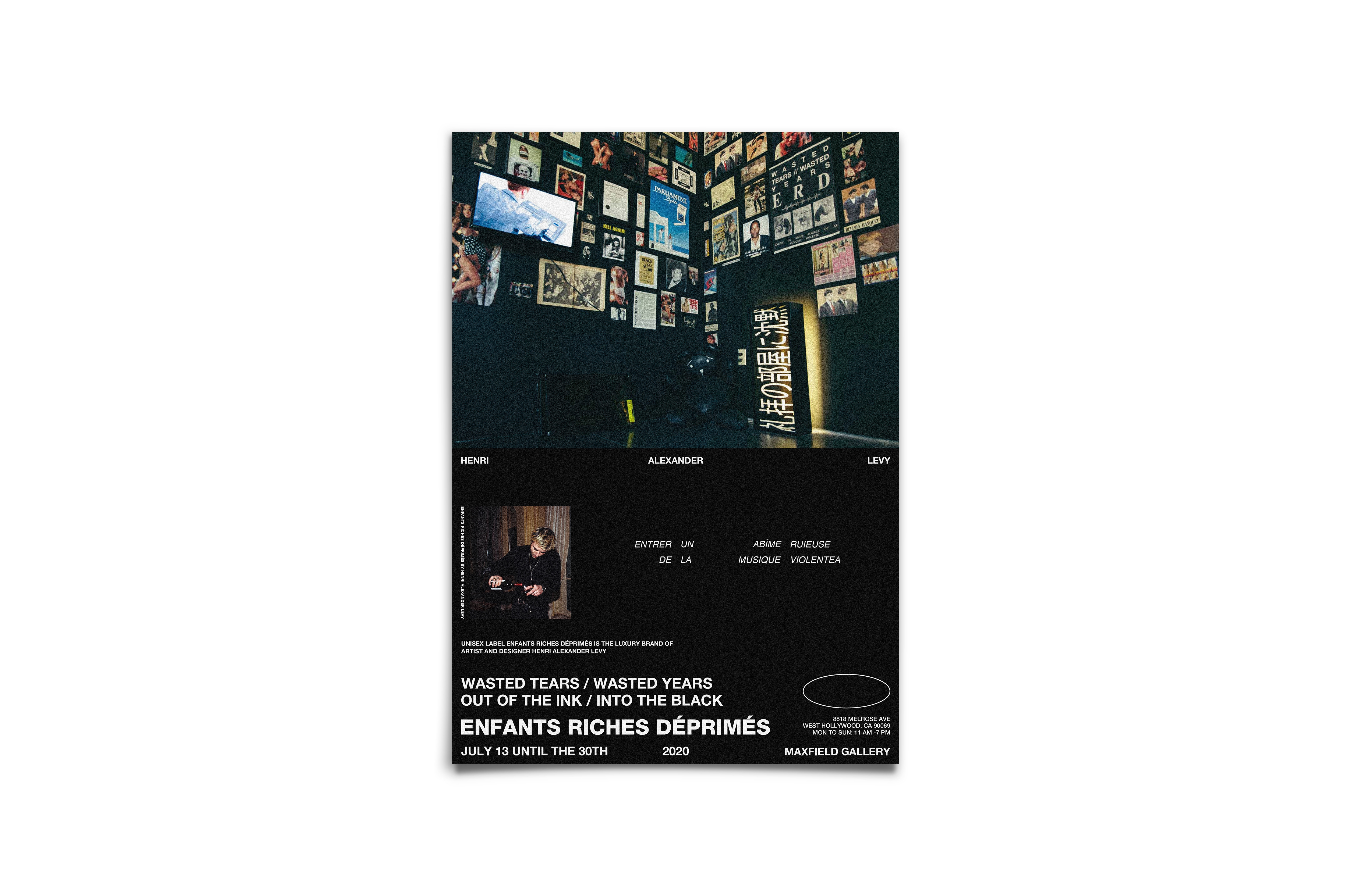
Using the essence of brand Enfants Riches Déprimés, this highlights the minimalism aspects with a stark, captivating picture. The white on black is meant to give a clear vision of the brand as the top picture alludes to a preview without giving away too much, thus spotlighting the elusive nature of the brand. Created using InDesign and Photoshop, photo credit to Enfants Riches Déprimés.
Image
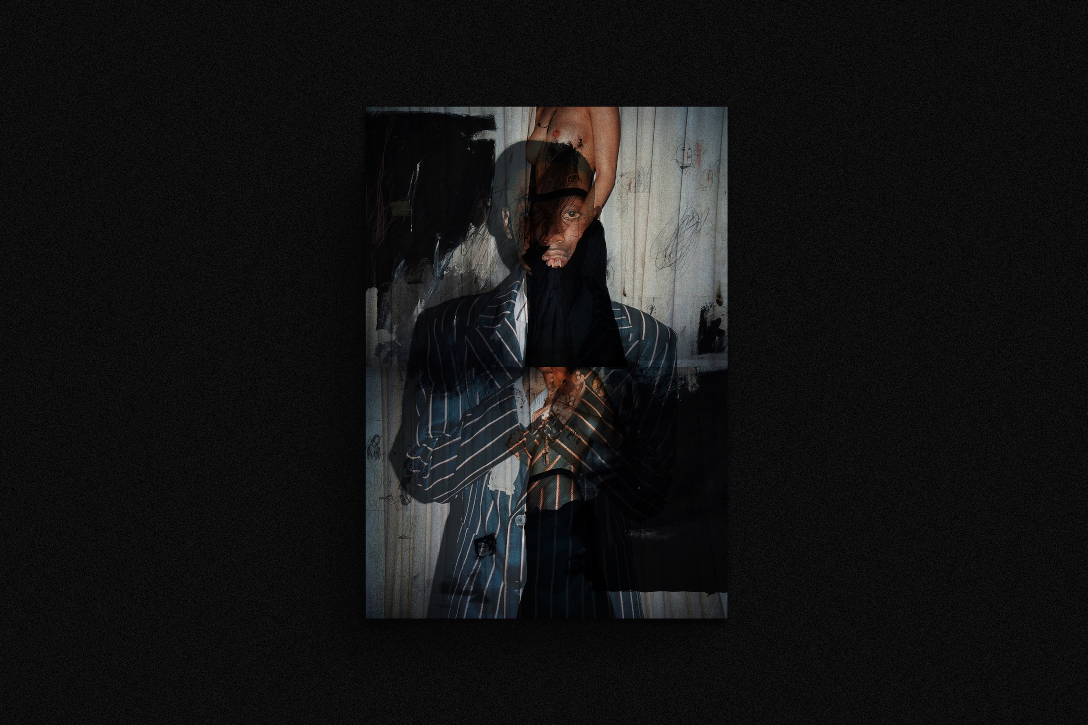
Self-ruination and existential crisis. The coming of age that comes when a man is exposed to the dark parts — the picture aims to juxtapose aspects of scars that come from living life, the vices that slowly fester into the skeletons of the past. Created using Photoshop, photo credit to Enfants Riches Déprimés.
Image
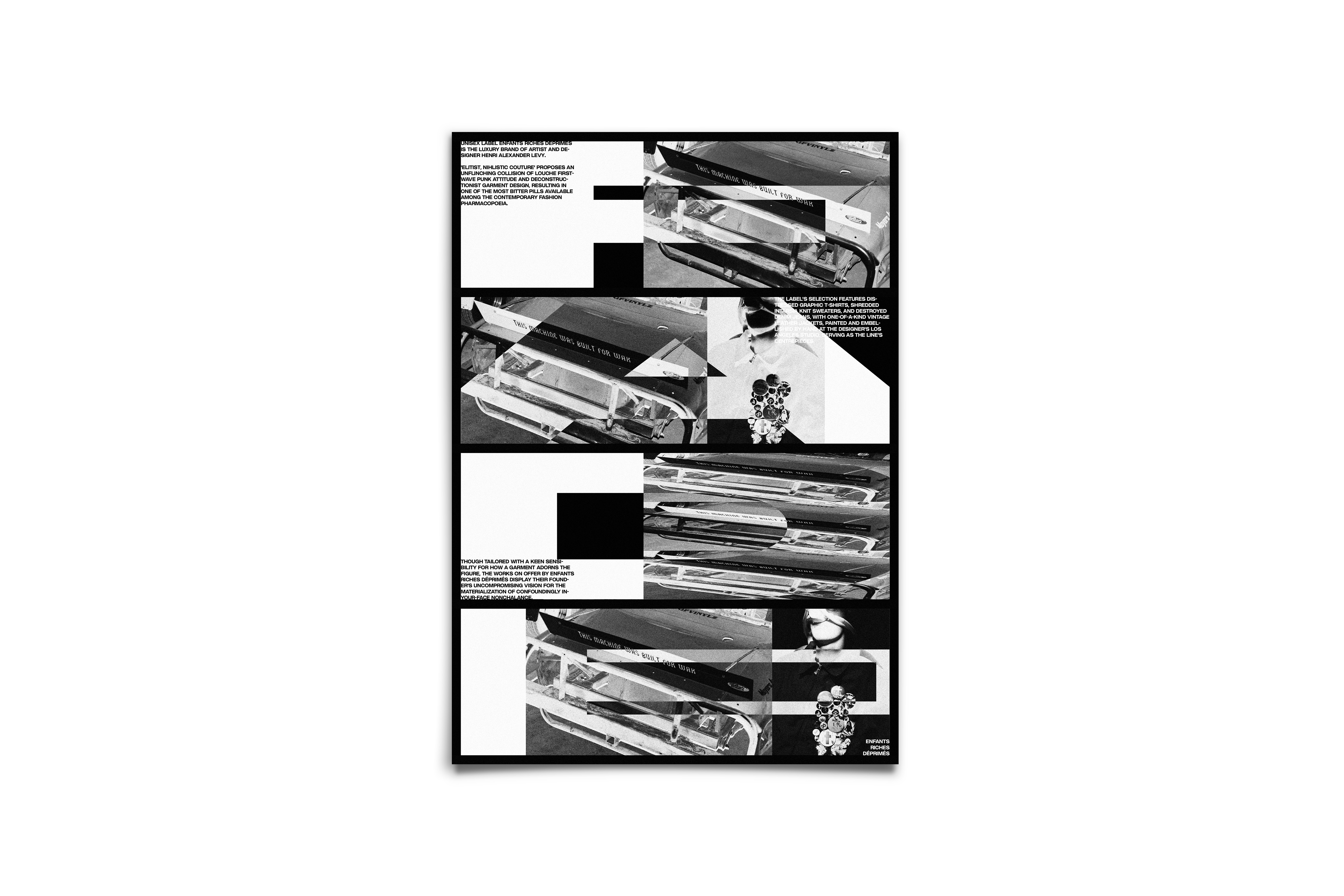
FADE is defined as growing to disappear. Using the juxtaposition of camouflage, the letters ‘f’ ‘ a’ ‘d’ ‘e’ are printed from top to bottom, using the camouflage factor as the letters are often faded or muted in the background due to the contrasting clash of vivid photos. Yet, it is all brought together by the repetition of the same photos, overlapped on different positions. The essence is to captivate the viewer’s attention enough that fade becomes visible. Created using InDesign and Photoshop, photo credit to enfants riches deprimes.
Image
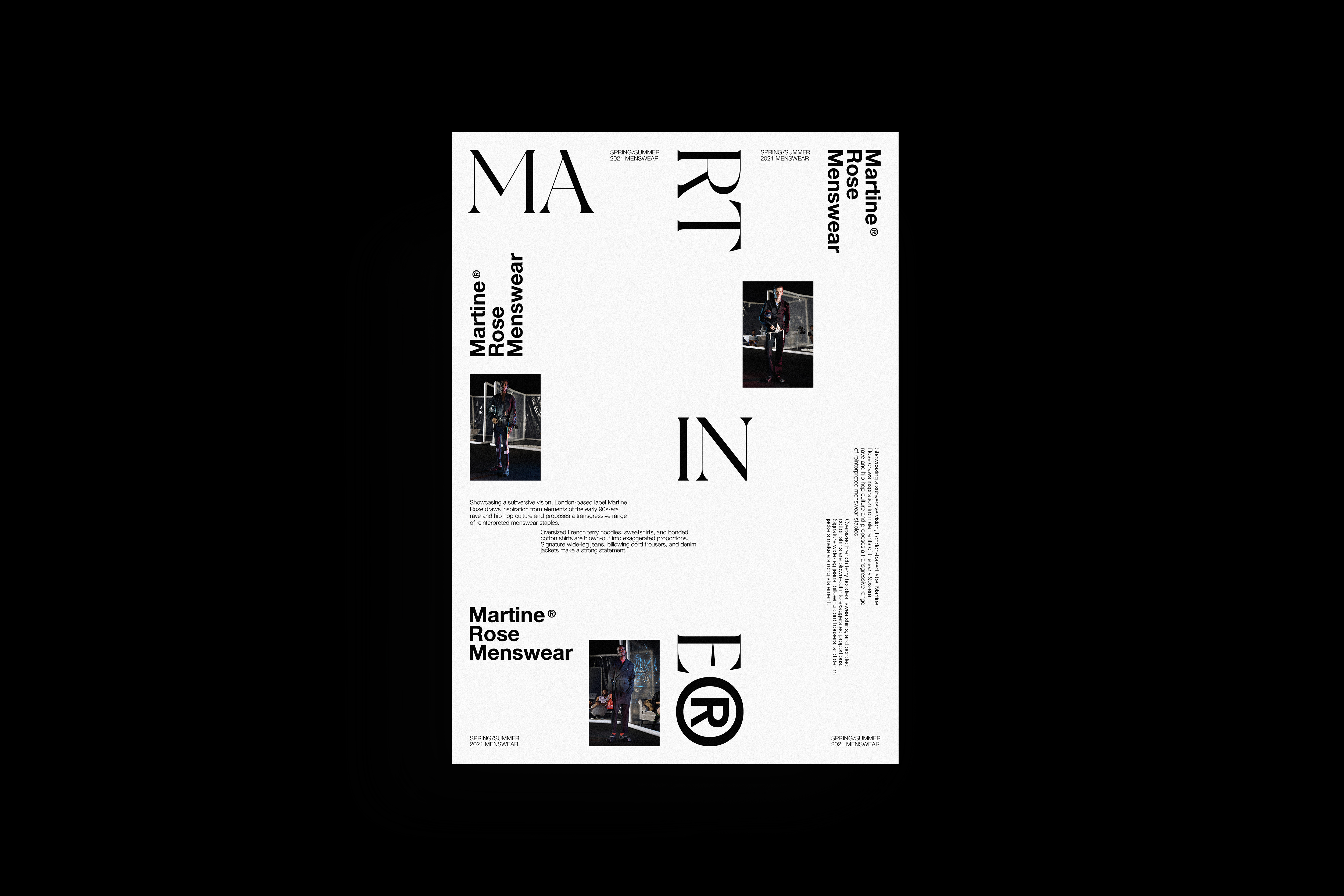
Martine Rose is often praised as having a new wave of fashion — the ideology that the pieces do not necessarily fit together. Inspired by the essence of the brand, the break up into Menswear gives a holistic approach to the brand highlighting the subliminal differences in each fashion piece for the season. A puzzle play inspired by the brand’s identity. Created using InDesign and Photoshop, Photo credit to Martine Rose.
Image
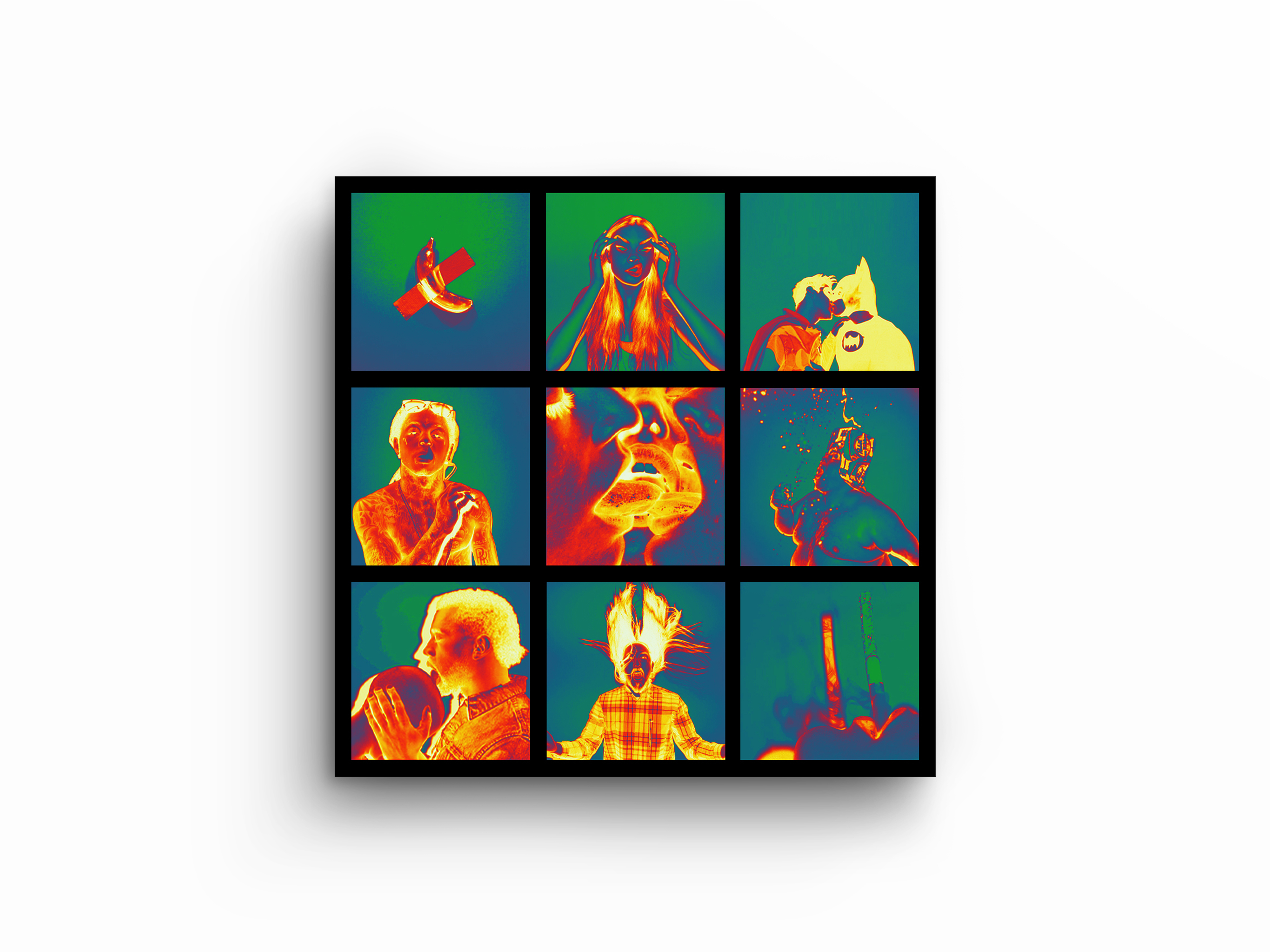
Inspired by human aversion to certain concepts, this 3 x 3 photo board juxtaposes the various photos meant to innervate the viewer. The clash of color and the clash of vibrant cool tones and warm tones give the visceral reaction to aversion. It hones in the focus on one picture, one by one only to come together for a bearable effect. Created using Photoshop, Photo credit to Terry Richardson.
Image
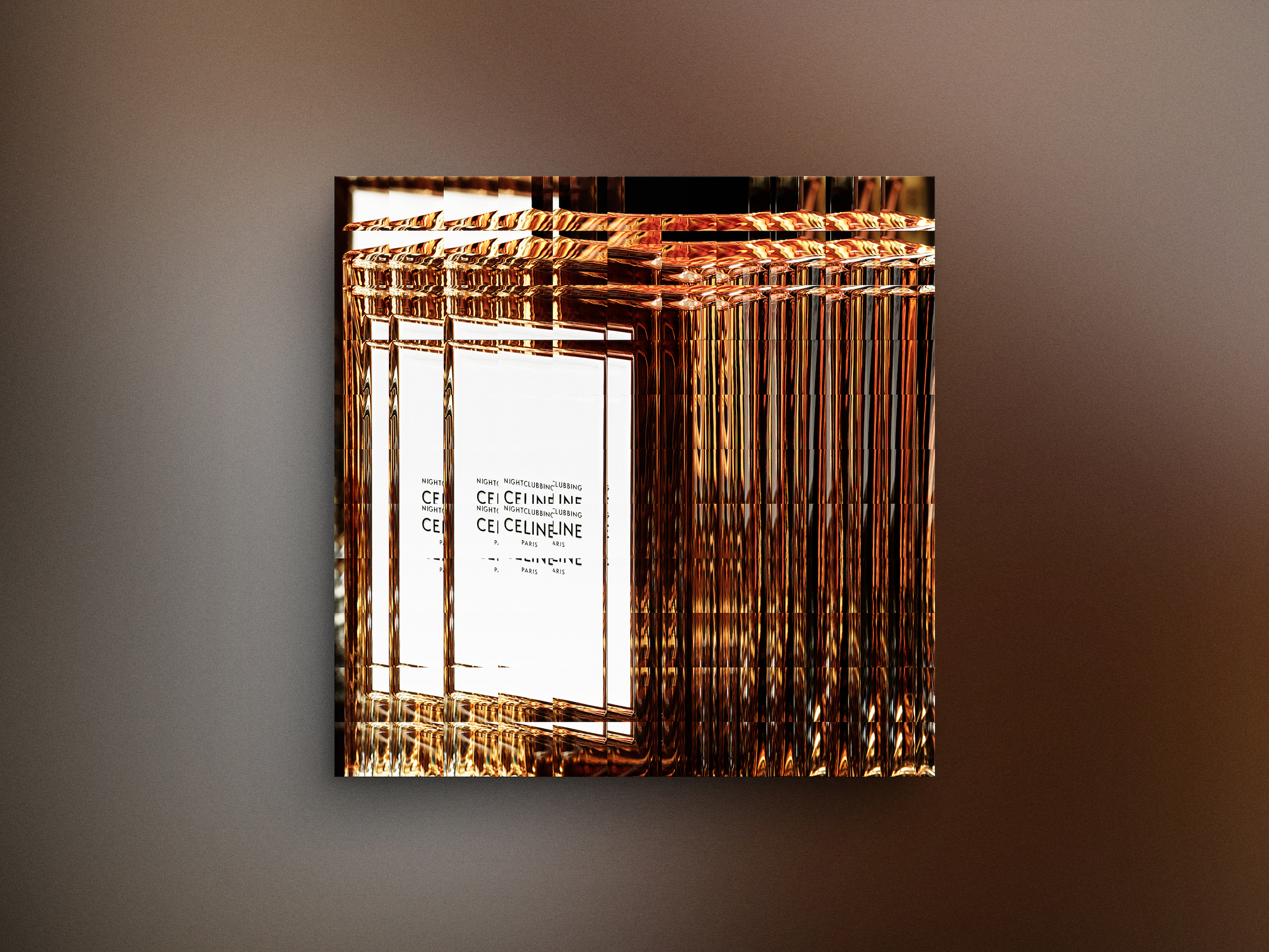
Celine a fashion house brand, yet the poster aims to highlight Hedi Slimane’s more artistic approach to the brand identity. Wanting to give in to the newest season, it focuses back on the juxtaposition of the lights and how the spotlight shines towards the consumers instead of the brand itself. The disarray of the lights give to a near ‘uneasiness’ as the project was inspired by the beauty in asymmetry. Created using InDesign and Photoshop, photo credit by Celine.
Image
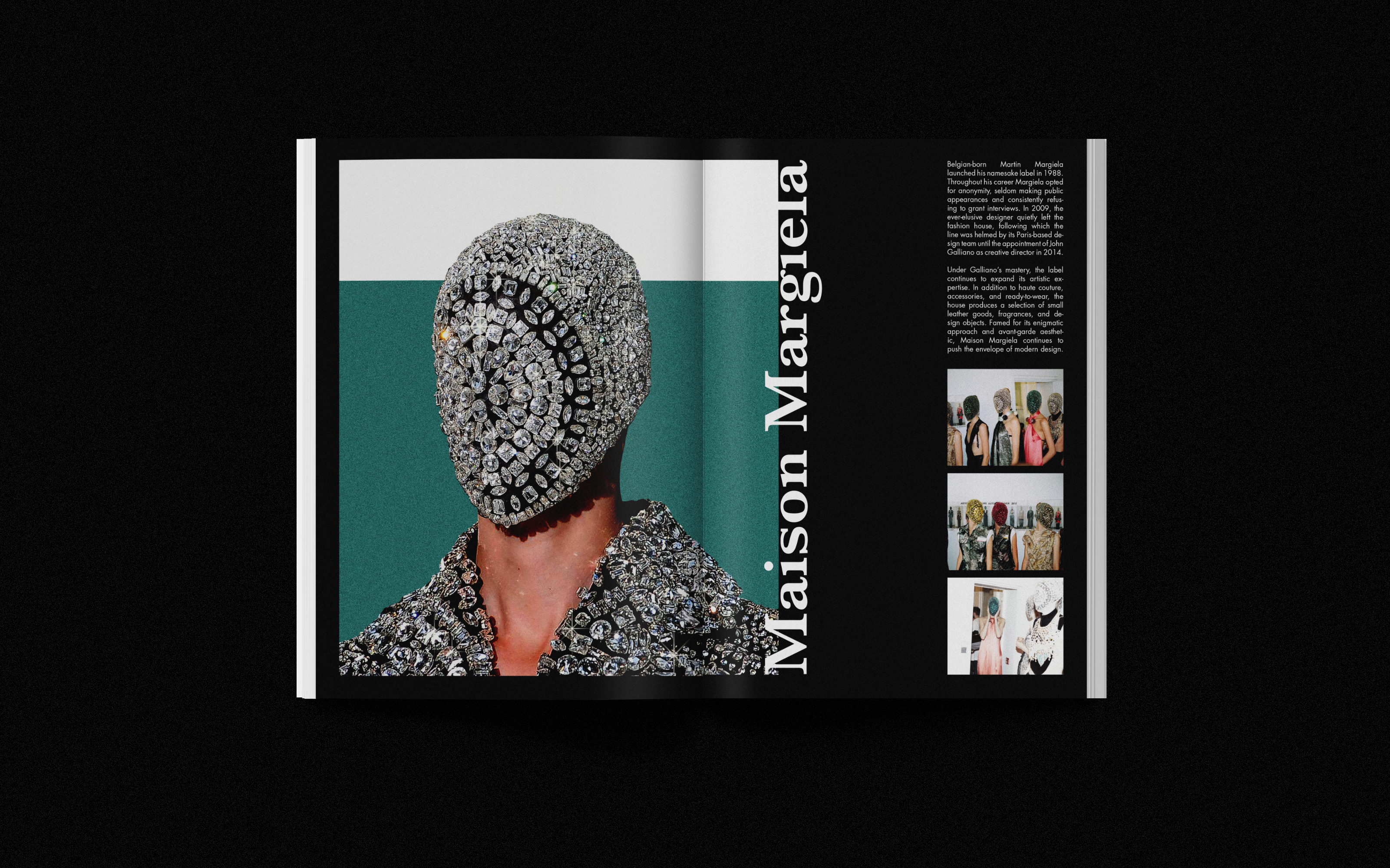
Humanity’s natural inclination to see the sparkle and jewels, it takes the centerpiece off-center to captivate human attention with the stark brand identity listed next to it. Immediately, viewers are forced to ‘tilt their heads’ in order to read. The uncanniness of the picture aims to draw them to the small text to gain interest inside the new brand. Created using InDesign and Photoshop, Photo credit to Maison Margiela.
Image
A phone book is essential to the brand’s identity. Often times, the cohesiveness of minimalism along with the scattered pops of blue is aimed to serve as a cohesive factor to the brand. Not solely based on fashion, the mockup includes colors and juxtaposition of photos to give an overall approach to the brand such that consumers are able to grasp the aura upon first glance. Created using InDesign and Photoshop, photo credit to Enfants Riches Déprimés.
Image
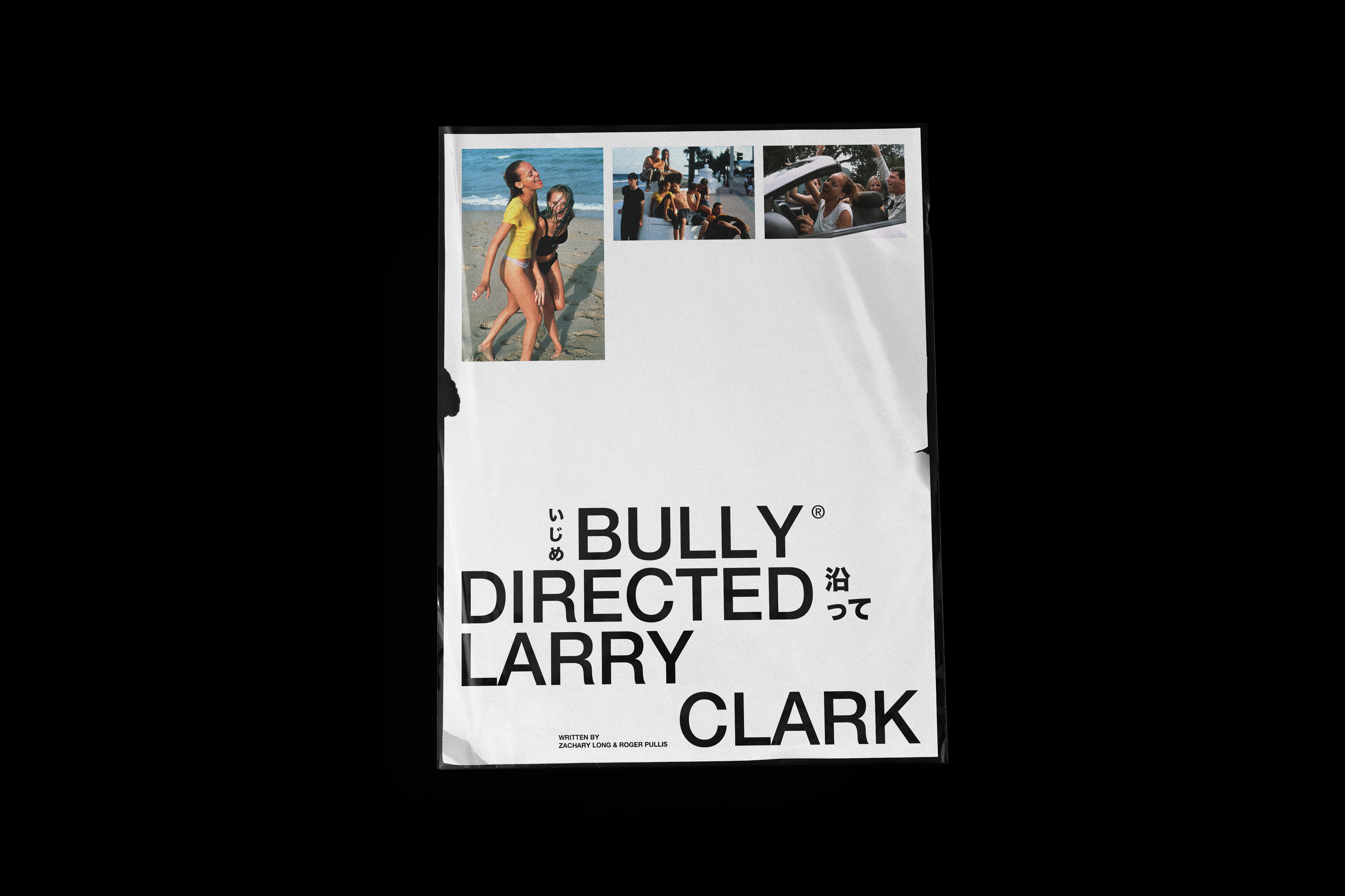
Bully is a timeless yet controversial movie. The ripped edges, and the focus on controversial director Larry Clark aimed to target via ‘shock factor’. The nature of the images are aimed to tone down the chaos that surrounds the moniker ‘Larry Clark’. Created using InDesign and Photoshop, photo credit to movie Bully.
Image

Invisible Monsters, a renowned novel by Chuck Palahniuk, is one plot reversal after another. The aim was to create a book cover that highlights the gunshot wound central to the twisted plot. Packaging often reminiscent of easily disposable plastic — it shows that pieces of beauty in packaging are often neglected and thrown for the sake of the content inside, which holds a twisted beauty. Created using InDesign and Photoshop. Photo credit to Enfants Riches Déprimés.