Image
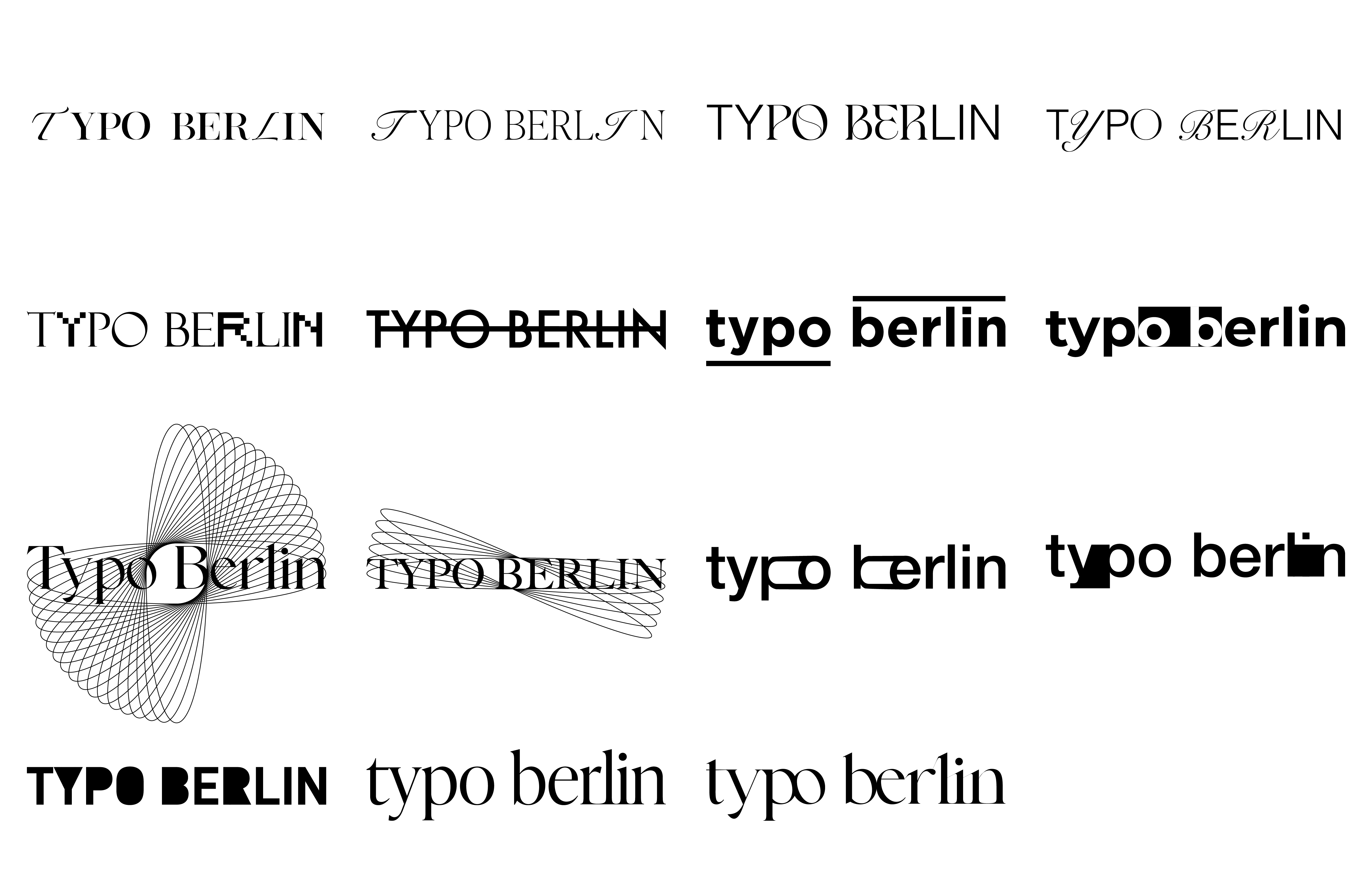
Typo Berlin Logo Ideation 01
Image
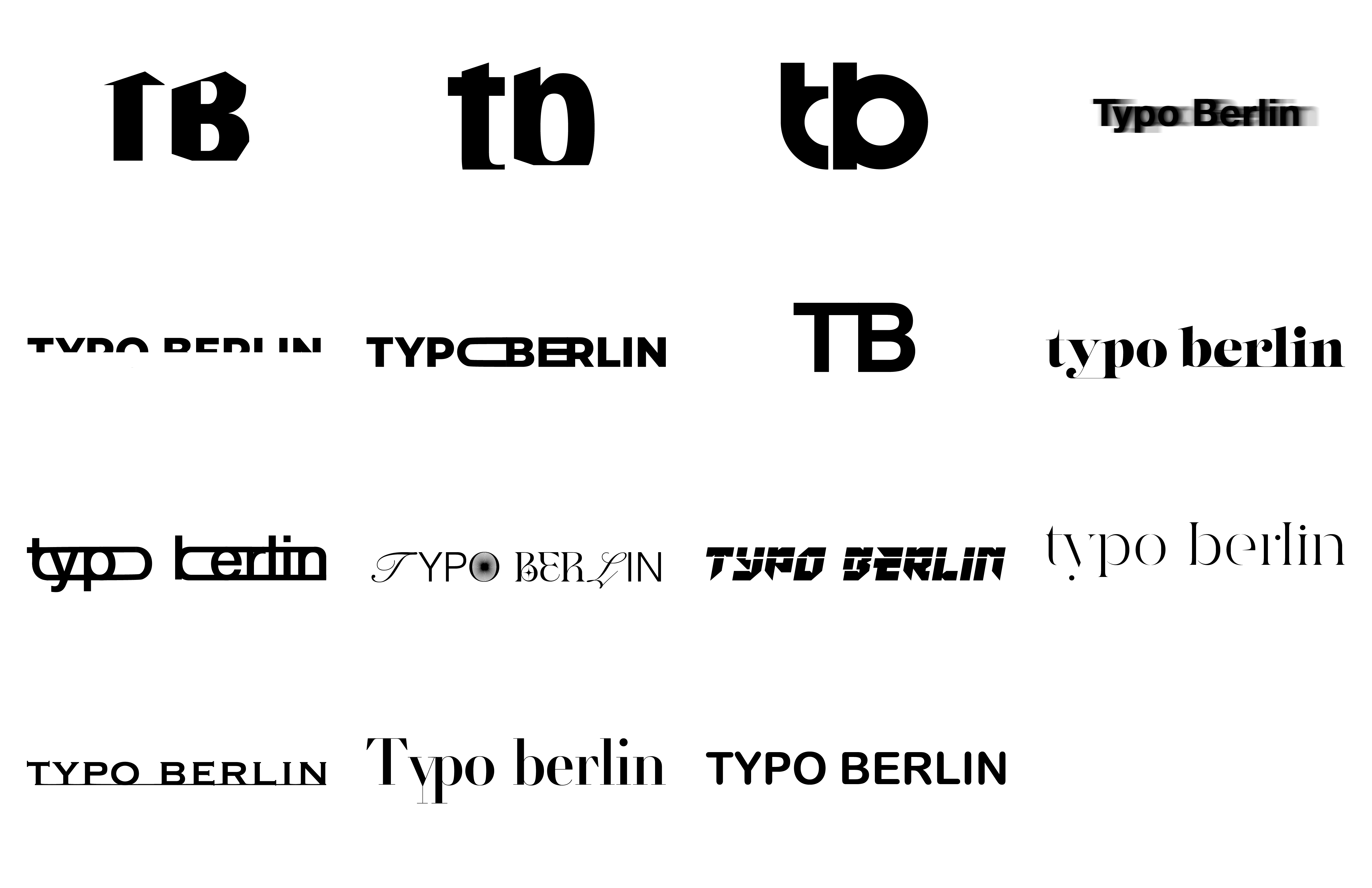
Typo Berlin Logo Ideation 02
Image

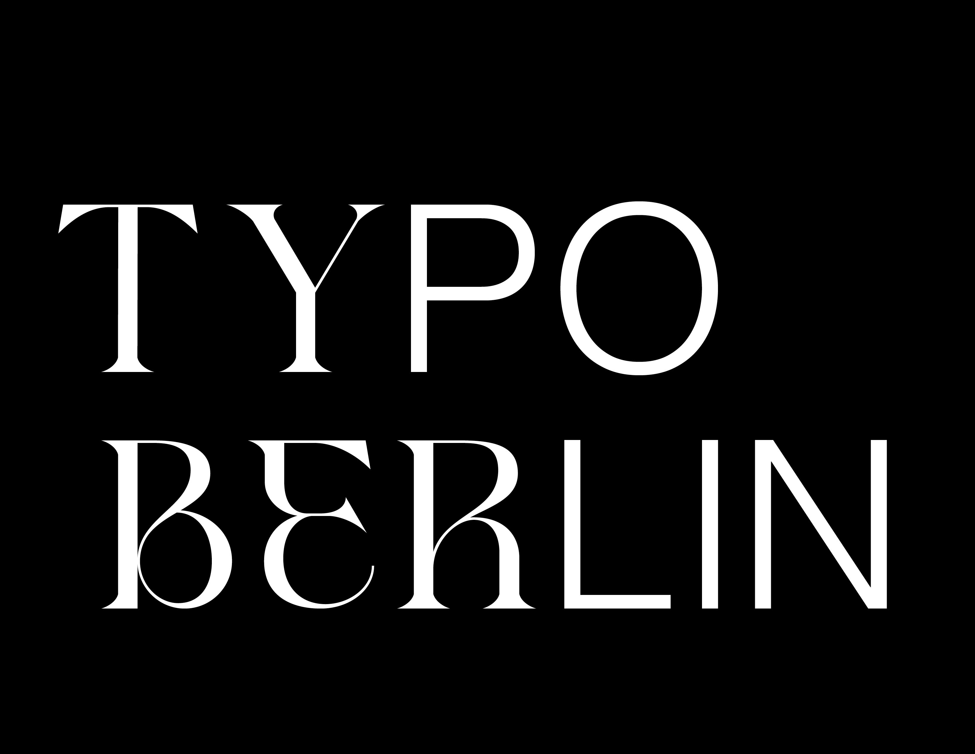
Final Logo (Black on White)
Image
Final Logo (White on Black)
Image
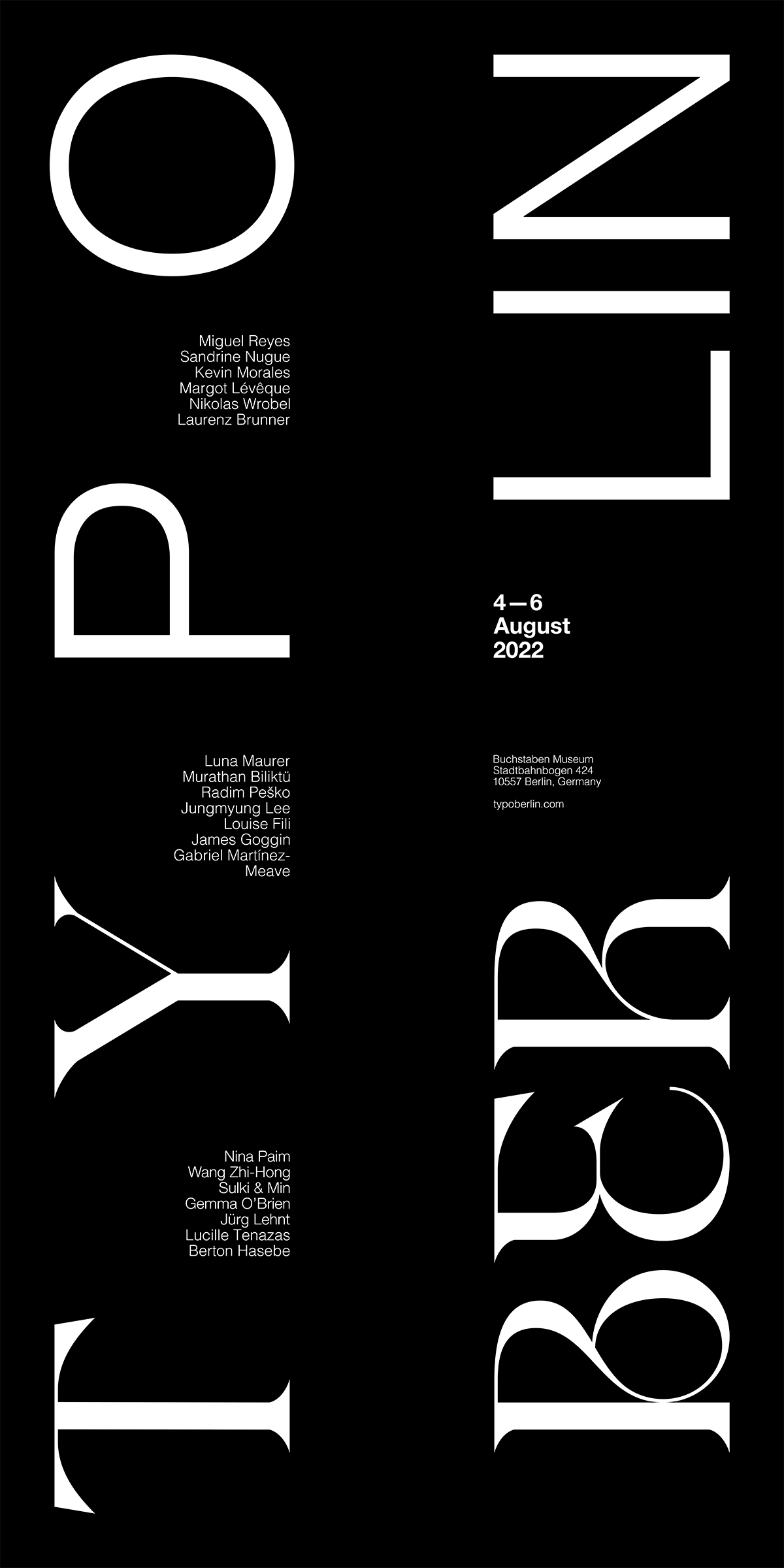
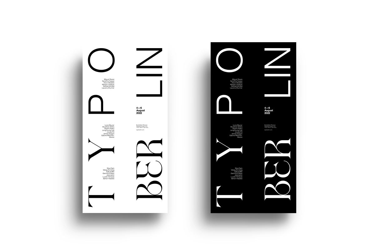
Poster (White on Black)
Image
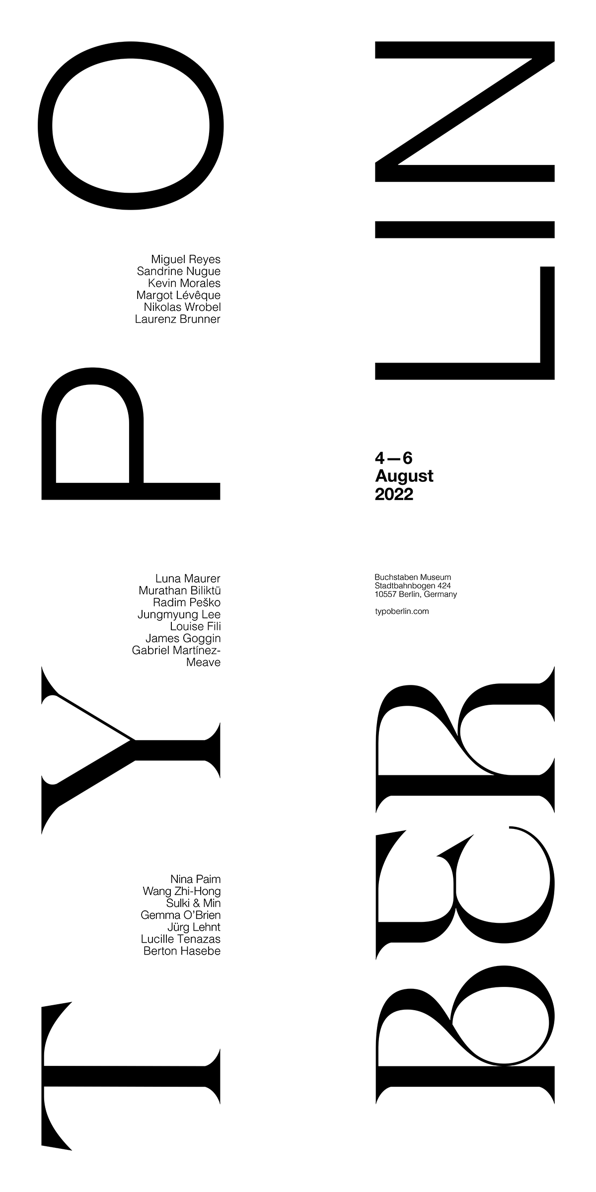
Poster (Black on White)
Image
Posters
Image
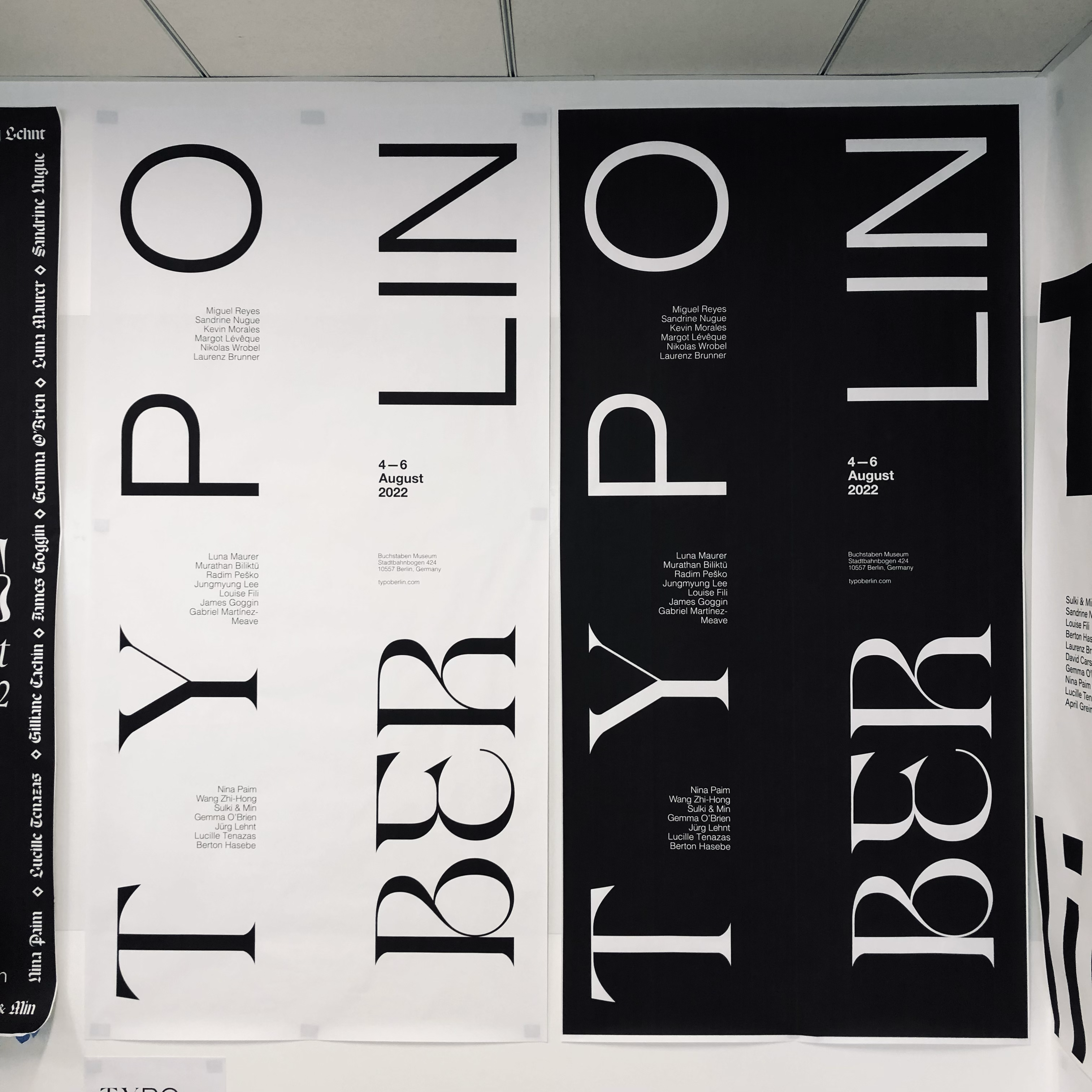
Photography
Image
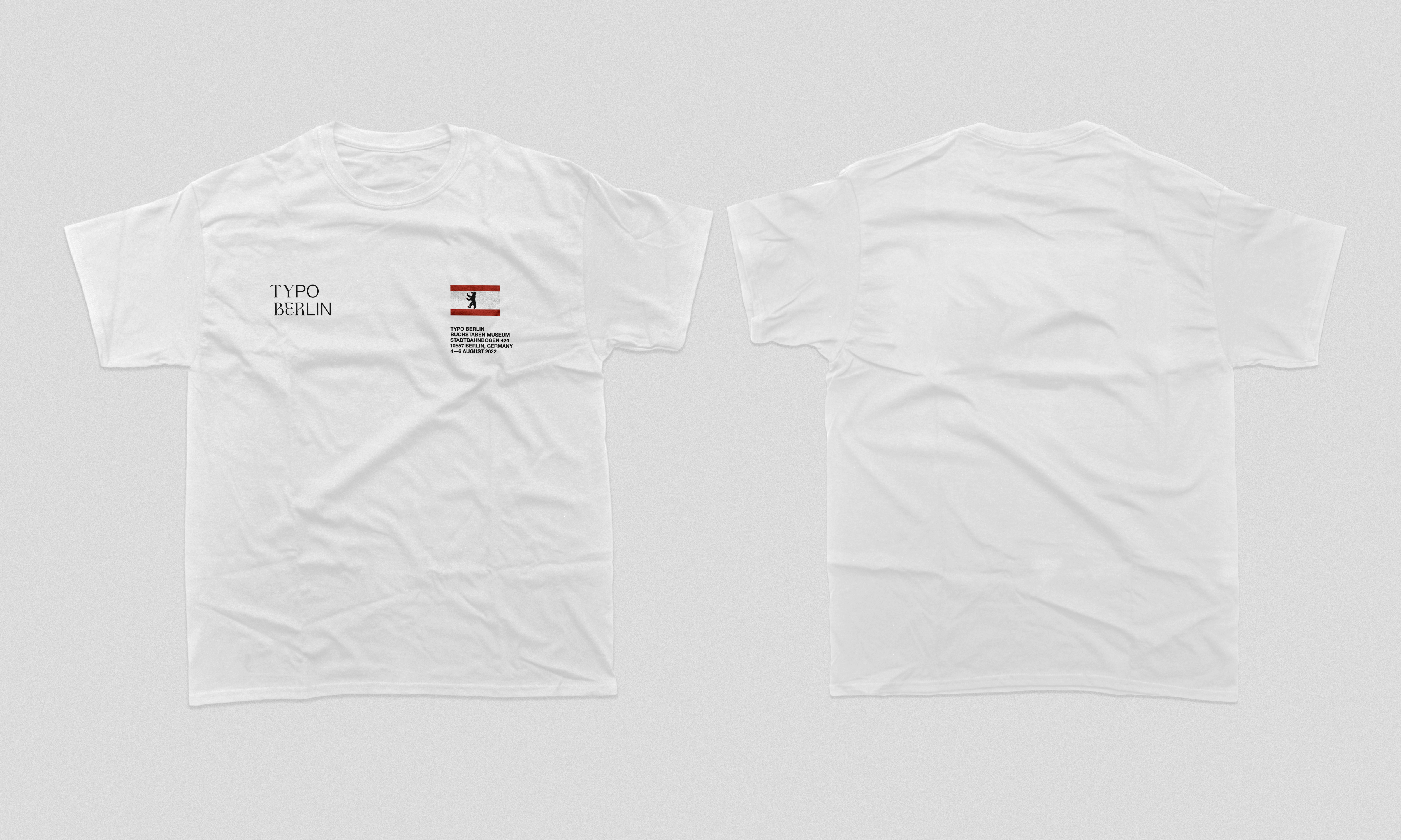
T-shirt (White, Front and Back)
Image
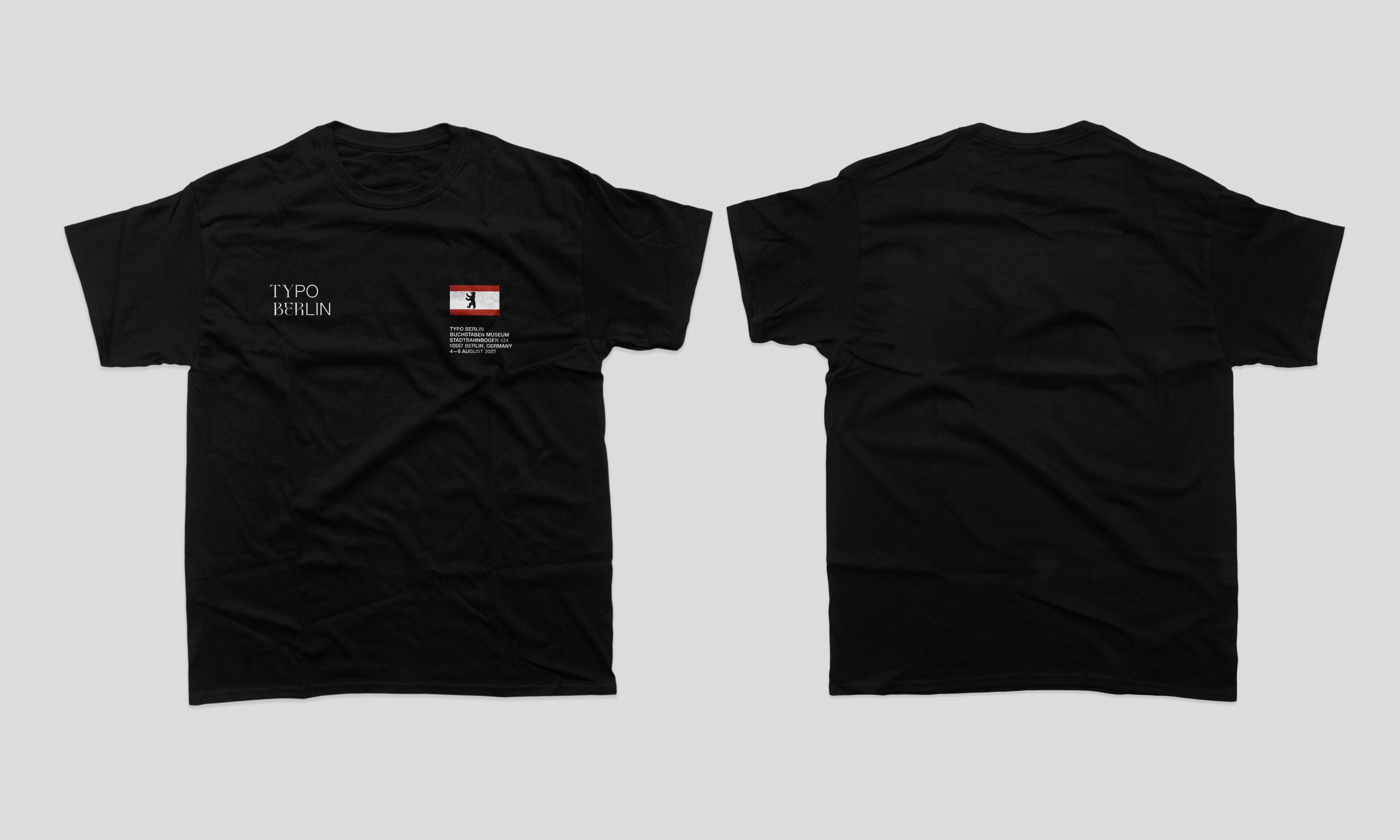
T-shirt (Black, Front and Back)
Image
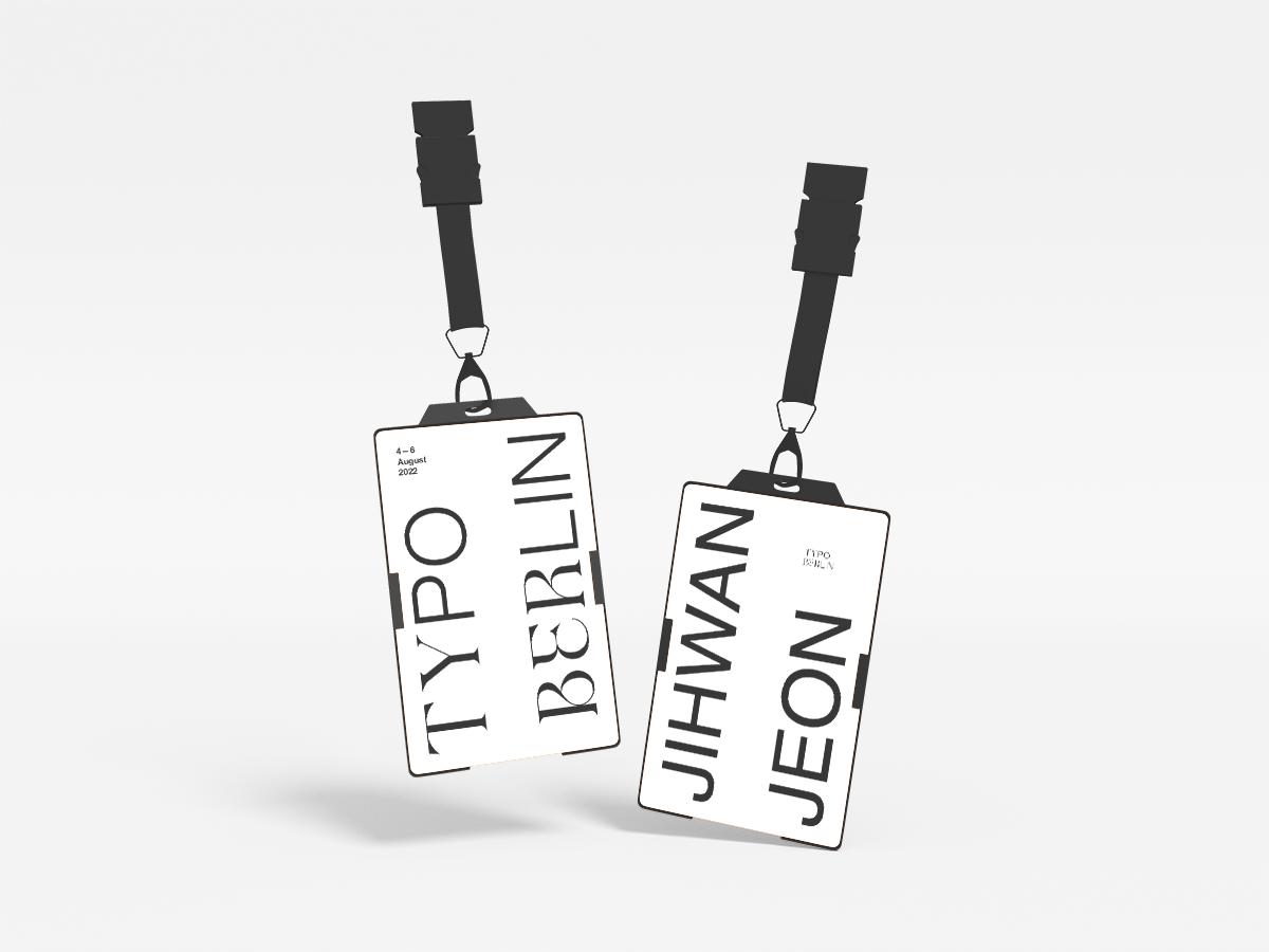
ID Card (Front and Back)