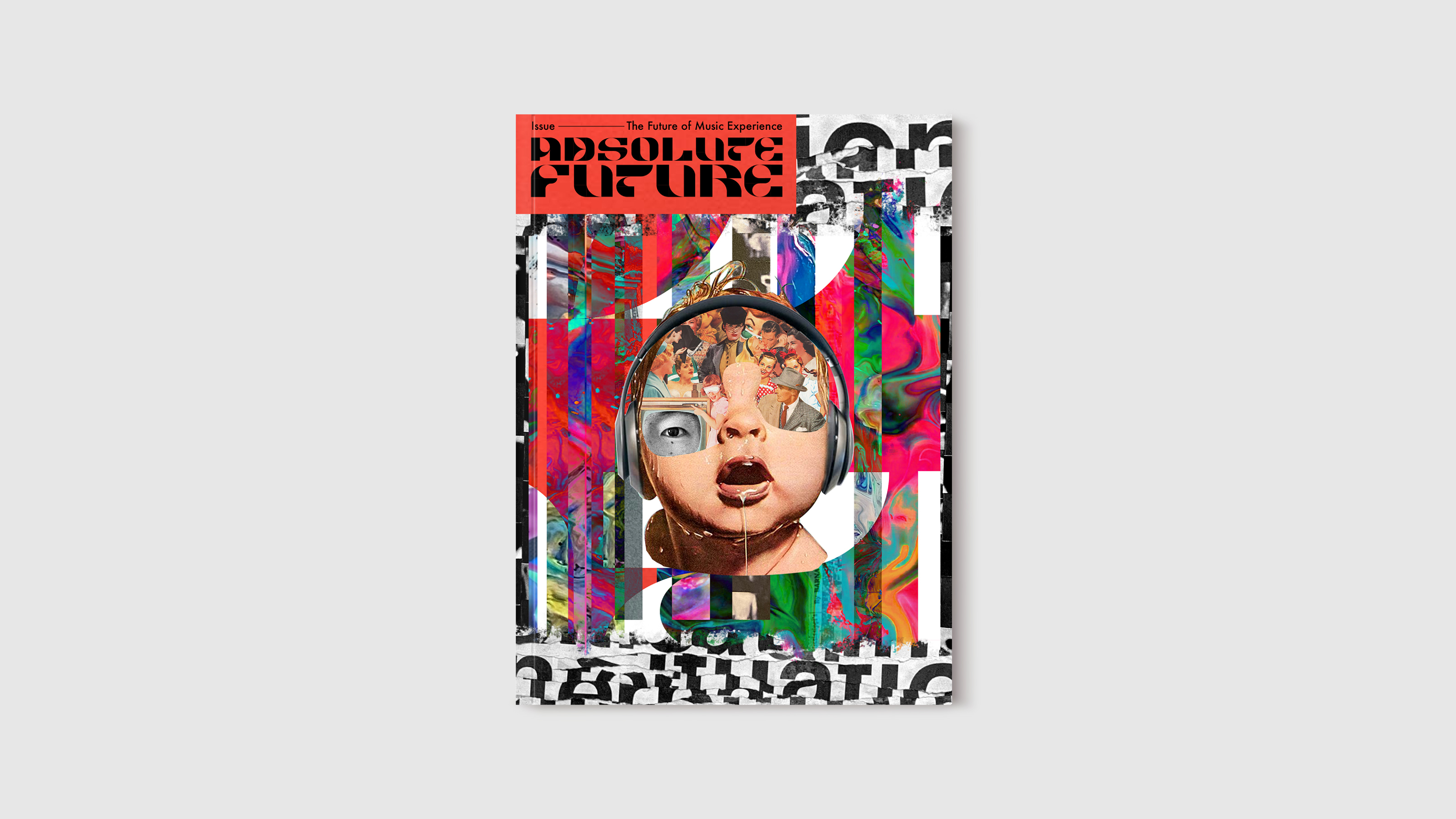
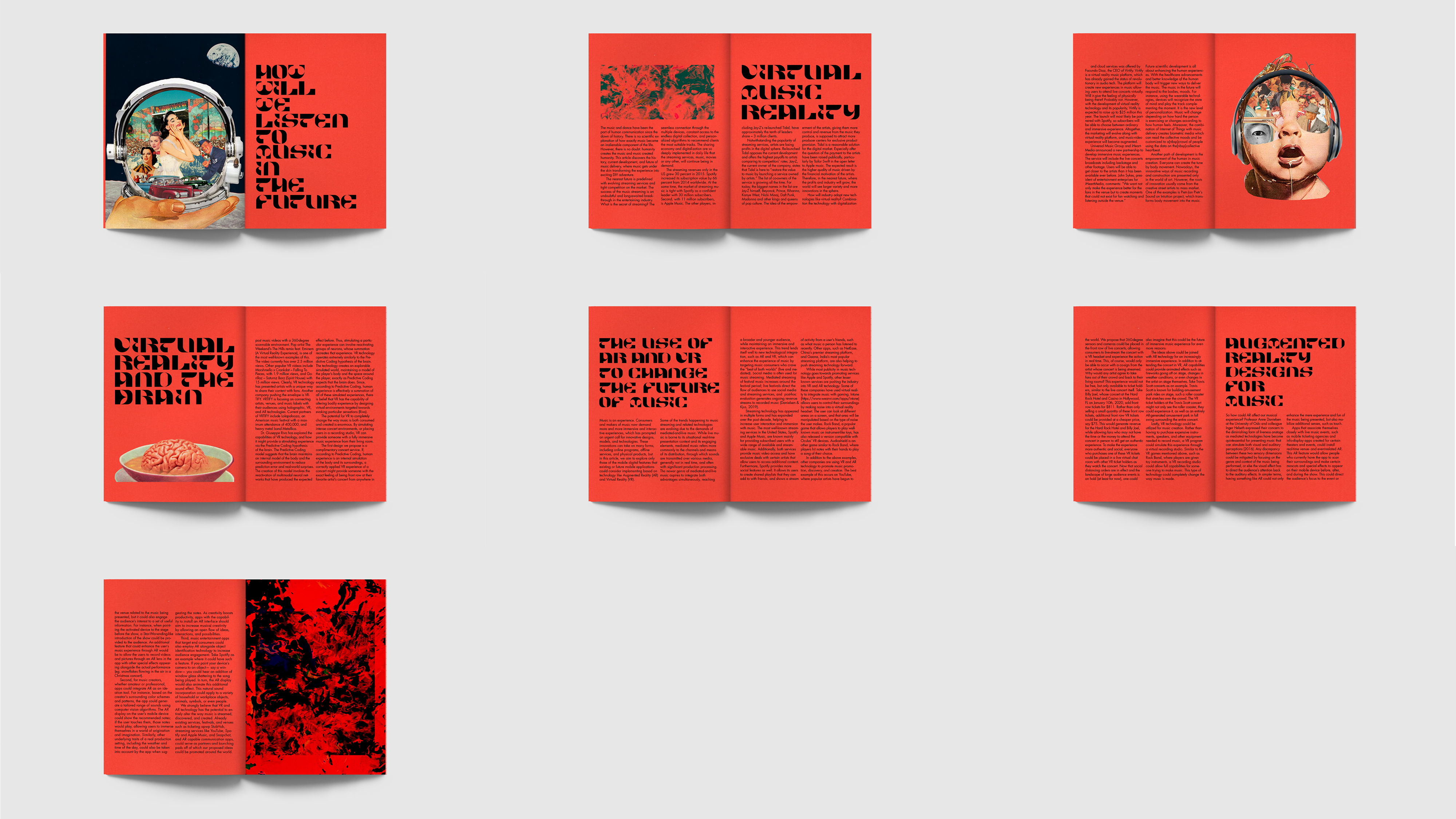
Image
This final version was edited during the summer break after the spring term.
Image
Image
Image
Image
Image
Image
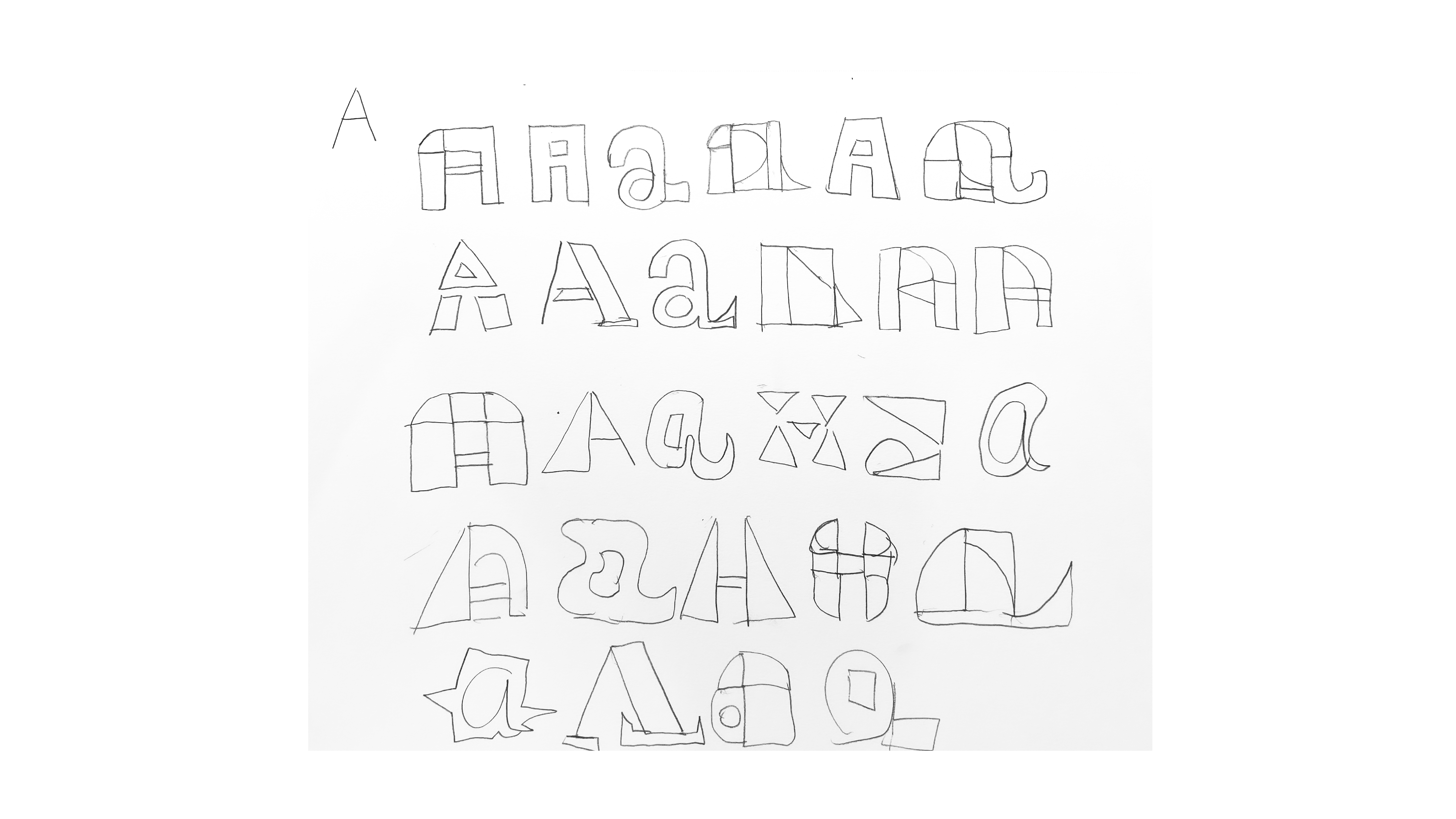
Type Design Process 1 To start this project, I wanted to design my own typography for the magazine. This is my initial sketch of designing the letter A of my own typography.
Image
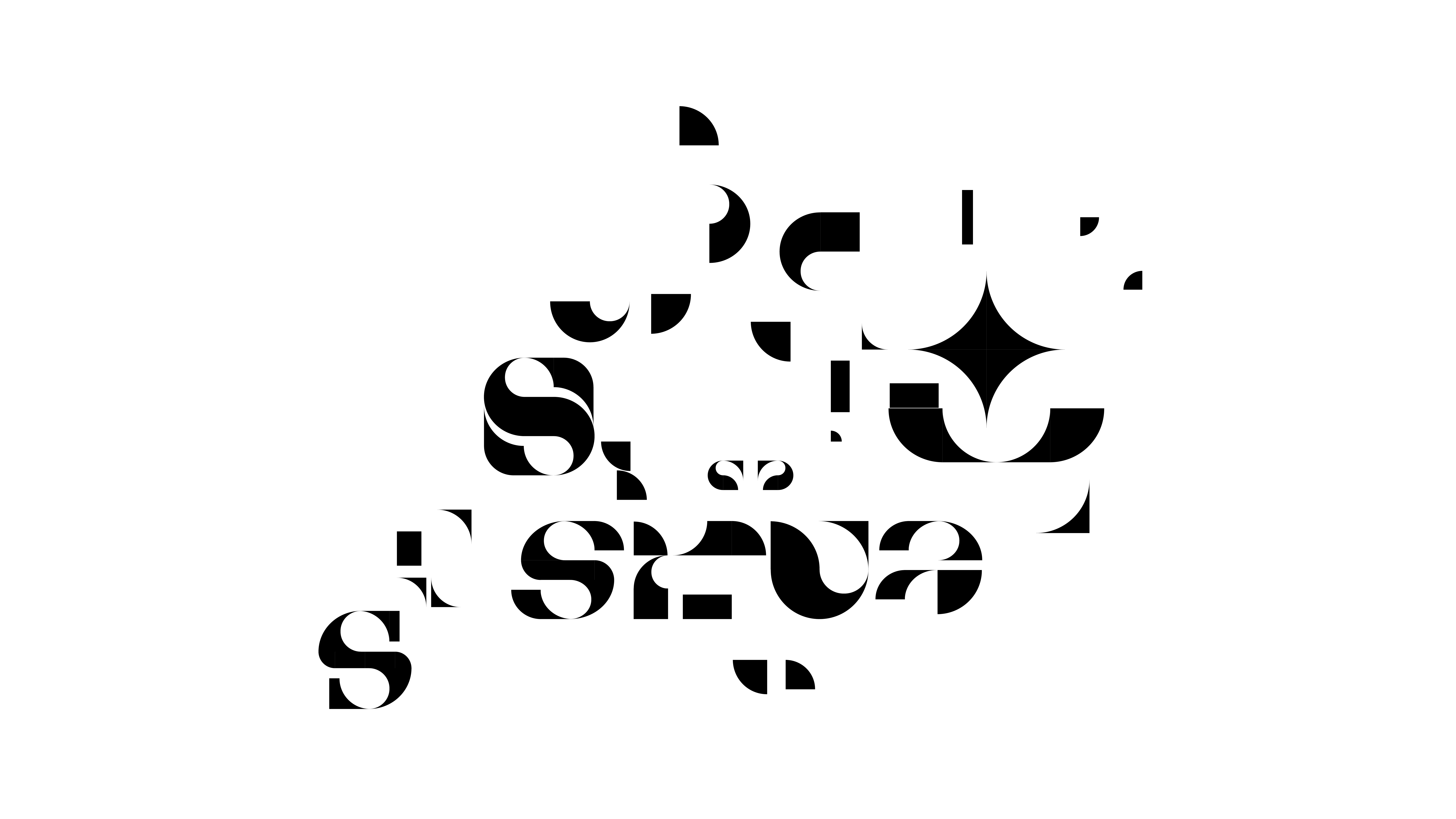
Type Design Process 2 After the sketch, I did experimentation of combining different shapes in illustrator to see what kind of combinations makes a shape of the letter that is unique and readable.
Image
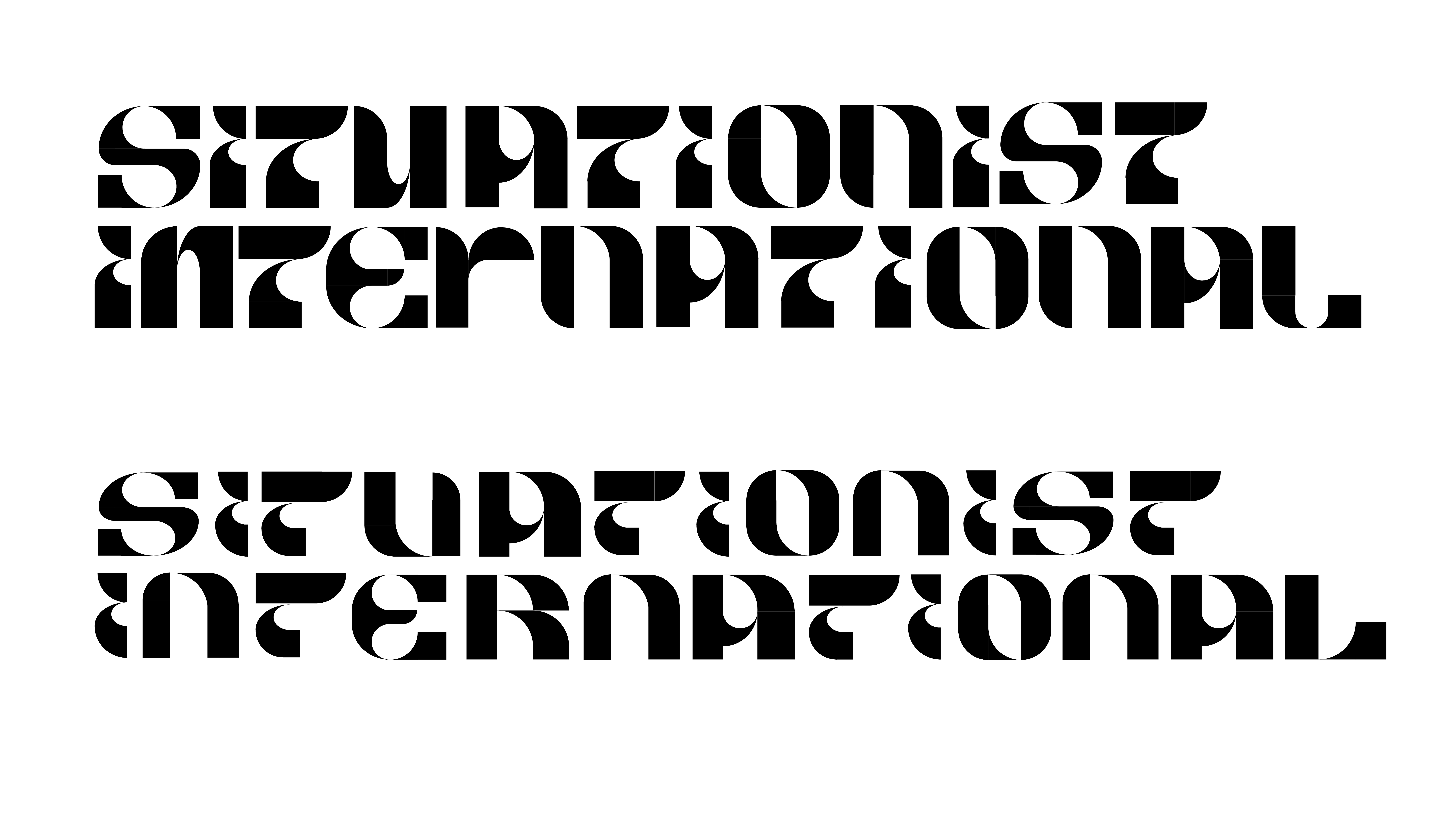
Type Design Process 3 This is my initial digital rough draft of my typography design. The first one on the top had a problem where each letter had inconsistent length and width. So I spent few weeks refining each letter and make sure that the height and the width of different letters match each other. The second one below is my refined one.
Image
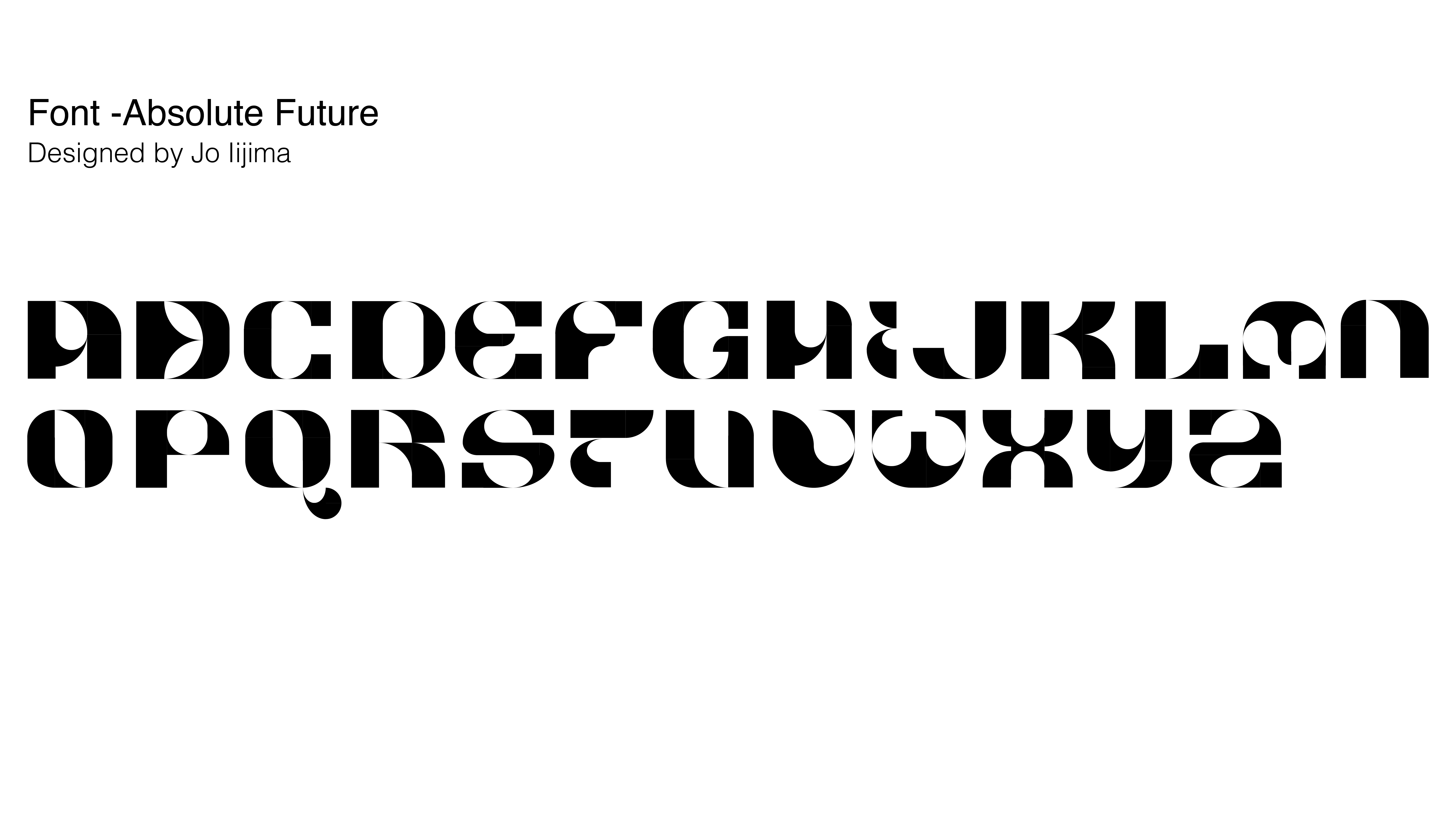
Type Design Process 4 This is my final design for the typography. This typography will be incorporated into the final zine design.
Image
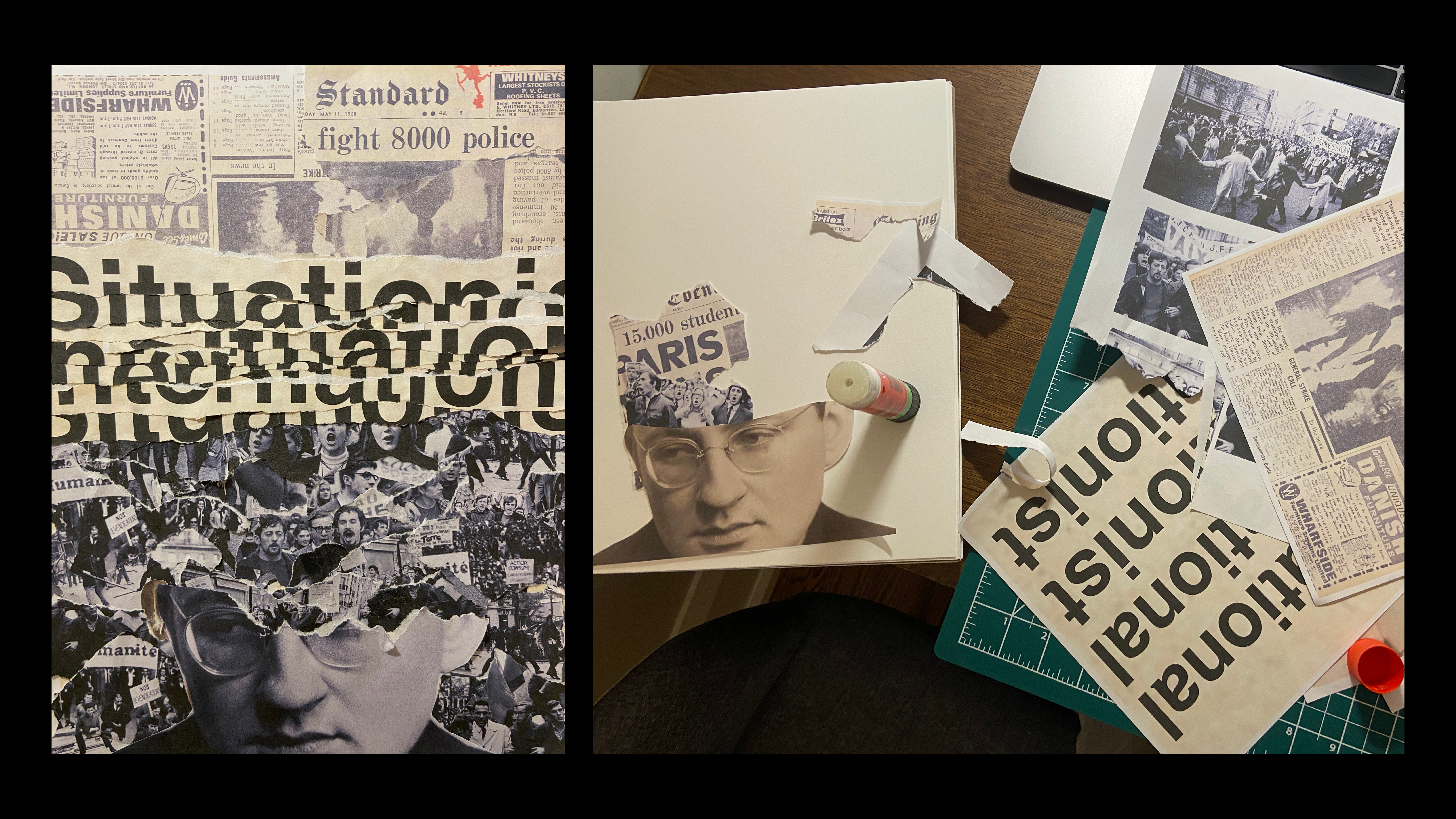
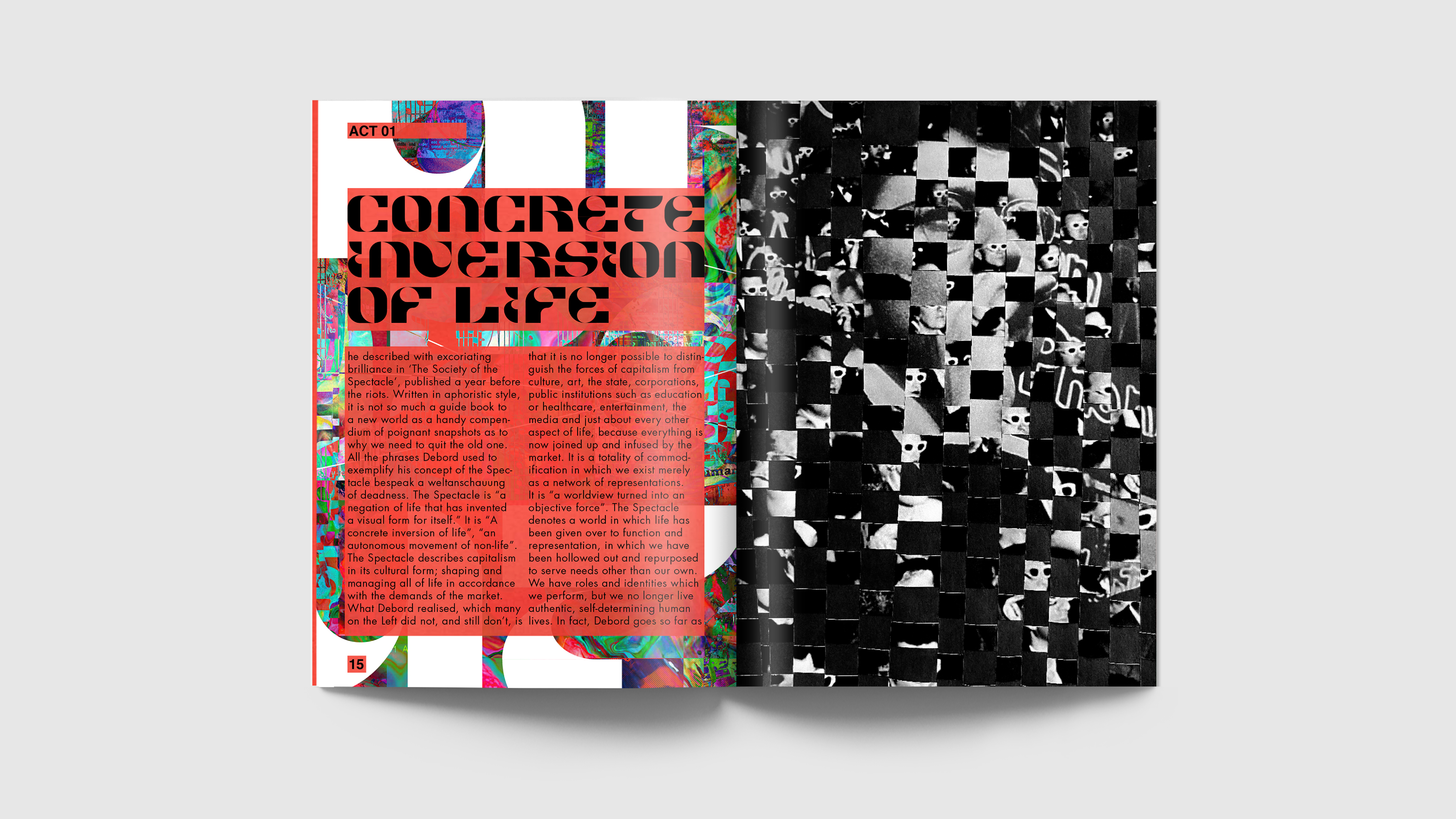
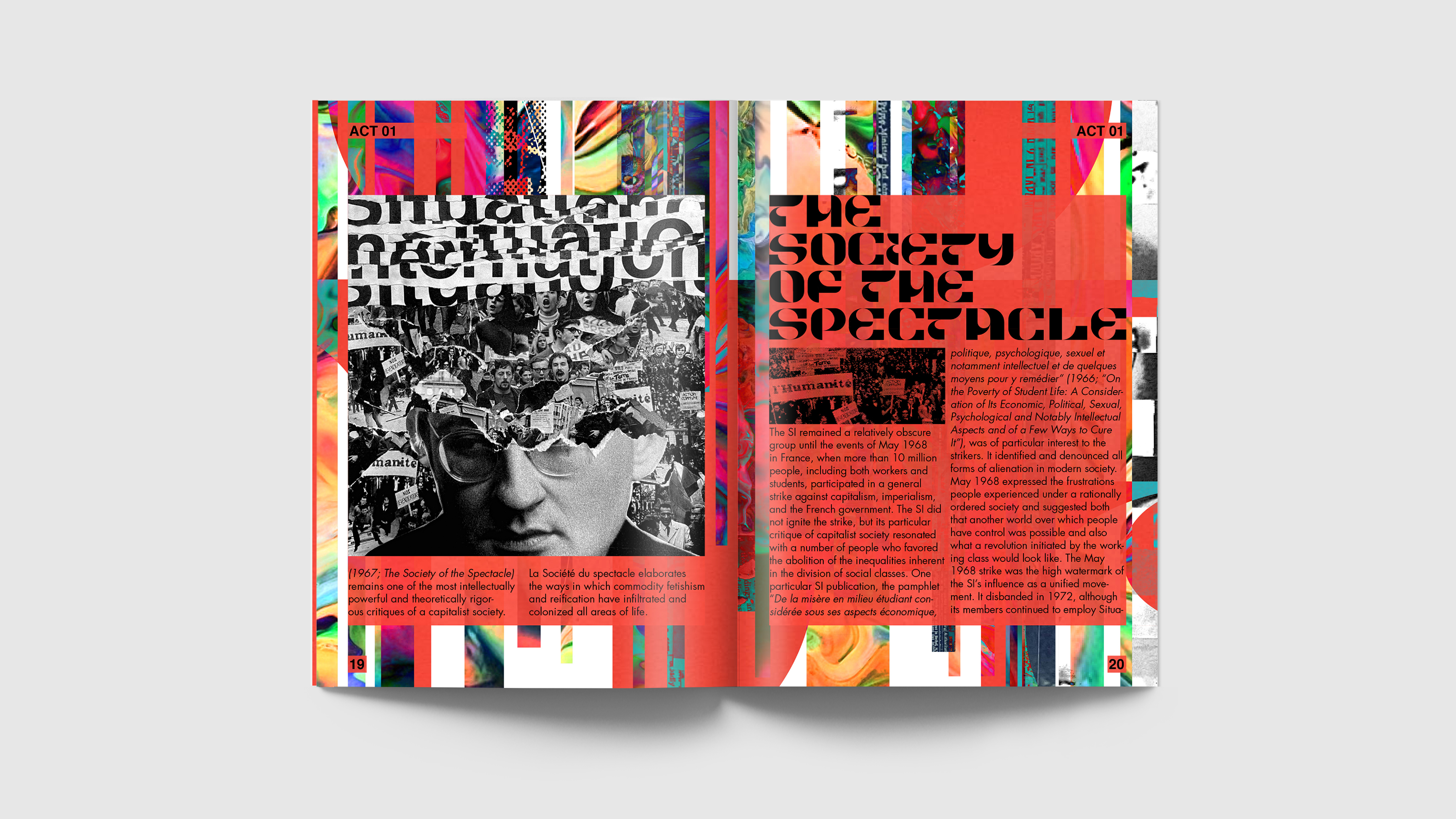
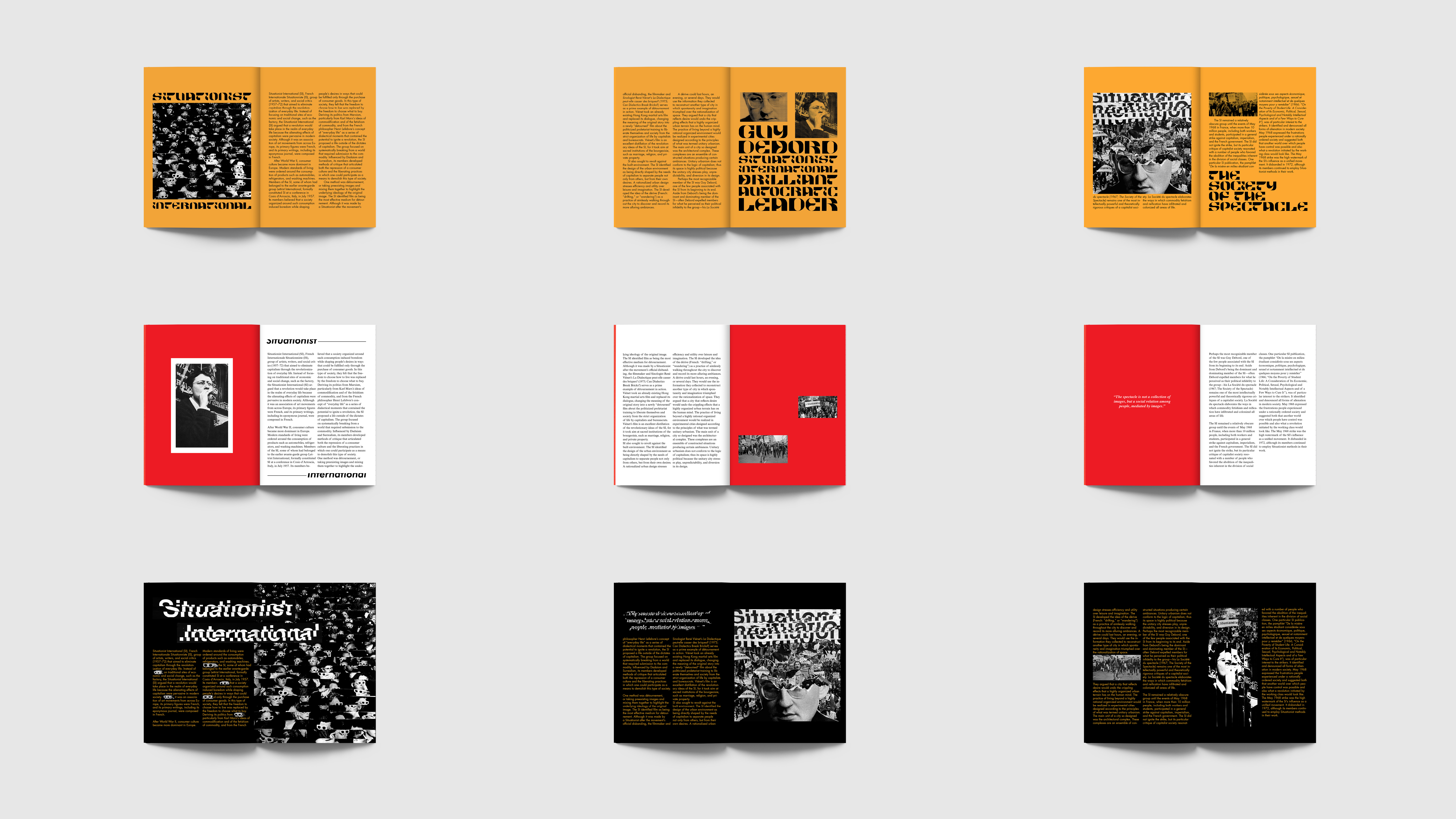
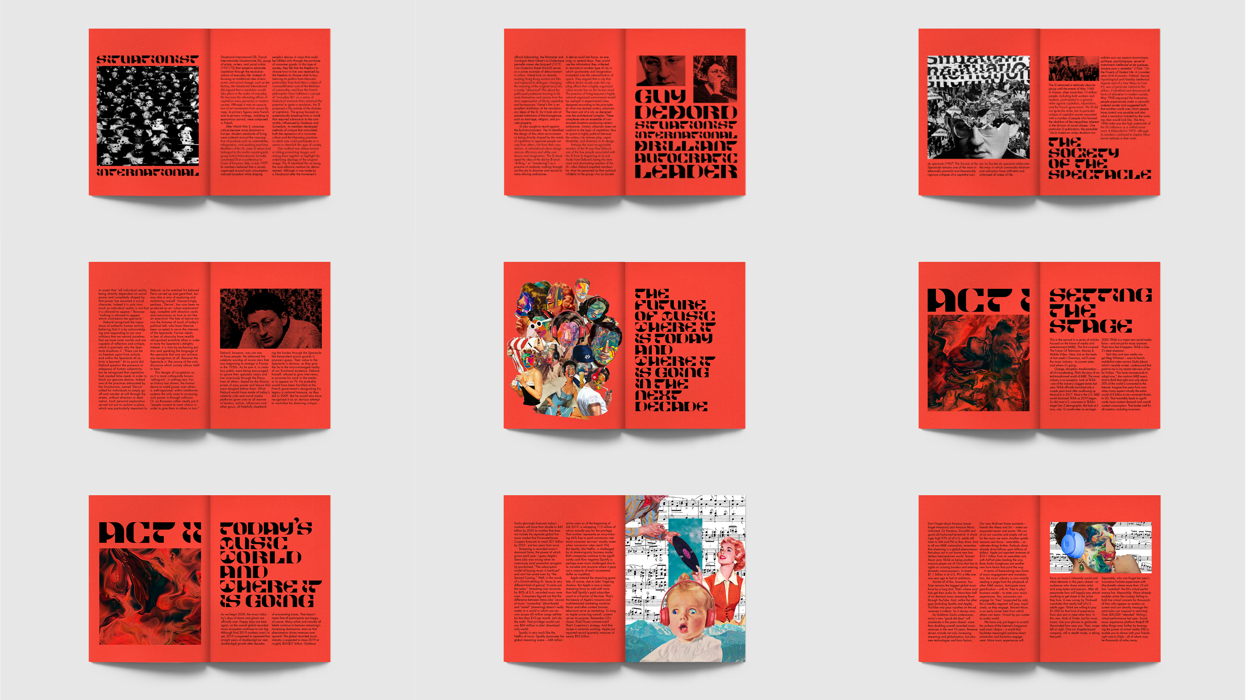
Collage Process 1 Since my topic is Situationist International, I first decided to make a collage using the pictures of newspapers and photos that are used around 1968. I used the picture of newspapers of 1960-70 because the Situationist International repeatedly emphasized that media such as TV, radio, or newspapers are shaping how we think in a certain way. In other words, brainwashing. I used the monochrome images of Guy Debord and French citizens demonstrating in May 1968 to express the stress and struggle that people were handling back then.
Image
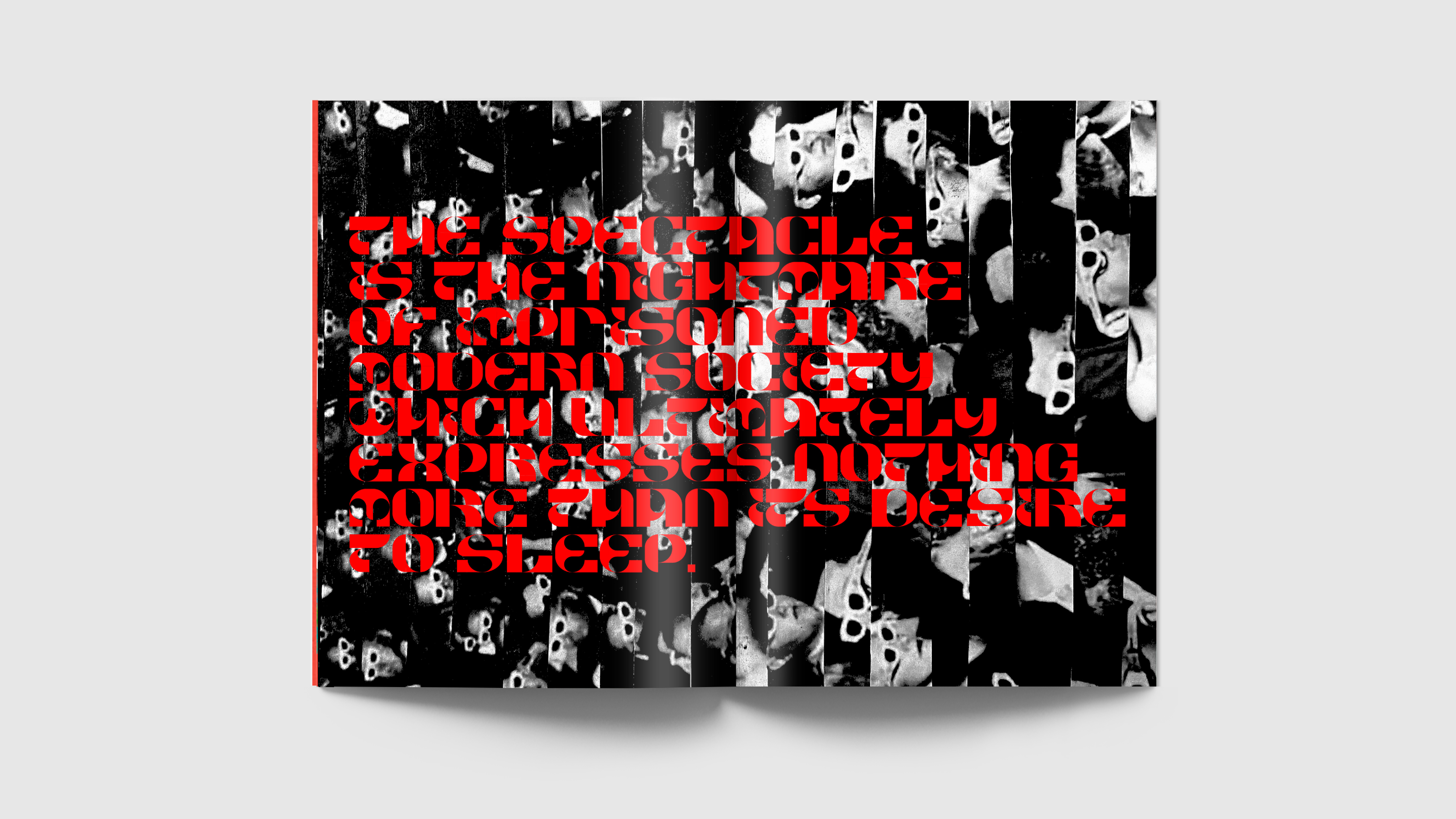
Collage Process 2 I printed out two same pictures of the Society of The Spectacle. I first cut two pictures into small slices. One of the pictures is a mirrored image so when I combine slices of two images, the direction of the spectacles goes left to right which shifts the viewer's eyes in zigzag. (finished images are shown on the next page).
Image
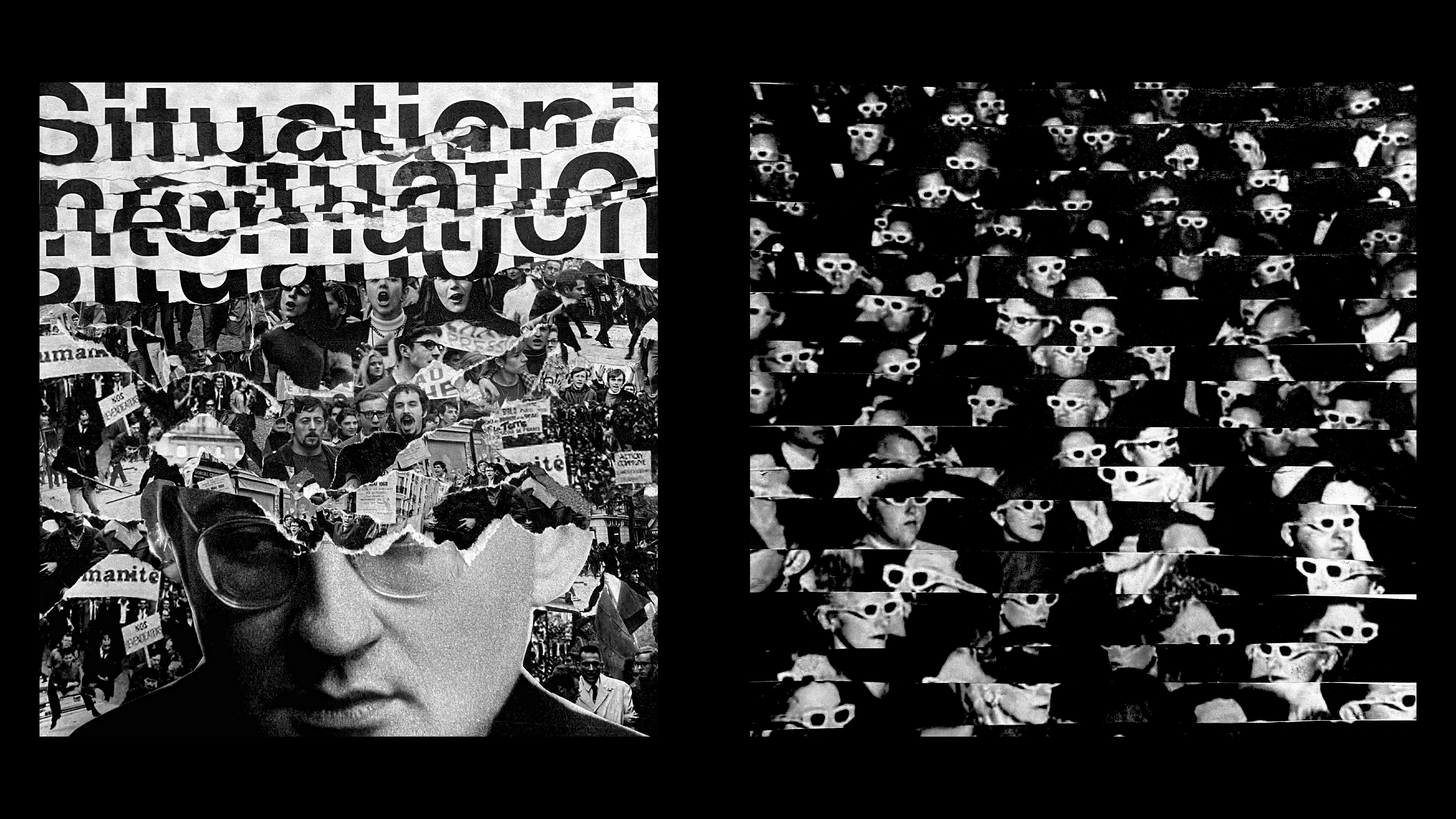
Finished images of my collage
Image
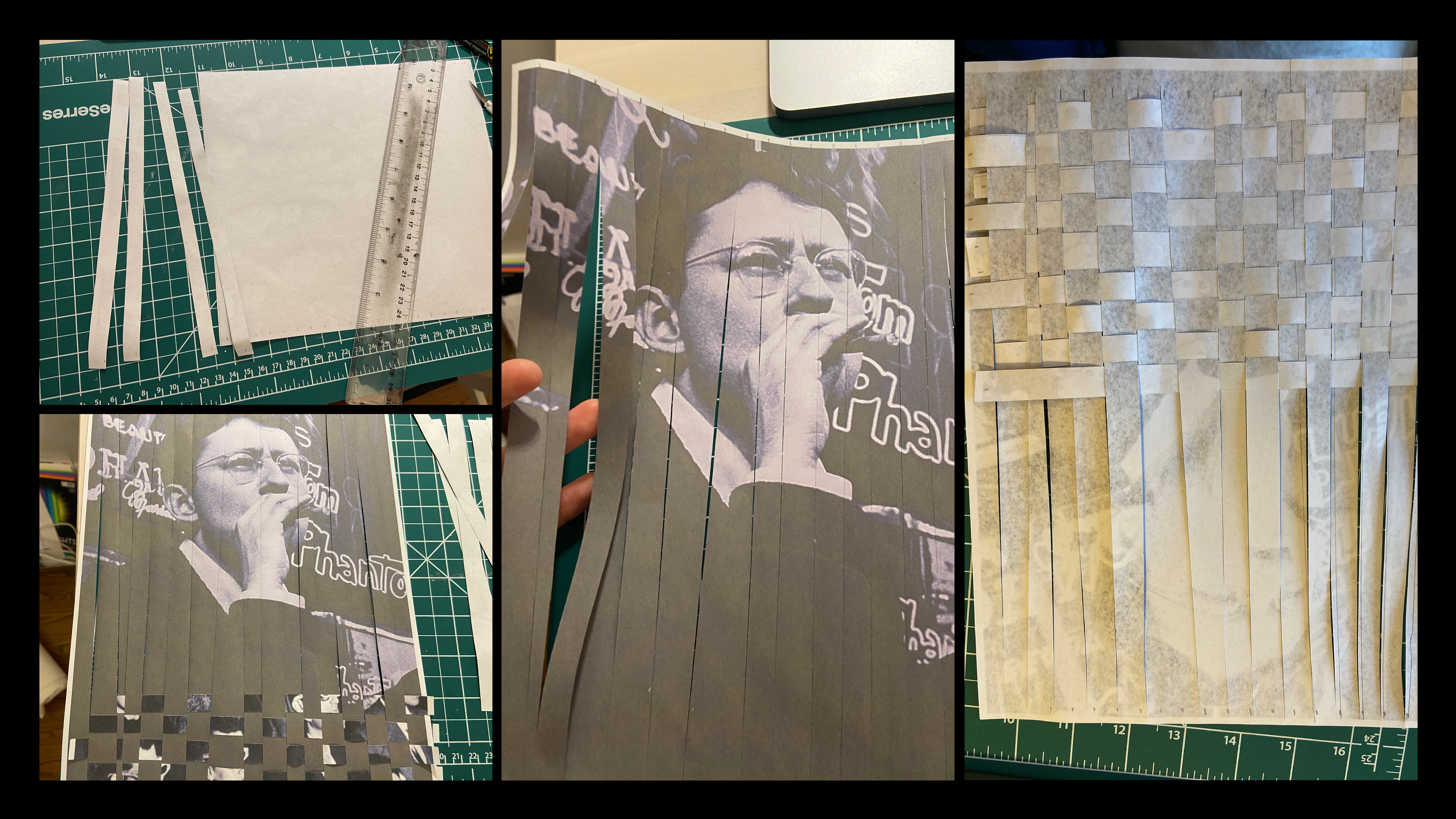
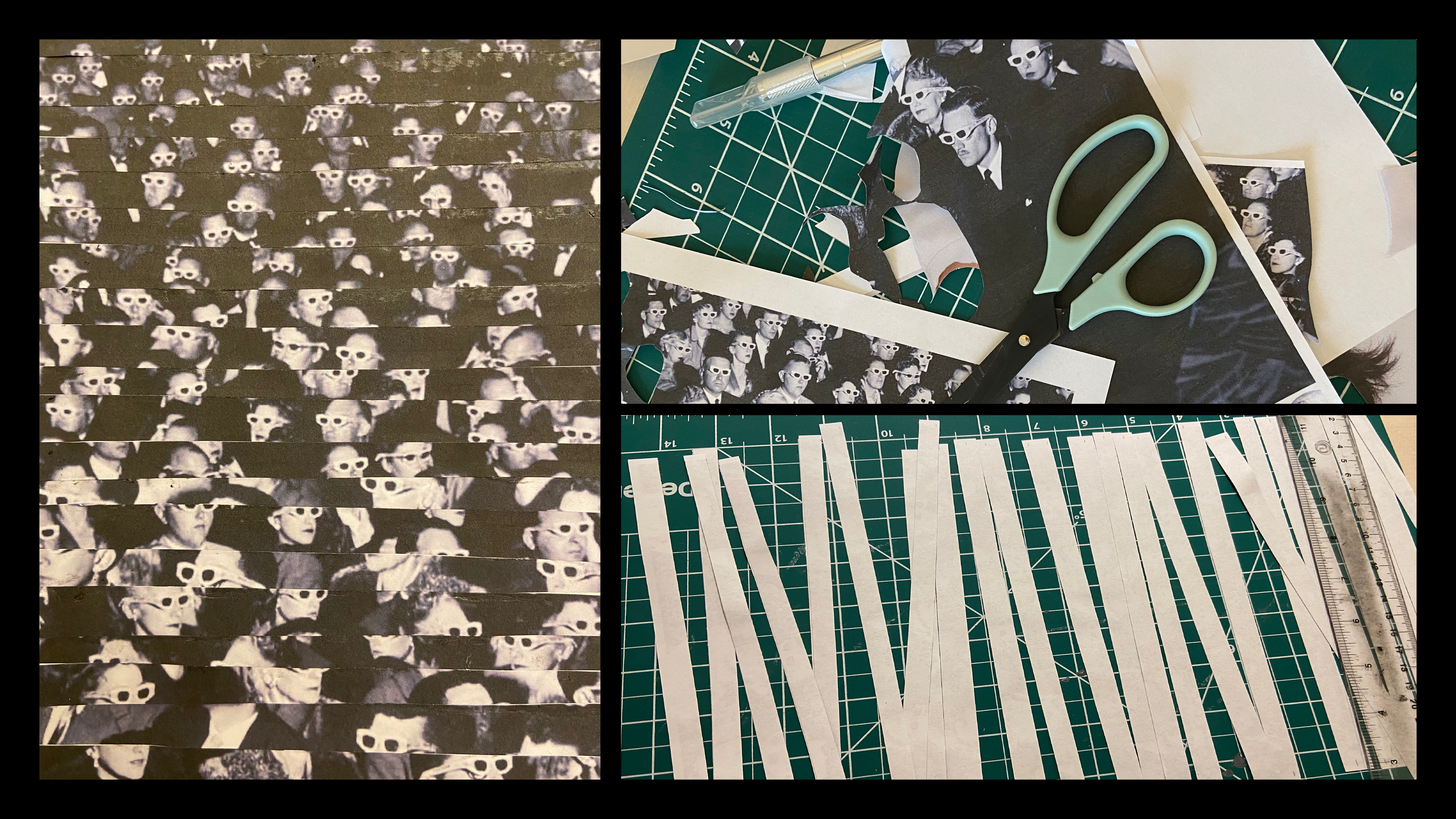
Collage 2 Process 1 For this time, I decided to experiment with the weaving techniques on this collage. I first printed out the pictures of the Society of the Spectacle and Guy Debord. I cut the first picture piece by piece using the cutter knife. I made different lines of cuts on Guy Debord's picture. After this process, I combined two images by weaving two images together which made a very interesting pattern.
Image
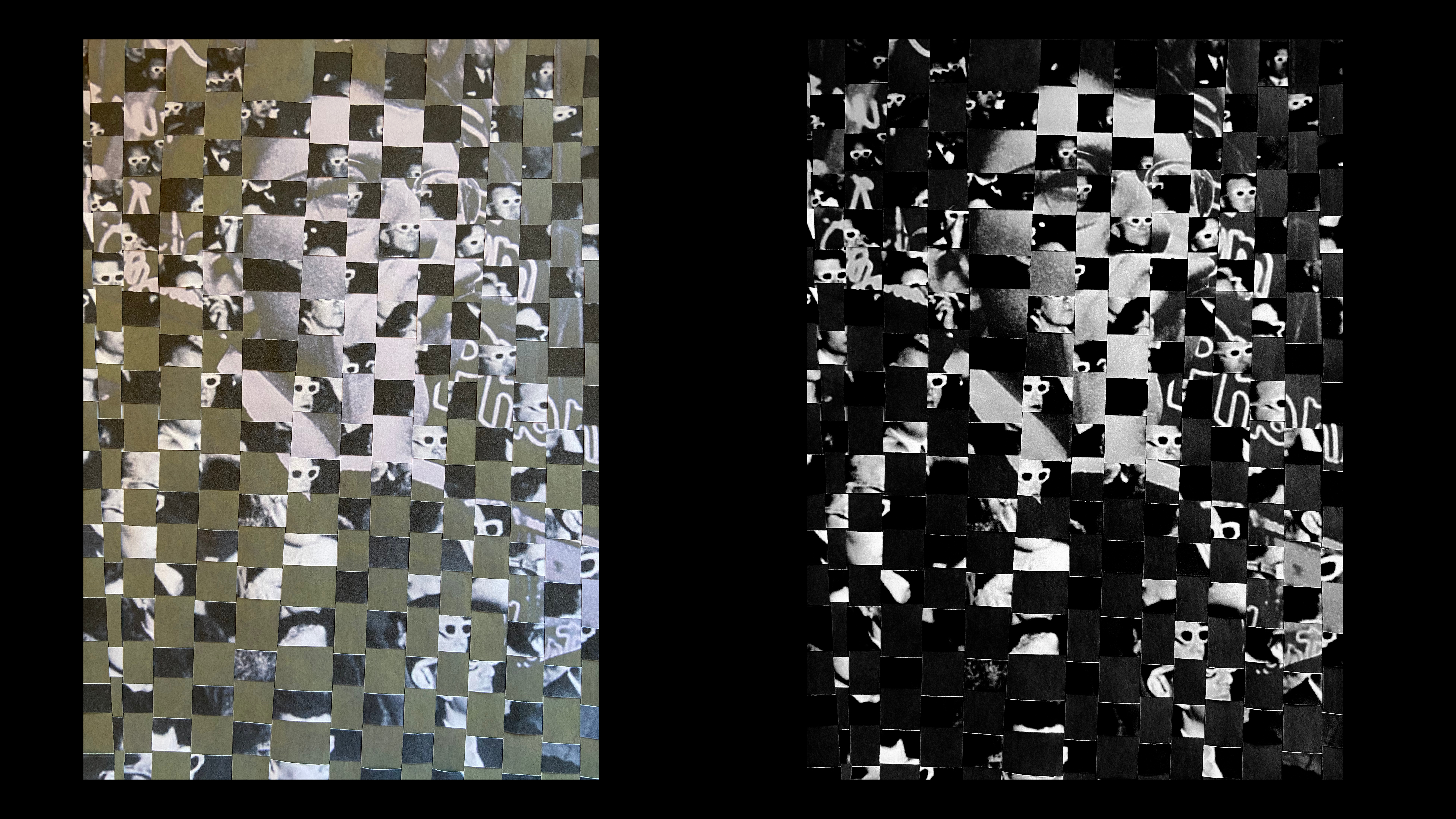
Refined Images of Collage
Image
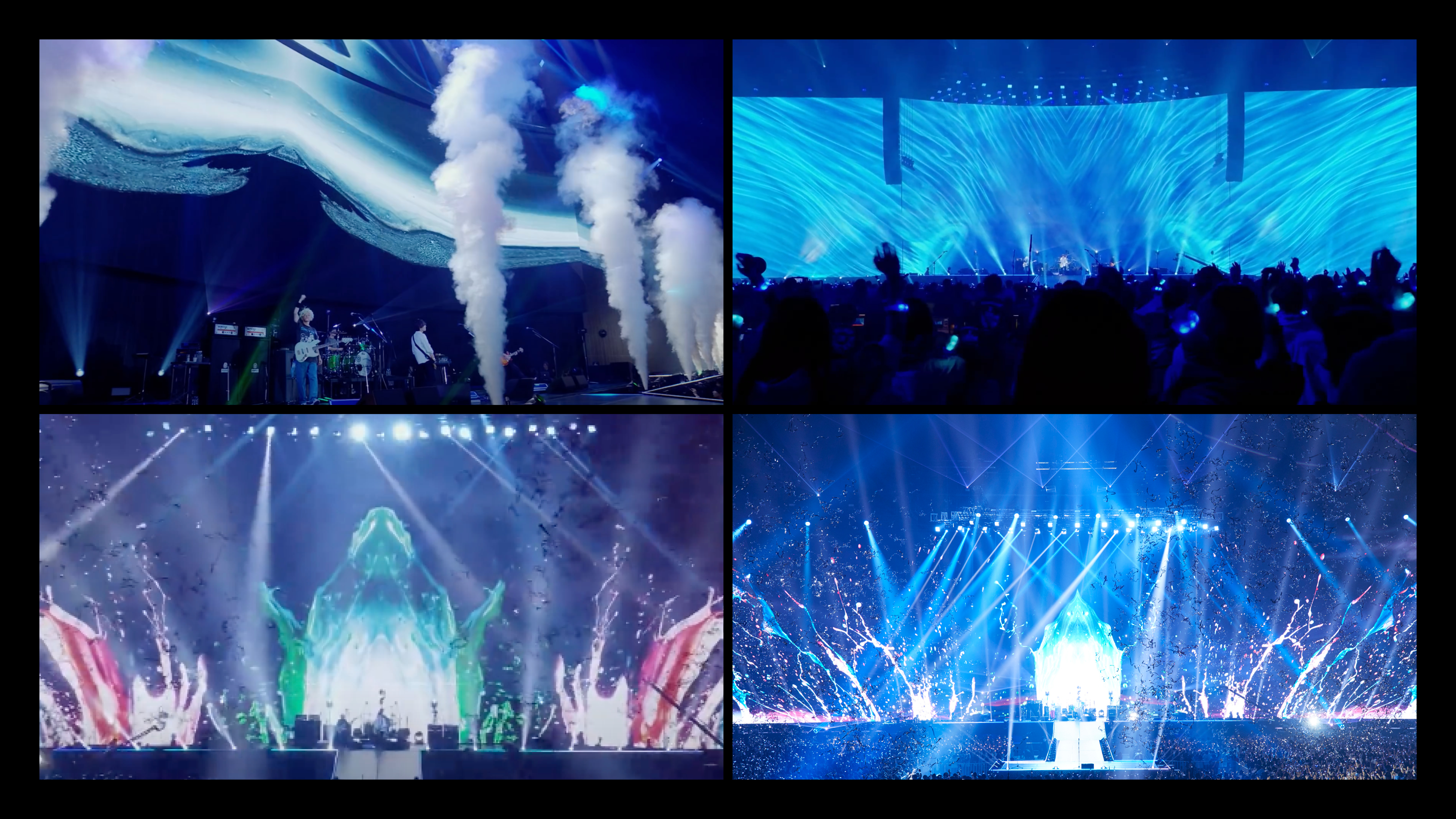
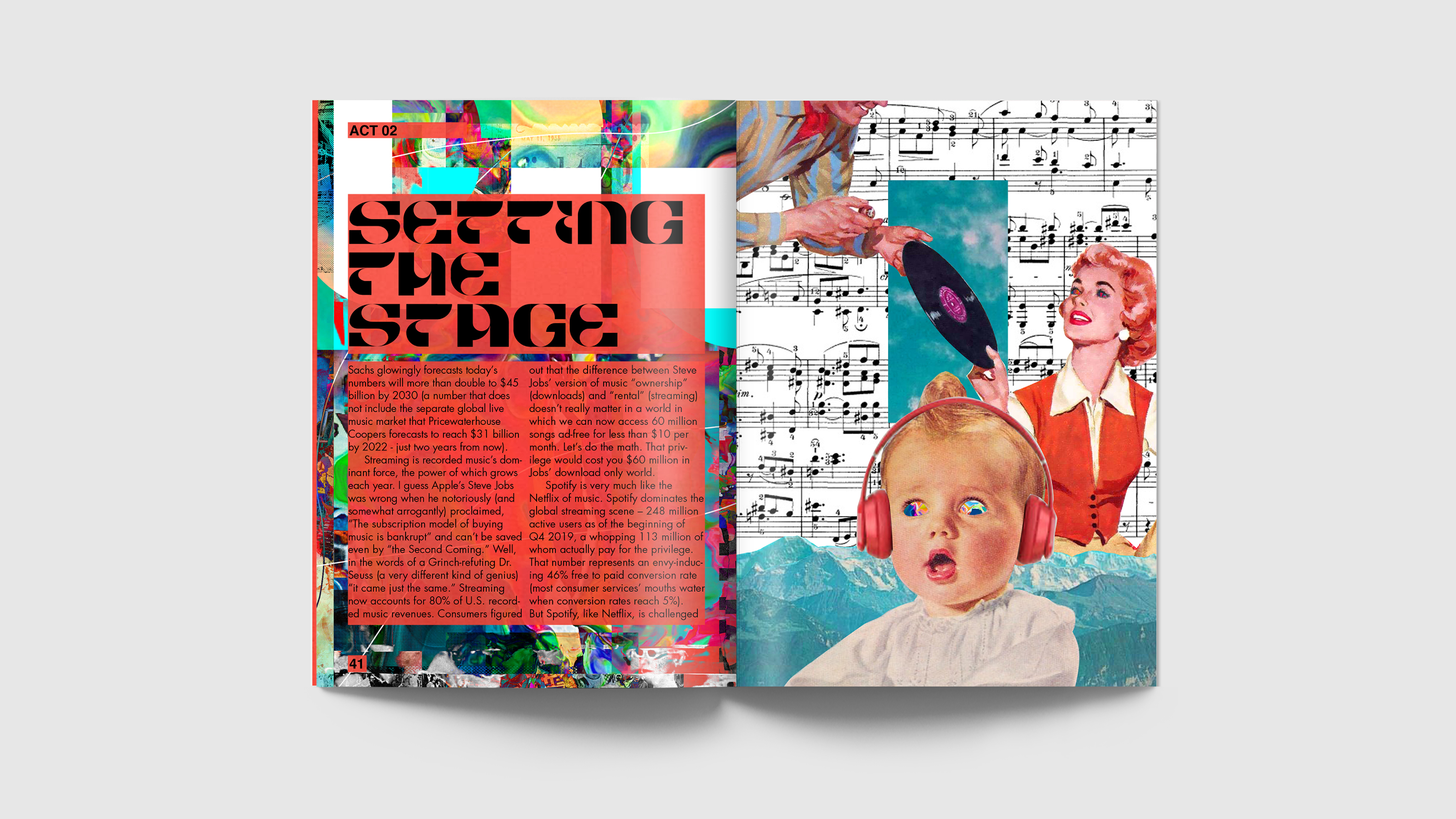
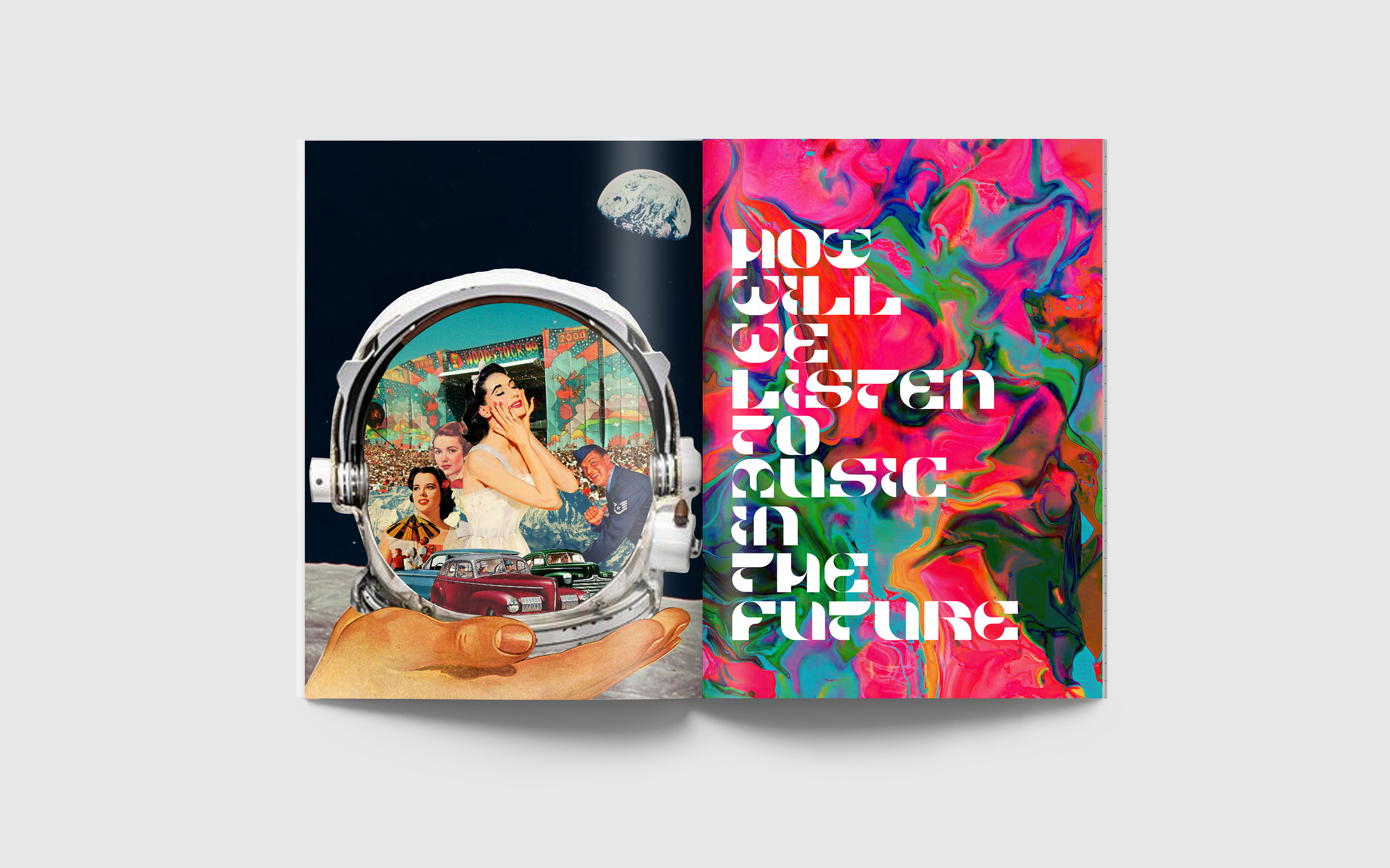
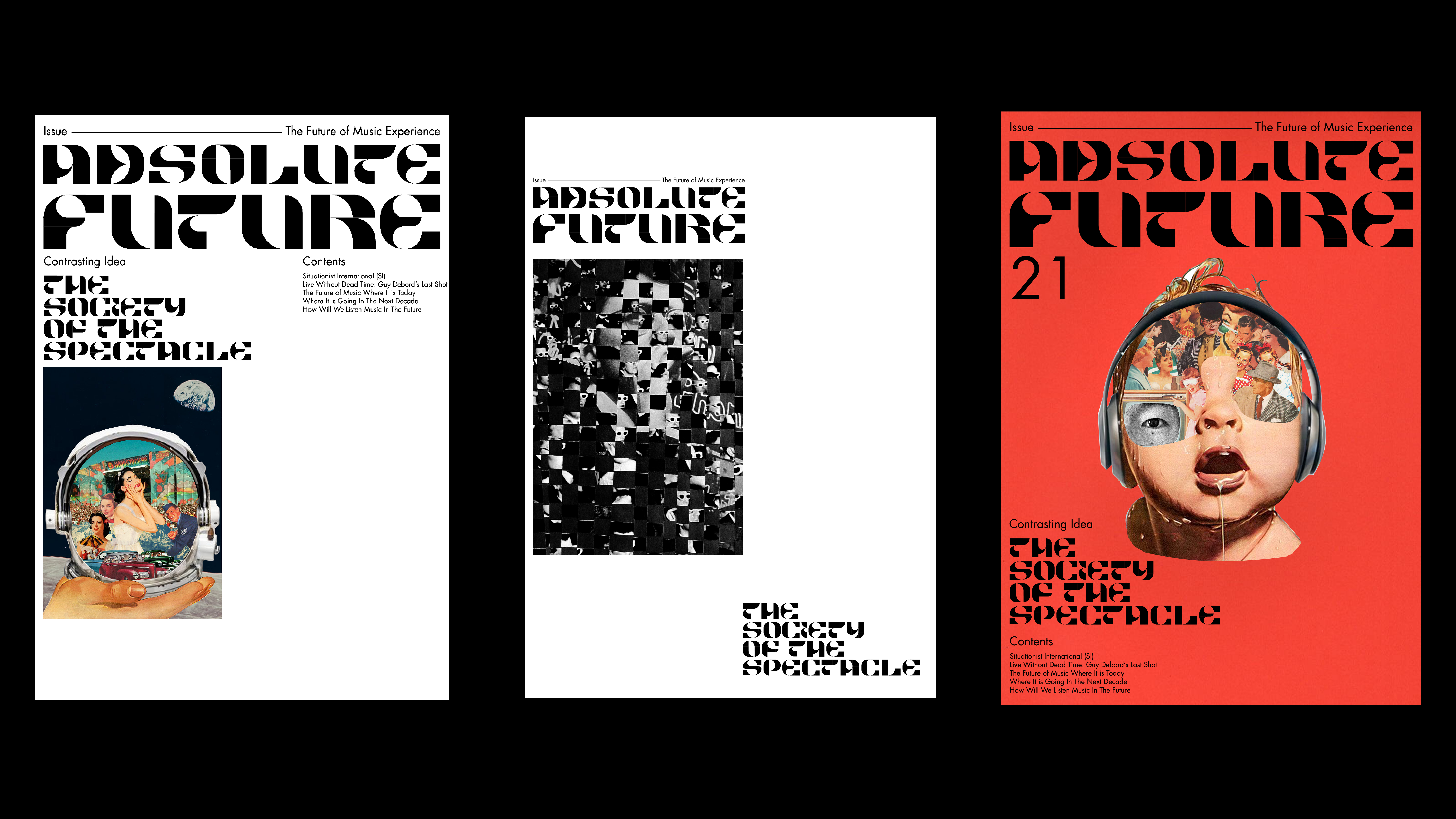
Since I chose to do future of music experience as my comparing idea, I did a research of the current music experience. I found this interesting live performance by BUMP OF CHICKEN where they used the animation of the oil paint on their background for the performance. The liquid paint interacts with the song they play which portrays different emotions in parts of the song. I decided to incorporate this idea of using liquid paint to express the future of the music experience in an abstracted way. Reference: https://www.youtube.com/watch?v=M2bQzkg8R8A
Image
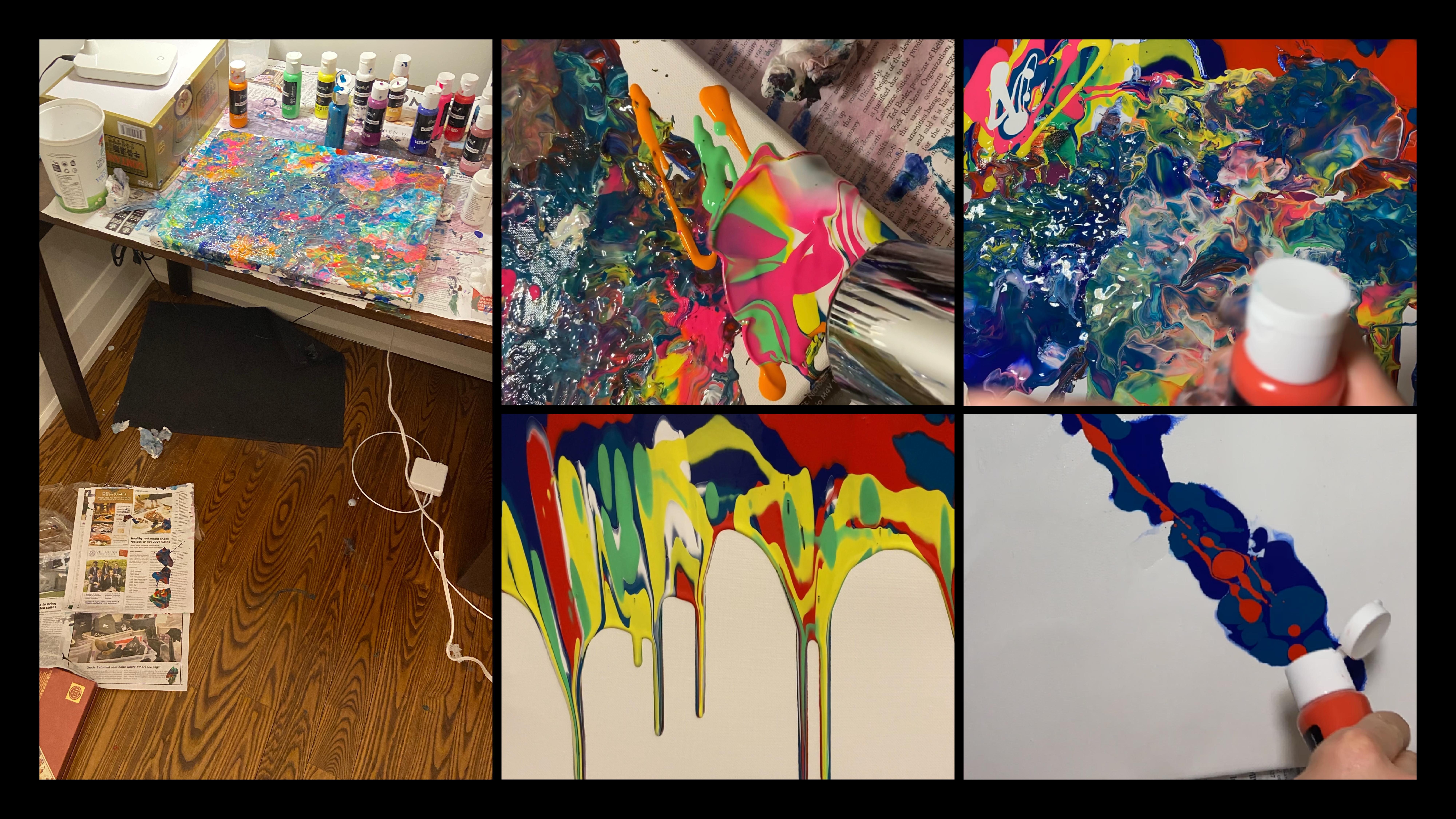
Painting Process 1 To create the abstract painting, I bought a set of canvas and acrylic paint. I dripped different colors of the painting onto the canvas and used the hairdryer to mix them.
Image
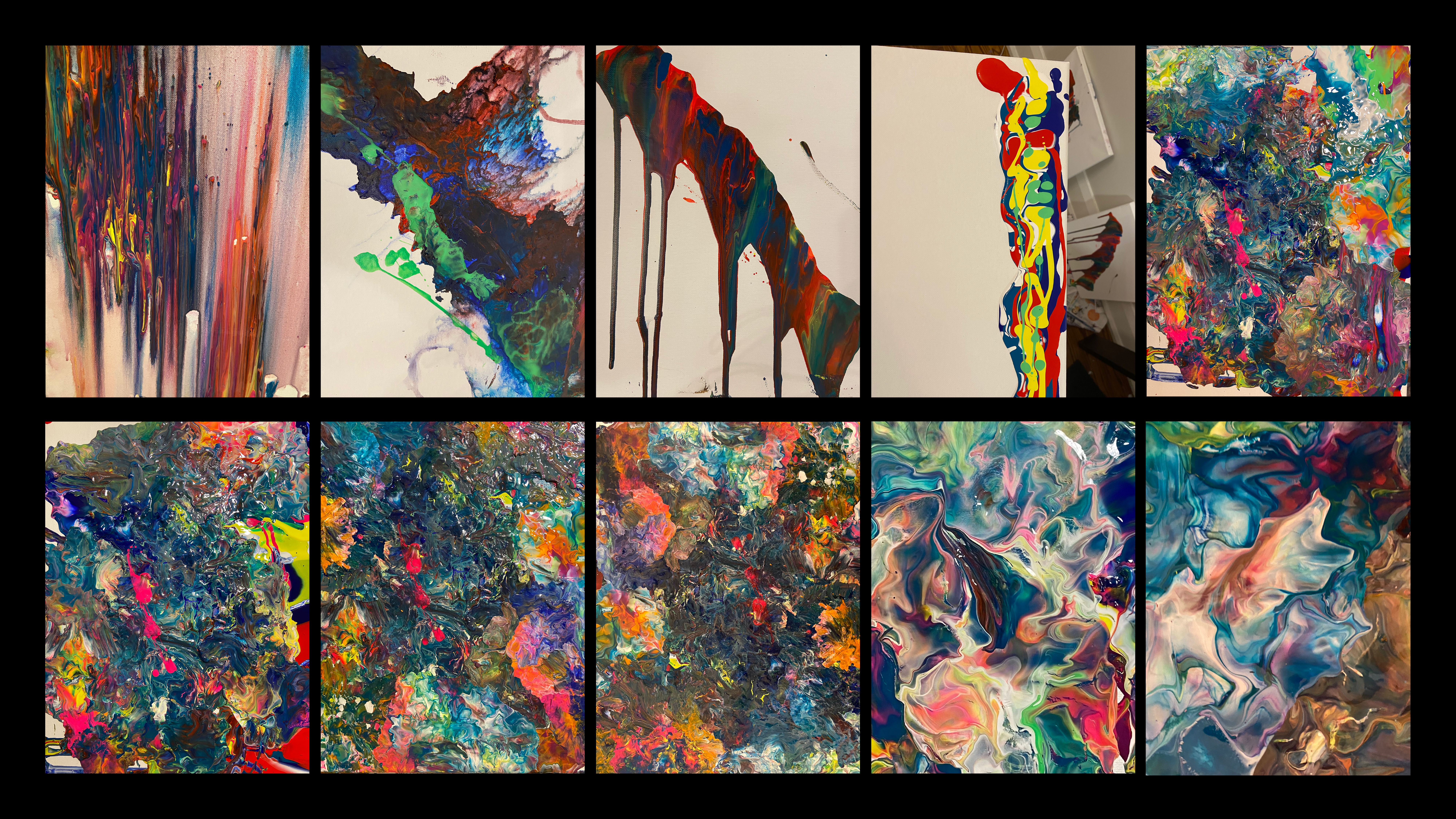
These are my initial attempt at my paintings. I did not put enough paint on top of the canvas; I added more paint on the canvas so that the paint fills the whole canvas. I cropped different parts of the painting to focus on one part of the painting where it had interesting mixtures of color.
Image
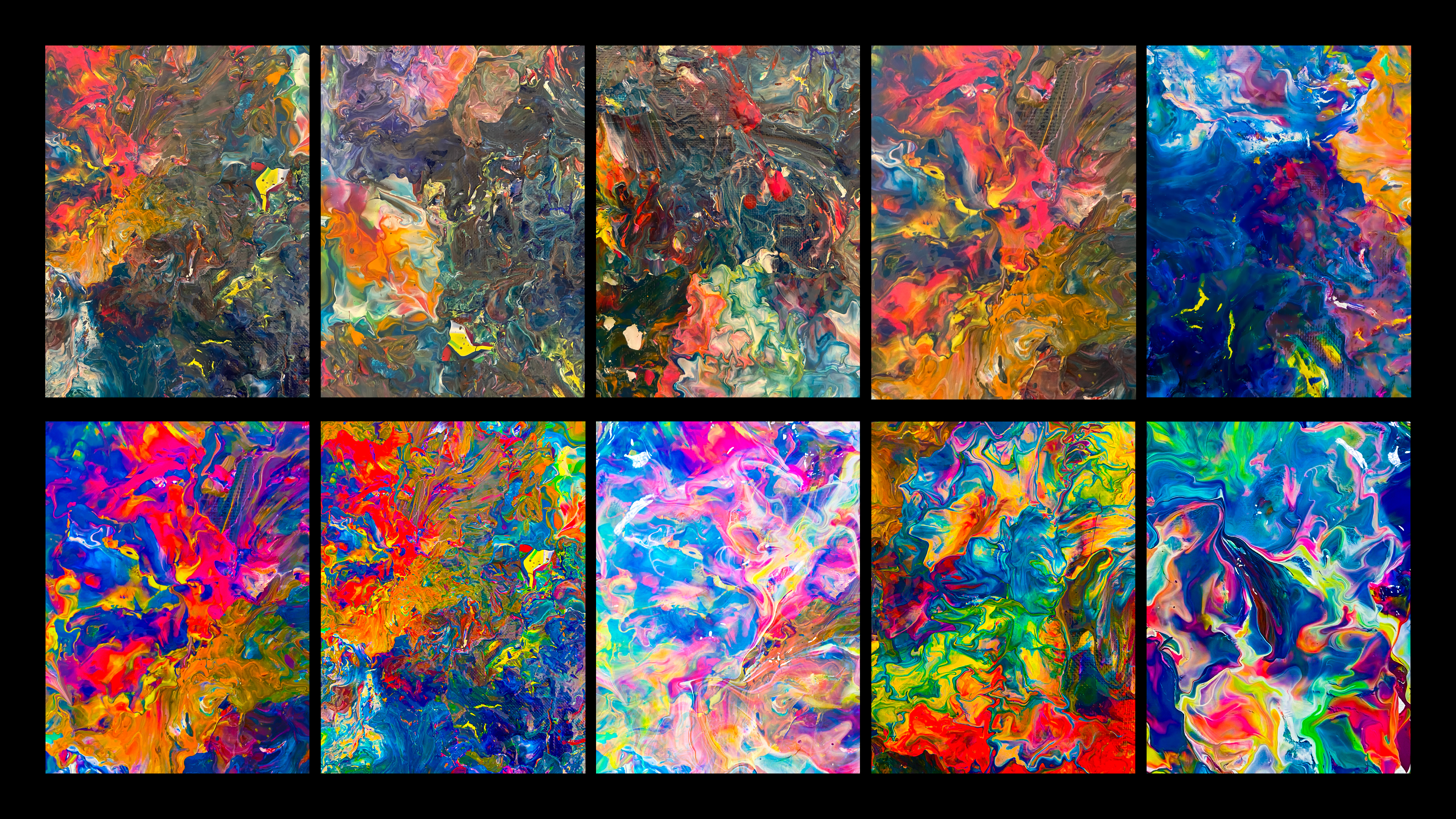
These paintings will be shown and incorporated in the final draft.
Image
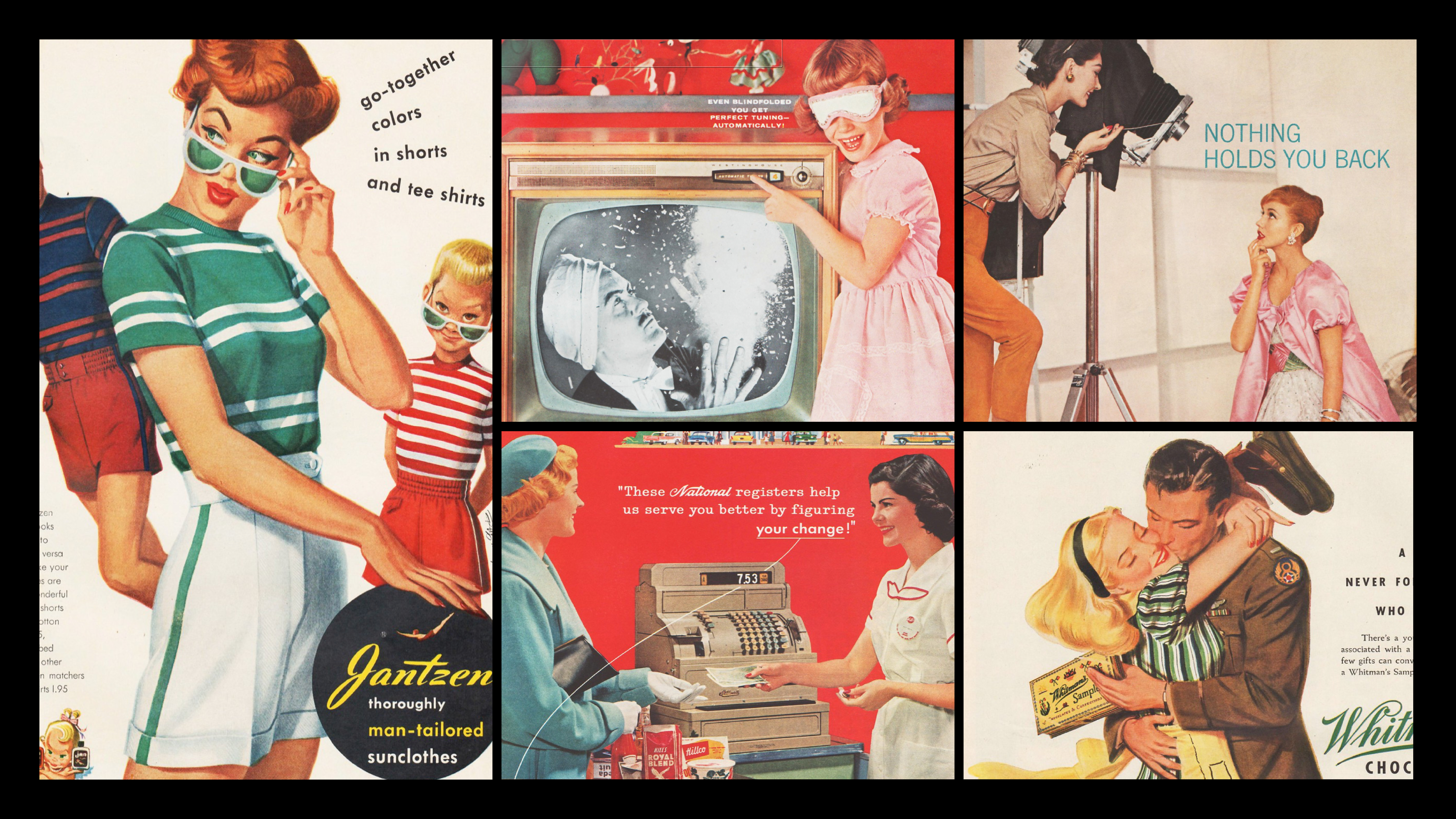
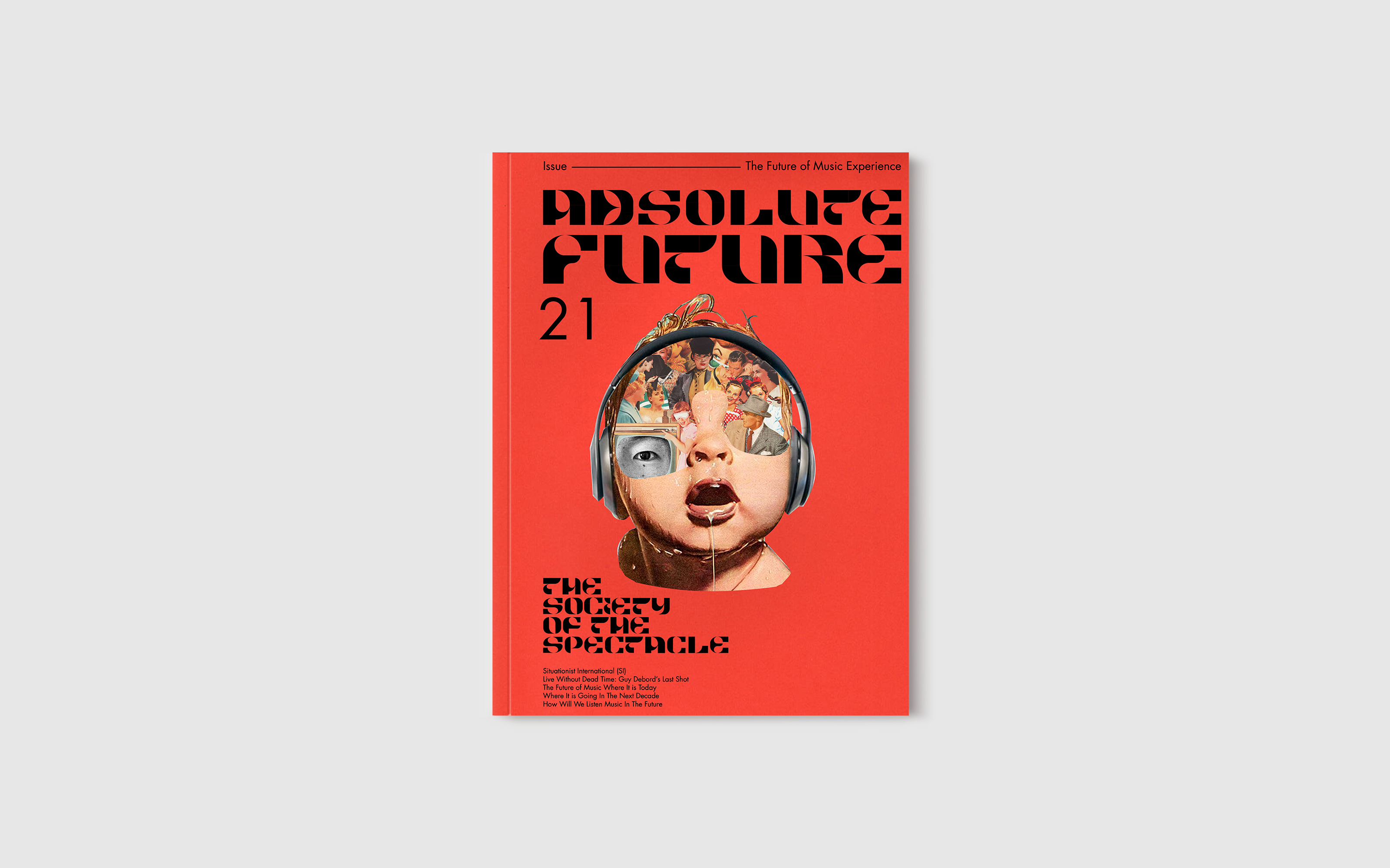
These are some photos that I used for my digital collage. I used the photographs of the vintage advertisement from 1930 to 1960; these advertisements introduce so many bias and inappropriate ideas that was normal back then. These advertisements were used to shape people's perception and perspective in a certain way which connects to the theme of brainwashing through media which was present in the time of Situationist International was active. By cutting away the characters from these advertisements, I can bring and give these characters a new characteristic that introduces the future of the music experience. The meaning of the image that was used for brainwashing can change into a character that focuses on the theme of music experience.
Image
Rough Design Direction
Image
Rough Draft Covers
Image
Rough Draft
Image
Image
Typography Presentation
Typography Presentation
For this part of the assignment, I was assigned to make a short clip of a video that expresses the aesthetics and mood of the zine. Since my topic is the "future" of the music experience, I decided to make a cinematic short video that takes the audience to the future world. I decided to use cyberpunk taste as a theme of my video. Since many cyberpunk cities have screens everywhere in the city, I thought it was a good idea to show my animation of digital collage and typographies that focuses on the music experience onto the screens in the city. To create cinematic cyberpunk futuristic cities, I used photoshop to create the cityscape images of Tokyo and Hong Kong to make the futuristic cityscape. Adding onto that, I wanted to challenge myself to use 3D software. The scene where the rain is pouring on the ground is completely made with the 3D software called the Element 3D in After Effect. The experimentation of adding soundscape of people talking and raindrop sound added a mood of crowded busy cyberpunk city.
For this part of the assignment, I was assigned to make a short clip of a video that expresses the aesthetics and mood of the zine. Since my topic is the "future" of the music experience, I decided to make a cinematic short video that takes the audience to the future world. I decided to use cyberpunk taste as a theme of my video. Since many cyberpunk cities have screens everywhere in the city, I thought it was a good idea to show my animation of digital collage and typographies that focuses on the music experience onto the screens in the city. To create cinematic cyberpunk futuristic cities, I used photoshop to create the cityscape images of Tokyo and Hong Kong to make the futuristic cityscape. Adding onto that, I wanted to challenge myself to use 3D software. The scene where the rain is pouring on the ground is completely made with the 3D software called the Element 3D in After Effect. The experimentation of adding soundscape of people talking and raindrop sound added a mood of crowded busy cyberpunk city.
Motion Posters
Motion Posters