Image
Image
Image
Image
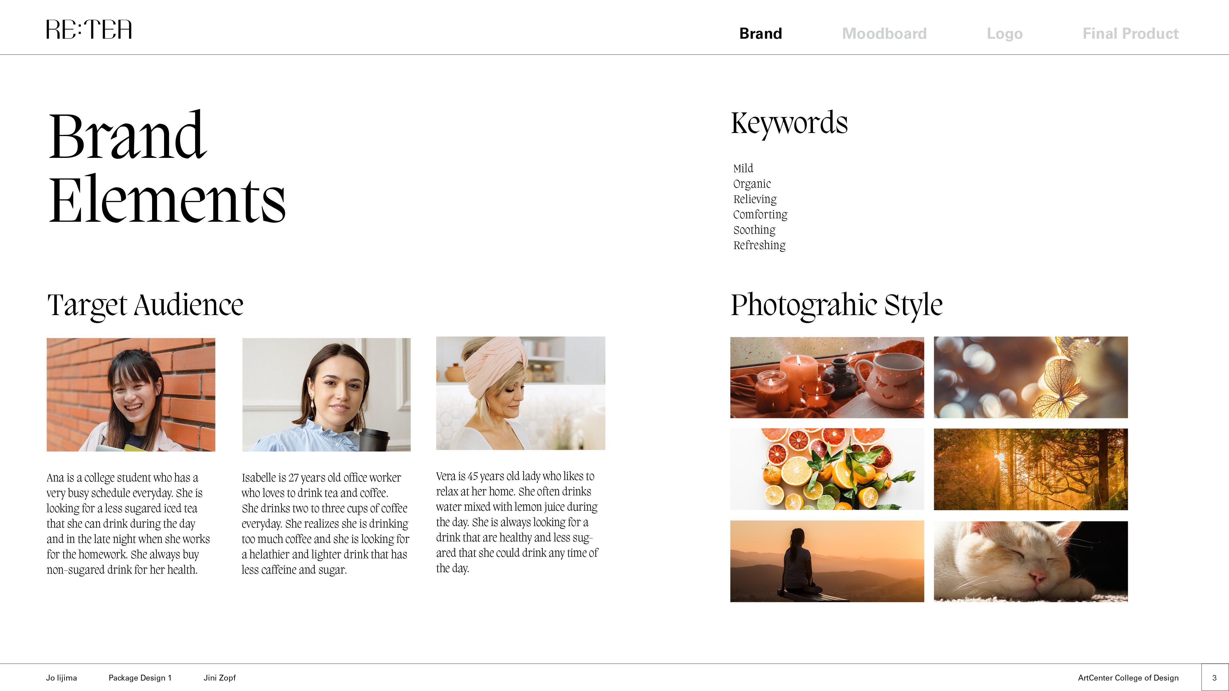
Image
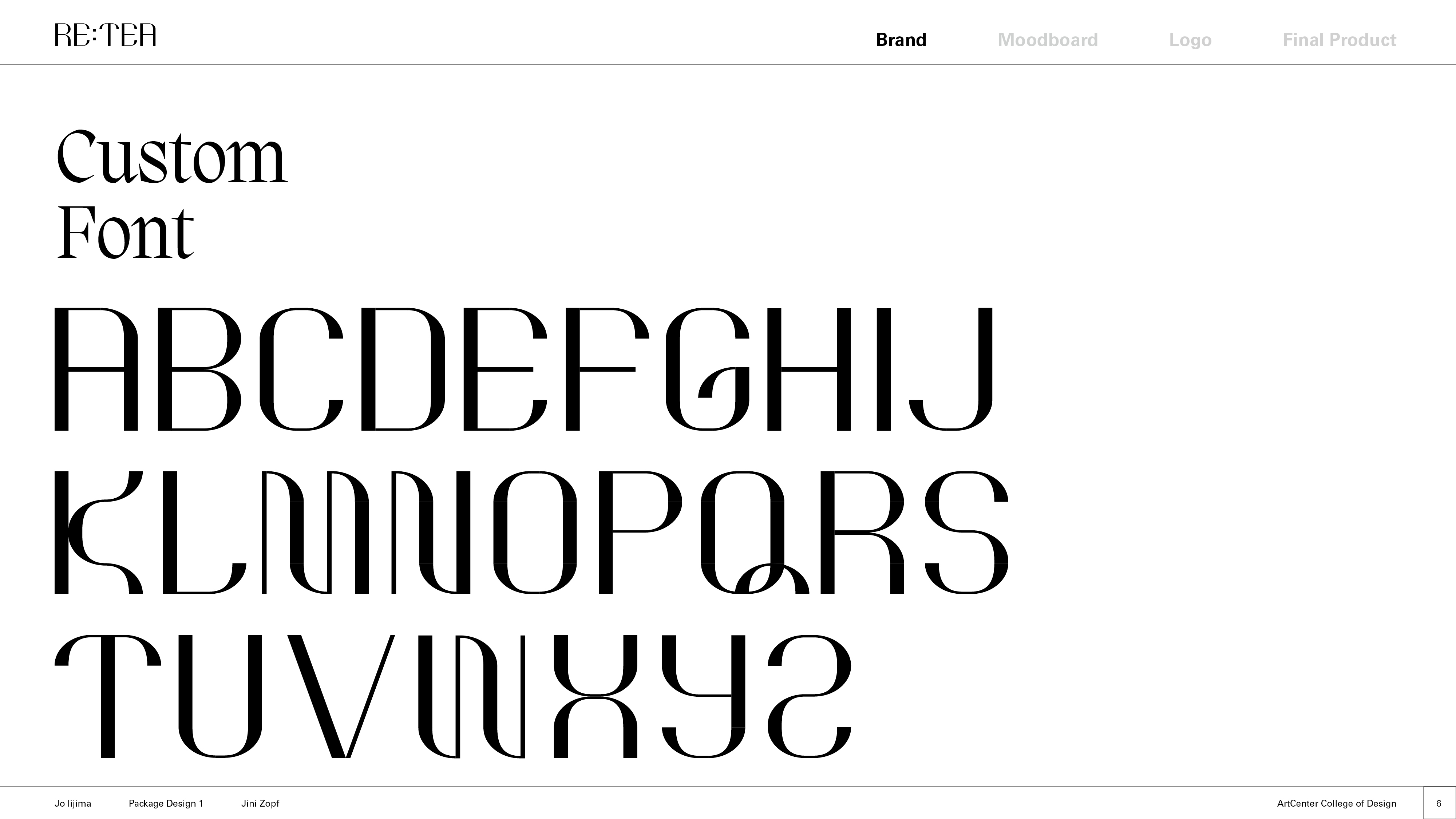
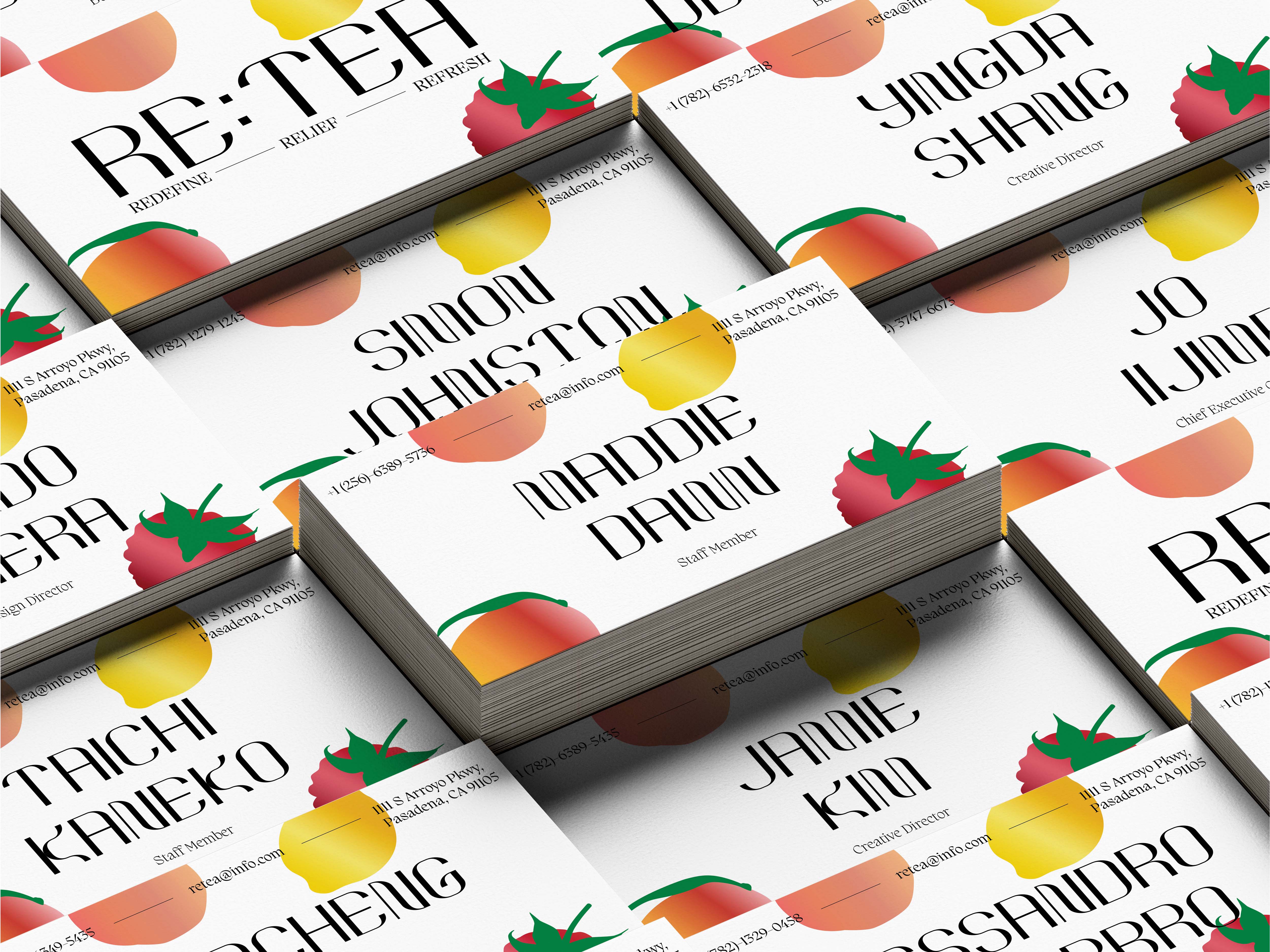
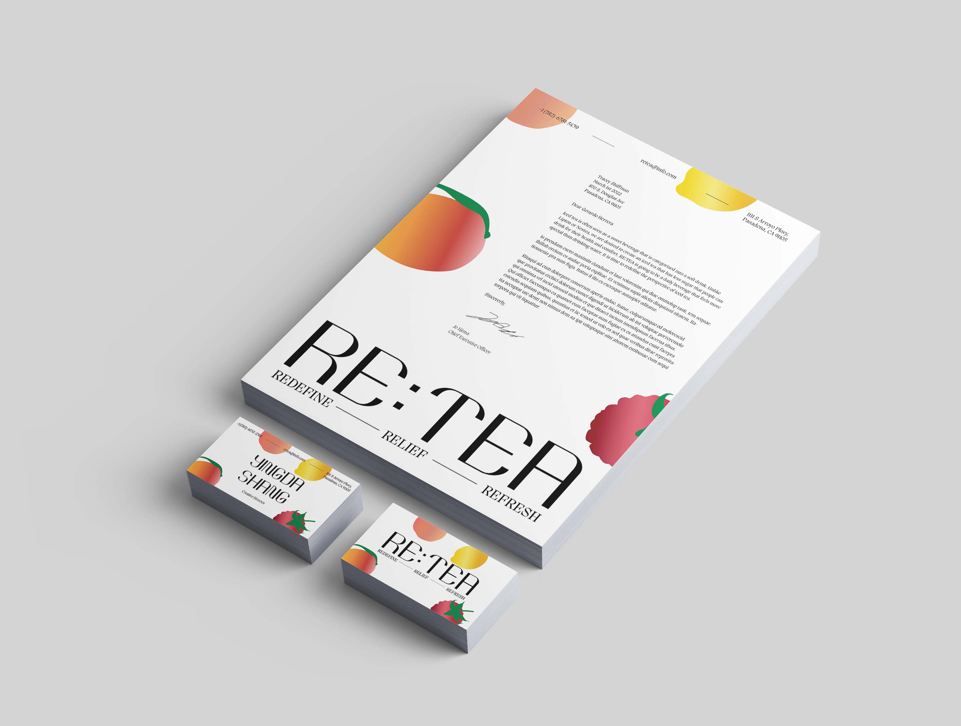
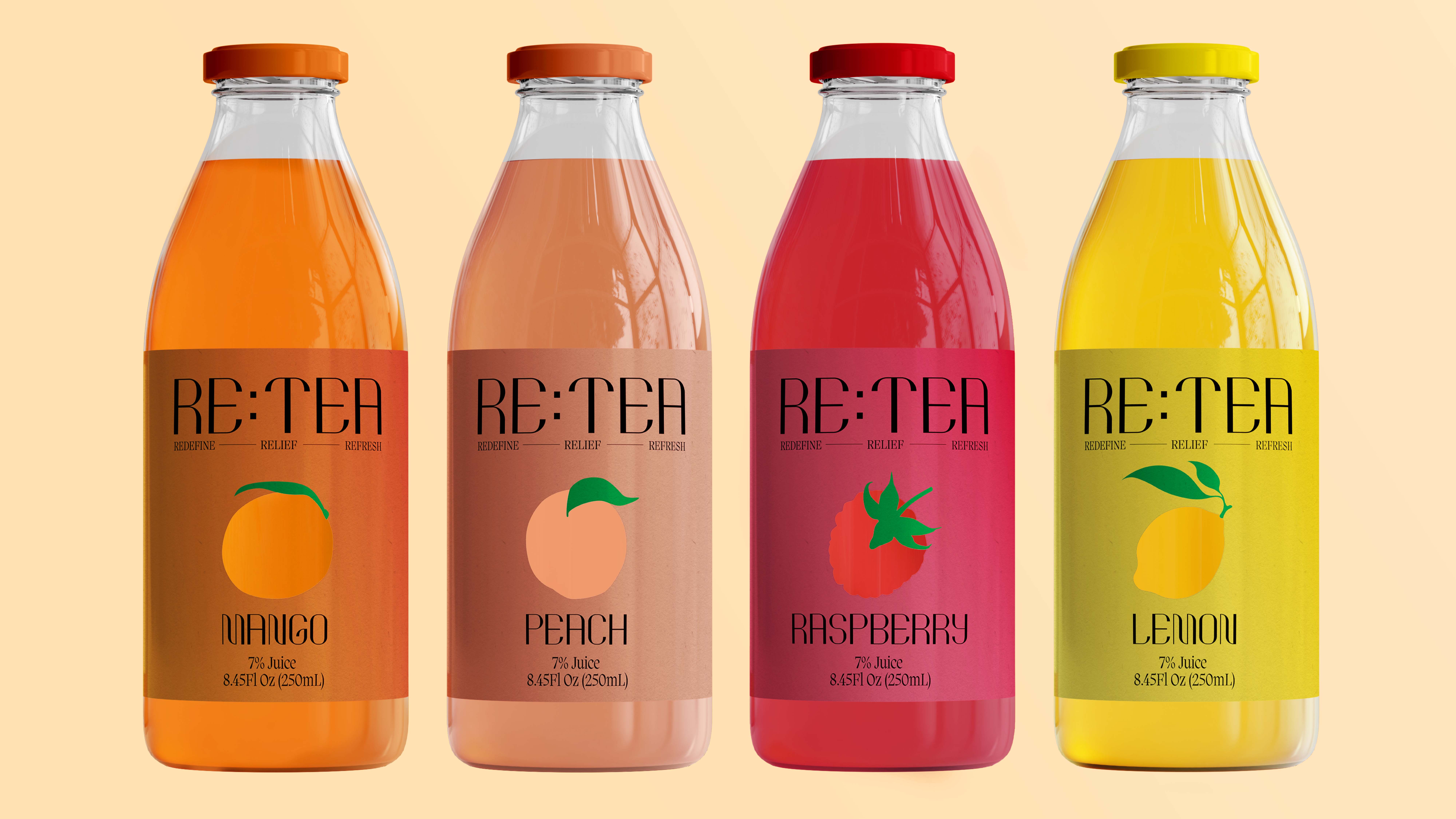
This is my original font created in illustrator.
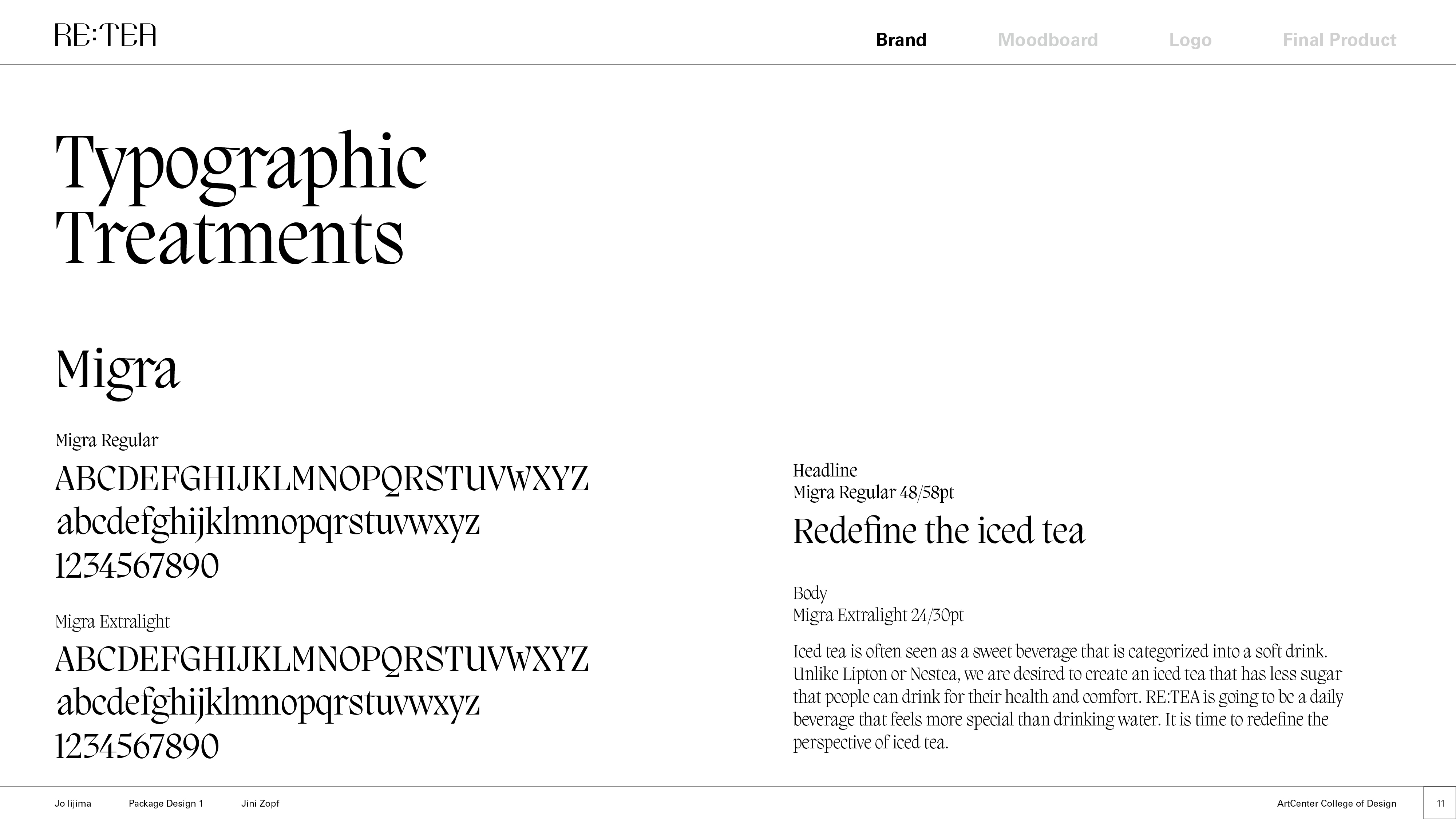
Image
Image
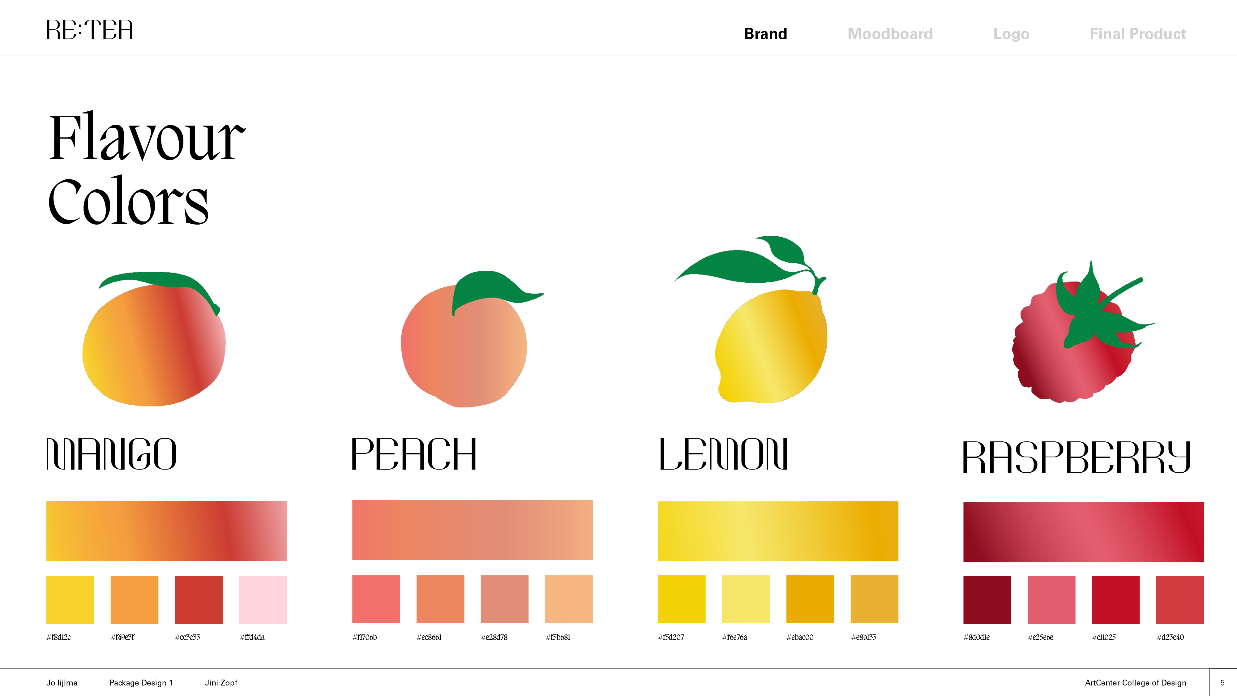
Image
Image
Image
Image