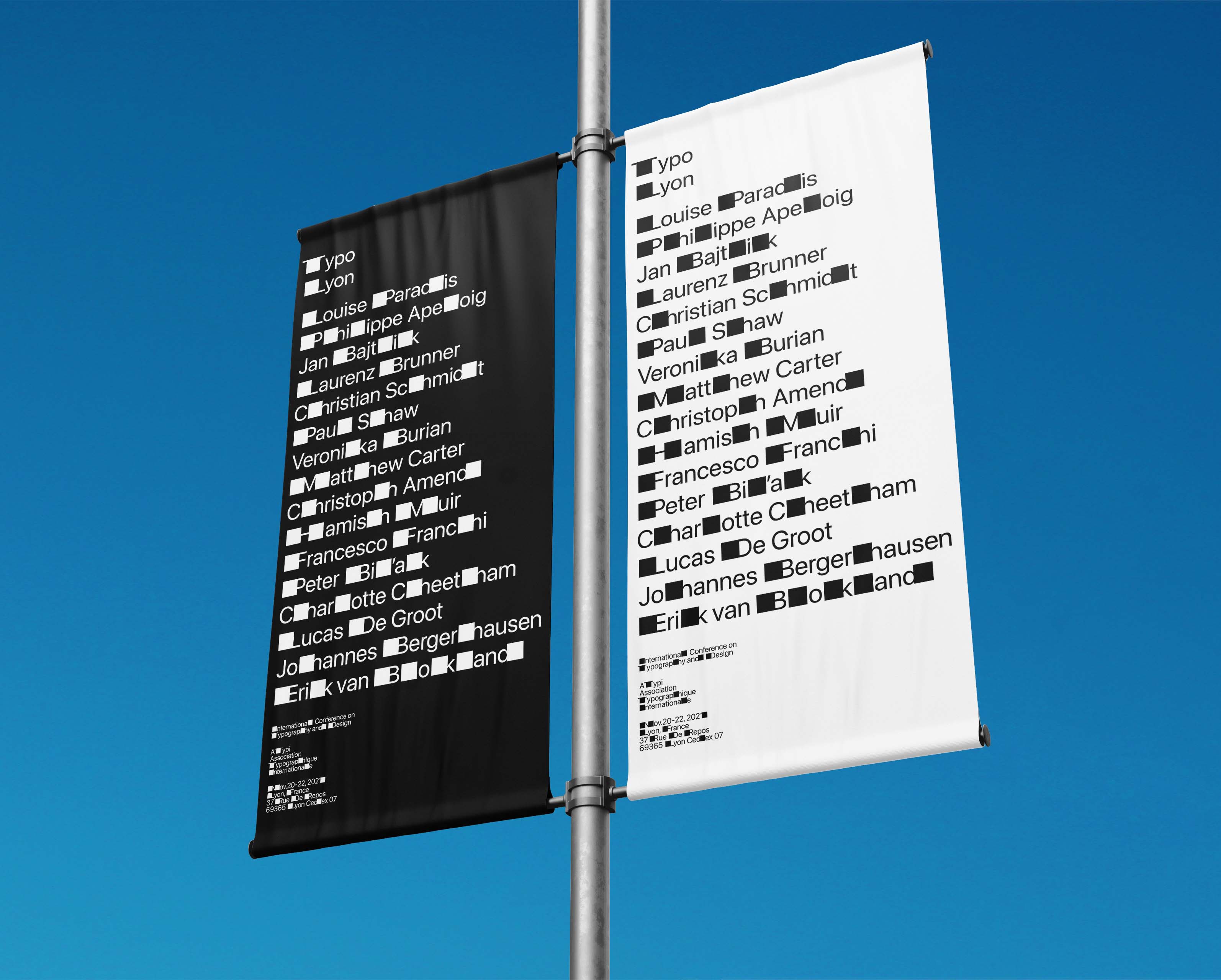
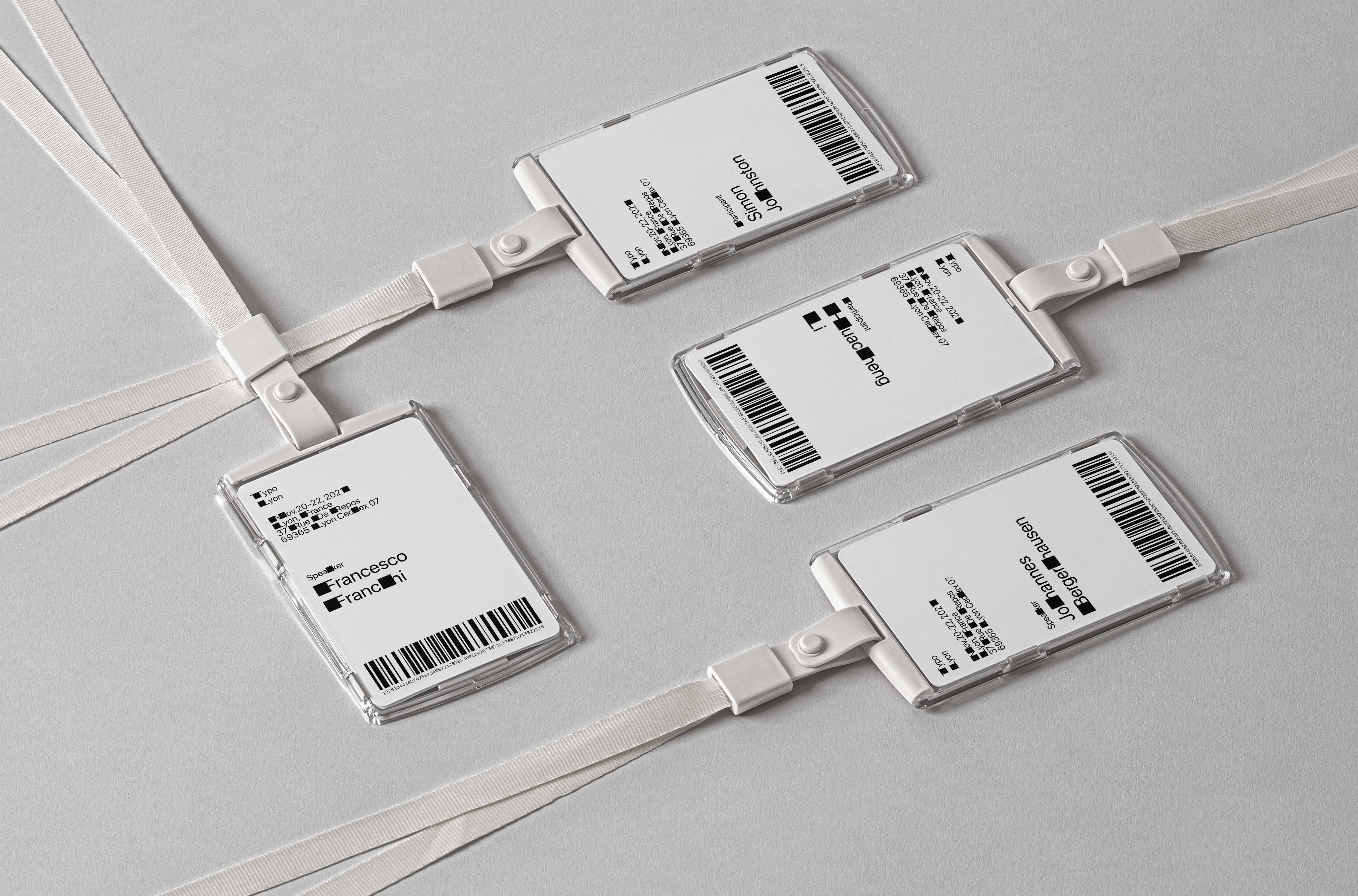
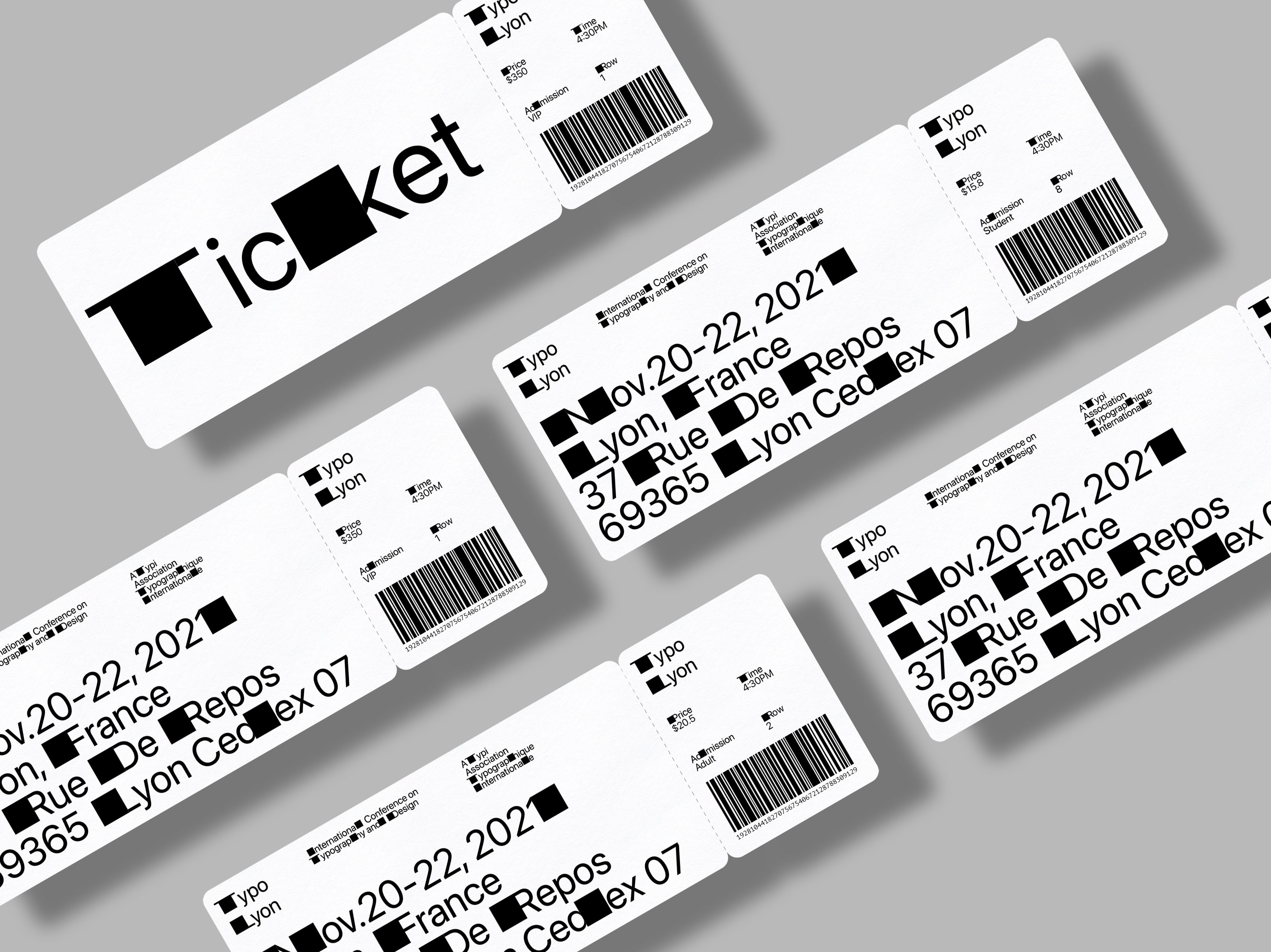
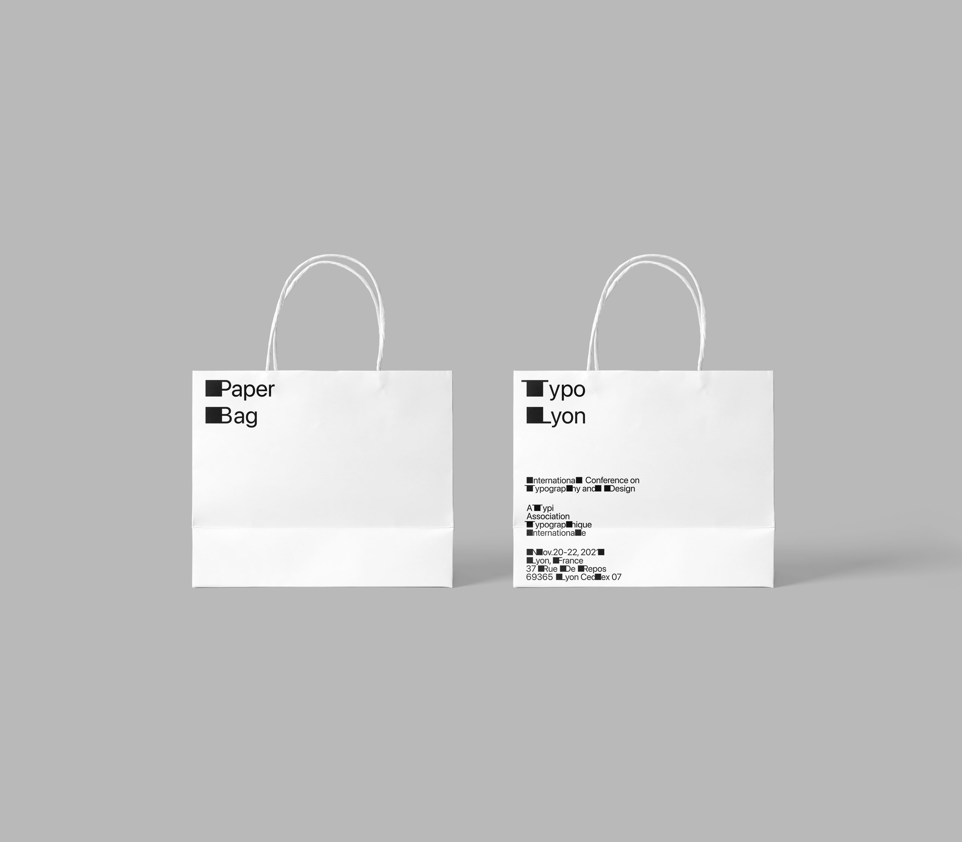
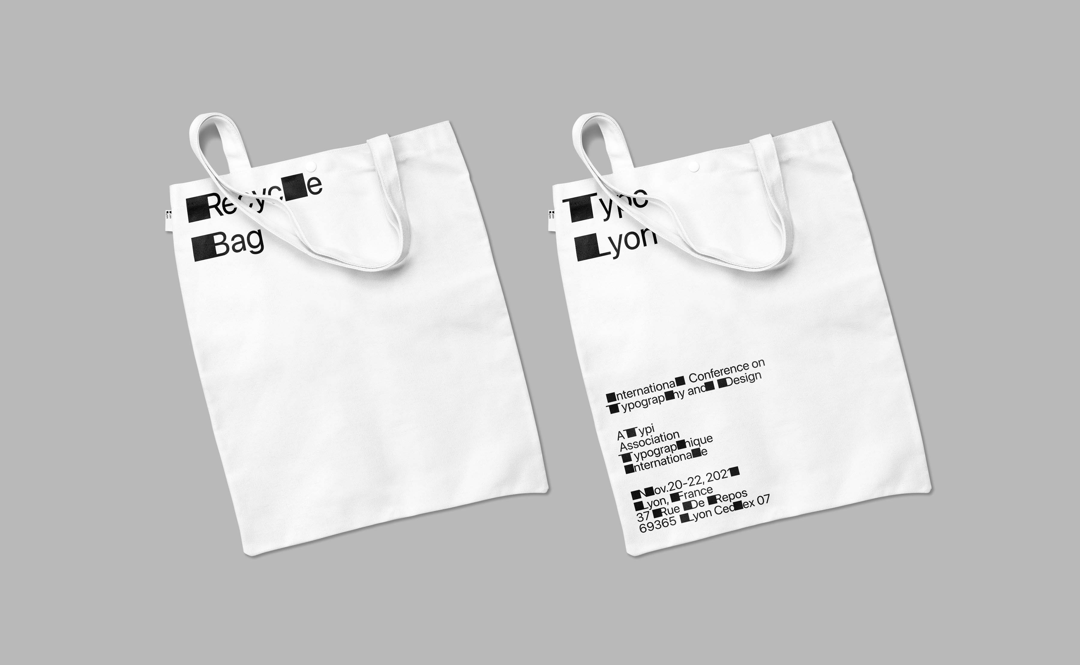
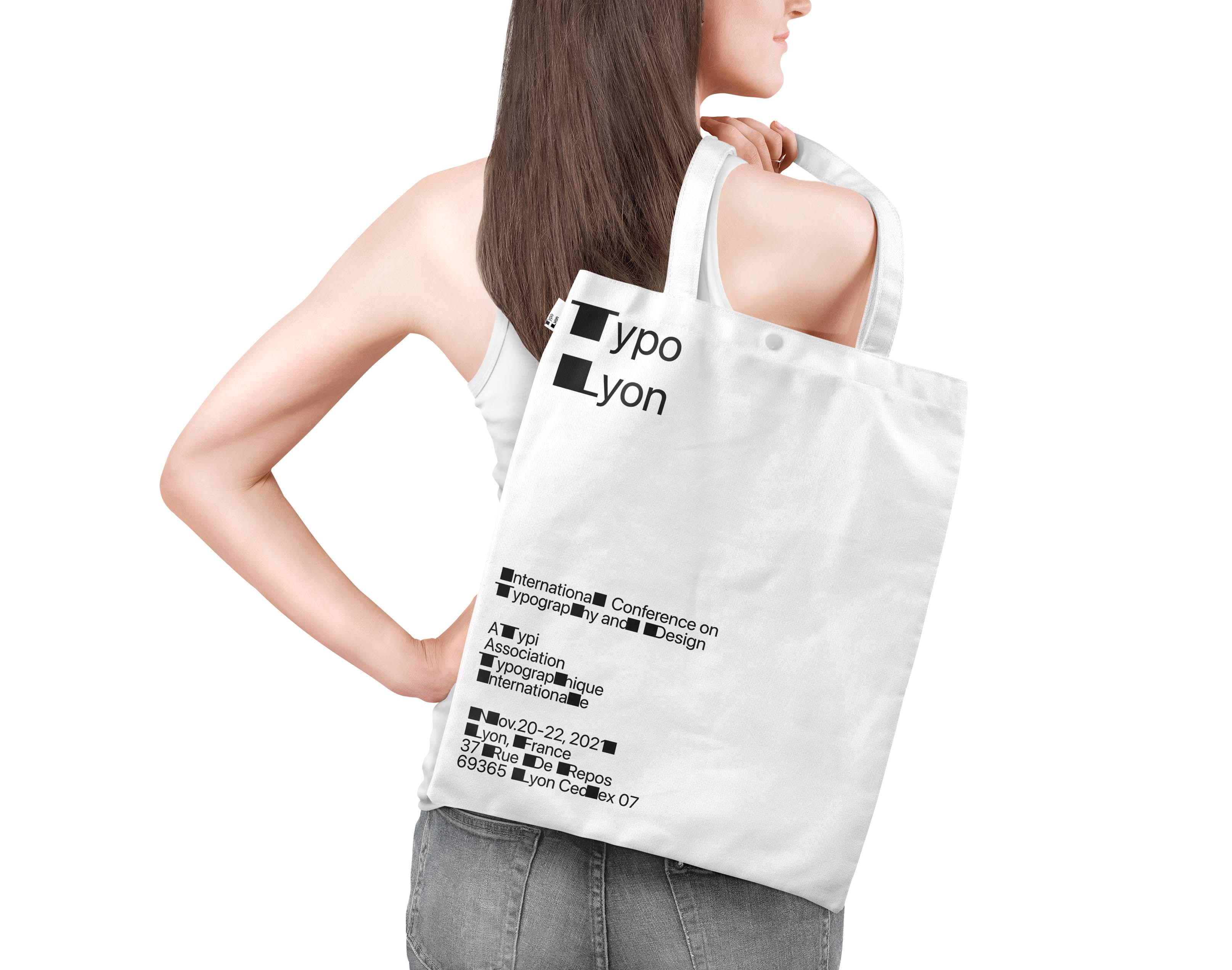
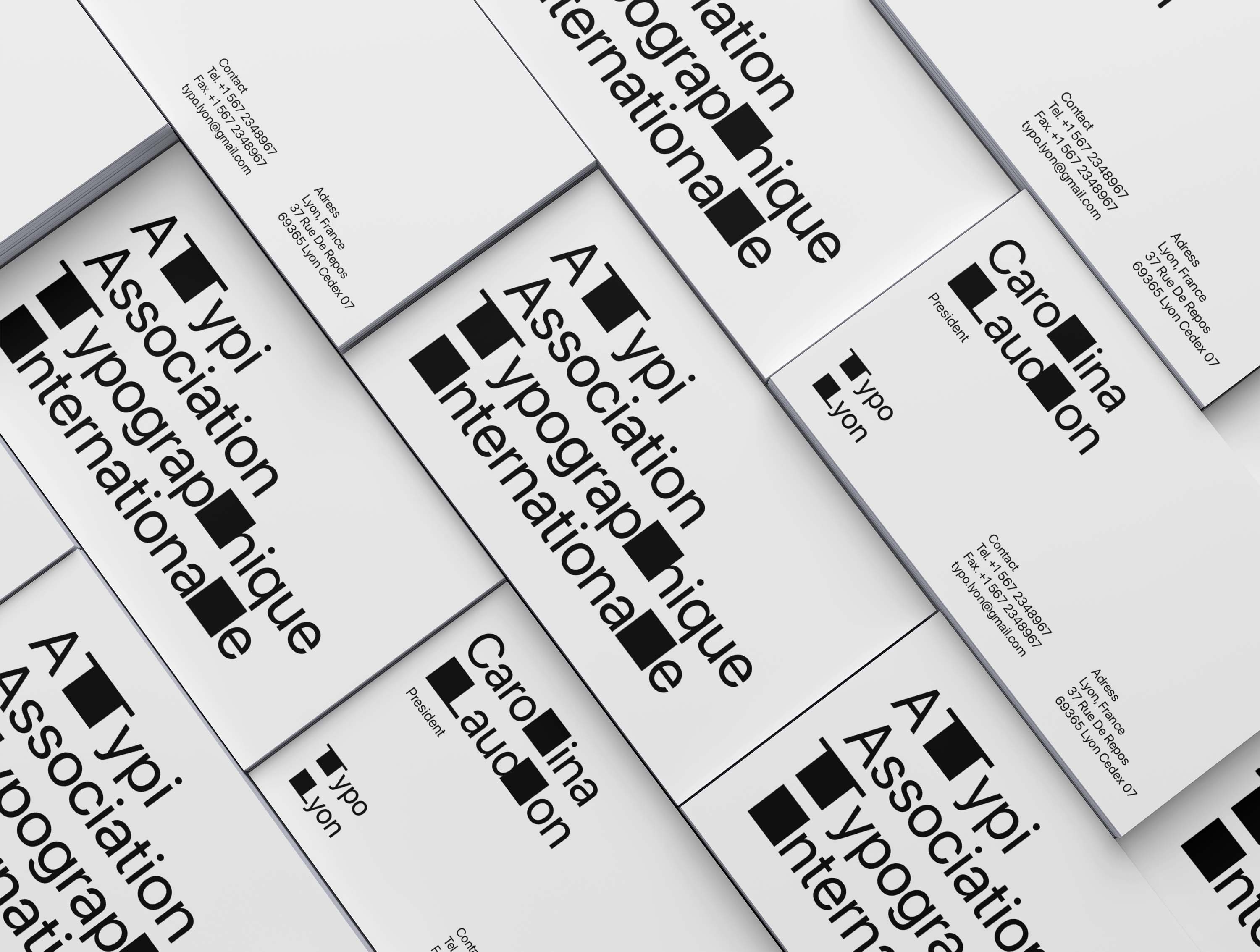
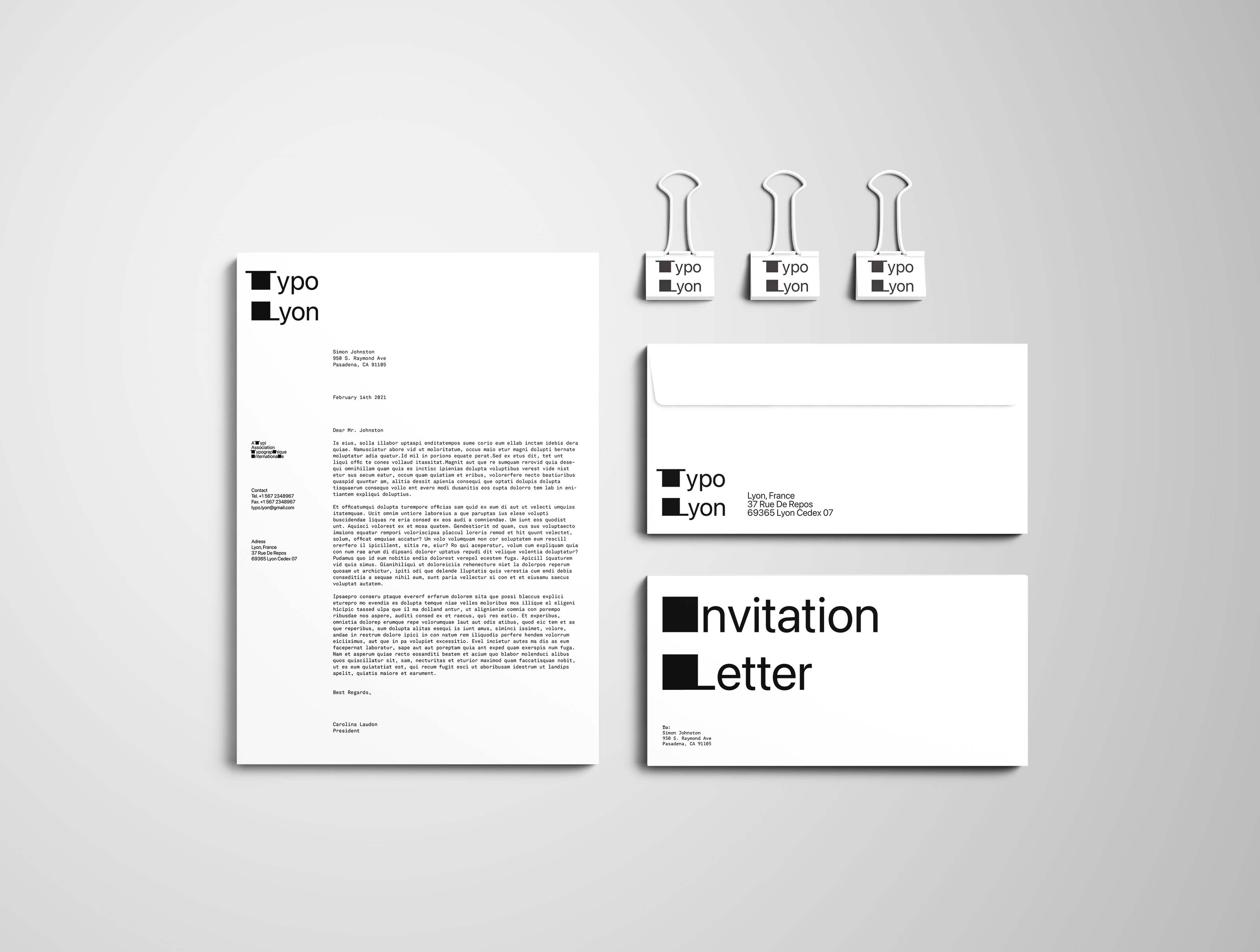
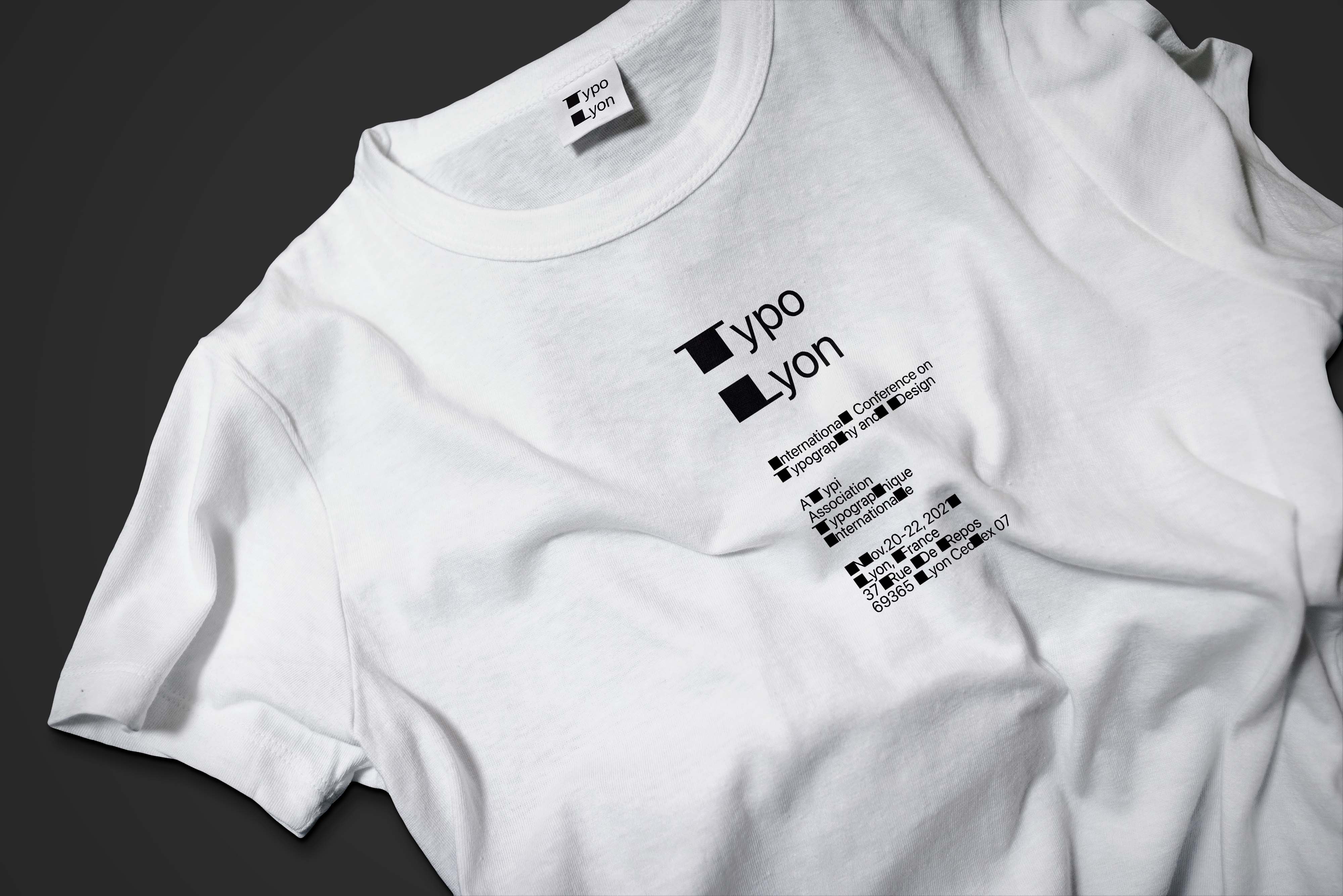
A branding project for Typo Lyon 2021, an international conference on typography and design hosted by ATypi (Association Typographique Internationale). The goal of this project was to design a logo for Typo Lyon using only black and white. From the logo, the students were assigned to create a typographic/visual identity system based on the logo.
Learning Outcomes:
The Typo Lyon logo extends the stems of the letters T and L. Using this technique, I created a system that horizontally extends the stems of every letter in the alphabet. The horizontal extension helps to create a strong movement throughout the whole identity which made continuous and unexpected patterns throughout the composition. I decided to push this project even further by extending my idea through different media such as tickets, digital screens, bags, and stationaries.