Image
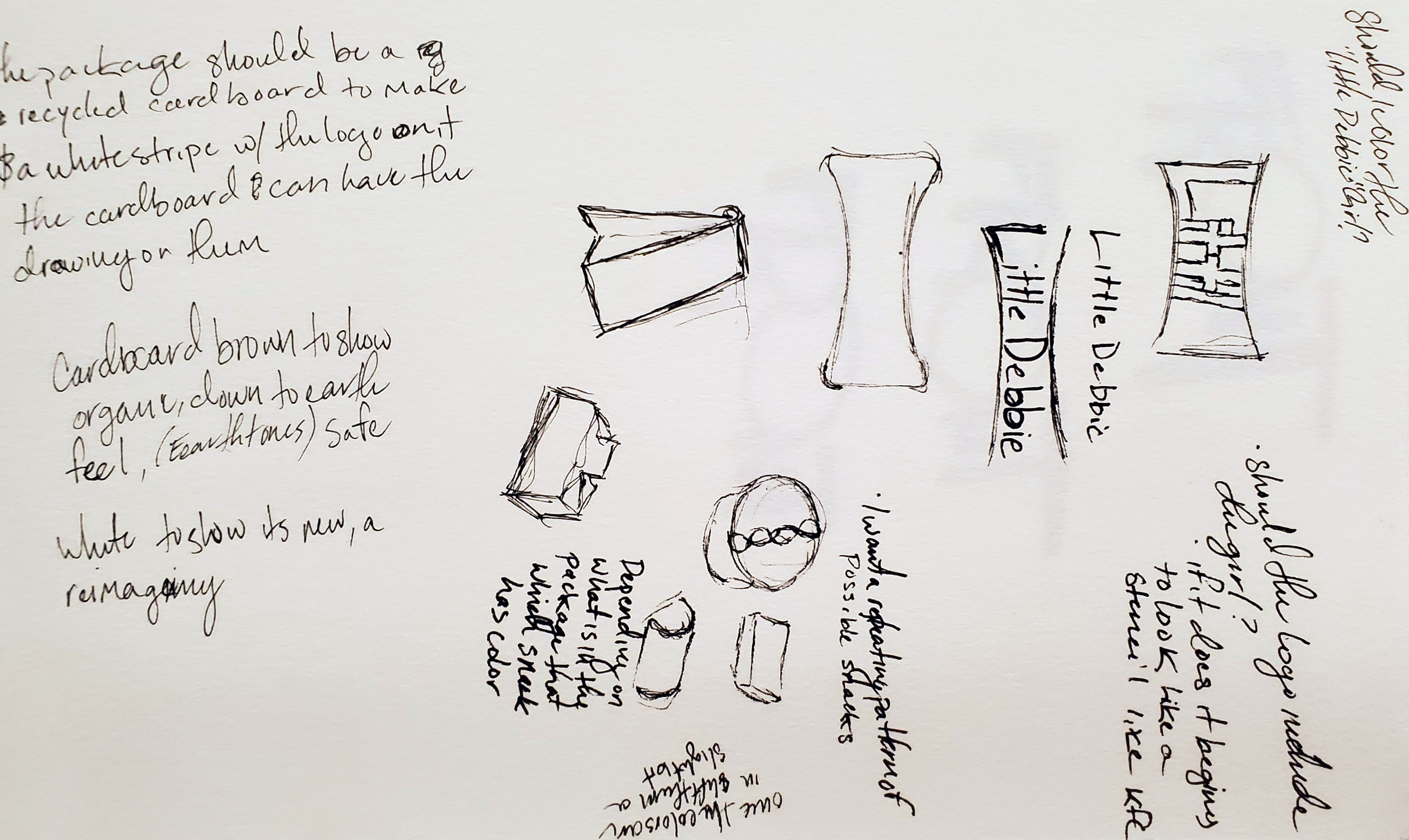
A rough idea of what I wanted to do with this package. I was essentially chasing the idea of maturity. The one cookie or snack brand similar was Milano because it has a sense of maturity that was being emulated.
Image
Image
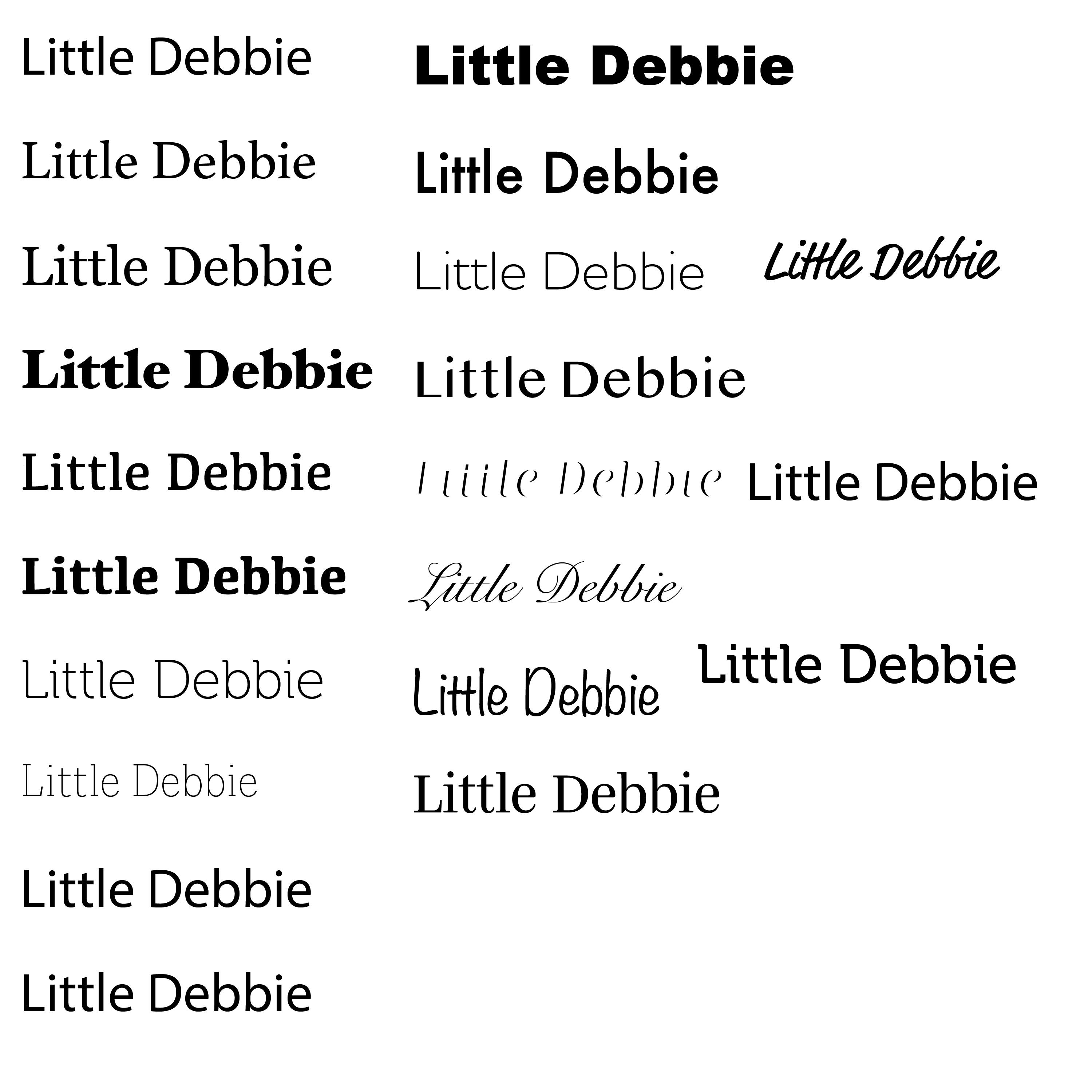
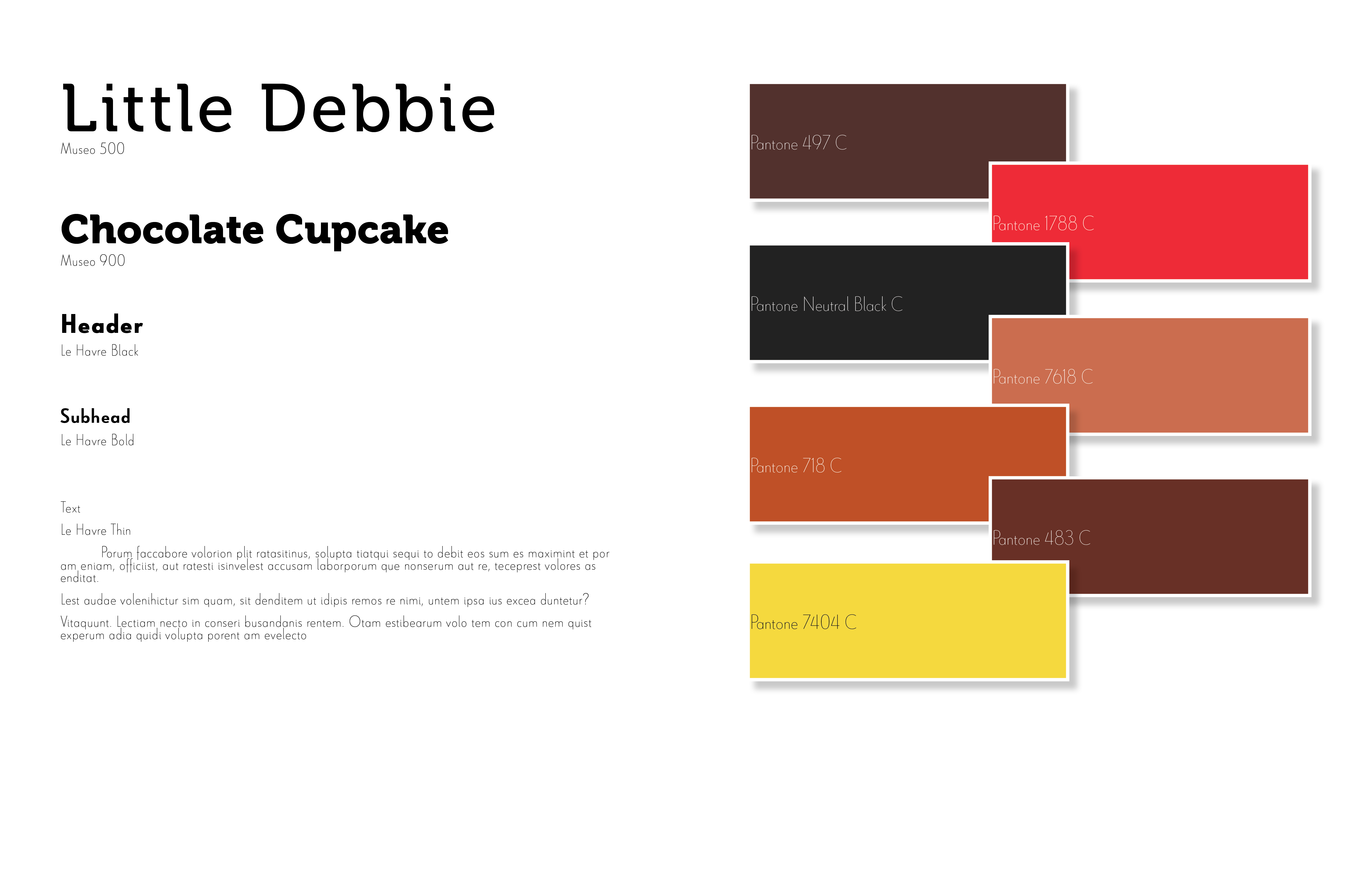
Looking for the correct typography was difficult, these were just several of the first attempts. It began with looking for something that could be fun, reminiscent of childhood, but still show enough growth and maturity.
Image
Image
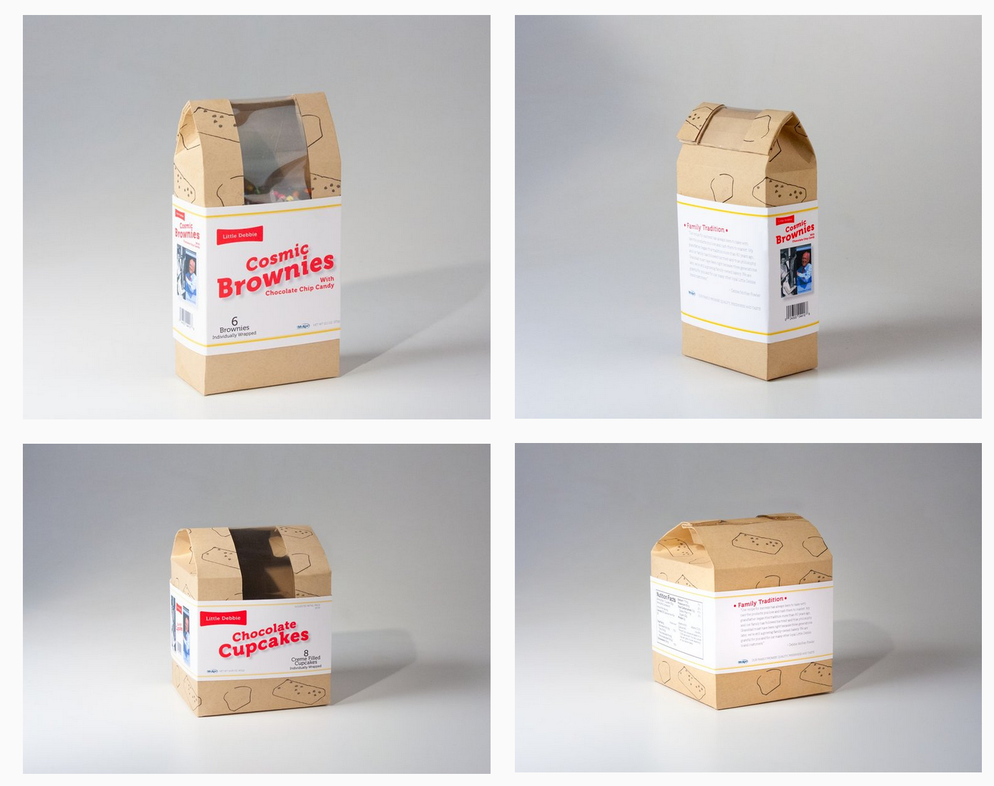
The Little Debbie brand is something the last few generations have grown up with and there should be a way for them to still appeal to those generation as they mature.
Image
Image
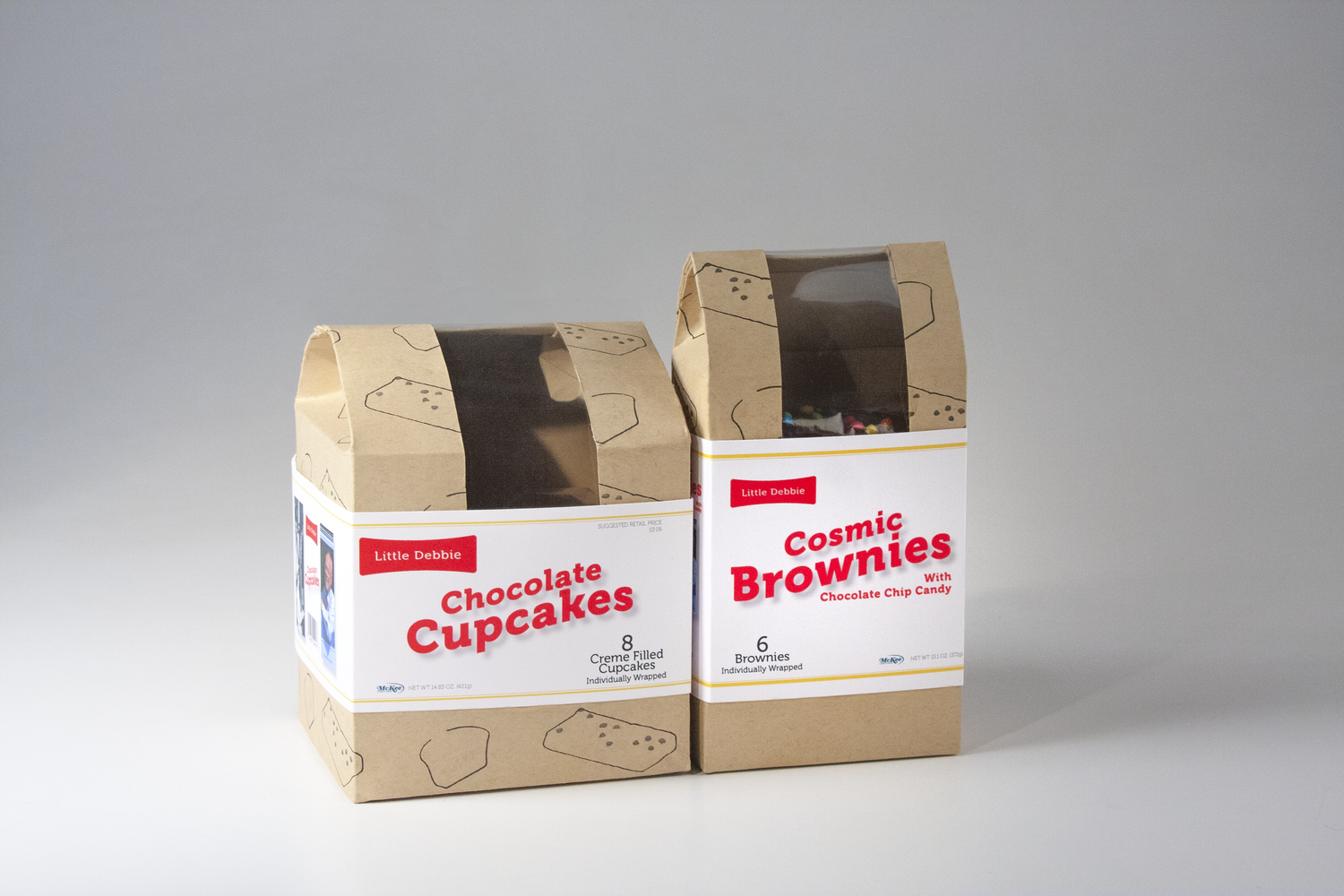
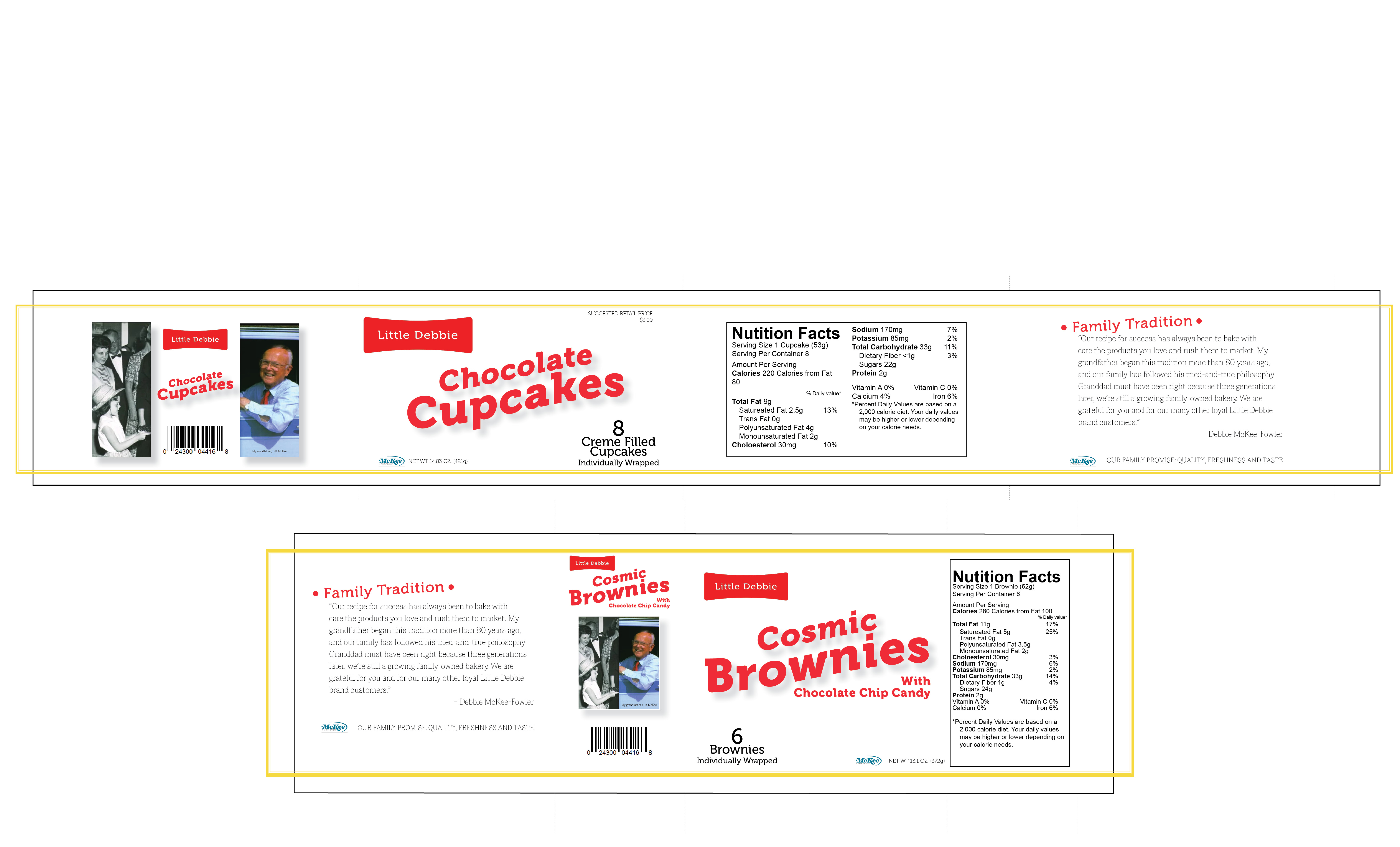
I still wanted to keep with the idea of baked goods such as cupcakes, brownies and cookies. This also made me think of the idea of how Folders coffee rebrand itself for a newer audience. Folders had been something of a stale br and and had not gone though any new changes with the look and feel over the last twenty years or so. It had me think there must be other brands that could use the same treatment. I sought out a snack brand that had not been updated in a long timer or ever and I stumbled on Little Debbie.
Image