Image
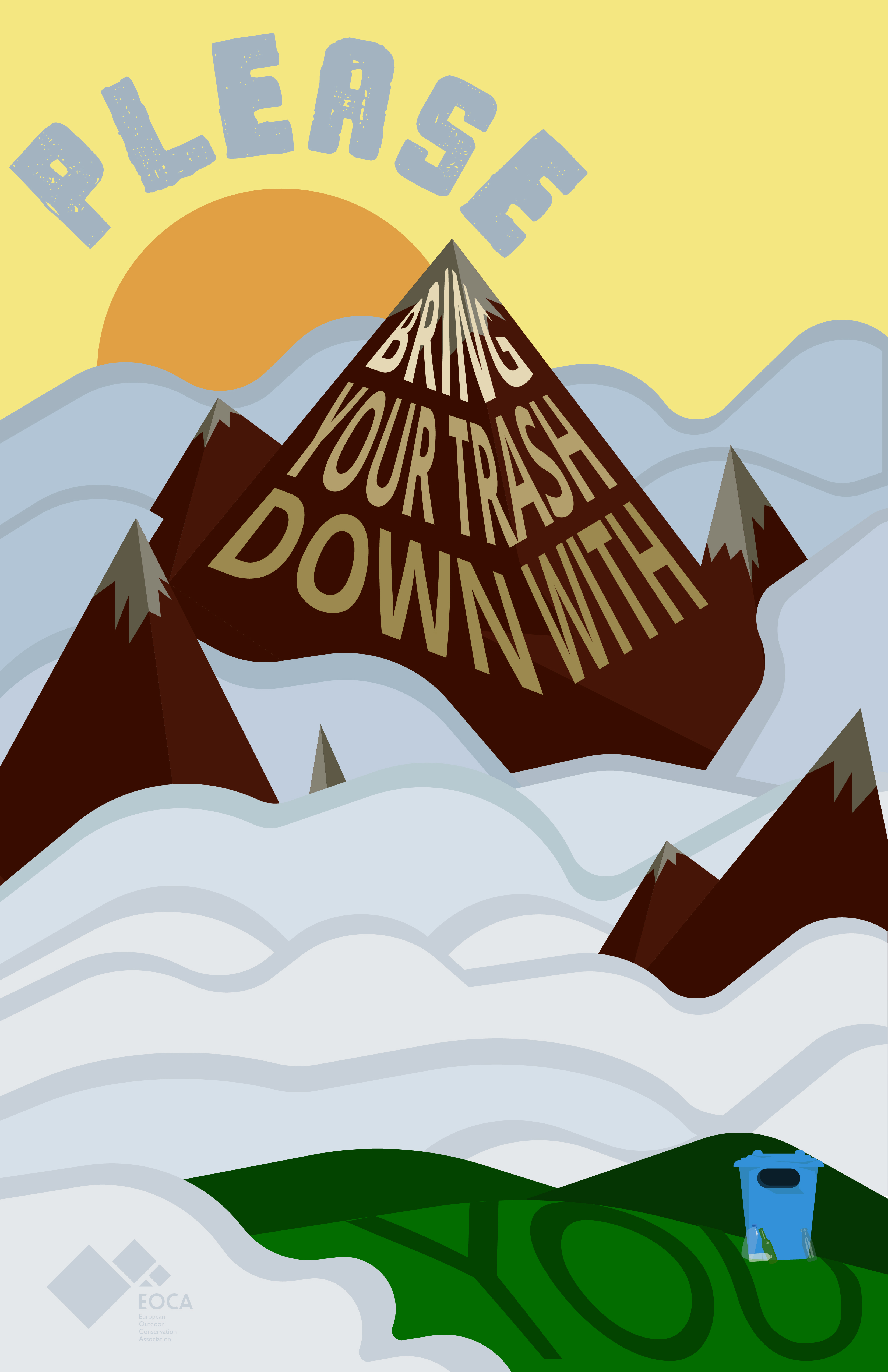
Final poster Variation
Image
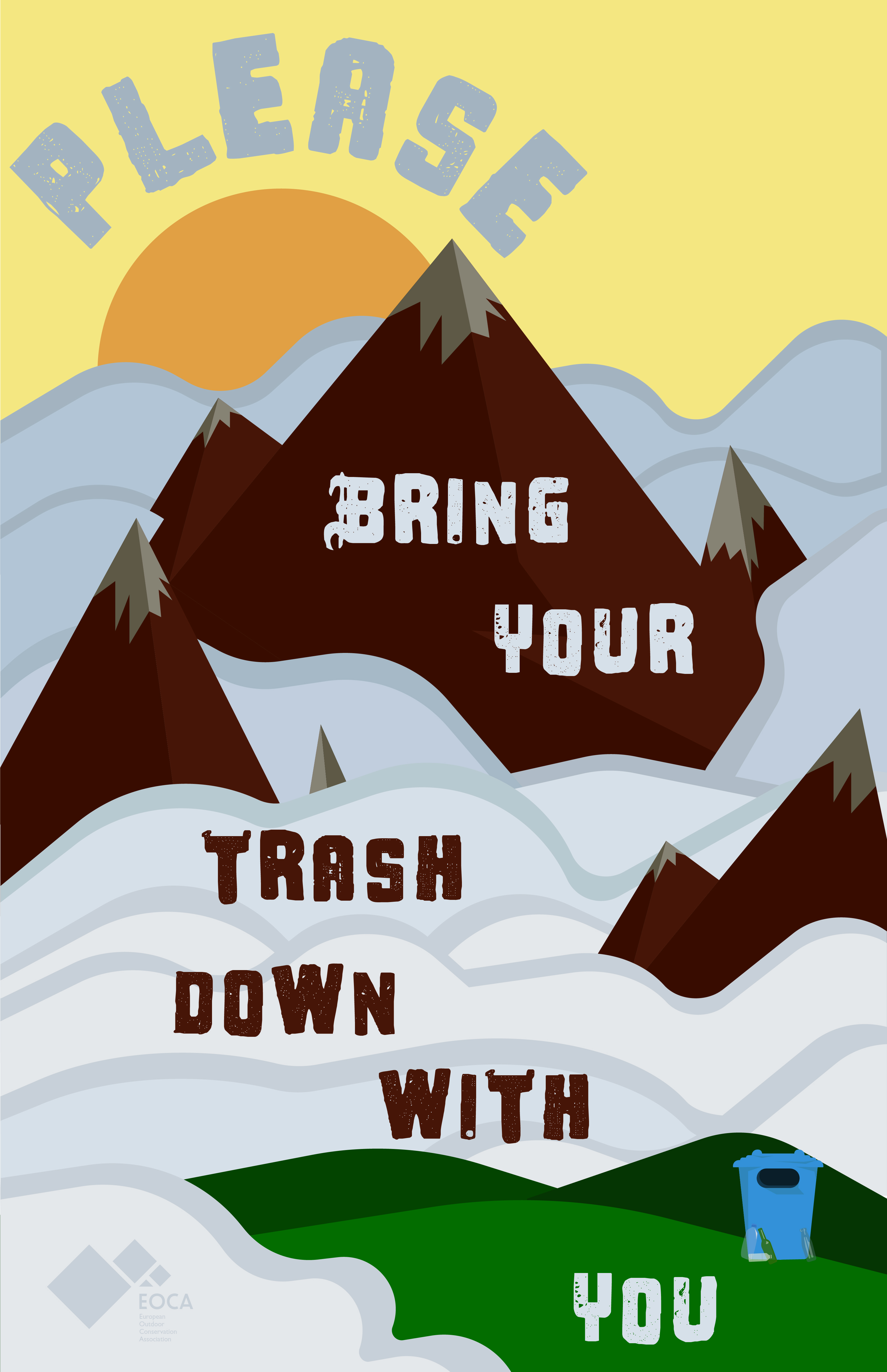
Semi final poster variation, the typeface in this one wasn't working
Image
Image

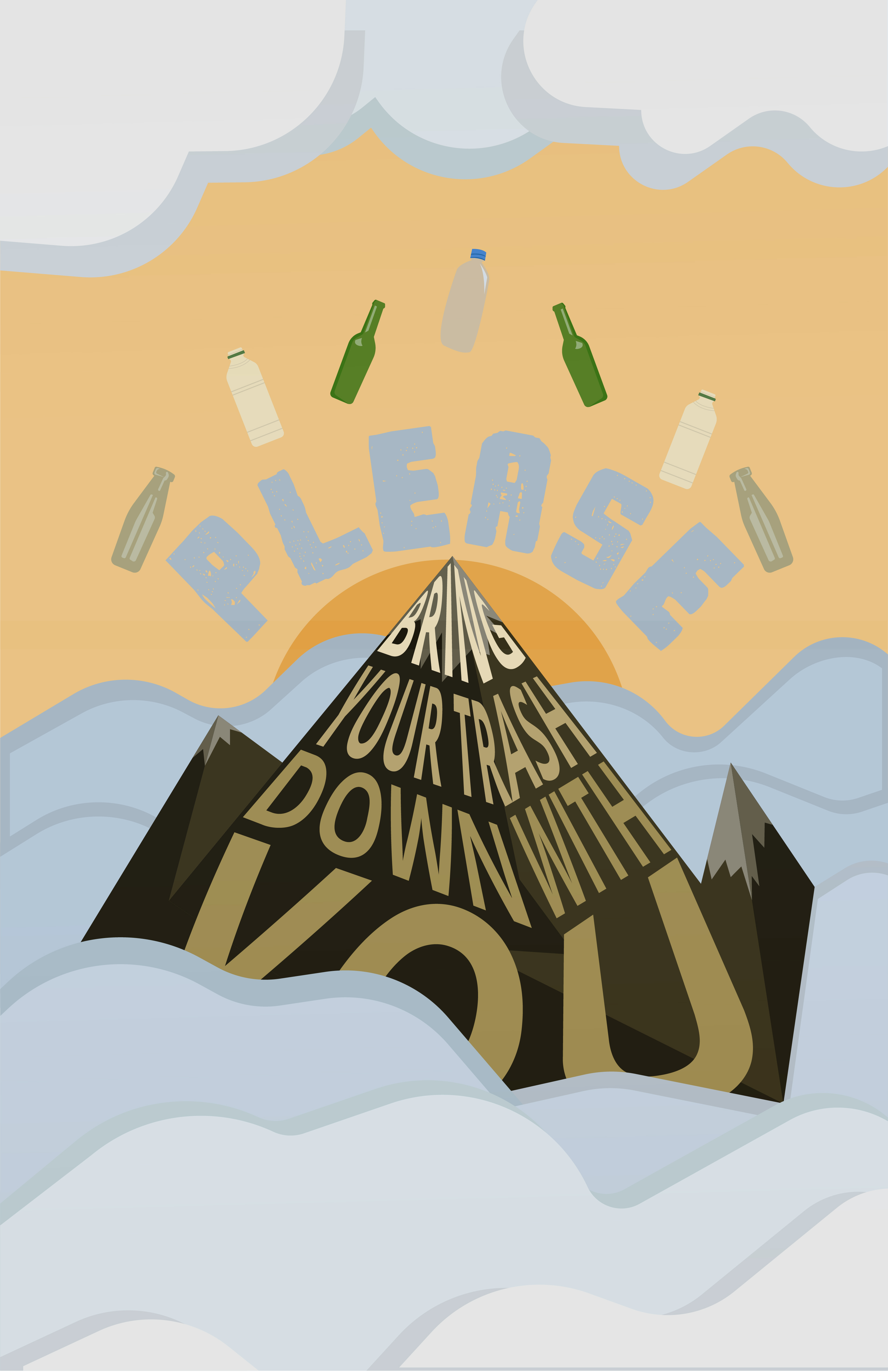
Beginning of my digital rendition where i was going for a paramount like poster with bottles instead of stars
Image
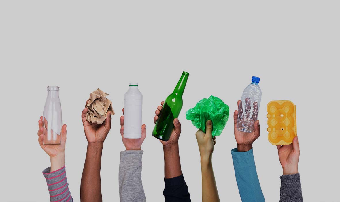
Image references for the bottles used
Image
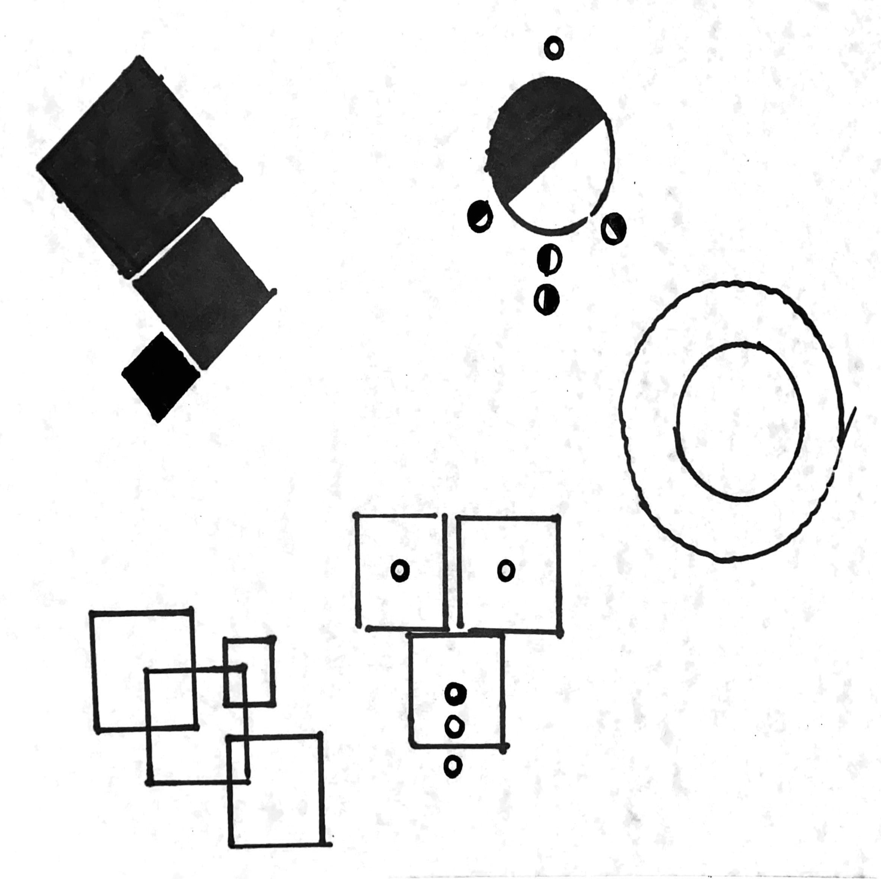
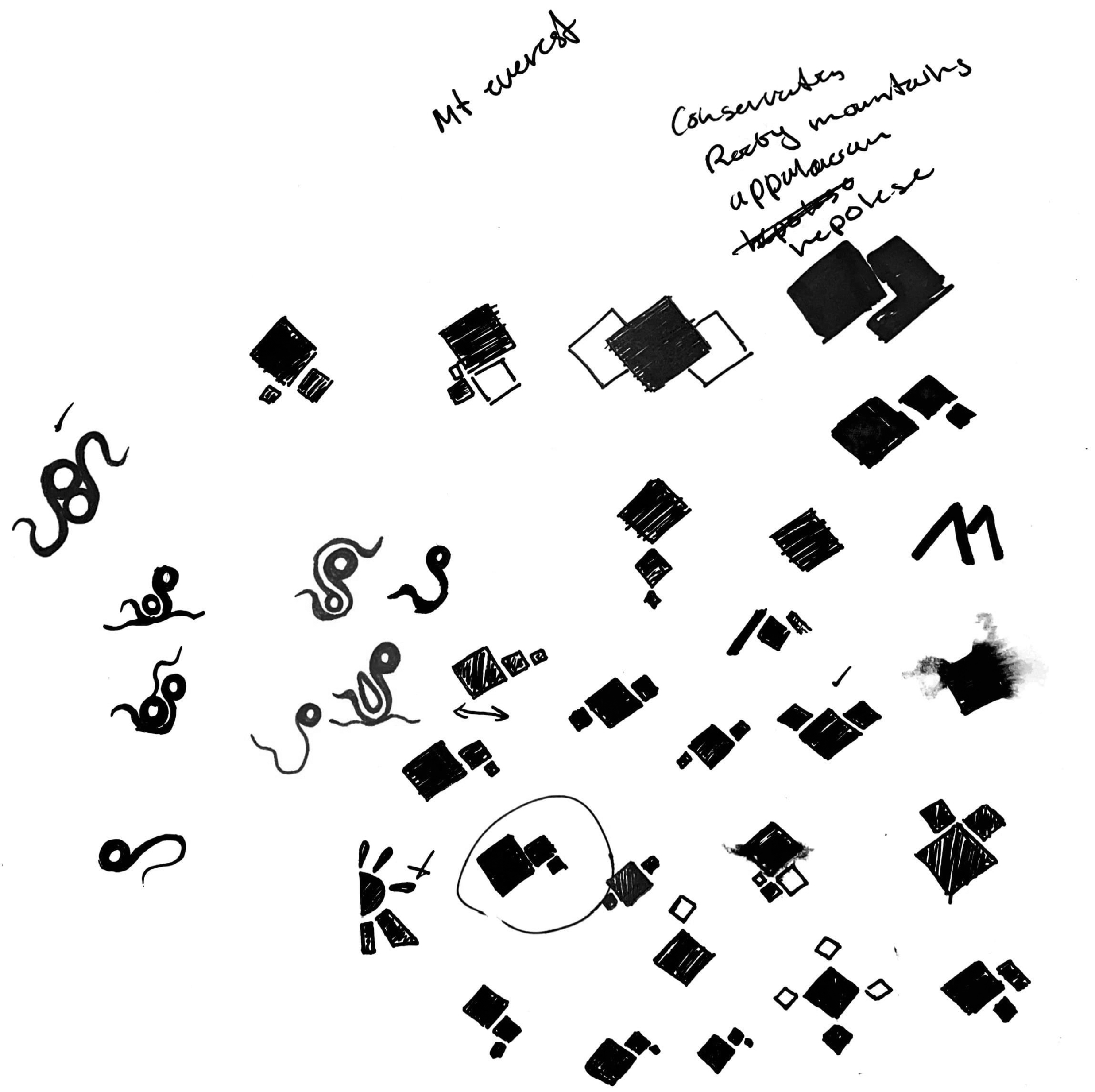
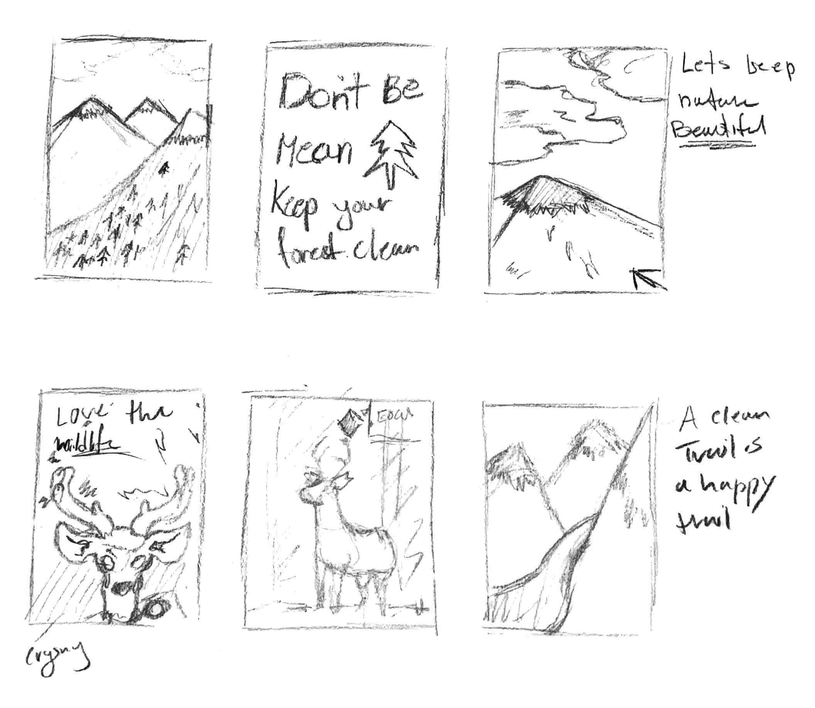
Original abstract sketches for the project.
Image
Exploration with shapes for the Logo
Image
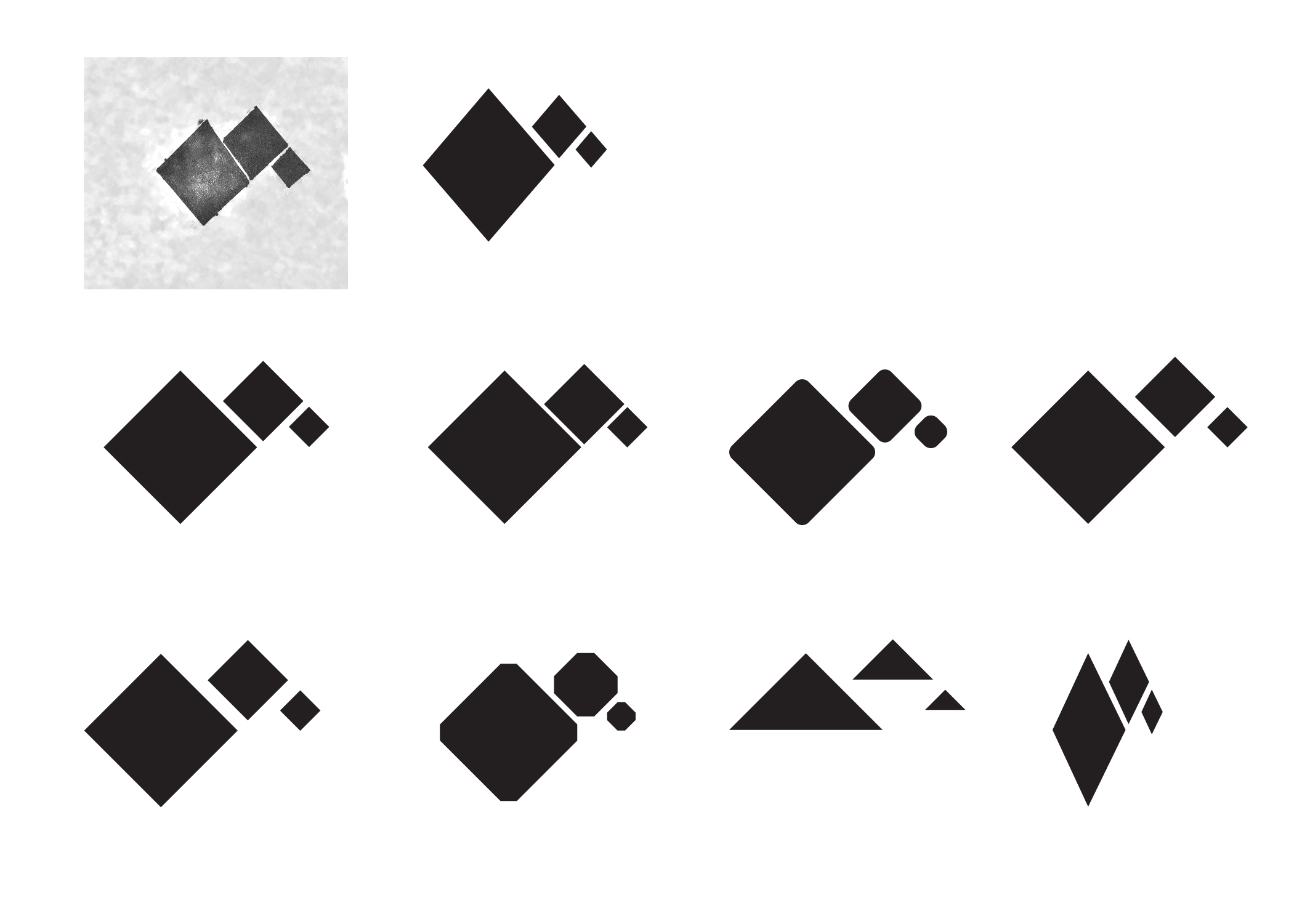
Logo shape exploration where i wanted to have a representation of the mountain.
Image
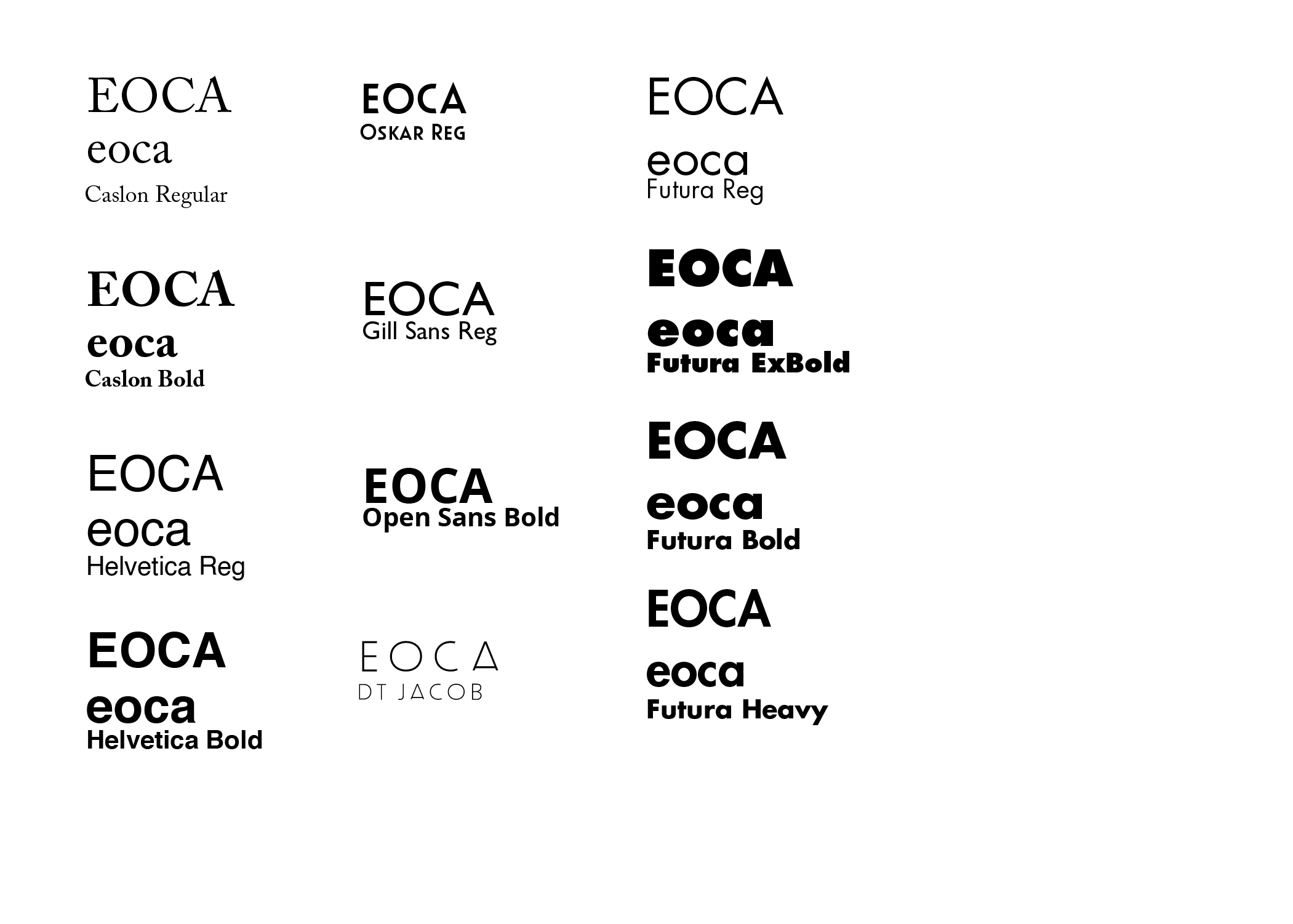
My type exploration, I was going for something strong and angular to pair with the square mountain shape.
Image
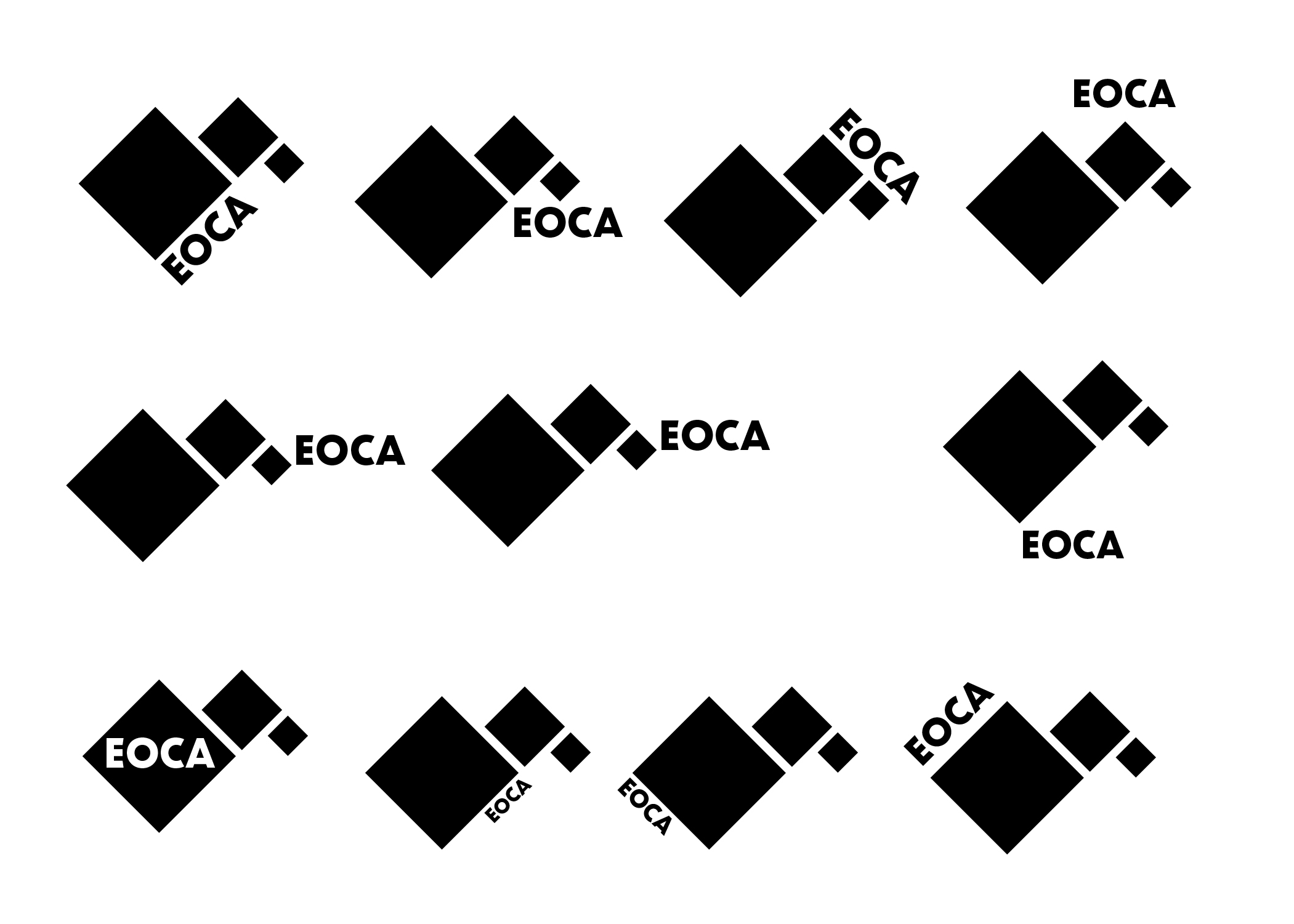
Type Placement Exploration
Image
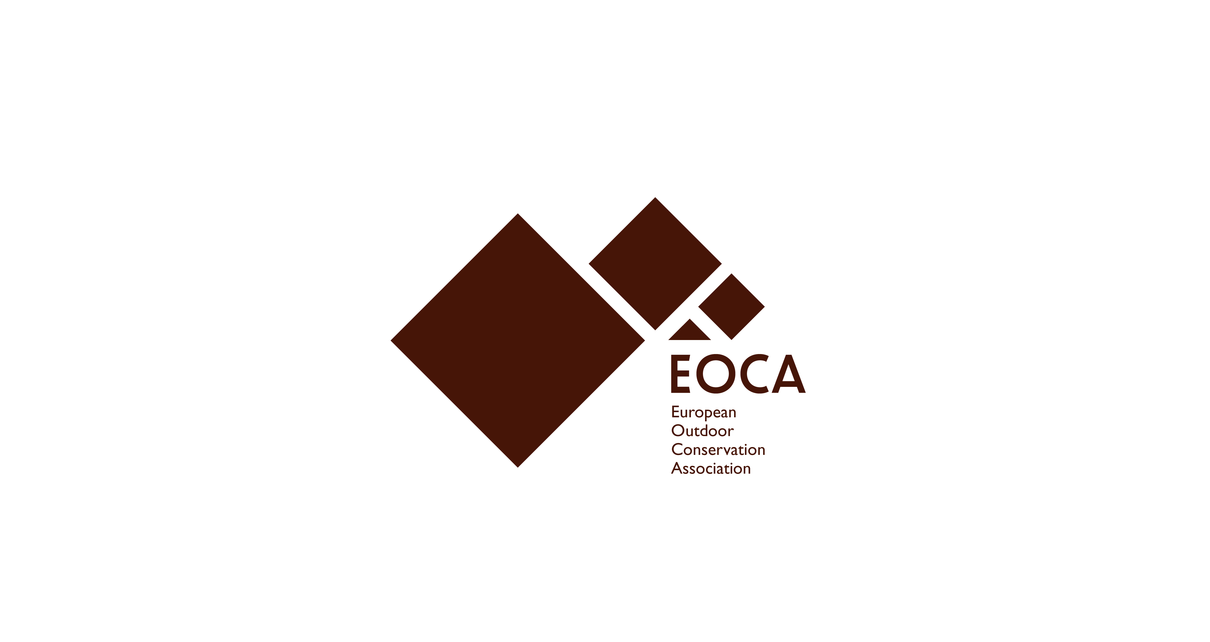
Final Logo design
Image
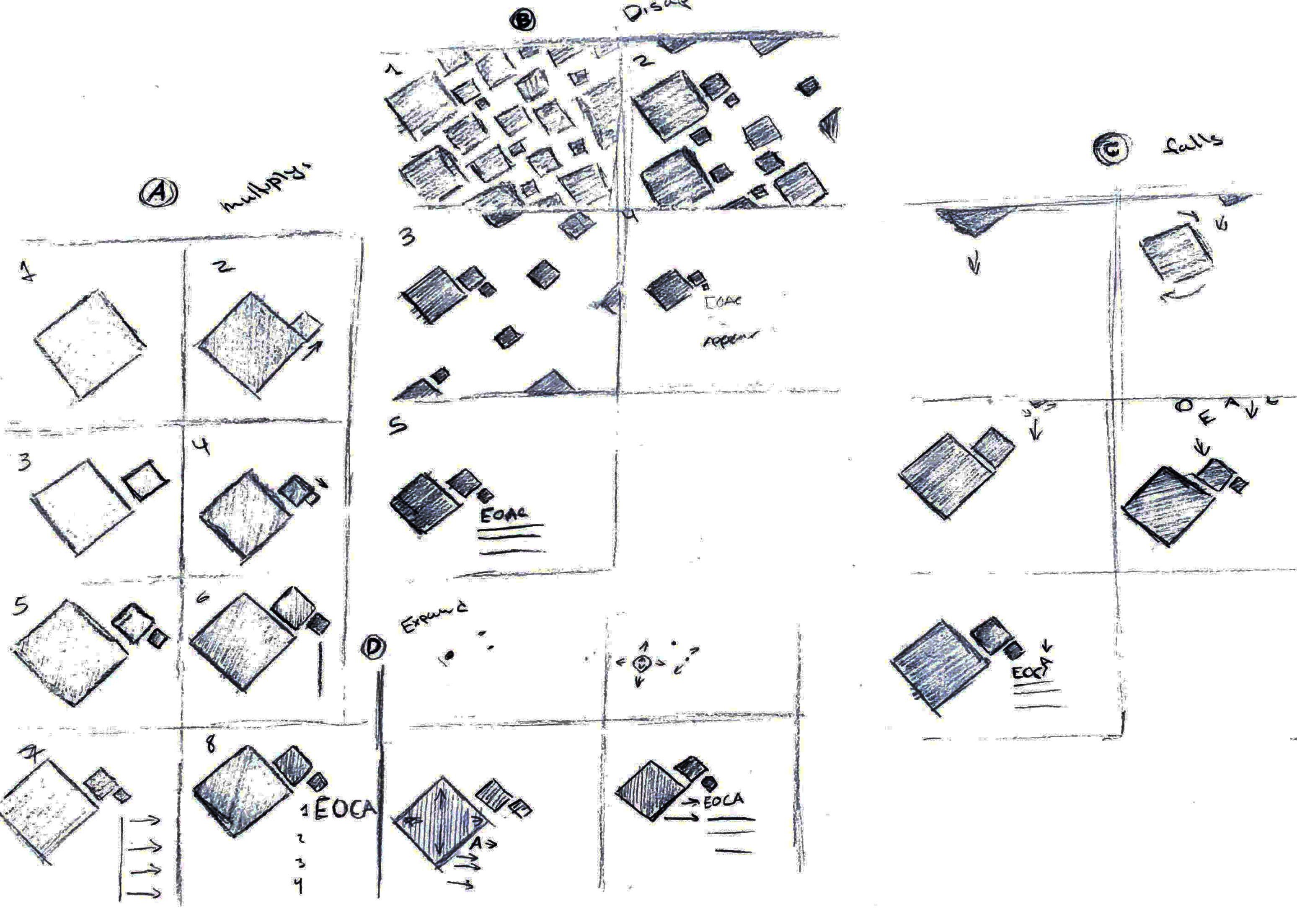
This is a motion piece sketch for the logo where i had 3 ideas, A,B and C. A would be the boxes multiply in order to create the logo, B is multiple squares slowly disappearing to show the logo and represent the mountains as a well as nature.
Image
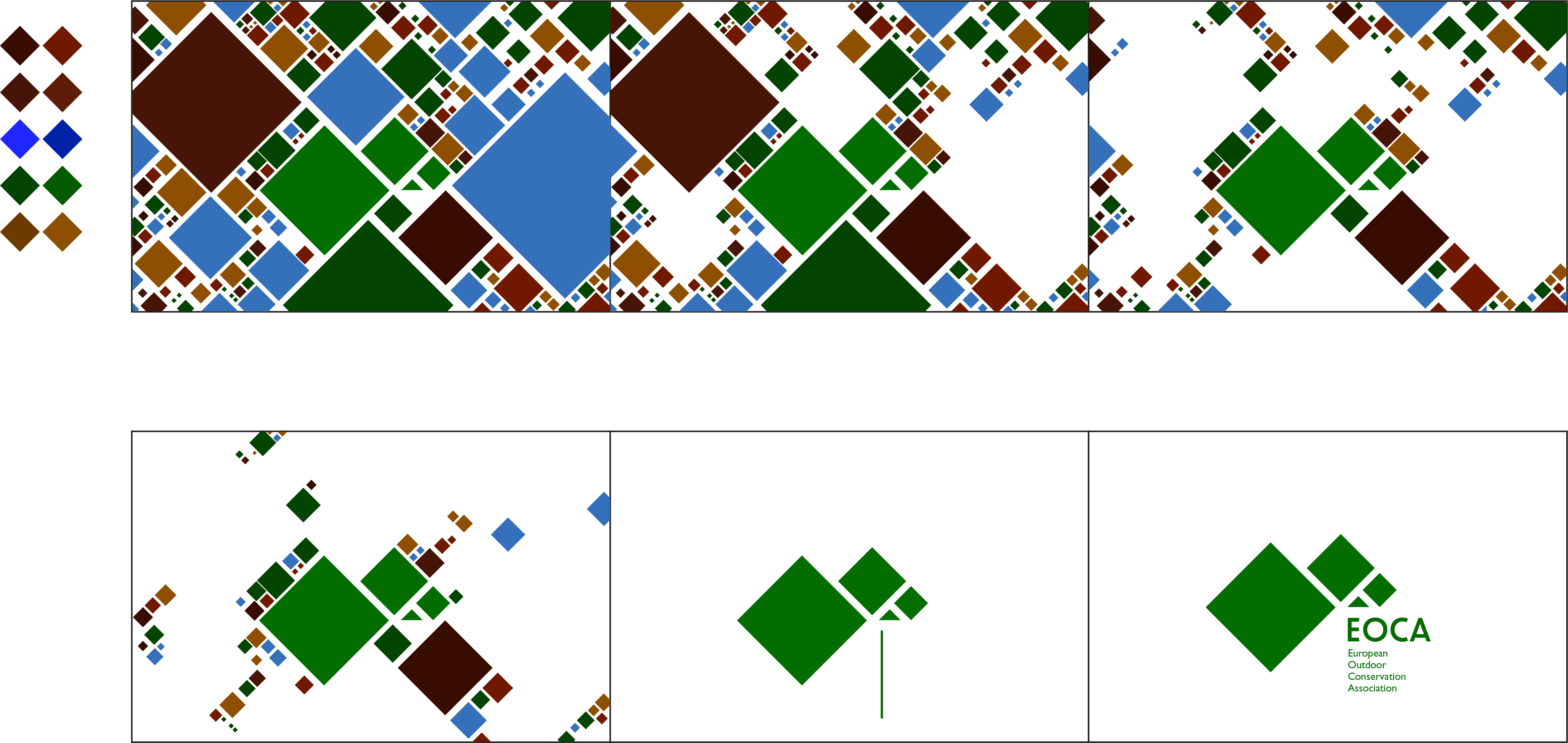
My digital storyboard for the motion piece.
Image
Original sketches for the poster