Image
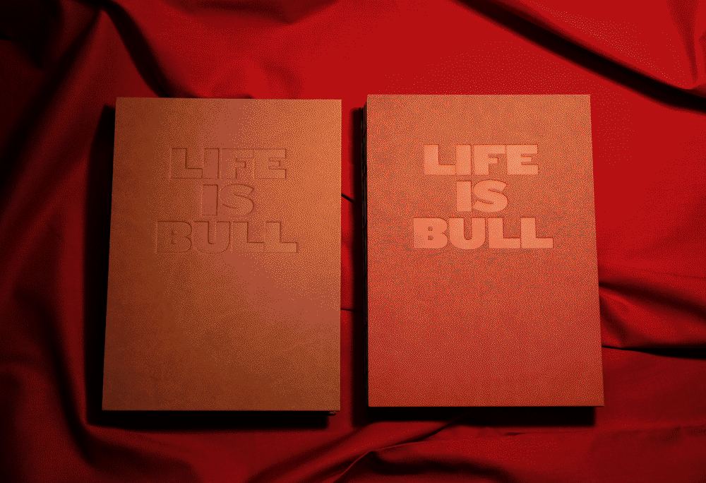
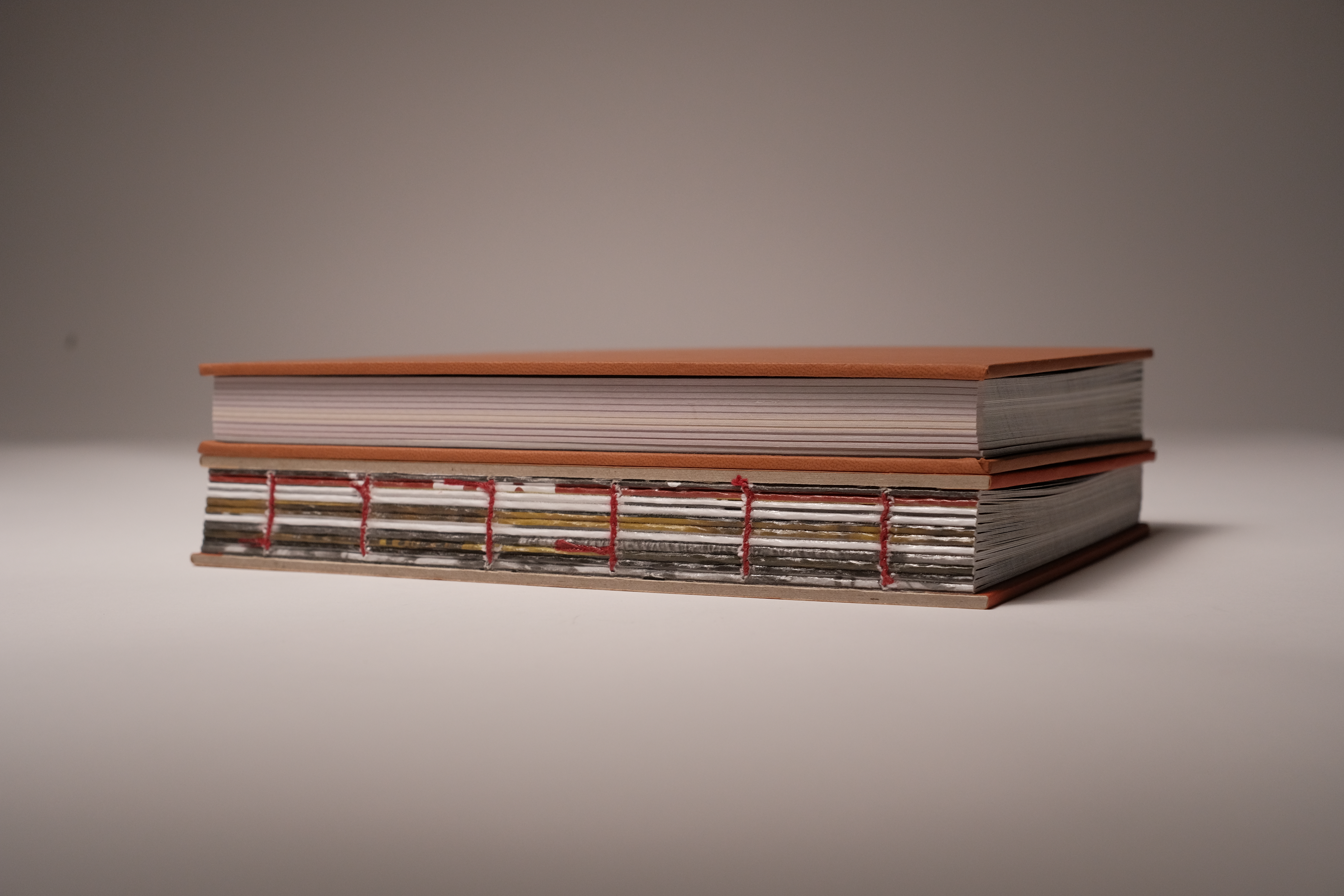
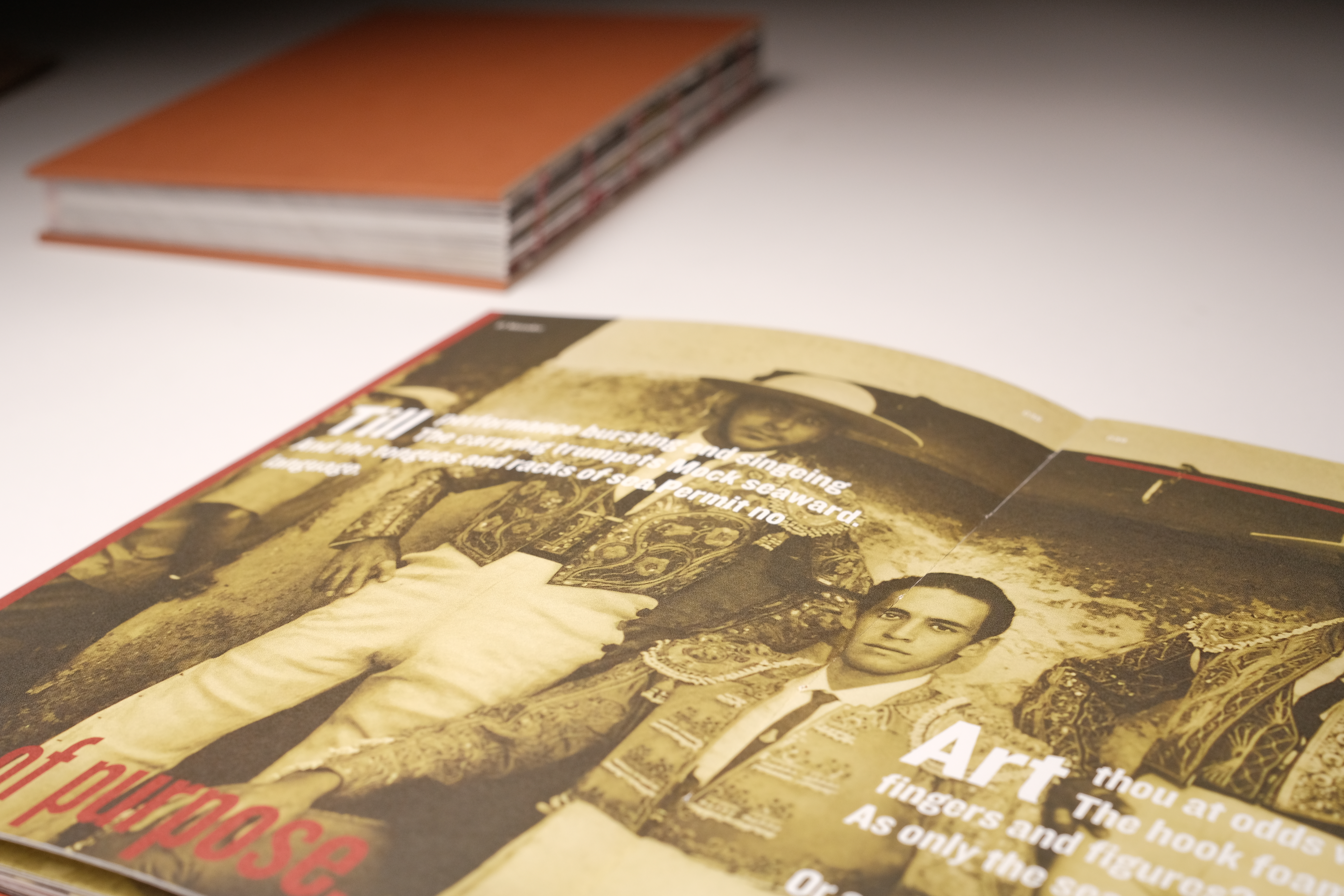
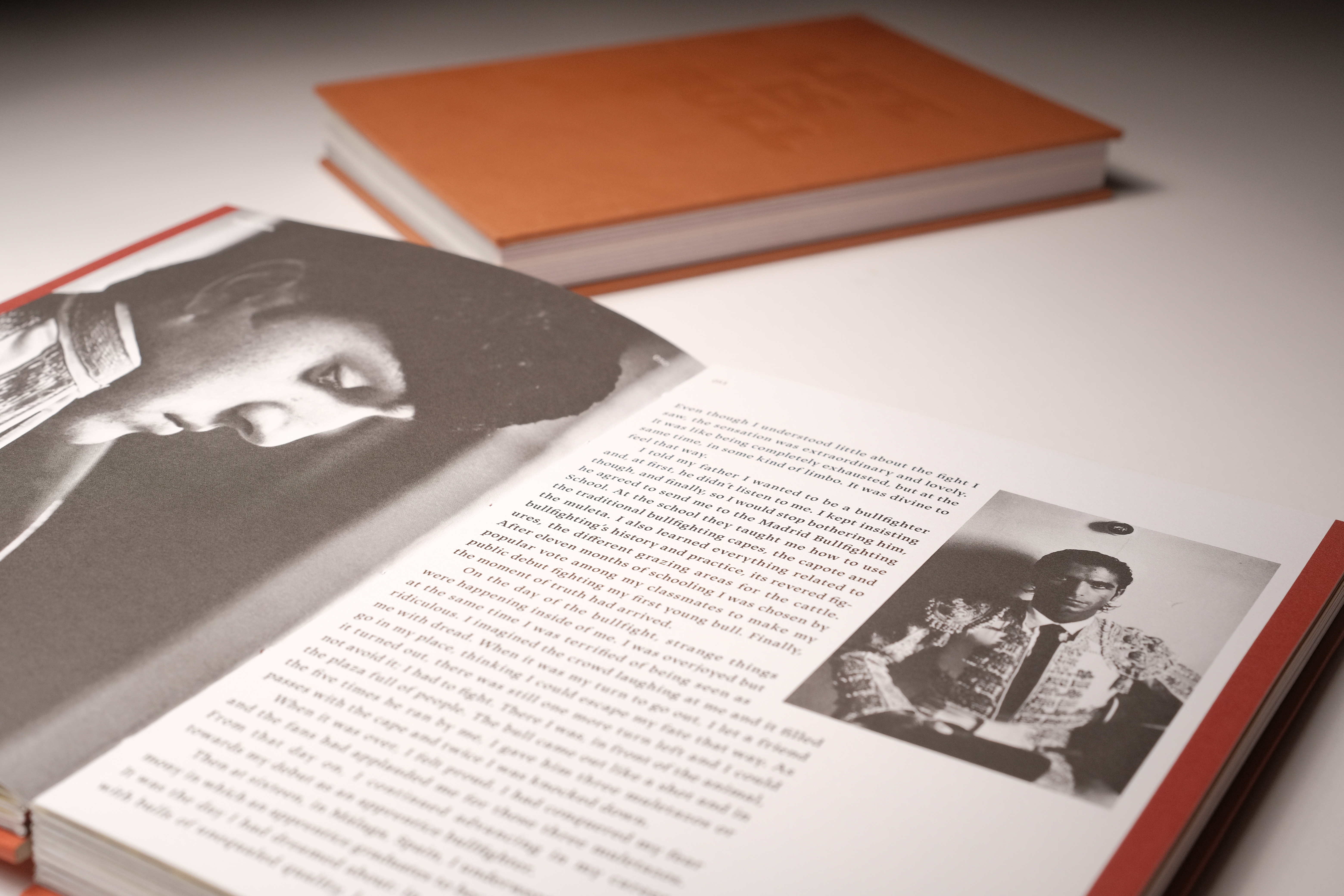
I was heavily influenced by the fighting of two, seeing the vengeful veracity of the bull in contrast to the elegant, cool headed nature of the bullfighter. Watching and reading about it all one idea came to mind, the idea of tearing and putting back together as well as contradictions. Having this in mind I used materials that felt appropriate, using a fake leather for the cover and red thread to sew together the book. The string also has a double meaning representing the string of fate but also how these two opposing ideas of man and beast are being stitched together in a book.
Image
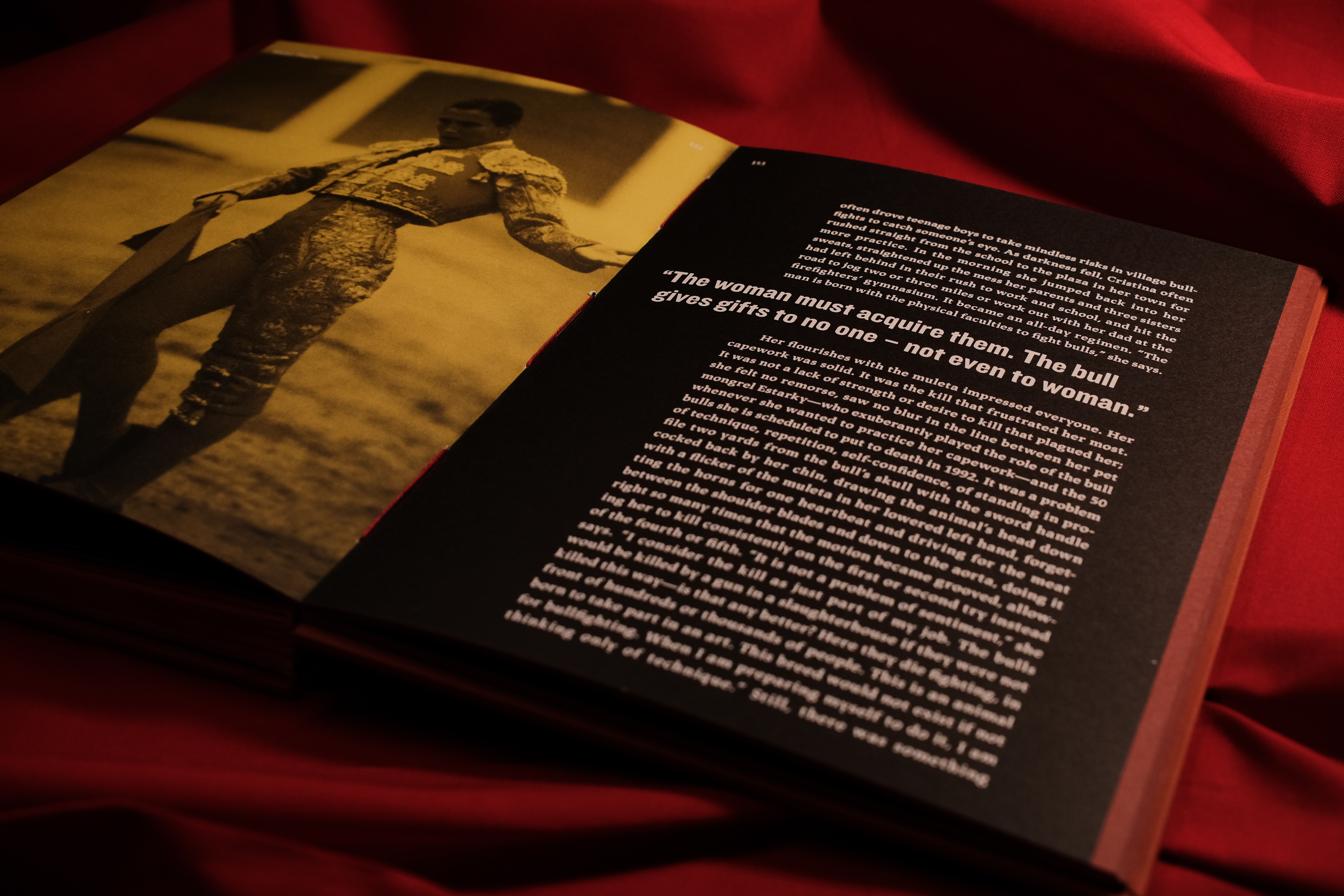
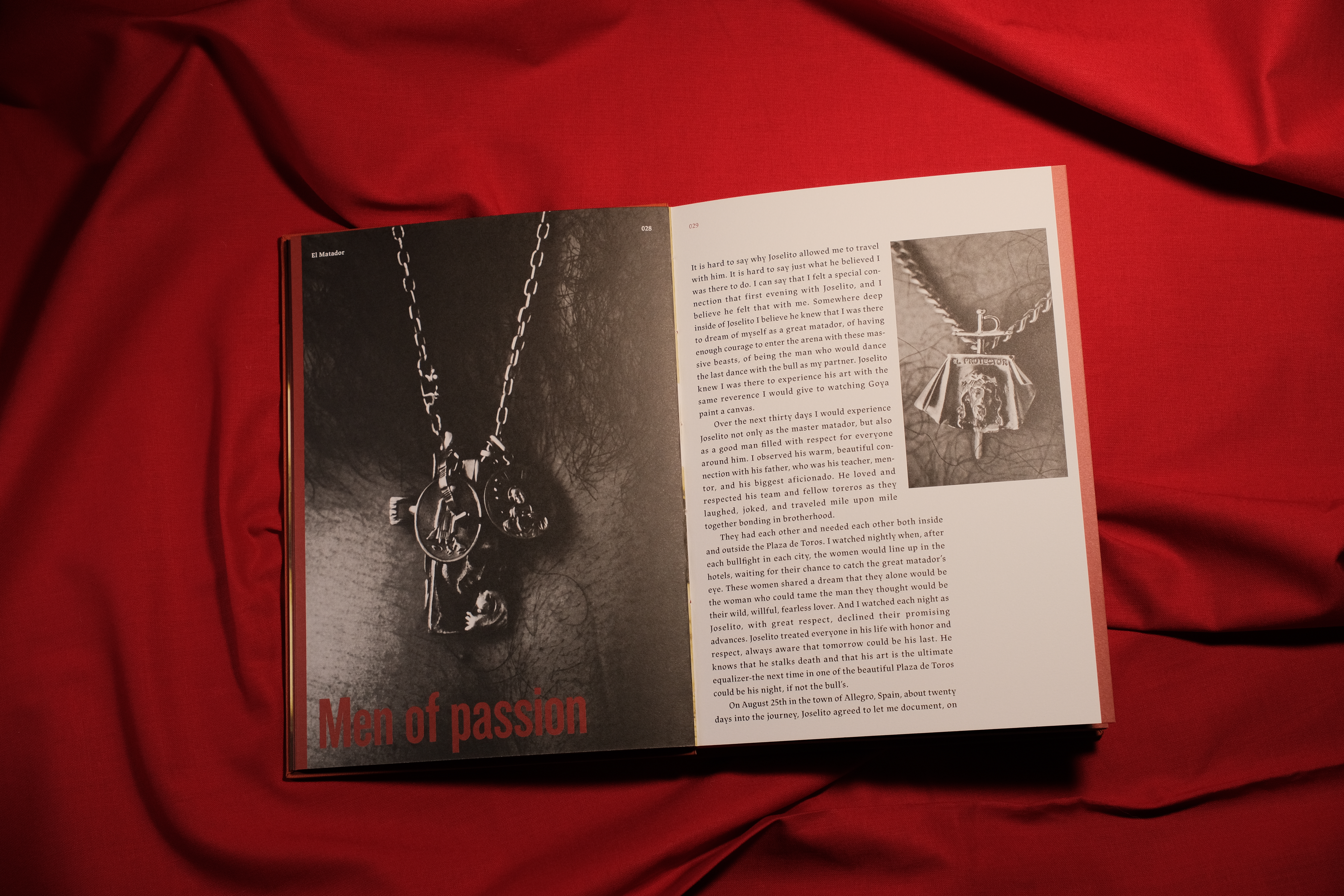
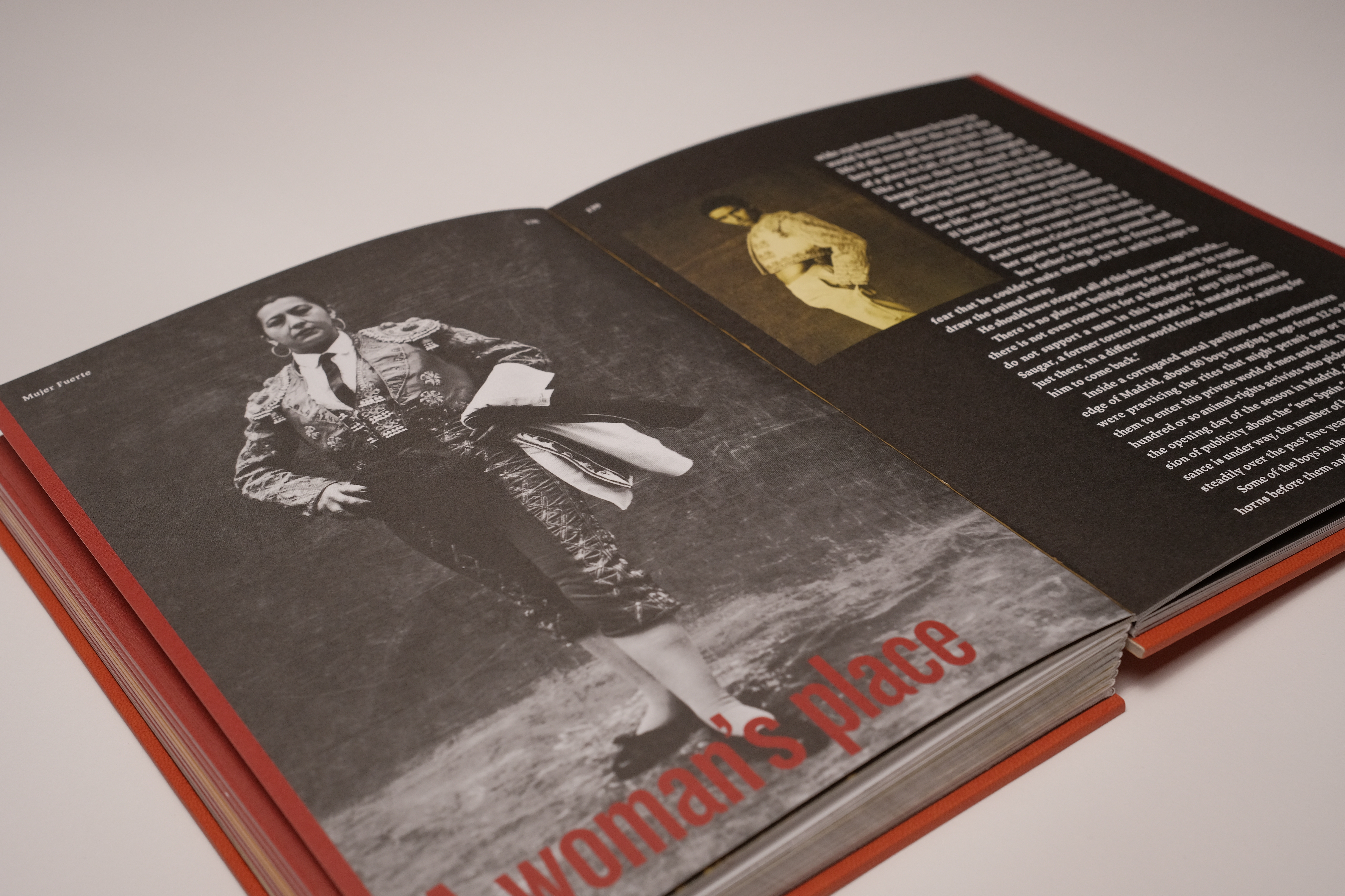
Not only does It go over the history and personal stories of bullfighting but It goes over the present, one thing particularly is the role women now play in this medieval sport once seen as male dominant.
Image
Image
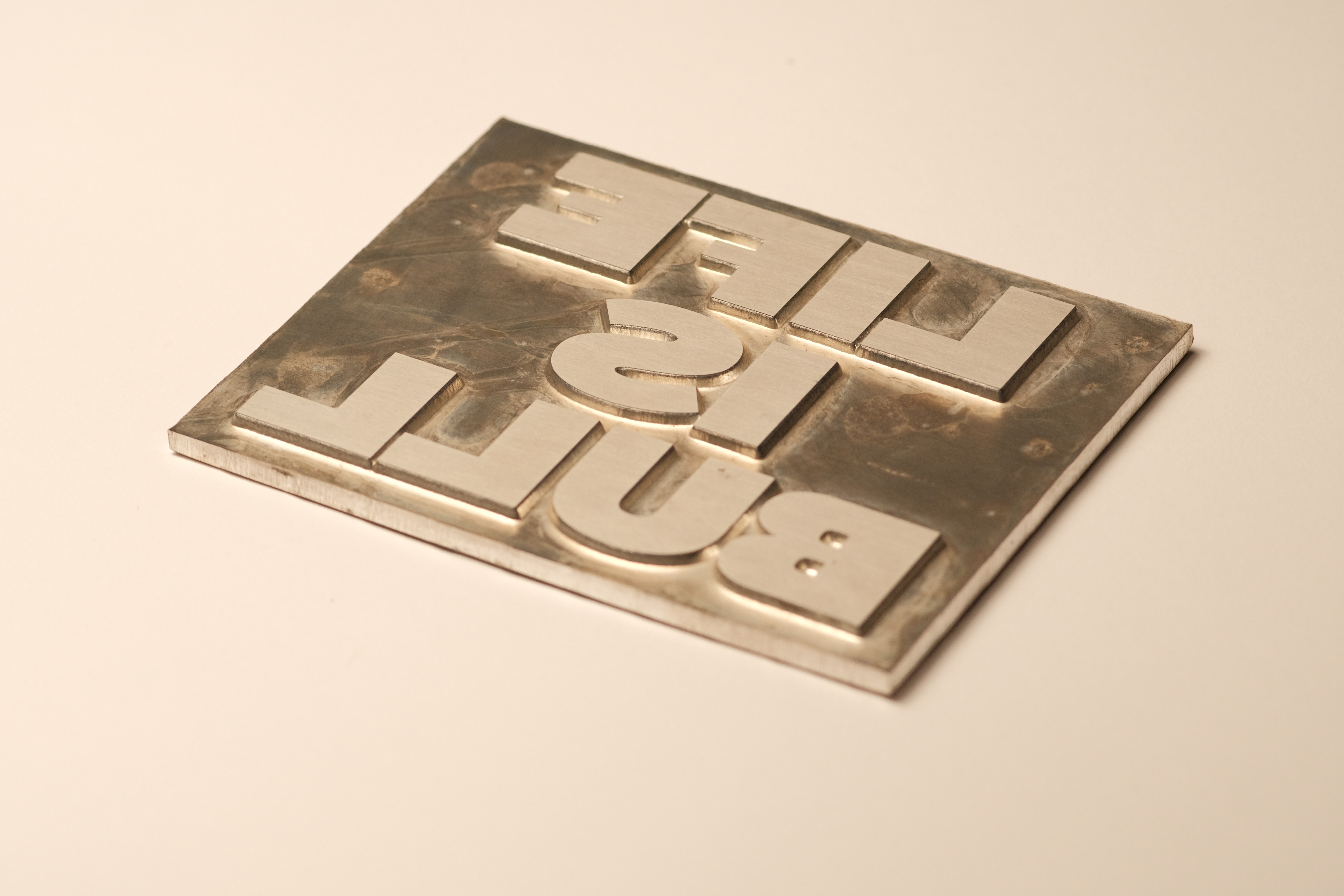
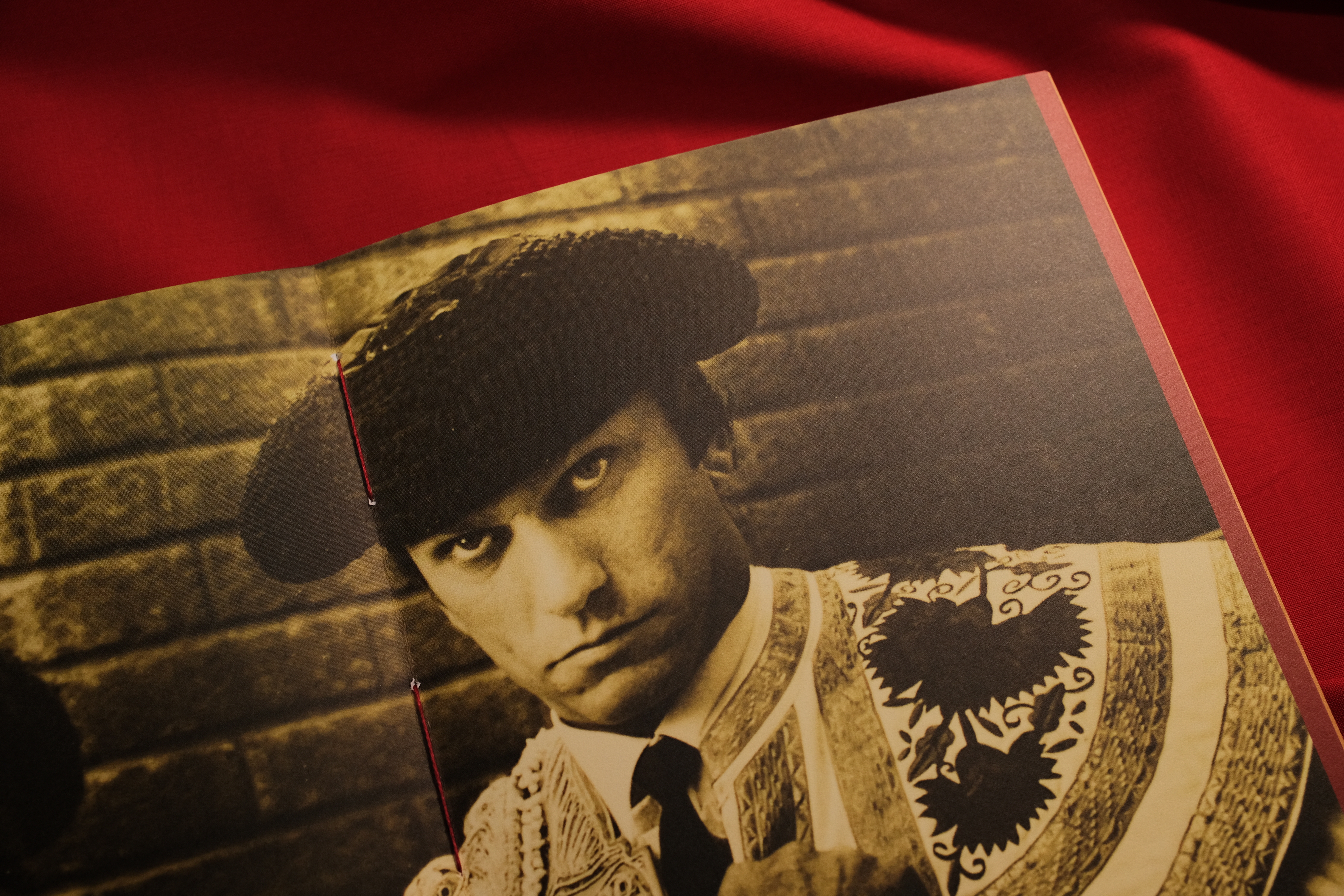
I used two contrasting typefaces to represent the man and beast. A big bold san serif to represent the loud showmanship nature of man and a serif to represent the fierce, sharp nature of the bull.
Image
Image
Image
Image
Image
Image
Image