This was a magazine spread where I only have three 2 page spreads to work with, I was able to create a grid using the baseline and come up with a solution for the text to fit into the spread along with various images in a fluid style.
Learning Outcomes:
The layout is very important in type placing texts in certain ways really helps the overall weight of the pages lighten up. Less information can go a long way in bringing attention to the reader and keeping their interest. Negative space doesn't have to be a bad thing in typography it can help the type breathe and lead your eyes. It's something I still struggle with but I am slowly starting to understand it more.
Image
Image
Image
Image
Image
Image
Image
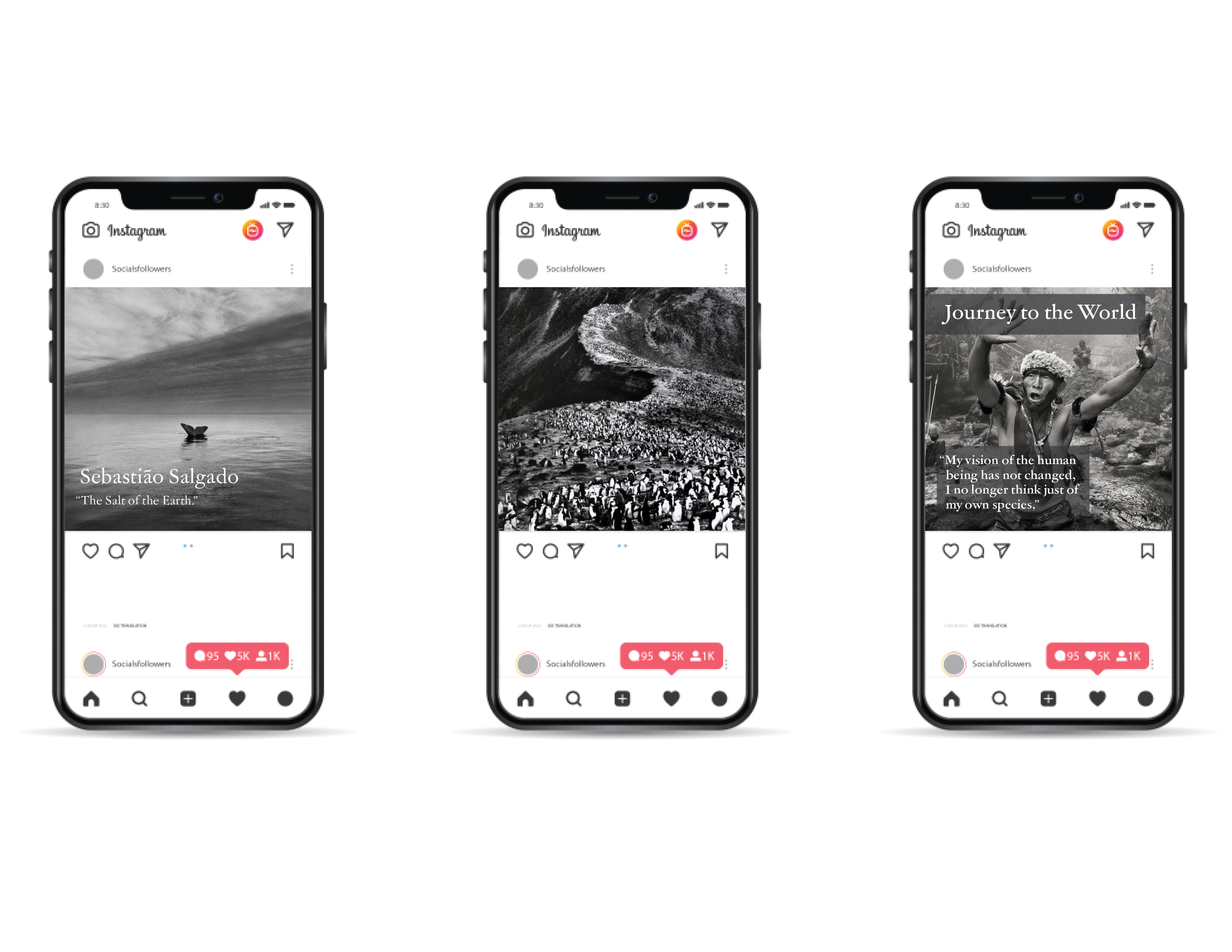
This is an Instagram post for the article on Sebastião Salgado