Graduates

Joshua Reyes

BFA in Graphics — Graphic Design
Course:
GPRT-203 Type 3: Context
Faculty:
Meryl Pollen

Thriller Movie Poster + Brochure EDIT

With the theme of thriller, I made a poster showcasing movies that would be playing at the ACFC with 10 films playing over the span of 3 months. The poster can also be cut into a brochure.
Learning Outcomes:
It's not always in the best interest to show everything, having too much information can become confusing and hard to digest for the viewer. Although having too much can be seen as a problem it's also in your best interest to have more so you have more to work with when you're refining work.
Image
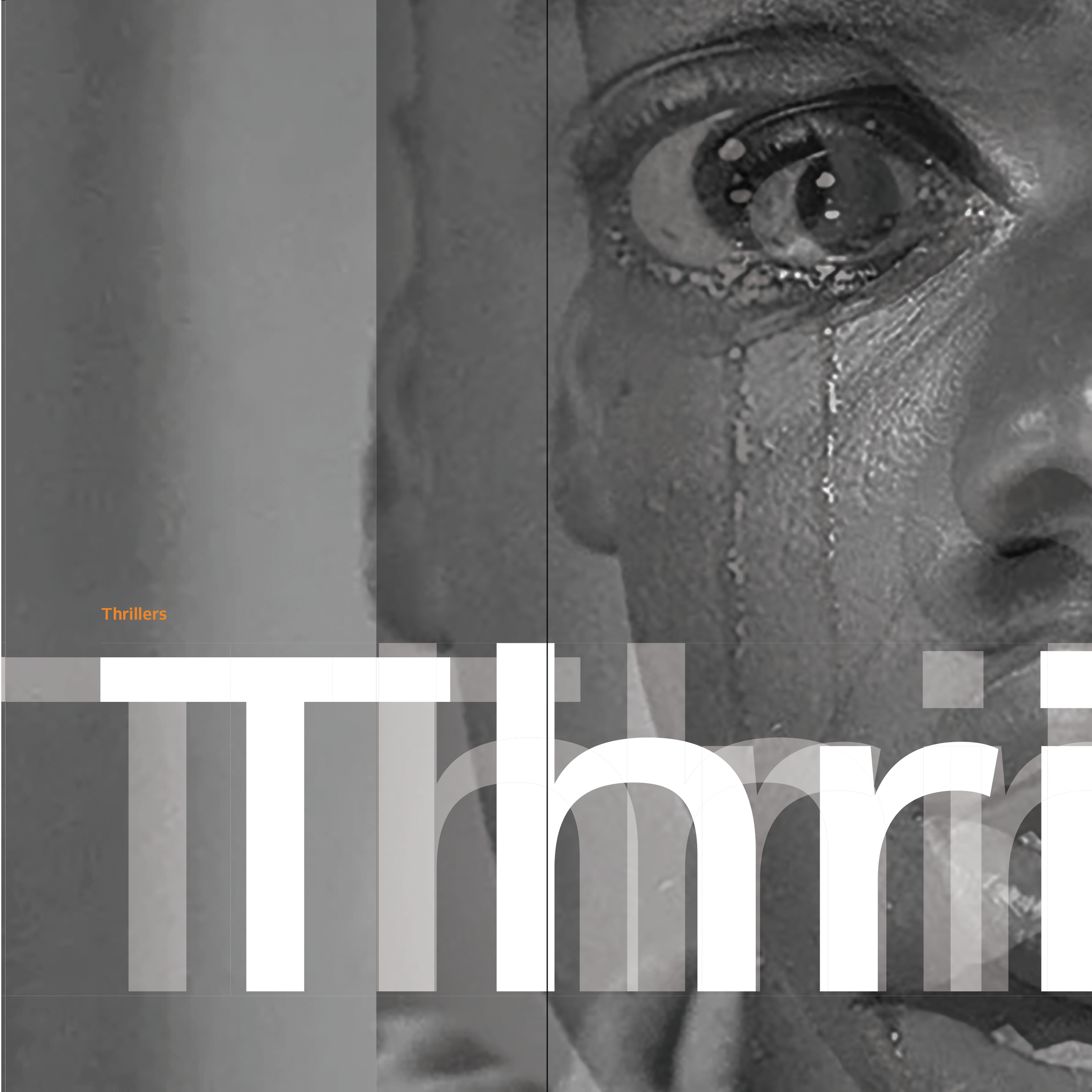
This was the first layout where I was playing with the idea of squares and organizing everything through compartmentalizing.
Image
Image
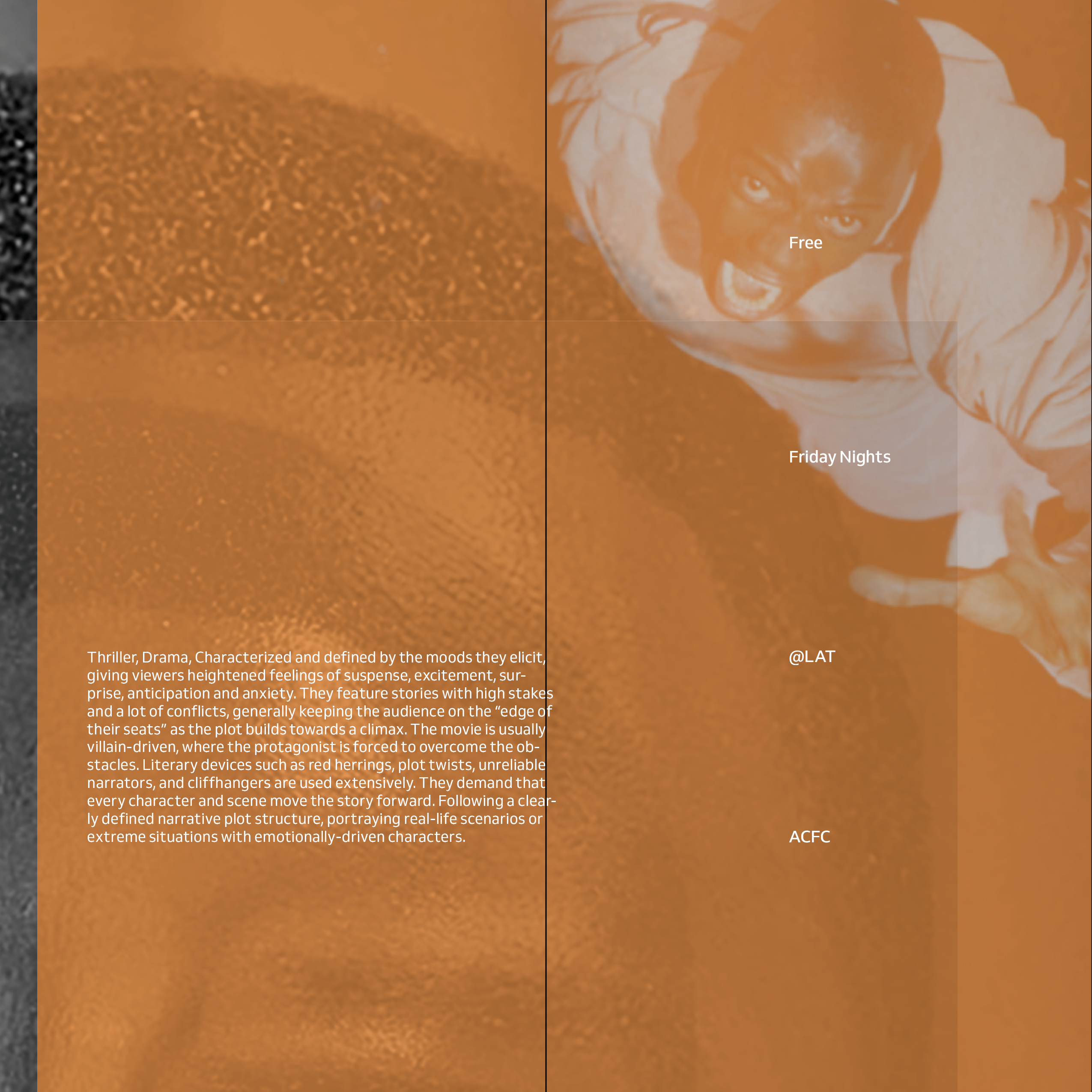
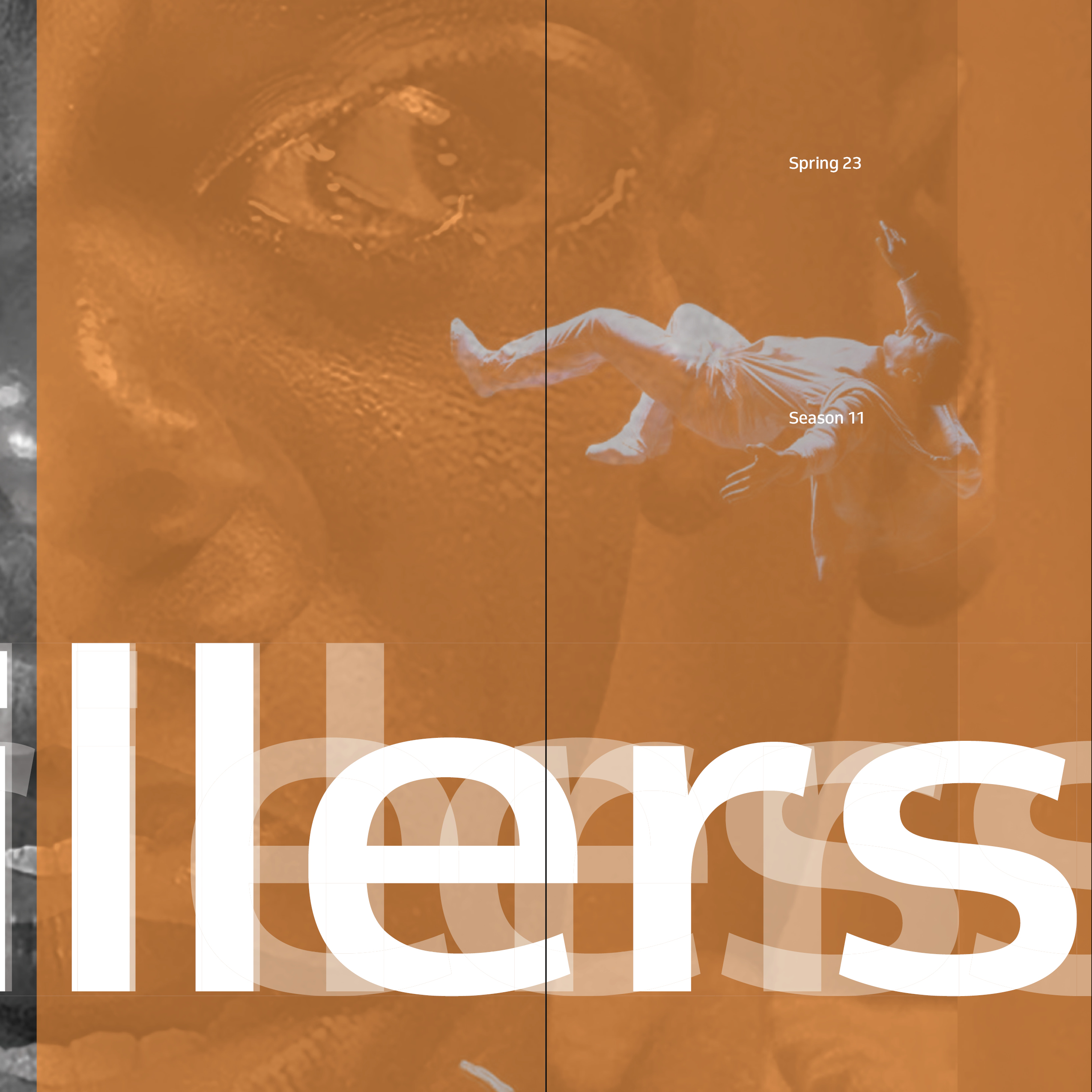
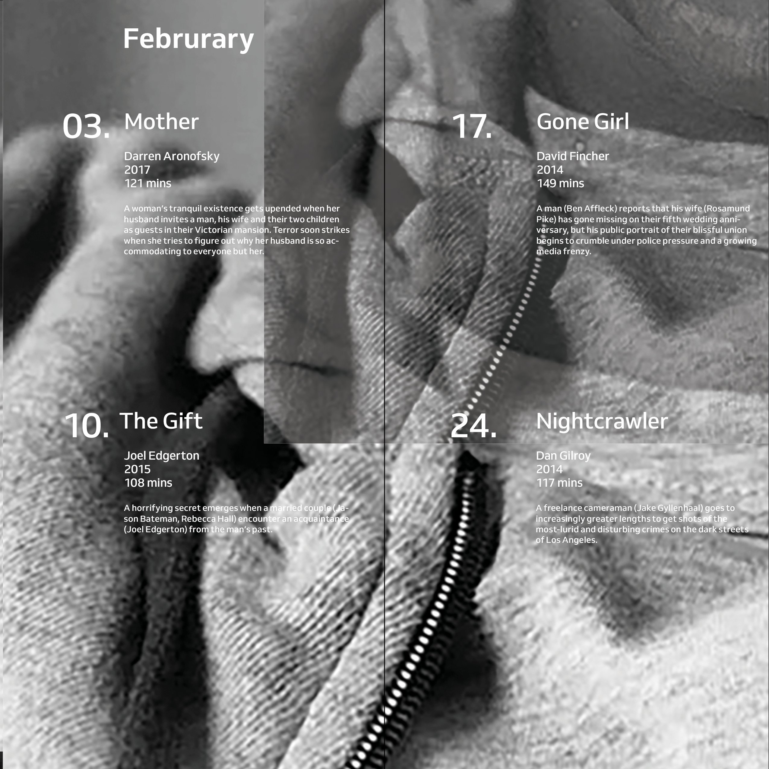
My finalized poster went in another direction I was thinking too much about showing the movie in the poster making it all chaotic, but still working with squares I opted for a simple layout. I used color and composition to represent the feeling of thrillers letting the imagery and color take control.
Image
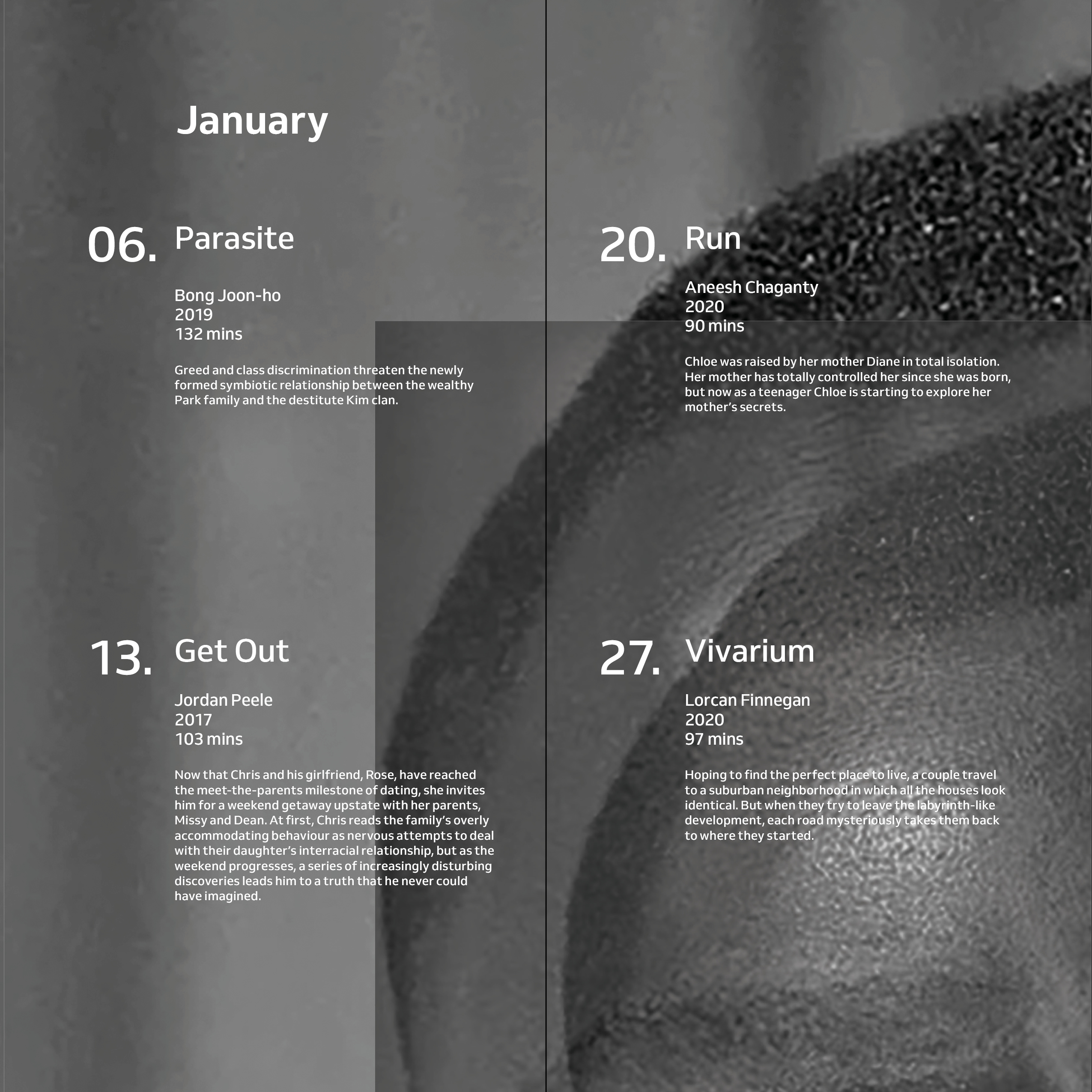
With the poster finished I had it cut into sections where it could also be read as a brochure.
Image
Image
Image
Image
Image