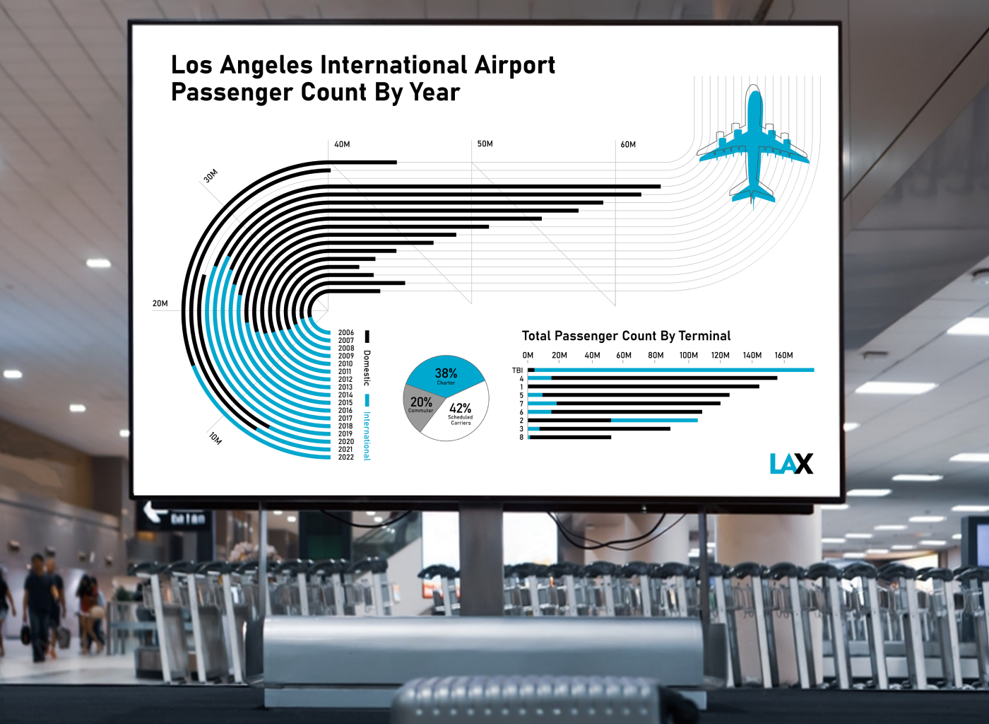
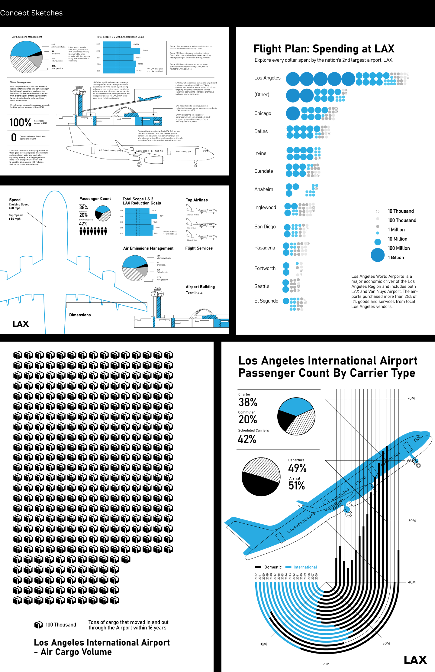
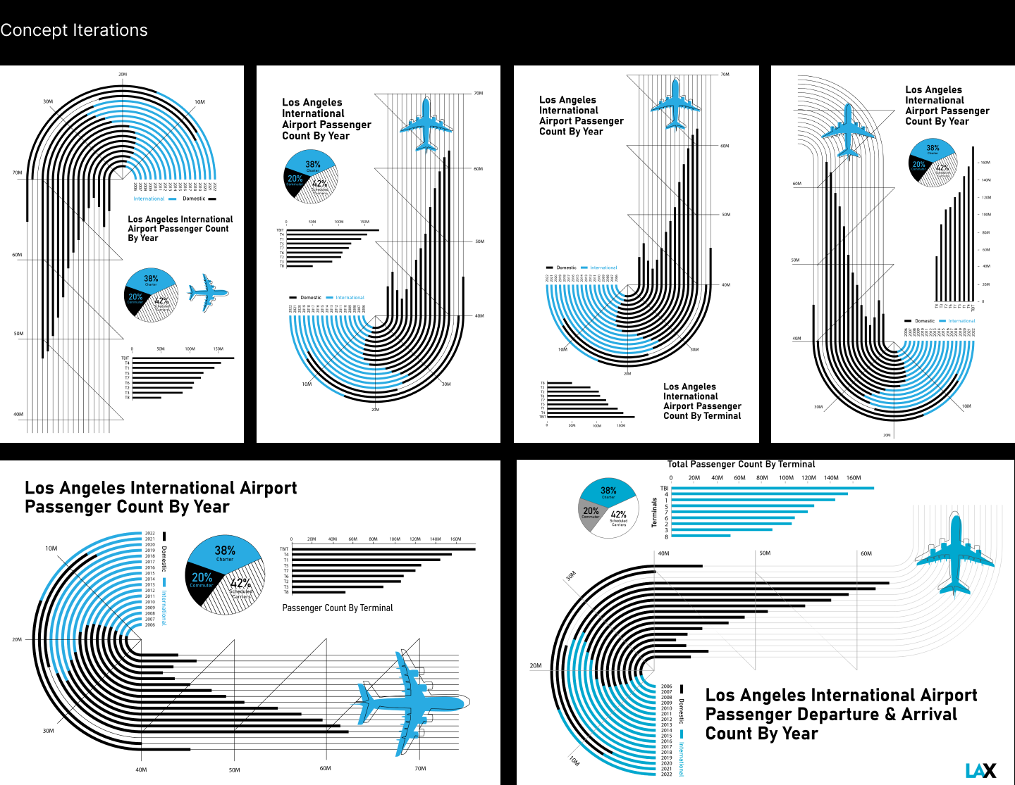
Researched and designed a 24 x 36 inch poster. Focused on the volume and nature of the arrivals and departures that came through the LAX airport within the provided span of 2006-2022. The visualization of the line graph was inspired by the airplane runways. Looking at several iterations, making the poster orientation to landscape was easier to read than the vertical. This infographic poster was made with the available online datasets provided by lacity.org
Learning Outcomes:
I learned that info design doesn't need to consist of graphs and data. Anything that tells you any kind of information is an infographic. In this case, I wanted to visualize a data set with a bunch of numbers in a way that was inspired by the airport runways. Looking at iterations and how the information is readable is an important step in the process.