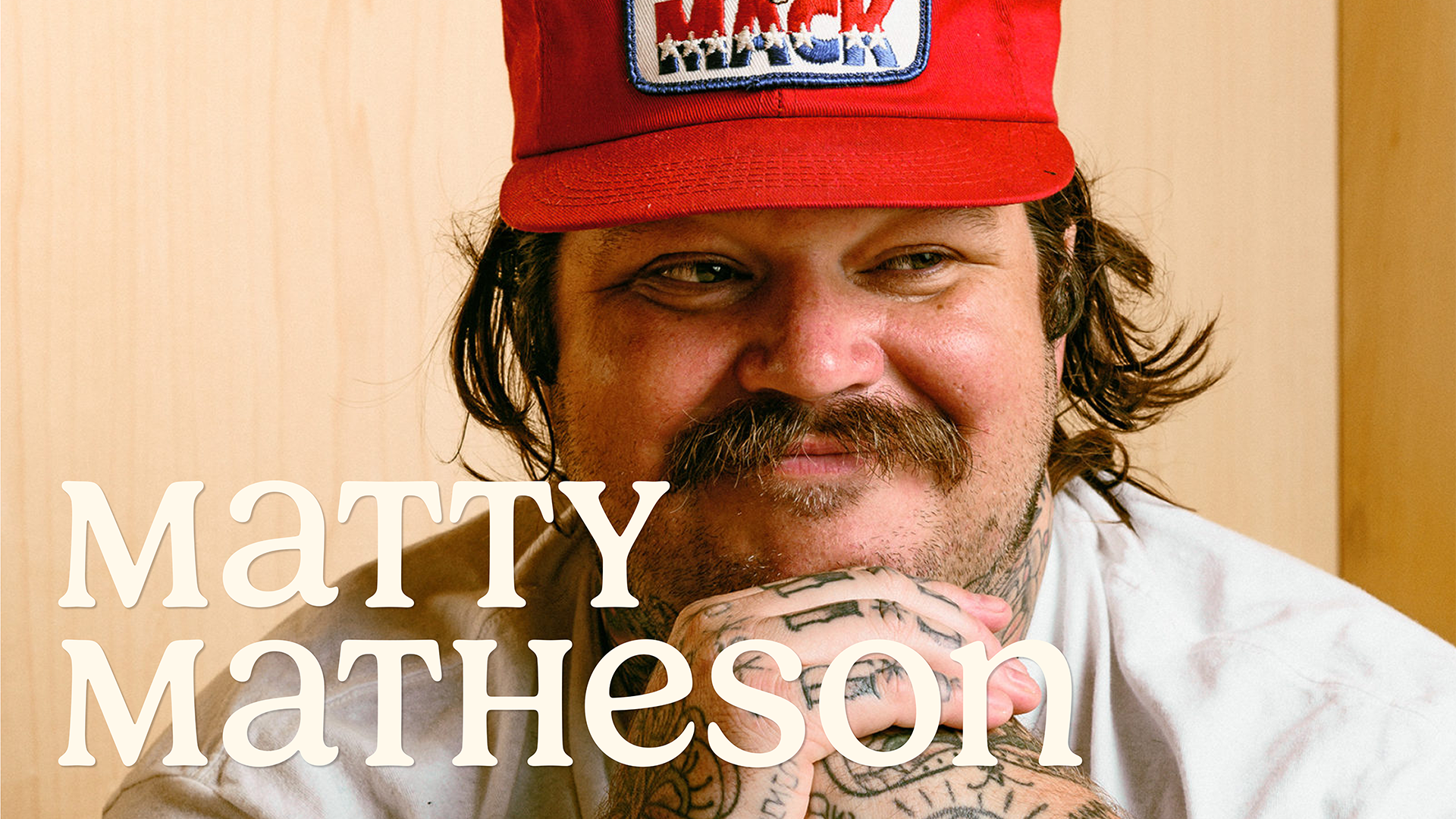
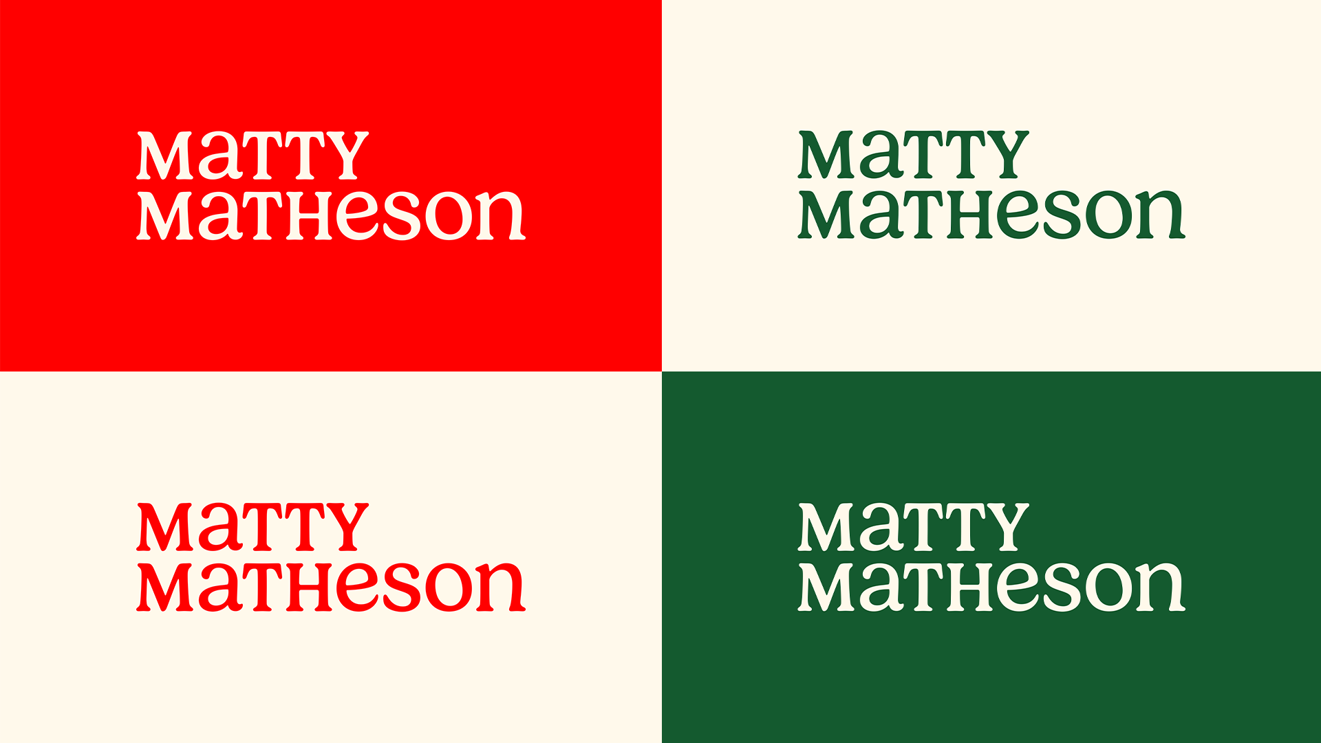
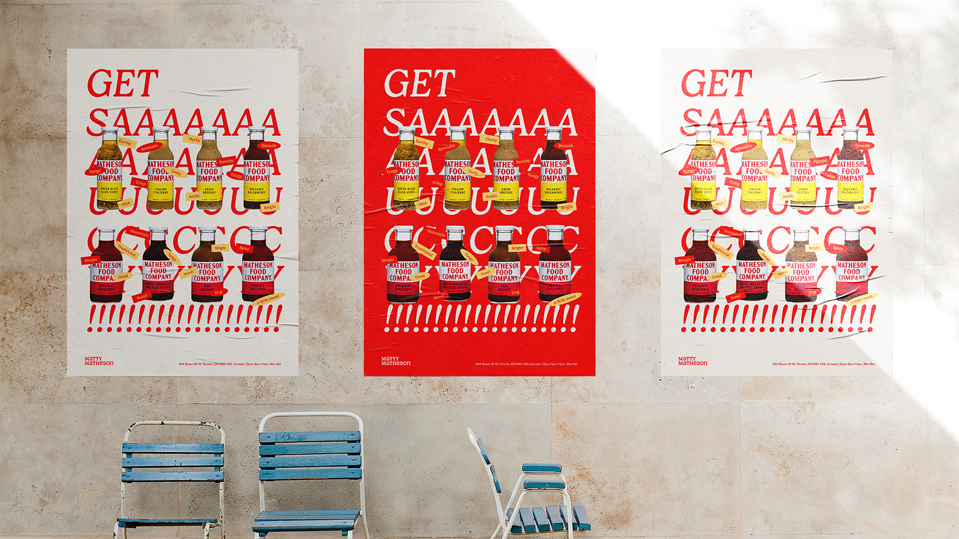
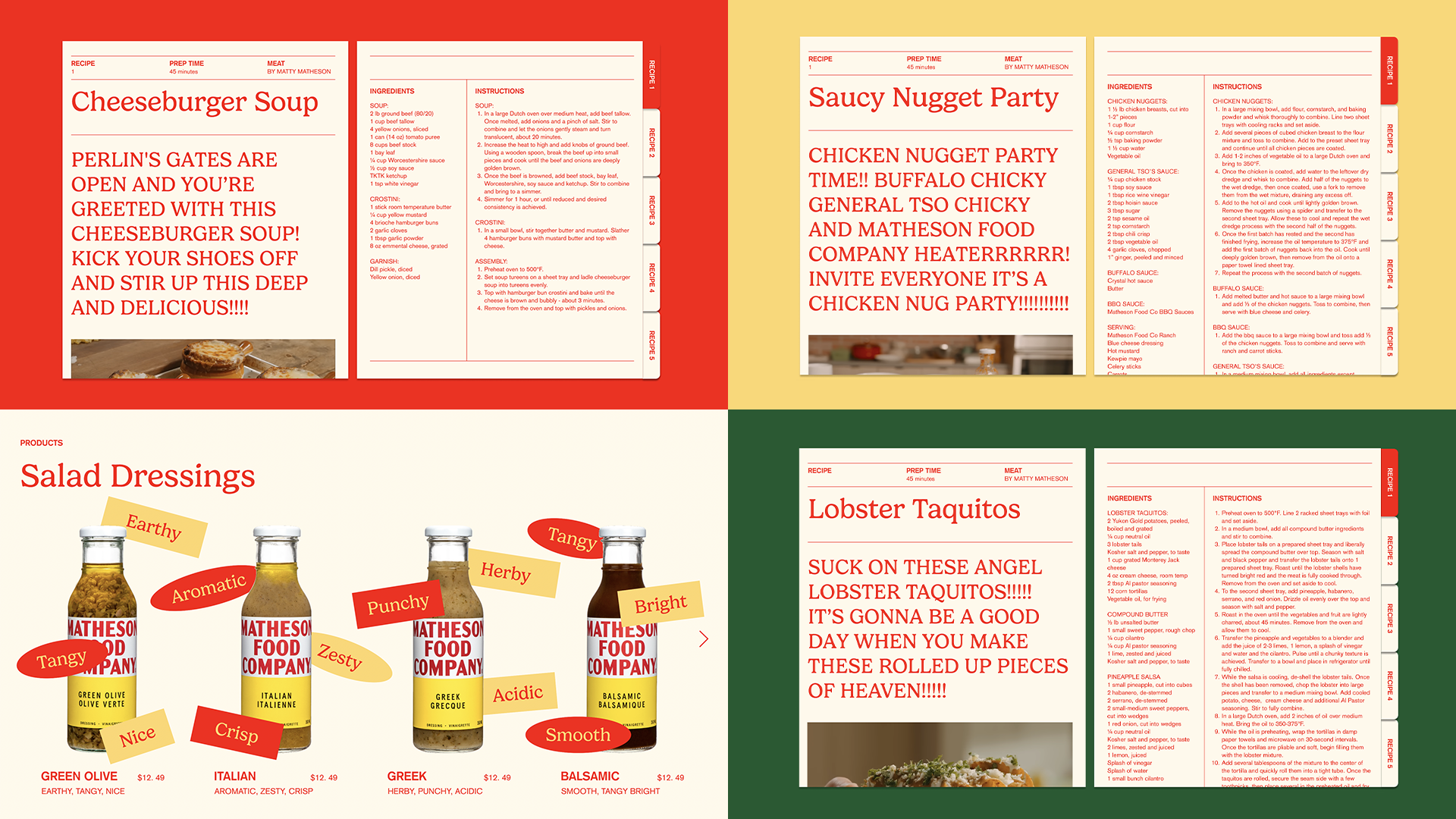
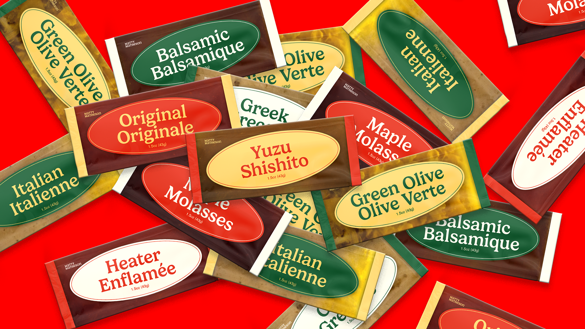
This rebrand for Matty Matheson captures his bold, colorful, and chaotic energy while ensuring consistency across digital and print. Inspired by his larger-than-life personality, the identity system balances playfulness with cohesion, reflecting his dynamic presence in food, media, and merchandise.
Learning Outcomes:
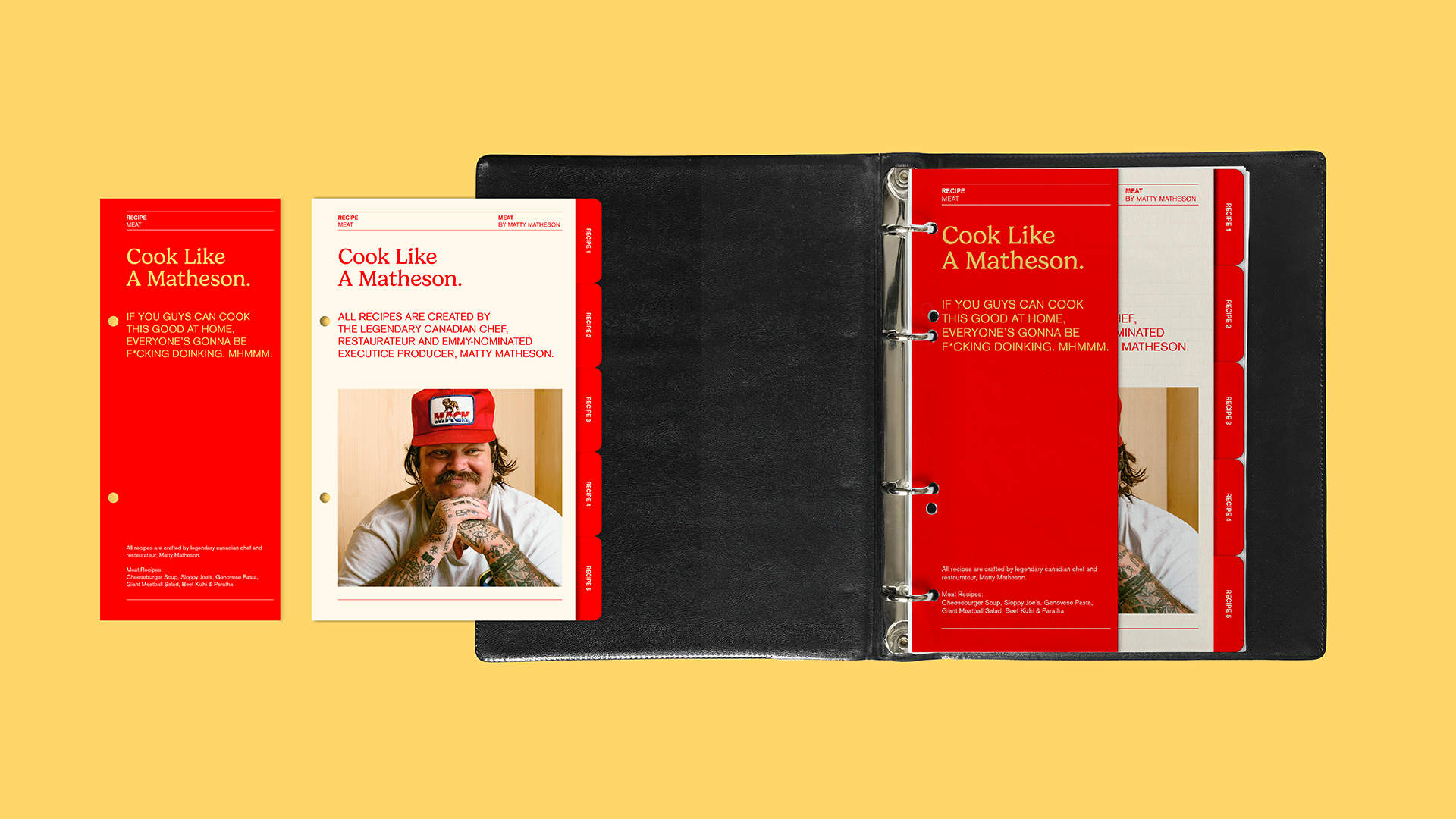
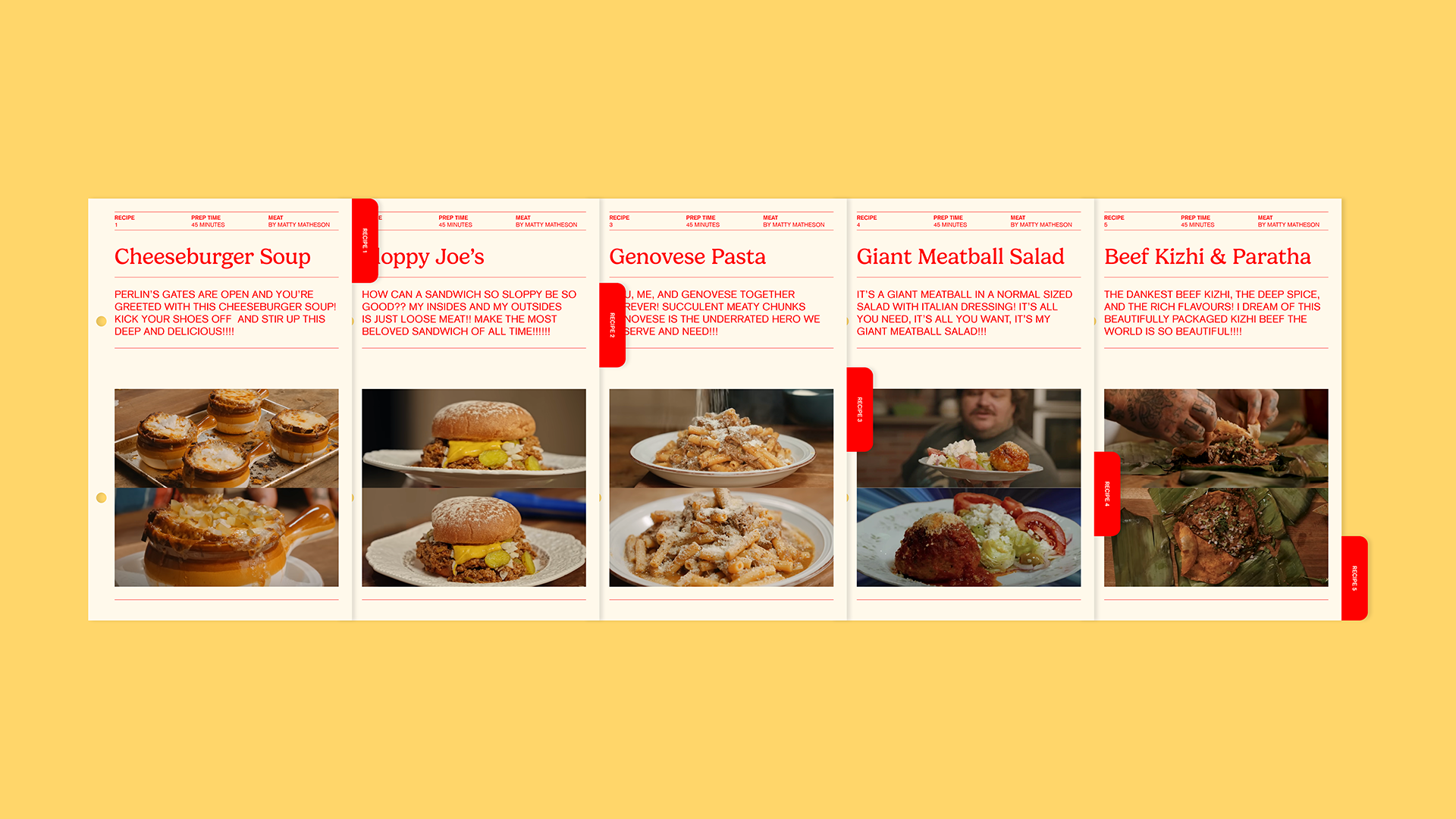
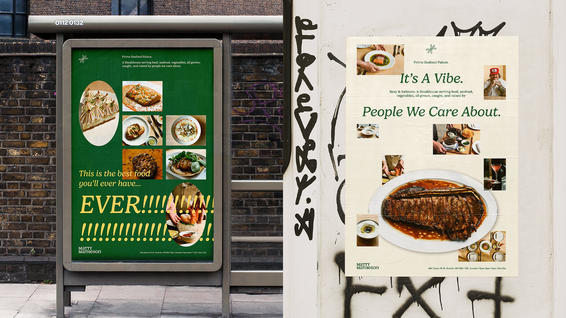
Inspired by Matty Matheson’s personality, the website incorporated bold, overlapping type and imagery. I learned to reference cookbooks as a structural framework for site navigation and content organization. Through strategic use of color, I differentiated playful sections—highlighting Matty’s persona and cooking—from more refined areas for his fine dining restaurant. This project strengthened my ability to break design conventions while maintaining clarity and usability.