Image
Image
We’re rebranding Aurora to utilize a state-of-the-art dynamic design strategy. Like a moving organism, our vehicles are always responding to the world with sensors using technology like lidar and radar. To visualize this kinetic aspect of our technology to our audience, we implemented a dynamic strategy.
Image
The new strategy makes for a more functional experience with elements that are intuitive, accessible, and digestible. Aurora’s rebrand helps to engage our audience with our systems by visualizing our technology in a way that is more humanistic, emotive, and relatable. Our new identity better communicates our forward-thinking commitment to the future of mobility.
Image
Image
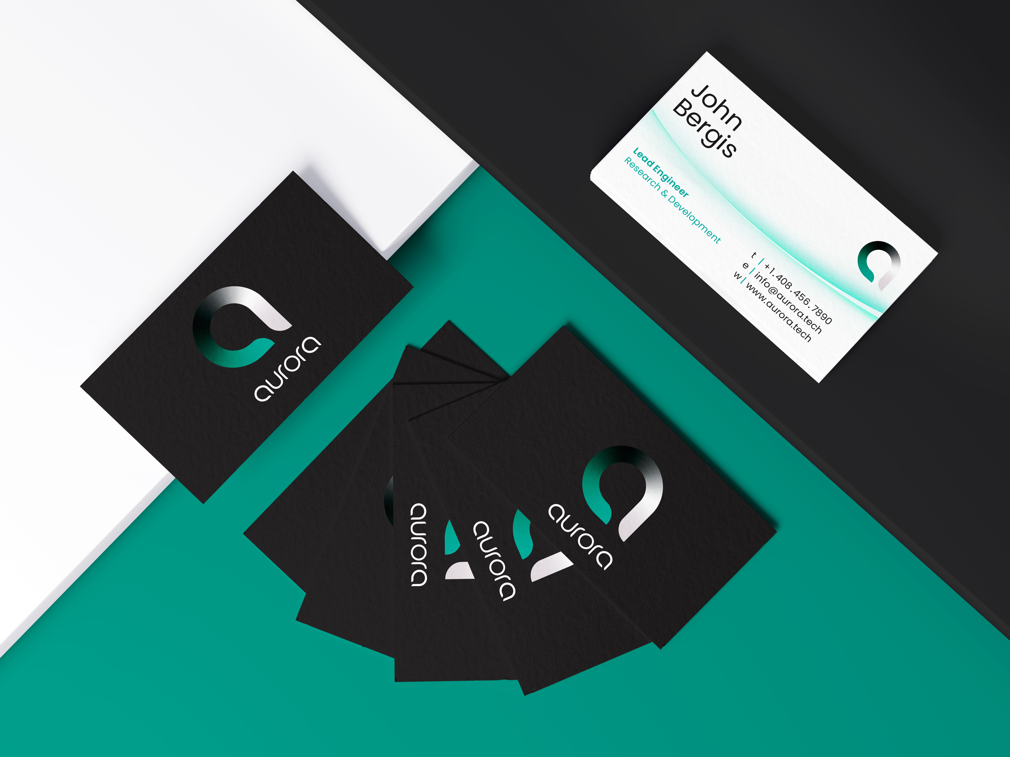
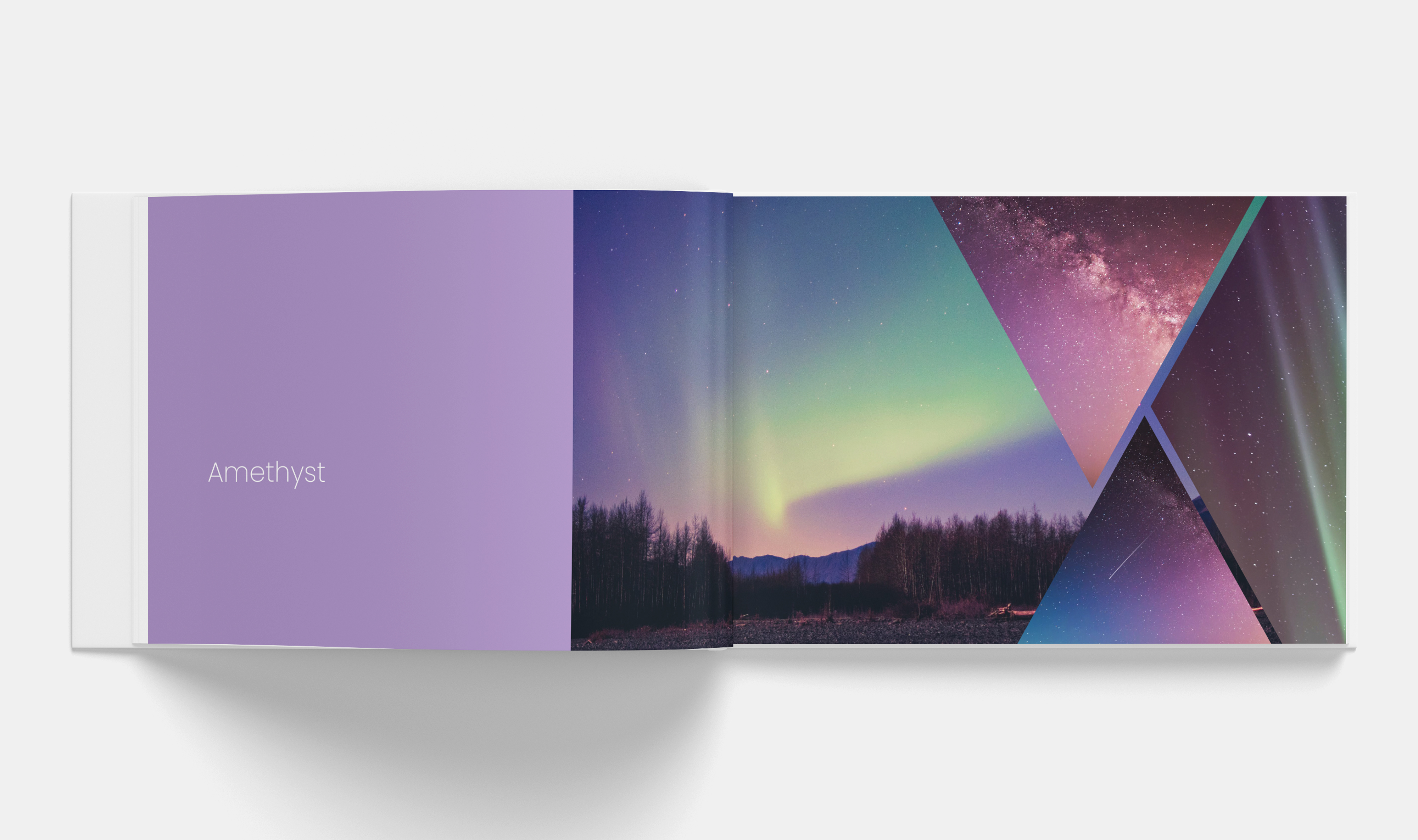
Because Aurora’s vision statement references diversity, a dynamic visual strategy with moving tourmaline and amethyst colors was used for our new logotype. The hues colors represent the Aurora Borealis, while the changing gradient helps audiences to see the diversity in our product with our modular technology. The dynamic quality in our logotype and visual graphics showcases a humanist perspective, touching on our diversity, modularity, and relatability.
Image
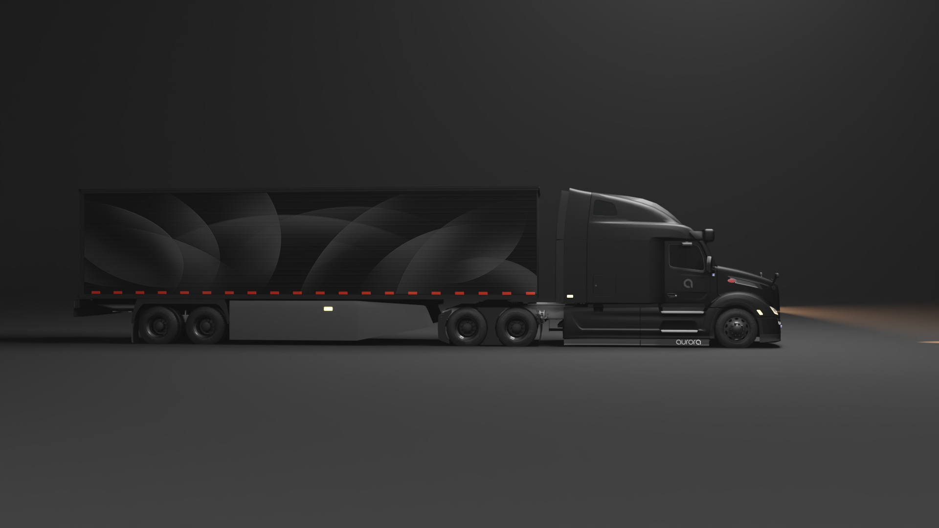
An important rebranding initiative was to make Aurora’s vehicles more recognizable from the road. The exteriors of our vehicles were updated to a matte black color and showcased our logotype with a glossy reflectance to add contrast.
Image
Image
Image
View website online at https://aurorakylejackson.webflow.io
Image
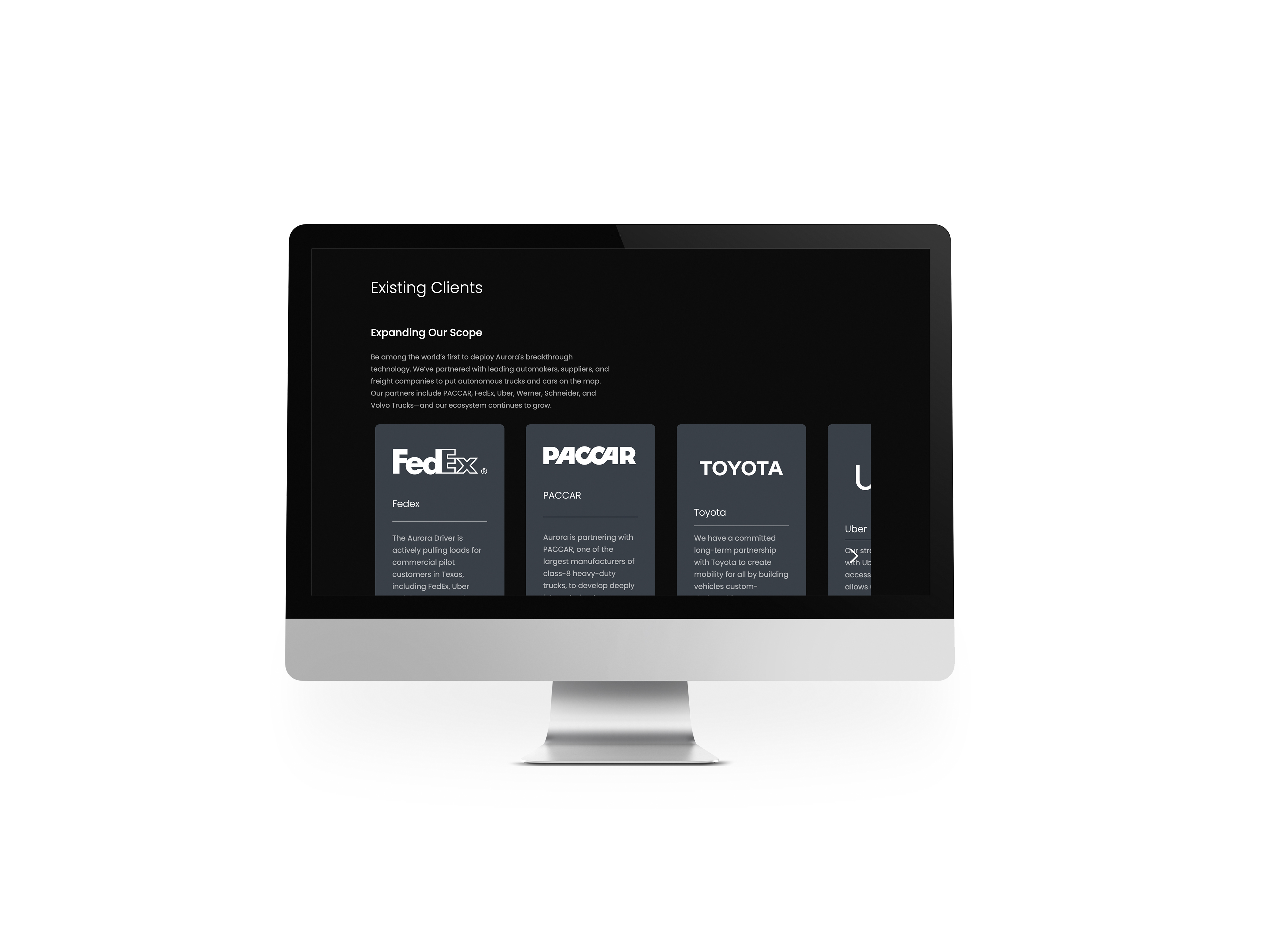
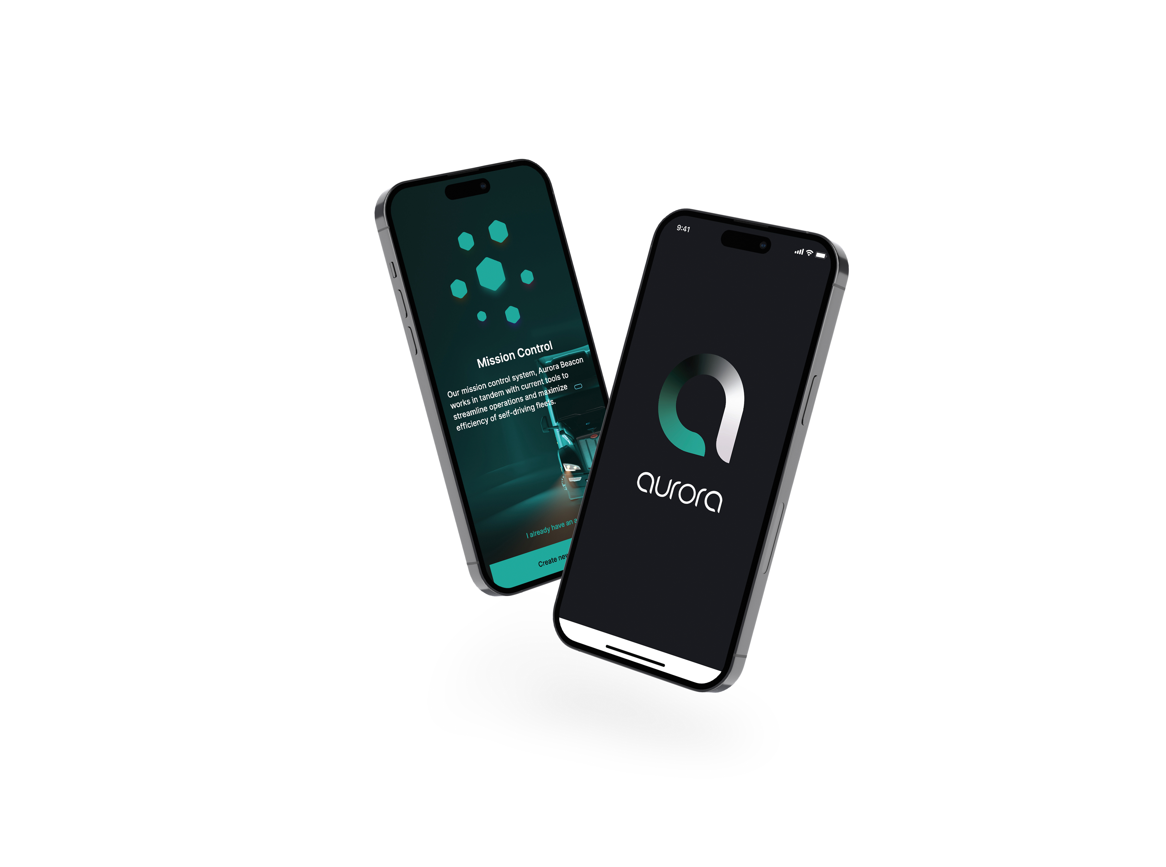
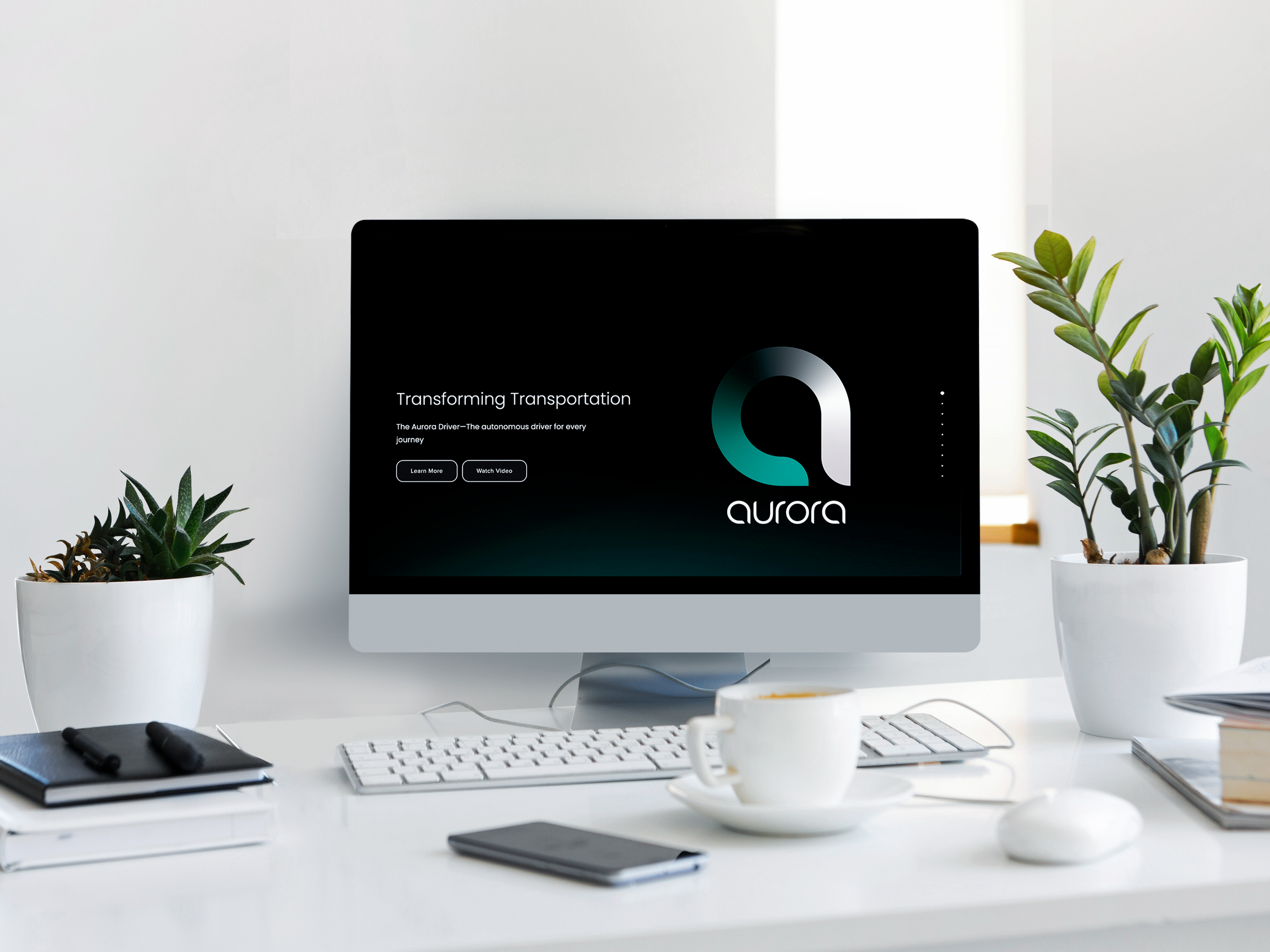
Aurora’s website details our commitment to the advancement of autonomous technology. With a vertically scrolling modern interface, the modular black and white format creates an intuitive experience for every customer.
Image
Image
Image
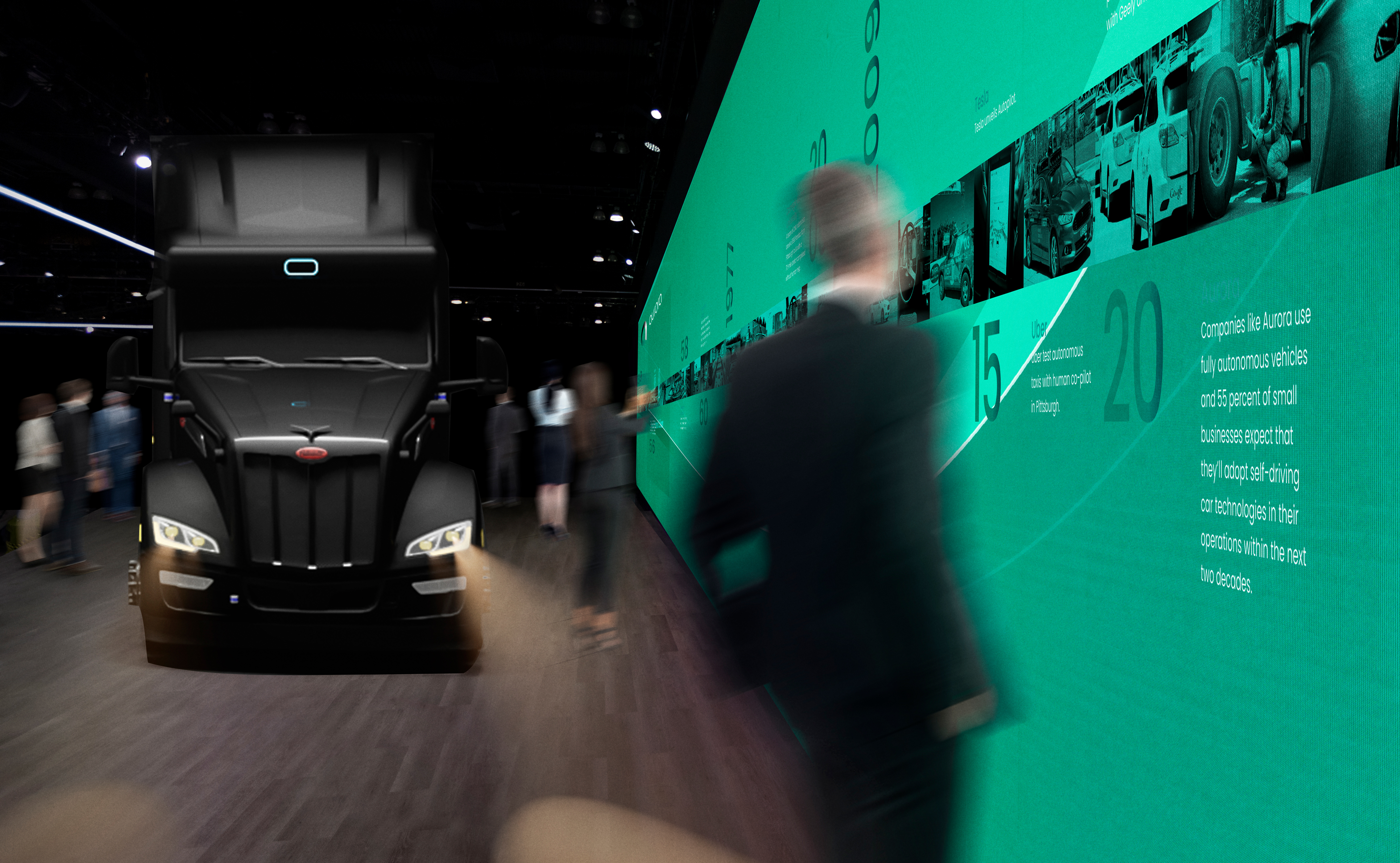
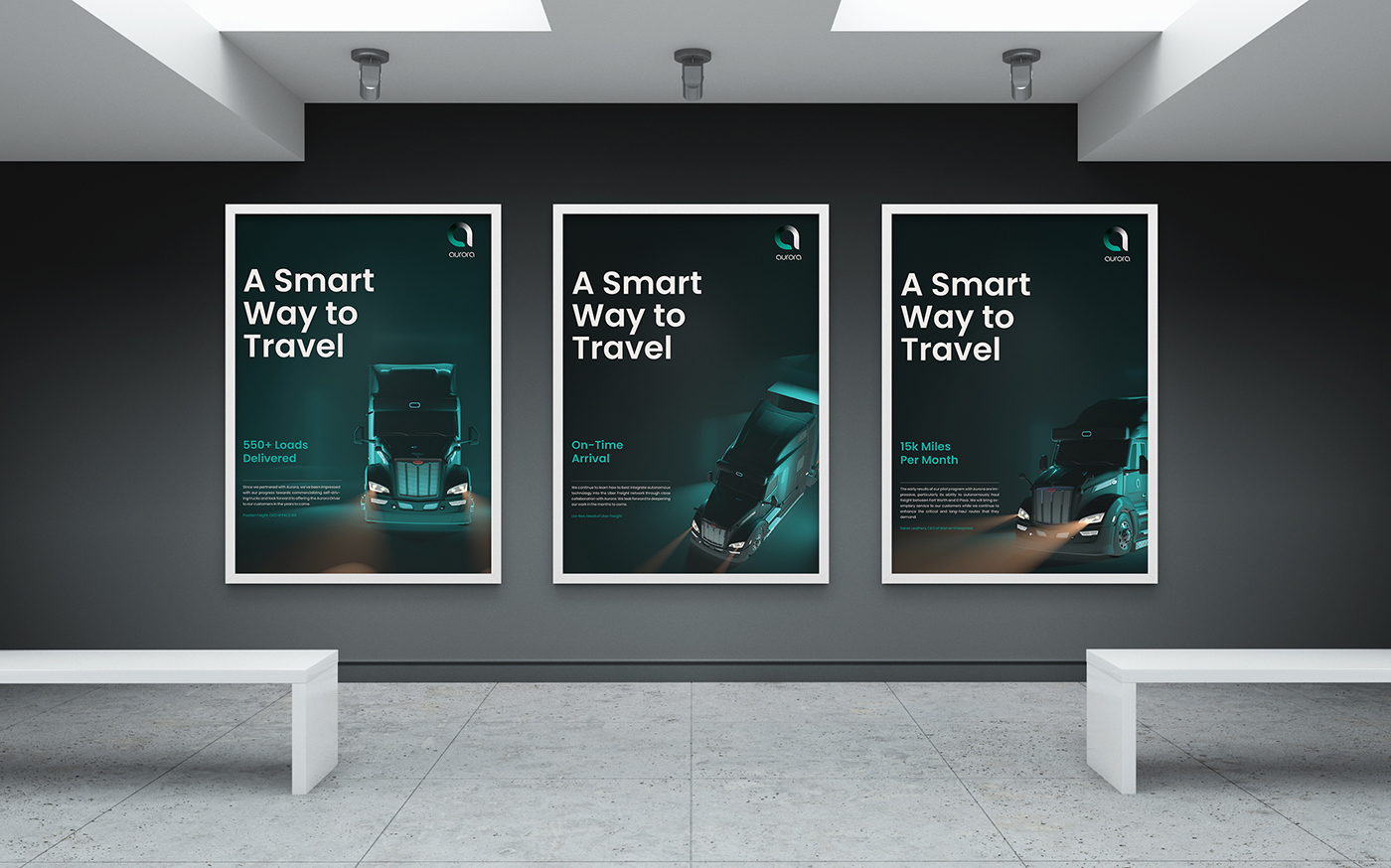
Moving fluid particles show our audience how the sensors on Aurora’s vehicle see objects around them. The visual strategy showcases our efficient, forward-thinking, and technological brand attributes. It captivates our audiences with an emotional impact using dynamic sweeping forms and is representative of the technology in Aurora’s vehicles like Lidar and Radar.
Image
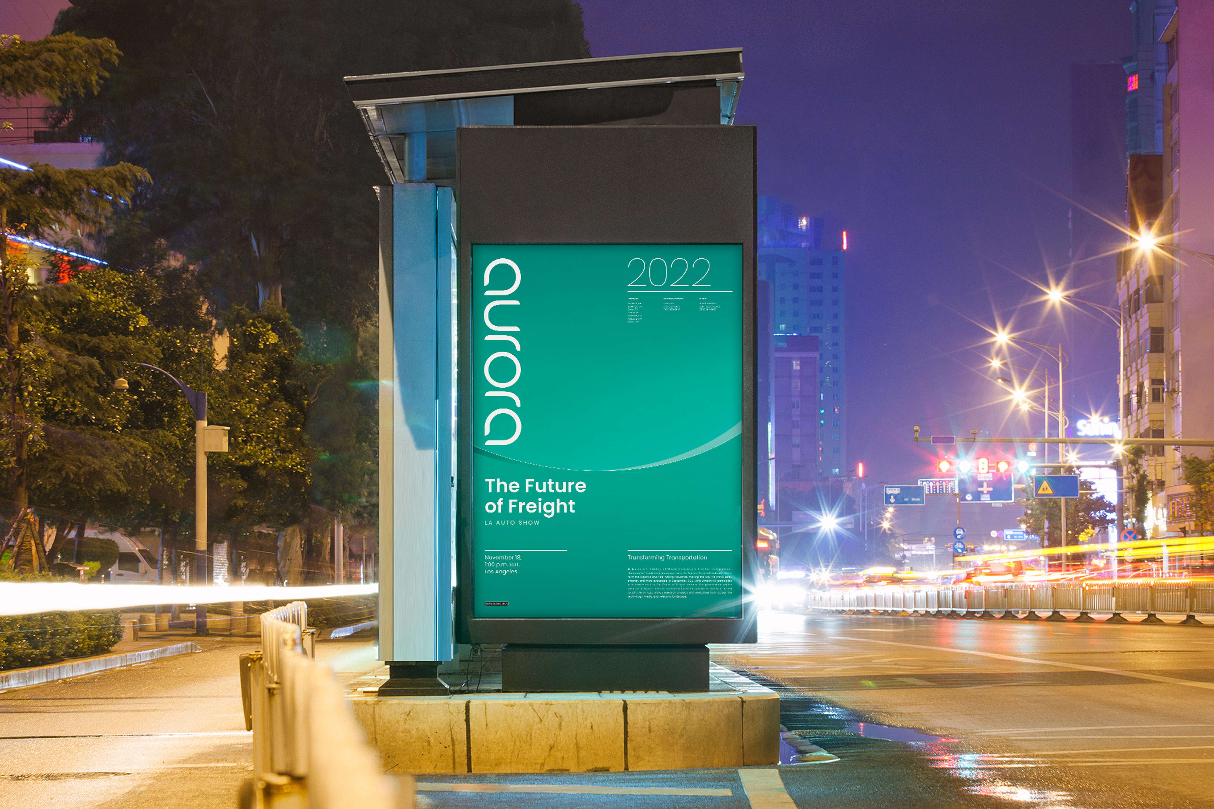
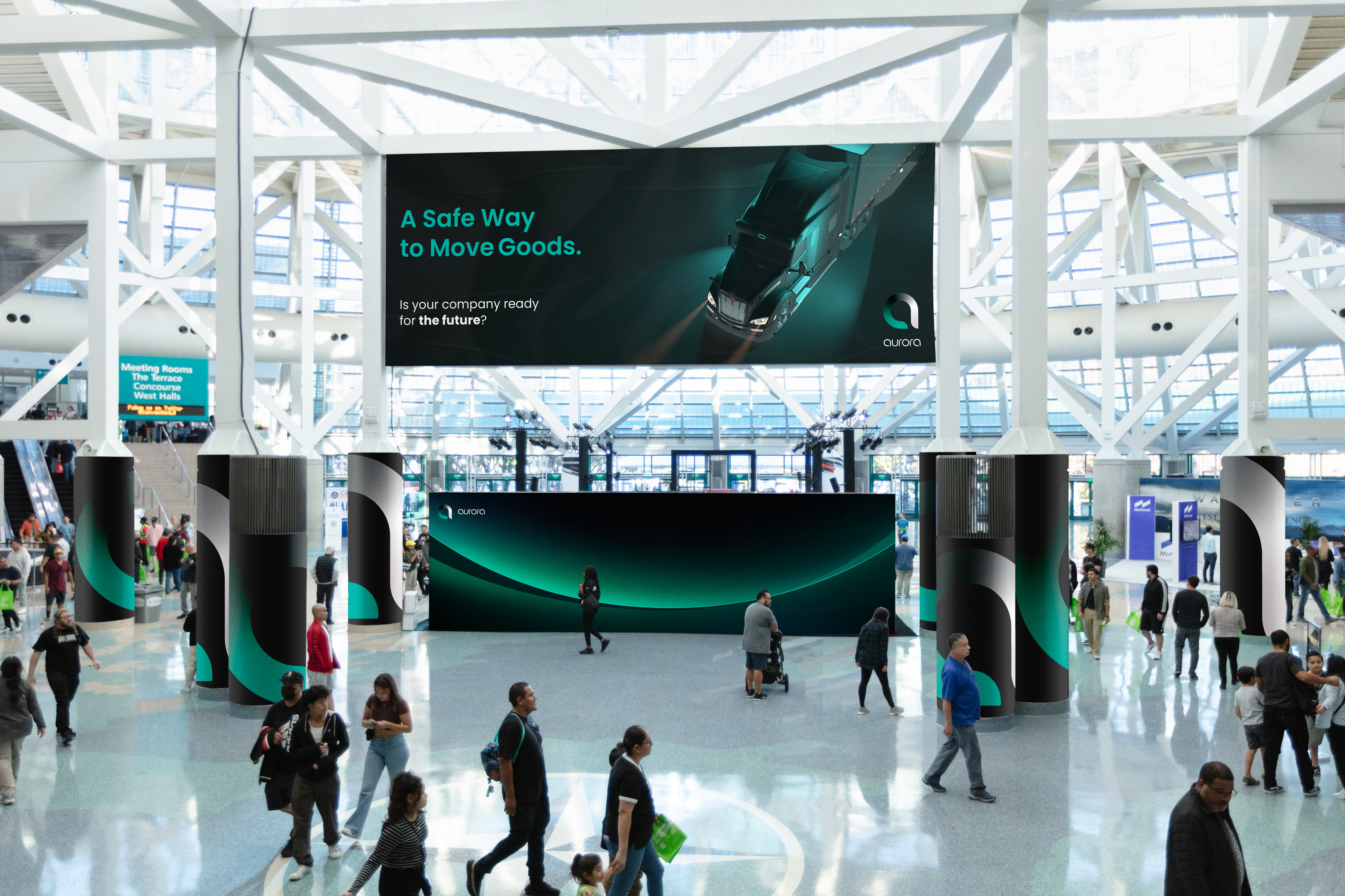
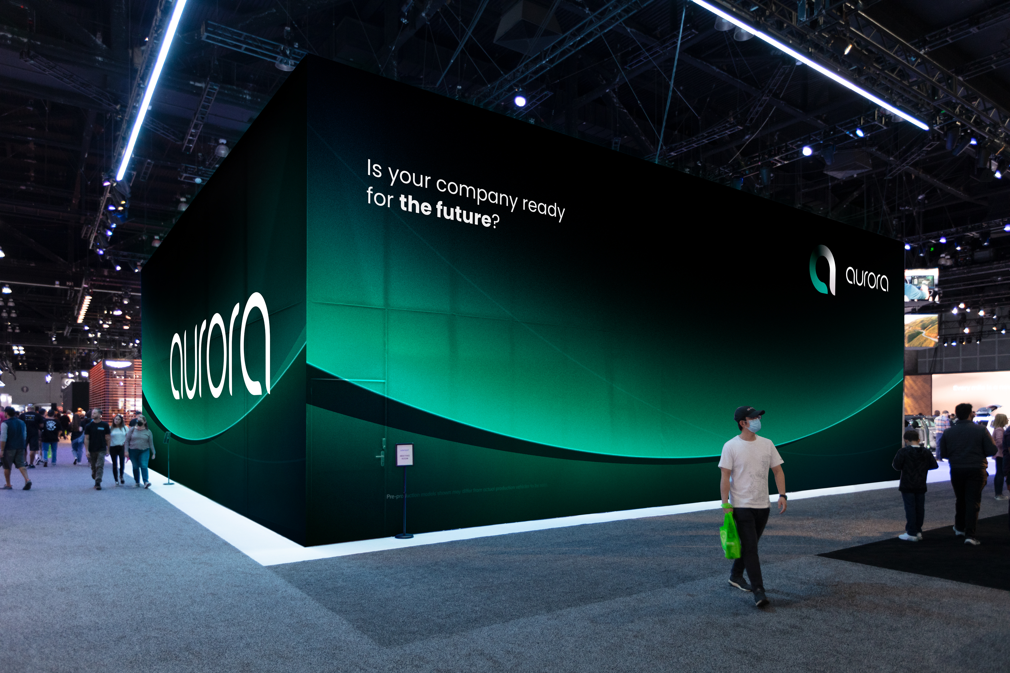
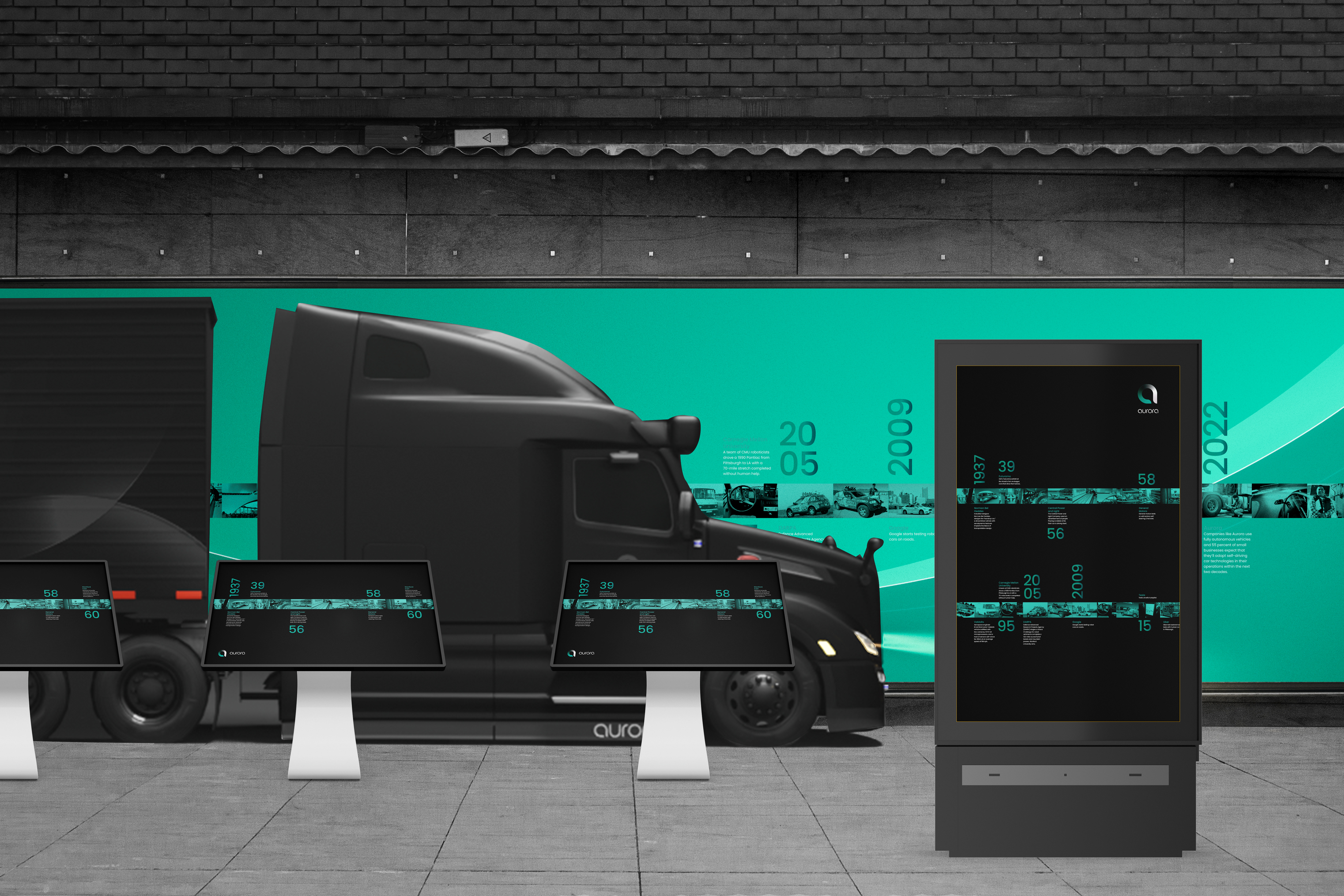
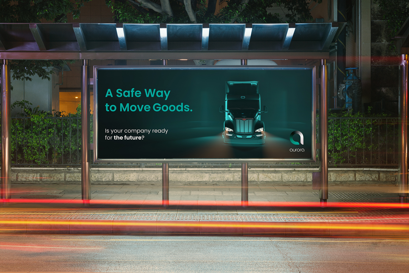
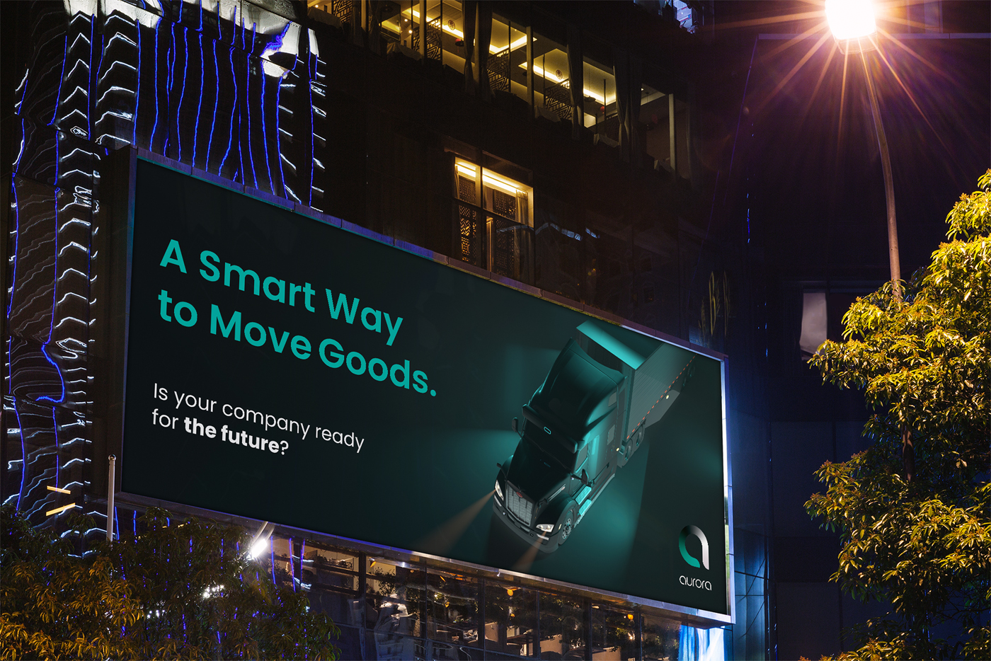
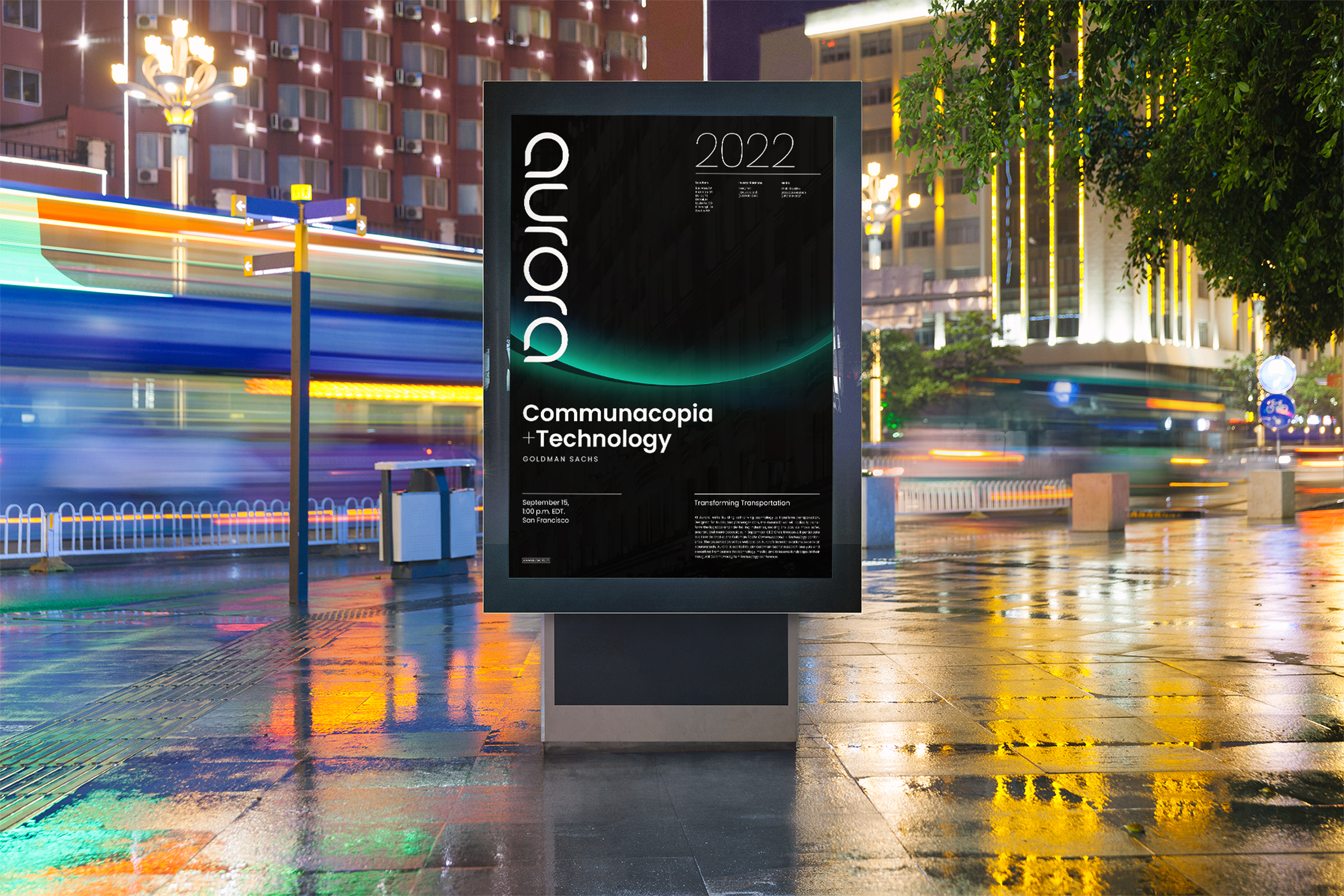
Our out-of-home solutions include our fluid particles visual behavior and information about promotional events, products, and technology.
Image
Image
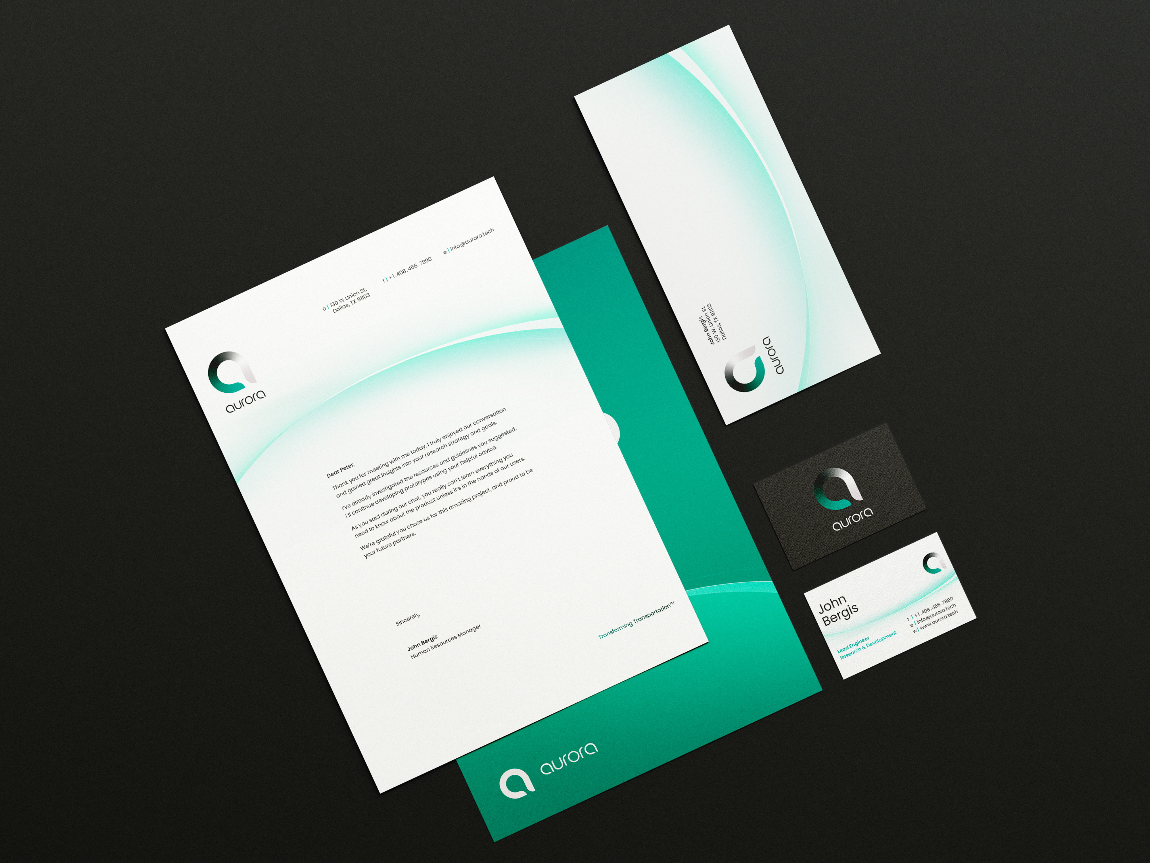
Welcome to the club. In person or online, every client we meet and worker we hire is outfitted with a custom stationery system and welcome kit.
Image
Image
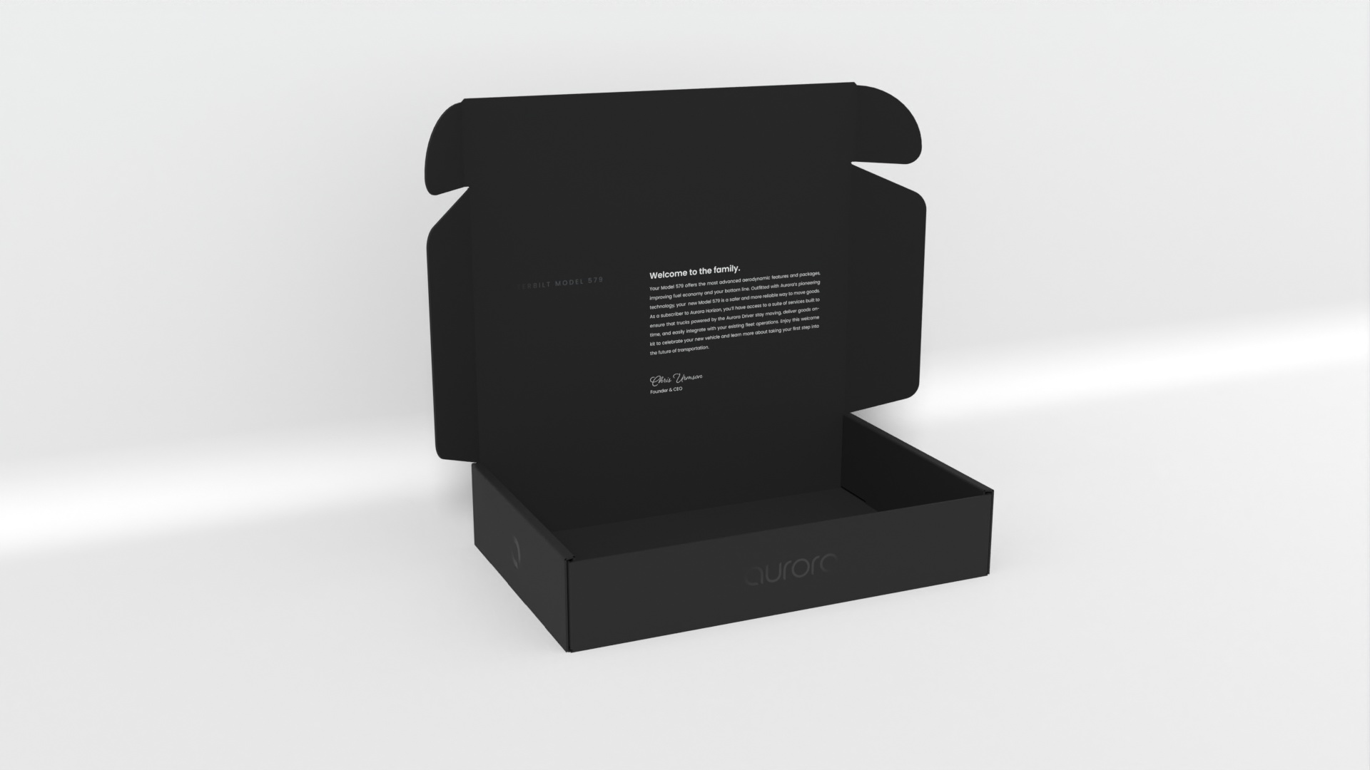
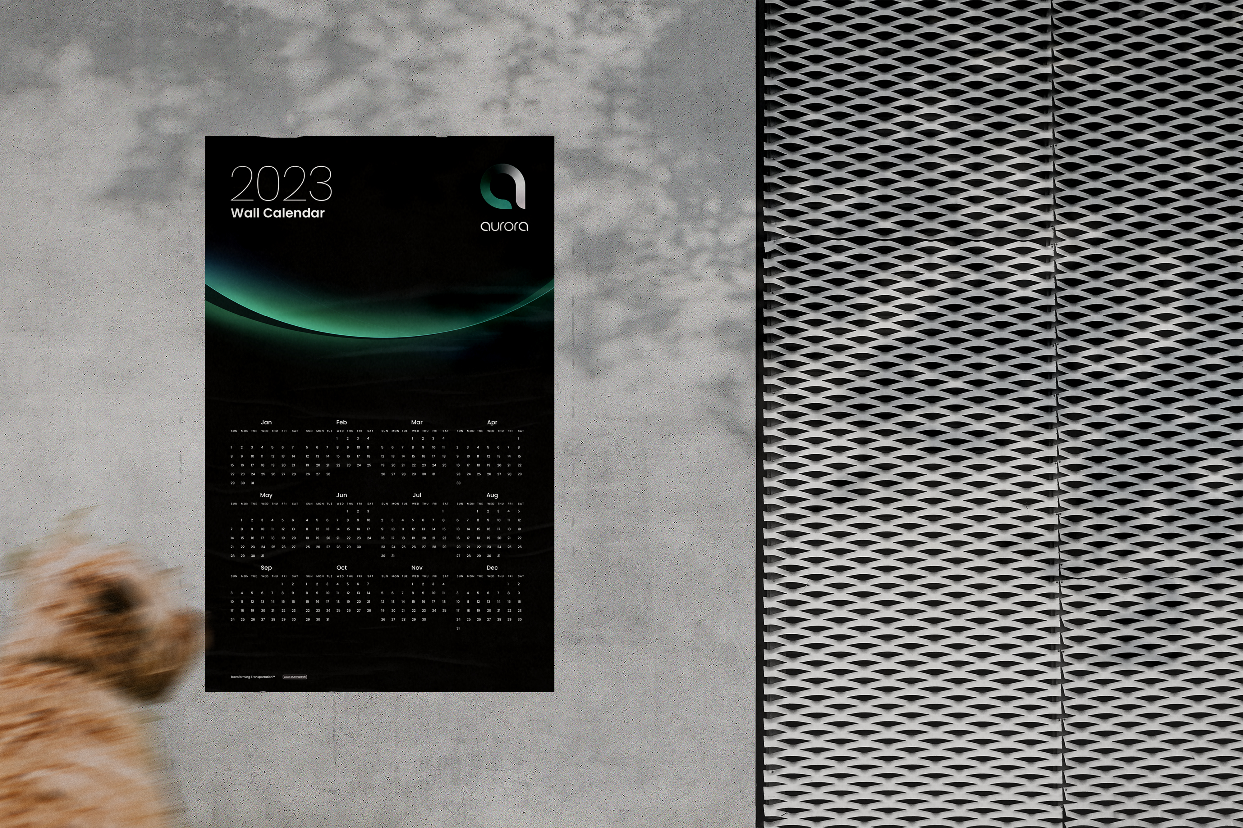
Each new client is given our complimentary welcome kit to celebrate joining the Aurora family. Aurora welcome kits include a yearly calendar, informational guide on the product of their choosing, and model Peterbilt paperweight.
Image
Image
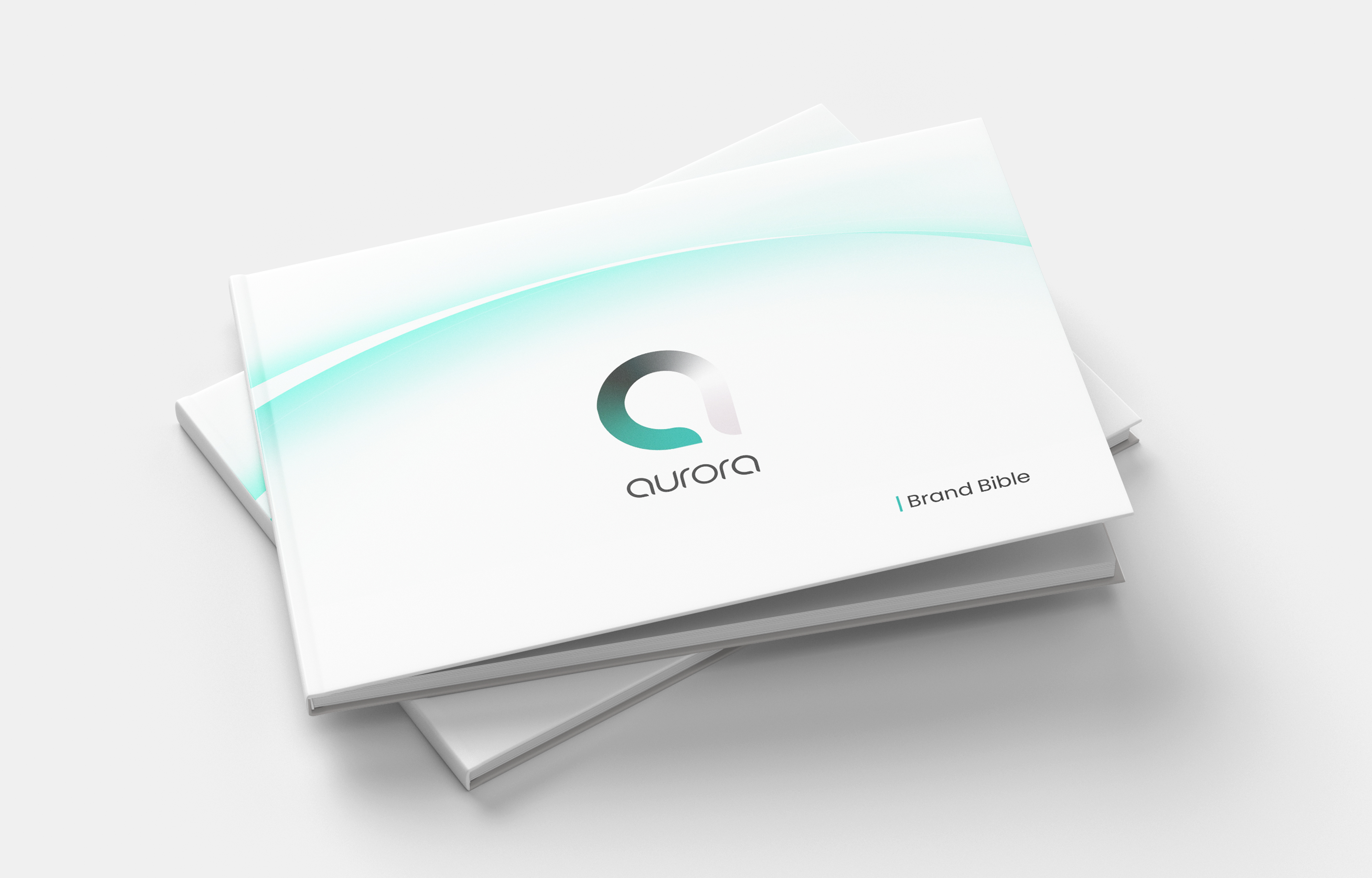
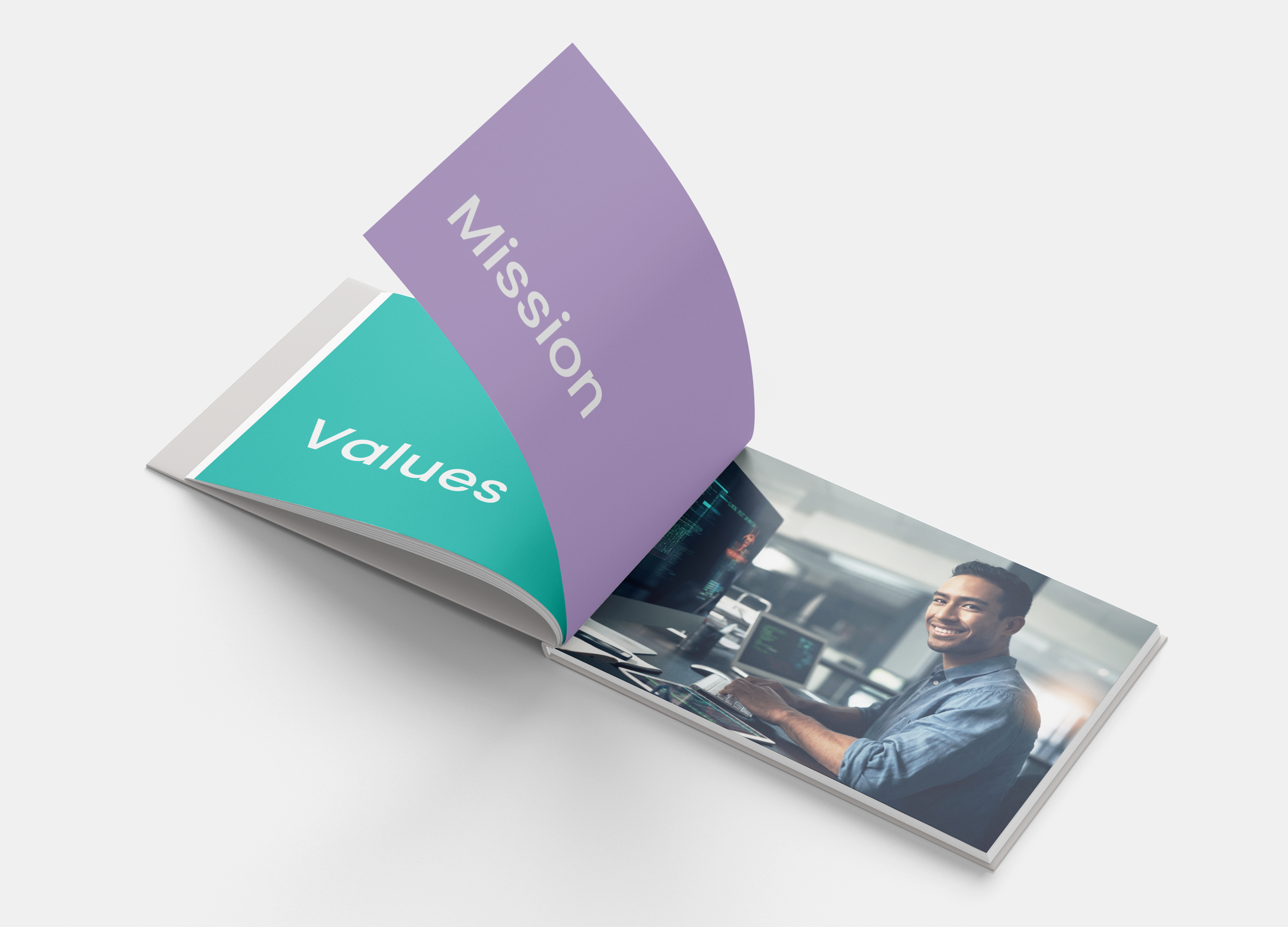
Each member of our creative team is gifted our brand bible. The brand bible is an inspirational booklet designed to create a cohesive vision throughout all of Aurora’s design solutions.
Image
Image