Image
Image
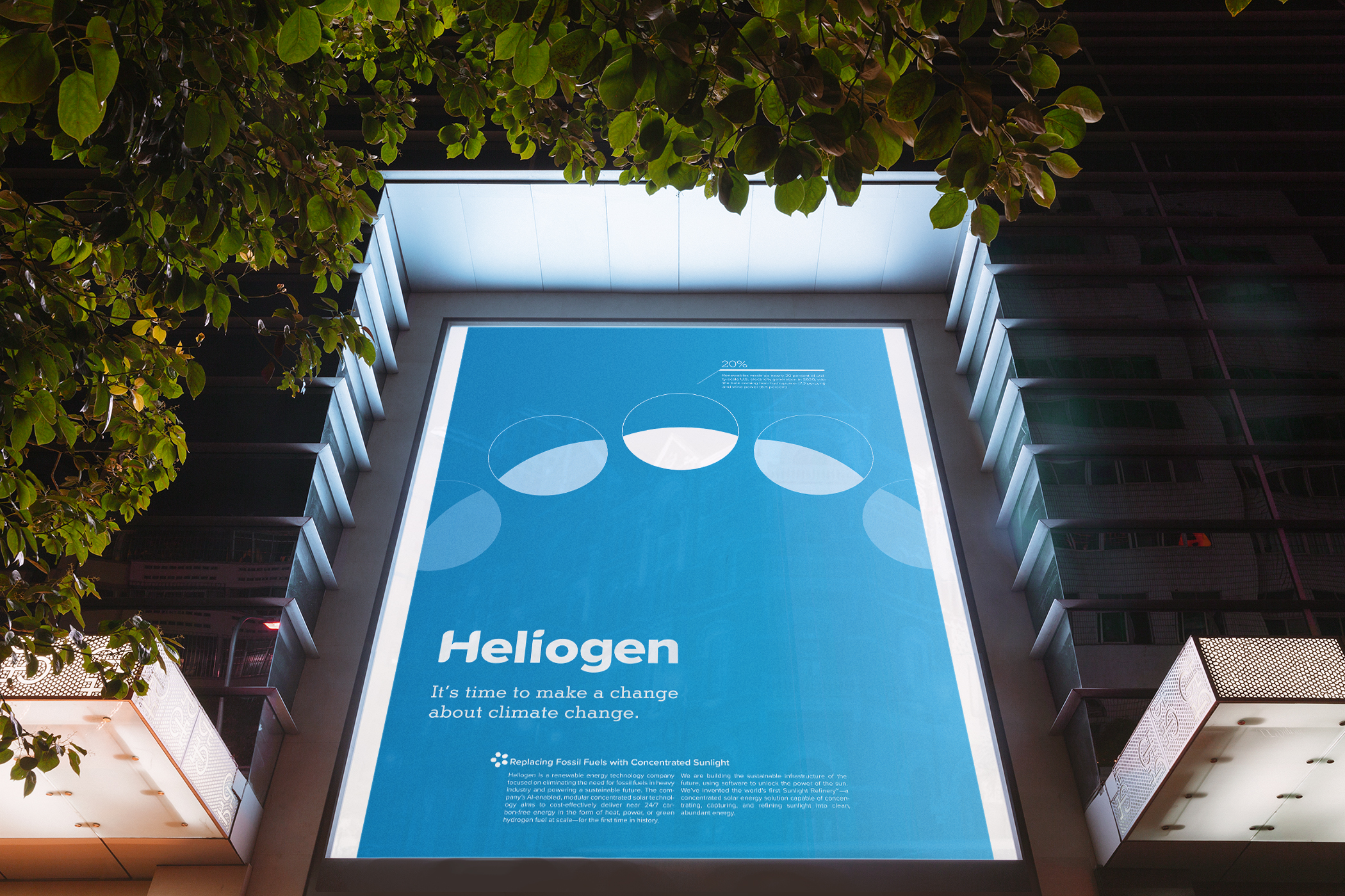
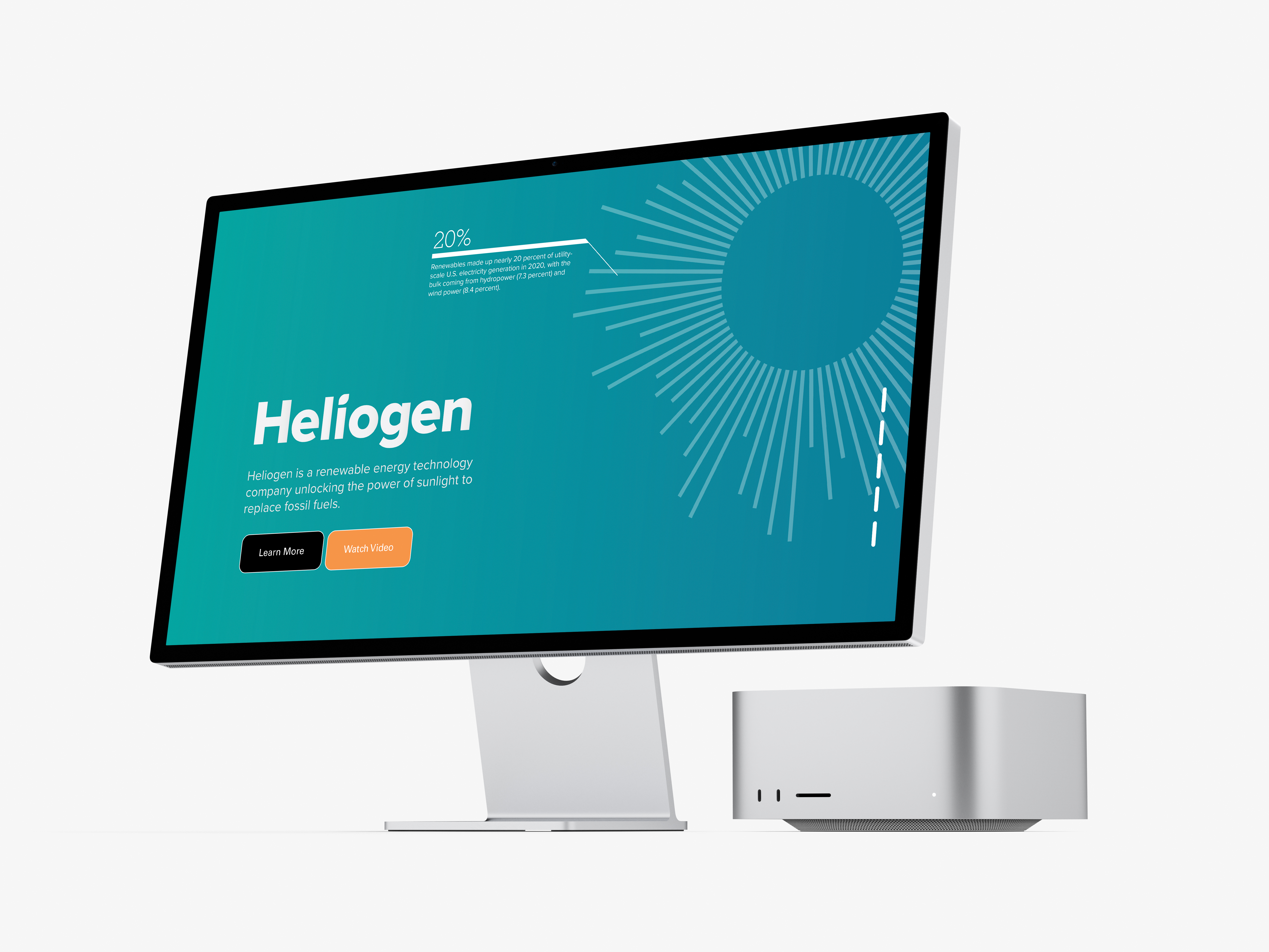
The design of the graphic elements in their advertising touchpoints originally featured a variety of distracting ornamentation which took away from their technological integrity. Instead, the concept of “expansivity” was translated into a visual strategy of repeated forms. In physics, expansivity is defined as “the amount a material expands or contracts per unit.” The expansivity concept works to illustrate sustainability from sunlight, a core feature of Heliogen’s technology. For each graphic, one simple element is repeated to show an expanding progression.
Image
Image
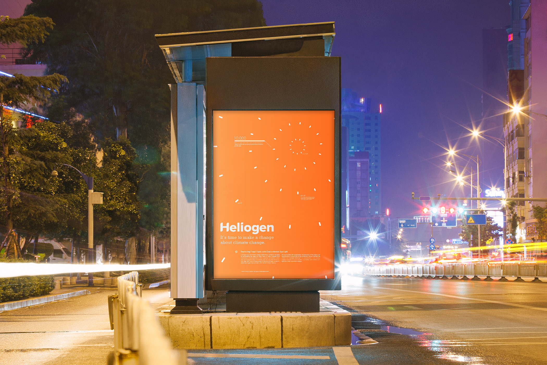
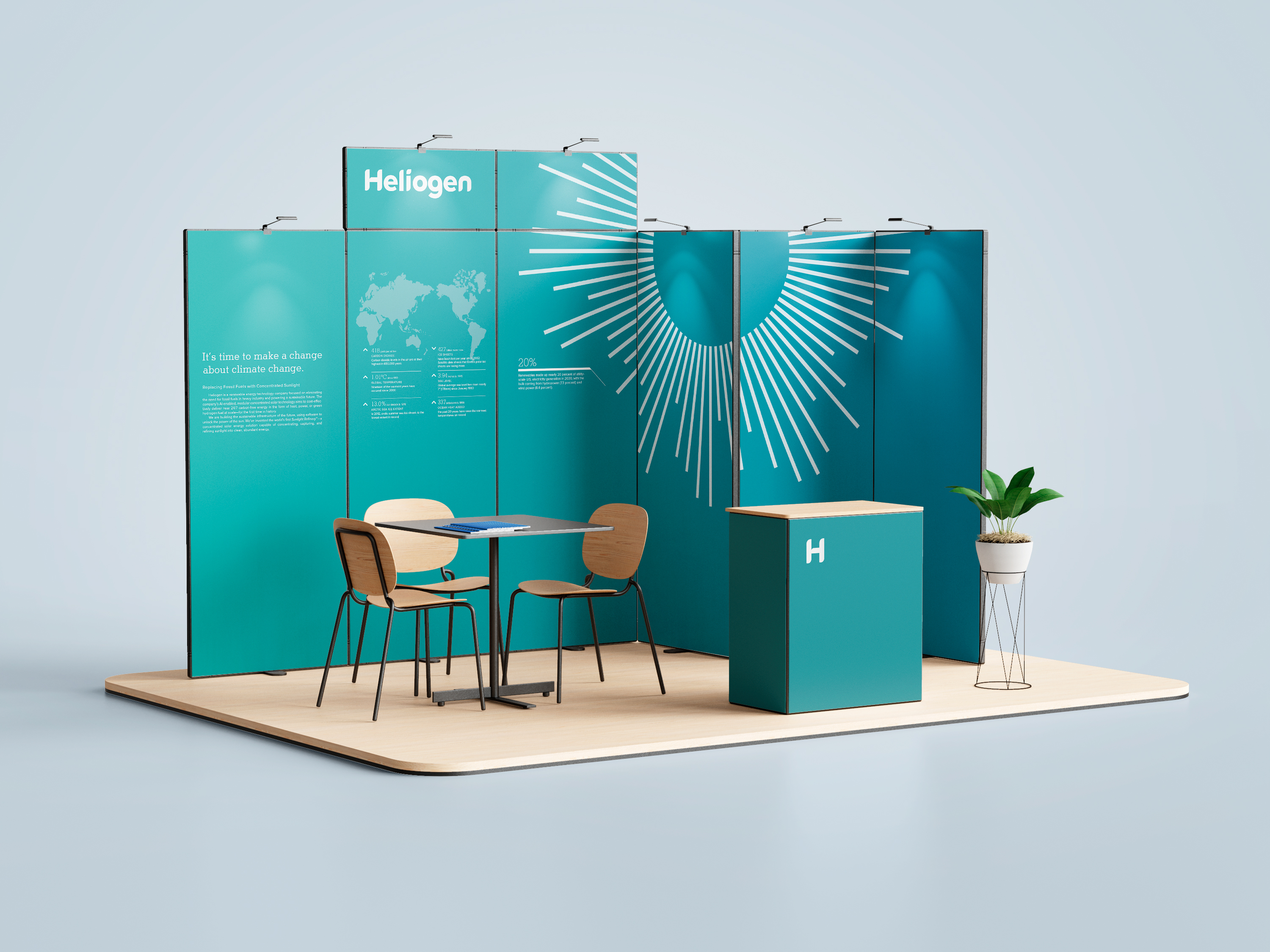
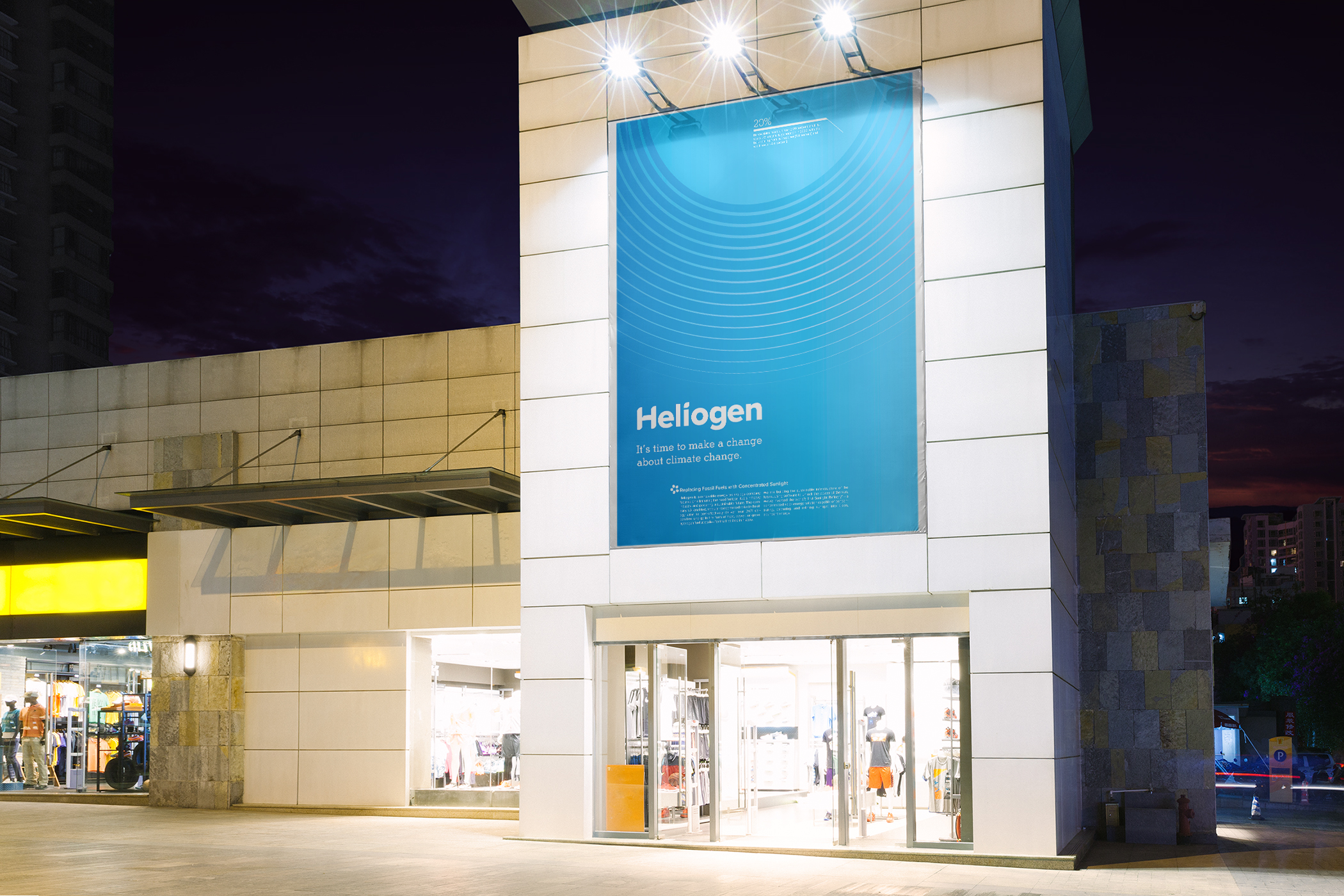
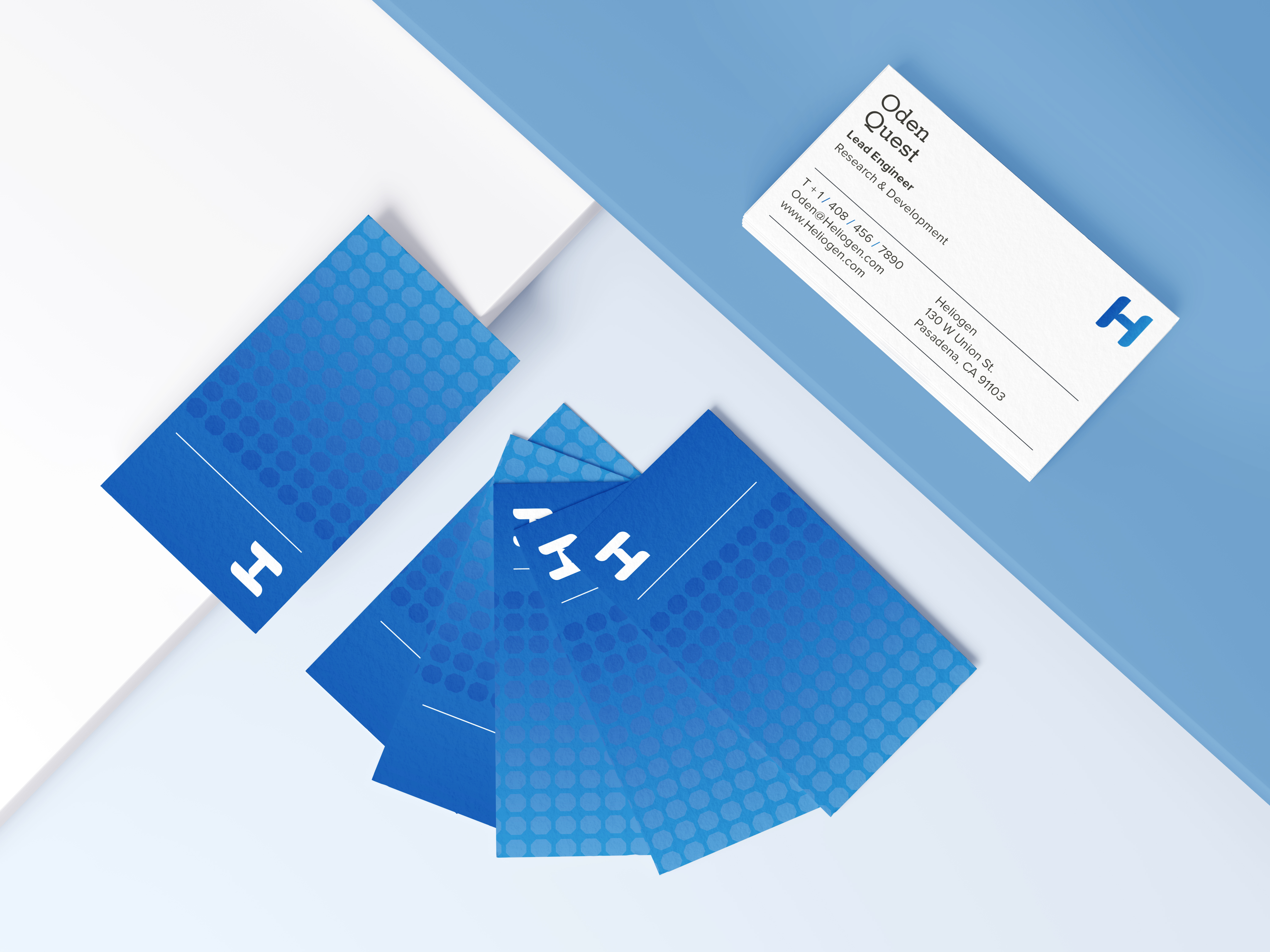
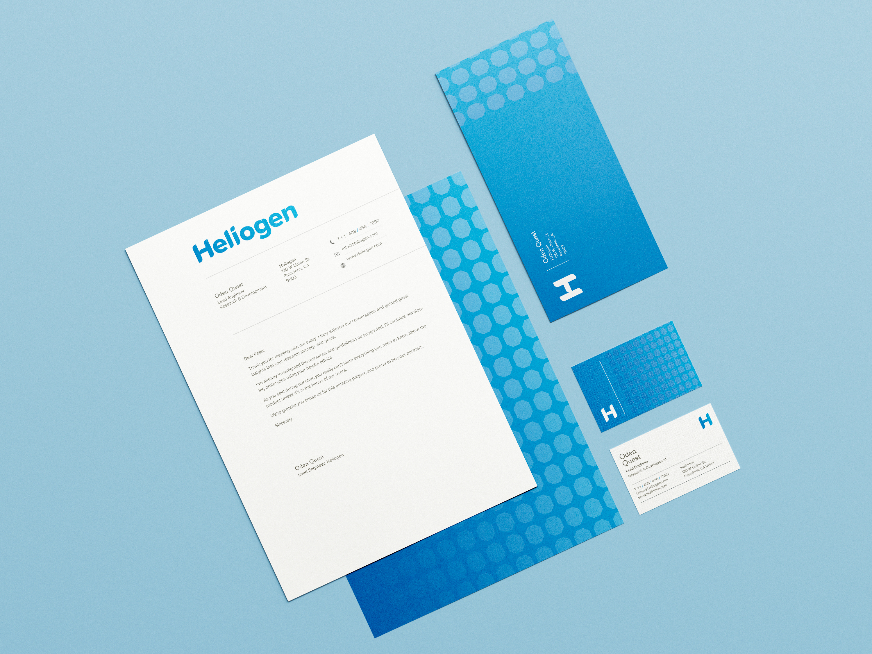
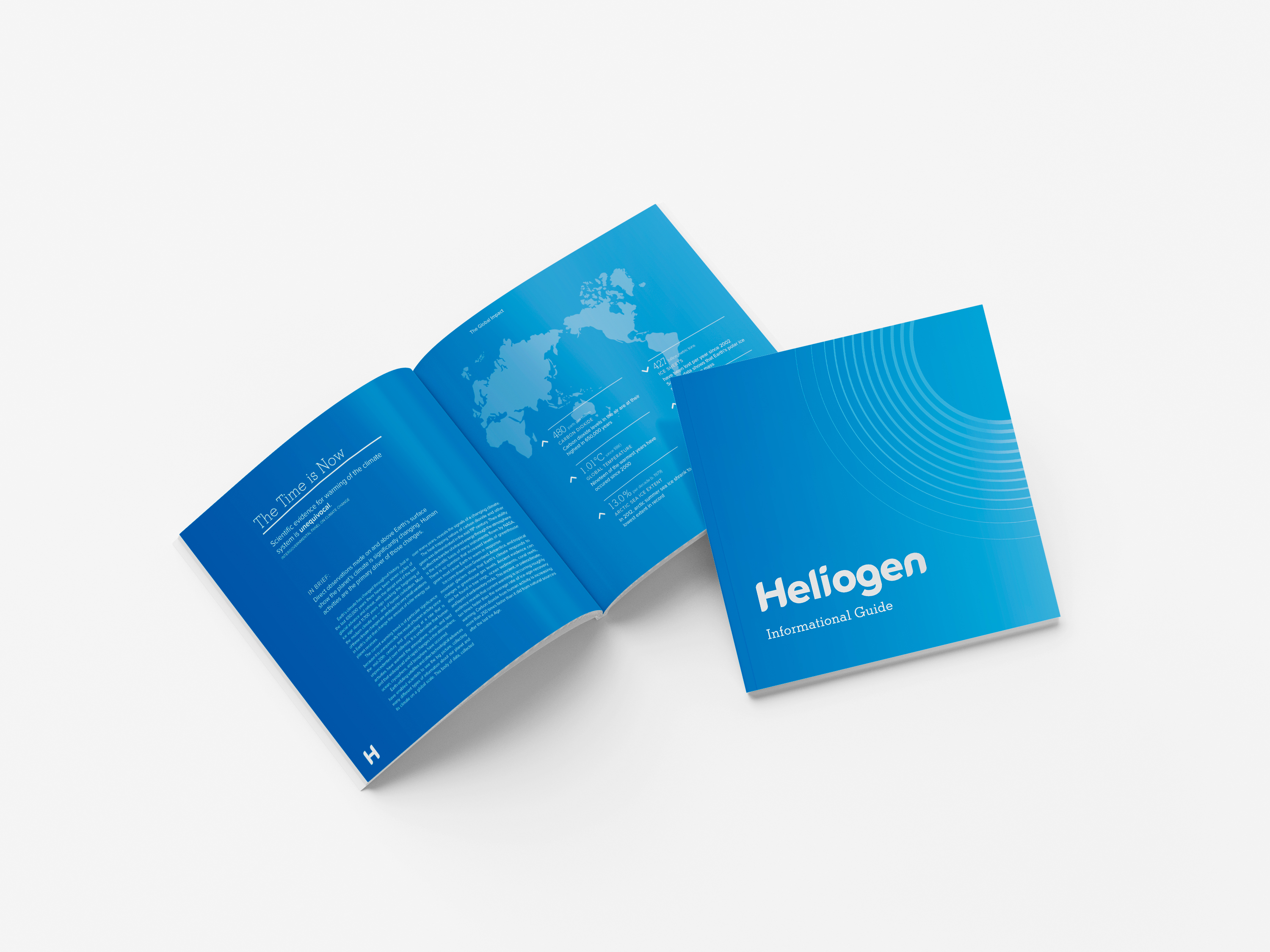
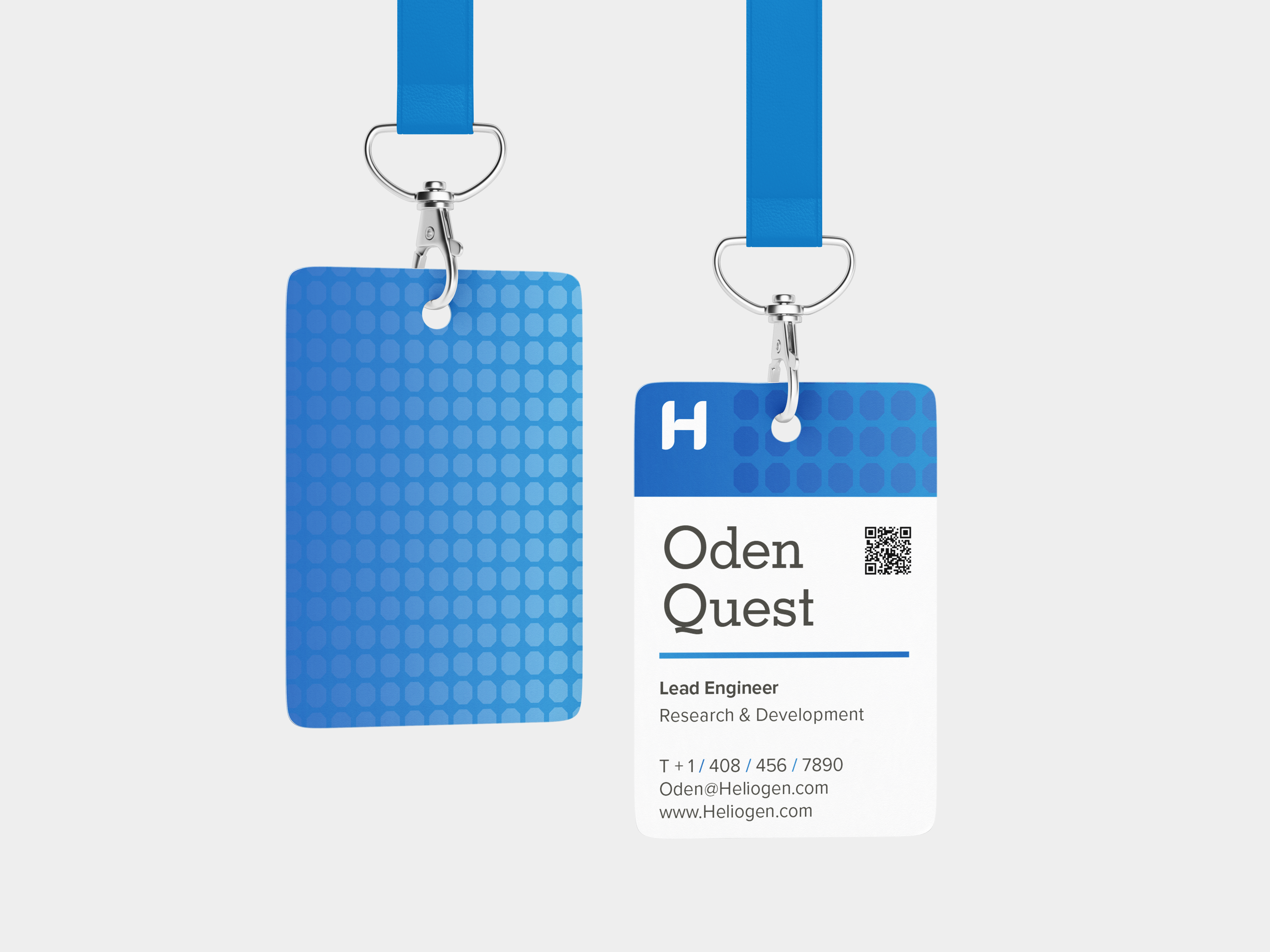
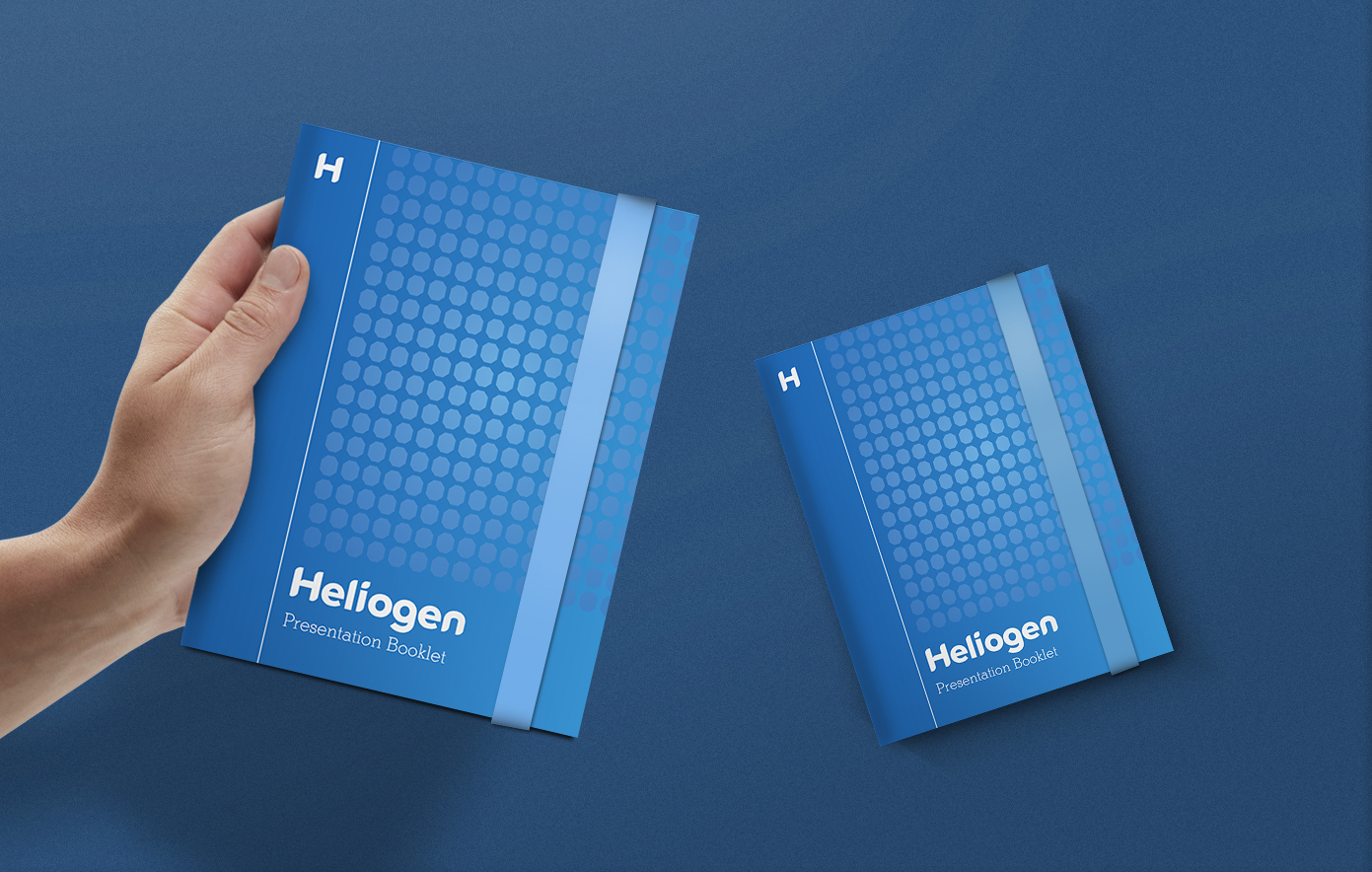
Three different accent colors also help to define each of Heliogen’s important cornerstones. Teal colors represent Heliogen’s sustainable green initiatives. Blue solidifies their position as a reliable corporation. Lastly, orange represents the warmth of the energy that comes from the sun. Each color can be utilized in a gradient form to showcase their modularity. Colors can be used monochromatically for more subtle internal applications or in opposition as compliments for more dramatic, audience-facing seeking applications.
Image
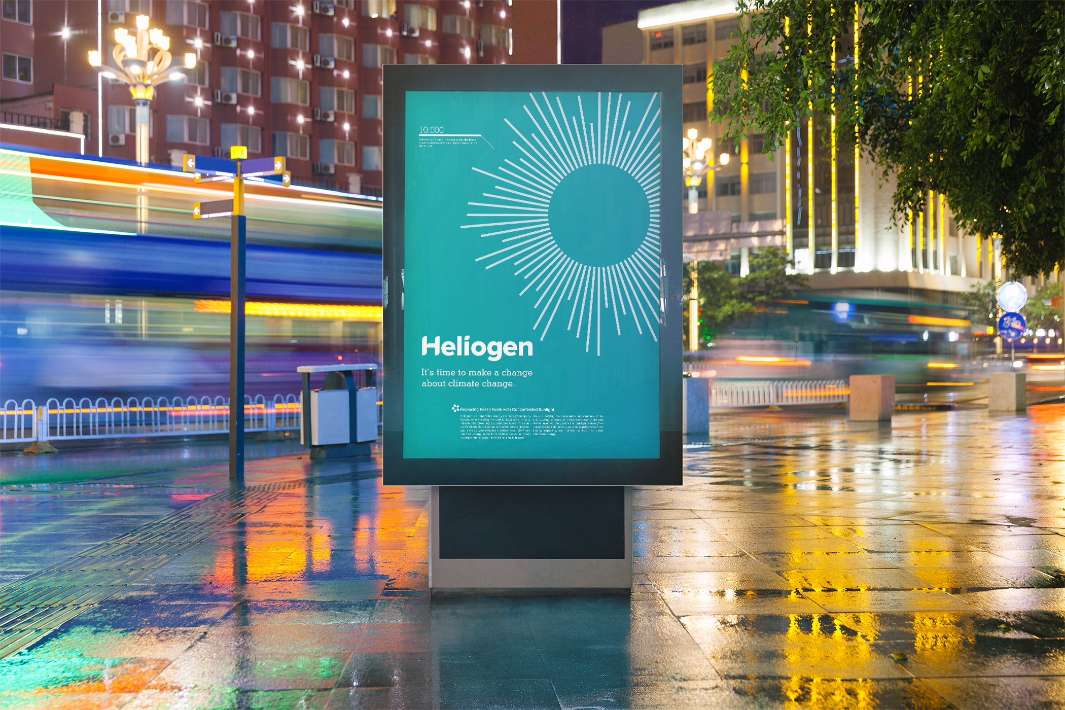
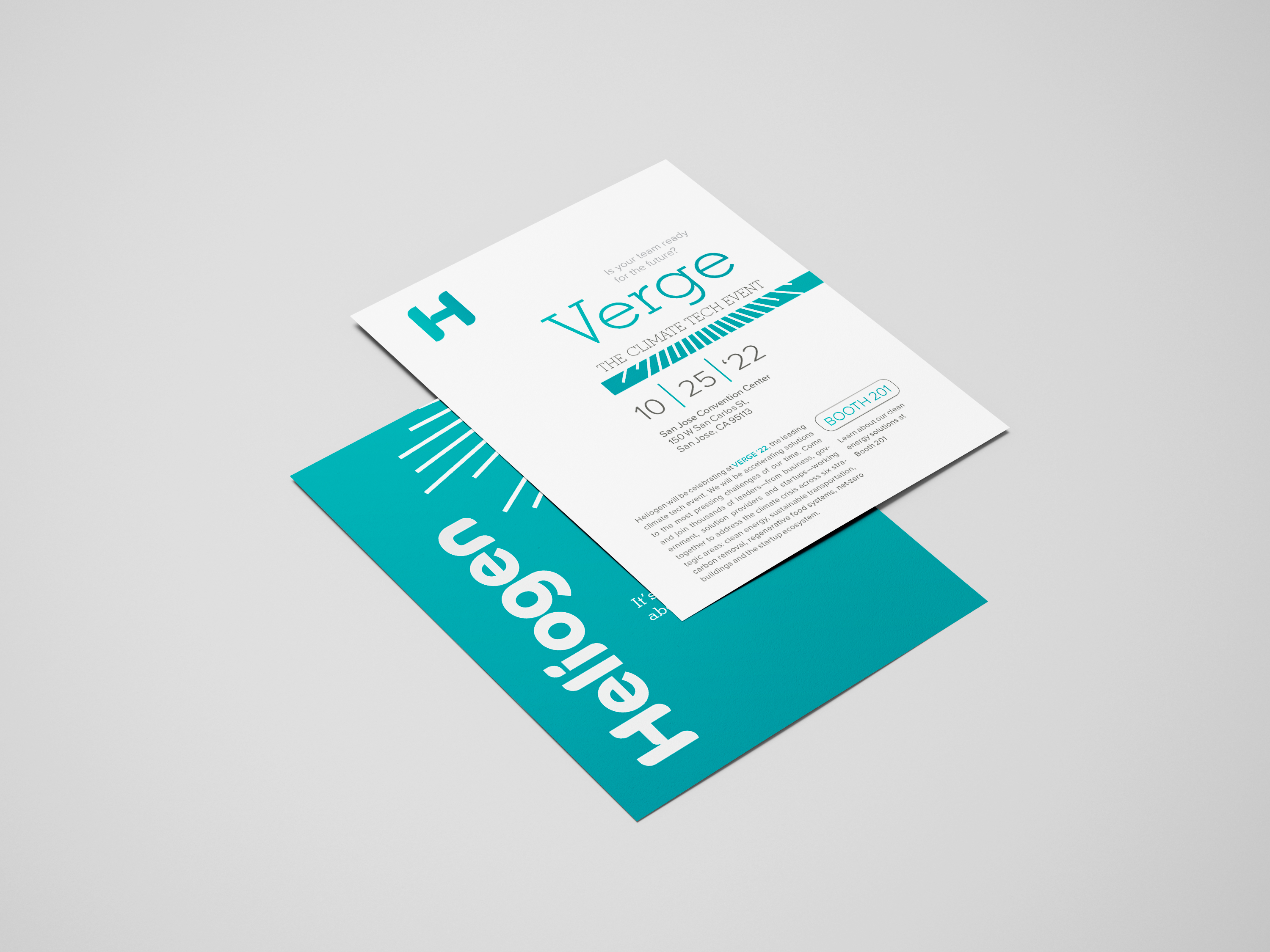
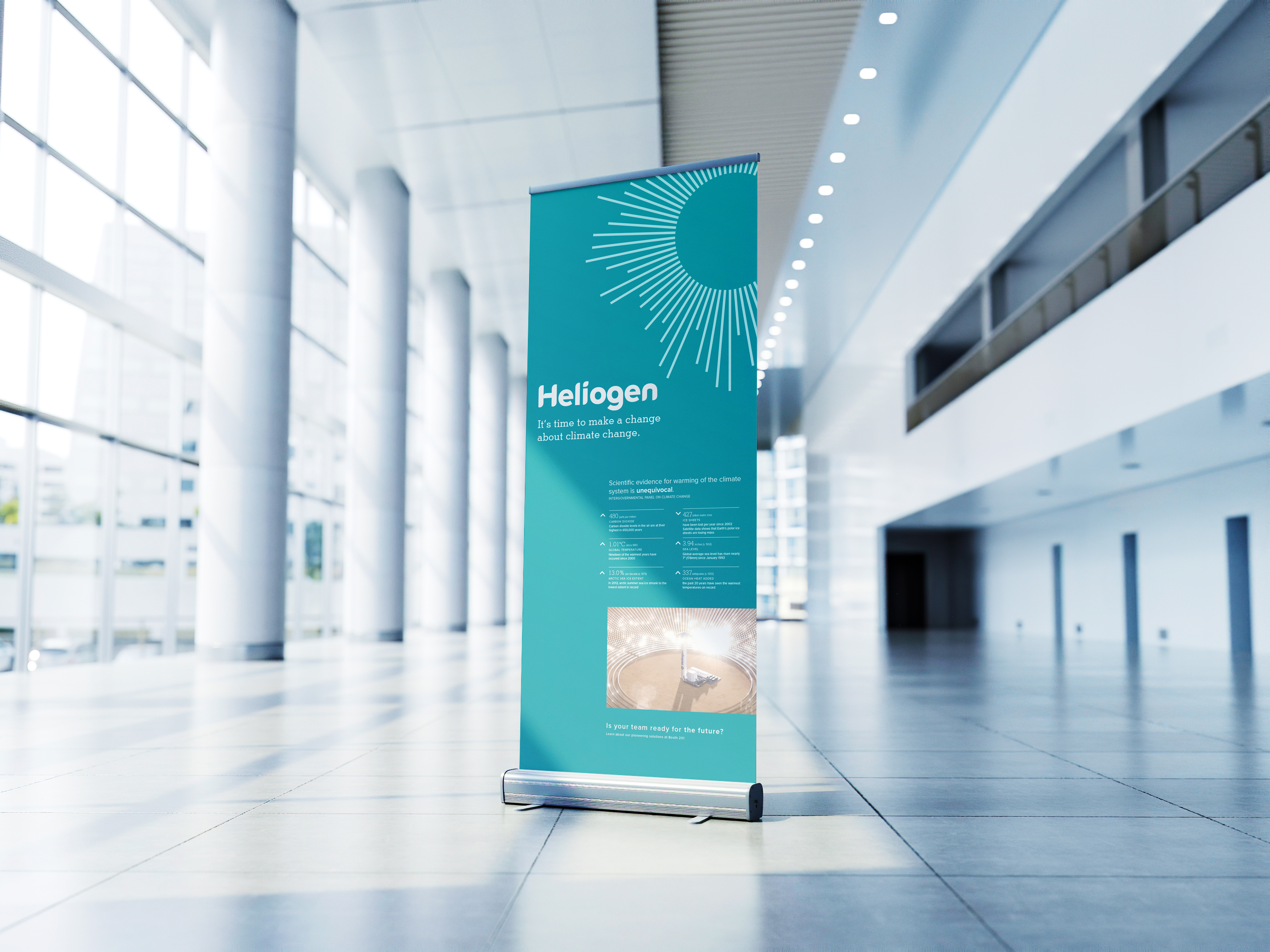
In each of their four new posters, numerals showcasing the inverse square law add technological creditability to graphic illustrations and showcase the importance of transitioning to a renewable energy solution. The graphics in their new visuals help to guide a viewer’s eye to the focal point of each branding touchpoint like posters, swag bags, and presentation documents.
Image
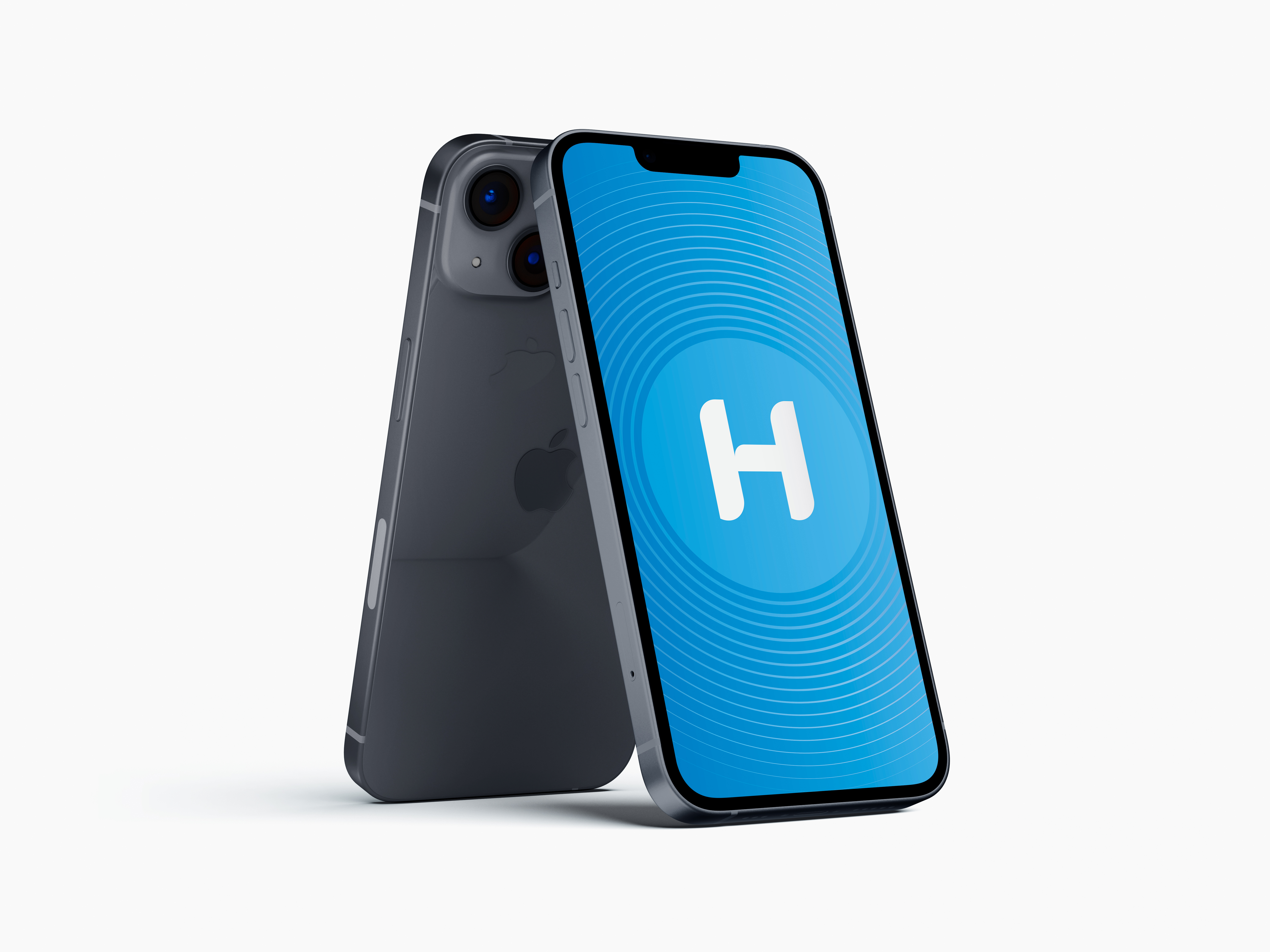
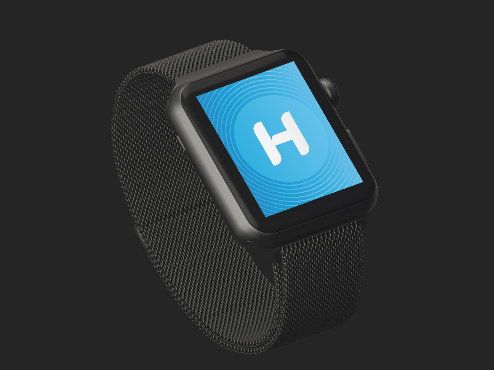
For their original logotype, an existing symbol featuring a sun was not clearly visible at different screen sizes. As the logotype got smaller, it became difficult to see the detail in their symbol on smaller mobile screens. The Helvetica typeface in their wordmark was also too dated and is not representative of their futuristic and modern brand values. Instead, the modern sans serif typeface Proxima Nova was used to clean up their wordmark. The letterforms were also updated with alternating curves representative of their modular technology. The result was a new wordmark which made their logo easier to see at different sizes.
Image

Image
Image
Image
Image
Image
Image
Image
Image
View site online at https://heliogen-site.webflow.io
Image

Image
As their visual strategy was being used more across new media platforms and on mobile smartphones and personal tablets, their brand needed to be welcomed into the digital age. For their rebrand, my vision was to create a new logotype and accompanying visual strategy to make their brand more responsive to digital platforms.