MFA in Graphic Design - 2 Yr Path — Graduate Graphic Design
Faculty:
Stephen Serrato
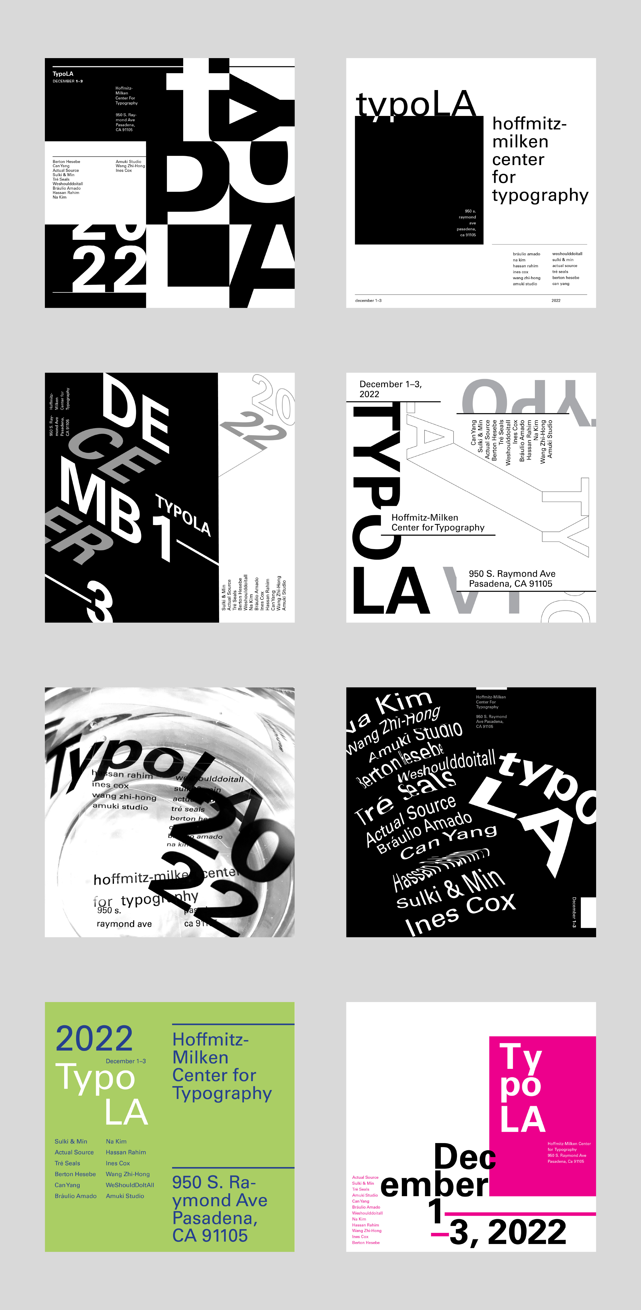
TypoLA
The purpose of this exercise was to experiment with different elements of typography for the same set of information. Each composition was meant to focus on at least one visual idea. By week 5 of the exercise, we had incorporated color, distortion, rules, color blocking, and analog processes into our exercises. Below are a few of my favorite compositions.
Learning Outcomes:
In the first weeks of the exercise, we were limited to using a single weight/size of typeface. With these constraints, I learned to maximize space and composition to convey hierarchy. As the weeks progressed, I learned how to incorporate additional elements with intention.