Graduates

Lena Jeong

BFA in Graphics — Graphic Design
Course:
GPRT-252 Communication Design 4: Identity Systems
Faculty:
Simon Johnston

MOCP Identity

In CD4, we were tasked on to rebrand and develop a identity system for an institution. I chose to do my development on Museum of Contemporary Art. Throughout the term, I researched and designed a new system that would work with my institution and effectively communicate that throughout the brand. Starting with the logo, I then thought about ways I can possibly tie back my logo with the overall identity system.
Learning Outcomes:
As this was my first time fully developing an identity system for an institution, there were many things I learned throughout my progress. Through the emphasis on research and communication through my symbols, I learned how to think about how I can effectively translate symbols and graphical movements throughout my system and as a communication tool.
Image
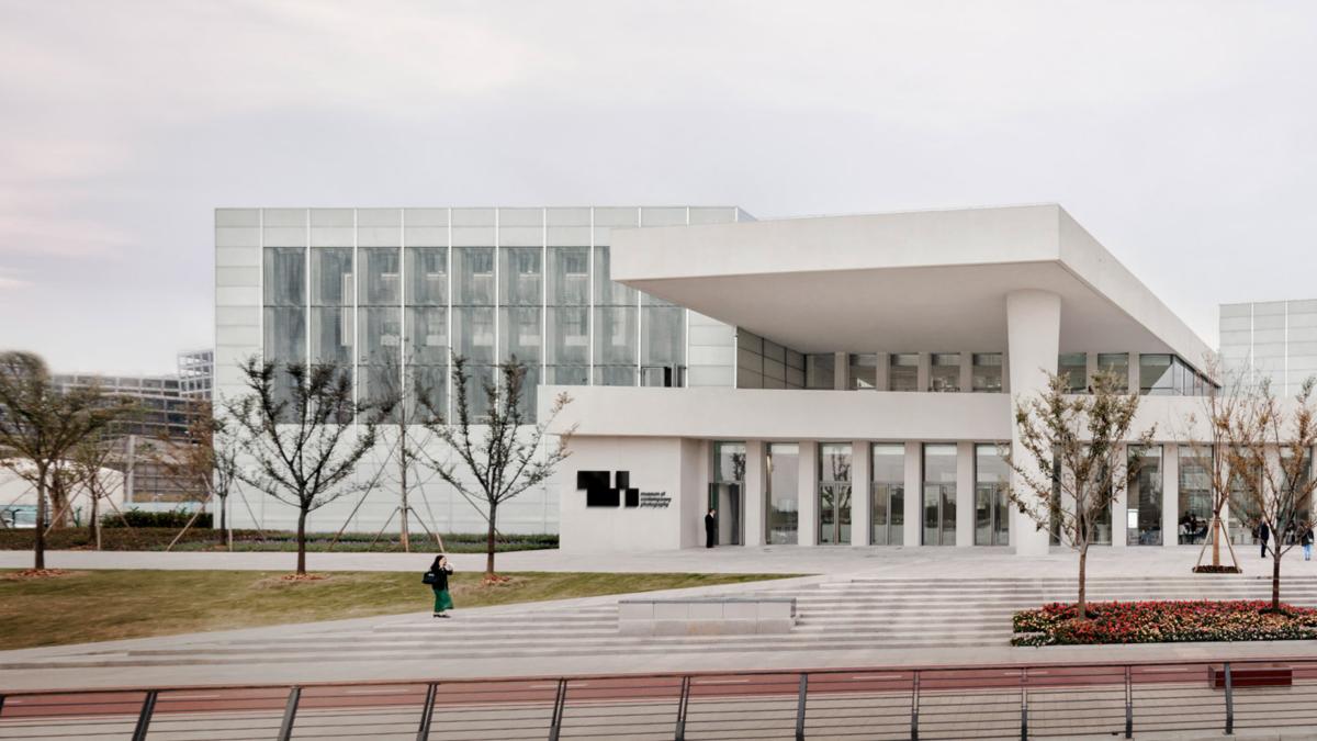
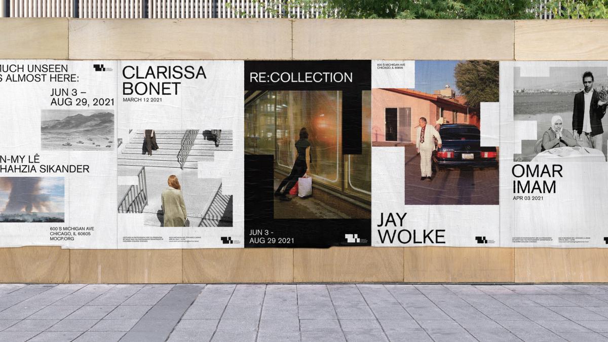
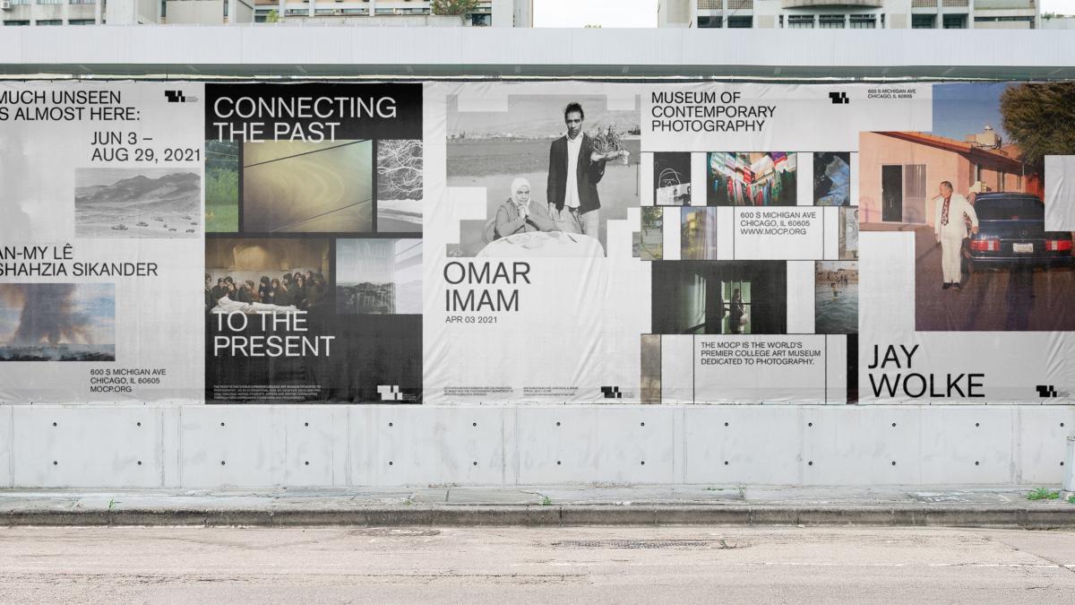
I chose to do my rebranding on the Museum of Contemporary Photography for CD4. Below shows the finished results and the bottom shows the progress of how I got to these results.
Image
Image
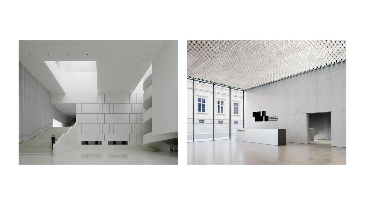
My identity system is highly emphasized on the geometrical and architectural shape of the lines taken from my logo. Usage of outlining my form and duplicating it to create a move relating to my identity is something I use throughout.
Image
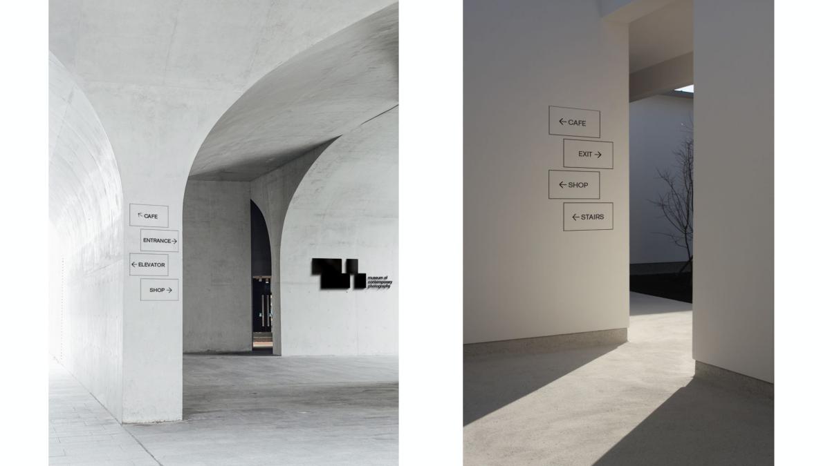
As mentioned, I use the outlined form of the geometric look of my logo for my wayfinding system to tie it back with my identity. This wayfinder uses outlined rectangles stacked on top of each other.
Image
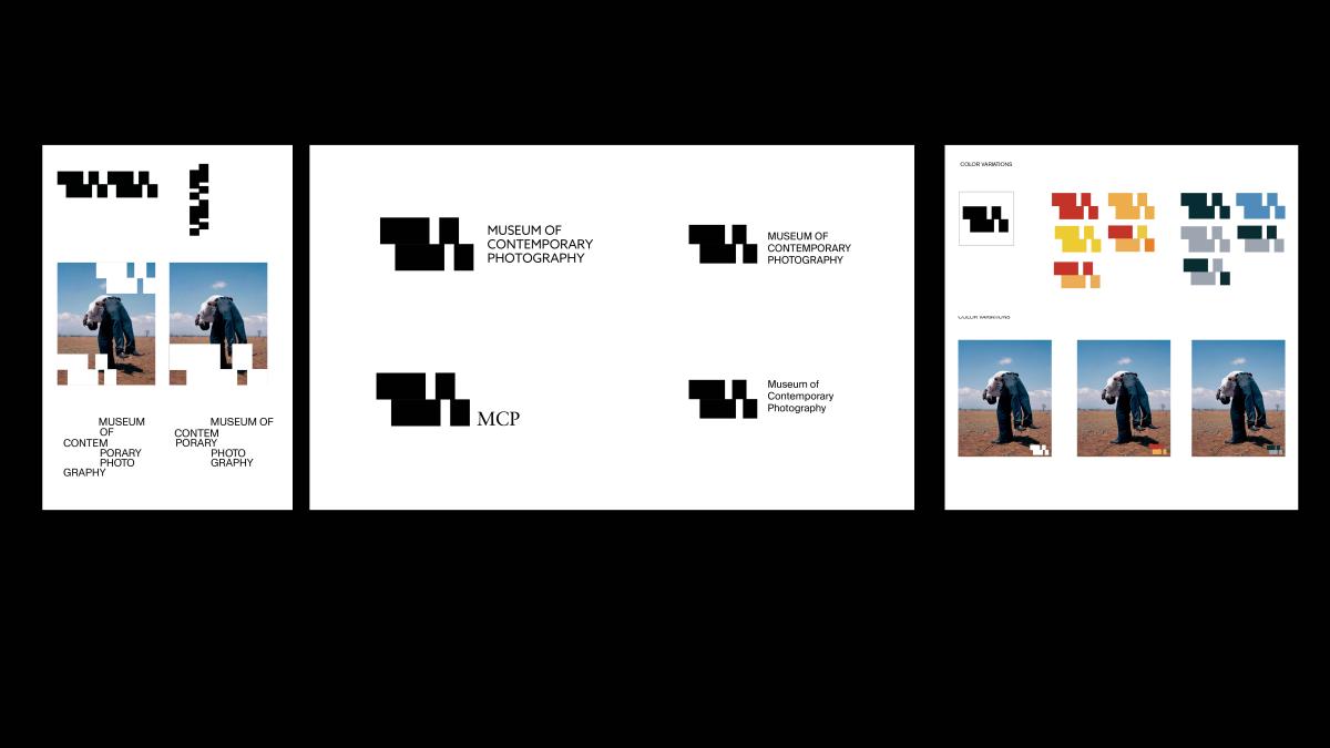
Throughout my posters, some sets include geometric shapes that tie back to my identity system to replicate the image of a pixelated photo.
Image
Image
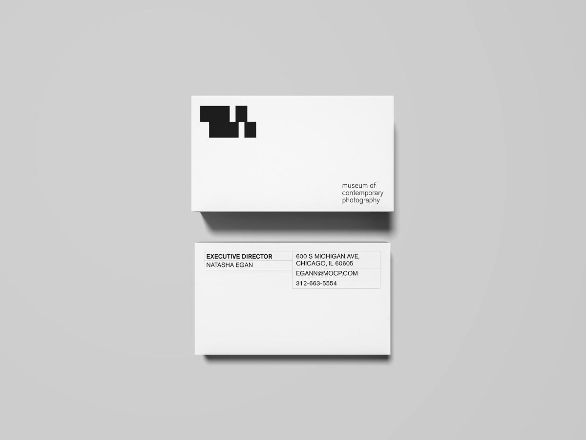
Business Cards
Image
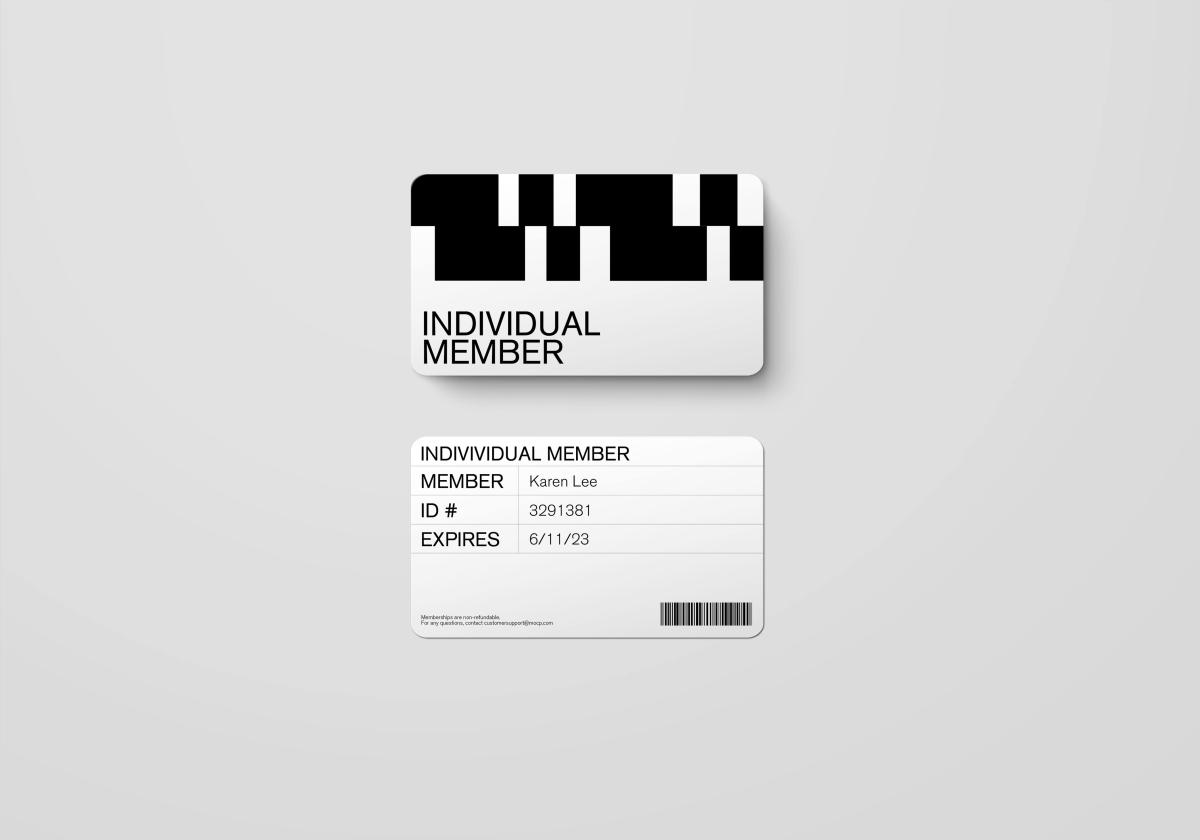
Membership Cards
Image
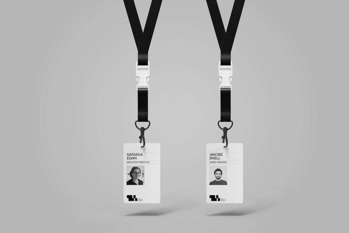
Employee ID
Image
Image
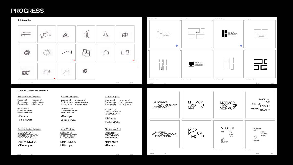
The start of building my identity and logo. We started off with sketching ideas with words relating to our brand, thus further developing that sketch into actual digital versions. The below two includes a few typographic explorations that I did and seeing if those explorations could fit into my identity as well. As I explored these ideas, I focused on the "shifting"—tying back to shifting from the past to the present through photography.
Image
The next step into building my identity, we narrowed down the top possible candidates and thus settled on the final version. I explored this version further and tried various forms within this one, exploring color, form, and type.
Image
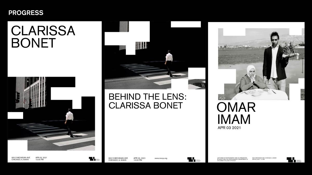
This shows the progress of the the set of posters I briefly talked about before. Using the geometric forms, I tried various different poster variations as shown the development from poster 1 and 2.
Image
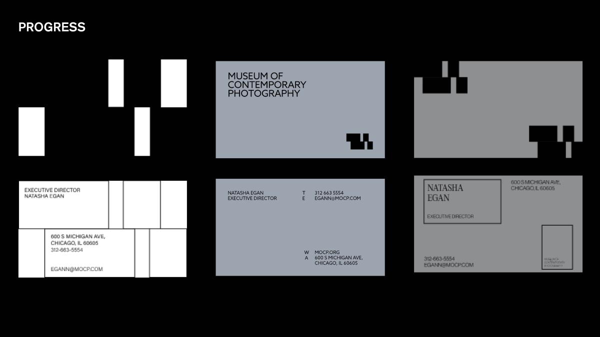
A few business card explorations I tried that did not make the final cut as we settled on business cards remaining relatively simple as the moves relating back to my identity can be pulled into other stationery. These business cards were my take on exploring the forms within the design.
To give a background on my logo, through my research, I noticed that the museum focuses on cultivating ideas and provoking dialogue through their community. In a way, through their photography—they are connecting the past to the present with the photography presented. Thus, that became the gateway and focus of my identity. My logo also translates to an abstract form of a film strip—translating to something that is revealed which is shown through my short form logo.