Image
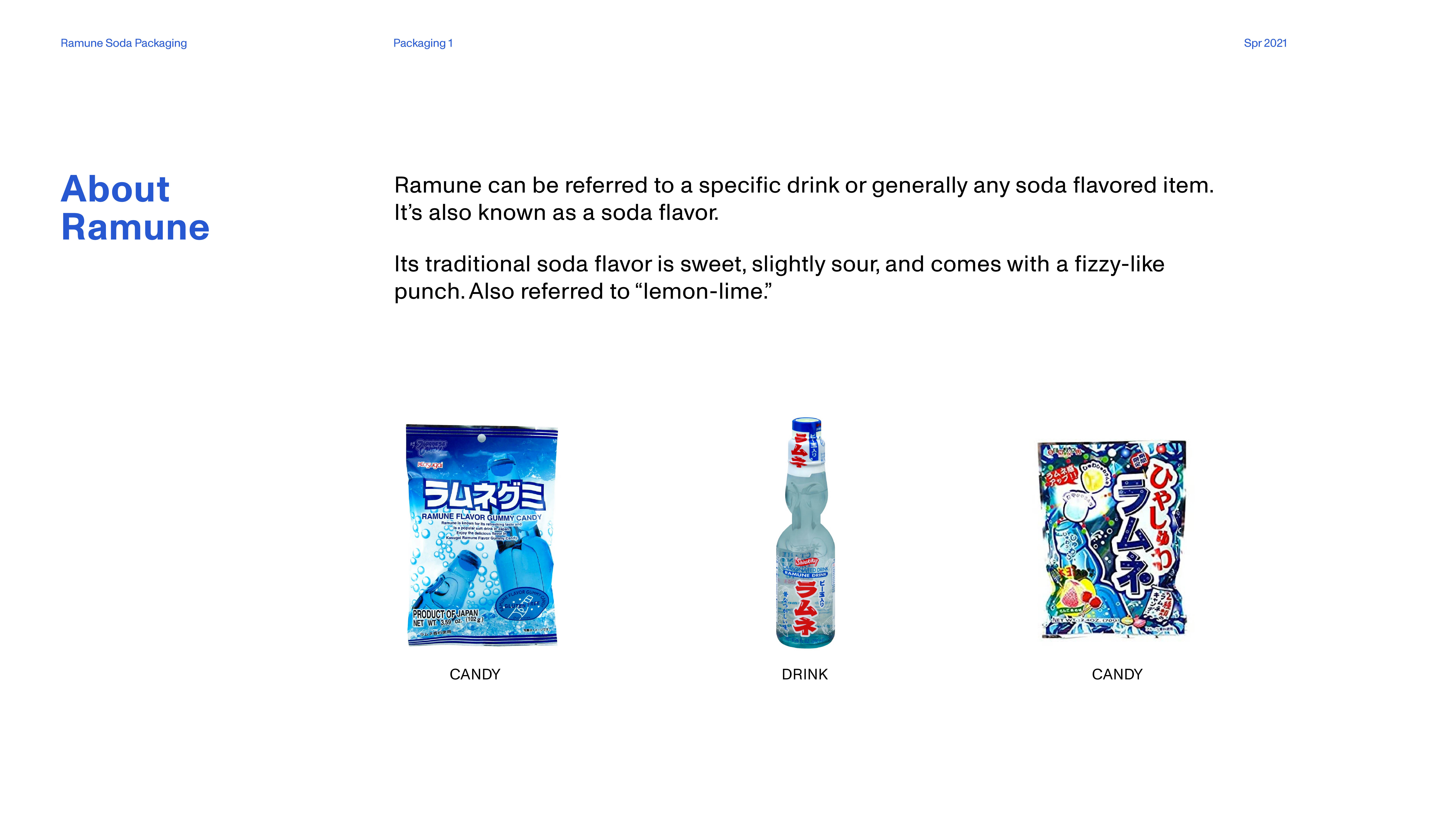
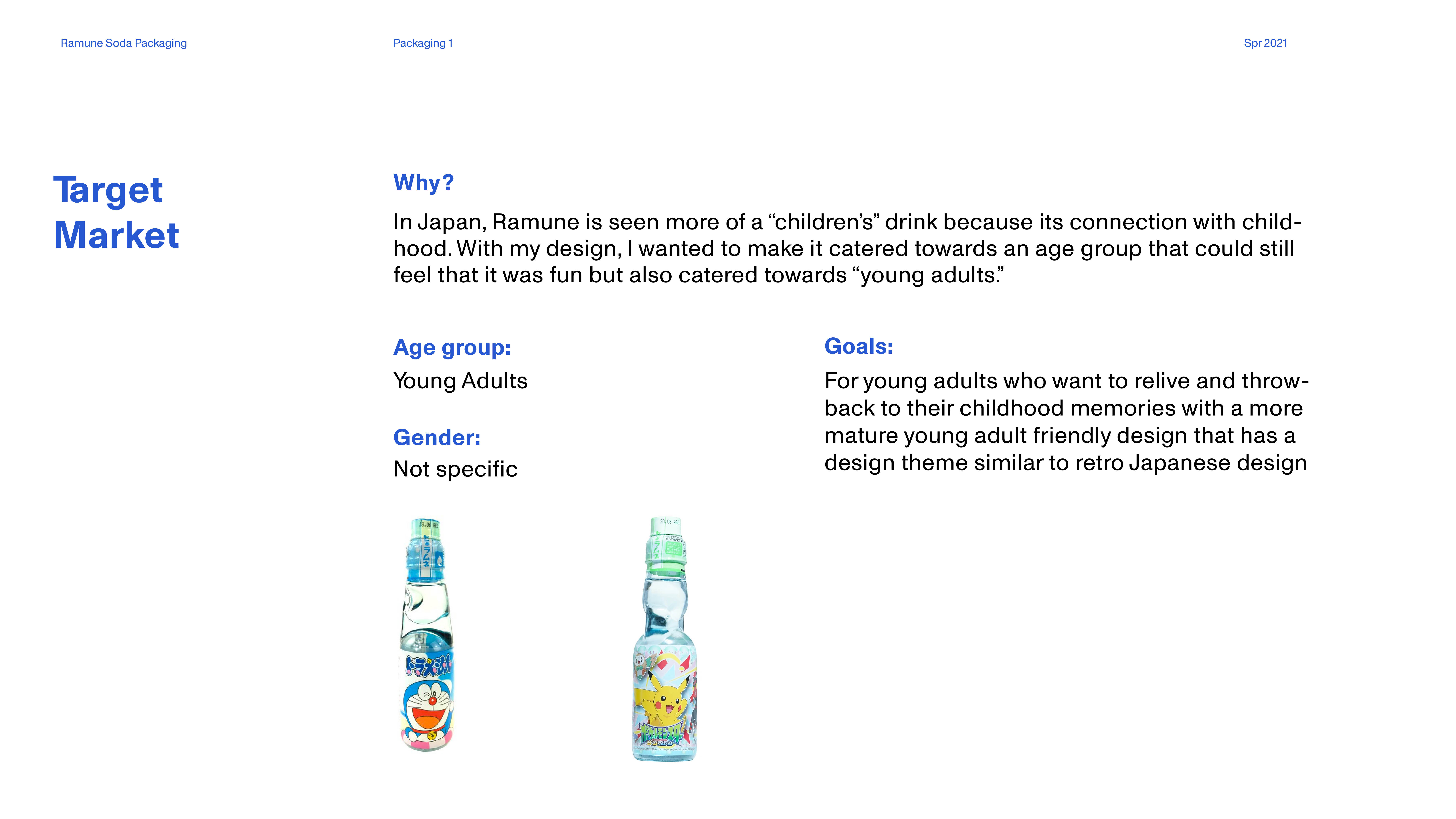
I chose to design Ramune bottles for this project (to give a brief on what is Ramune, Ramune is a Japanese drink that generally refers to a carbonated soda). I wanted to create a concept that would appeal to young adults as many of grew up drinking Ramune as children, thus through my Ramune—I wanted my audience to relive the experience of drinking Ramune that wasn't target for children (as the original bottles are associated with children).
Image
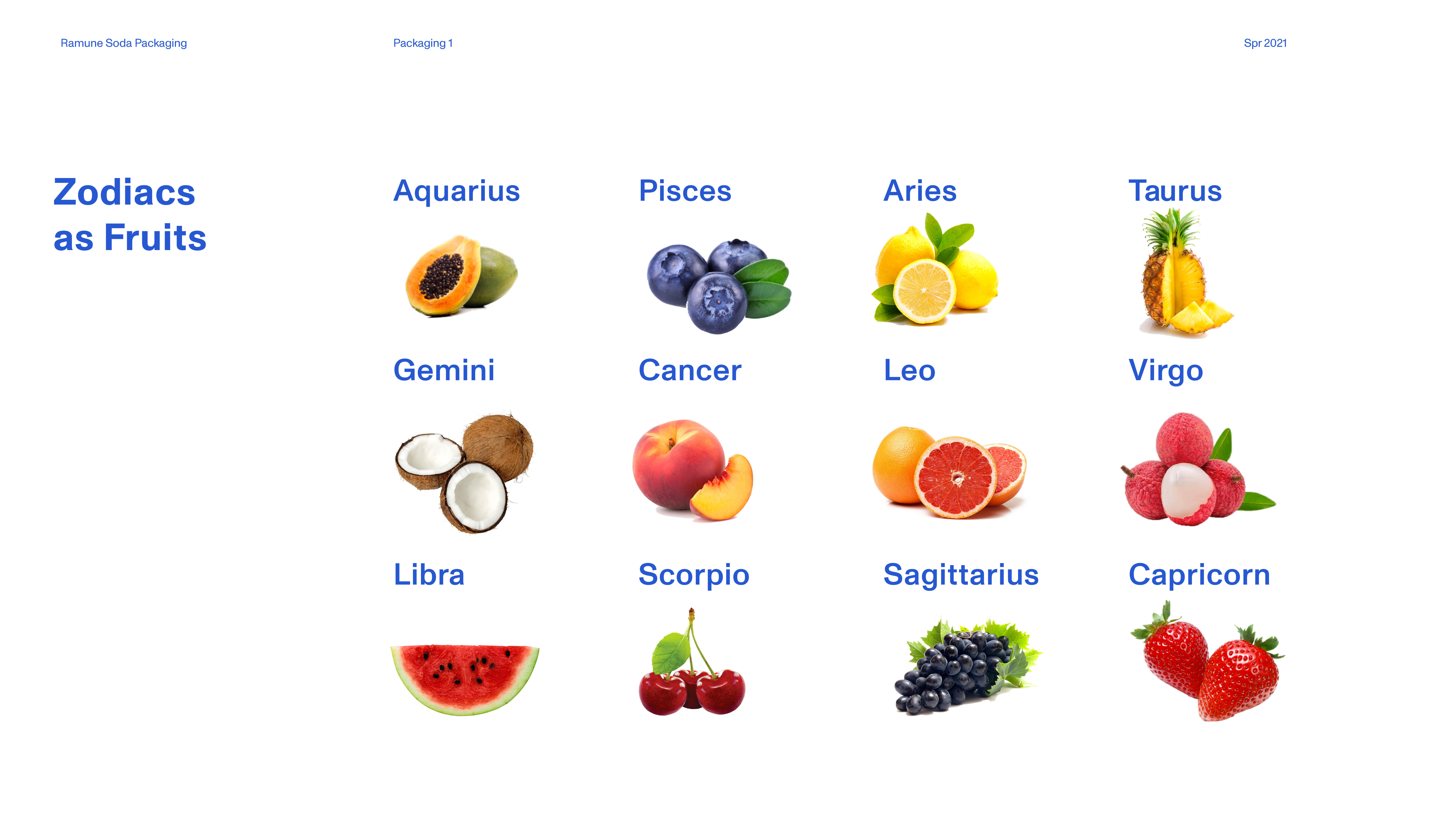
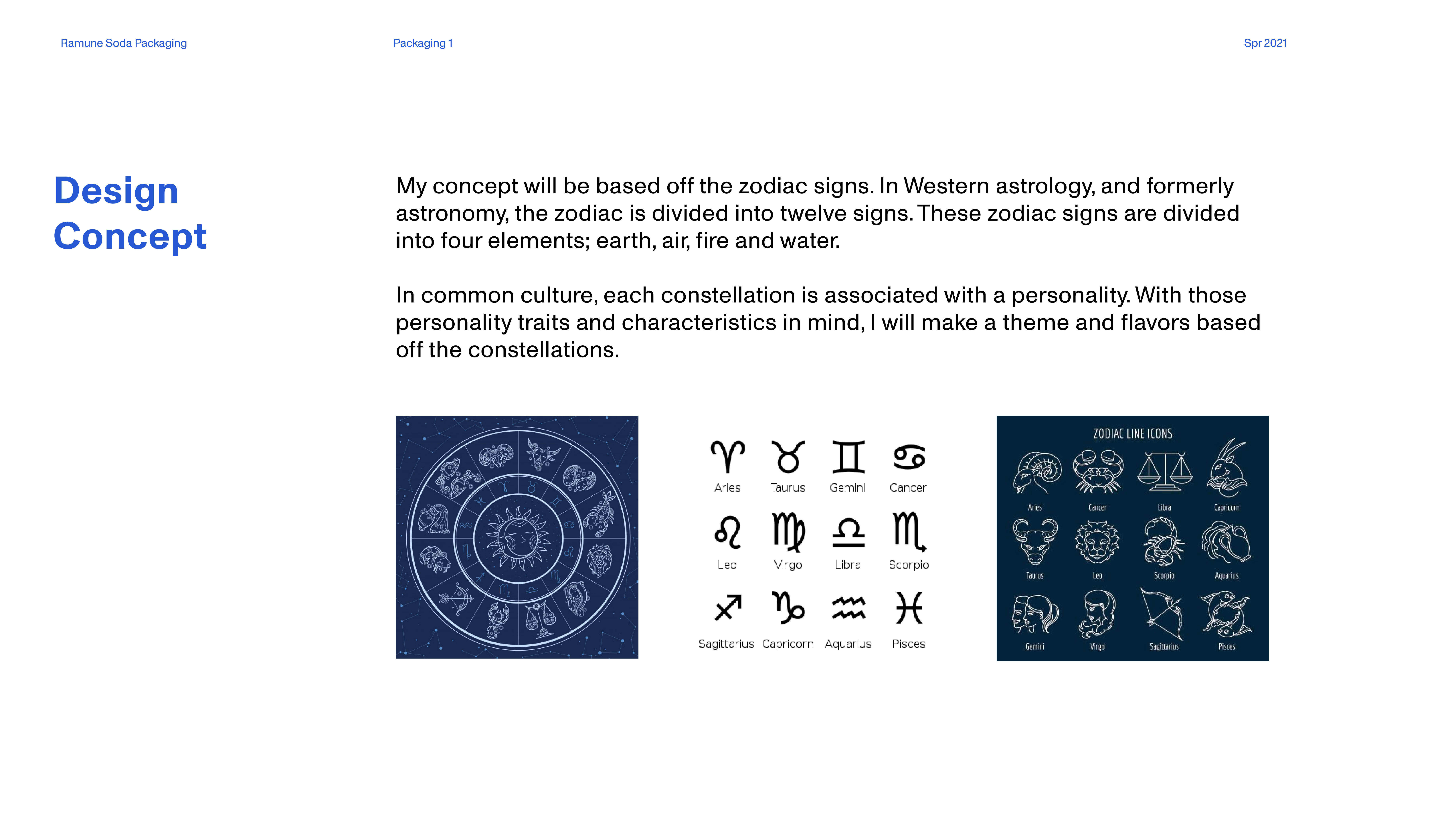
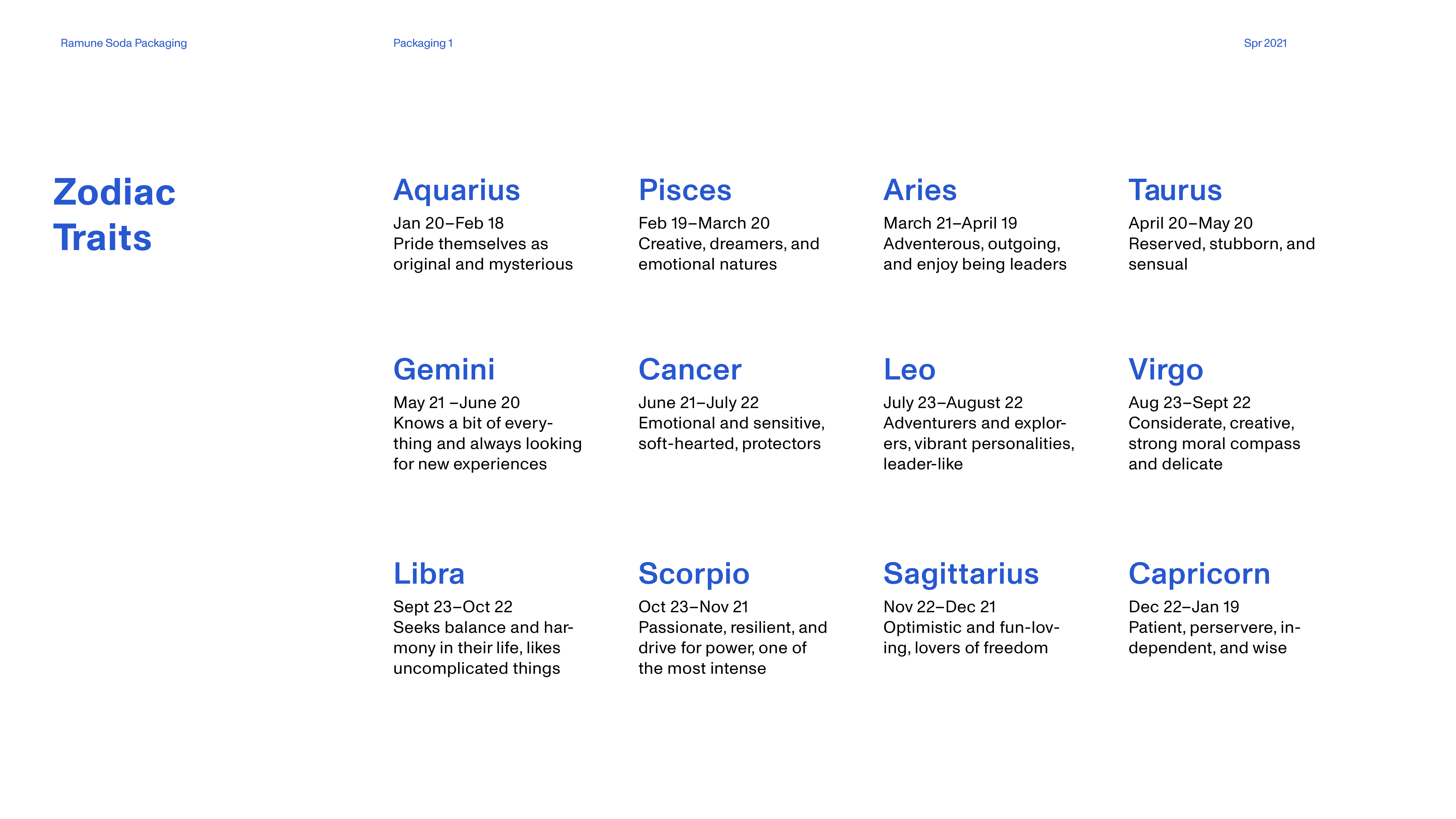
This project would hypothetically have 12 flavors in total—that all relate to the zodiac signs. I chose to specifically focus on the signs Pisces (Blueberry for their sensitive nature), Scorpio (Cherry for their passionate nature), and Taurus (Pineapple for their reserved yet sensual nature). So behind my design process, I researched each zodiac sign and their commonly associated personality traits and matched it up with a certain fruit flavor that would match them.
Image
Image
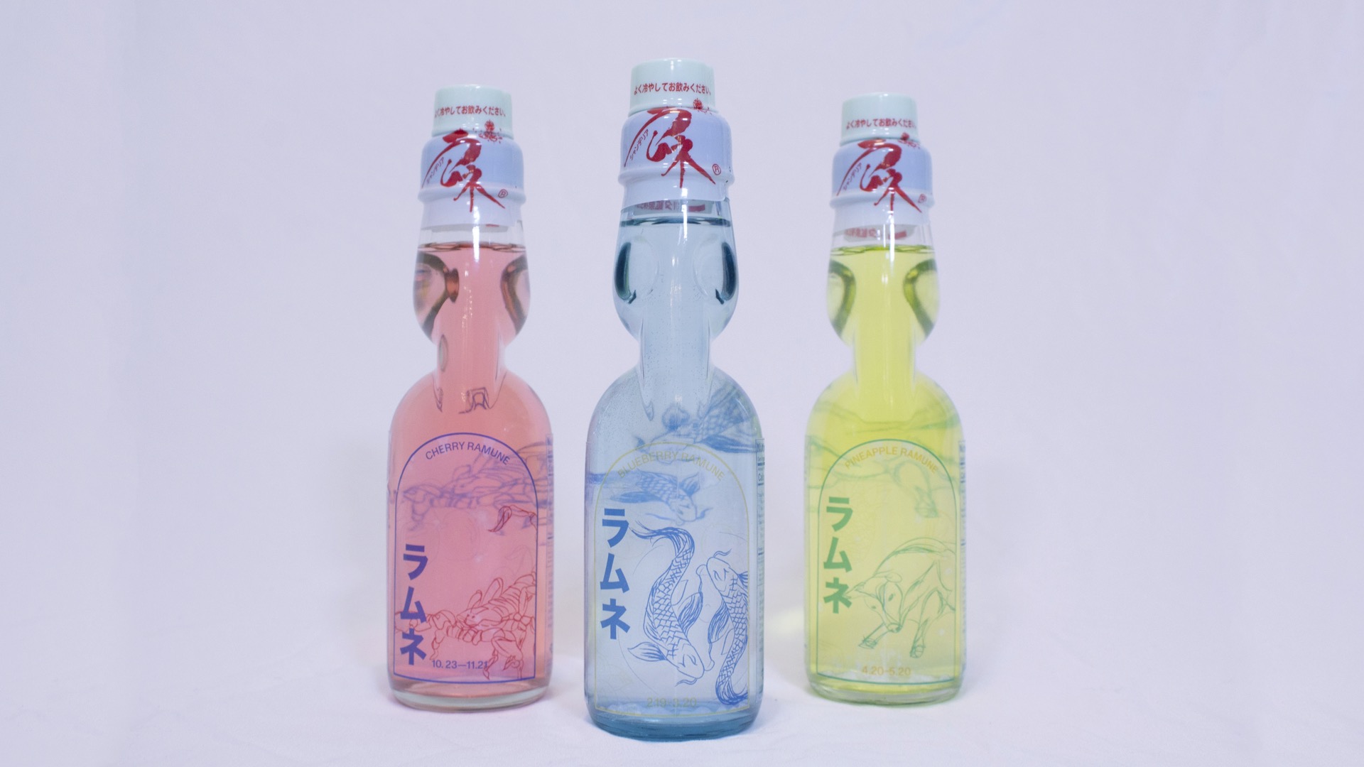
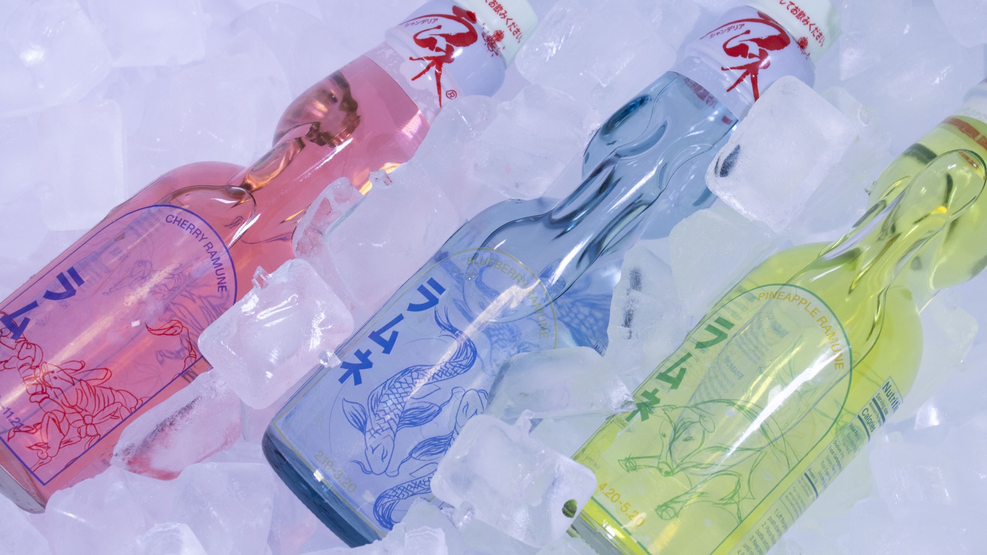
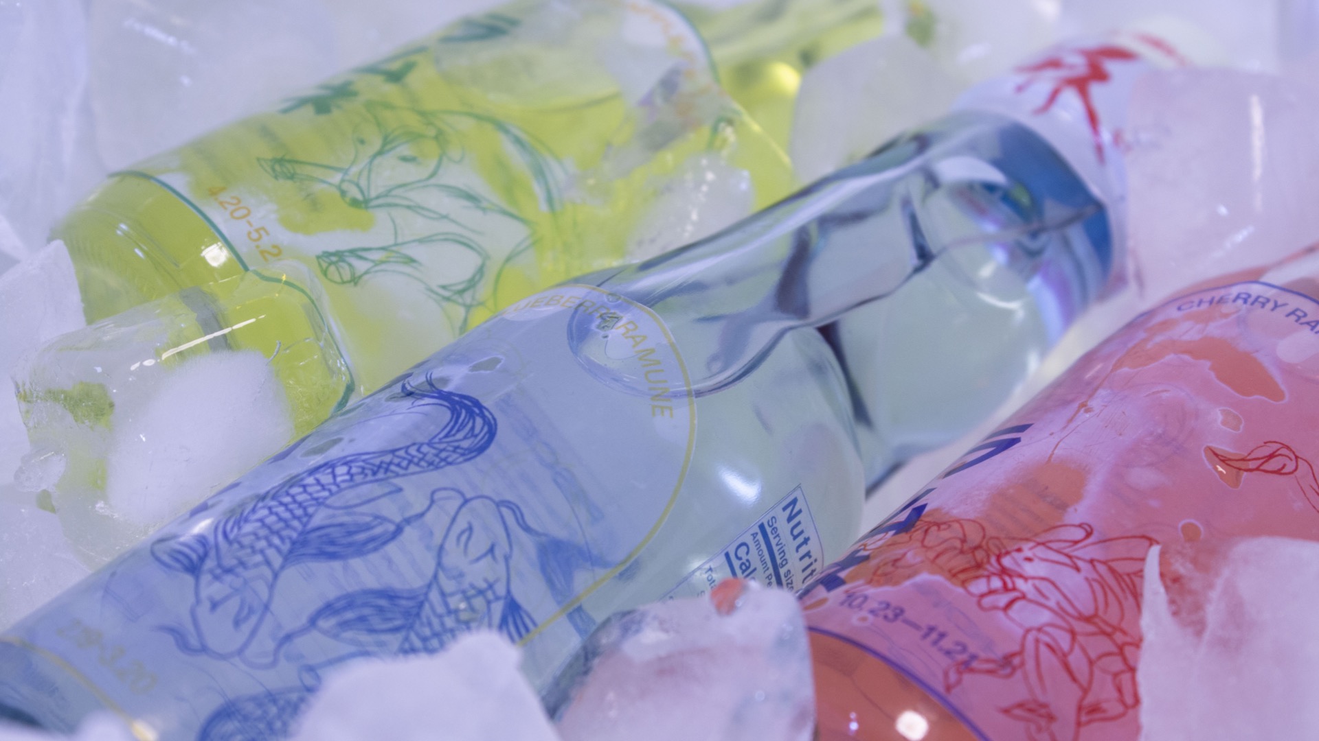
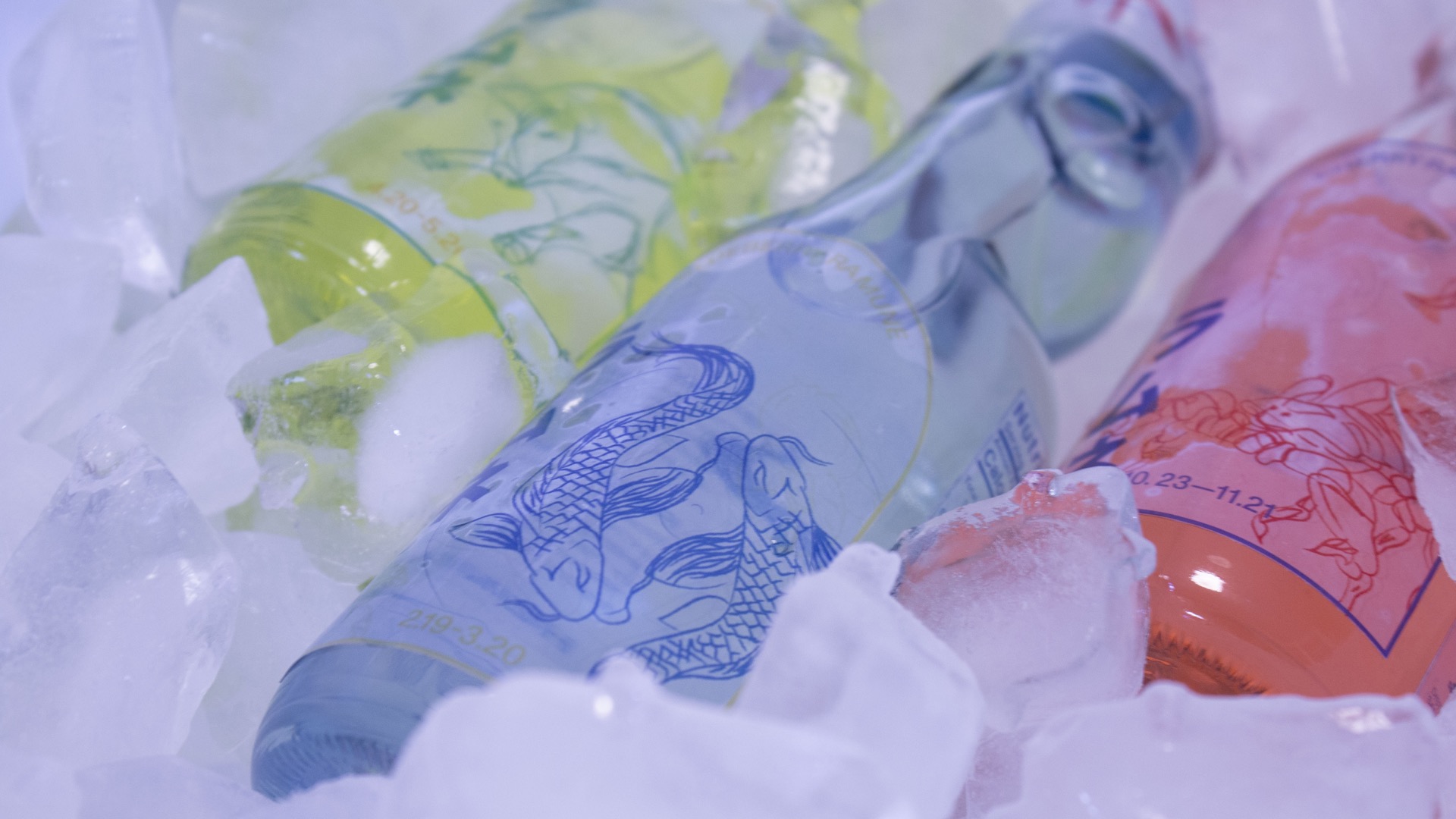
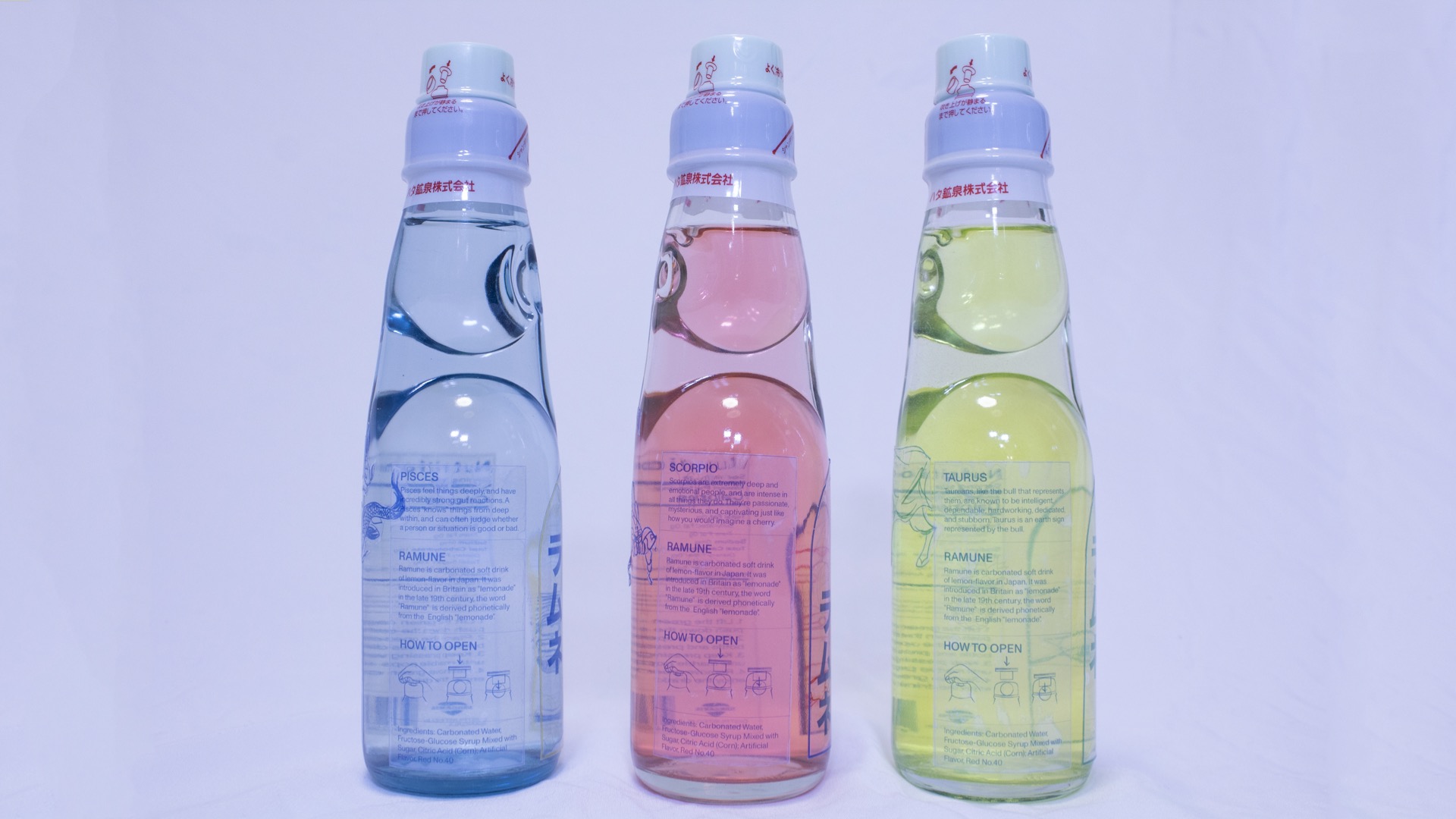
As shown clearly in this picture, I chose to go with a transparent label for my design to emphasize the drawings that were expanded in the back. Through this, my audience can see through the bottle and view the associated animals peeking through the label.
Image
Image

Image
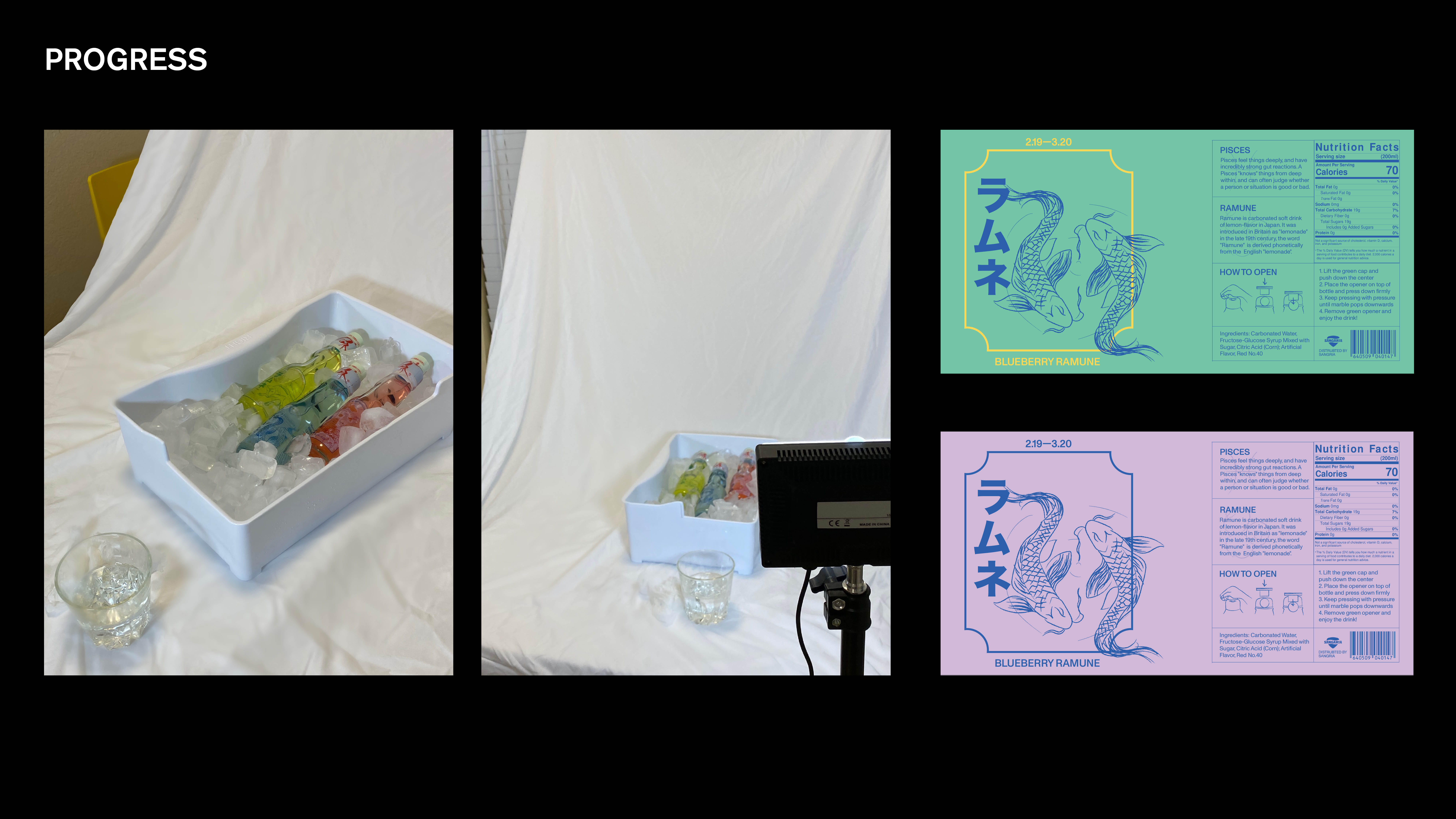
As shown to the left, I photographed the bottles myself. Using the ice available and using water to emphasize the cold drinks, I set up this to take pictures of my final variation of my design. The right shows different color variations that I tried, such as mimicking the blueberry colors—that ultimately did not make the cut as I chose to go with a transparent label.
Image
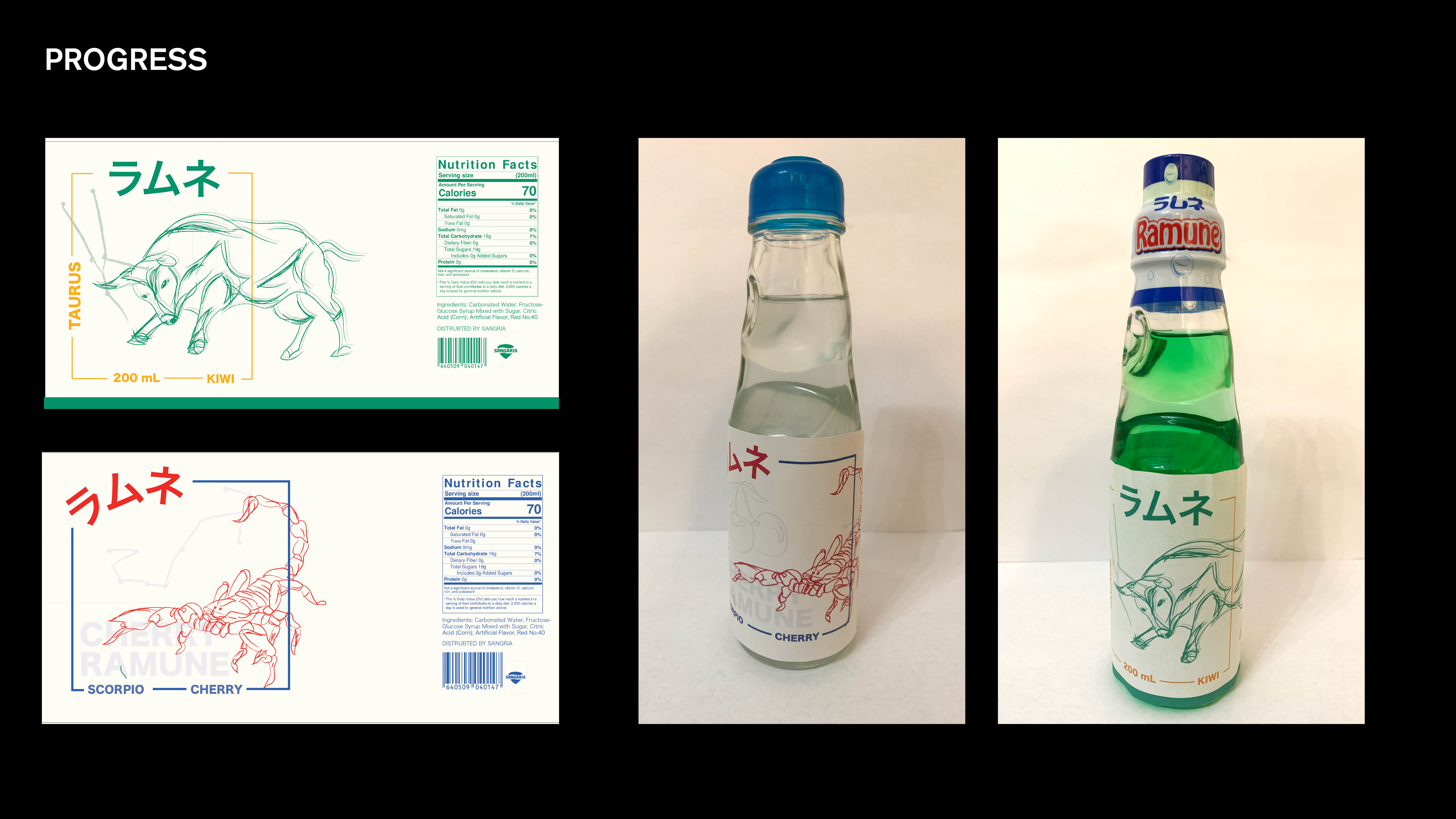
One of the first variations of this specific design direction I was going towards to. Using a two color scheme and bold type that reads "Ramune," I illustrated each zodiac animal and used that so that my audience would be able to see their zodiac animal along with lighter tone illustrations of the fruit associated with the drink.
Image
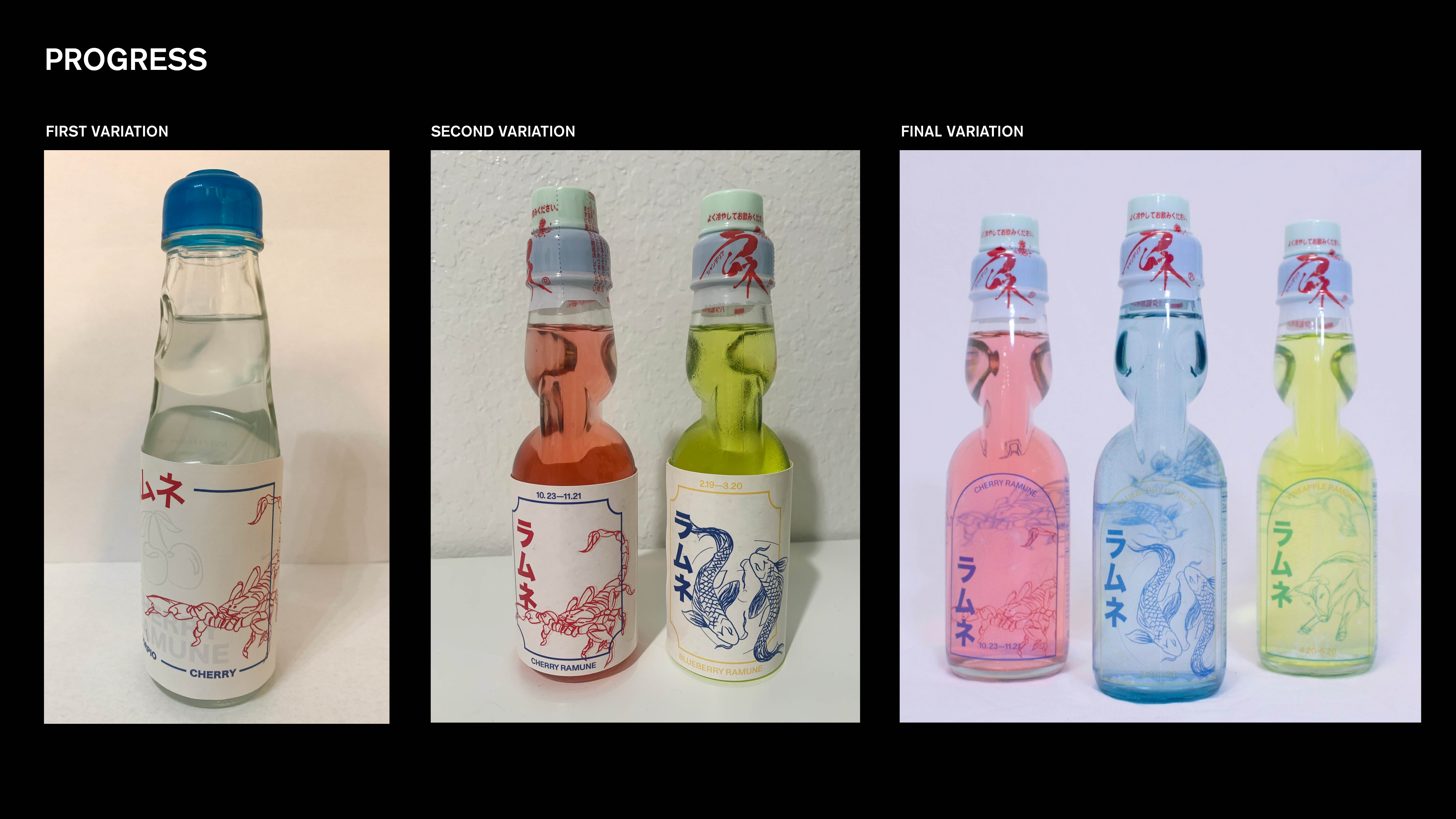
This shows the process of the different variations that I did. The first variation shows a lot more timid scaling in the type and drawings, which ultimately scaled up with the second variation. At this point, I was heading for a colored label as shown in 1/2 pictures but as I headed towards the final variation, I decided to go with a transparent label where you could clearly see the illustrations of the zodiac animals through the front label.
Image

Below shows the some of the key design process points that further explains my design choices.
Image
Image
Image
Image
Image