Image
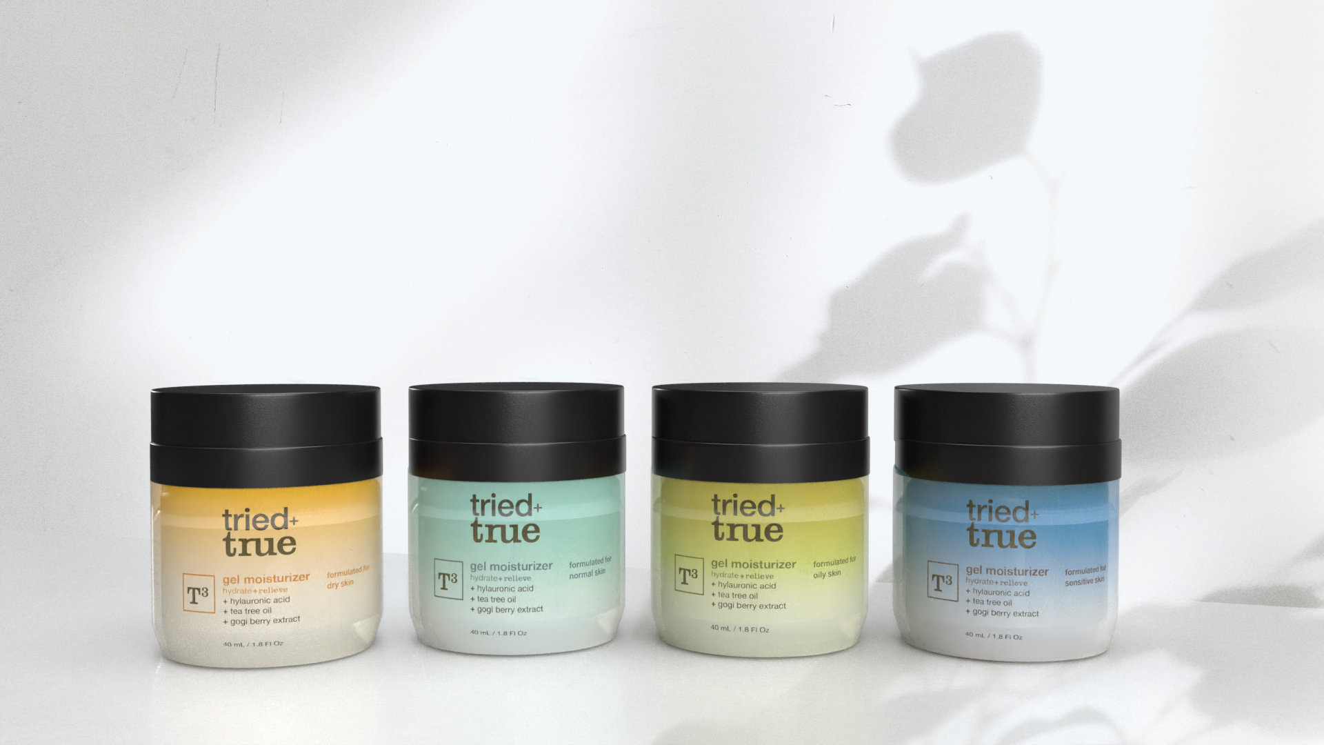
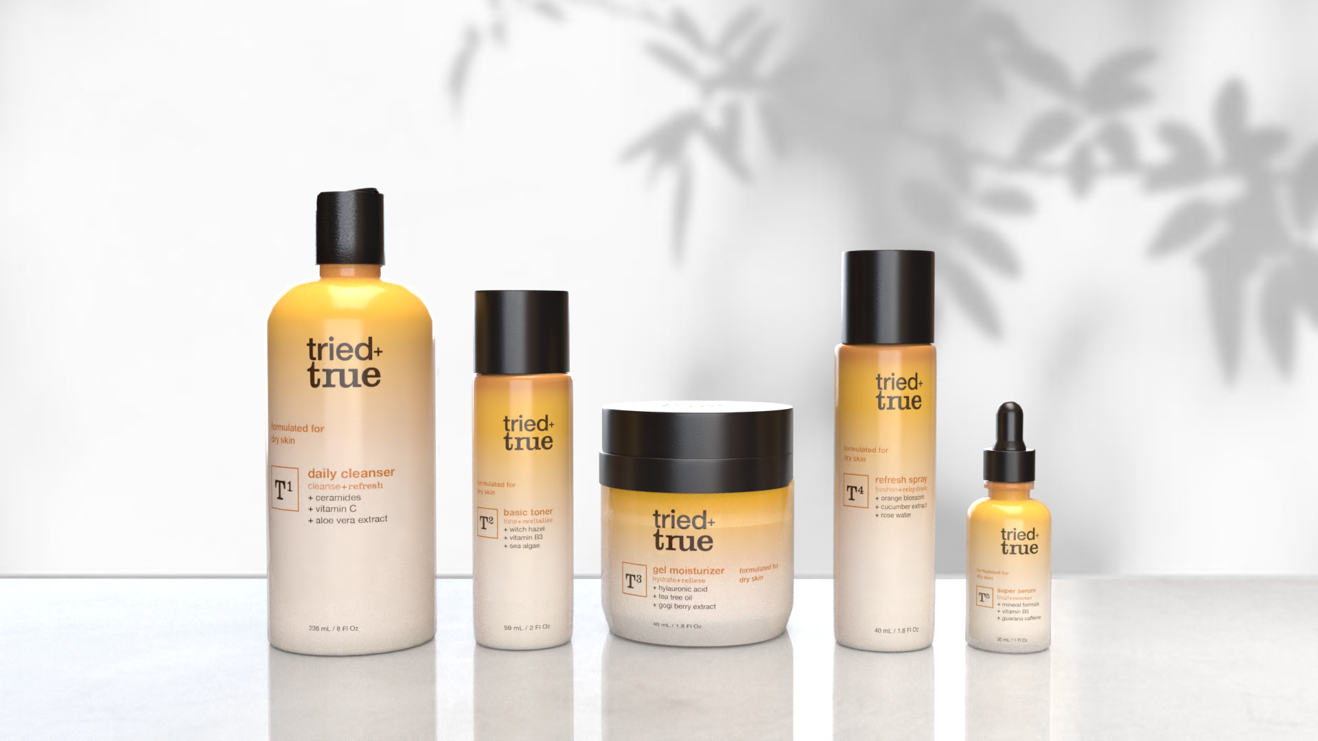
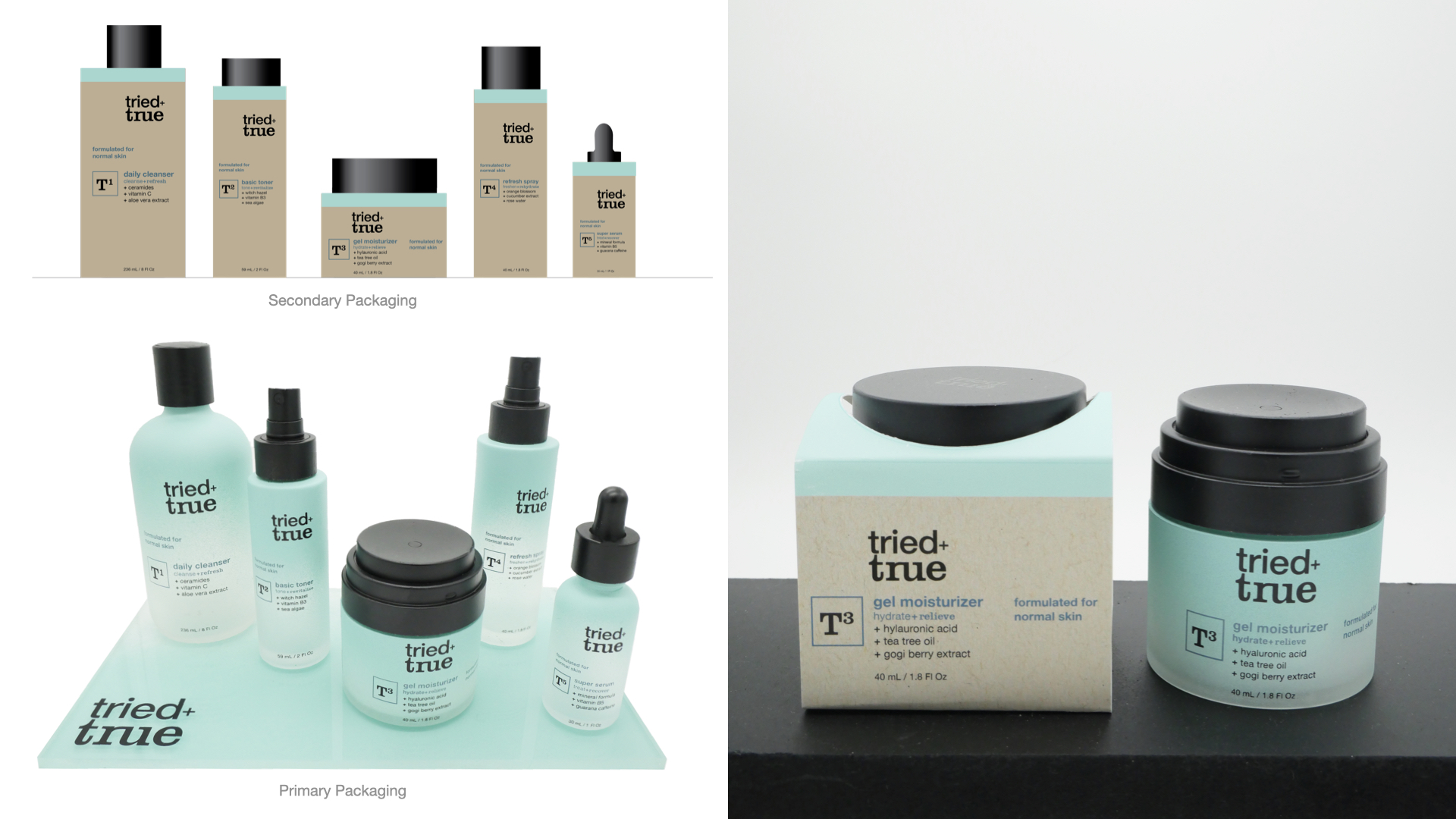
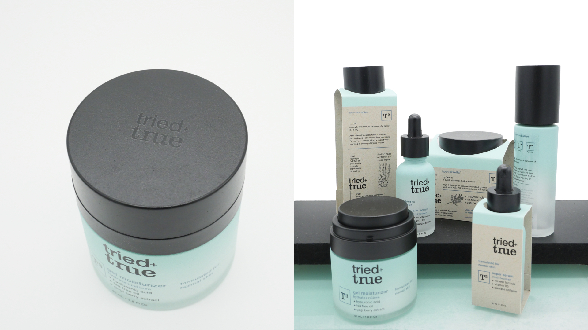
This straightforward five-step system uses a visual system influenced by scientific elements, it features the letter T followed by the corresponding step number, ranging from T1 to T5. The core concept and color story is directly related to the four most common skin types. Each lineup, with different formulas, is assigned to a specific skin type and has a specific corresponding color. The secondary packaging is a band of recycled card stock to protect the primary packaging in a retail environment while showcasing the gradient frosted glass from the sides.
Image
Image
Image
Image
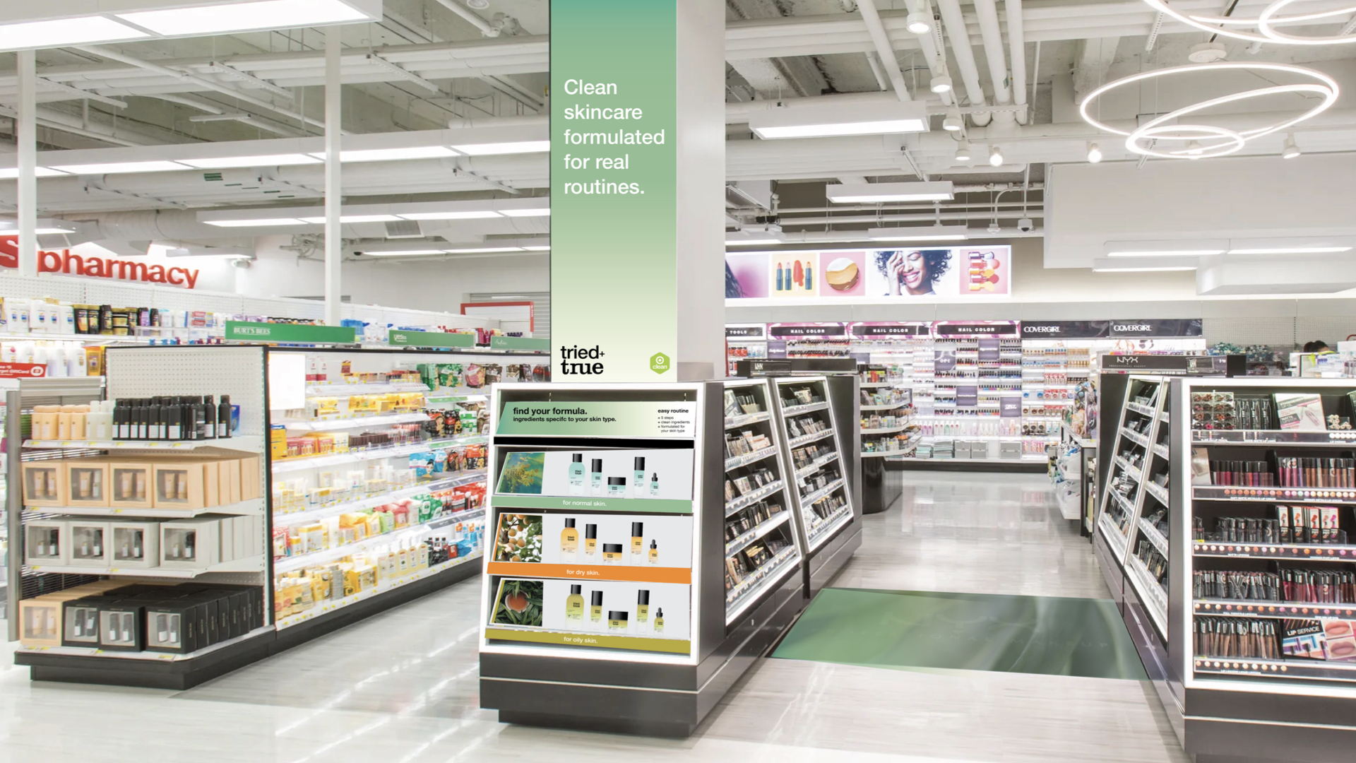
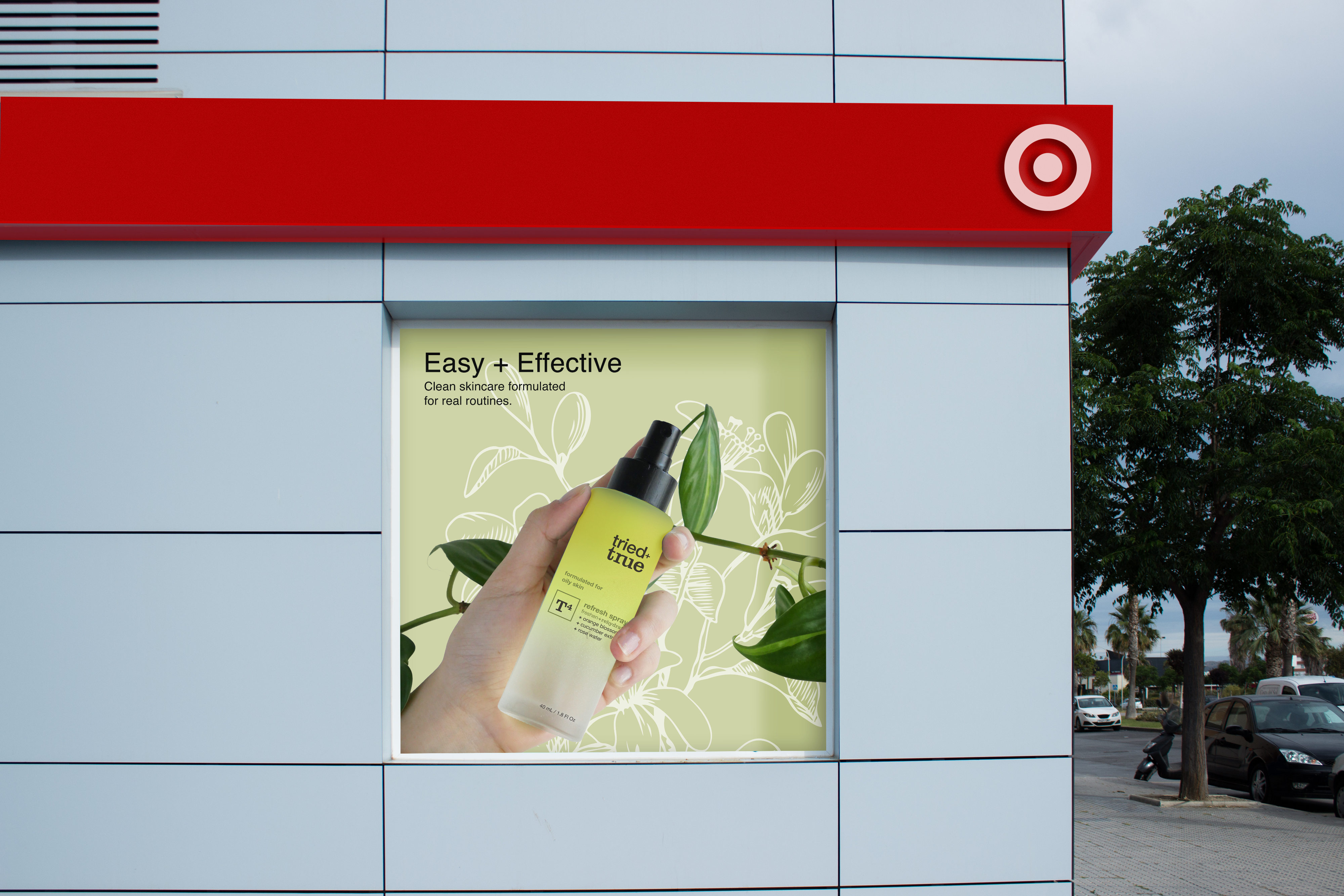
The correlation between the brand's visual language and the Target store environment was an important consideration in this project. The retail environment at Target embodies the overarching approach of bringing order and clarity to shoppers. This is achieved through meticulously crafted and concise taglines that effectively convey the product's impact. The product photography shows real plants and people to showcase the brand’s authenticity. Both ingredient photography and line drawn illustrations were carefully selected to promote the brand as honest and comprehensive. This showcases the naturally derived formulas suitable for everyday use through the casual art direction of the product being held.
Image
Image
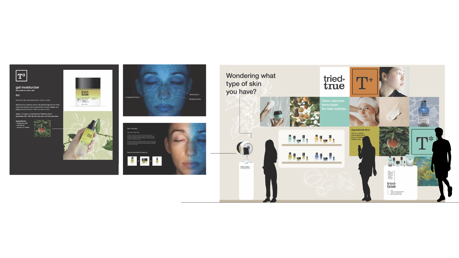
Recognizing that potential customers may not know their skin types, I created a pop-up experience featuring a skin analyzer (screens on the left). This new technology is a recent trend being integrated into retail environments. Once customers have identified their skin type and individual concerns, they can then browse through a curated lineup of products tailored to their specific needs.