Image
Image
The inspiration from the brand came from midcentury modern furniture. It played on the idea that many times MCM furniture or products physically hold up, while also showcasing timeless designs. They end up being thrifted, reused and ultimately economical and more environmentally friendly than furniture that proves obsolete after a short period of time.
Image
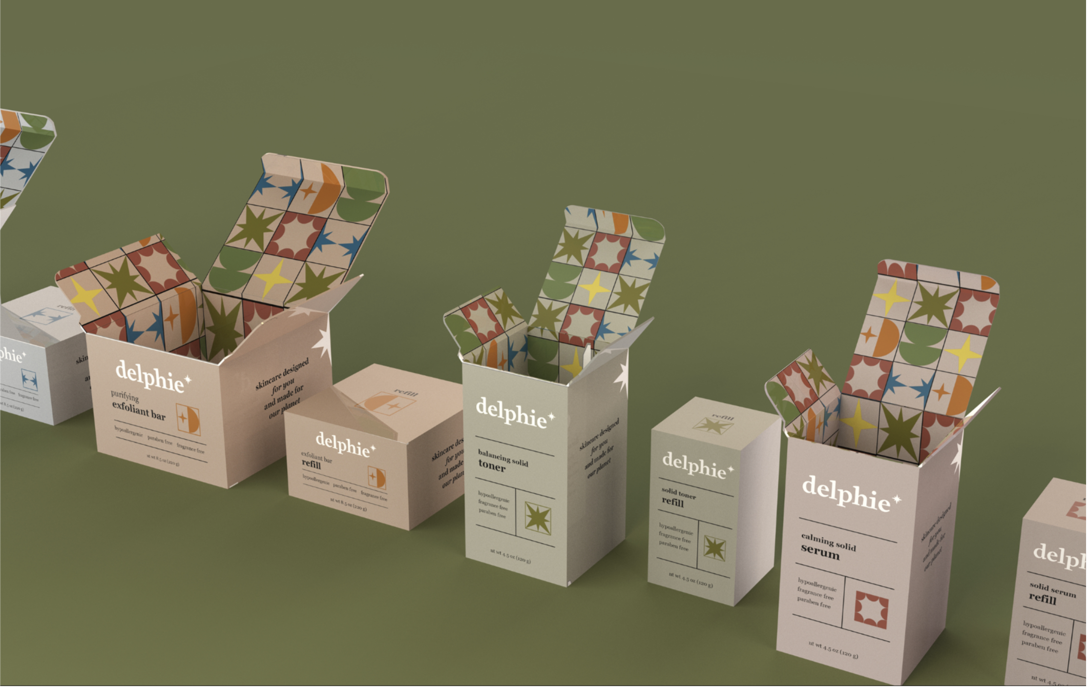
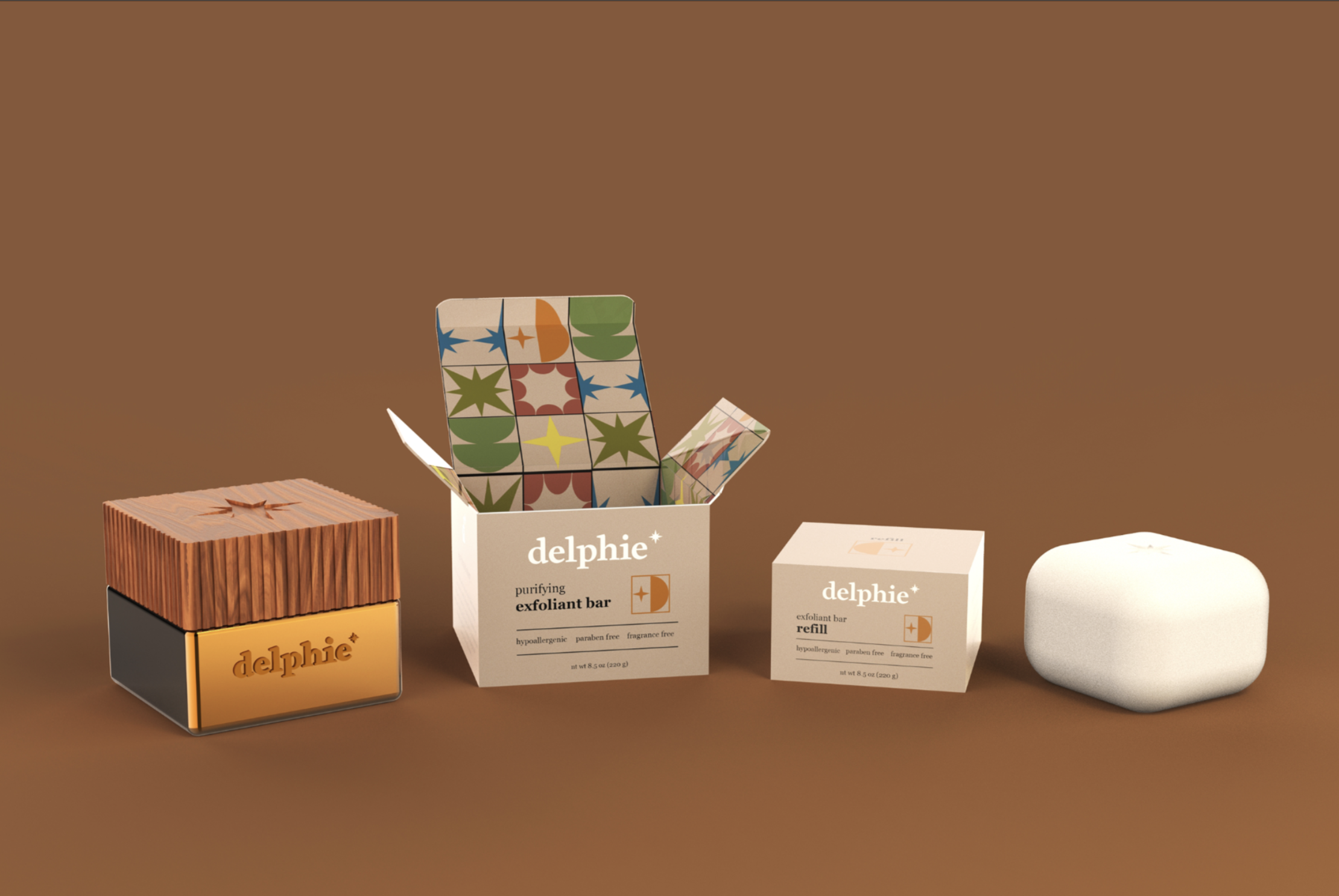
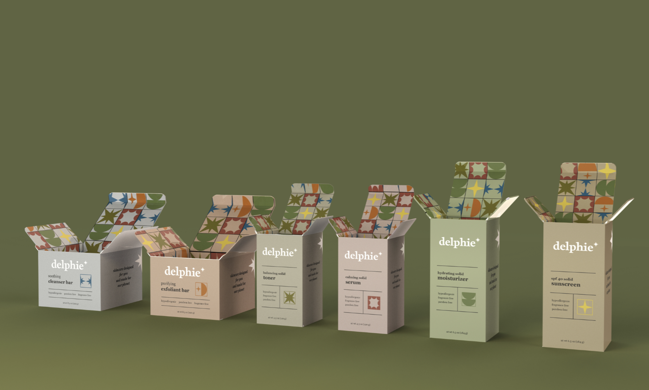
The starburst seen in many Midcentury designs became the hero visual for inspiration, with colors taken from fabrics and patterns found on real furniture pieces. The iconography was created and the patterns played on this MCM concept.
Image
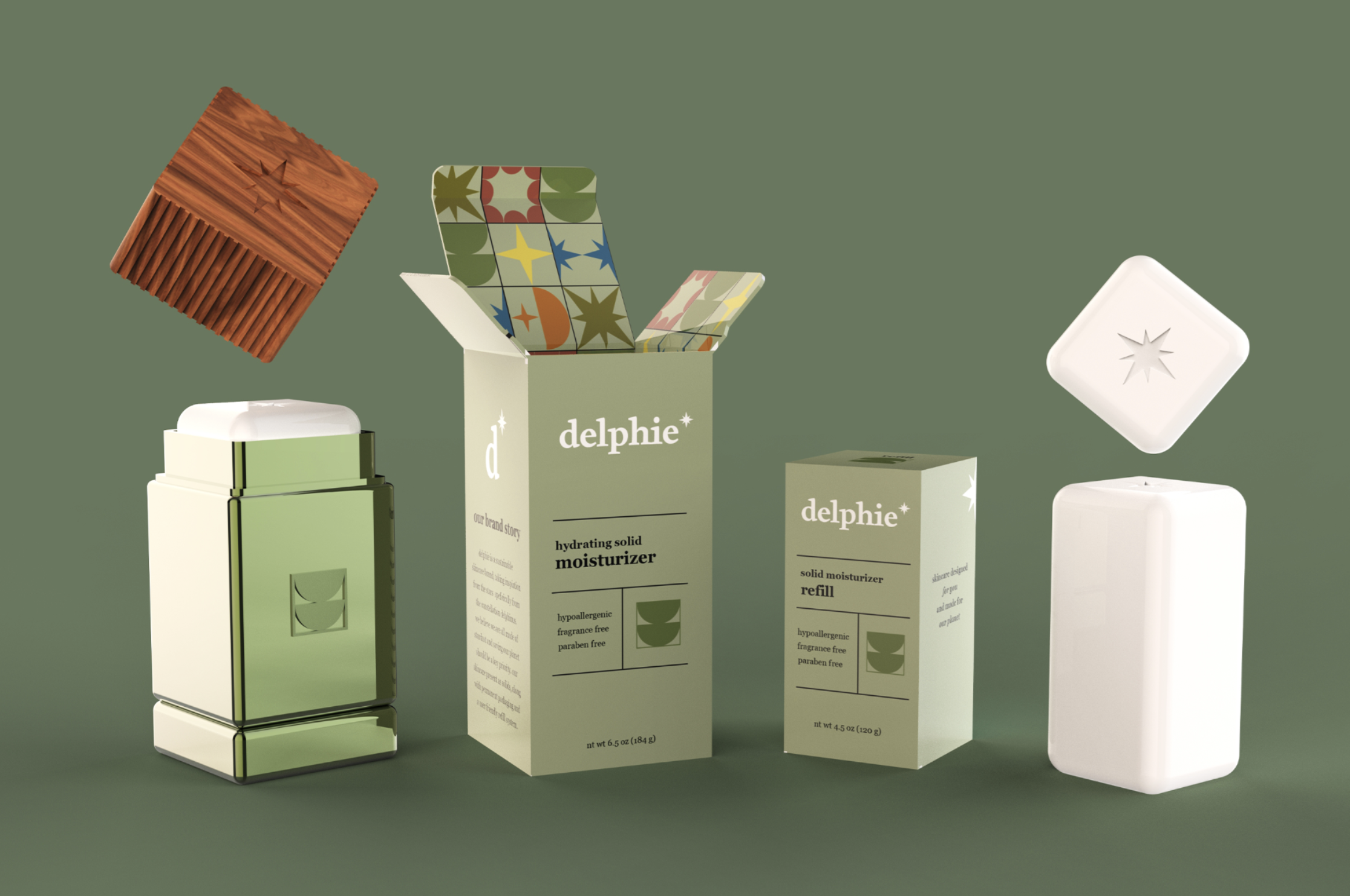
Because the beauty is solid, it can be sold in cartons as is and be put back into the solid aluminum refill system created. The solid beauty reduces water waste, and also the fuel needed for transport with the lighter weight.
Image
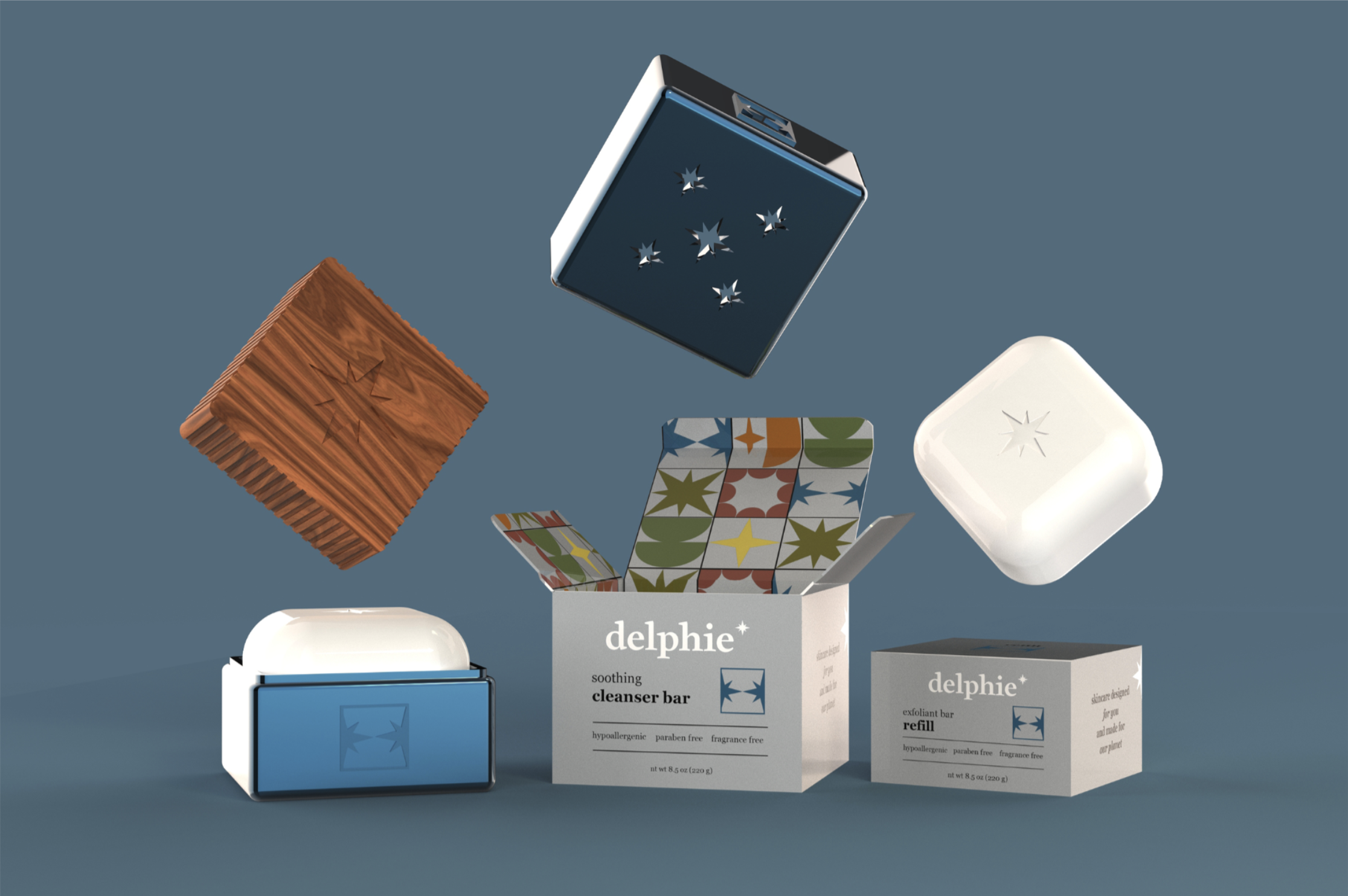
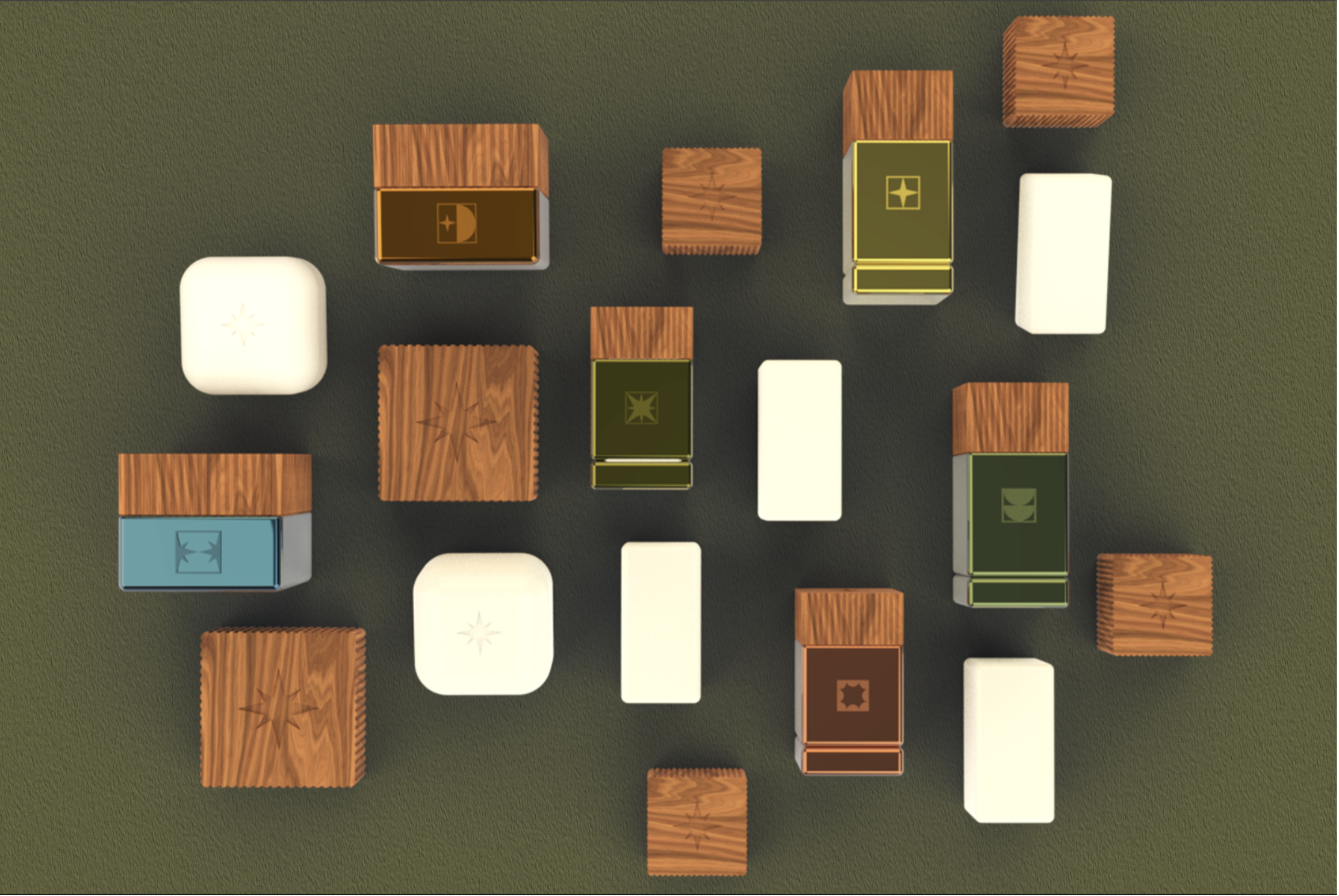
The square forms took inspiration from the patterns found in MCM design with the lids using ridges to add better functionality while also alluding to the textures. The embossing and debossing then showcases the brand and the product type itself.
Image
Image
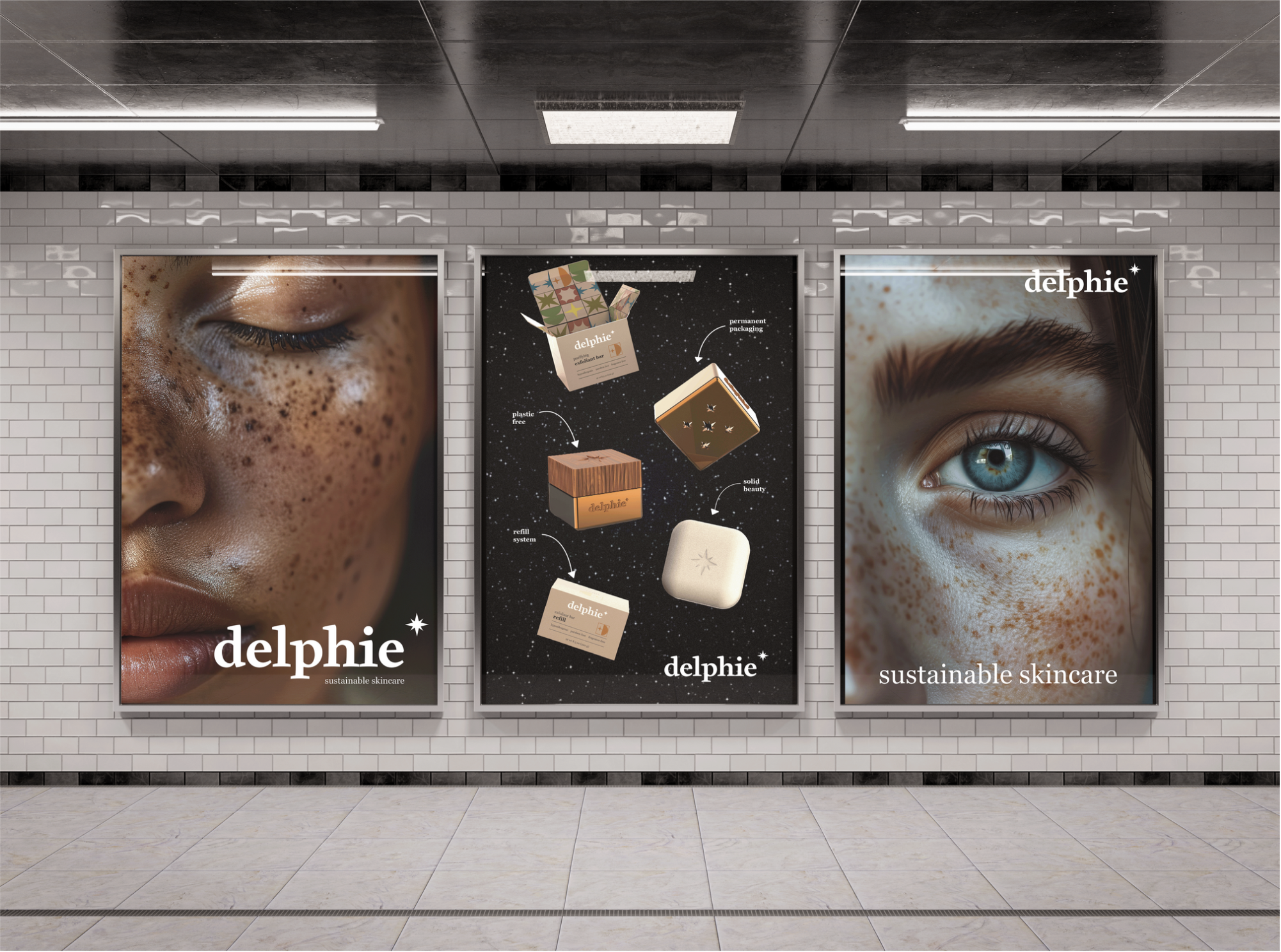
The starburst then gives the opportunity to relate it back to the night sky and nature, while also alluding to this same pattern seen in freckles in up close shots of skin to showcase the natural beauty. These patterns are also visible in irises, showcasing a range of color and patterning.