Mikey Replan
Master of Design in Interaction Design — Graduate Interaction DesignNASA Worldview Redesign
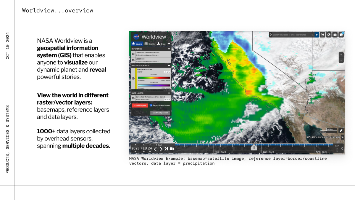
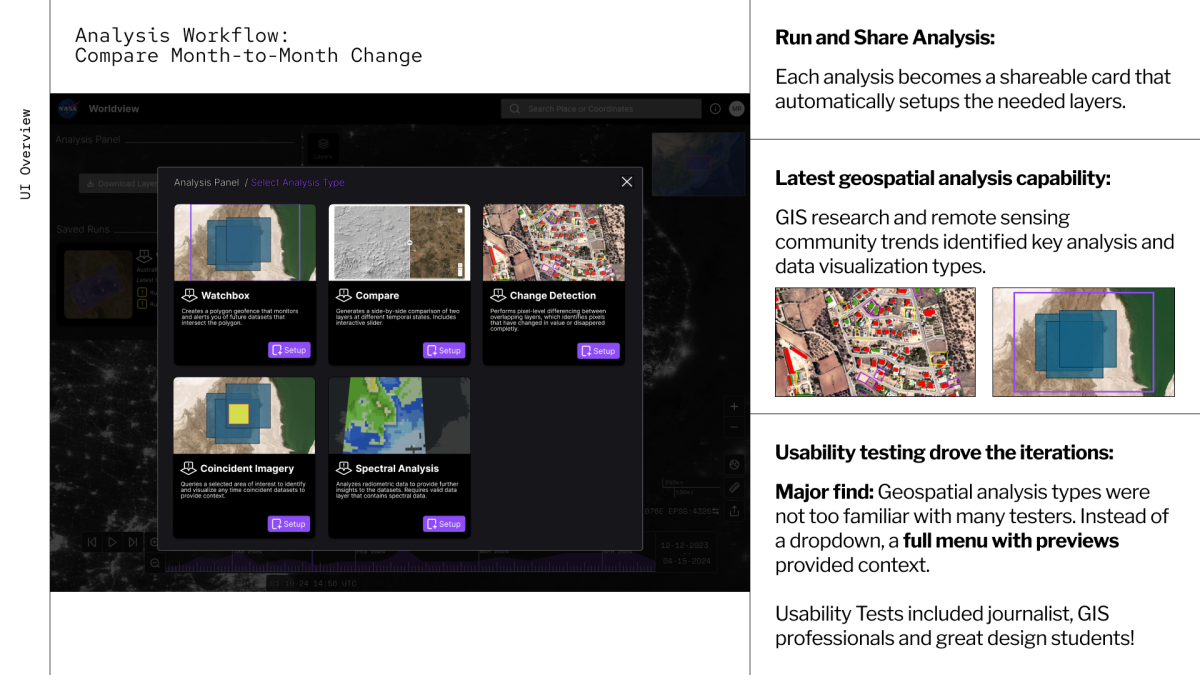
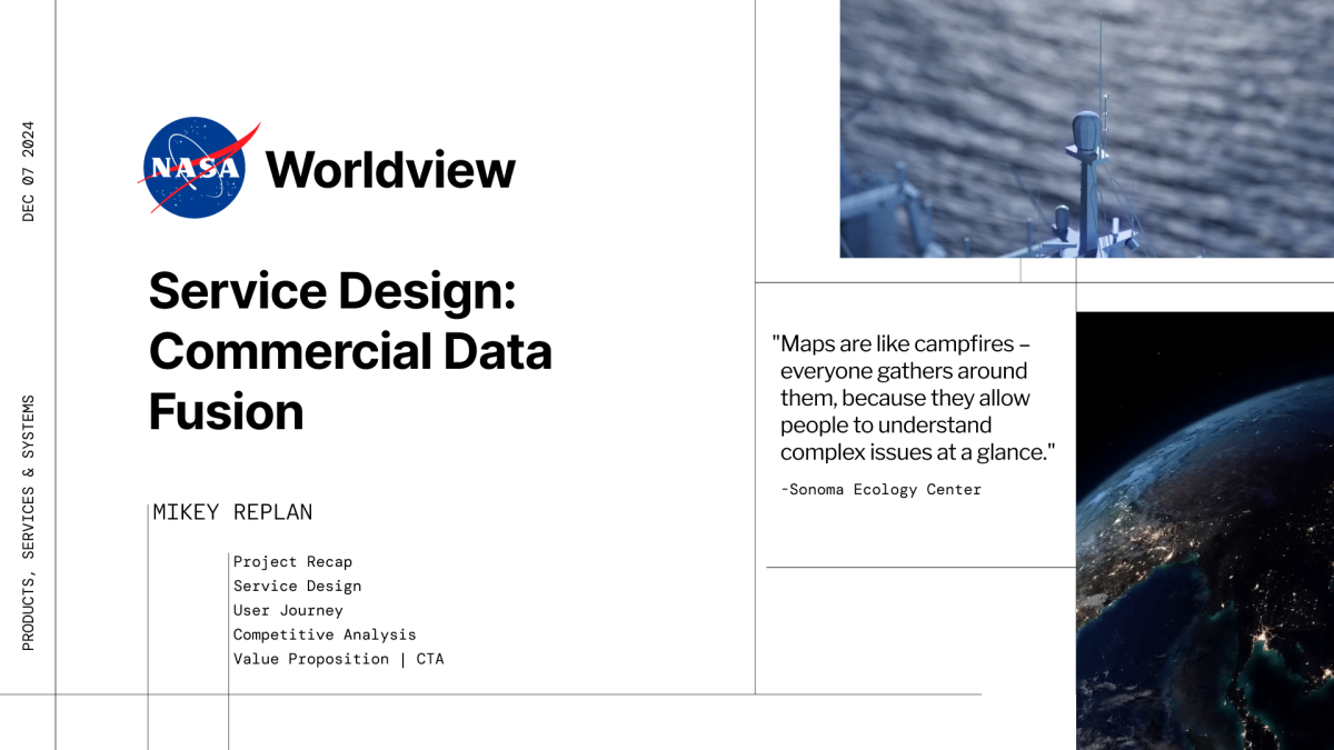
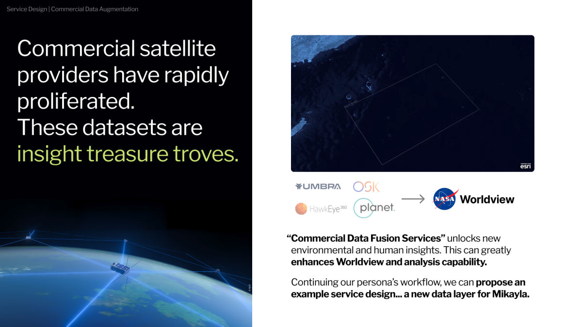
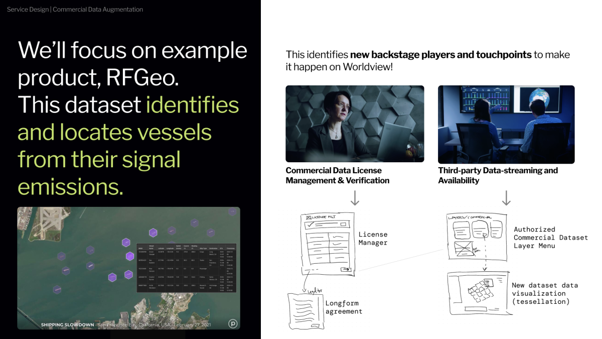
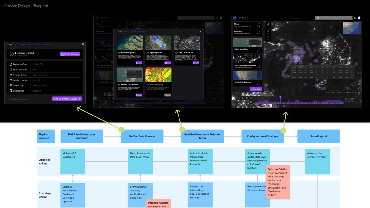
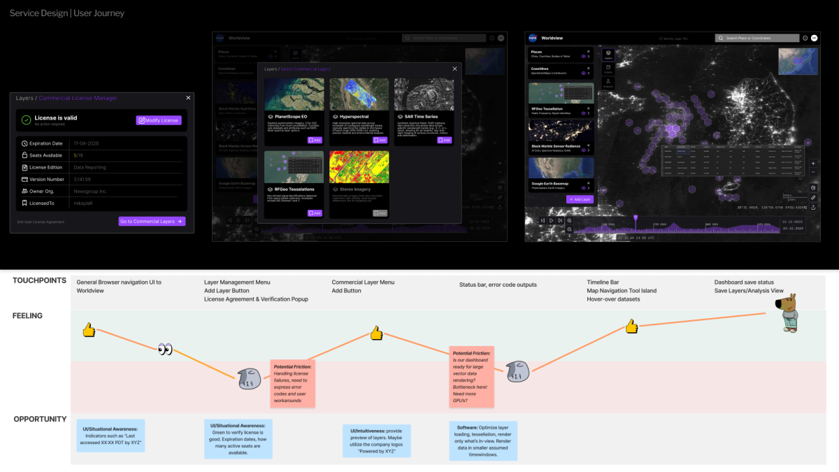
This project evaluated NASA Worldview, a geospatial dashboard displaying historical weather and climate data from numerous remote sensing sources. Over the years, the platform has grown complex. Using a data journalist persona framed by UX research, I identified opportunities to streamline task flows and designed the integration of a new service: commercial data sources.
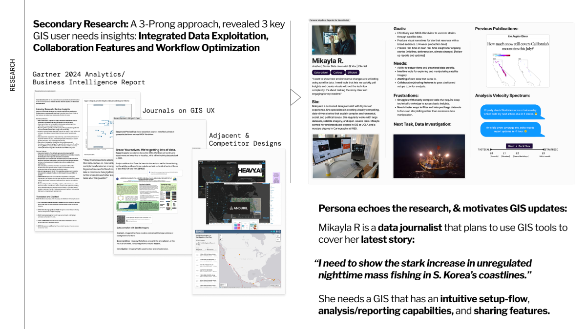
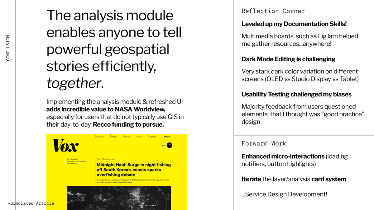
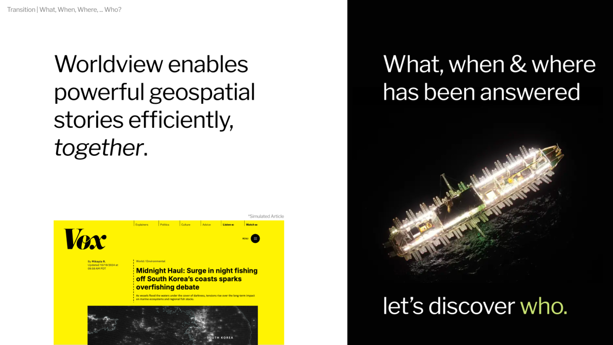
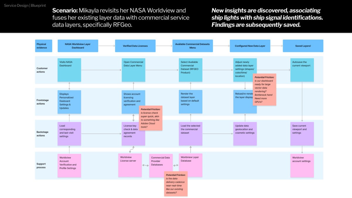
This project also exercised creative storytelling where the persona, Mikayla, a data journalist, is looking to use Worldview to solve a real-life problem. Using both government and commercial data sources with the redesigned Worldview, she is able to uncover an emerging ecological-economical maritime crisis.
See the UX/UI and Service Design full slides: https://www.figma.com/slides/jeWqxK8McRLMJ58aV3QcLo/presentation_Worldview?node-id=27-21&t=i0xQV4Agz4wEEAKa-1
Note: This project is a hypothetical redesign based on an existing, publicly available NASA data dashboard. It is an independent concept study with no affiliation or collaboration with NASA or any commercial entities. Reference to commercial products were drawn from publicly available marketing materials for illustrative purposes only.
- Systematically evaluated the existing dashboard, noting deficiencies in terms of user situational awareness and interaction design principles.
- Perform primary and secondary research, especially pulling from dashboard performance studies and recent trend reports.
- Develop service design blueprints that identified front-of-the-house actors and key backstage processes.
- Competitive analysis of other system that could have pulled Mikayla to adopt a different task flow.
- Expanded User Research Sourcing: this class opened my eyes to a plethora of annual design studies and trend reports from reputable research firms were worth citing and added a lot of value, especially strong statistics that helped justify my design choices. Current-day GIS Dashboard design UX reports gave me a strong starting point in terms of improved layout backed by already-completed user testing!
- Dark-mode Design can differ by machine!: my dashboard design primarily had a "dark-mode" visual design and I learned how this can drastically appear different among computer monitors, especially when deploying prototype to other people's machines.

