MFA in Graphic Design - 2 Yr Path — Graduate Graphic Design
Course:
Font Design 2
Faculty:
Greg Lindy
Term:
2025 Fall
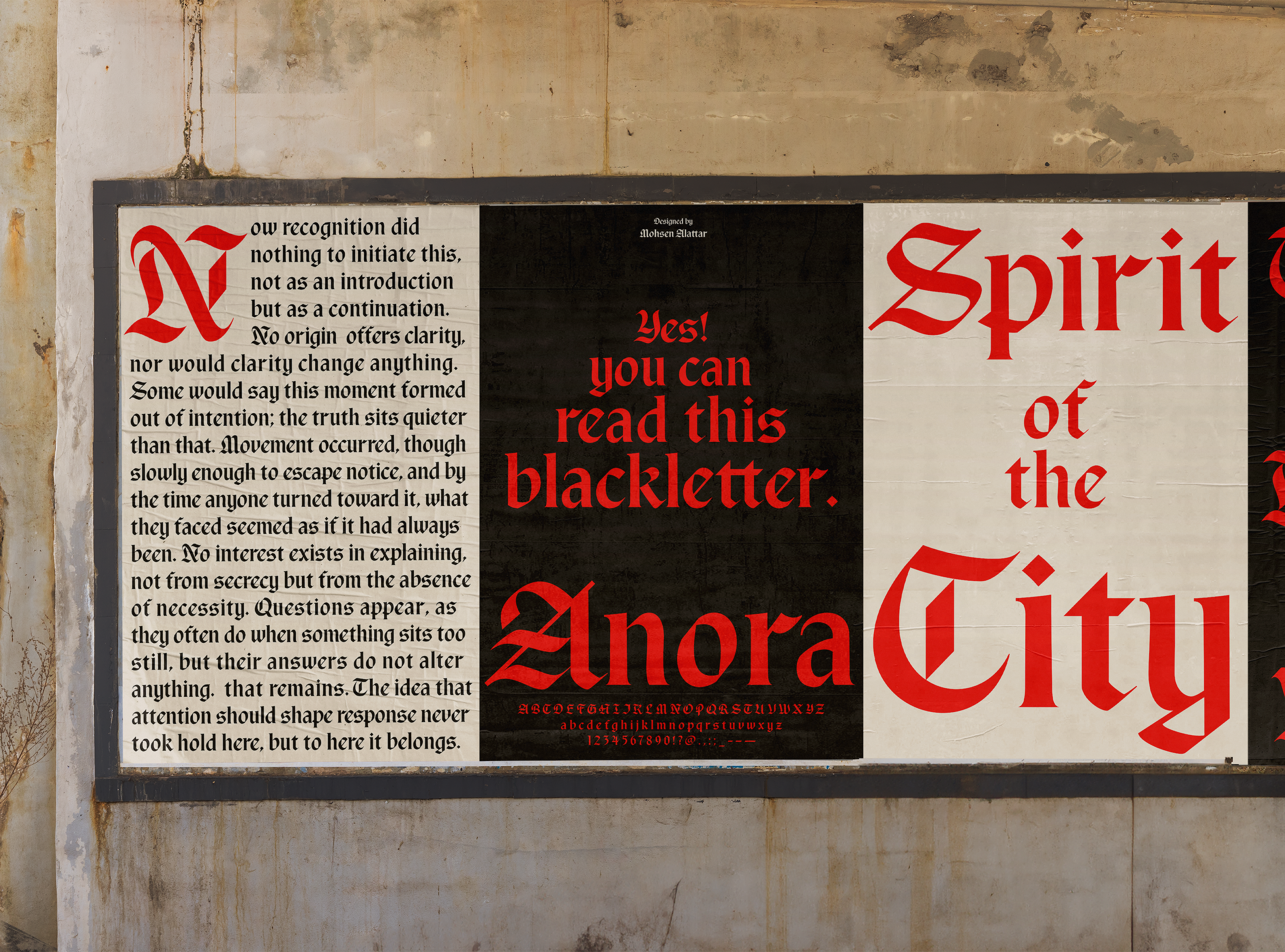
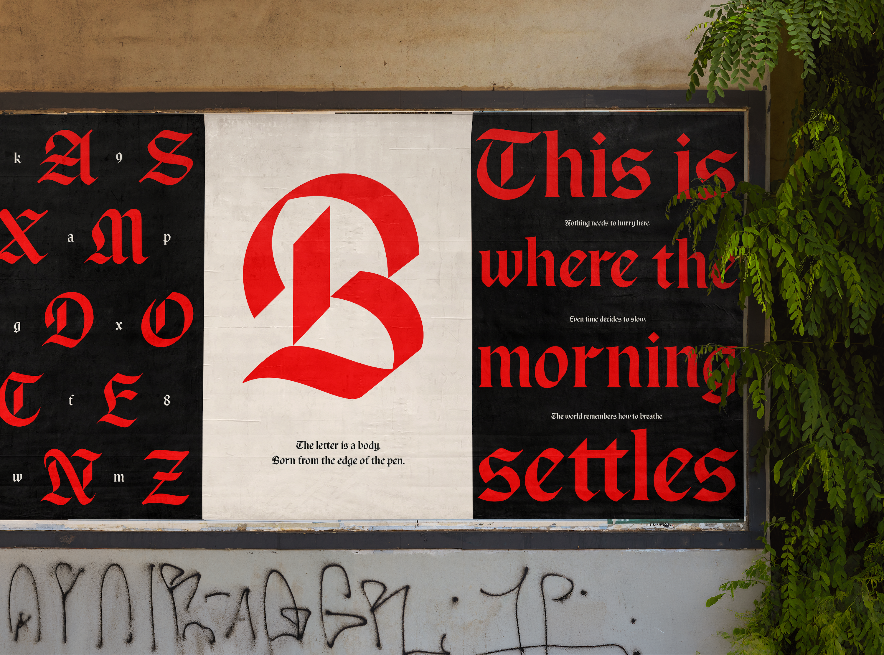
Anora Font
This project is the development of a readable blackletter typeface derived from Rotunda and early script traditions. It challenges the assumption that blackletter must be dense, ornamental, or difficult to navigate. Instead, it focuses on clarity, proportion, and rhythm while preserving the structural discipline of its historical roots.
The design draws from the rounded logic of Rotunda, refining its forms for consistency and contemporary legibility. Internal geometry and controlled stroke relationships help stabilize the texture, allowing the typeface to maintain presence without overwhelming the reader.
Process:
The process began with research into Rotunda manuscripts and early blackletter specimens to understand their structural logic rather than their ornament. Instead of tracing or directly reviving historical forms, the focus was on analyzing stroke construction, rhythm, proportions, and counter shapes.
Initial explorations were developed digitally in Glyphs, starting from skeletal structures to establish internal geometry and spacing before expanding into full forms. Particular attention was given to simplifying complex junctions and moderating contrast to improve legibility while preserving character.
Learning Outcomes:
This project deepened understanding of blackletter structure and its underlying calligraphic logic. By translating Rotunda principles into a digital framework, the work strengthened skills in proportion, spacing, and systematic construction. Iterative refinement of key letters improved sensitivity to rhythm and legibility.