MFA in Graphic Design - 2 Yr Path — Graduate Graphic Design
Course:
Packaging 1
Faculty:
Dan Hoy
Term:
2025 Summer
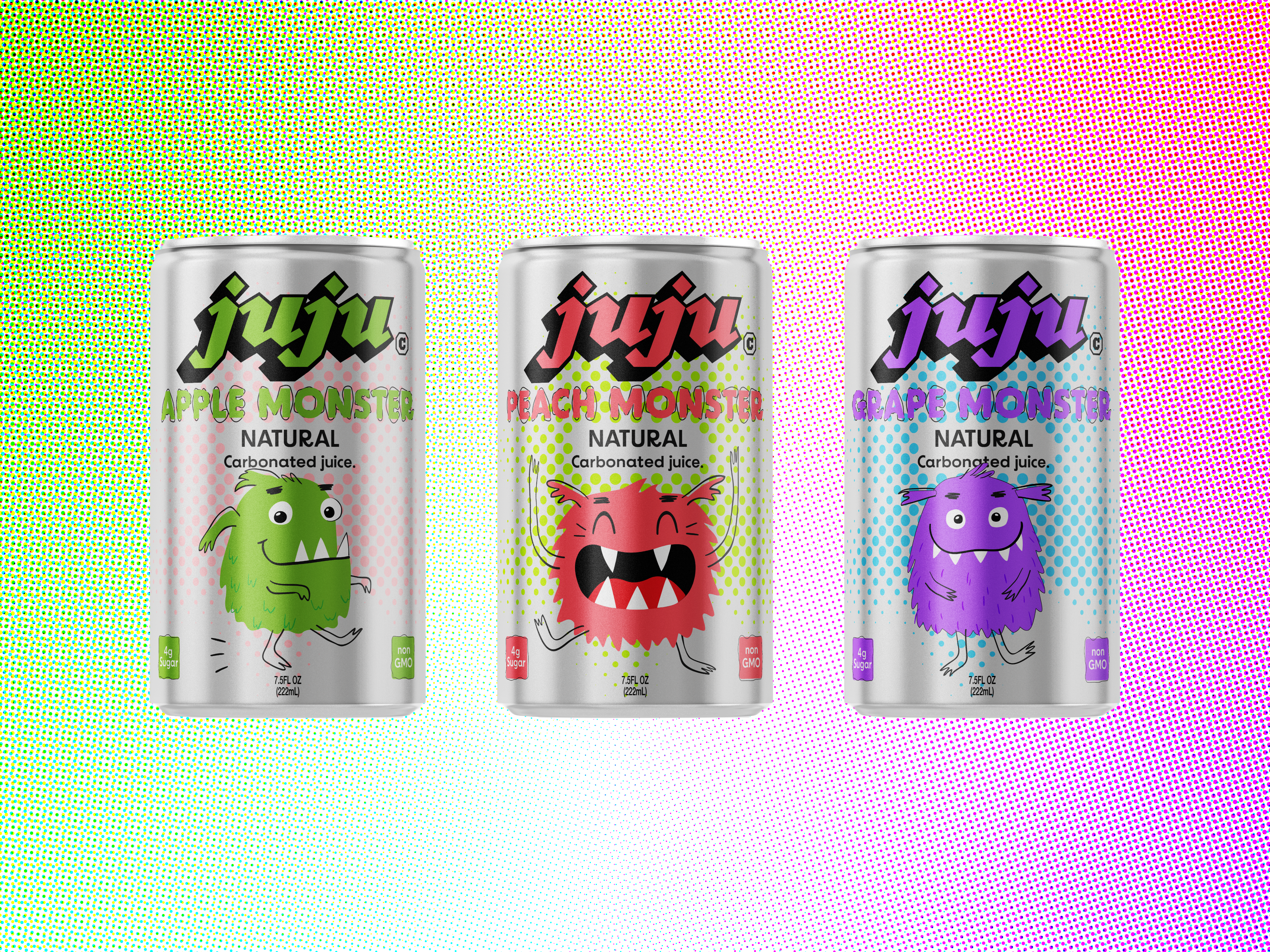
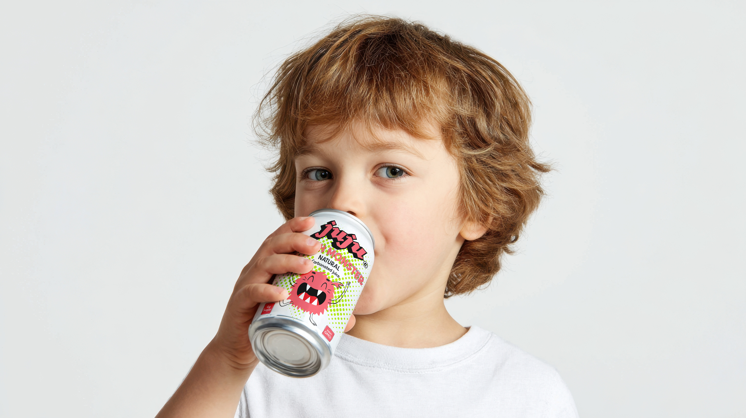
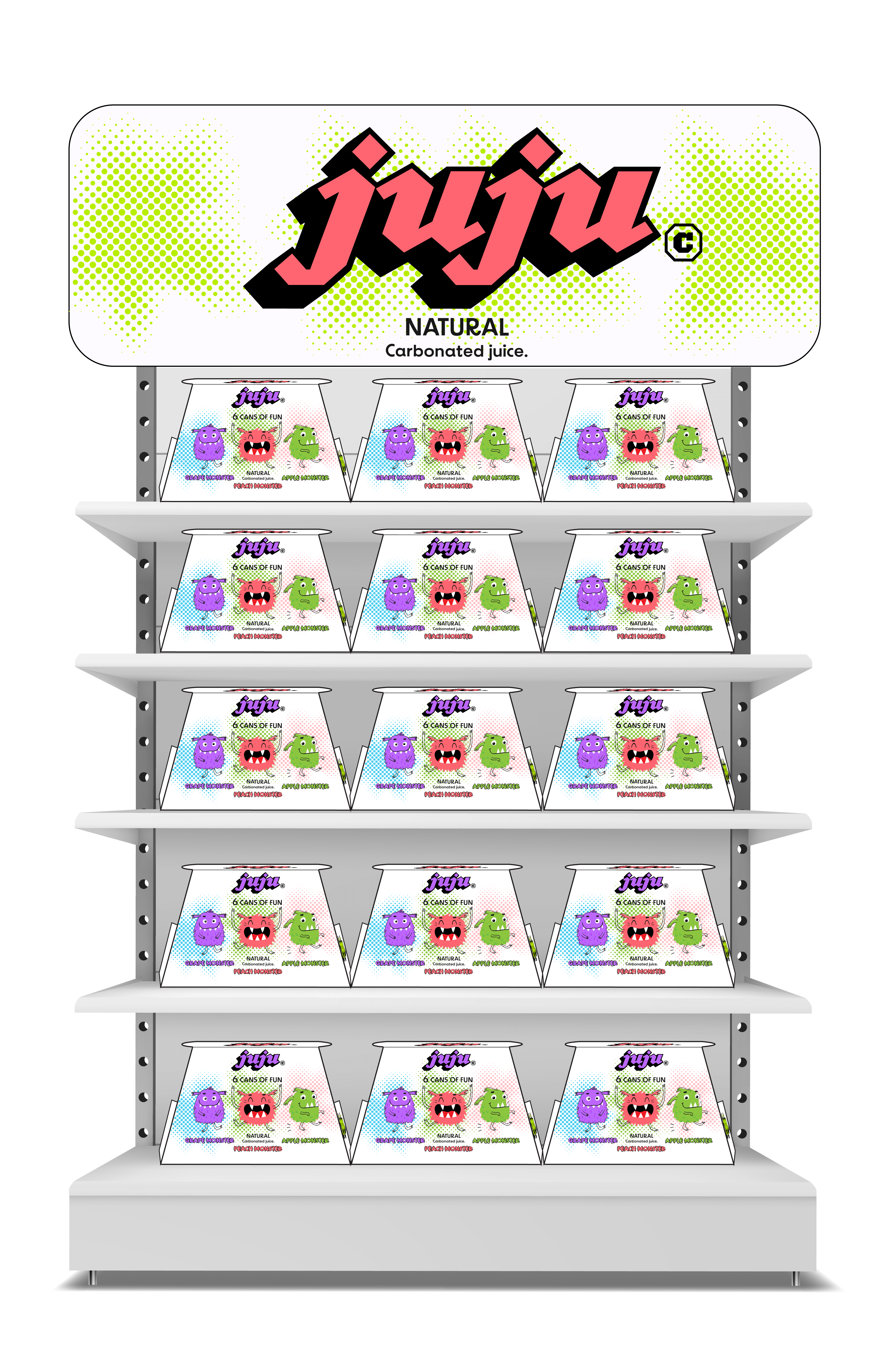
Juju Soda Packaging
Juju began with a simple observation: kids often reach for regular soda, even though most of what’s on the shelf isn’t made with them in mind.
That insight became the starting point for a design exploration, how could a beverage for children feel fun and familiar while presenting a healthier alternative?
As a designer and strategist, I approached Juju as a study in visual language and perception. The goal wasn’t to imitate existing soda brands, but to rethink how form, color, and tone can communicate clarity, trust, and playfulness at the same time.
Process:
The development of Juju started with loose sketches and mind maps that explored tone, personality, and structure. Because the audience is children, with parents as the decision-makers, the challenge was to find a balance between playful energy and clear, trustworthy communication. These early explorations helped define that balance.
I tested shapes, rhythms, and expressions that felt light and approachable without drifting into overly cartoonish territory. The process was about understanding the system first, mapping the emotional space the brand needed to occupy, and letting the logo form grow naturally from those insights.