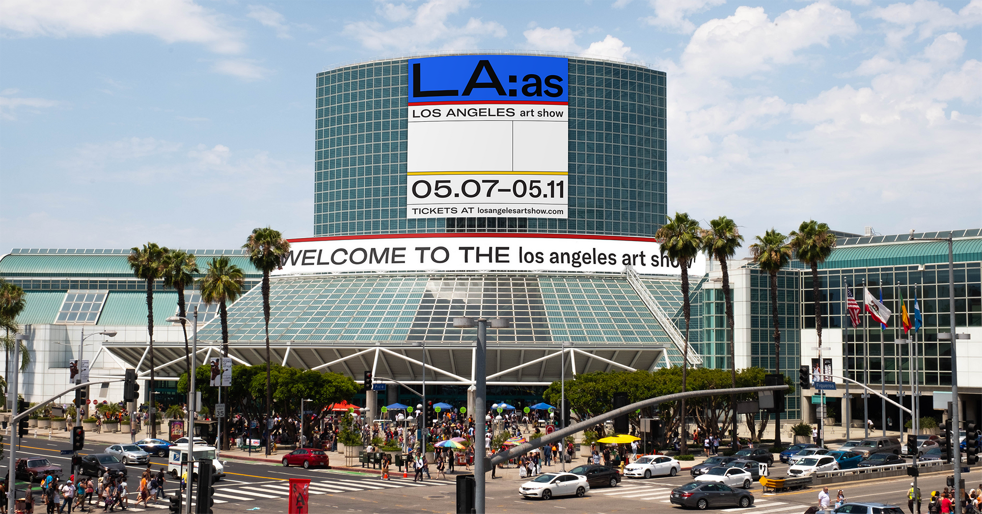
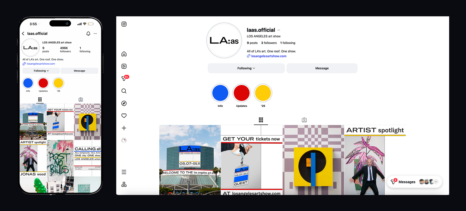
This identity repositions the LA Art Show as more accessible and reflective of the city it represents, with a focus on engaging a broader, non–art-savvy audience. It highlights local artistic diversity while inviting more LA residents beyond the traditional art fair demographic.
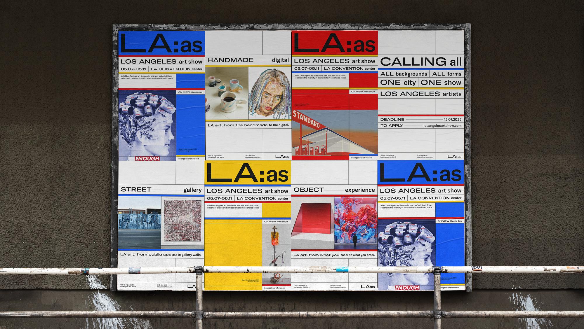
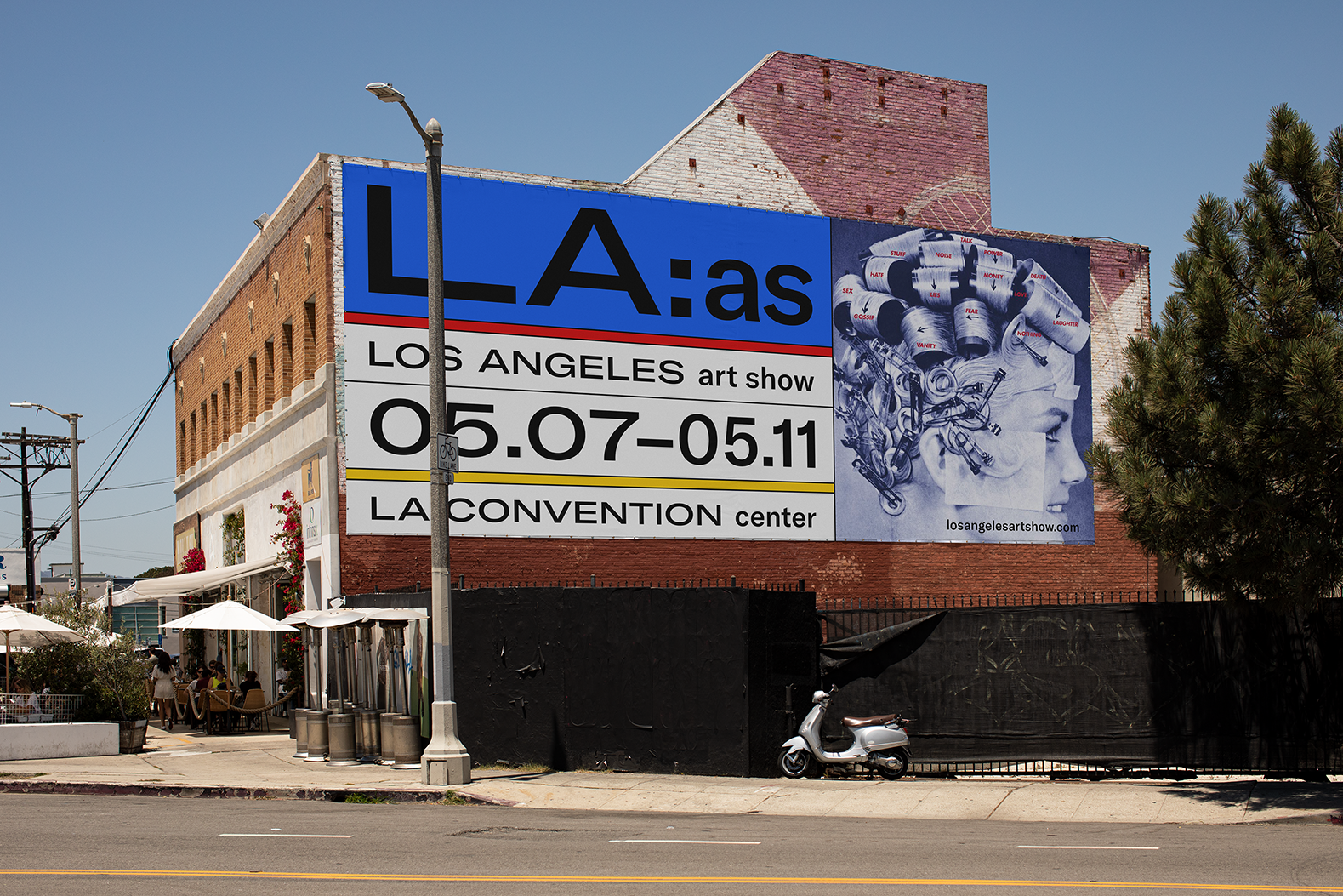
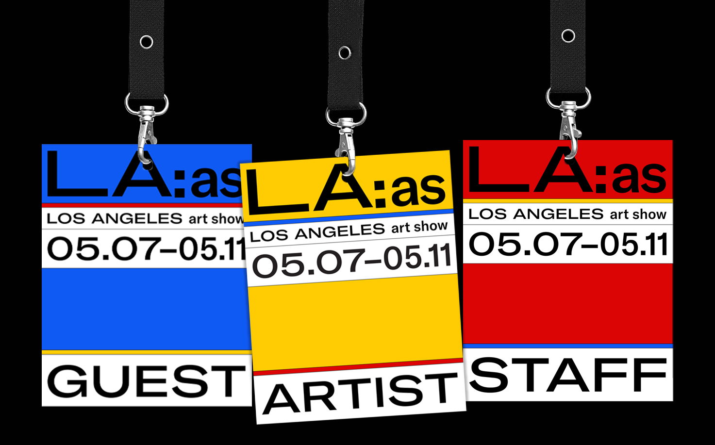
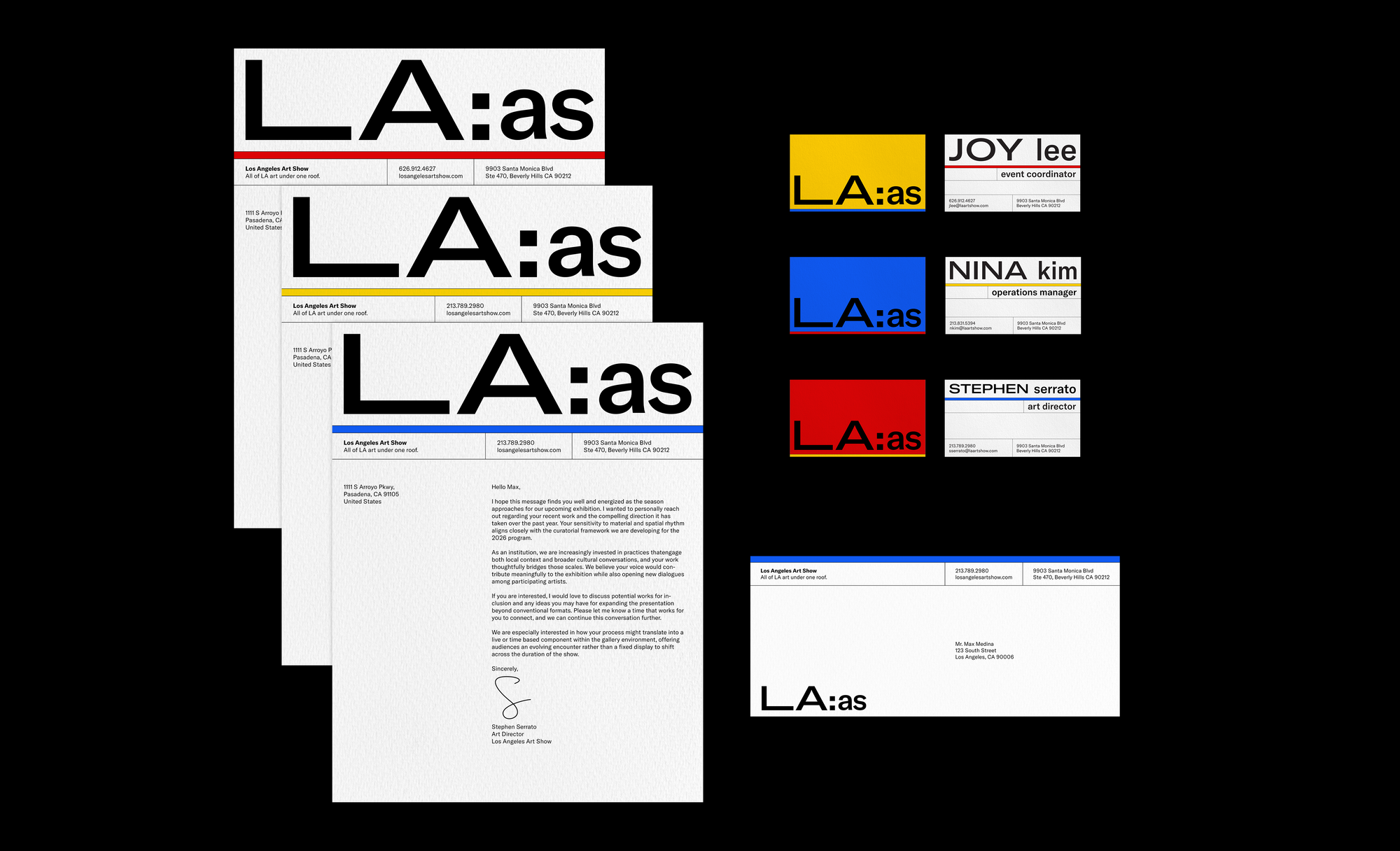
The logotype draws from storefront signage across Los Angeles. The expanded all-caps "LA" signals the scale of the city, while the standard lowercase "as" consolidates it—framing Los Angeles as something brought into one place.
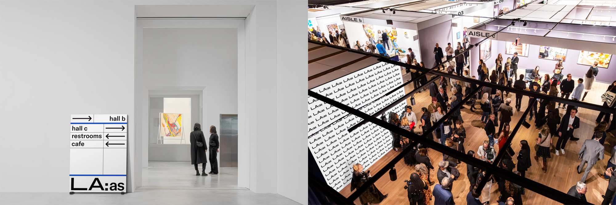
This logotype becomes the foundation for a 60:40 grid system derived directly from the proportions of "LA:as." The ratio translates across posters and print materials, creating a consistent underlying structure that allows for variation while maintaining a cohesive visual language.