Graduates
Pablo Robin
BFA in Graphic Design — Graphic DesignCourse:
GPRT-306 Font Design
Faculty:
Gregory Greg Lindy
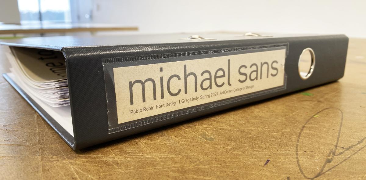
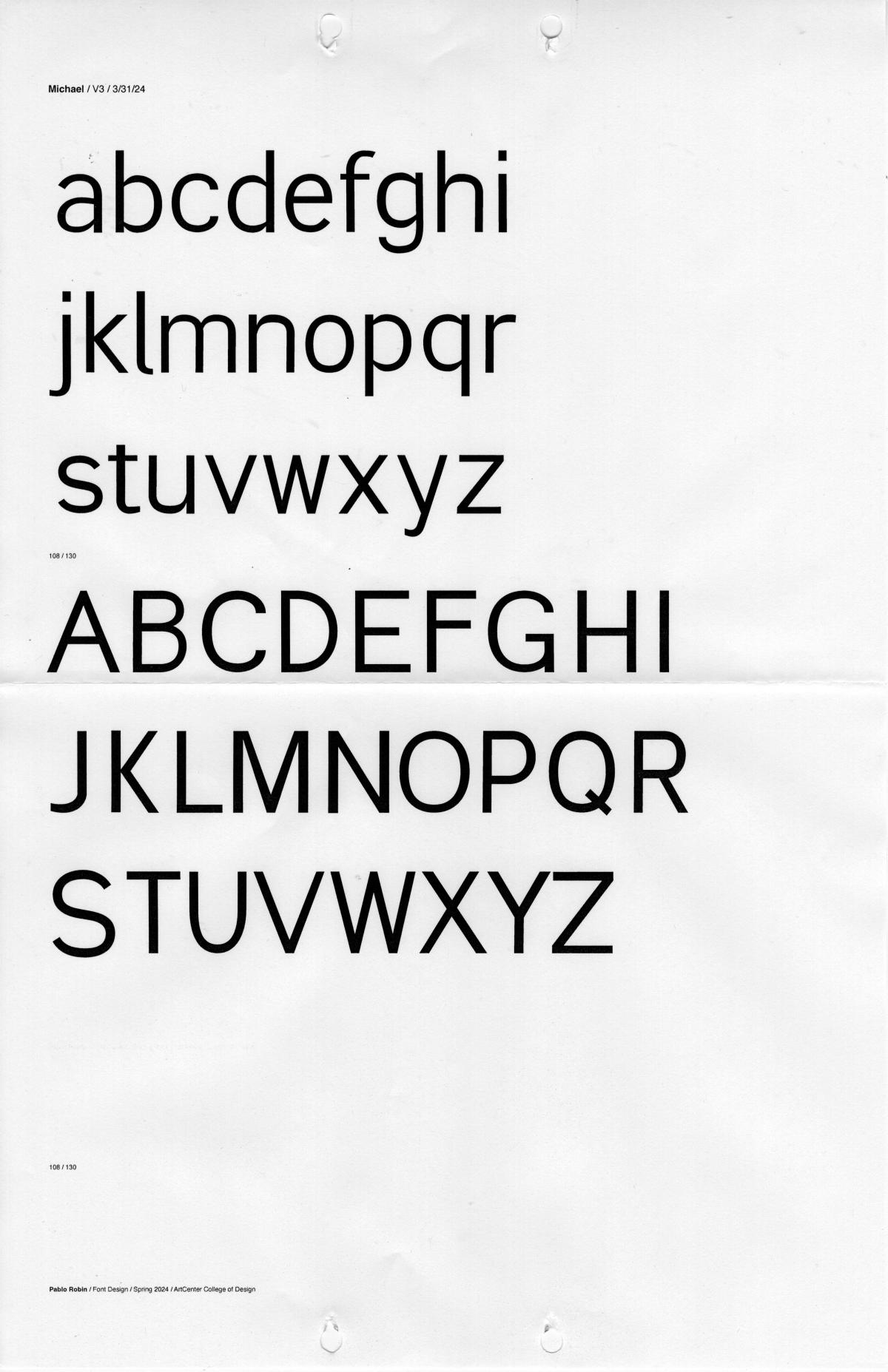
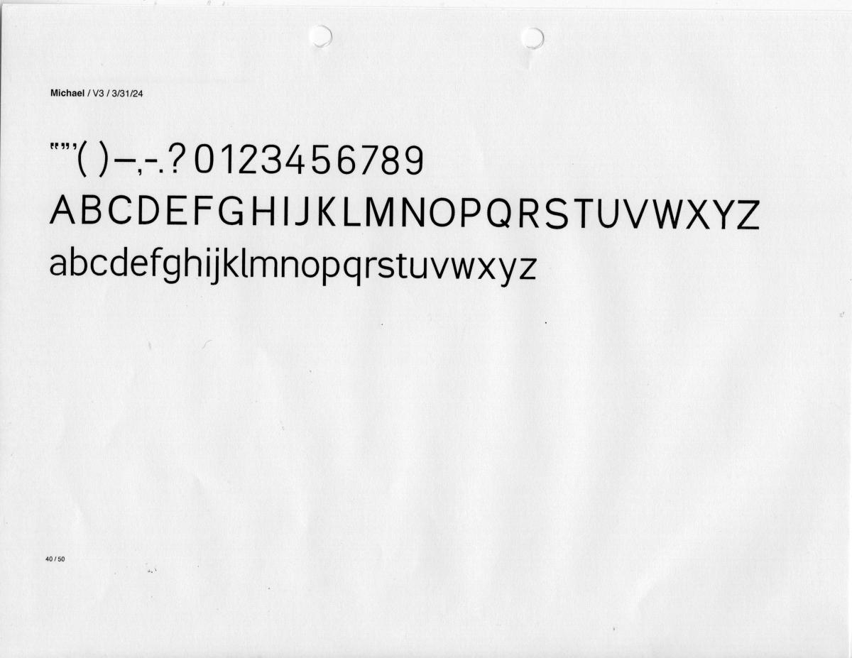
michael sans
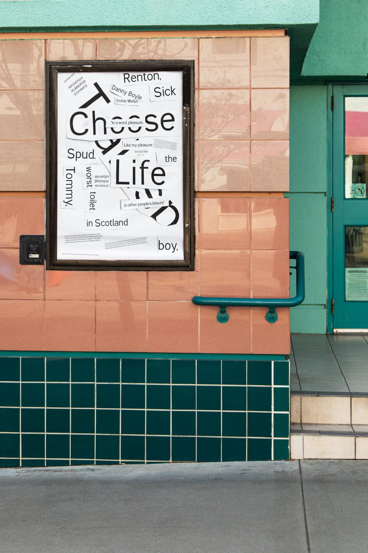
My font is named after a Berlin ACCD professor named Michael Sans. I based it on the font Akkurat, which also was the name of a cafe I would go to with Michael Sans. My font is intended to be manipulated digitally and collaged by hand, but it still functions without manipulation. Michael sans is supposed to bridge the gap between low-brow and high-brow design.
Learning Outcomes:
At the beginning of the project, I felt like I was not going to create something I was proud of. Looking back, I feel like I've grown so much compared to the first day using Glyphs. I was able to get a really in-depth perspective into type while researching and making my own typeface. I would recommend every designer take this class because I learned so much about type, not just about making a font but why the classics are the classics and where it all comes from.


