Image
That way, I was able to take inspiration from that and embrace that into my piece. Having an established and cohesive form, I was able to still use a bold and strong typeface for titles while still representing George Orwell in a unique way.
Image
Image
My publication has 4 columns throughout the spread, where one of them breaks the alignment. That move is to represent what the content tells about Orwell not fitting in with the society standards and questioning the rules.
Image
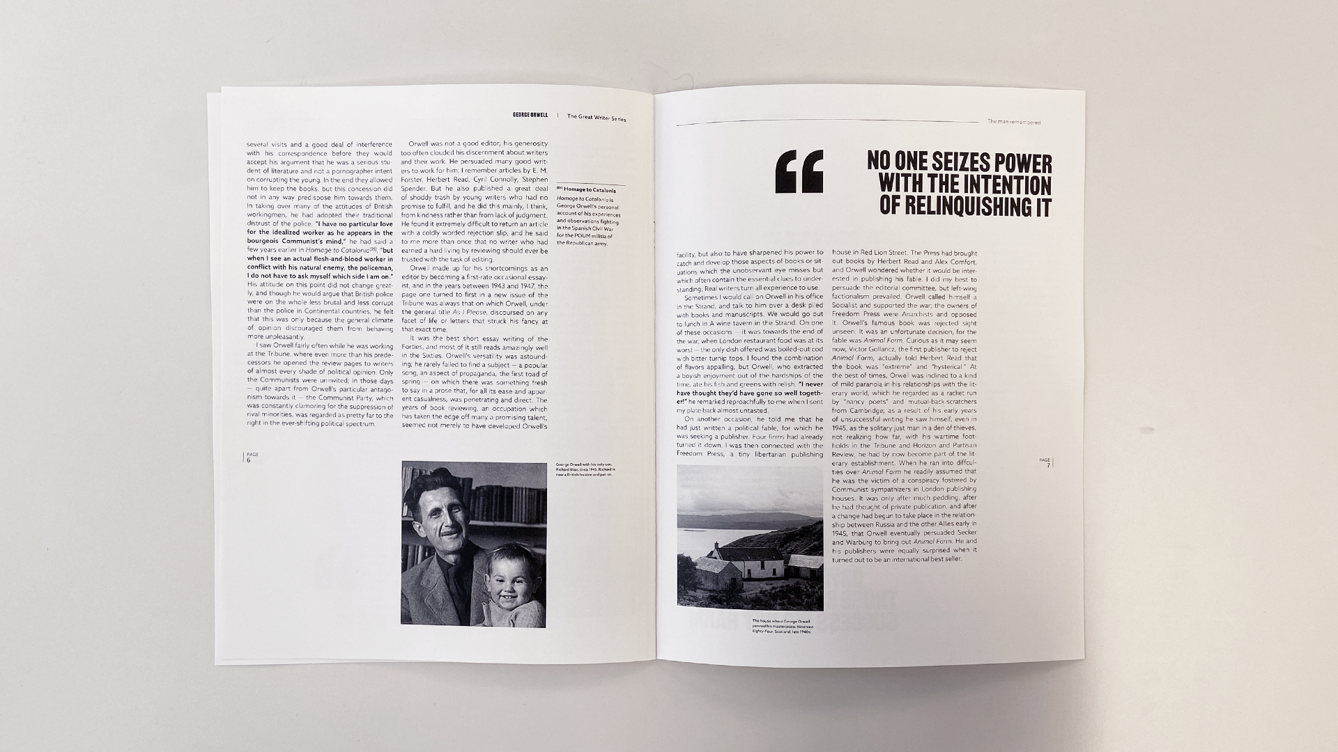
I have two different treatments for the pull quotes, where one of them is accompanied by big quotation mark and one is not. That's because I have two different contents for those quotes, where the ones with the quotation marks are the ones that represent Orwell's words, while the ones without the marks is the author's talking about Orwell's.
Image
Image
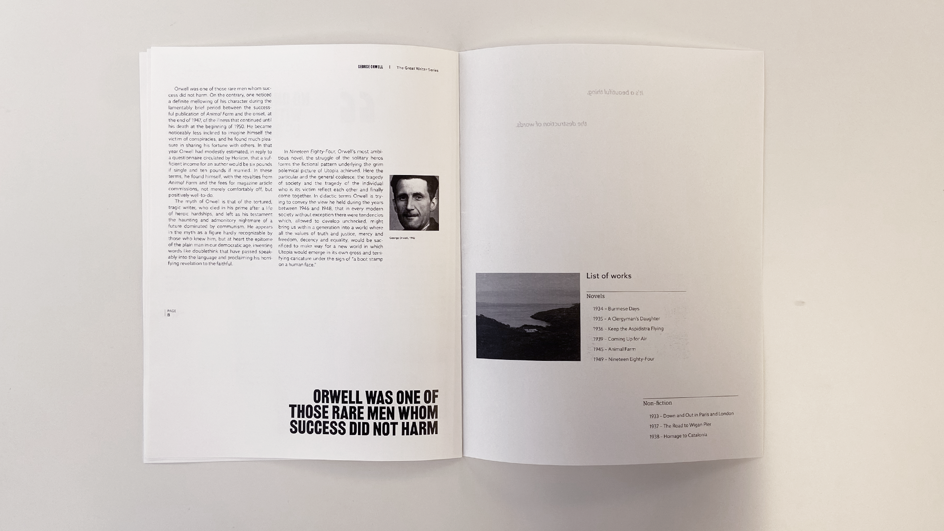
In the inside of the back cover, a list of works, listing all of Orwell's books and novels, accompanied by another photo of the cabin he wrote his last book. This one is a shot from afar, showing how isolated and intimate the cabin is.
Image
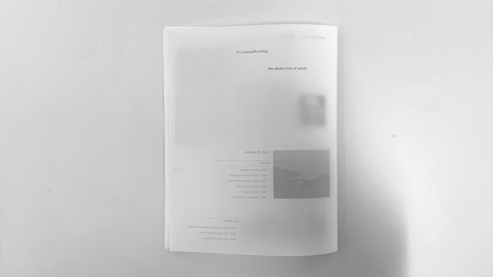
To close, I chose a quote by the writer that fitted well the product. "It's a beautiful thing, the destruction of words".