Image
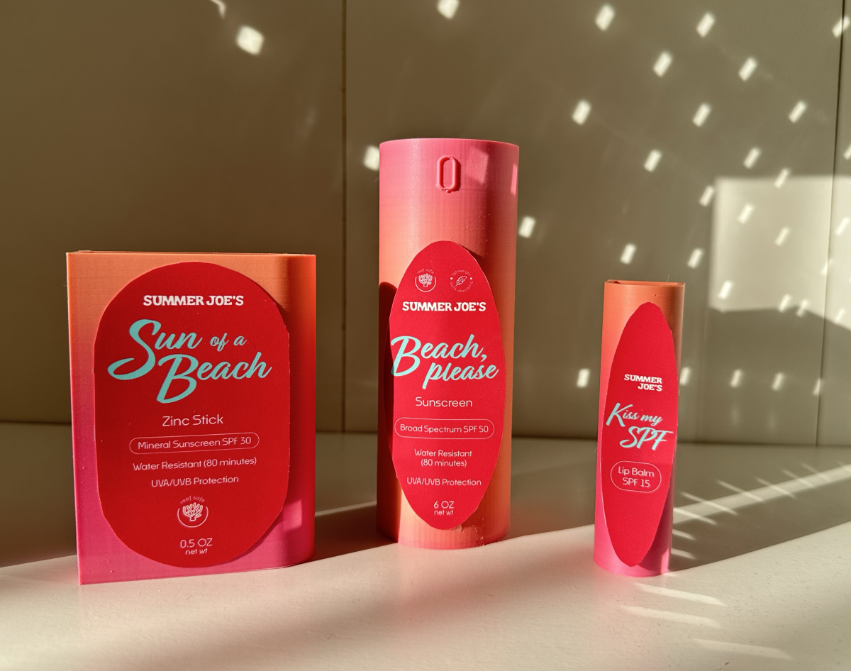
Product at Week 7. First round of 3D printing with gradient filament and testing the labels to decide on size, shape and colour.
Image
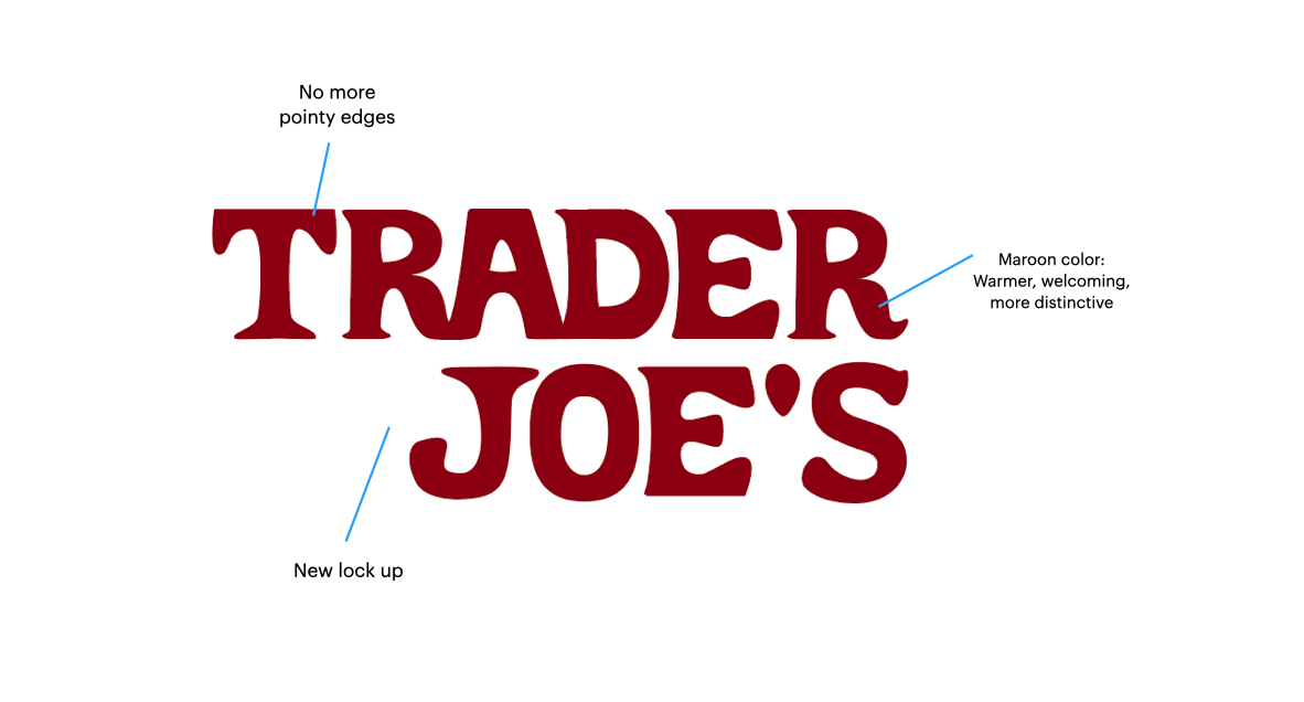
The new logo for Trader Joe's. The letterforms were handmade, just like the original one, but now the forms are rounded, the spacing is refined and the lock-up is dynamic. The color is a deeper shade of red to differentiate from competition (Target), also making it more friendly and welcoming than the "stop sign" red they previously used.
Image
Image
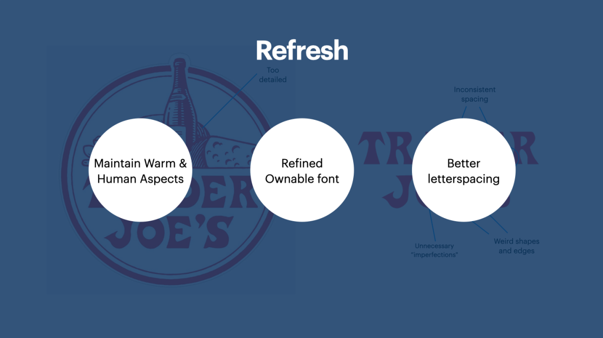
When I decided to change the logo, the approach I chose was a refresh instead of a complete renovation. My goals was to design a handmade font that was more ownable than the previous one, to be more welcoming and that allowed me to have better spacing.
Image
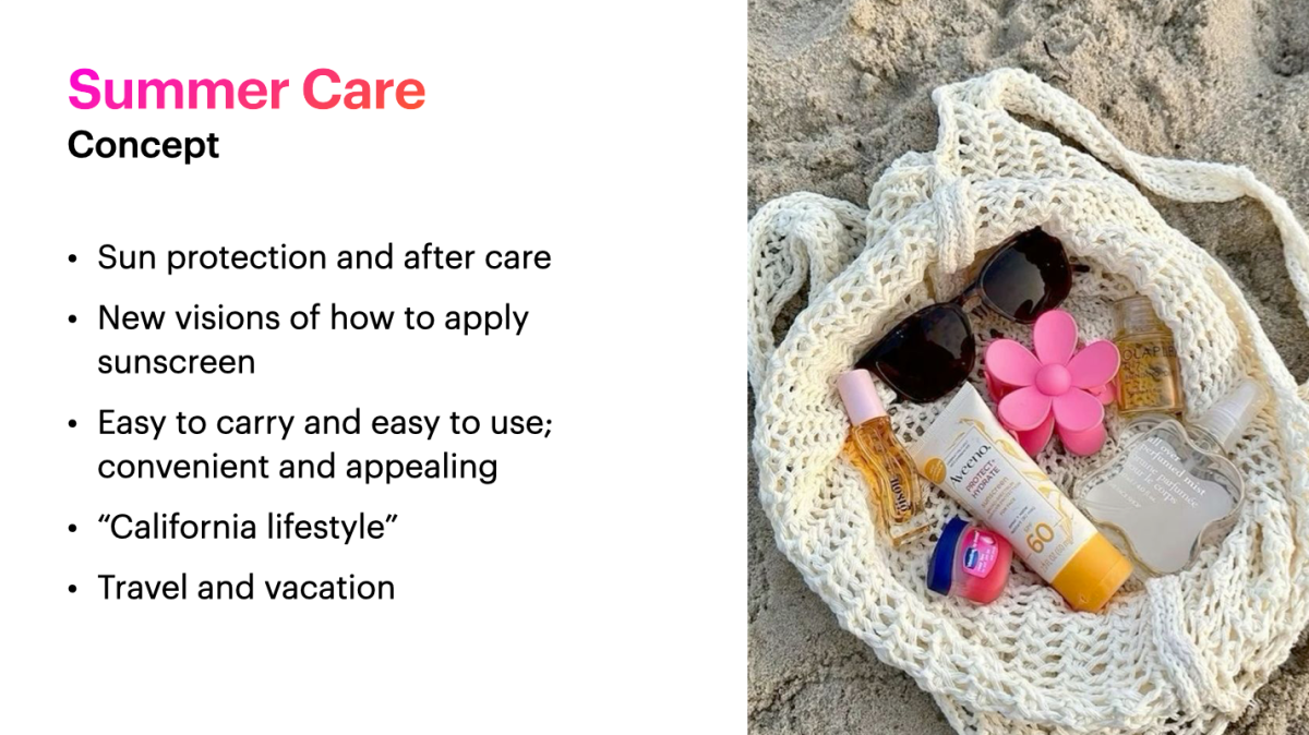
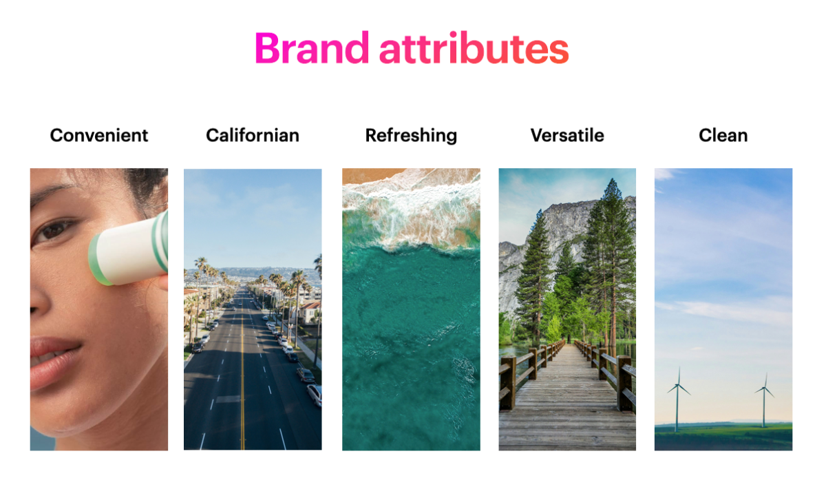
During my research, I noticed that the cosmetics section at Trader Joe's was really overlooked and not attractive at all. The packaging didn't seem trustworthy, resembling too much of house keeping products. I decided to create a cosmetic line focused on Summer Care, inspired by Southern California.
Image
Image
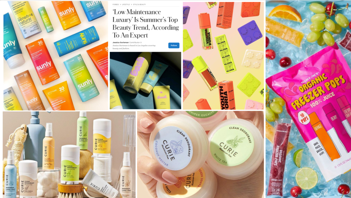
Inspiration moodboard.
Image
Image
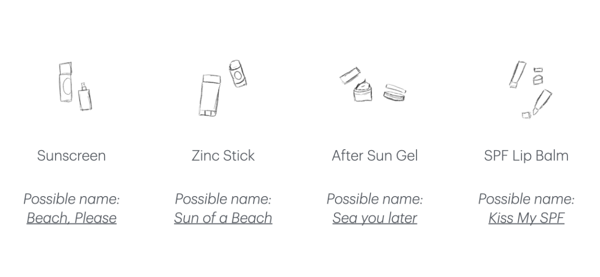
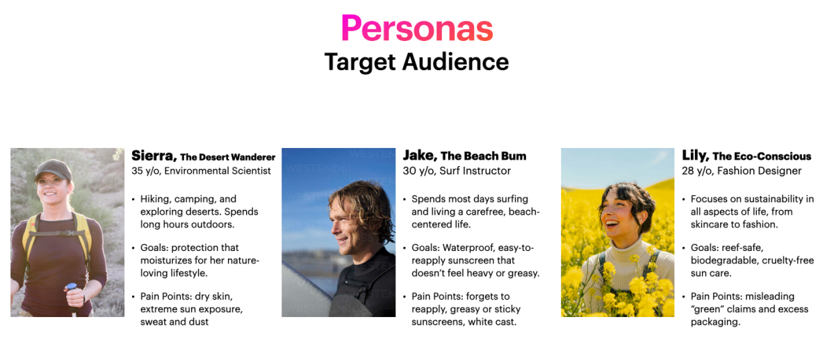
After researching the market and target audience, I decided these would be my four products for the line, keeping in mind that I wanted them to be convenient and thinking of innovatives way of using sunscreen.
Image
First form sketches. Here I was trying to figure out ways of using the products with just one-hand. My idea was for surfers to be able to apply it before entering the sea, while holding a board. My challenge was to figure out how to package it in a way that they could open that way without loosing the lid or getting sand all over it, in case it would fall into the sand.
Image
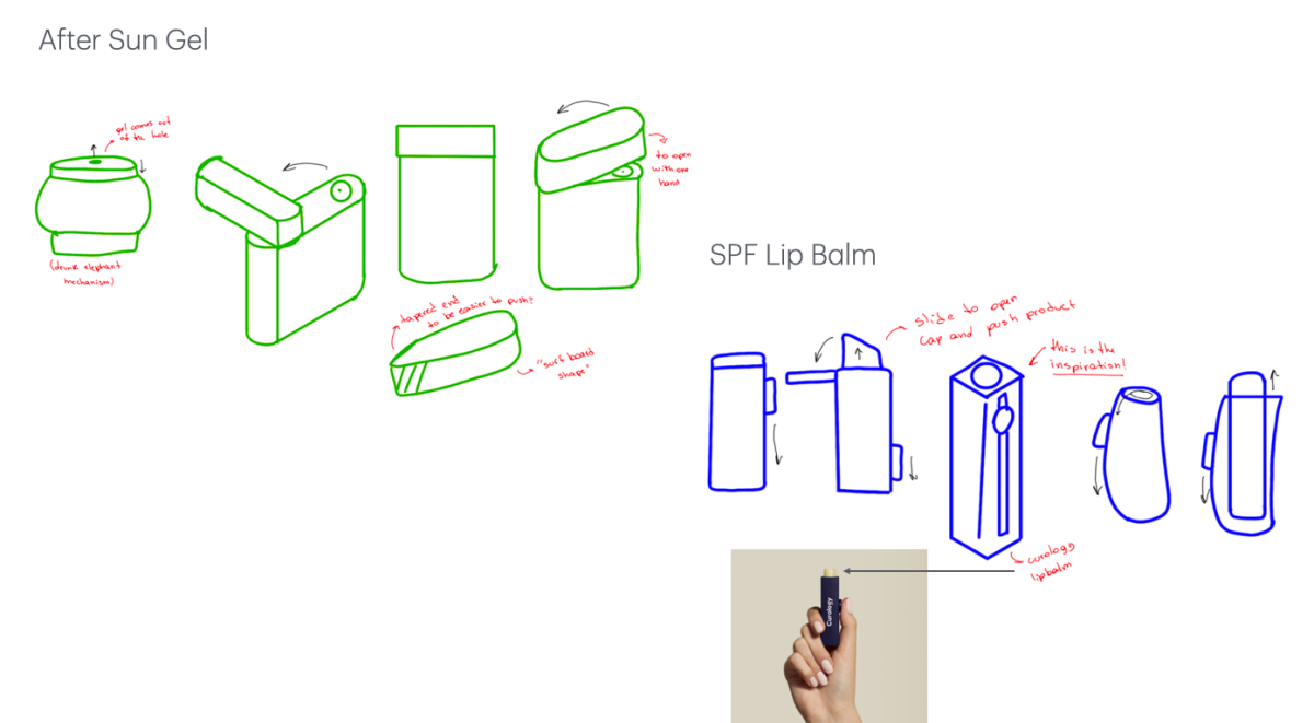
I started looking into ways of keeping the lid attached to the body of the product and that's when I came across this reference of lipbalm, that the user can slide the lateral to open it and push the product.
Image
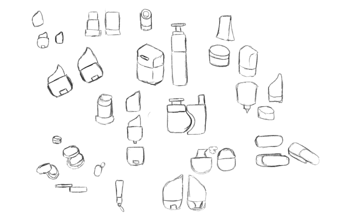
This was my first line-up of the four products but after critique I noticed that the forms were to different from each other, making it less cohesive.
Image
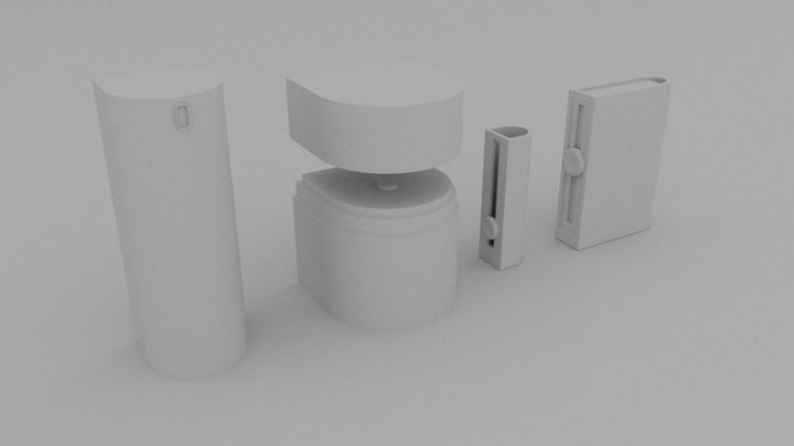
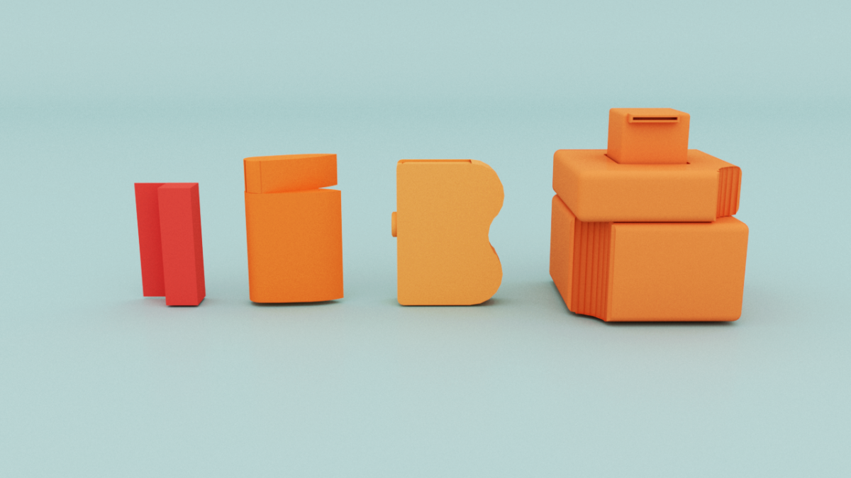
After new studies, I came up with a new line-up, with the shapes of each product being more similar to each other. The shape with one rounded edge and one straight edge is a reference to the counters of the letterforms I created for the logo, keeping it consistent and on brand.
Image

Quick render of the line up with color.
Image

Quick render of the line up with color with more dynamic composition.
Image
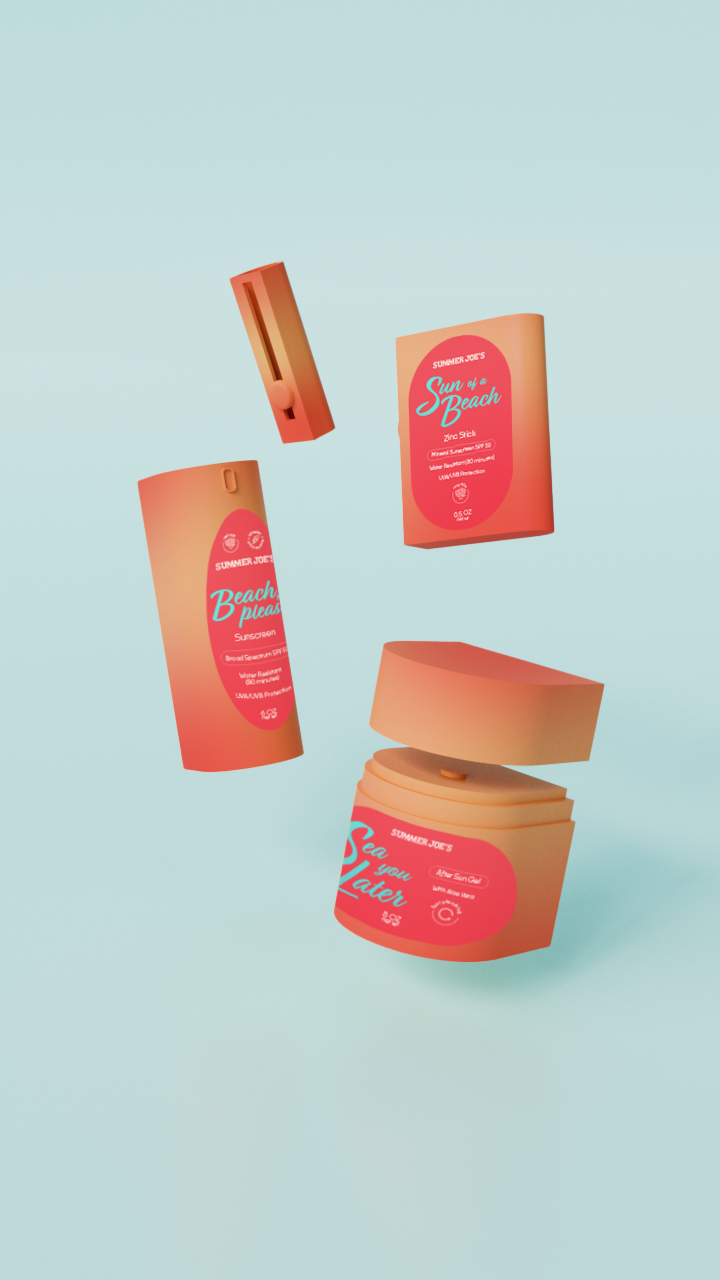
Digital mock up of packaging with labels. Test of color, shape and composition.
Image
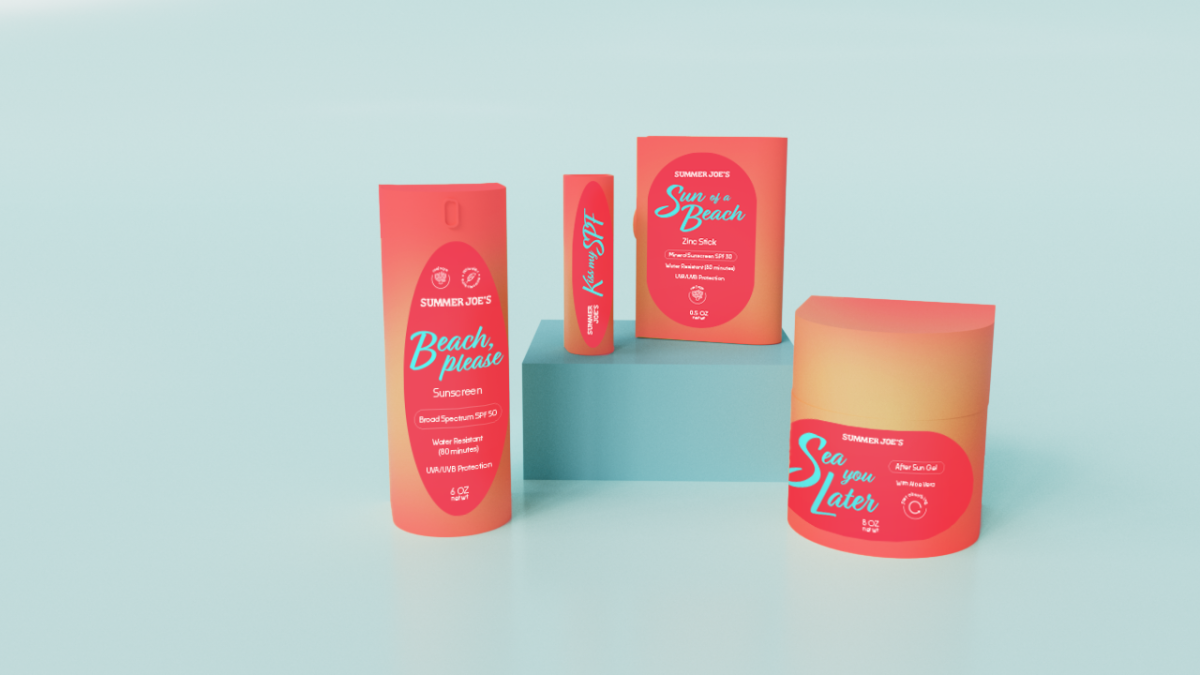
The name of each product is a word-play with beach references. This type of humor is very fitting for Trader Joe's, that's known for its puns and "dad jokes" in some of their products.