Graduates

Raphaela Carvalho Moraes

MFA in Graphic Design - 3 Yr Path — Graduate Graphic Design
Course:
507 Graduate Typography 2
Faculty:
River Jukes-Hudson

TYPO Mexico | Brand Identity

Typo Mexico was a project assigned during Graduate Typography 2 with the goal to develop a wordmark and identity for typo Mexico conference, a fictional event that would reunite the biggest names in typography set to happen in Mexico City. As inspiration, I used "vernacular typography" to represent the latino culture and for the promotional posters blend with the environment in big cities in Latin America, such as Mexico City and Rio de Janeiro.
Learning Outcomes:
As having the color limitation and no images was a challenge, I really improved the way I face typography when it comes to showing personality and representing a culture. As I wanted to represent the latino culture meeting traditional typography, I had to think more conceptually for my type choices since I wouldn't have colors or images to support my concept.
Image
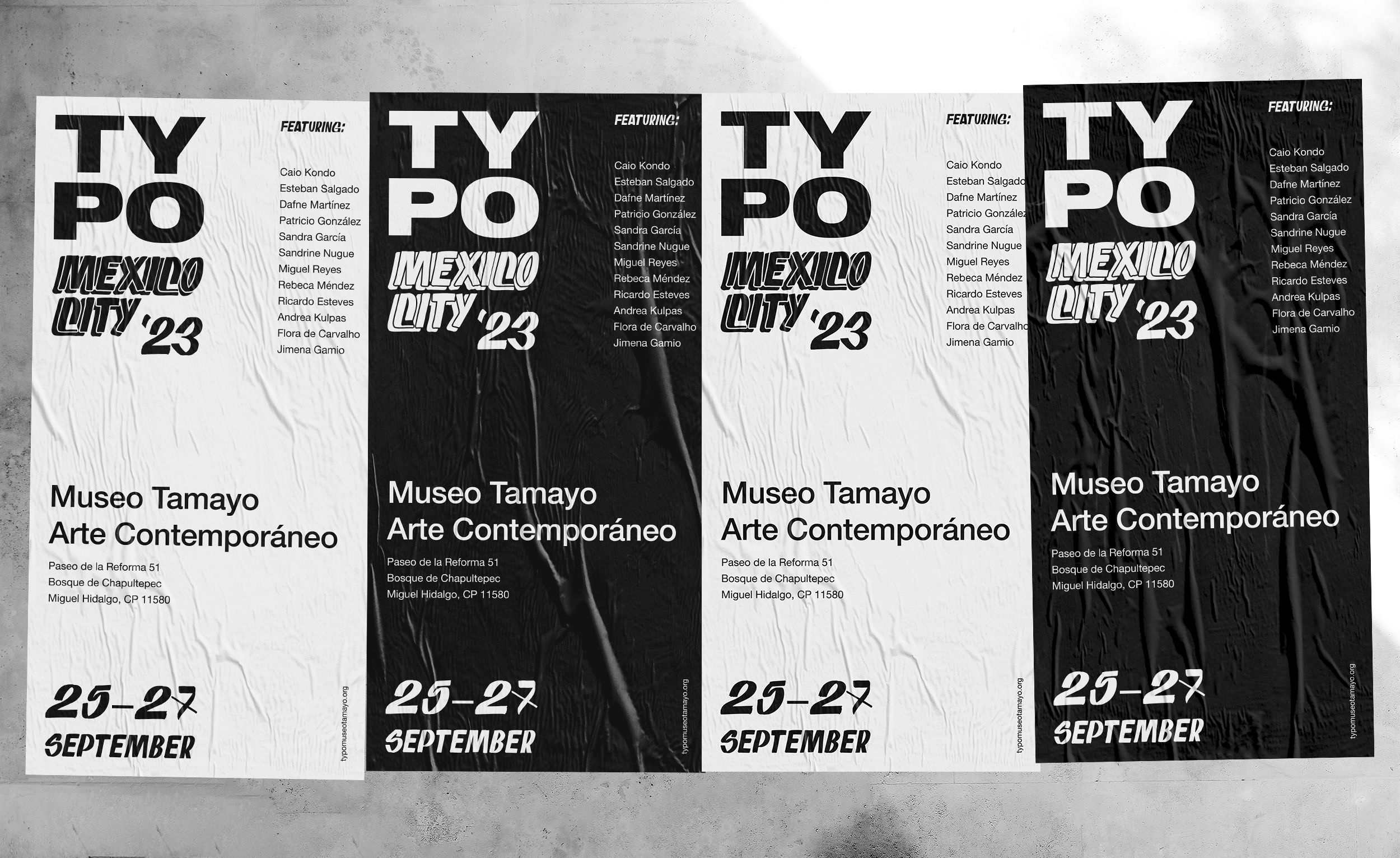
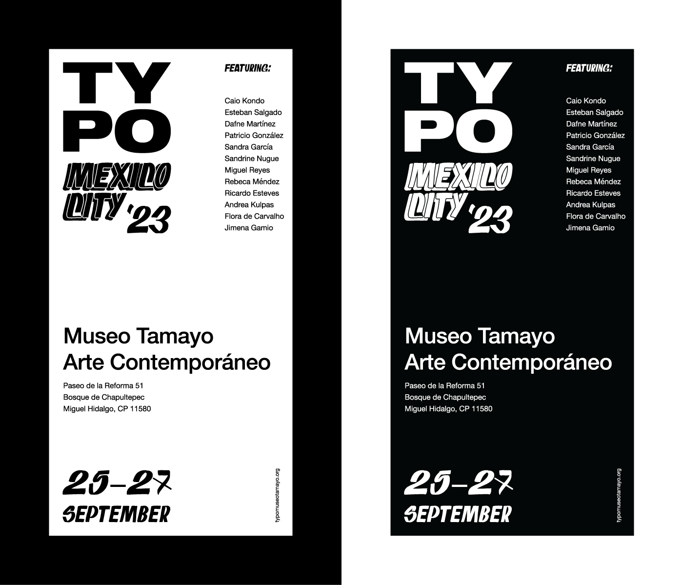
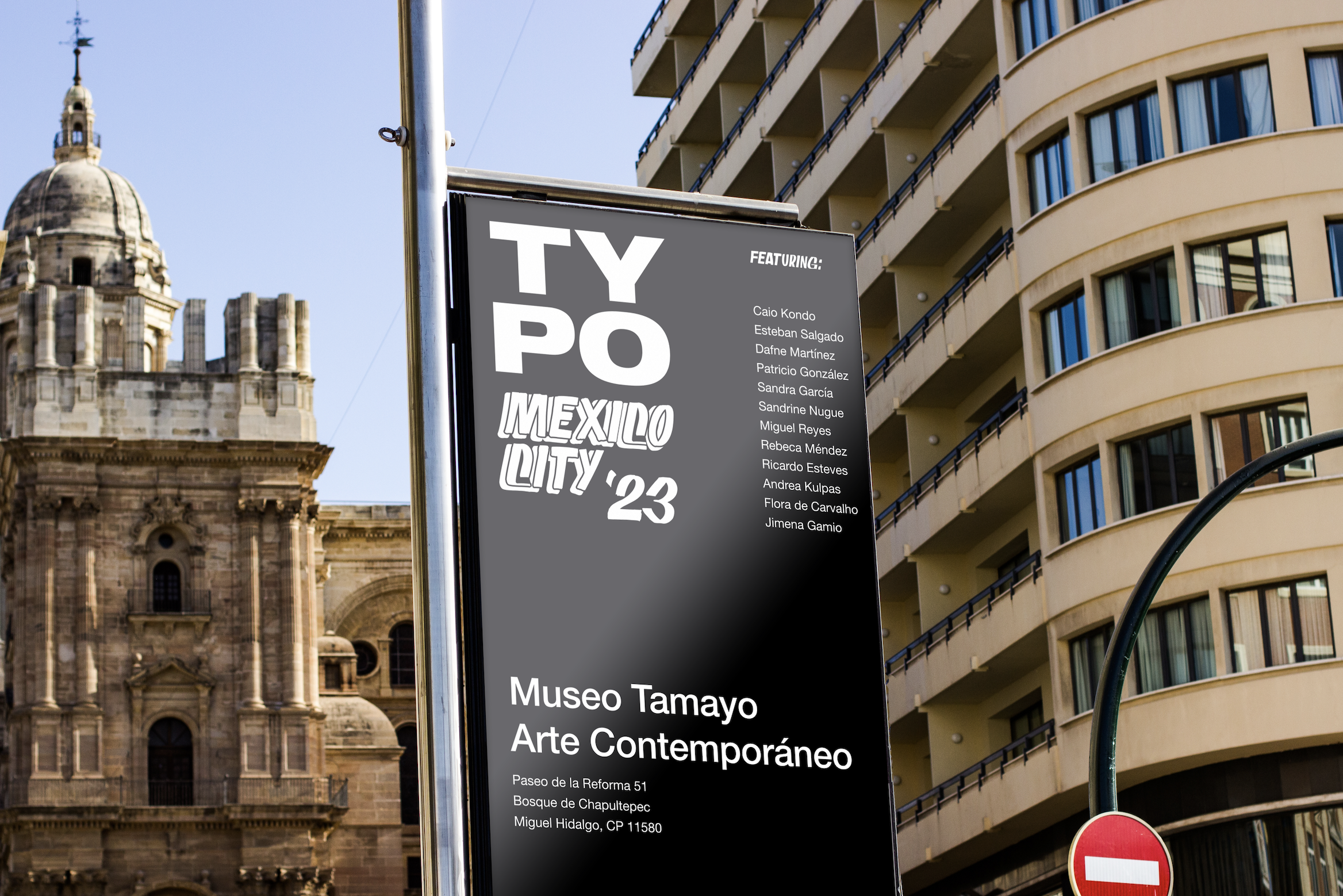
Positive and negative versions of the poster. As the posters were really big, I envisioned the posters in the urban spaces of latino cities, not only Mexico City but also Rio de Janeiro, São Paulo, Buenos Aires and Santiago. The cities are full of color and people , so I saw the black and white as an opportunity for the posters to be highlighted in the walls of these metropoles. I tried to keep some minimalism, that would be a nice contrast with all the information I mentioned.
Image
Image
Image
Image