Image
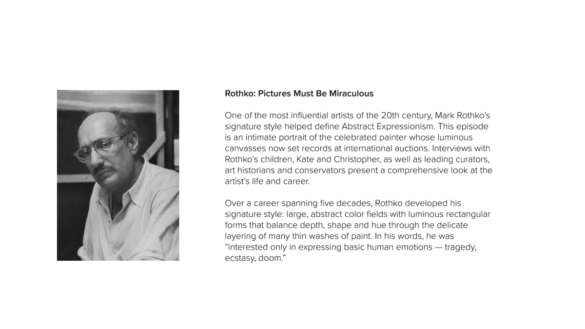
Background information about Mark Rothko including the PBS American Masters episode title: Pictures Must Be Miraculous. Future work on this subject matter includes book design and a set of posters. I intend to continue this project by exploring what a Mark Rothko pop-up exhibition might look like. This may include several extensions of the visual identity I’ve established (exhibit design, wayfinding, stationary, merchandise, motion graphics, social media graphics, etc).
Image
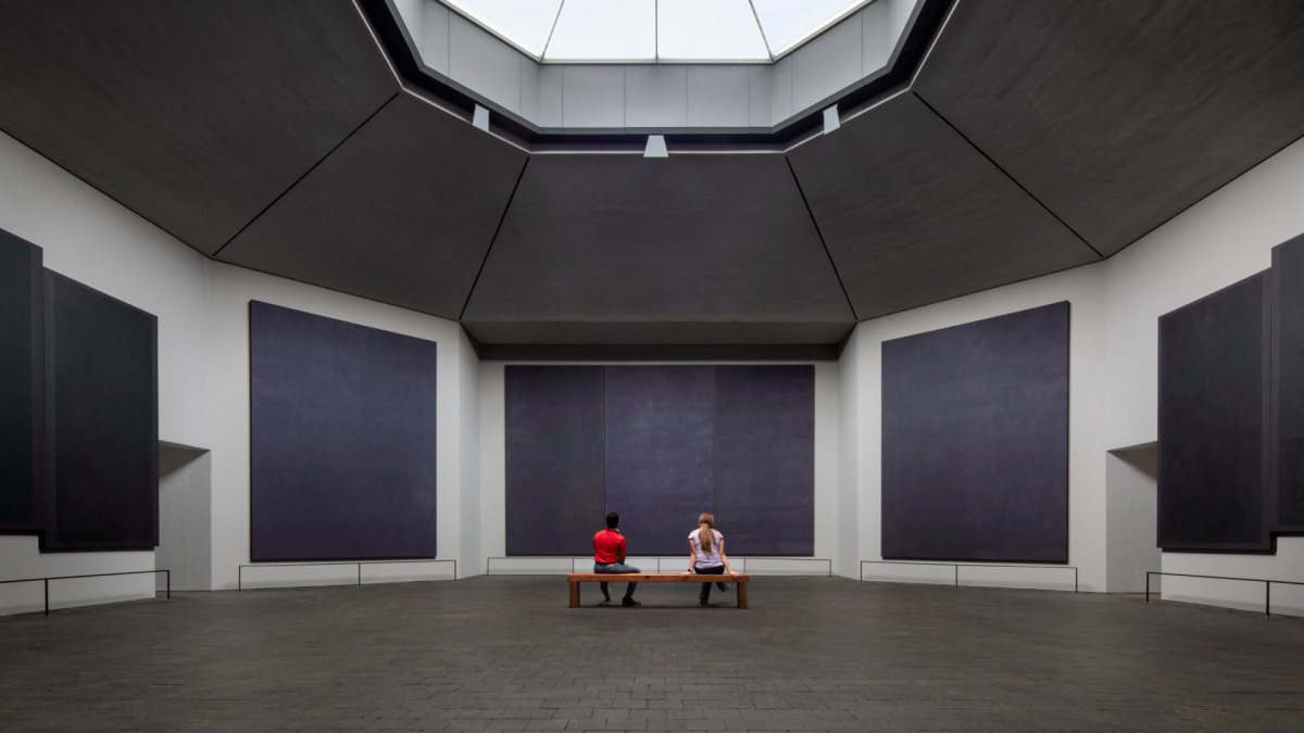
I was inspired by the Rothko Chapel in Houston, Texas which is subservient to the artwork. Rothko painted these large murals and was deeply involved with the building’s architecture to present his work in an optimal way. Photo: Elizabeth Felicella, sourced from Architectural Digest.
Image
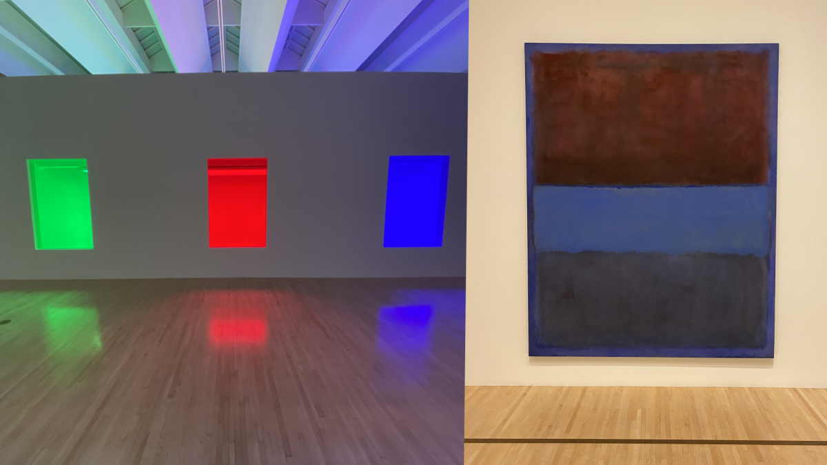
Being in Los Angeles, I visited MOCA for a fresh experience of Rothko. I was deeply moved by the pieces on display, just as I was at Tate Modern in 2019.
Image
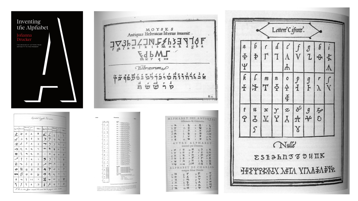
During my research, I learned more about Hebrew letterforms based on Rothko’s Jewish upbringing (which led his family to flee Russia for safety when he was a child). I found more references to early alphabets from Johanna Drucker’s latest book, “Inventing the Alphabet”.
Image
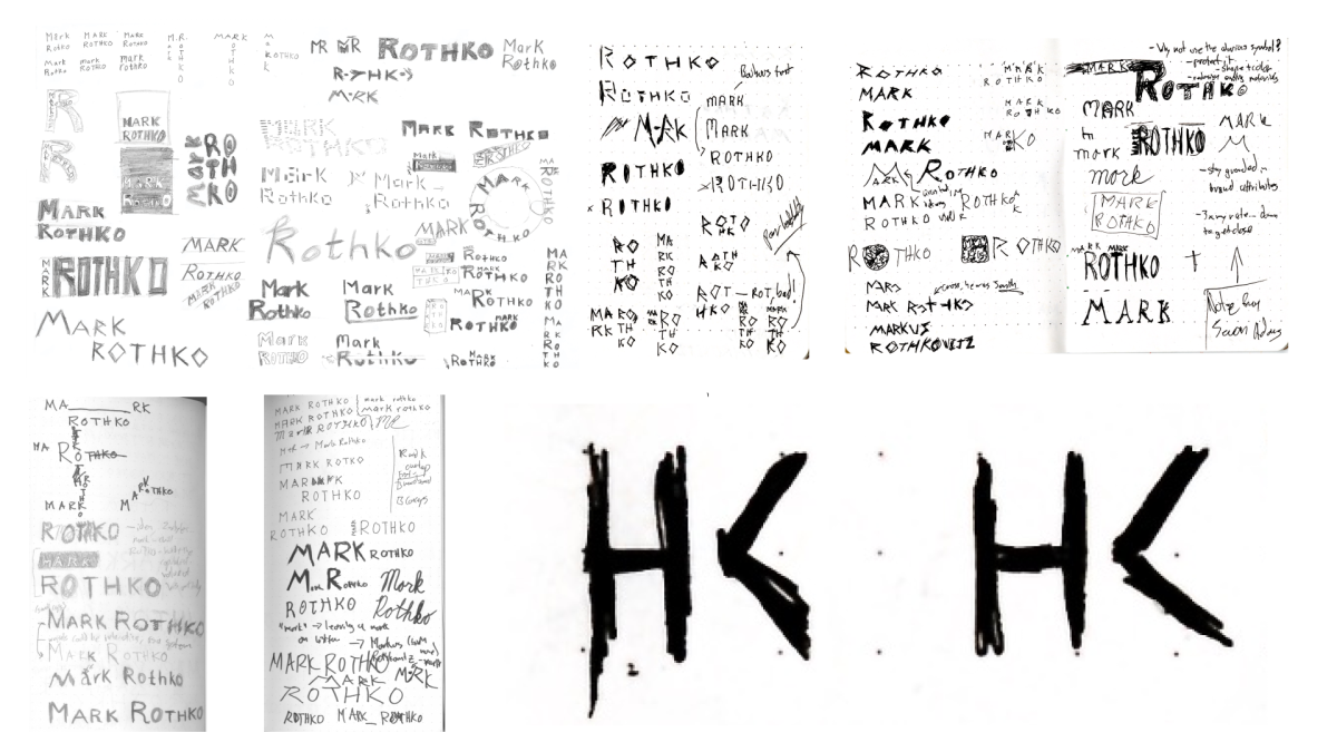
Several rounds of sketching.
Image
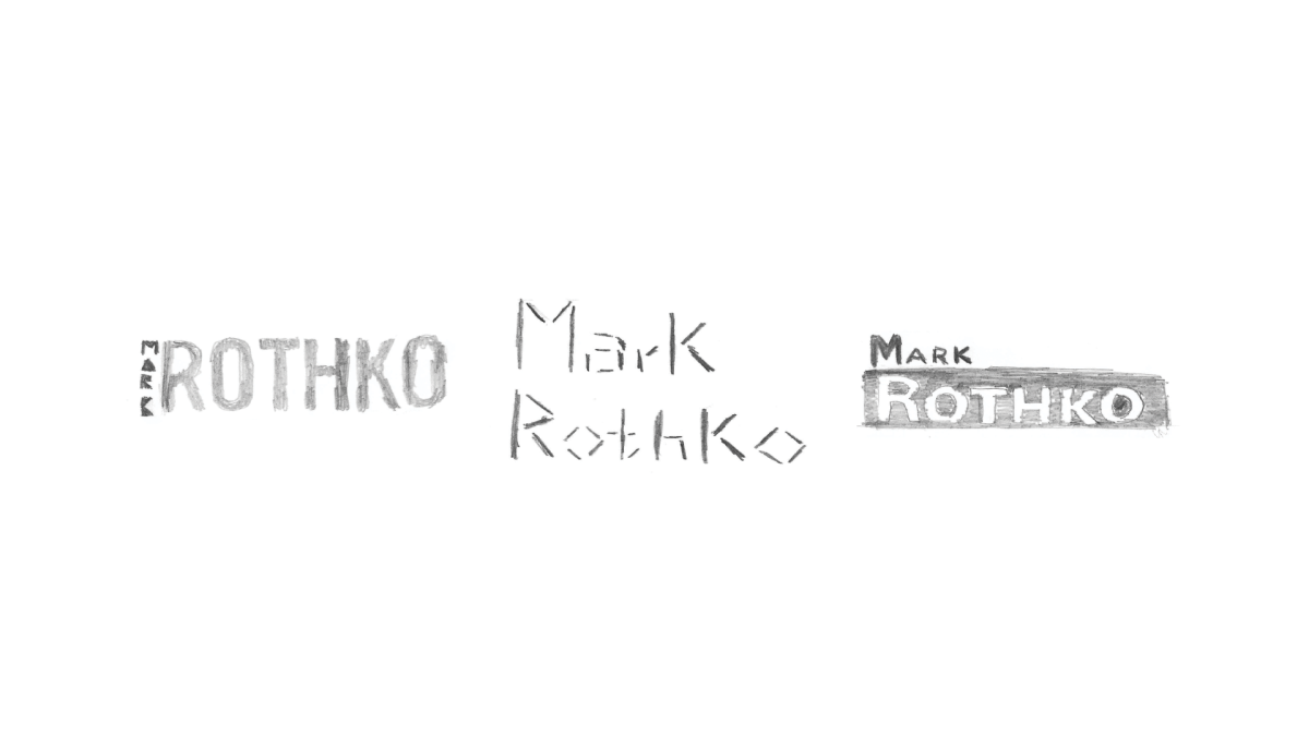
Top 3 selected sketch concepts. My fundamental challenge with designing for Rothko was to “get out of the way” by not visually competing with his art. I drew my inspiration from museum placards which exist to aid and facilitate the experience of the artwork they describe.
Image
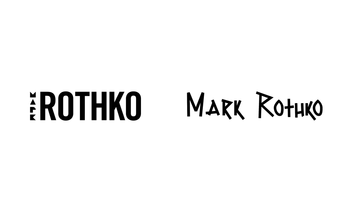
Top 2 concepts as vector artwork.
Image
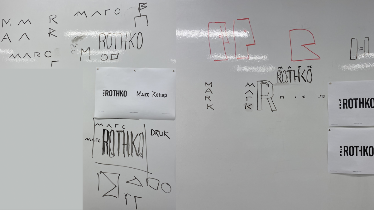
In class critique. Discussing my work objectively as a group helped expand my viewpoint and clarify my concept.
Image
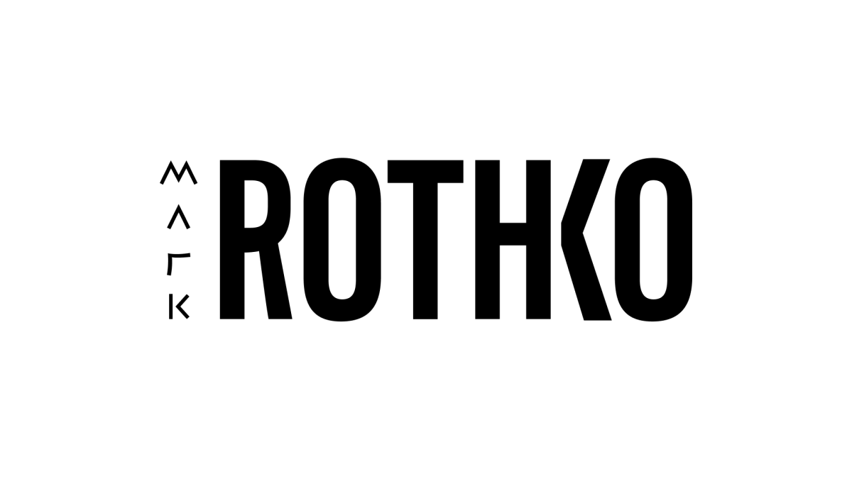
The final wordmark. Colors will be explored in the coming weeks. ROTHKO is set in a modified bold condensed typeface called Acumin, which closely resembles Trade Gothic. This typeface was chosen for its bold elongated forms, which mimic the experience of standing in front of a Mark Rothko painting. MARK is symbolized by primitive shapes inspired by Hebrew lettering, which references his Jewish heritage and emphasis on experiencing basic human emotions through his work. I created a custom unconnected ligature between the H and K in ROTHKO to address some visual clutter among those letterforms. In doing so, perhaps the implied vertical stroke on the K symbolizes the deeply personal (hidden) interpretations many people have after experiencing Rothko’s work in person.
Image
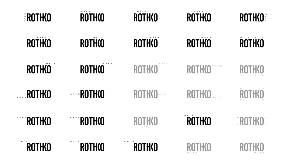
Wordmark system. While exploring configurations of both names, I discovered a dynamic system. ROTHKO remains stationary, while MARK can be positioned relative to ROTHKO in a multitude of combinations. However, some placements greatly impair readability or meaning; these variants are presented in gray. I intend to continue this exploration through motion graphics during my final project.