Image
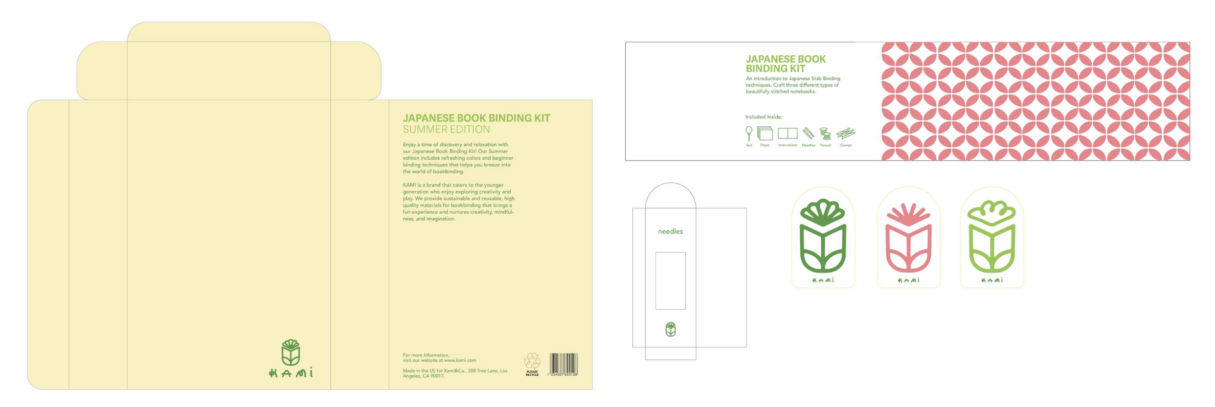
The logo combines a book with a flower, creating a growth motif that reflects learning, creativity, and the blossoming of ideas. It visually ties the concepts of knowledge and hands-on exploration, reinforcing the brand’s focus on mindful, creative growth.
Image

Image
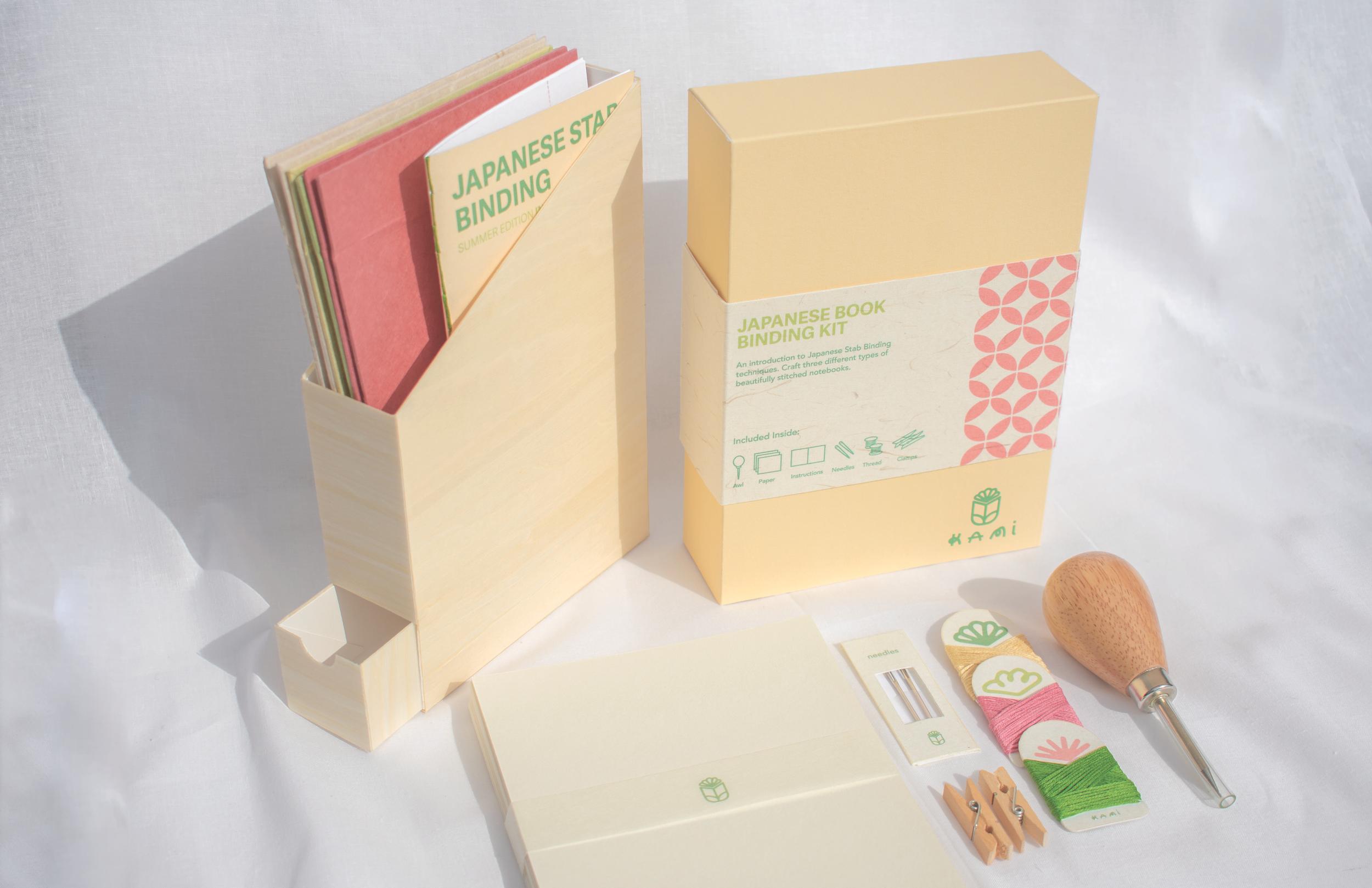
The design challenge is to create a compact and sustainable bookbinding kit that remains beginner friendly while preserving the beauty and tradition of Japanese craftsmanship. The packaging needs to hold all essential materials without waste, stay environmentally conscious, and still feel inviting, playful, and accessible to younger creators.
Image
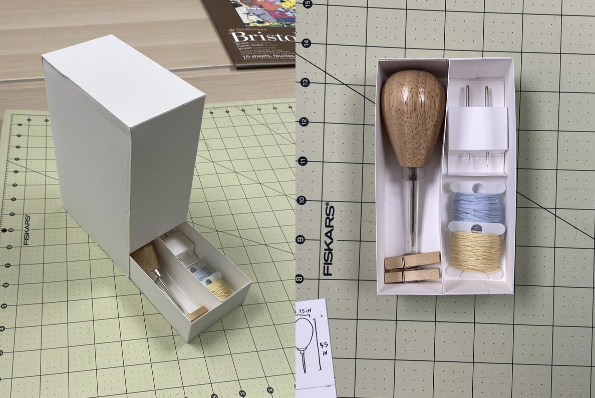
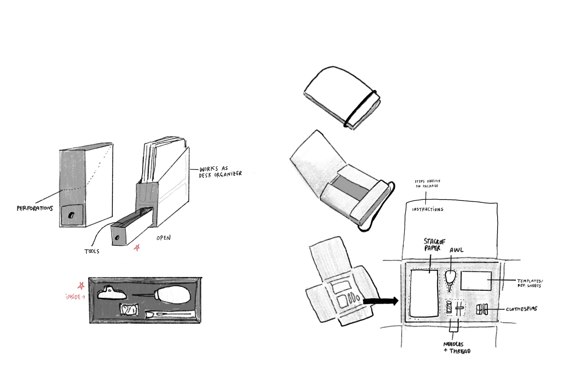
Prototypes
Image
Image