Image

Image
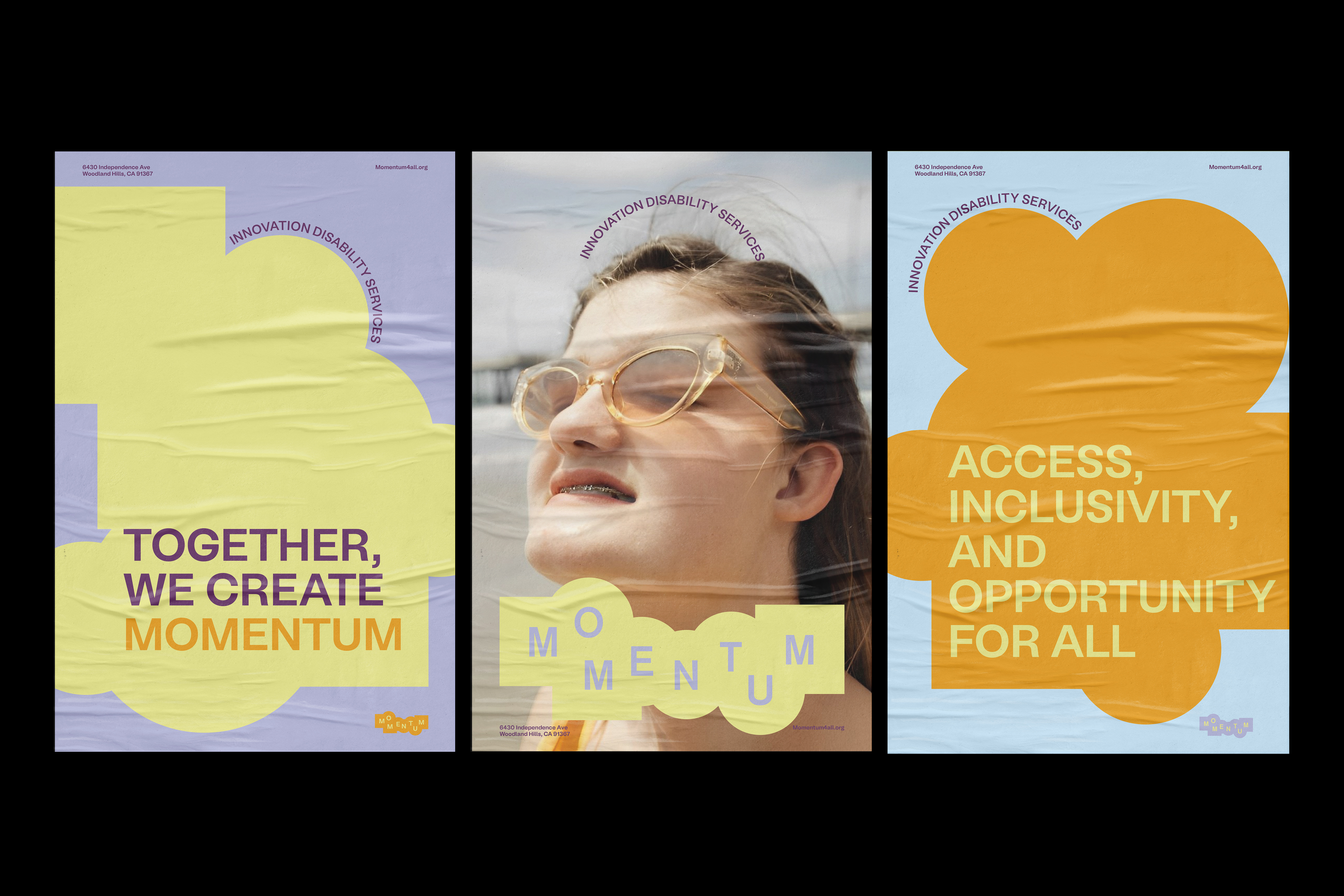
With a balance of simplicity and boldness, the posters articulate themes of inclusivity, hope, and play in a way that feels approachable, uplifting, and visually engaging.
Image
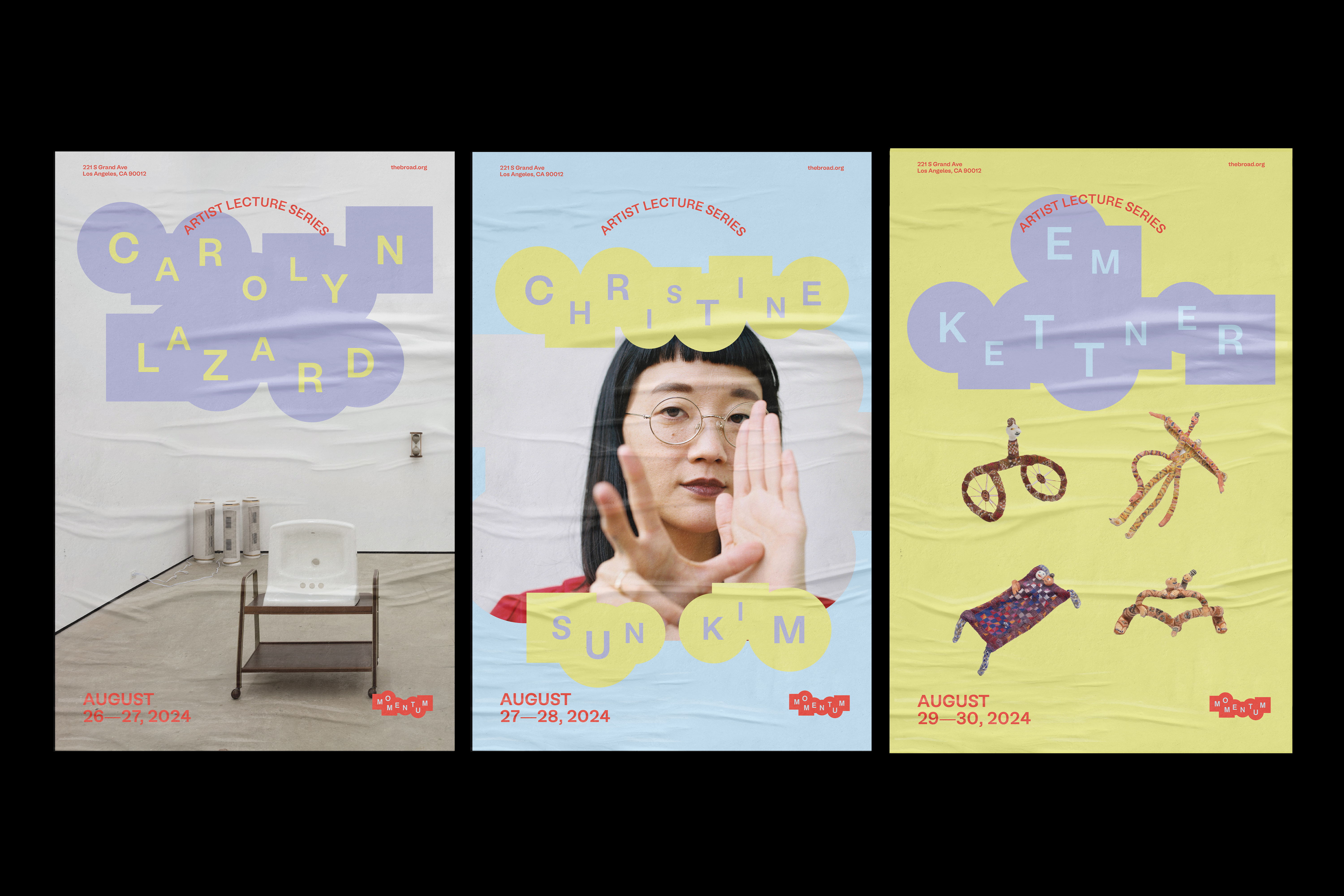
Artist Lecture Series: These posters highlight artists with limitations, turning challenges into strengths to raise awareness. The series celebrates their creativity and resilience, inspiring young individuals to remain hopeful and pursue their dreams. The rebrand introduces a visual language that is playful yet thoughtful. Using bright colors, soft forms, and expressive typography to communicate openness and positivity. This shift transforms the perception of disability services from purely functional to emotionally engaging and community-driven. The new identity helps audiences feel welcomed and understood, inspiring confidence and participation.
Image

Momentum Refresh: A mobile accessible restroom designed for individuals whose needs are often overlooked in public spaces. By bringing inclusive design directly to festivals, events, and community gatherings, Momentum Refresh makes it possible for people with disabilities, caregivers, and families to participate fully without barriers. The new identity inspires audiences to see disability services not as a label, but as a space of possibility and growth. It encourages younger individuals to engage confidently with the brand, fostering a sense of belonging and optimism.
Image
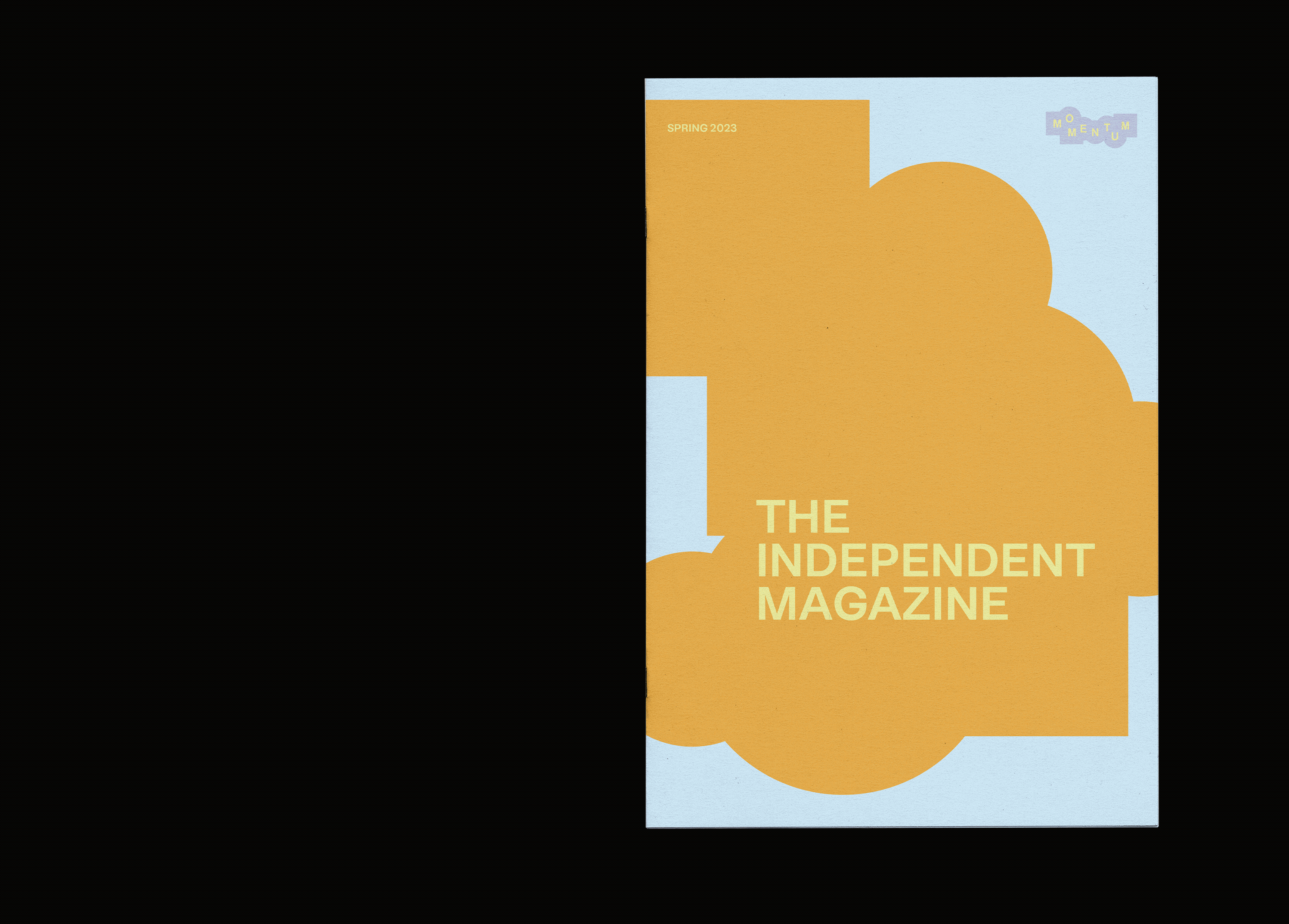
The Independent Magazine is a monthly newsletter for MOMENTUM members, delivering curated insights, key highlights, and timely information to keep the community informed and inspired. The design communicates confidence and optimism, helping young people feel represented, empowered, and proud of their identities.
Image
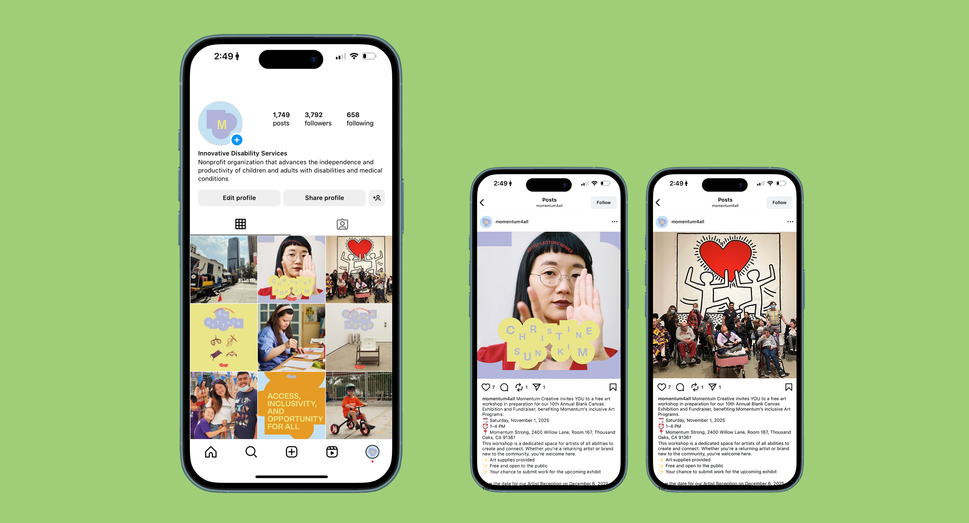
Momentum’s primary audience includes young adults with disabilities who are seeking independence, community, and meaningful participation in everyday life. The audience also includes families, caregivers, and educators who want services that reflects progress rather than limitation. The use of social media aims to speak to a new generation that values individuality, creativity, and connection.