Image
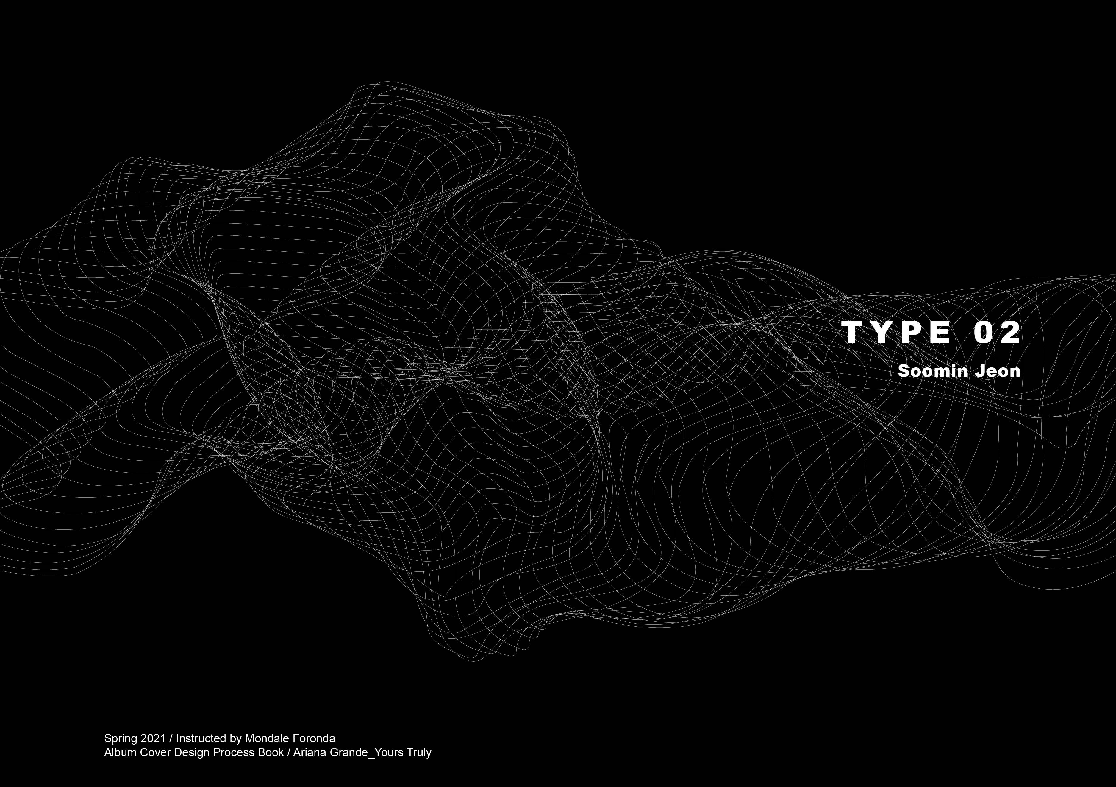
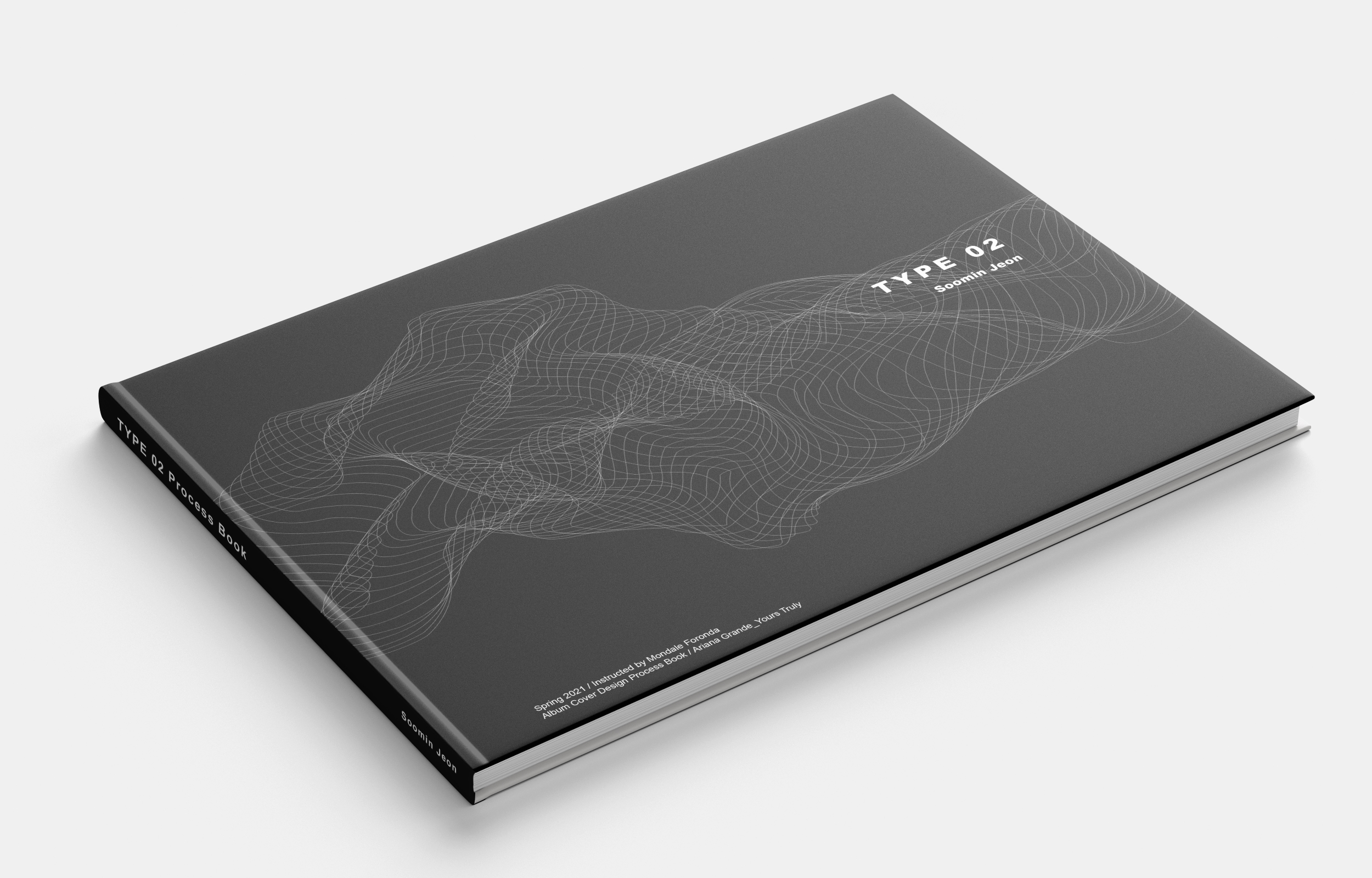
It is my cover page of the album cover design process book. I expanded one of my designs by using black and white. I wanted to describe Ariana Grande's unique vocal sound with a sense of ethereal lines.
Image
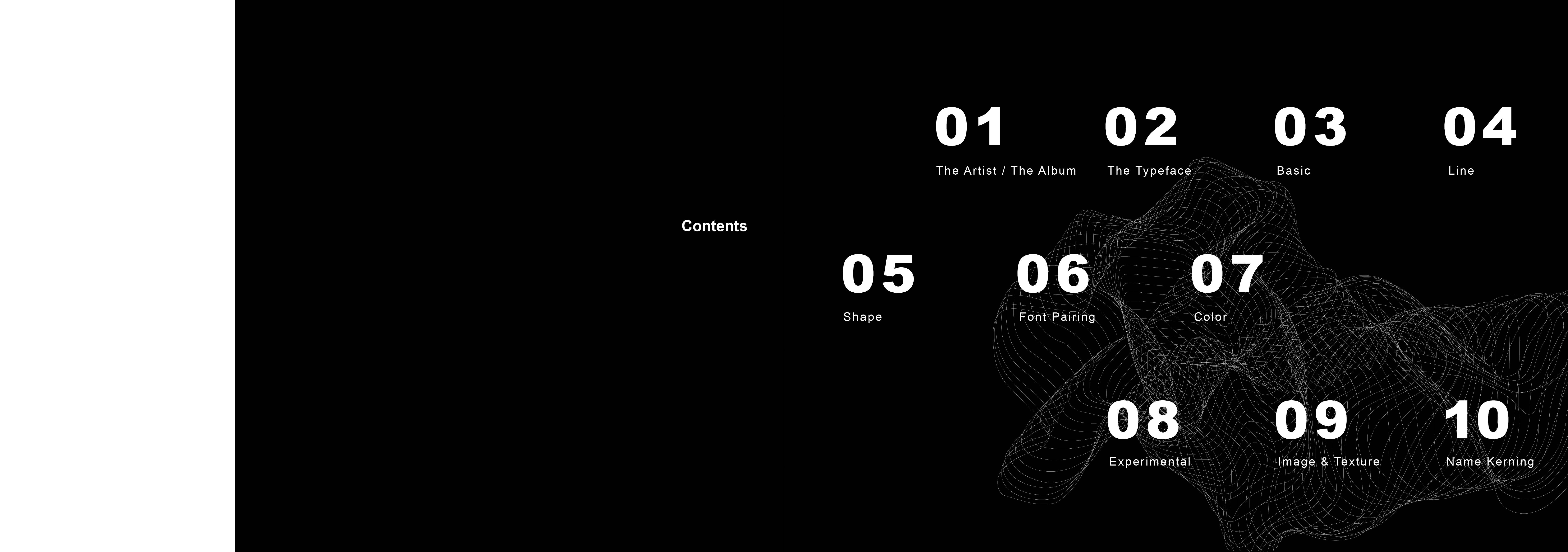
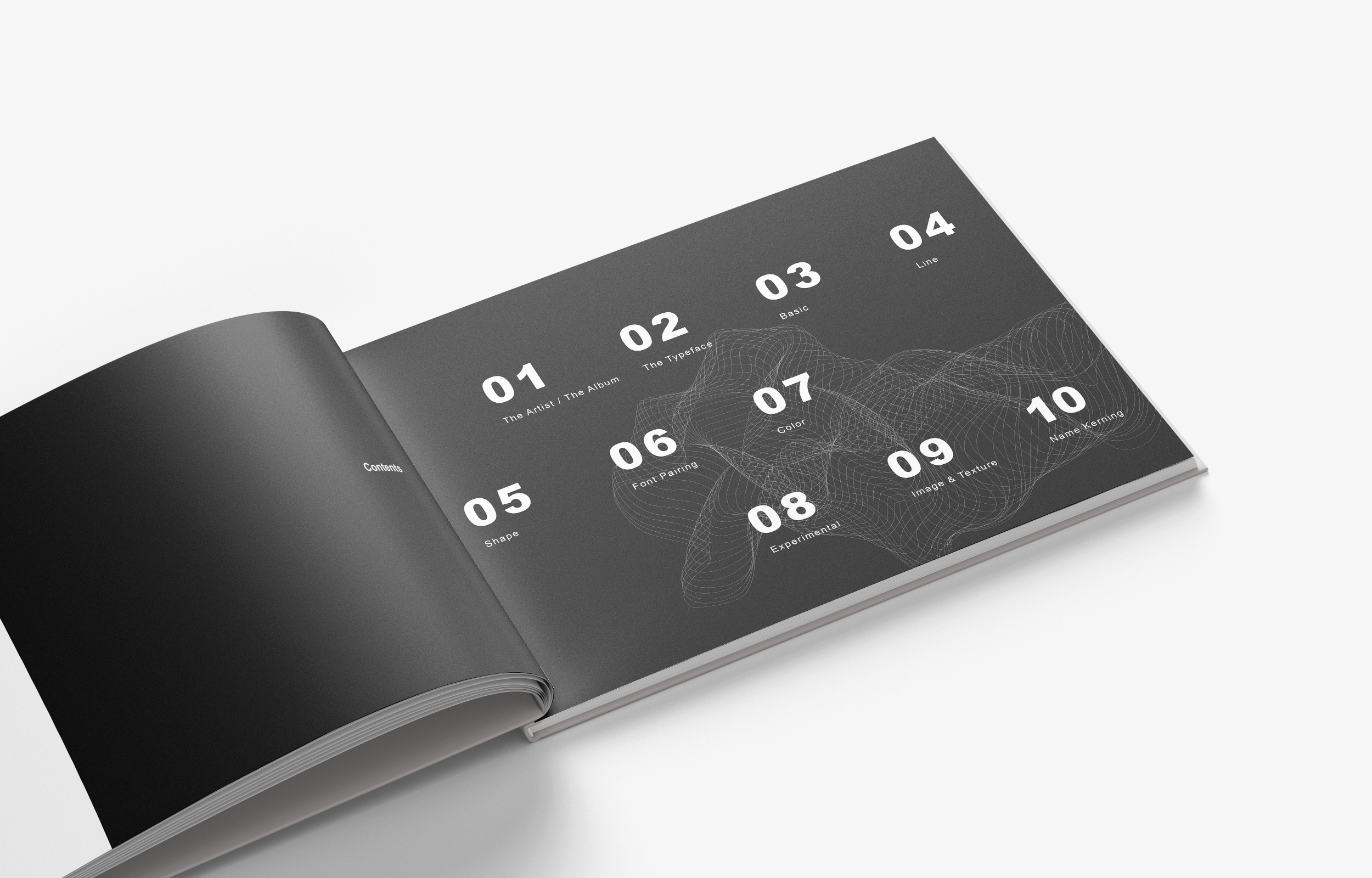
It is the brief information about the artist and the album that I chose. I used a black and white image which has a quiet feeling. By filling the entire page with photos of the singer, he emphasized the singer. It is a spread of the Contents page. I chose 15"x10" for my process book. I placed a similar line effect as a background to give continuity with the cover. I thought bold numbers could capture viewers' eyes. I also made negative white space on the very left side since I wanted to make the book clean and clean.
Image
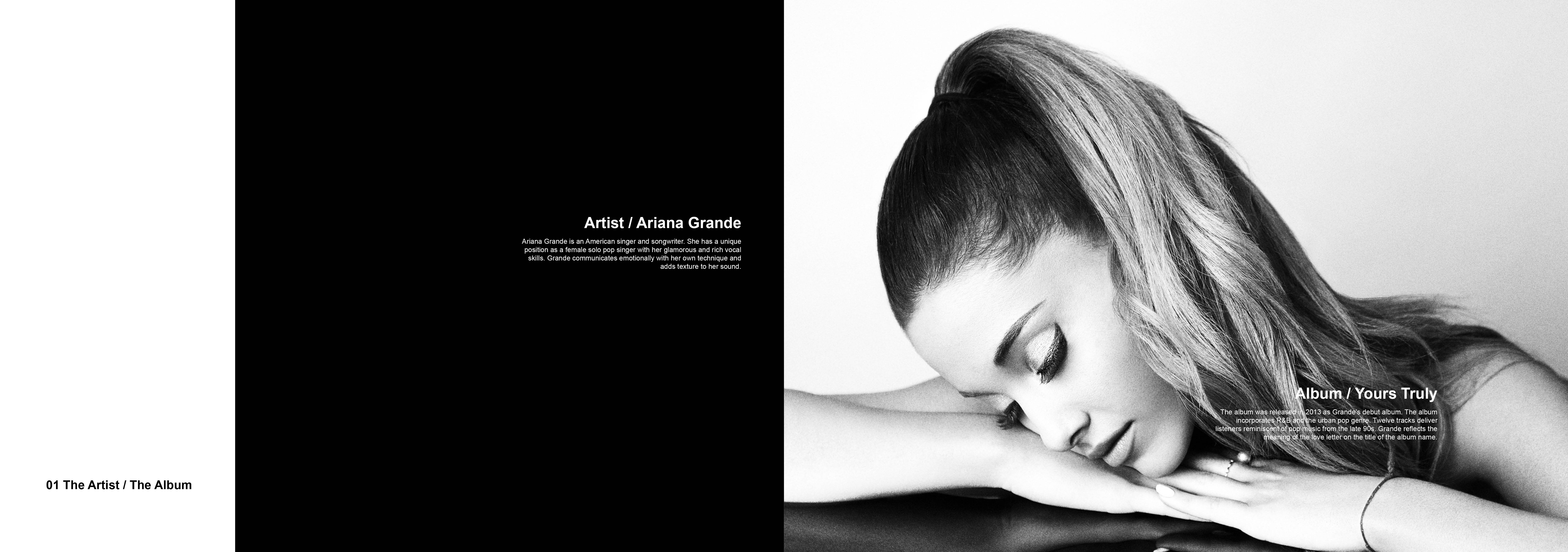
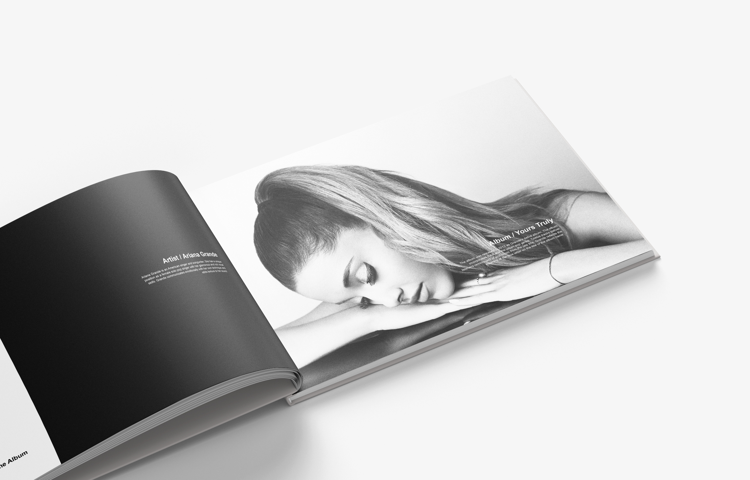
It is the brief information about the artist and the album that I chose. I used a black and white image which has a quiet feeling. By filling the entire page with photos of the singer, he emphasized the singer.
Image
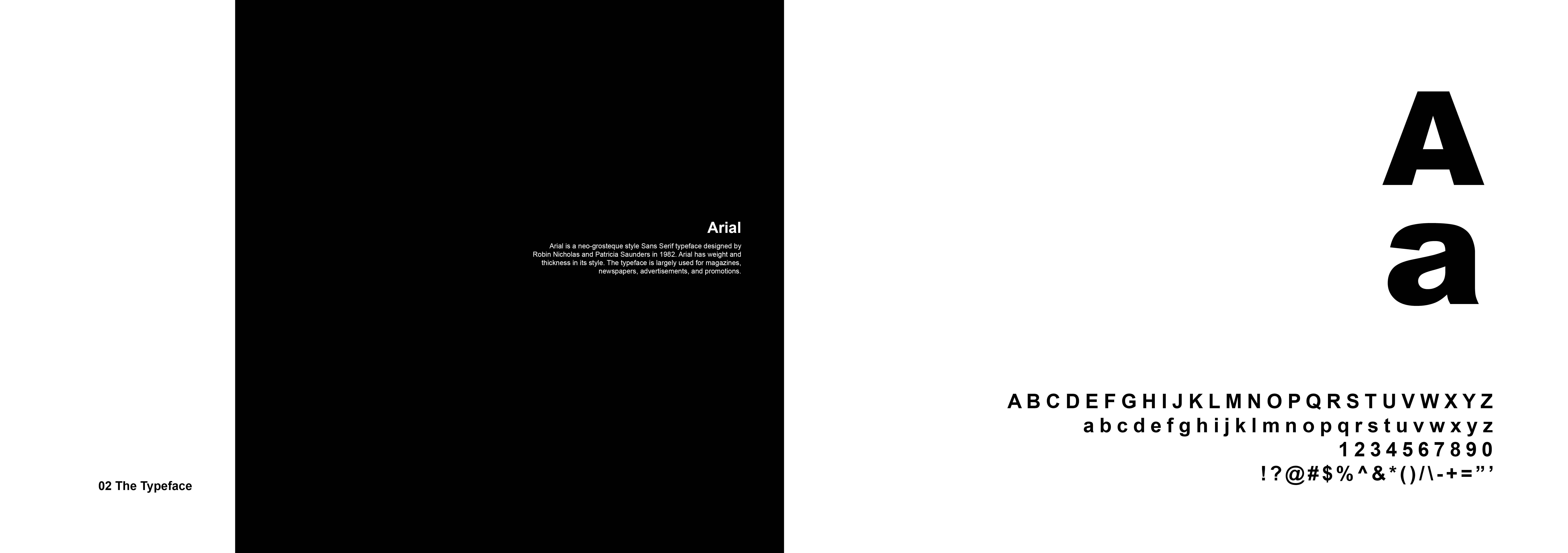
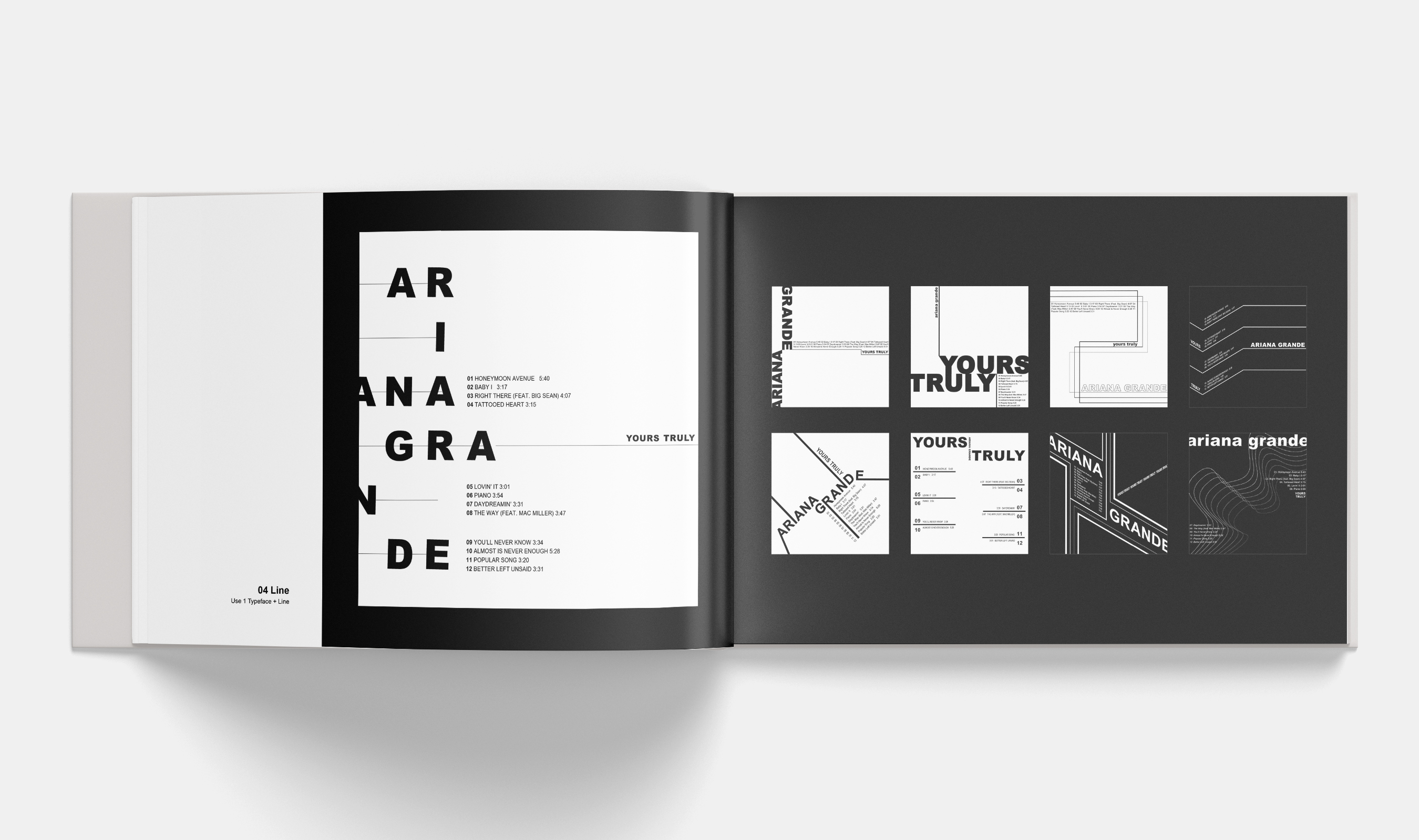
It is the page of my primary typeface information. I used Arial for most of my designs in this exercise. I liked the thickness and weight of the font. Especially, the soft curve on "R" makes "ARIANA GRANDE" and "YOURS TRULY" give a sense of smoothness.
Image
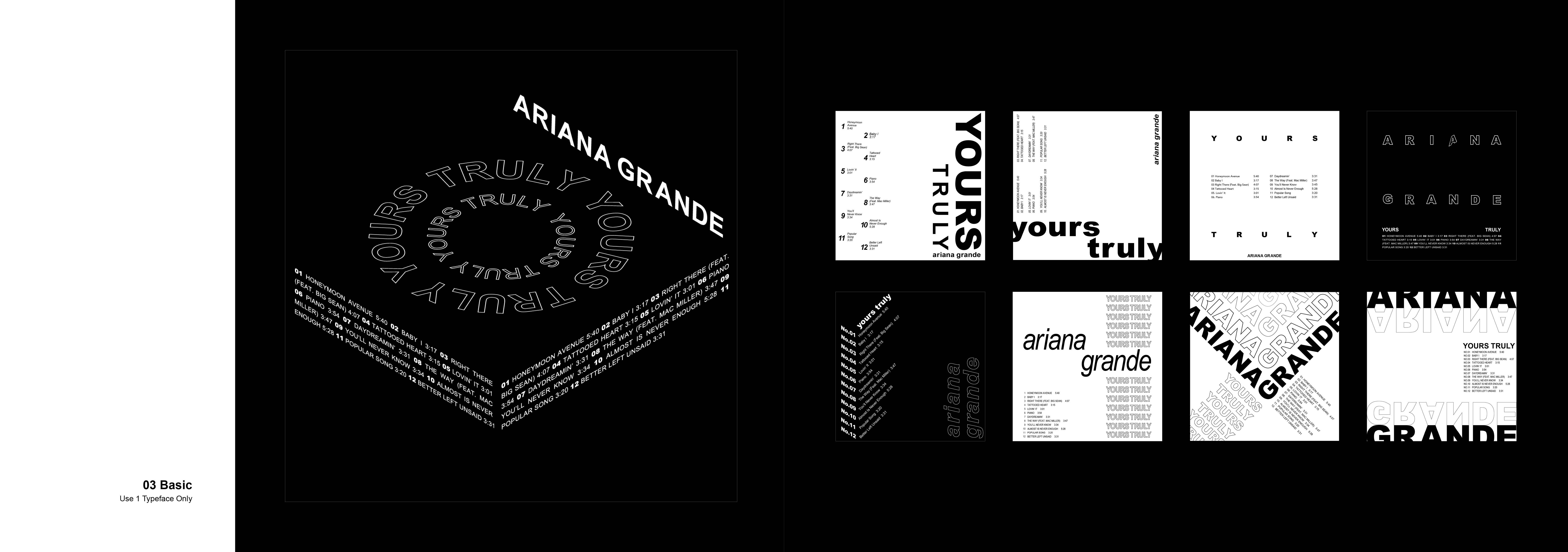
For the first exercise, we used only a sans serif typeface. I played around with diverse compositions with typefaces. The biggest image is my selected one from the exercise. I wanted to showcase a turntable feeling by adjusting the album title, artist name, and tracklists since the album is most likely a very retro and urban pop style. I thought my selected design incorporates the mood of the album very well.
Image
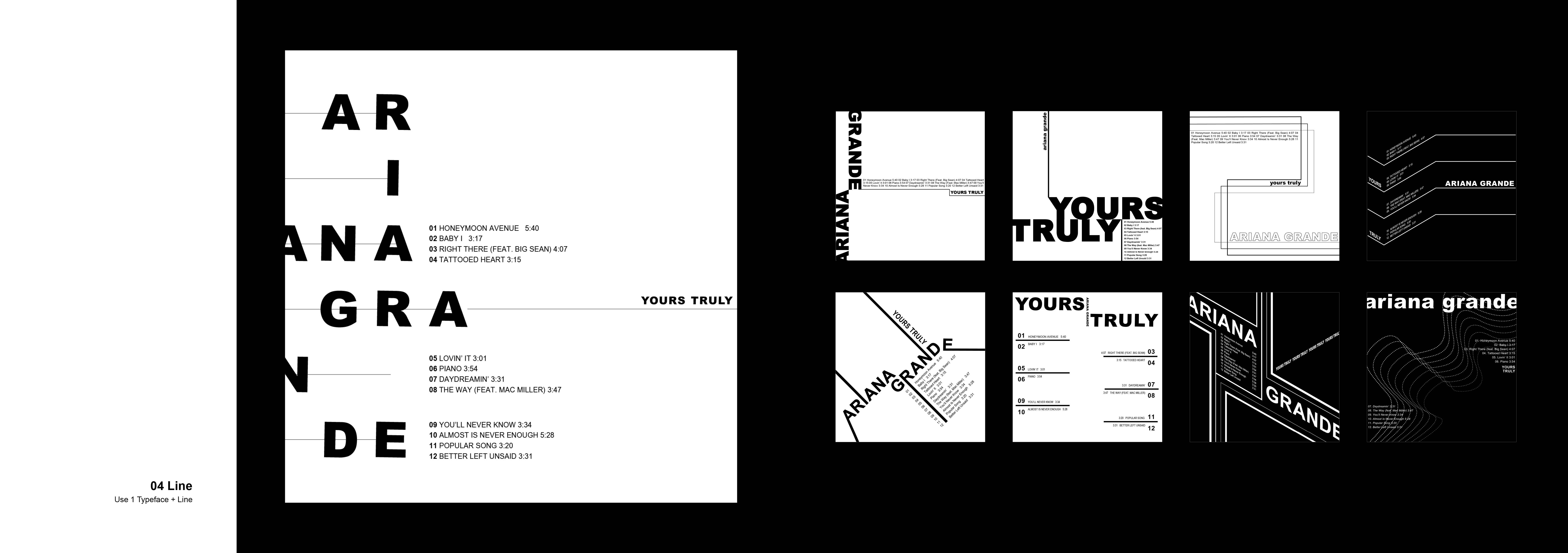
Every design contains lines as designing element. Each panel was designed by increasing the number of lines one by one. The design I chose used seven lines. Ariana Grande was separated and aligned on each line. I placed letters carefully so that there will be no error in reading them vertically with different words. By adding a line under the album's title, the negative space was used to complete the overall subtle and simple design.
Image
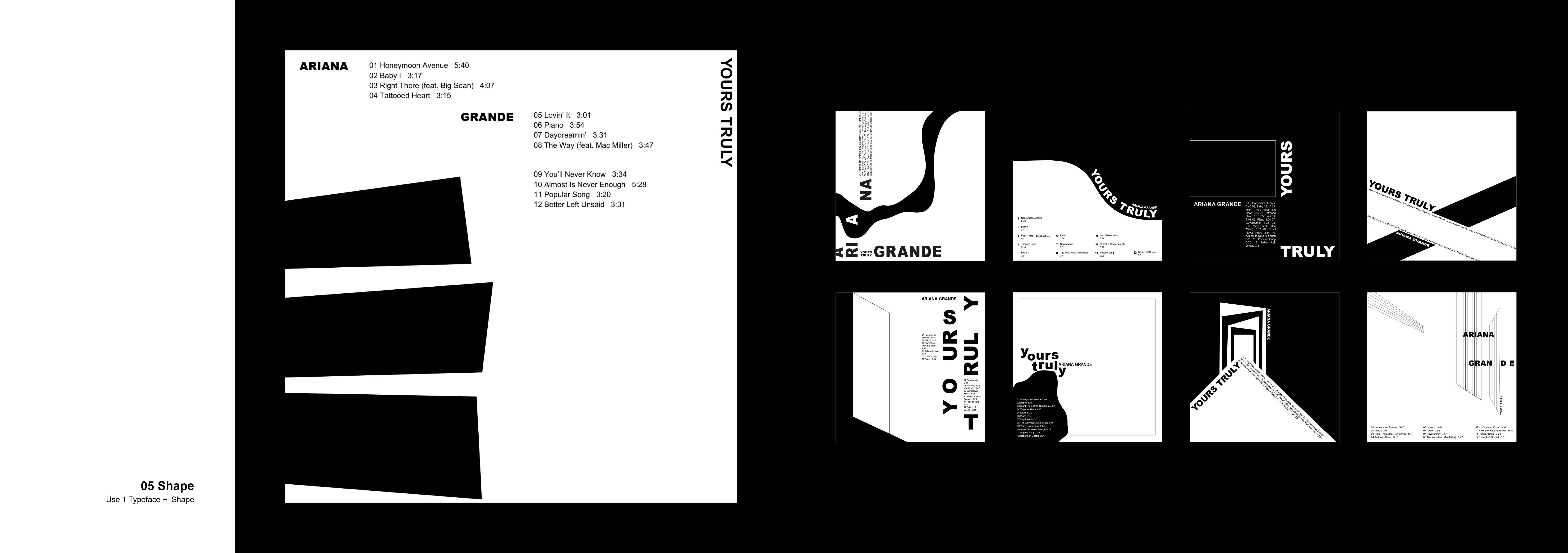
I used abstract shapes to elaborate my designs. Each of the three artboards used one, two, and three shapes. The figures in my selected design look loud, but I maintained the negative space on the right side to balance the composition. I wanted to make piano keyboards with abstract rectangle shapes since one of my favorite songs in the album is "Piano."
Image
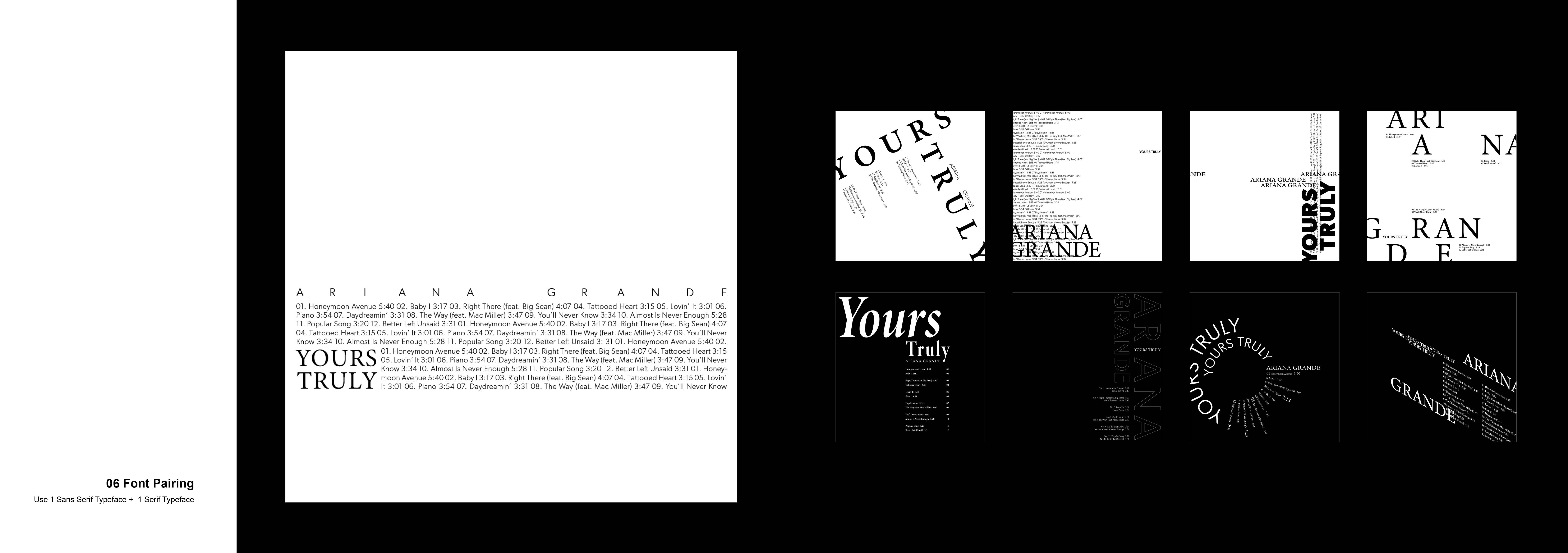
For this exercise, we did a font pairing. I paired Gibson and Minion Variable Concept. Overall, I tried to focus on a new concept by overlapping a sans serif and a serif font. I found out that the font pairing provided many possible ways to execute the composition. For the selected design, I stacked the tracklist and created a rectangle shape by adding the album name on the left bottom. I placed the entire figure slightly down of the center to give a feeling of subtlety.
Image
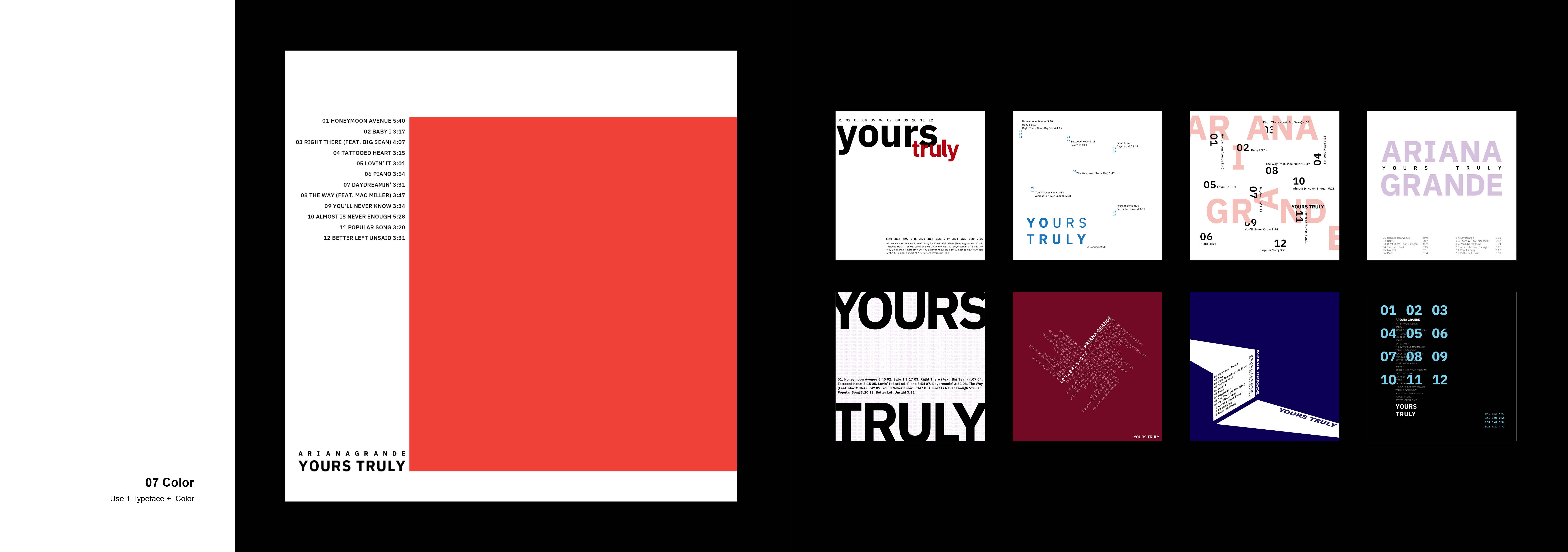
The main hero of this exercise was using colors. I explored various colors and compositions. The sixth design is that I tried to make a heart shape with tracklists reflecting the song, "Tattooed Heart." My favorite design has a big orange rectangle which draws viewers' attention right away. I placed the tracklists right next to the rectangle by aligning the top line of shape. The intense orange color rectangle can be loud, but the rest of the type elements show atmospheric feeling.
Image
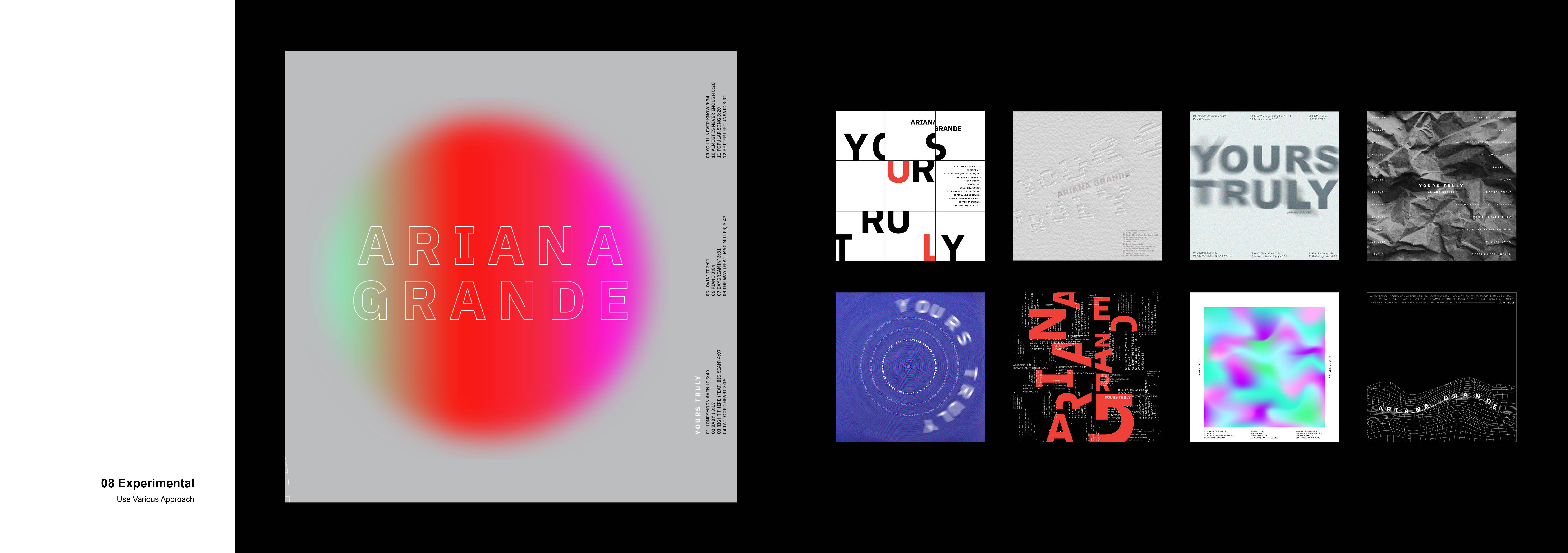
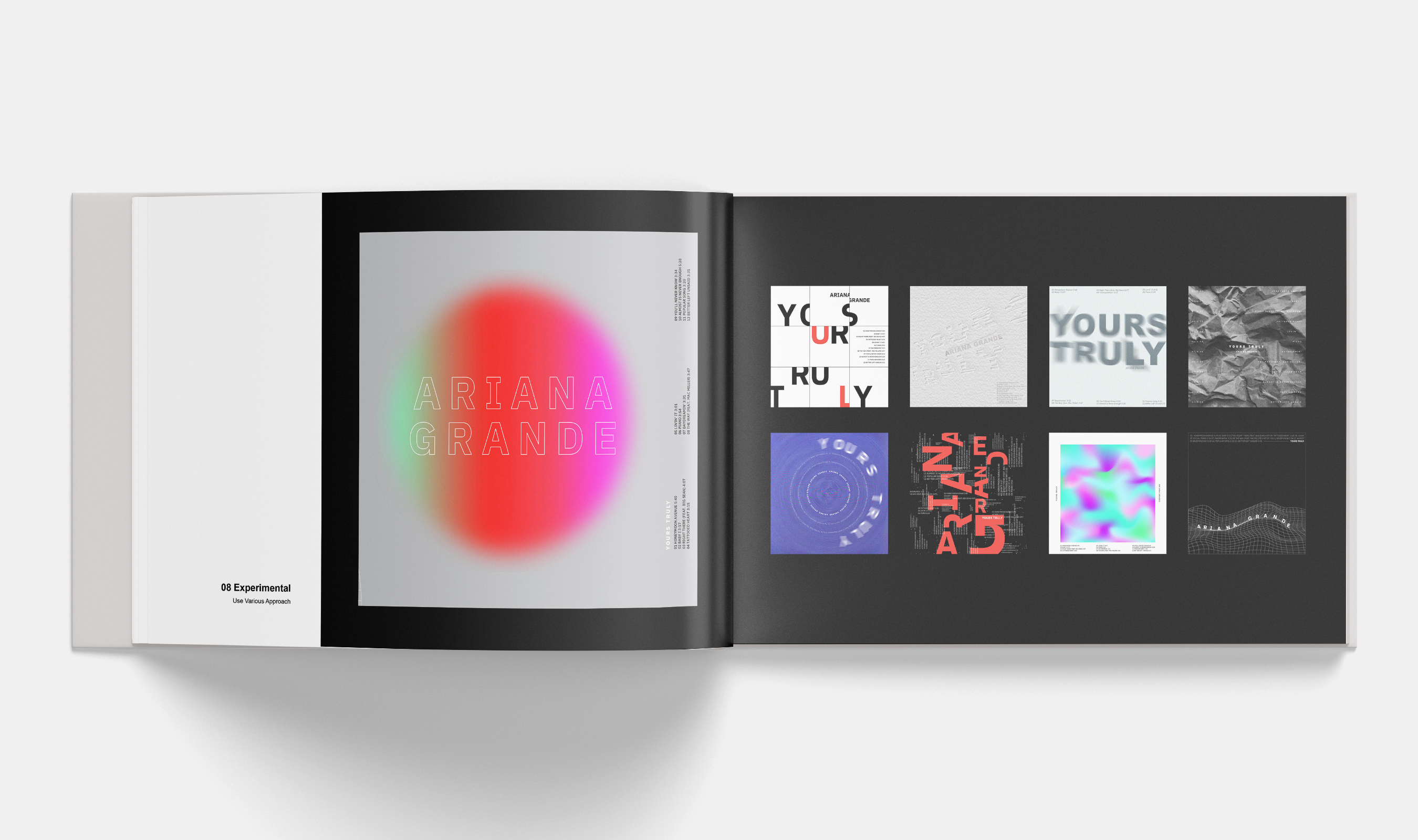
The experimental exercise was really fun. I explored different effects and colors. I added some textures and images as a background. The one that I selected has an illusional feeling with a gradient circle. The light gray background is matched well with the giant circle. Tracklists are placed vertically in a quiet manner so that the main figure can lead the space.
Image
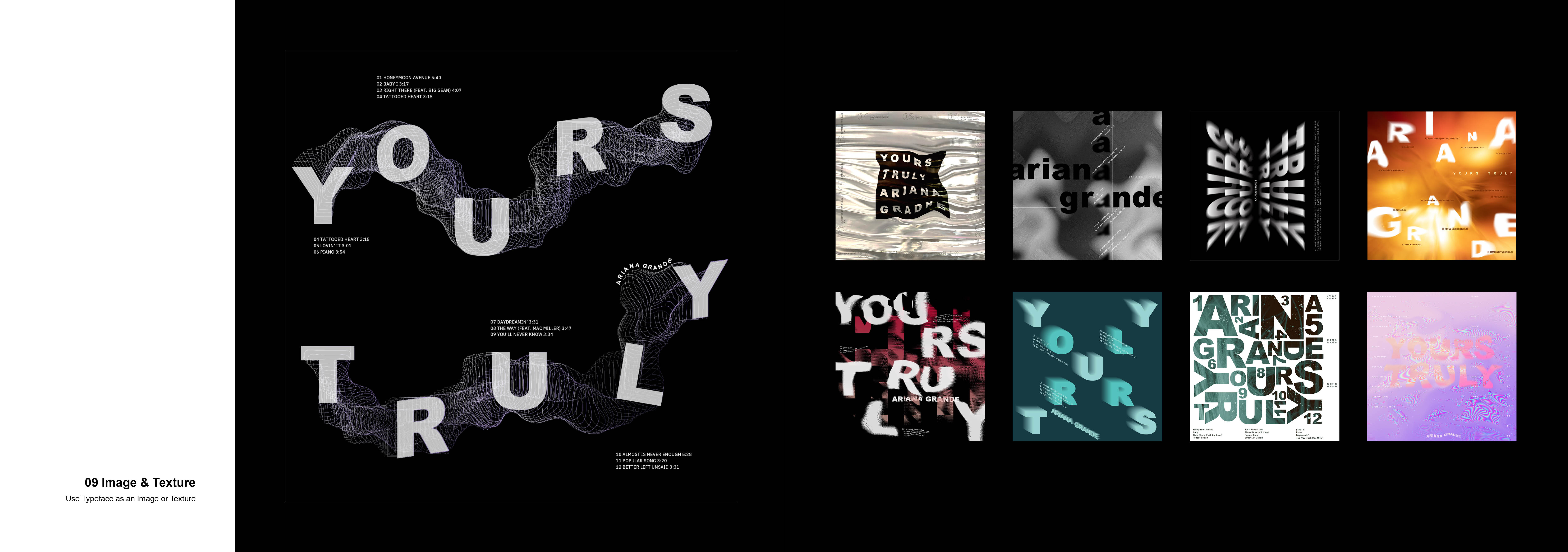
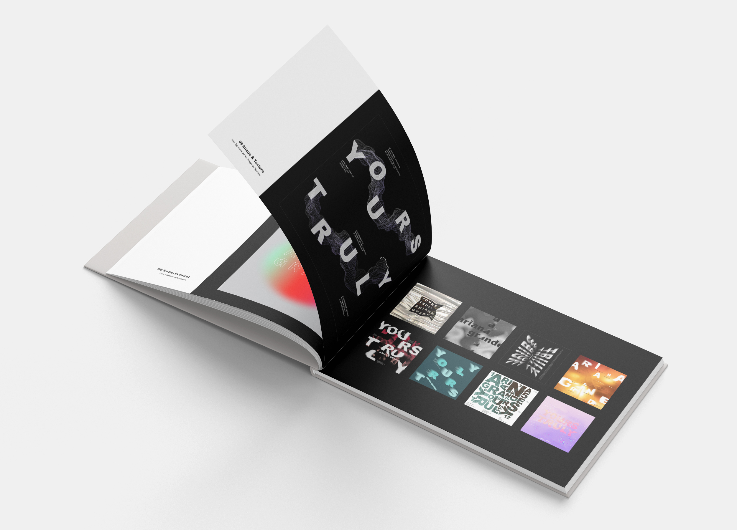
In this week, I experimented with different methods of using images and making a texture with types. I wanted to express the flow of songs with the blended lines in my selected design. I used a black background to elevate the album title and design element. I incorporated this design as my cover design for the process book. I created a flipping type effect in my other designs, various textures, such as holographic, images, distortion, and applied images as a background.
Image
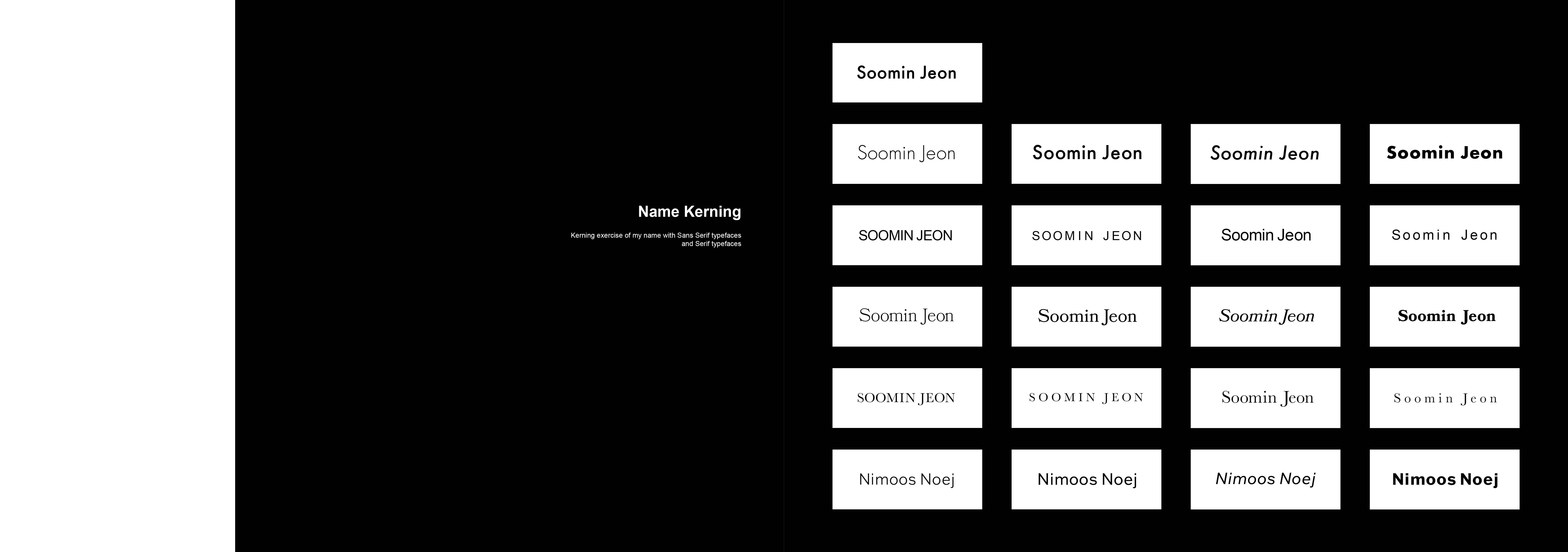
Every week, we practiced name kerning. The upper to lower rows are two to seven weeks. In week 3, I kerned my name in a light, book/regular, Italic, and bold in title case. In week 4, I kerned in a sans serif font, in all caps, and in title case, in regular weight with a tracking measure of -50, and other in 250. In week 5 and 6, I kerned my name the same as week 3 and week 4 using a serif font. In week 7, I reversed my name to kern.
Image
It is a mockup of the cover page of my process book.
Image
I applied the contents page on the mockup.
Image
It is the artist and the album information page that I applied in the mockup.
Image
I applied the line exercise in the mockup. On the bottom left, there is the info about the exercise. I chose the landscape dimension because I thought negative space could deliver a stronger emphasis on my design and could elicit emotions effectively. Also, I wanted viewers to see my 9 sets of designs all at once with a wide page layout.
Image
It is the mockup of the experimental exercise page.
Image
It is the mockup of the texture and image exercise page.