Image
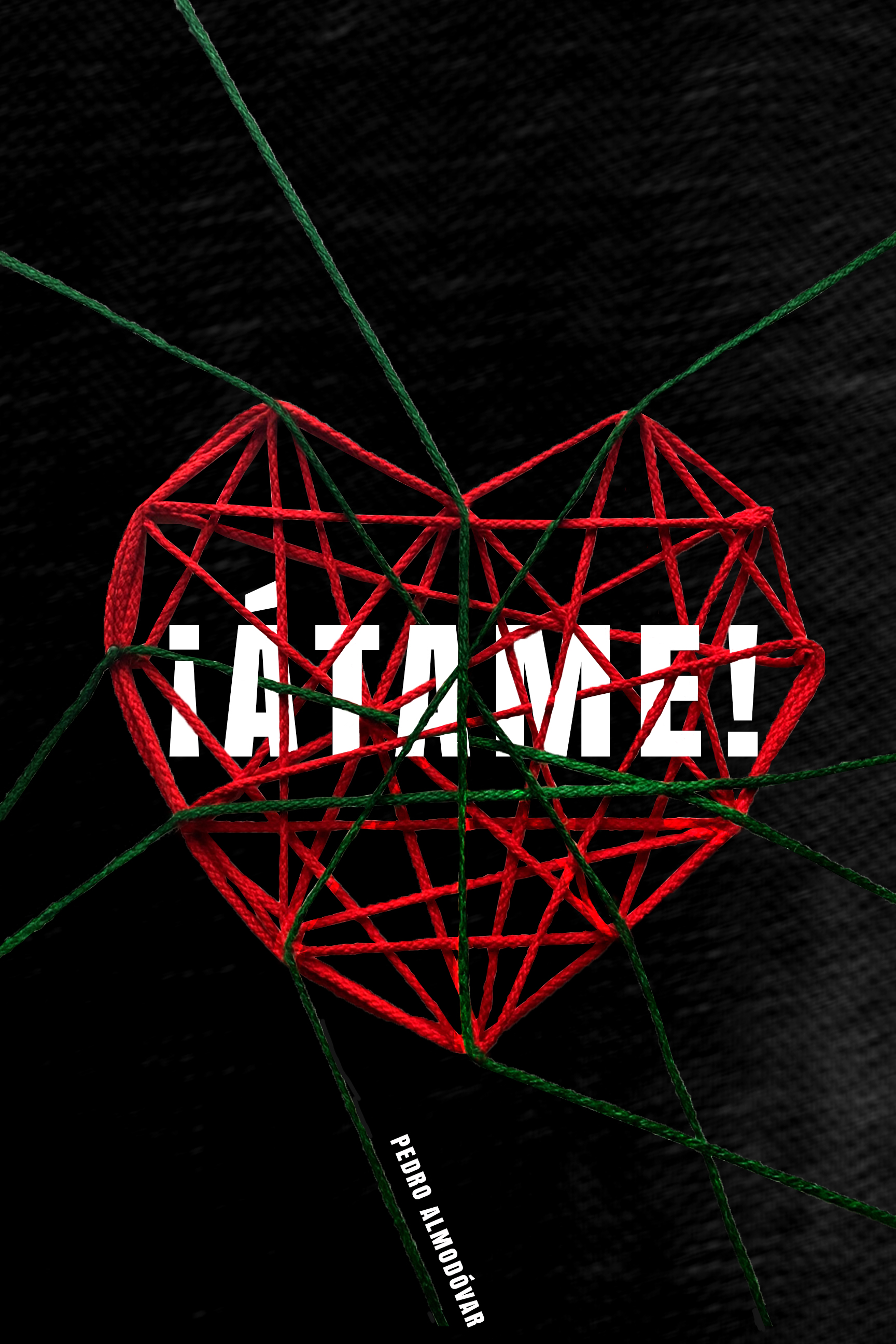
This is my final design for the movie poster. I made a heart shape with ropes to express their relationship, which gradually grows up to love. I wanted to use red and green, the most symbolic colors of the movie, to represent the atmosphere of the movie. By placing the title of the movie between the ropes, I wanted to give a feeling of Marina being tied up in the film. I think the irregularly tangled ropes expressed their slightly strange relationship. This is because the main female character eventually falls in love with the man who kidnapped her with Stockholm syndrome. I also added some textures to the background. I thought the texture could deliver the sense of their crazy love. They both feel solitude, and they think it fills up as they meet each other. I tried to express their melancholy mind with a dark background and texture. I tried to use the main symbols of the movie to complete this poster. In this project, the film title and the director’s name are the only types allowed.
Image
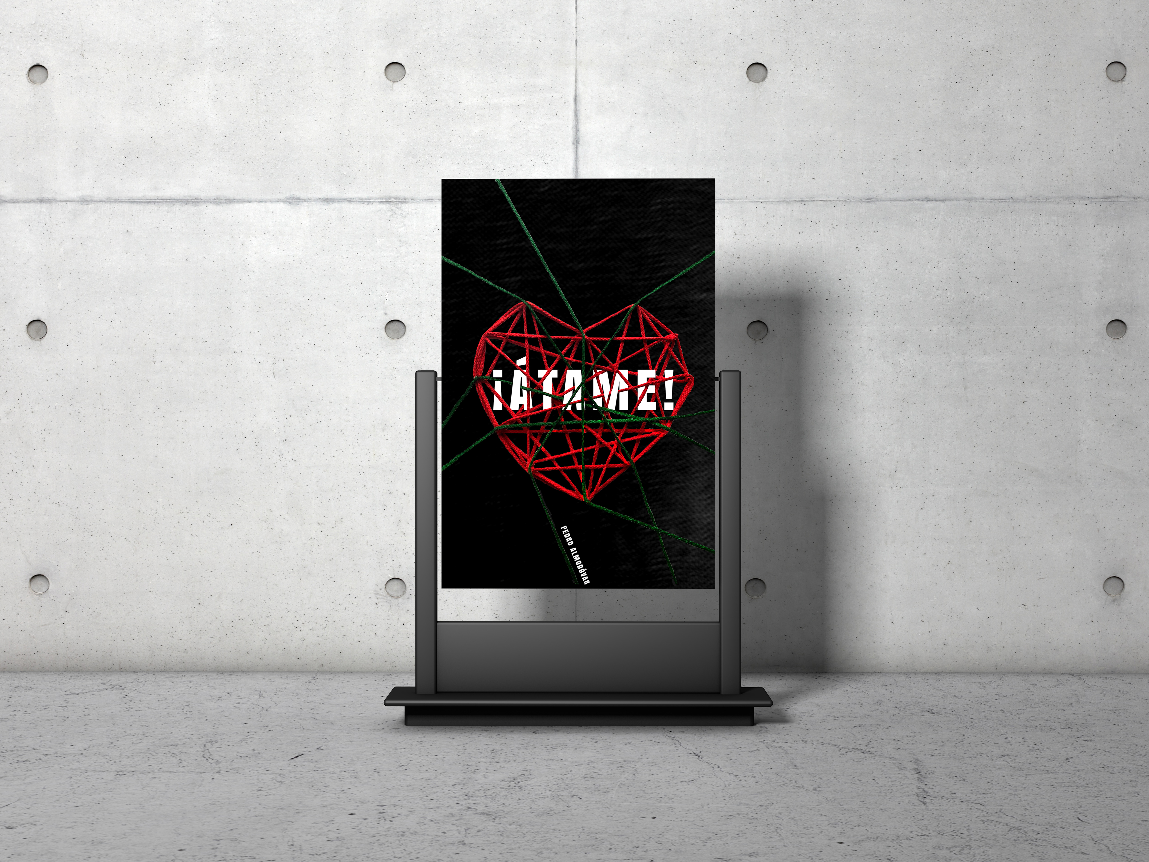
I placed my poster in the mockup.
Image
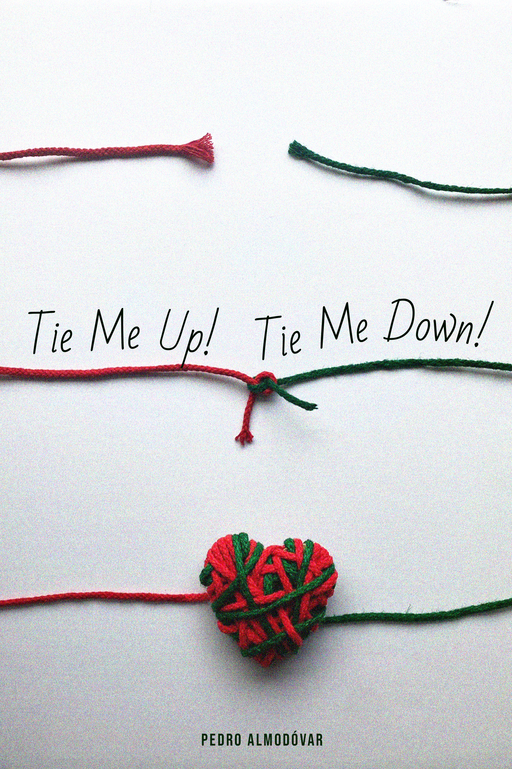
The rope was tied up after being separated and eventually made into a heart shape. I tried to show how the two main characters develop their relationship from strangers to love. It metaphorically expresses how the film's contents unfold using the symbols.
Image
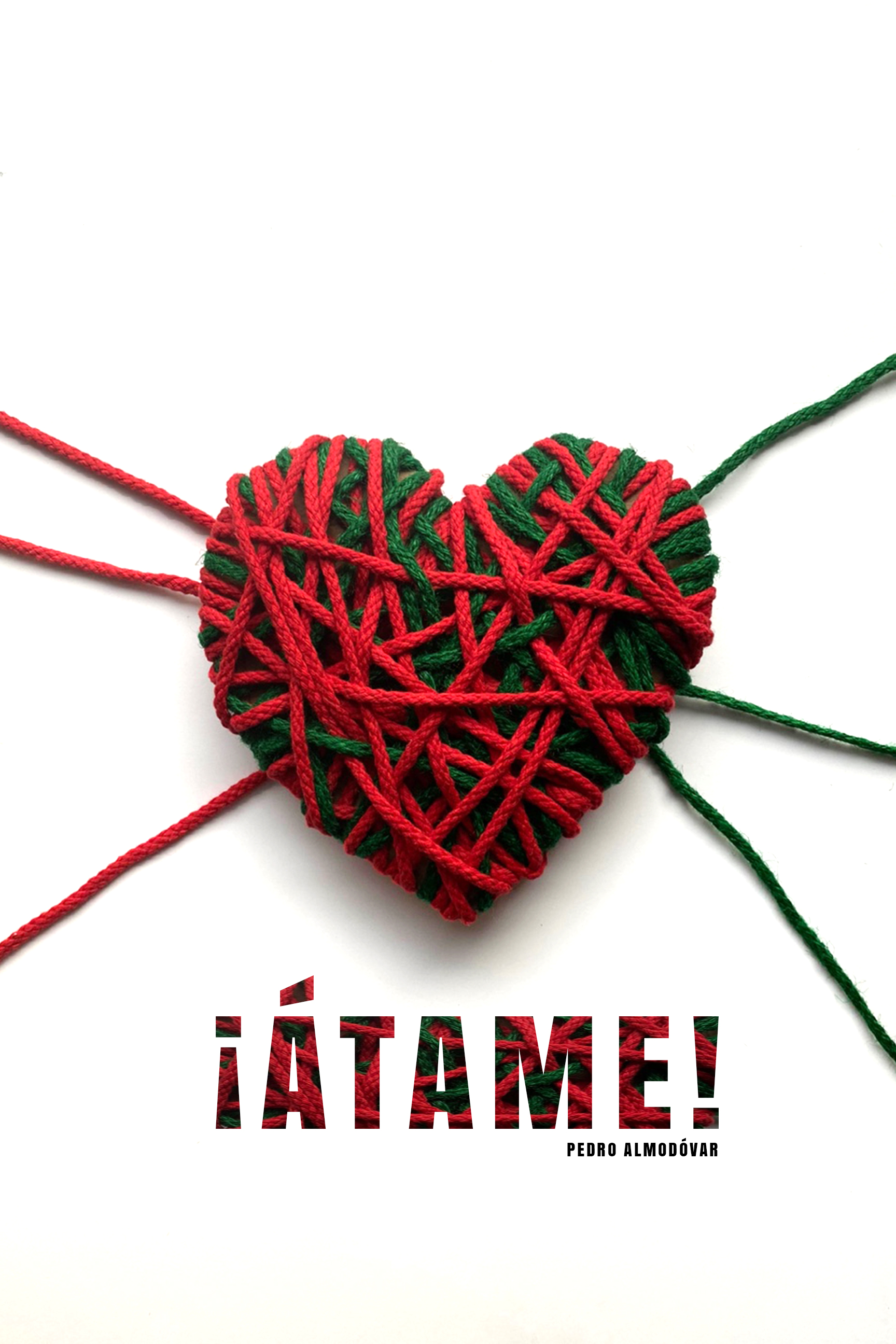
I wrapped the rope randomly to make a heart shape. I thought this execution could also represent the two characters' strange love. I used a clipping mask on the film title to describe the movie scene well in that the female character is kidnapped in her place.