Graduates

Soomin Jeon

BFA in Graphics — Graphic Design
Course:
GPRT-102 Communication Design 1: Primer
Faculty:
Jen Sorrell

My Secret Obsession

It was the project talking about my secret obsession or shame. My topic was that I am obsessed with cold or cool temperature. I prefer staying in cold temperature even in winter. Therefore, I expressed that feeling on my book design cover. I printed out the title and my name and dipped in the water. I froze the paper and used that image as my book cover design. I think the way I did incorporated my intention and topic. The ice texture is well shown on my design.
Learning Outcomes:
It was a great opportunity in that I could use an image as a whole design. The combination of the image and title reveal what I try to say. I learned that I could create a direct and solid expression through the use of the actual image. It might be a little vague initially; however, it can draw people's curiosity.
Image
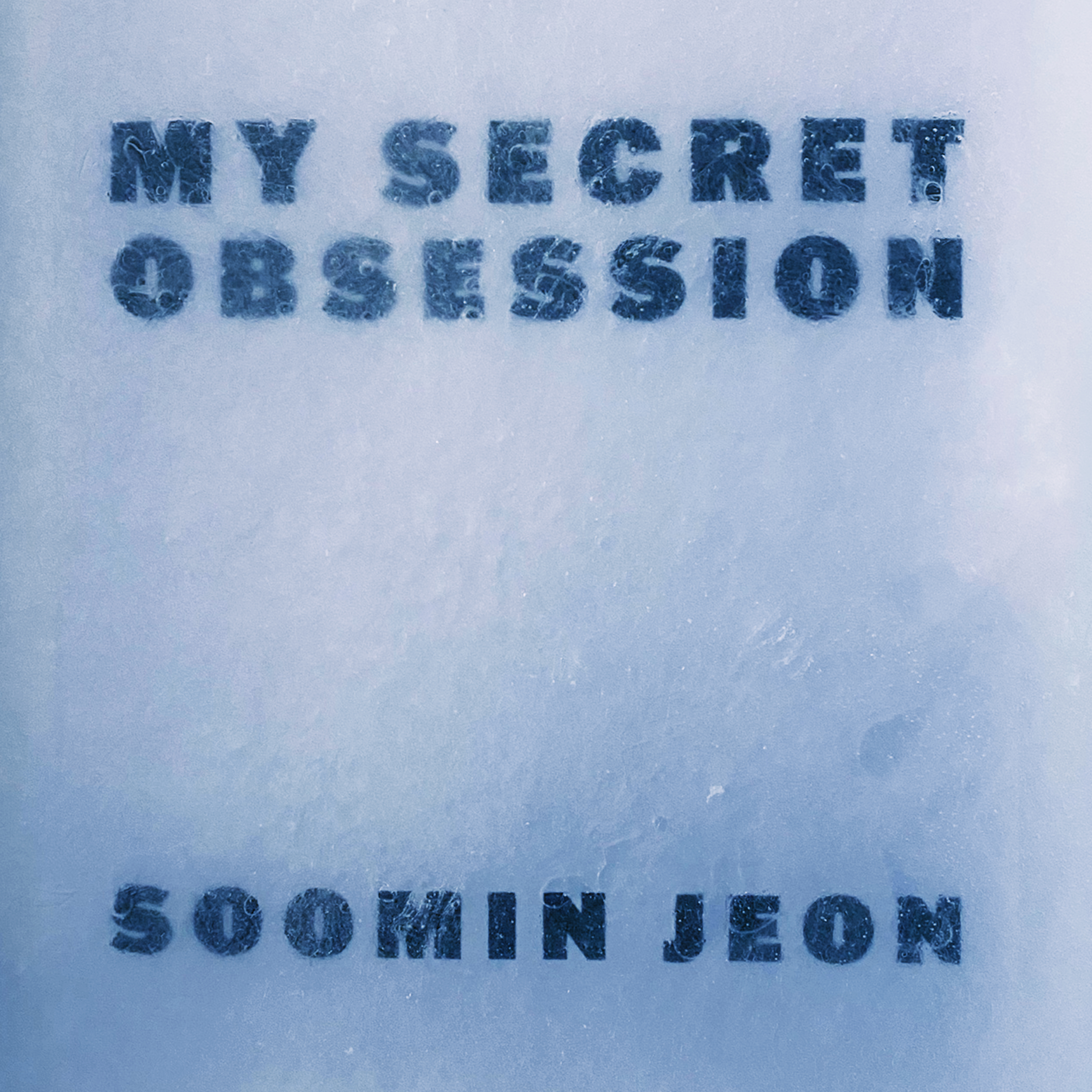
It is the cover page of my secret obsession book design. The bluish ice texture is well shown on the cover and tells that my book is about ice and cold temperature. I used a sans serif font because the thick and bold font goes well with the ice texture and delivers a feeling of my intense obsession.
Image
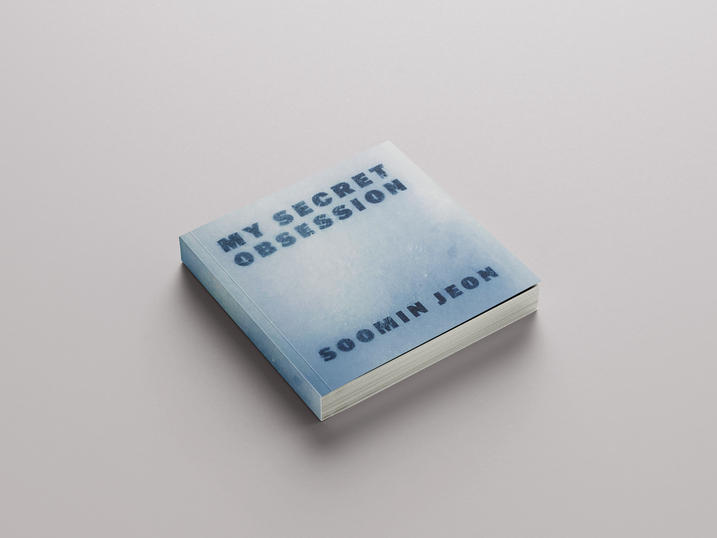
I applied my design to the square mockup.