Image
Image
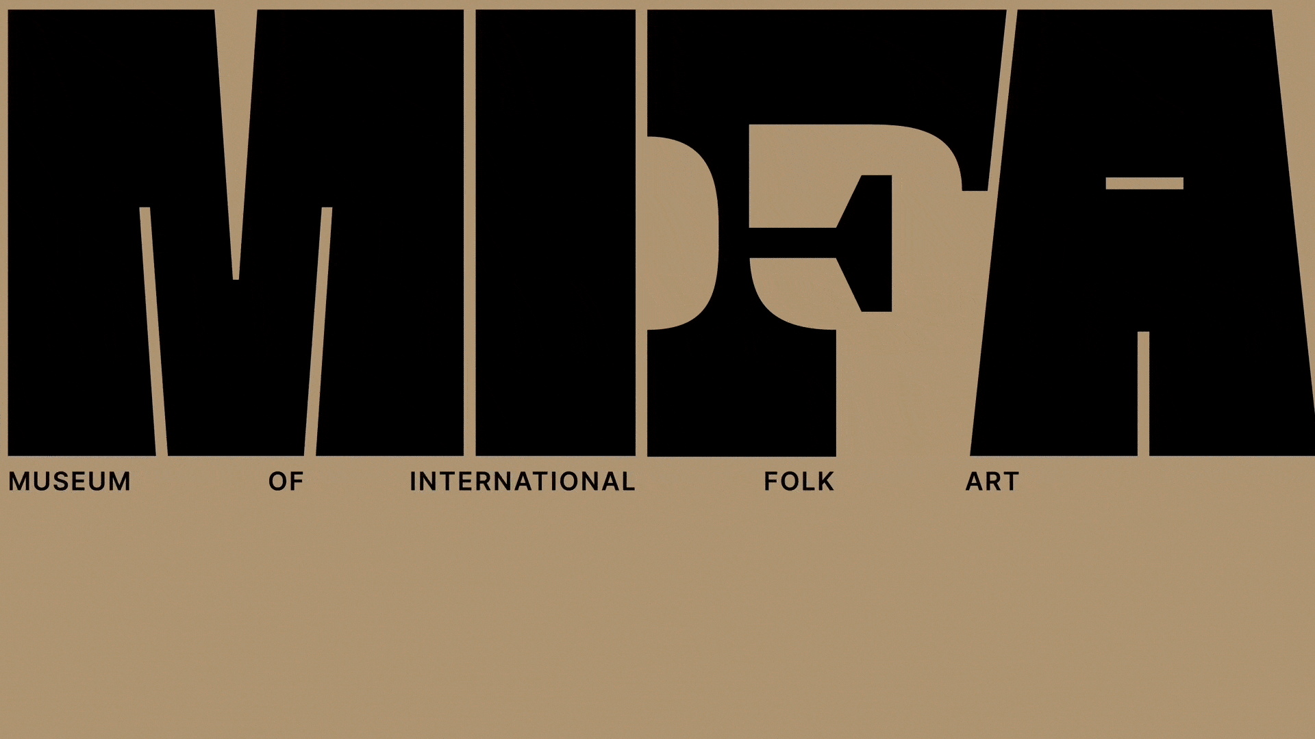
Beginning a system is first a matter of grasping what the essence of what your subject is—Folk Art to me is all about the local, personal, quality of the art.
Image
Because folk art is global in scope, varied in style, and takes on a local, personal, and individual quality,
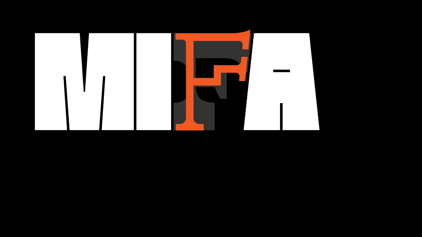
I felt that an iterative logo with a series of permutated Fs is really effective at bringing those qualities into the visual language of the system.
This series can also change with the demands of the museum, adding new F’s whenever the museum demands it.
Image
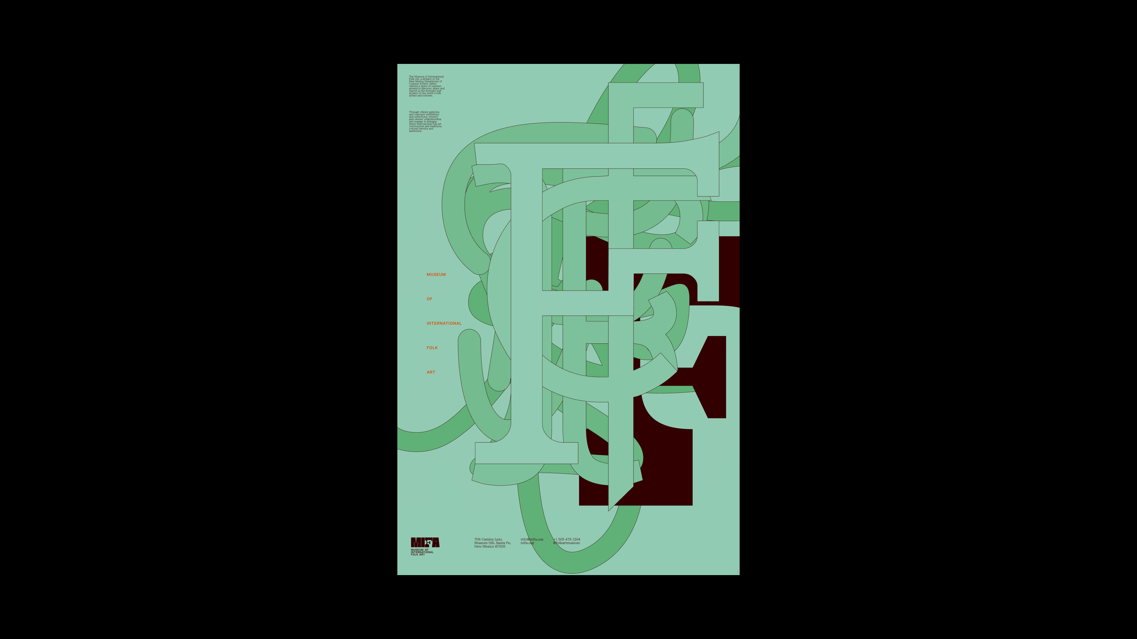
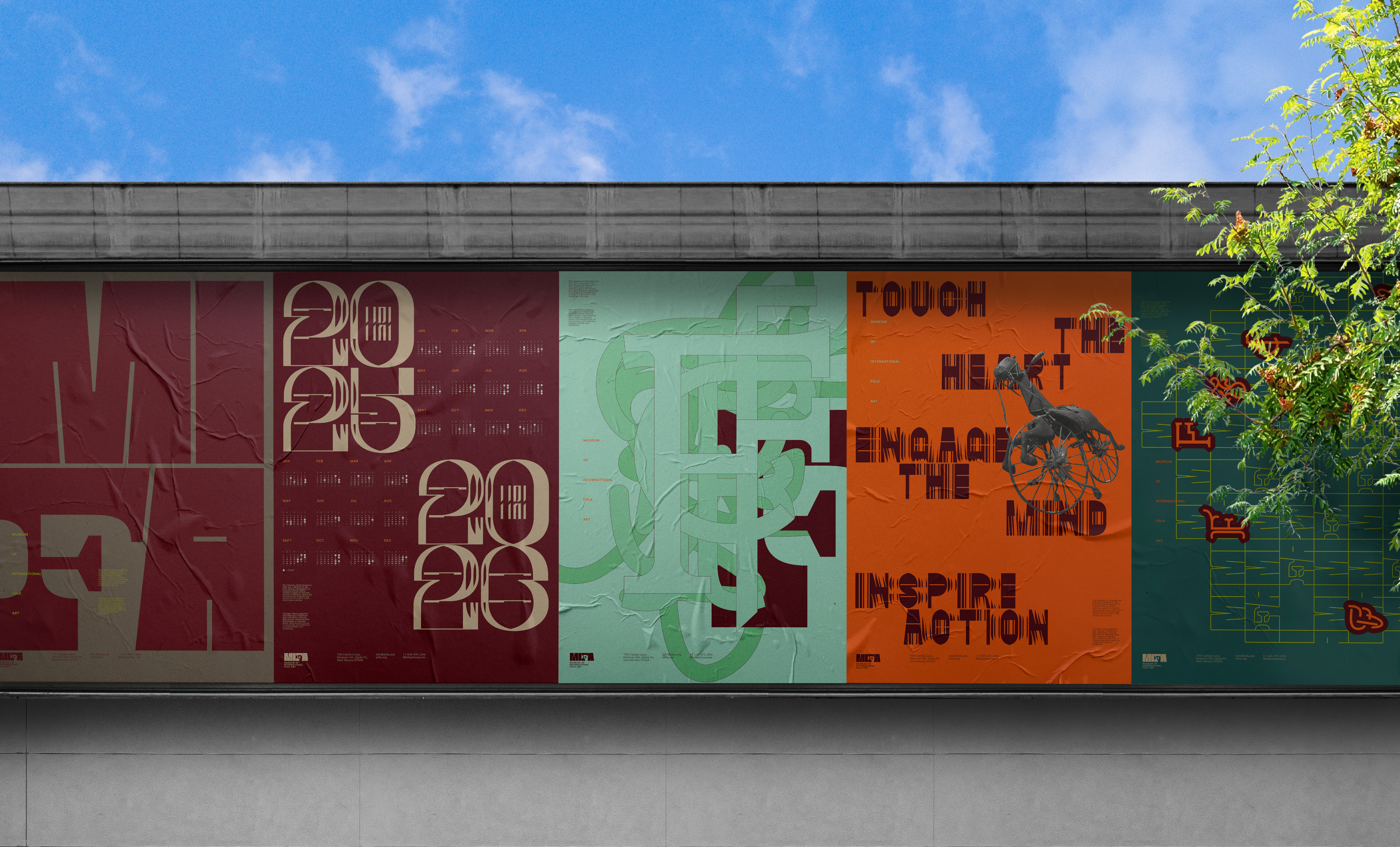
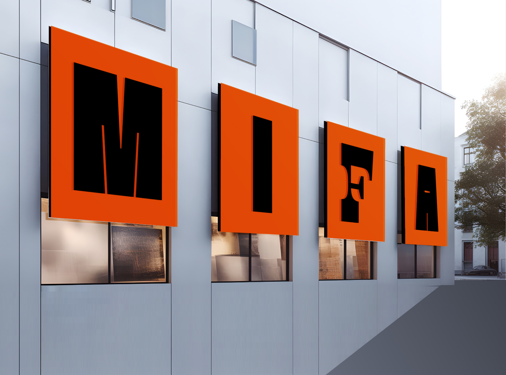
In a poster context, The F iterations stacked on top of one another creates an abstract wash of form—and communicates the wide scope and breadth of what 'Folk' entails at a single glance.
Image
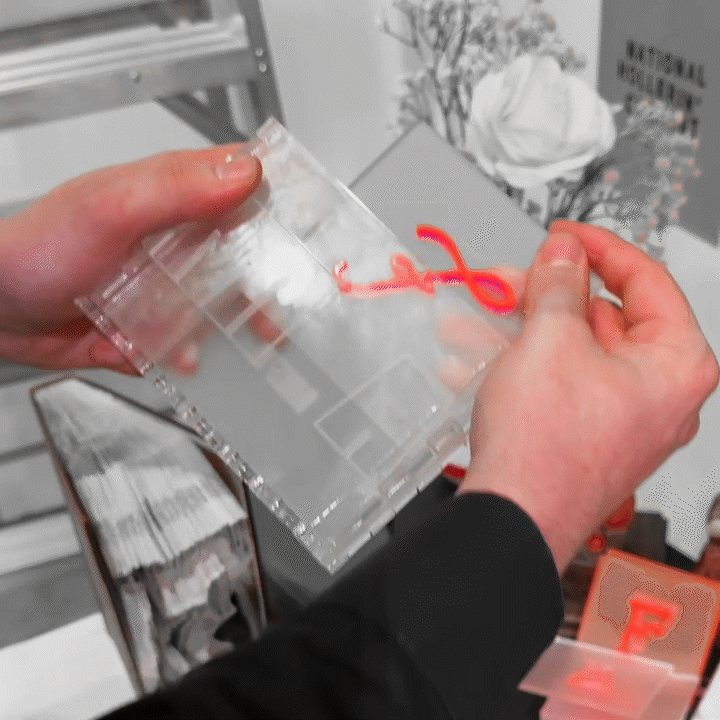
An application of this iterative F system is in desk name plates—these different F’s can be customized and swapped out to demarcate different sections of the museum.
Image
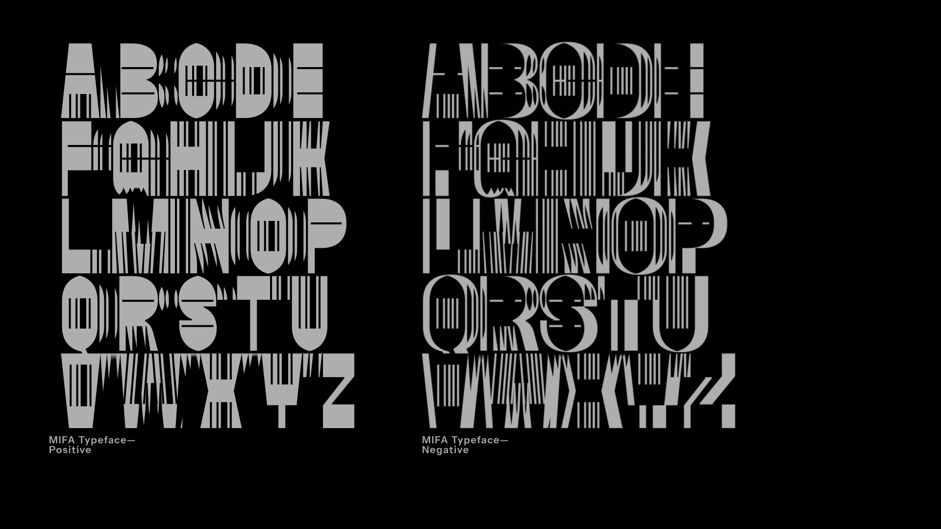
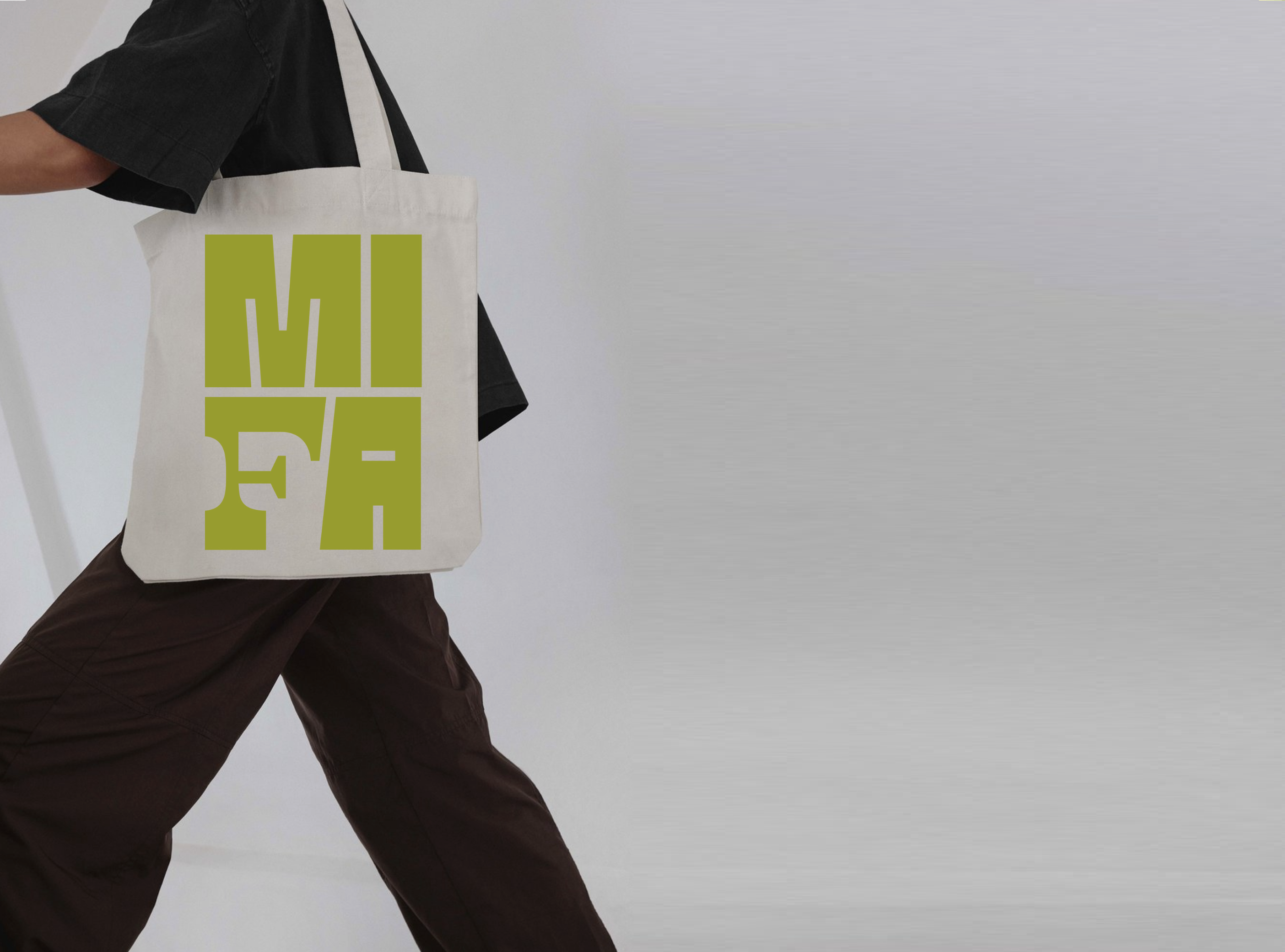
An essential aspect of the system is the custom typeface I developed which essentially uses these displaced pieces and repetitive forms to both allude to some of the geometry that you might find within textiles, and to add a sense of dynamism and motion to a otherwise flat piece of typography.
Image
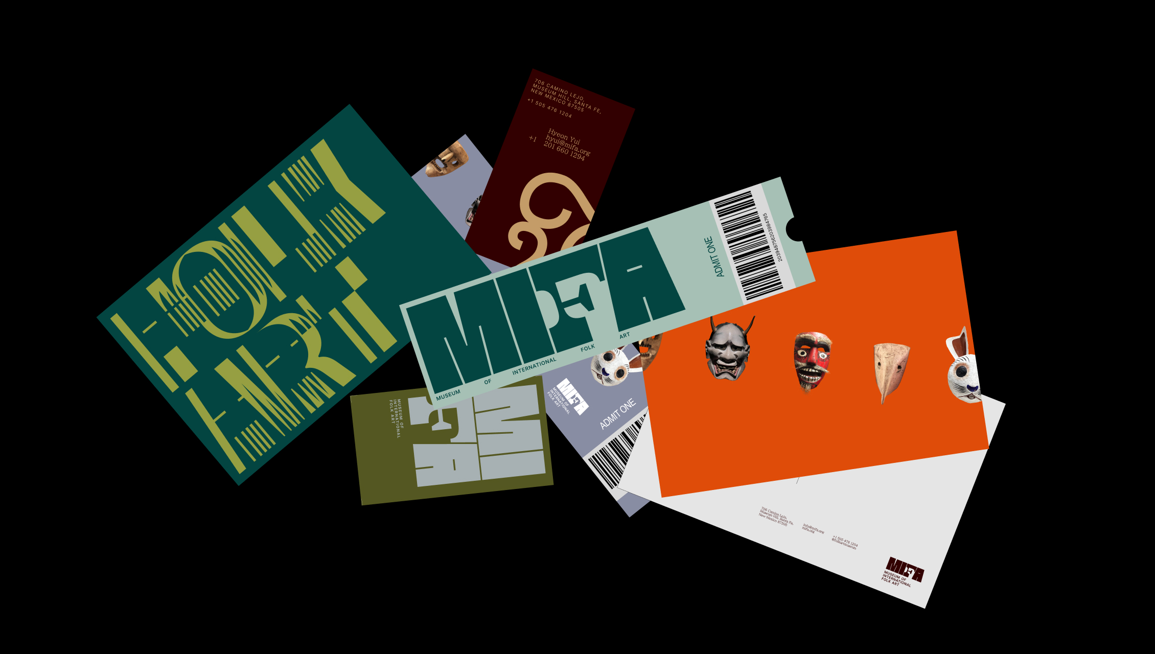
Applied to a series of print materials, you can see the variety in typographic voice, color, and logo involved.
Image
Image
Translating the identity to a web environment was firstly a matter of how content would be organized, so I again used the logo at supergraphic scale to dictate where those gridlines would be, what the edges of that content would click to.
That same big, bold, dynamic typography is used as a way to introduce things, in this case the founder of the museum.
Image
Image