Graduates
Spencer Fraye
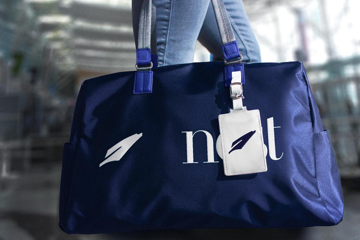
BFA in Graphic Design — Graphic DesignNest by Lufthansa
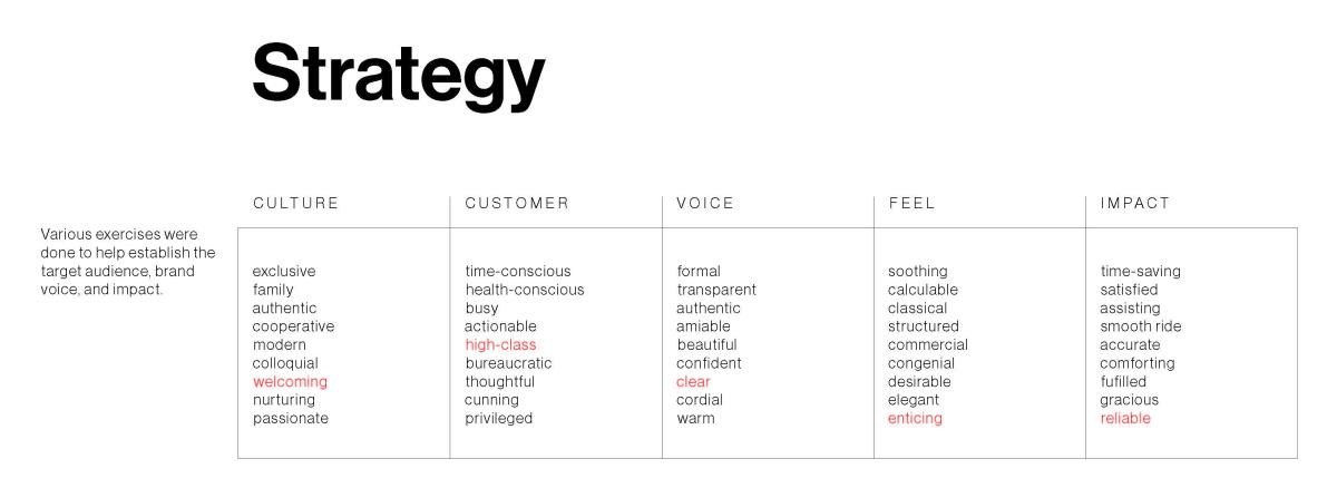
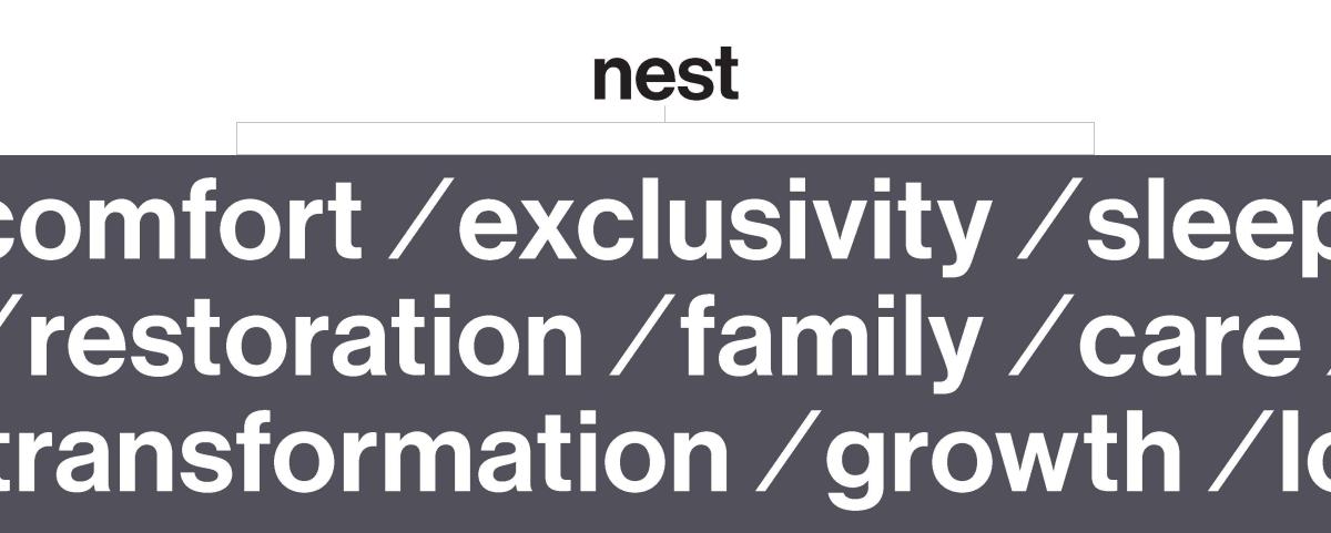
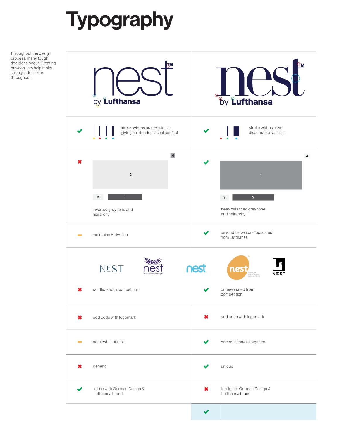
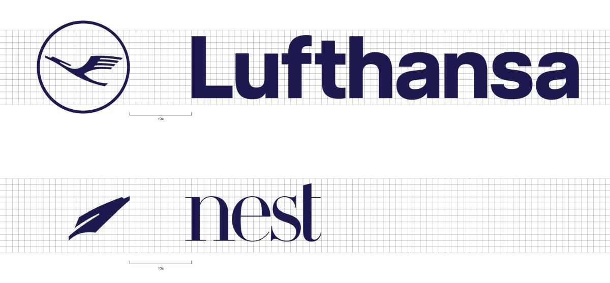
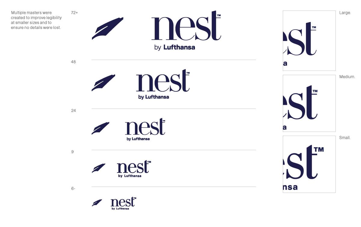
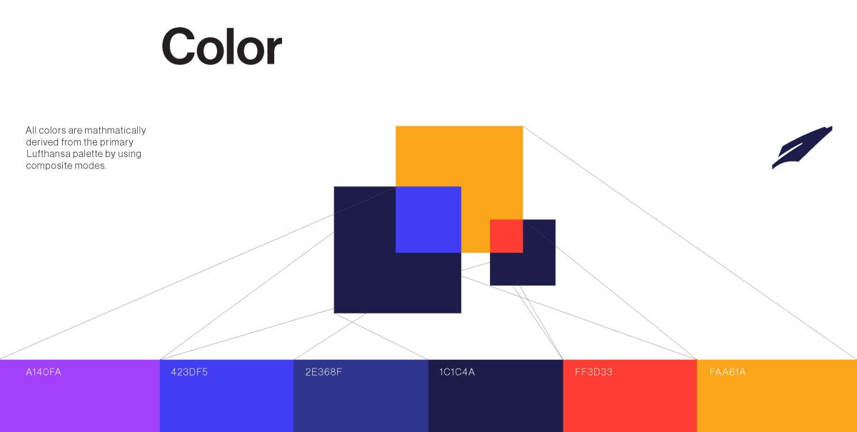
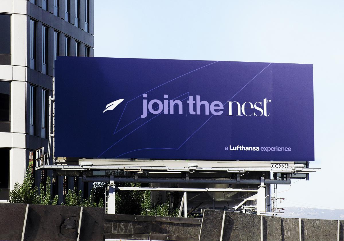
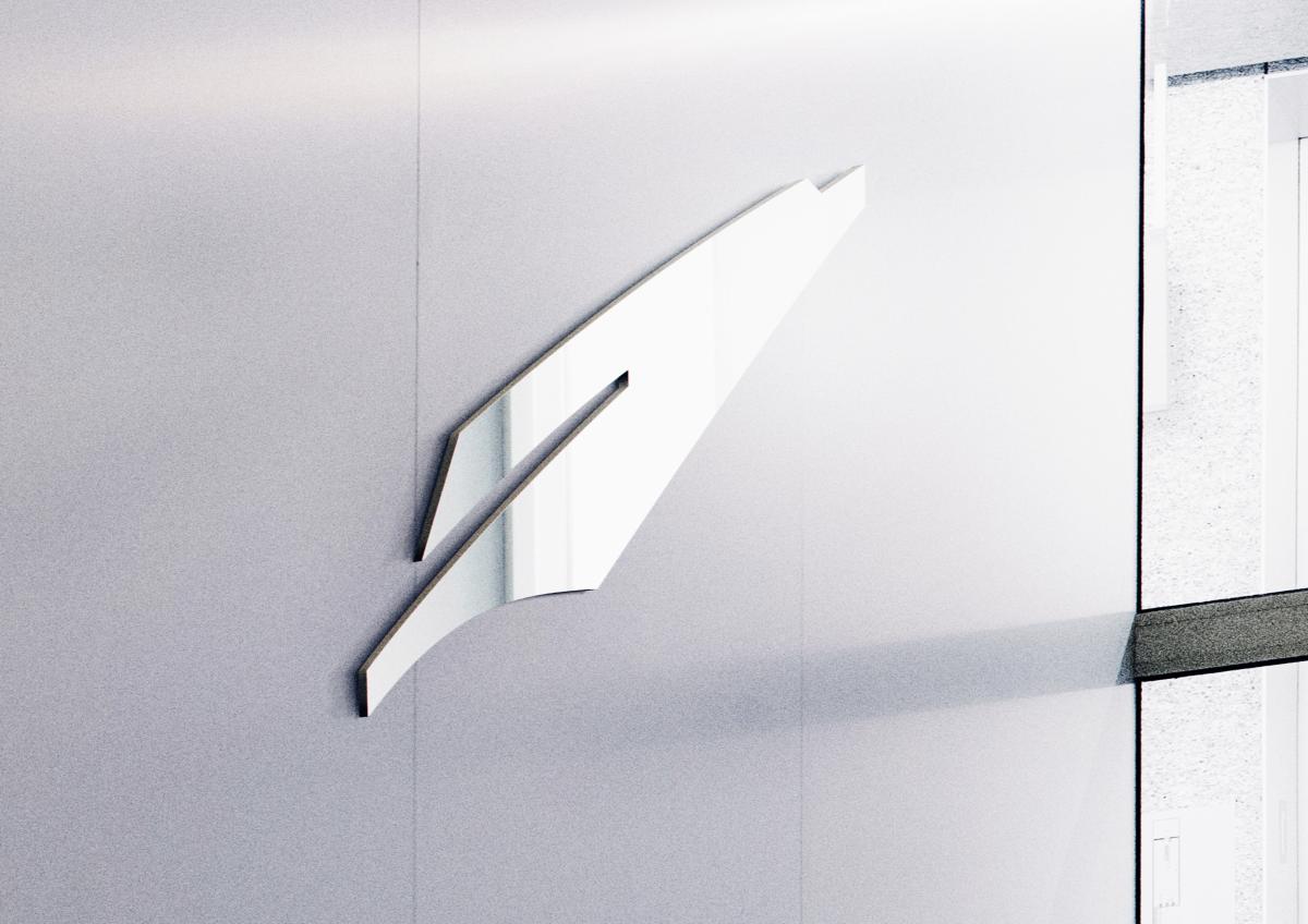
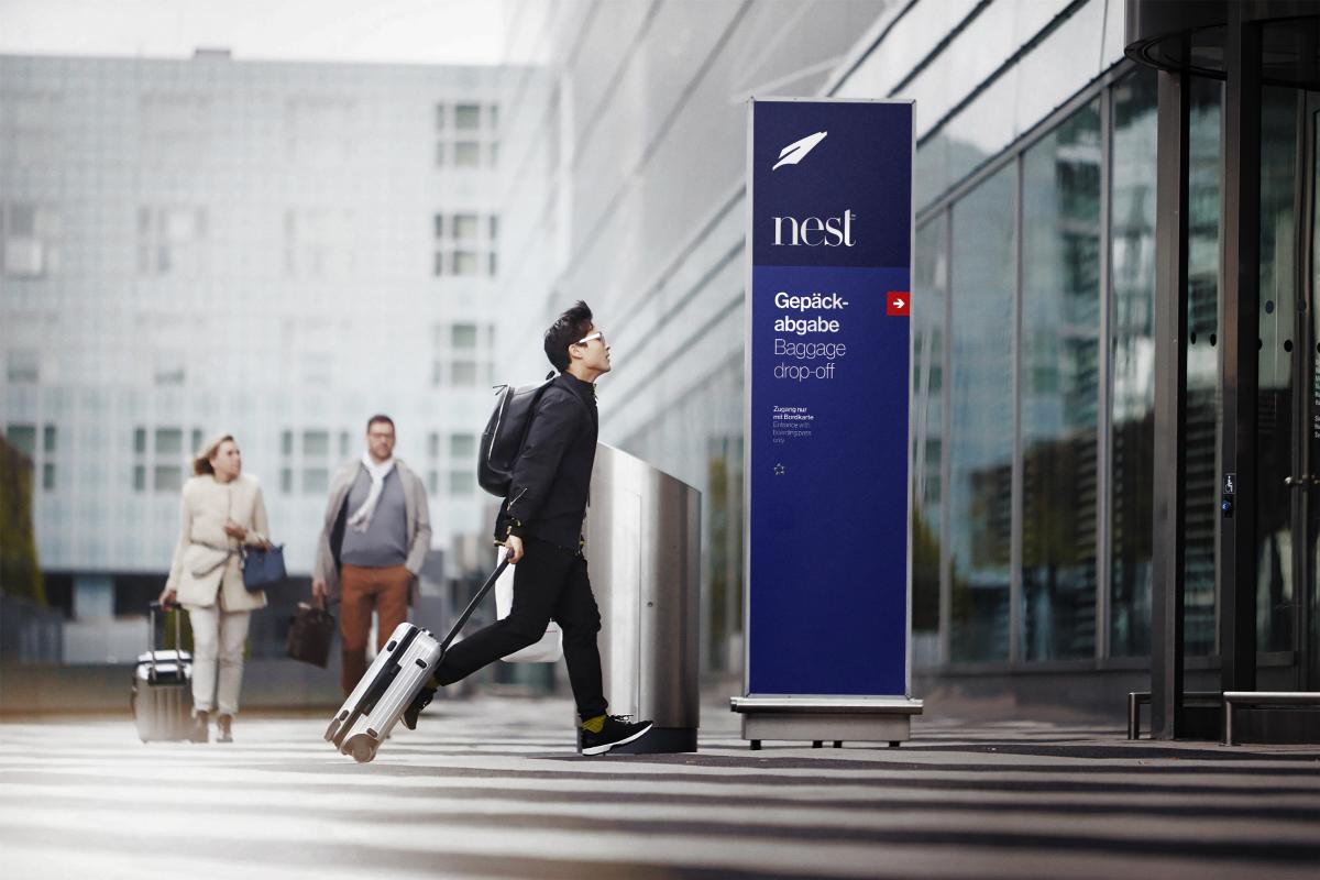
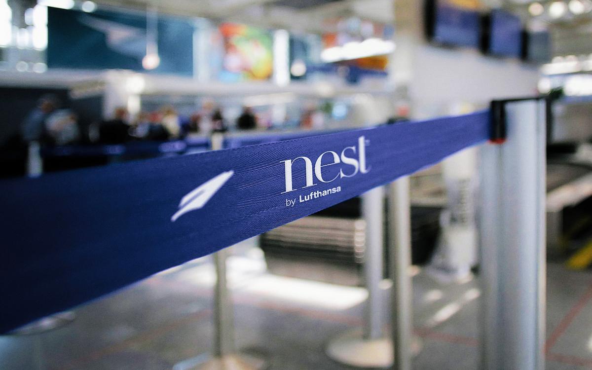
Who: Returning customers of Lufthansa What: A sub-brand identity system for a new high-class branch of Lufthansa Airlines Why: To create a premium experience for the most dedicated flyers How: Using color, typography, and imagery to create a more meaningful experience for flyers and fans.
Learning Outcomes:
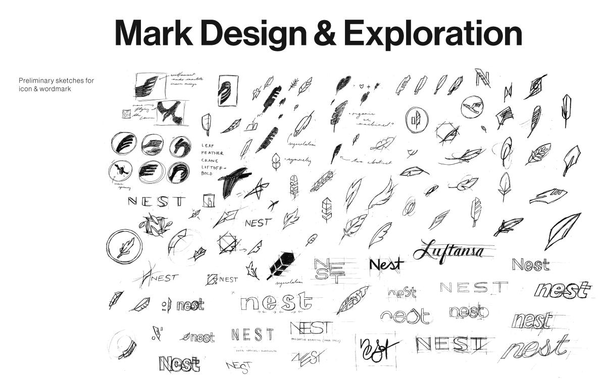
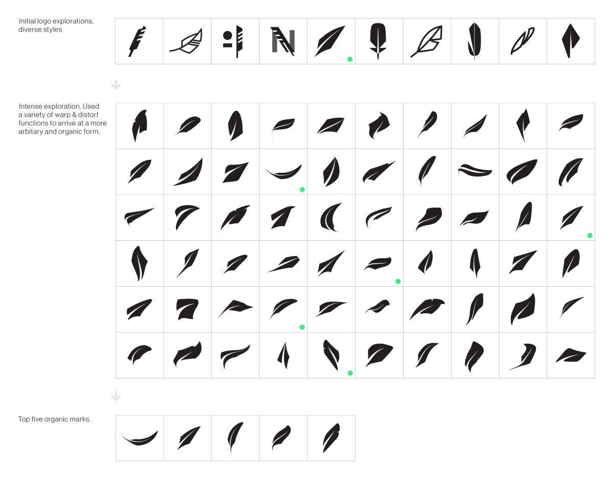
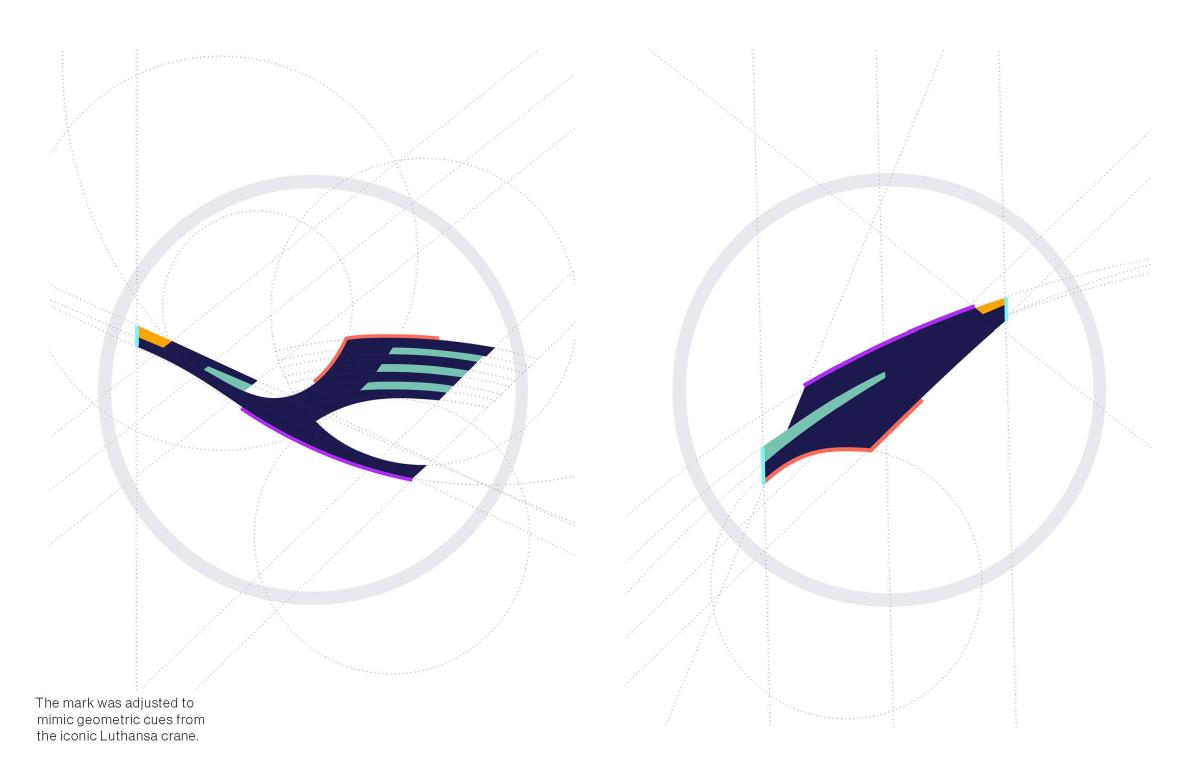
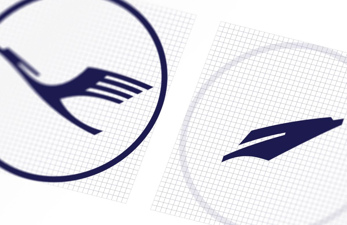
I learned how to create an identity system that has to cooperate and work within an existing one. I learned how to extrapolate geometry and style and apply it in new, creative ways to arrive at something familar, but innovative and fresh. I learned how to design for all the different touchpoints a consumer might have with a brand. I learned that when a project isn't working, it's completely worth it to start over (if parameters allow).

