Suemin Yoo
BFA in Graphic Design — Graphic Design2026 MILANO WINTER OLYMPIC
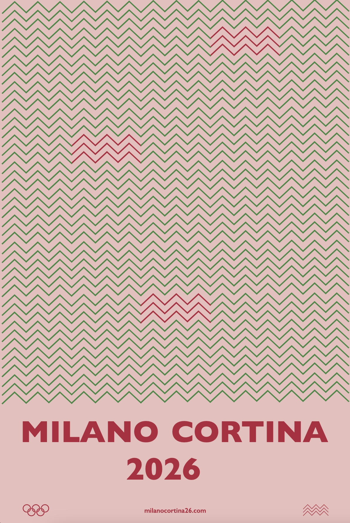
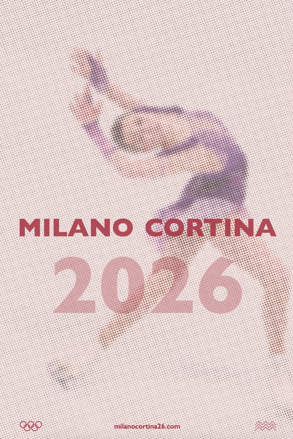
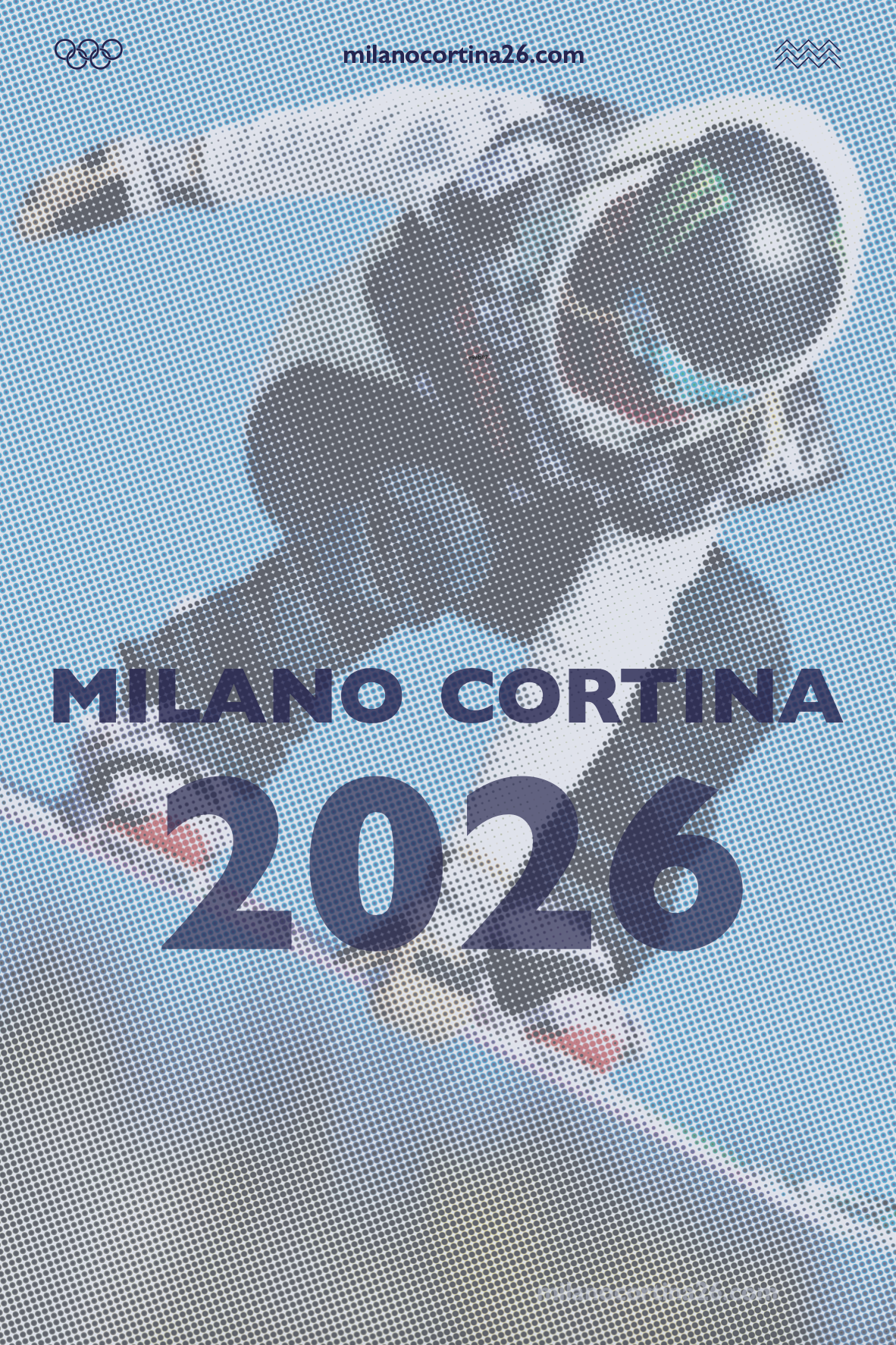
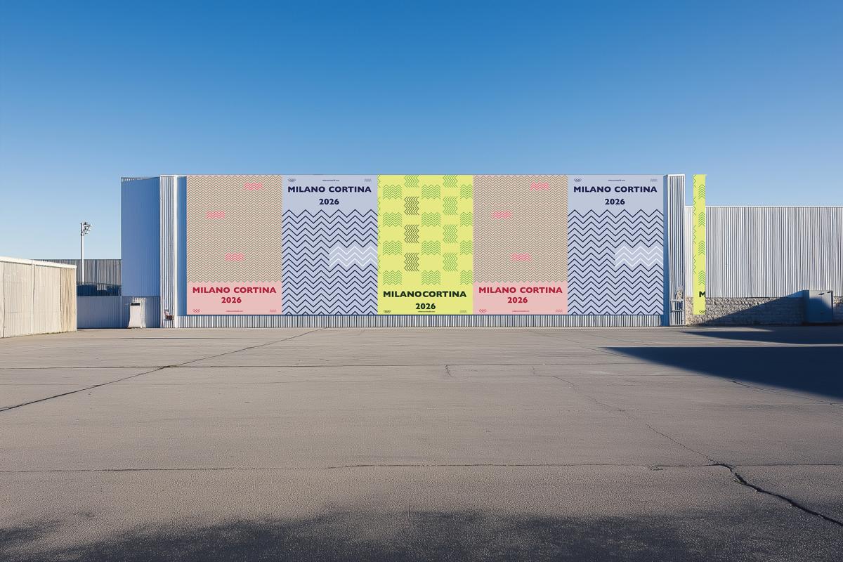
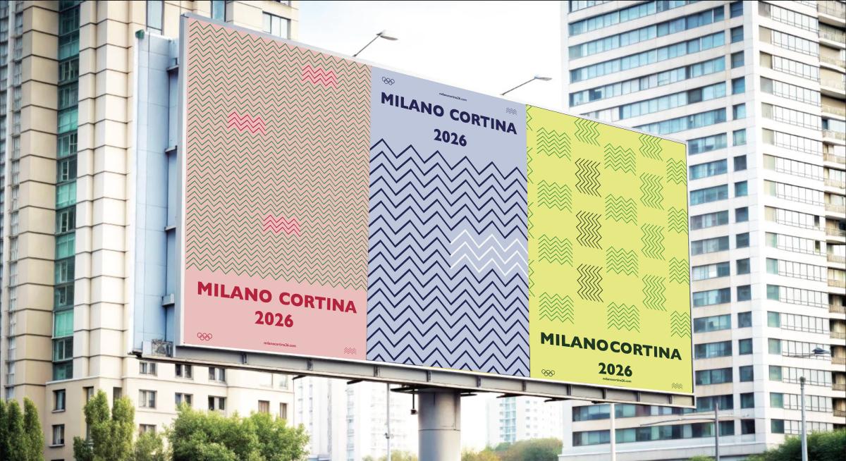
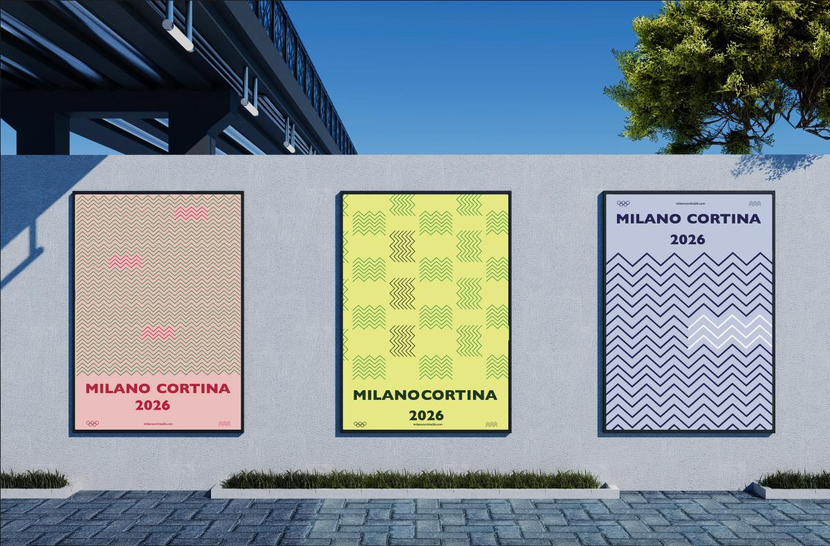
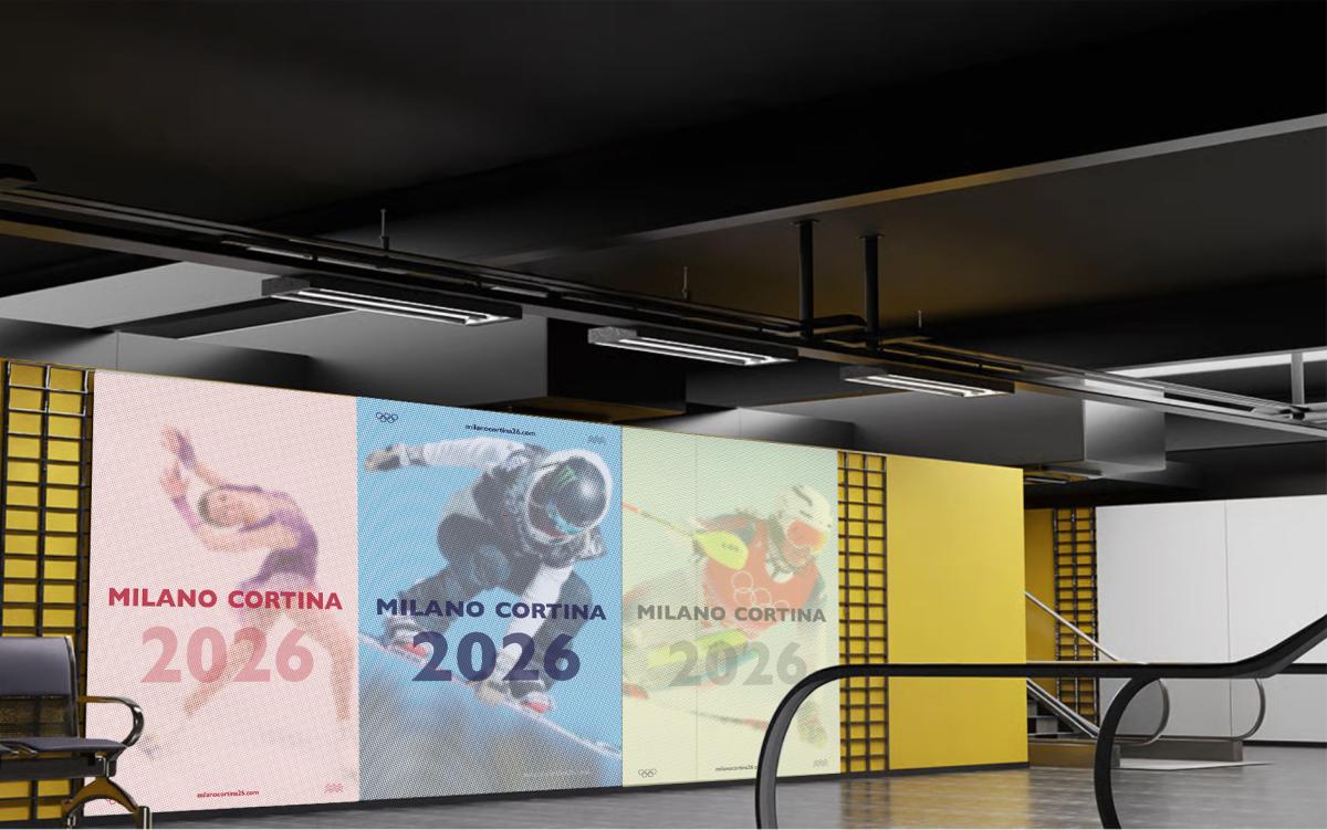
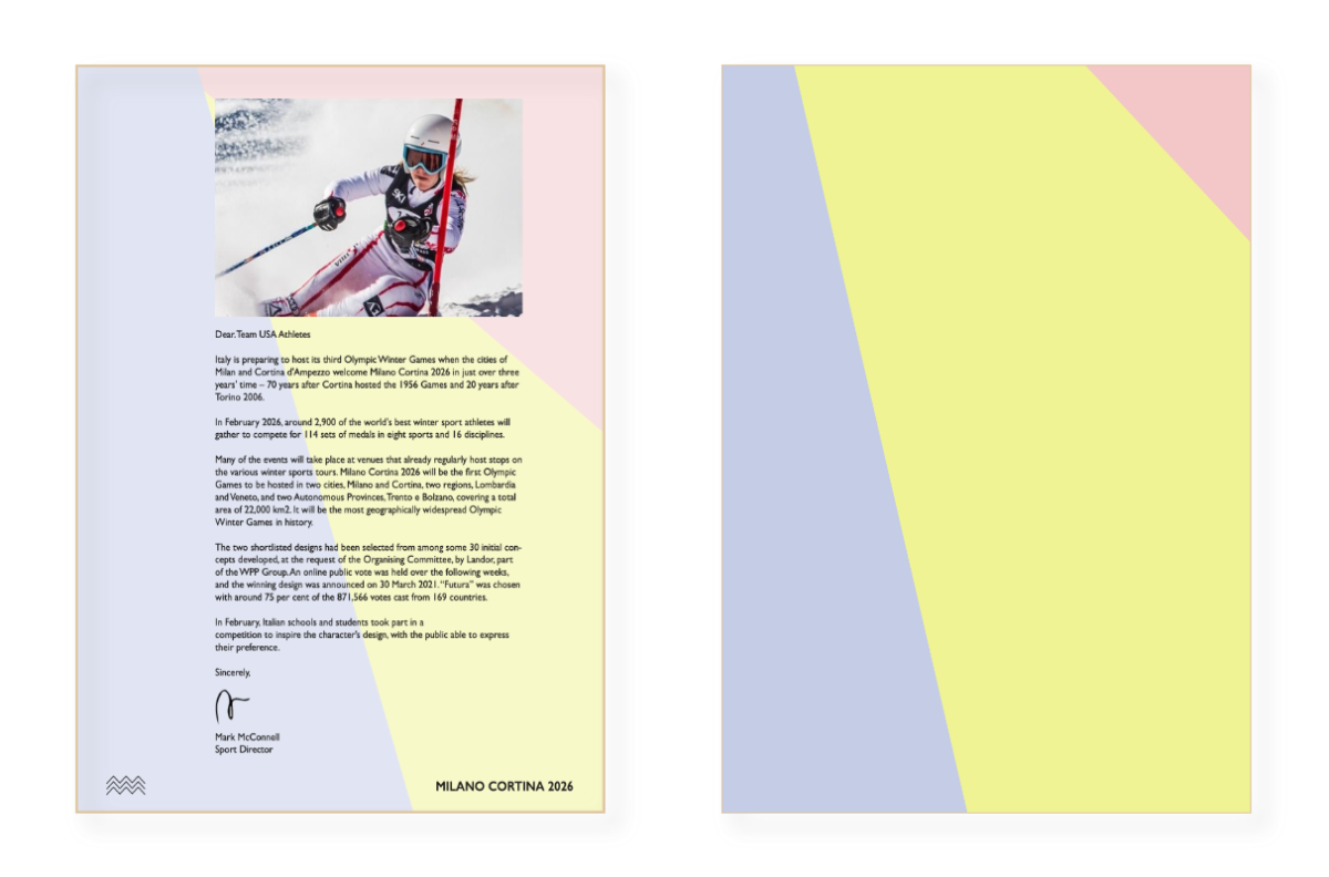
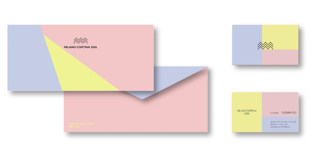
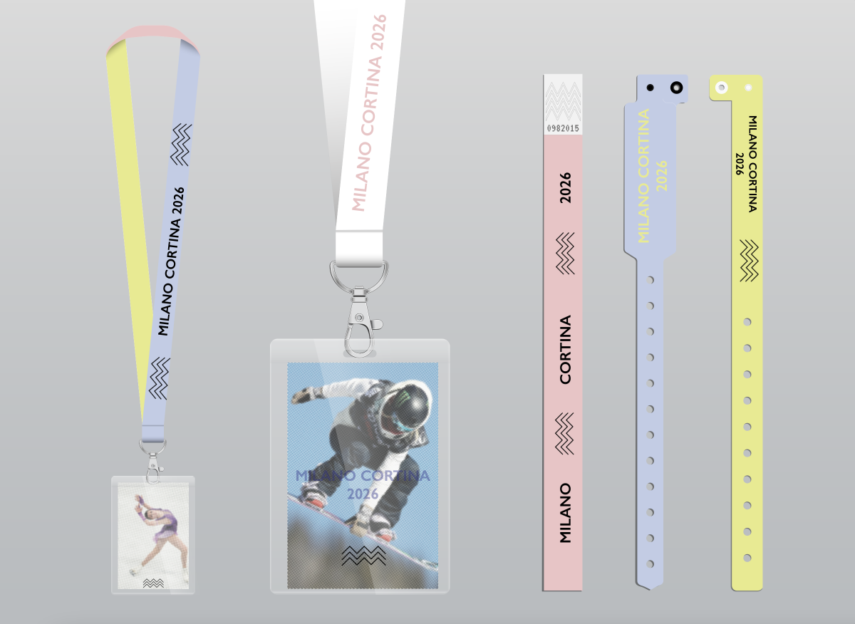
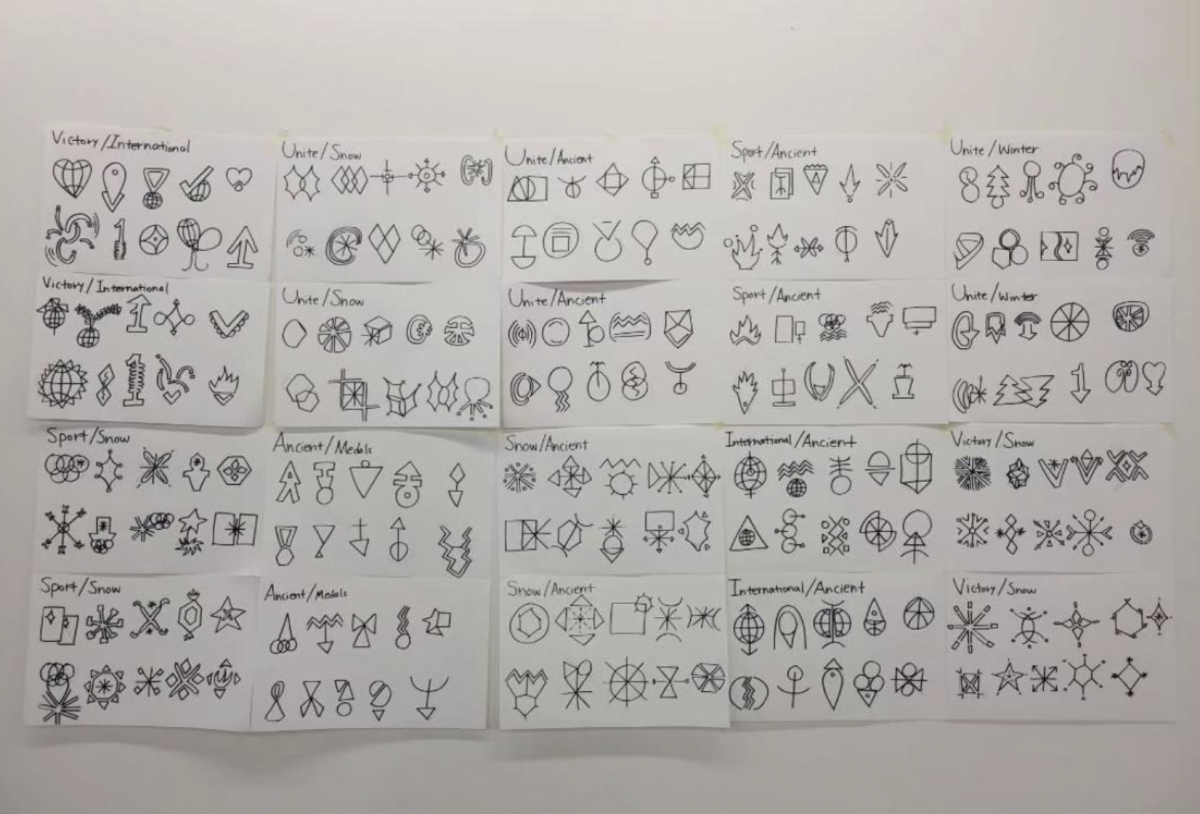
This rebrand explored a softer, more emotional vision of the Winter Olympics—shifting focus from competition to human connection. Inspired by the mountains that hosted the Games, the final logo balanced simplicity with movement. A gentle palette of pink, yellow, and pale blue conveyed warmth, peace, and inclusivity across all applications, creating a cohesive and contemporary identity. The project highlighted how color and tone could redefine perception and emotion in branding.
Through this process, I gained a deeper understanding of how color, tone, and visual mood can fundamentally reshape a product’s meaning and strategically influence how audiences emotionally and visually experience a brand. I learned how intentional color decisions can shift perception, strengthen brand identity, and create stronger connections with a specific target demographic.

