Image

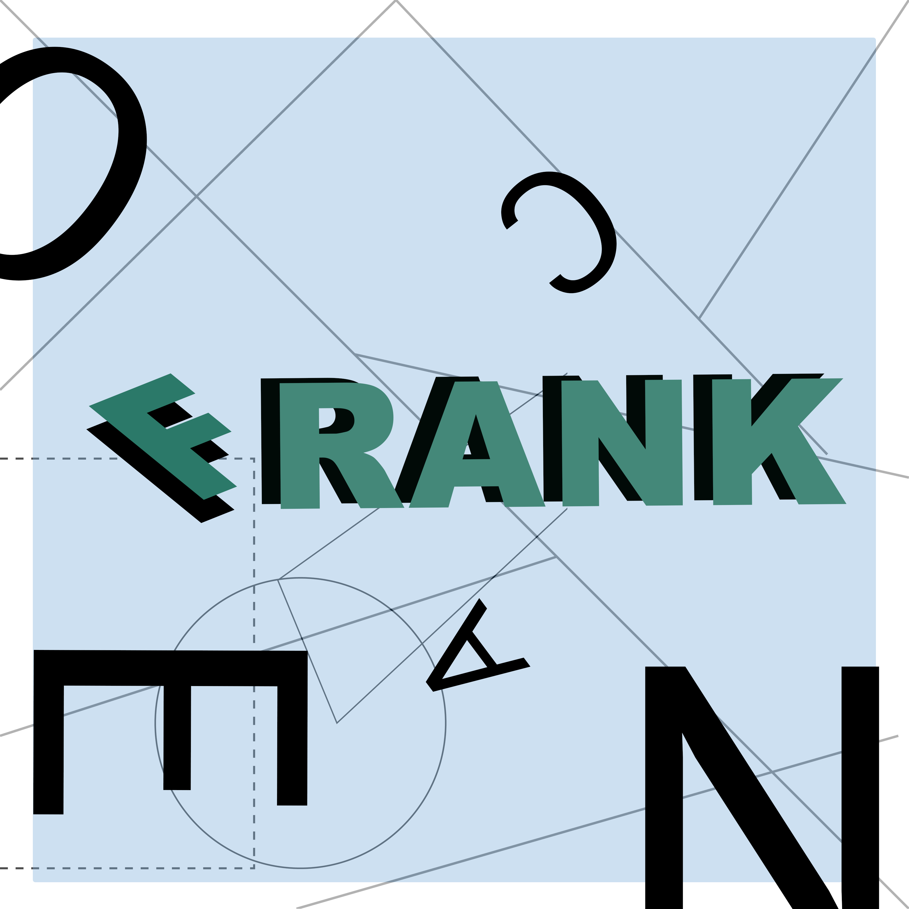
I had a lot of fun creating this album cover and trying to emulate Jayme Odger's style. Throughout my process, I kept feeling inclined to organize the text in a normal manner. However, I had to remind myself that New Wave Design was a reaction to the International Typographic Style, which meant that I should defy a strict grid and follow my instinct to create kinetic energy within my design.
Image
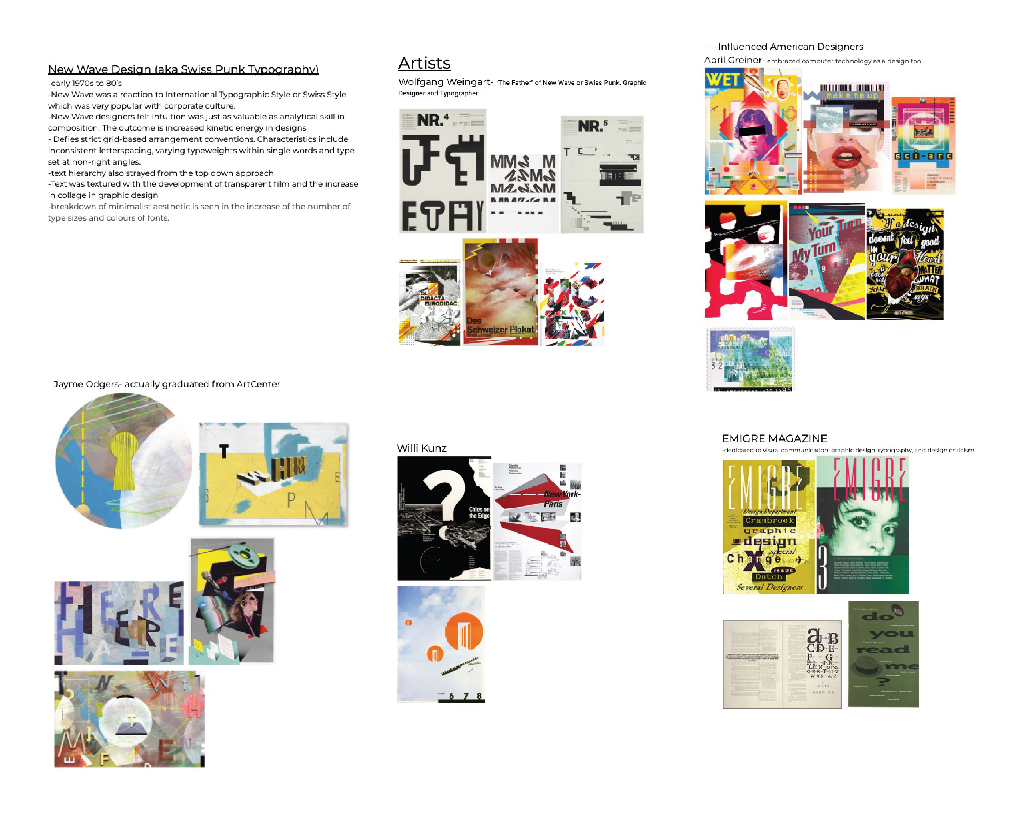
Throughout my research on New Wave Design, I was mostly drawn to the work of Jayme Odgers. Something about the organic look and playfulness of his designs really drew me in. I also wanted to challenge myself to try and create a piece that used physical paintings and digital work together, because I had never done that before.
Image
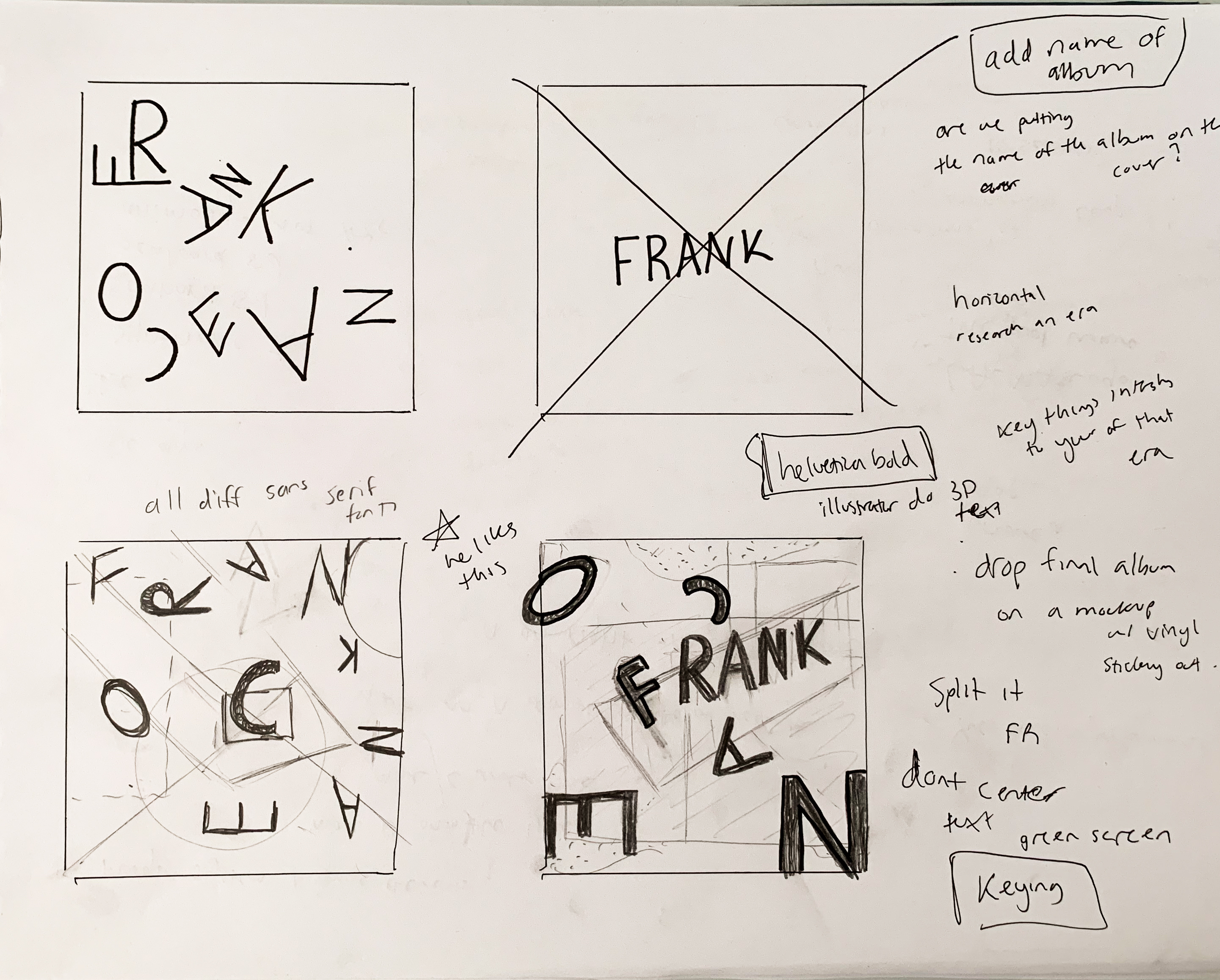
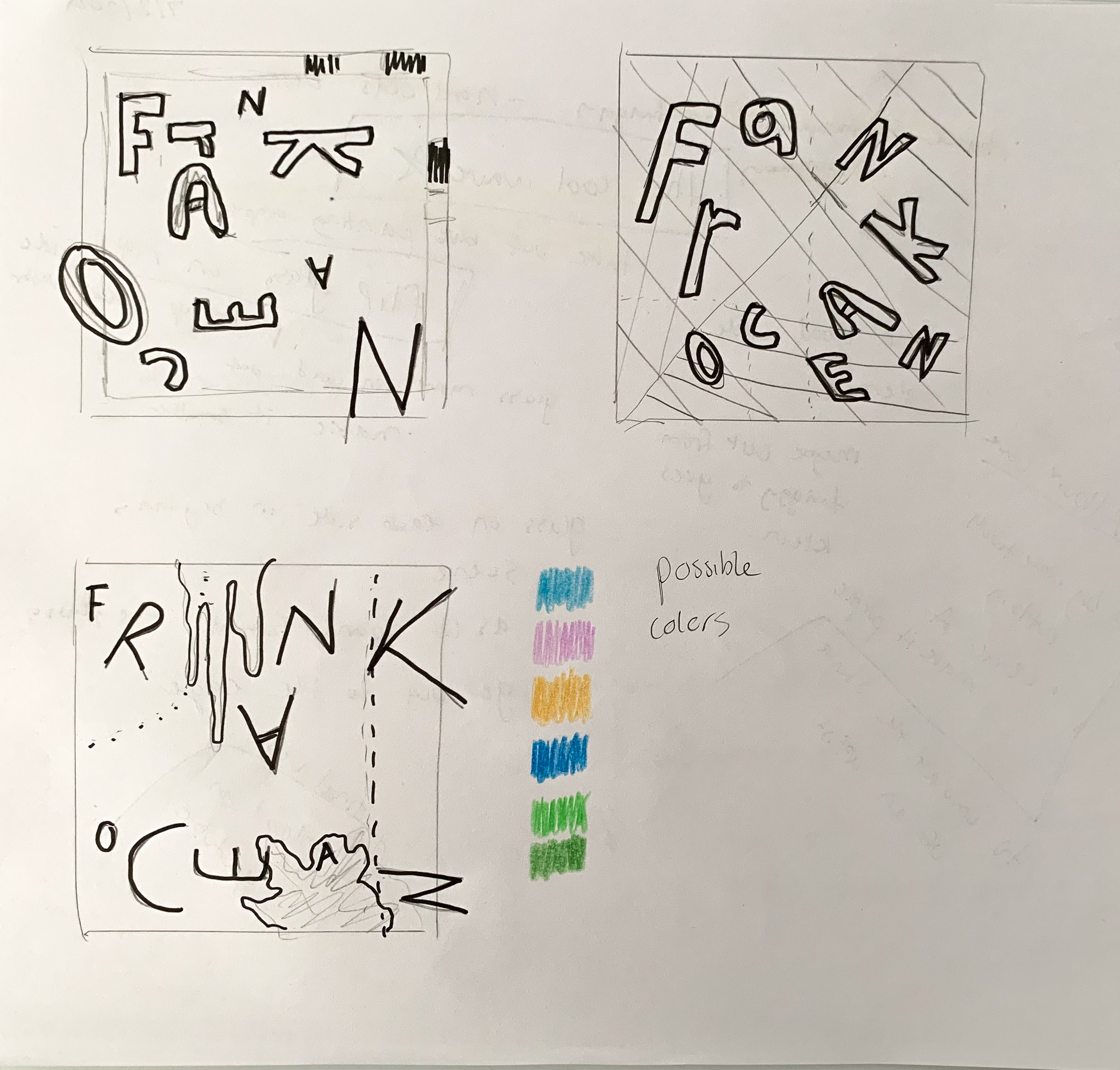
After my research, I began sketching some ideas that emulated those of Odgers.
Image
Image
First rendition made digitally.
Image
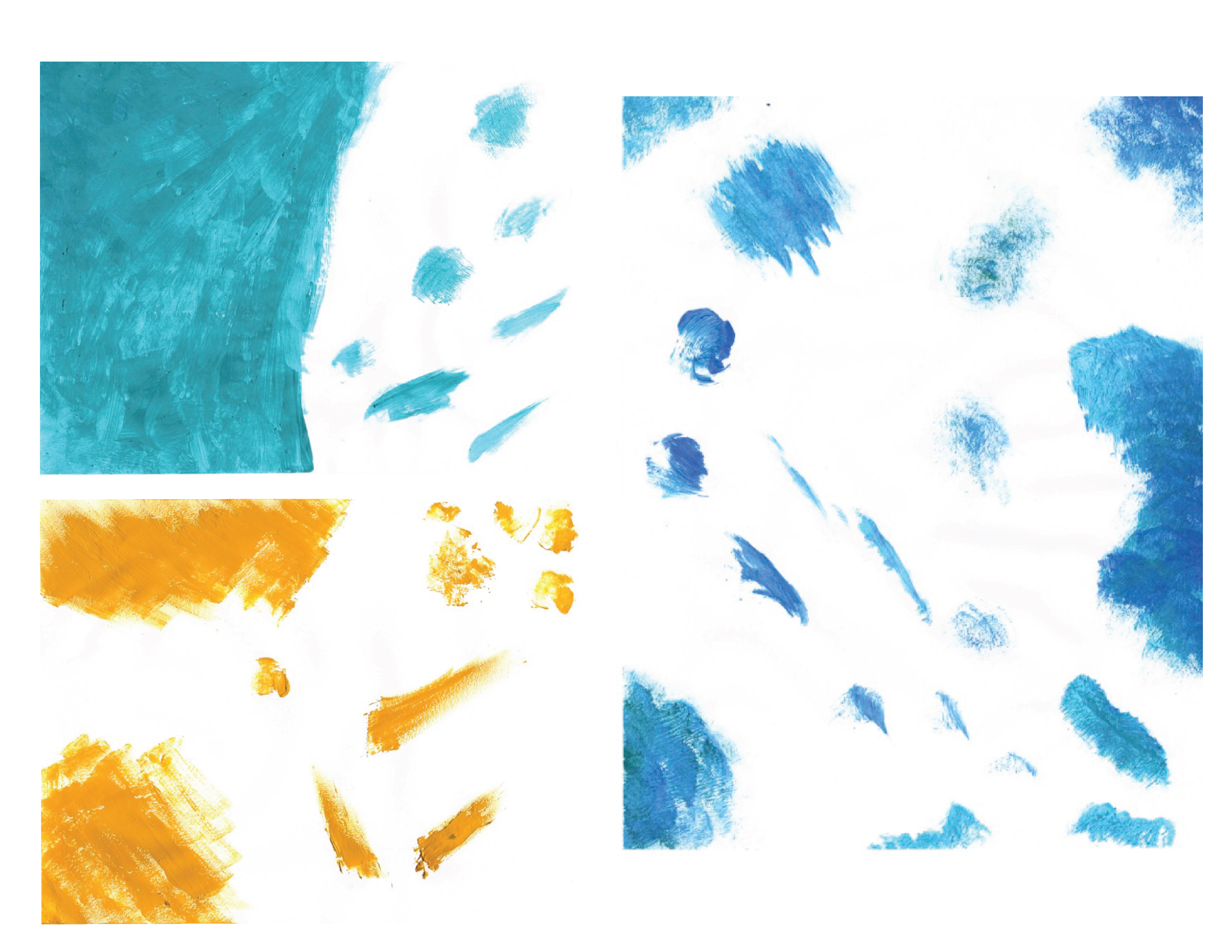
Scans of some paintings I did for this project after receiving feedback. Exploring texture and brush strokes.
Image
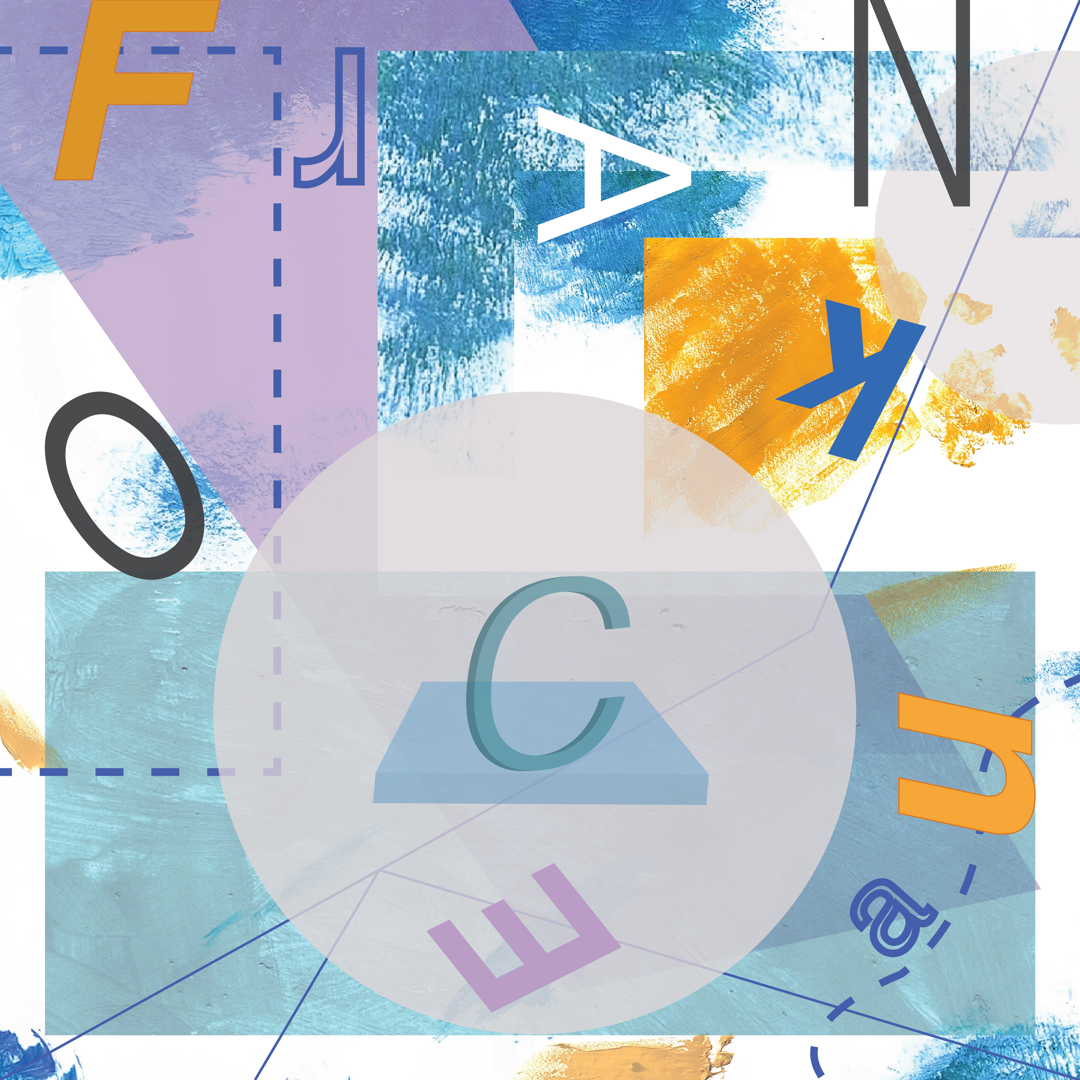
Final Rendition after receiving feedback, focusing more on physically painting the background rather than trying to create it in photoshop. Developed a solid color scheme and margins and stuck to them.
Image
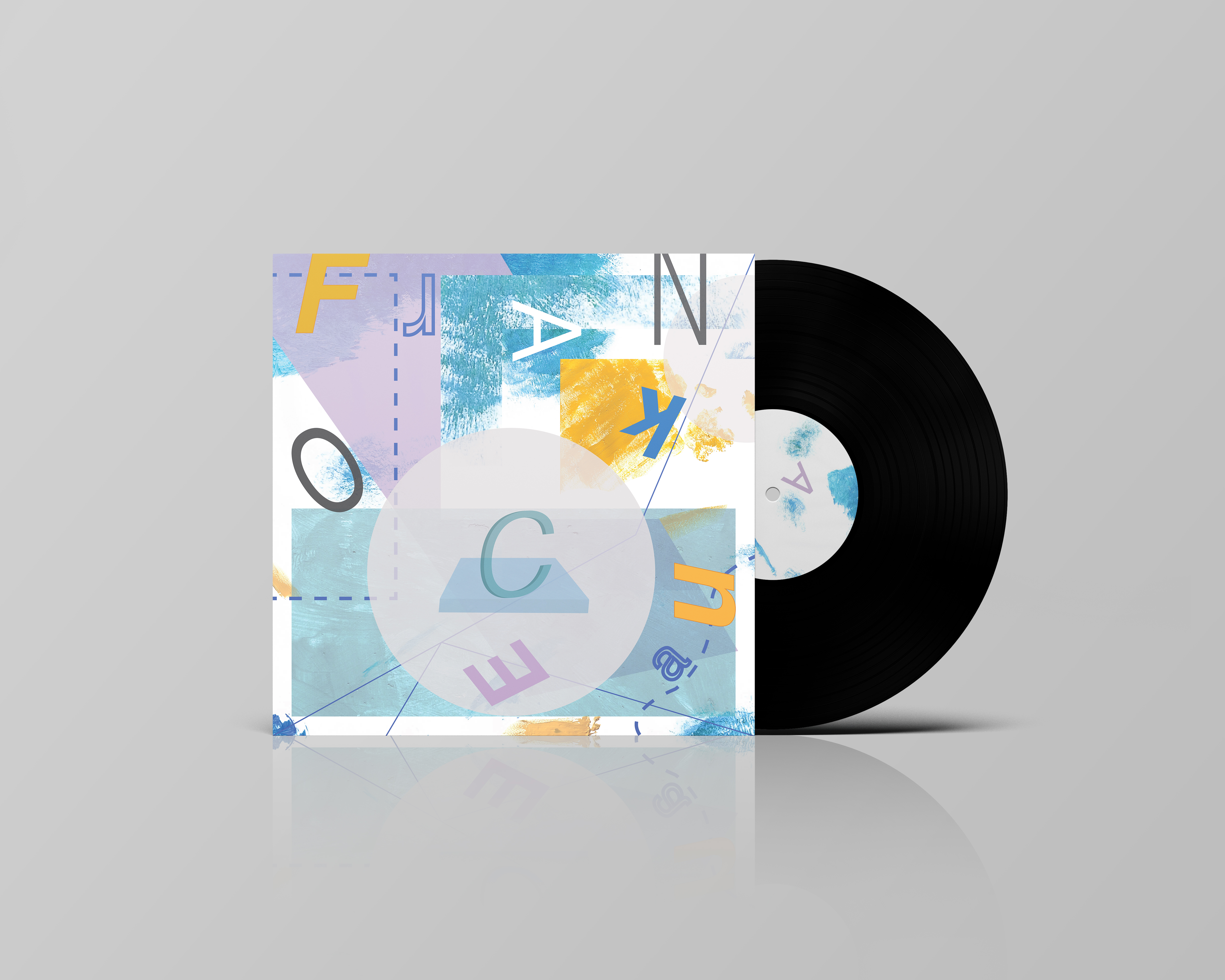
Final Mockup