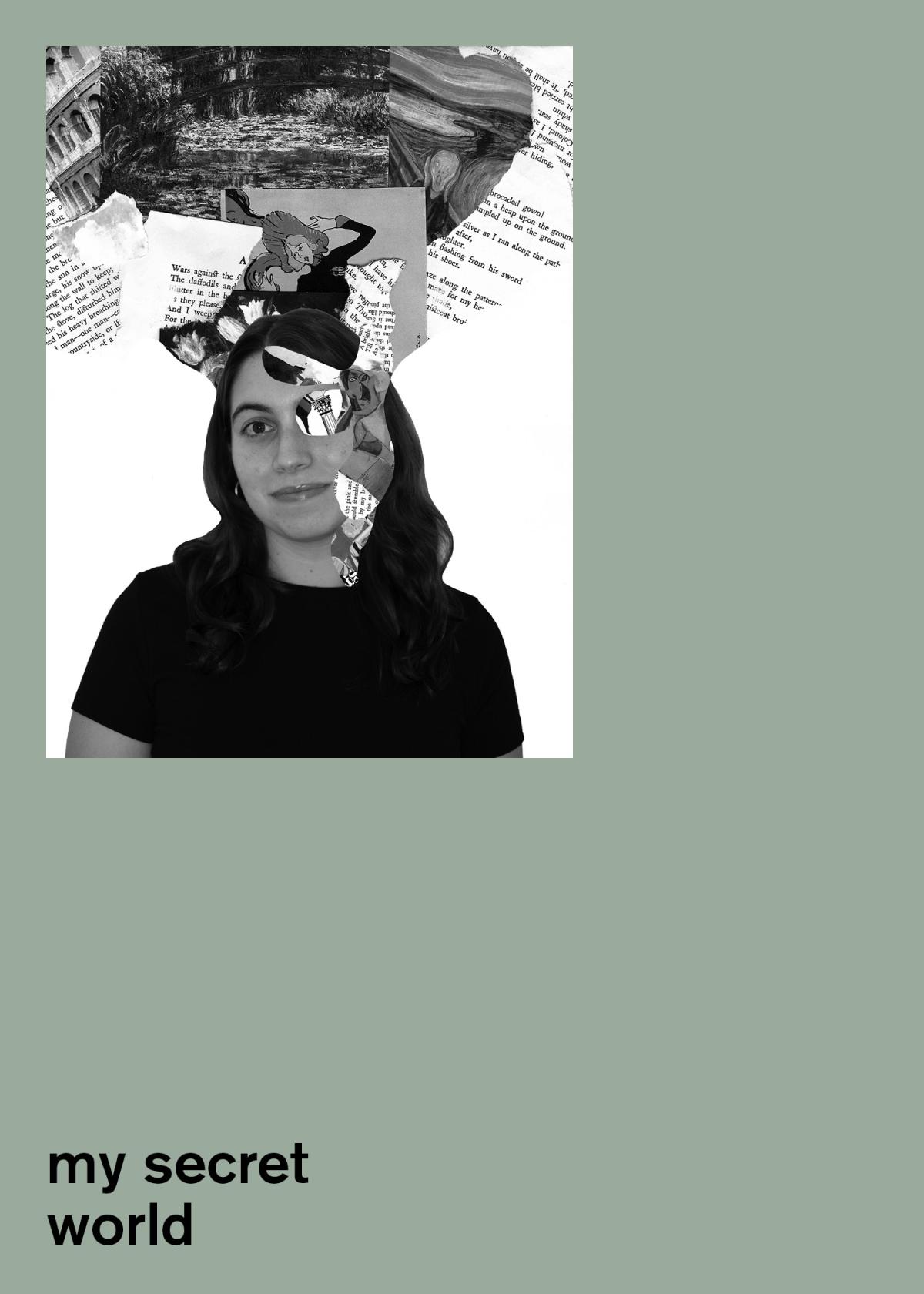
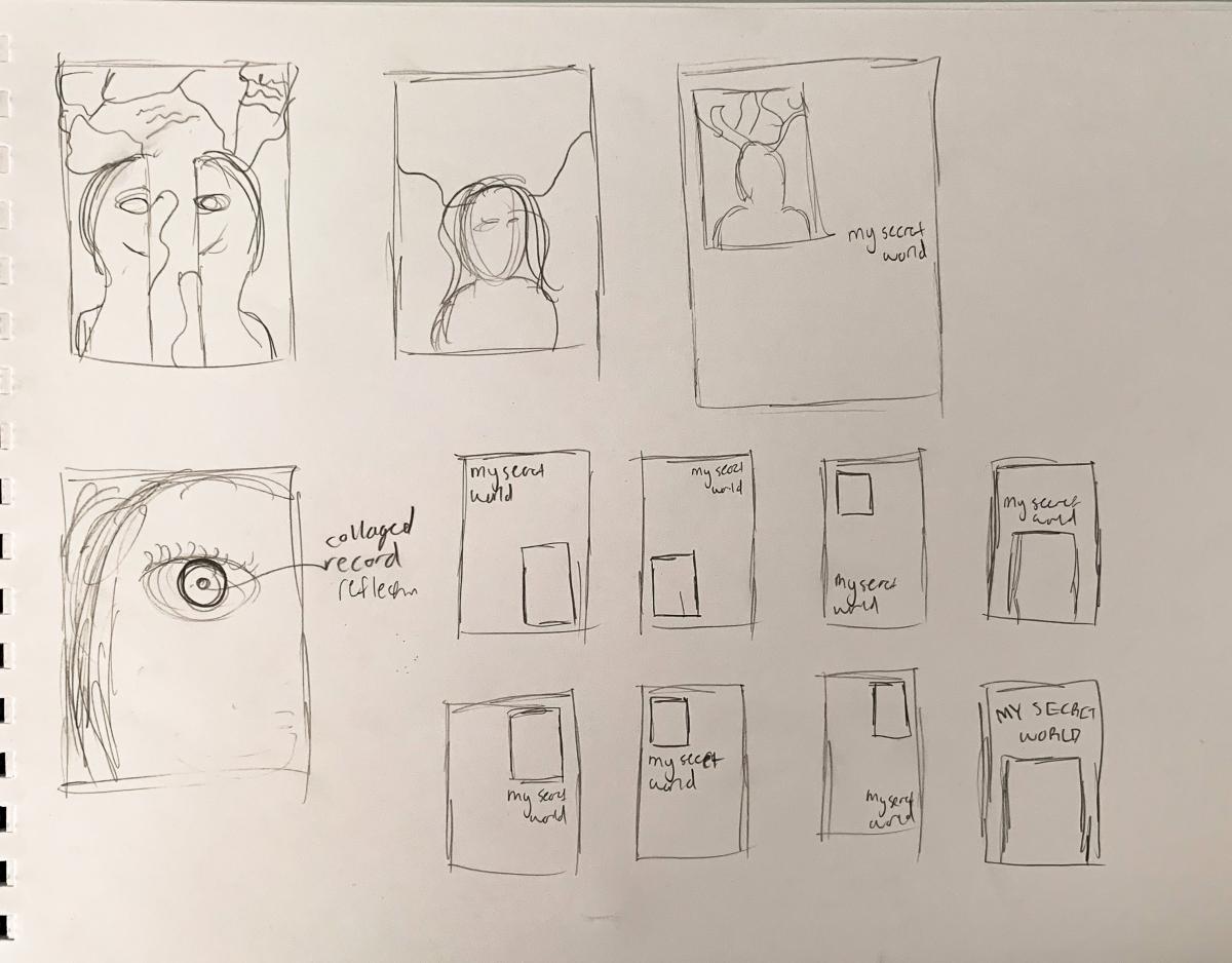
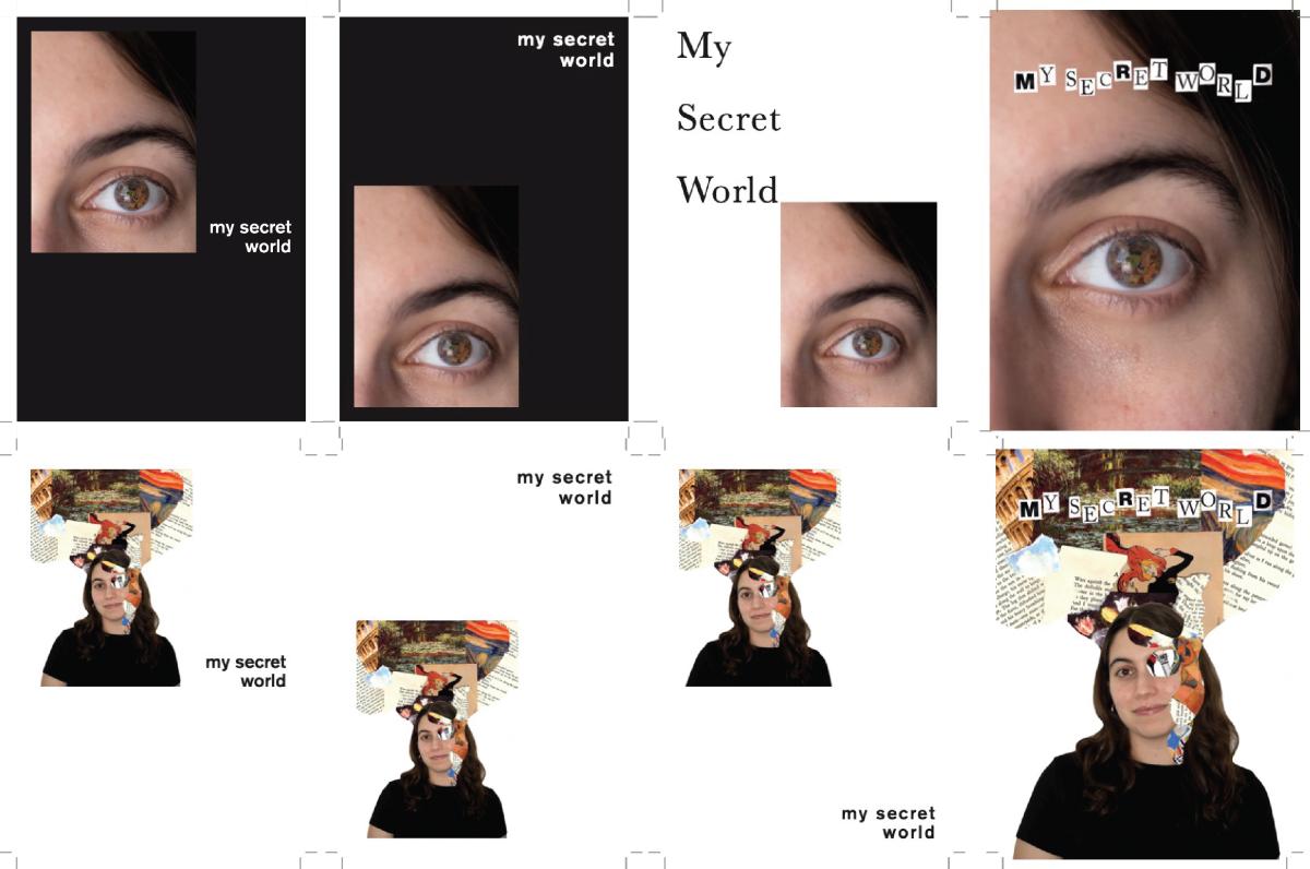
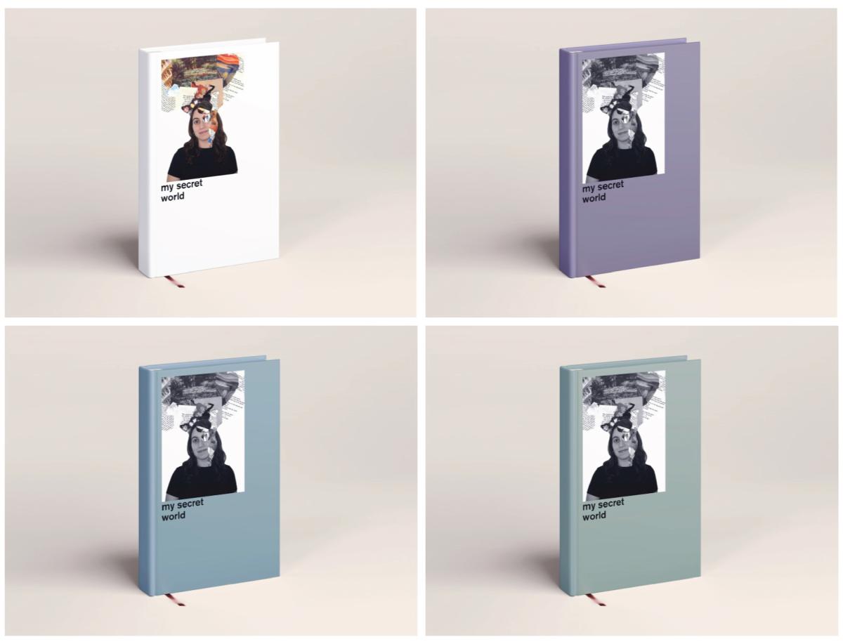
For my book cover, rather than blowing up the image to fit the full cover, I wanted to create an emphasis on my symbol with the use of negative space. I also did this with the placement of the title. Initially, I had it right under the image, but to create more movement and emphasis, I lowered it down to the bottom margin.
Graduates
Tatiana Khoury
MS in Environmental Design - 2 yr Furniture and Fixture — Graduate Spatial Experience DesignCourse:
GPRT-102 Communication Design 1: Primer
Faculty:
Guillaume David
My Secret World
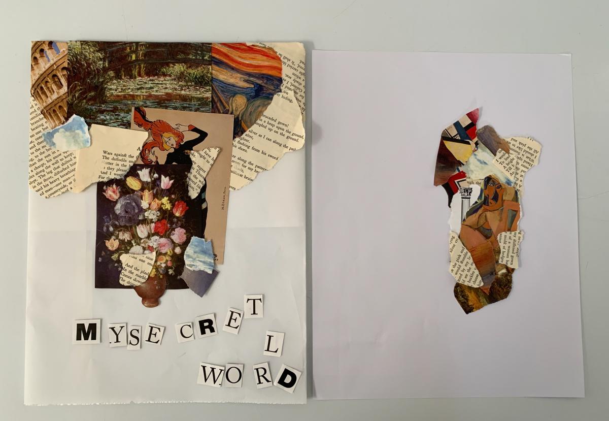
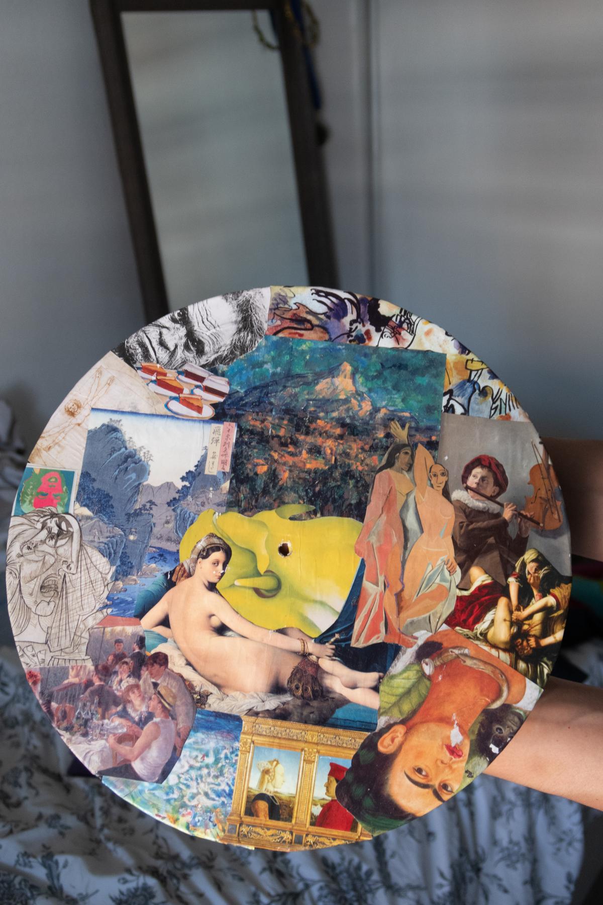
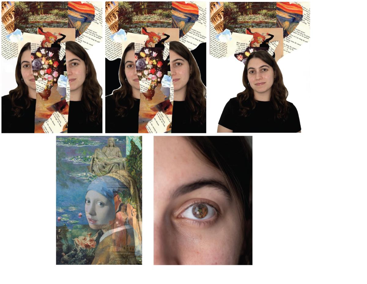
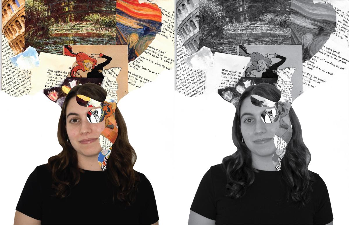
"My Secret World" is a book that dives deep into something that not many people know about me, which is my love for art history. The book cover displays this through a symbol I created to represent my secret world.
Learning Outcomes:
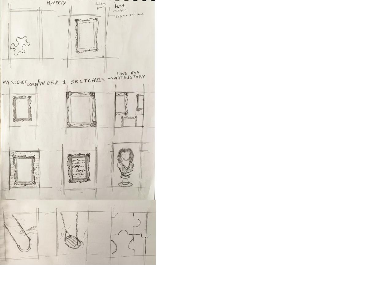
I learned how to create a symbol rather than an illustration. My initial sketches were just illustrations of the idea of art history, but my final design is actually a symbol of my love of art history. At first, I didn't understand the difference between the two, but now I know how to think about things symbolically.

