Graduates

Tatiana Khoury

BFA in Graphics — Graphic Design
Course:
GPRT-153 Type 2: Structure
Faculty:
Cheri Gray

Specimen Guide: Saint Colombe

This is a Specimen Guide for Saint Colombe, inspired by the work of director Jane Campion. I chose to focus on the movie "The Piano." Saint Colombe is a fairly new typeface but it has a quality of music to it. This book utilizes the typeface and sells the typeface to the viewer. It aims to show the beautiful applications of this typeface in combination with the feeling evoked by Jane Campions work.
Learning Outcomes:
I learned so much about layout and setting type in this project. It is such a tedious process making sure everything fits and looks uniform but in the end, it is worth it. I learned how important a good layout is for a book to work and also to have fun with typography. I really enjoyed being able to mesh photos with type in a unique way I haven't really done before. I practiced type as image and morphology as ways to utilize type in a nontraditional manner.
Image
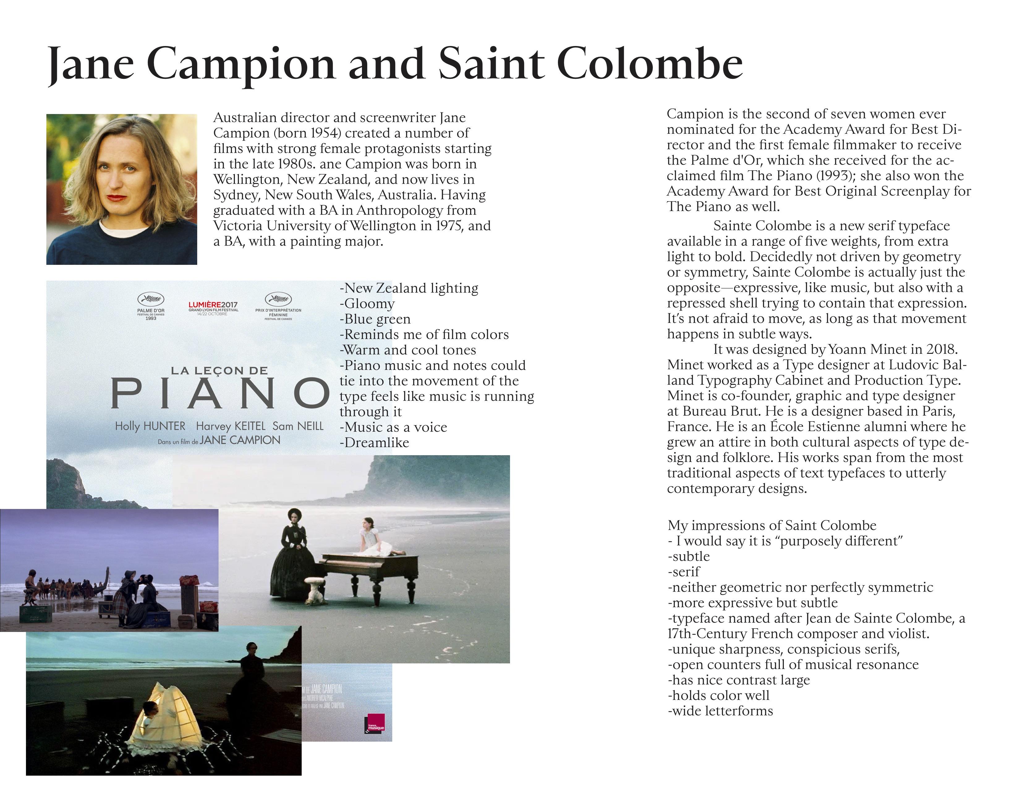
Initial research on Jane Campion and Saint Colombe
Image
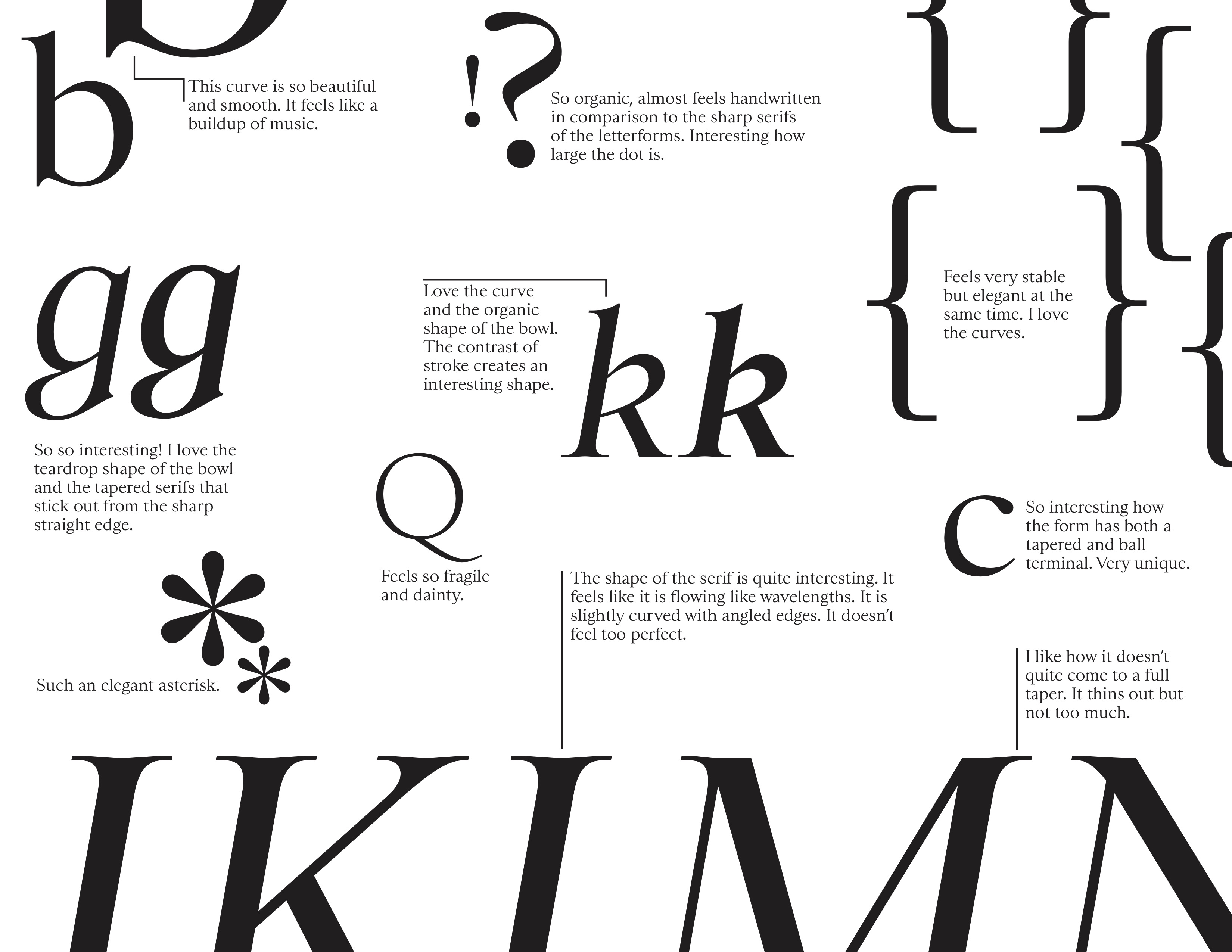
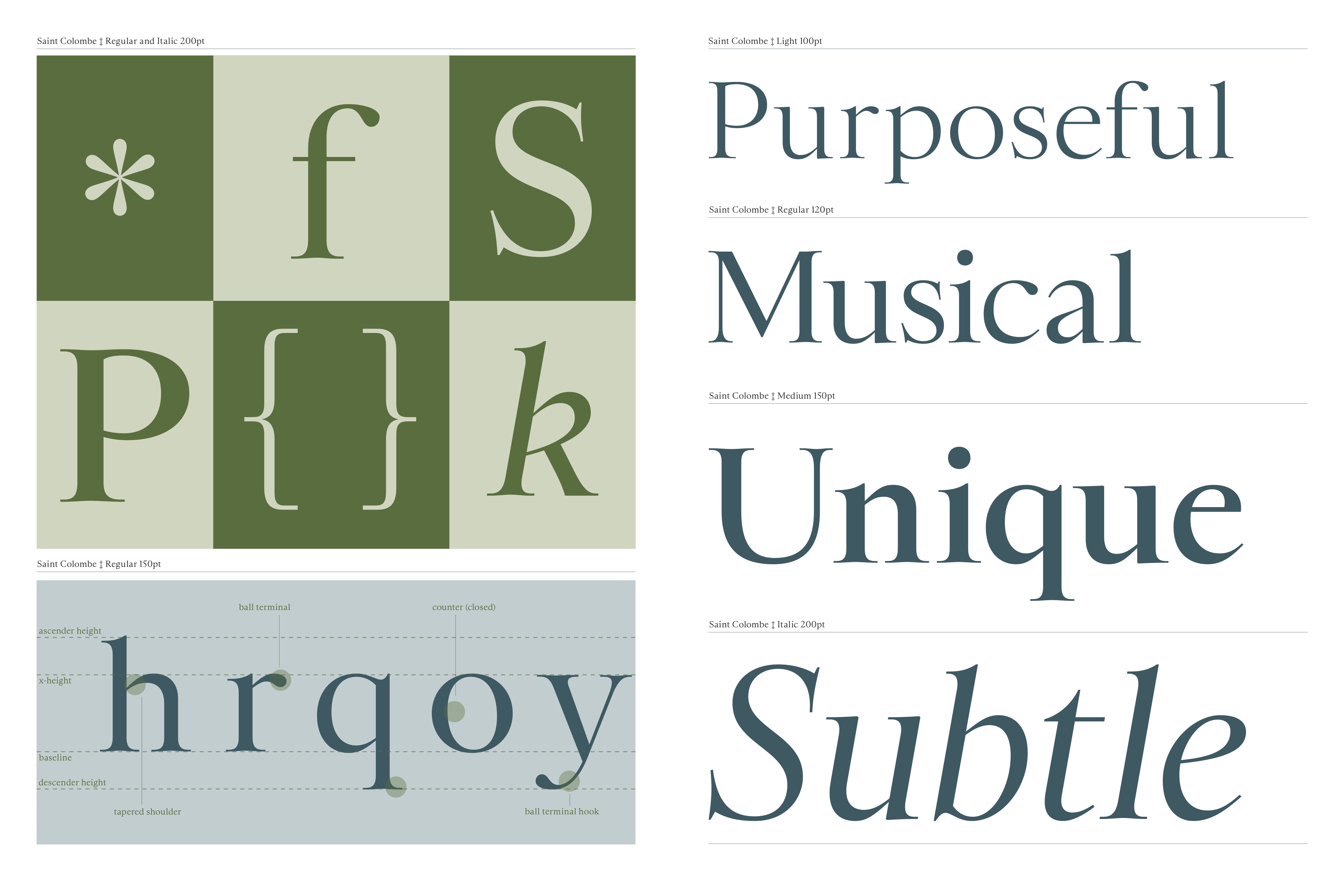
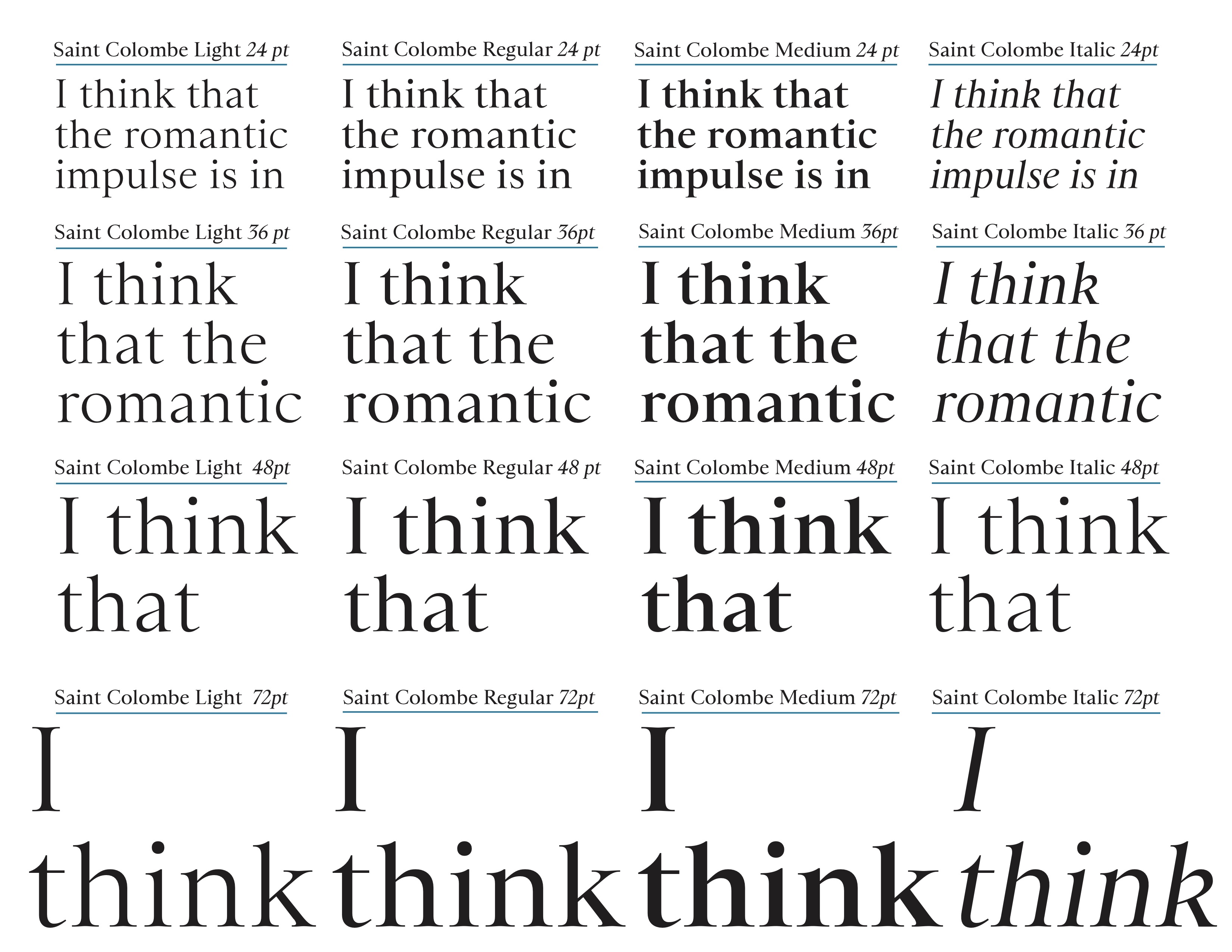
I explored and noted what aspects of the typeface I liked.
Image
Image
Image
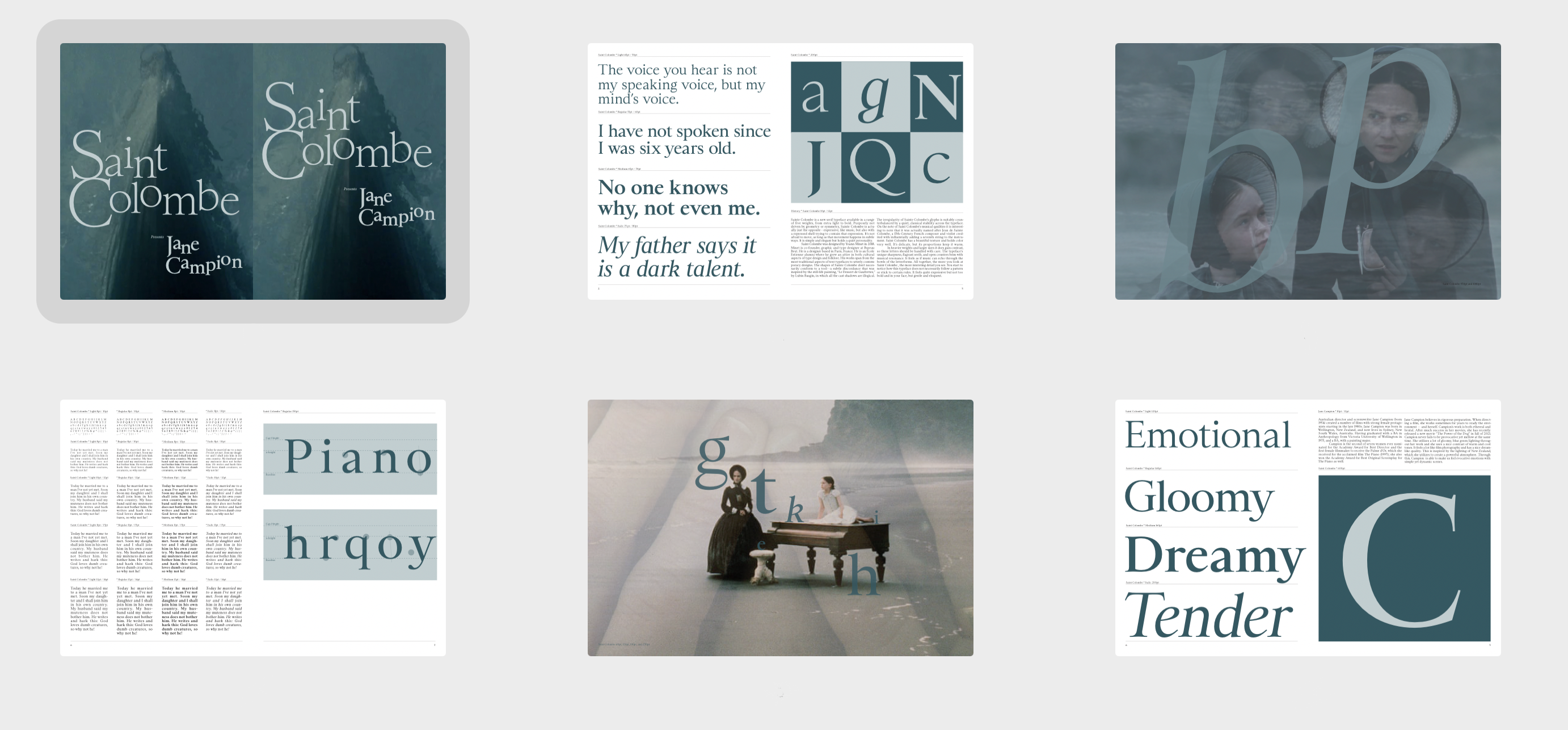
The first round of page layouts and ideas.
Image
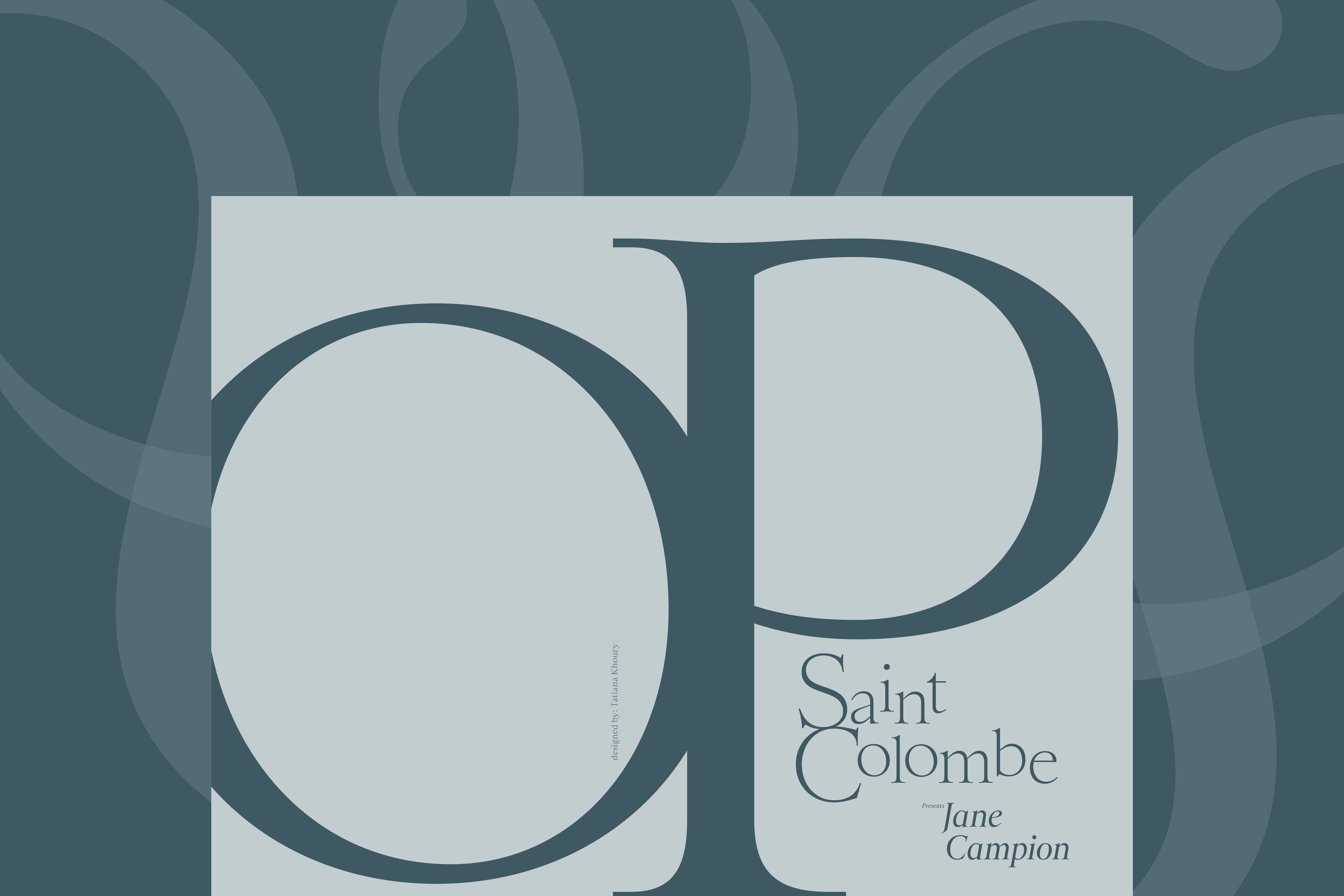
Final small cover overlapping large cover
Image
Inside of small cover
Image
Backside of small cover
Image
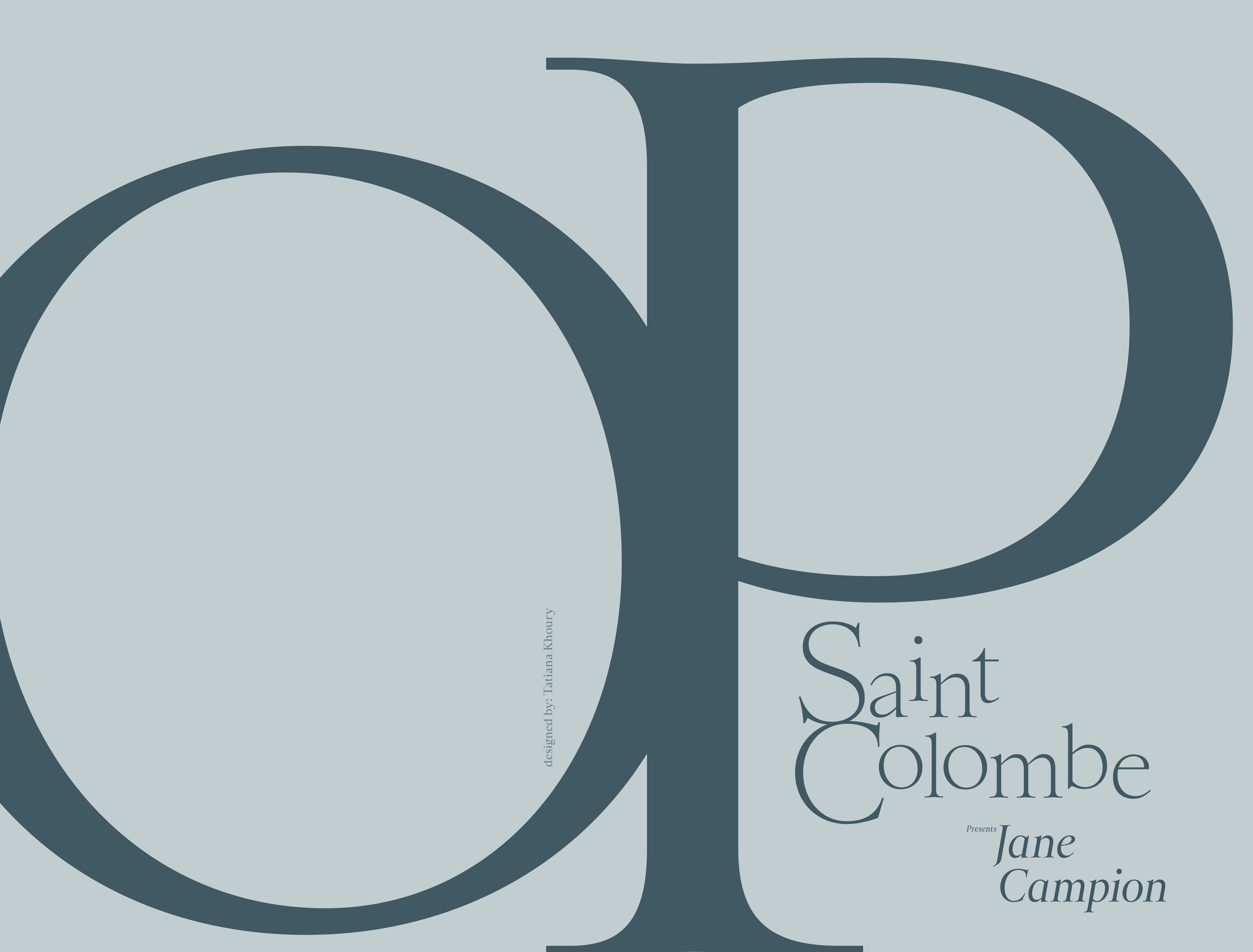
Type as Image large front cover
Image
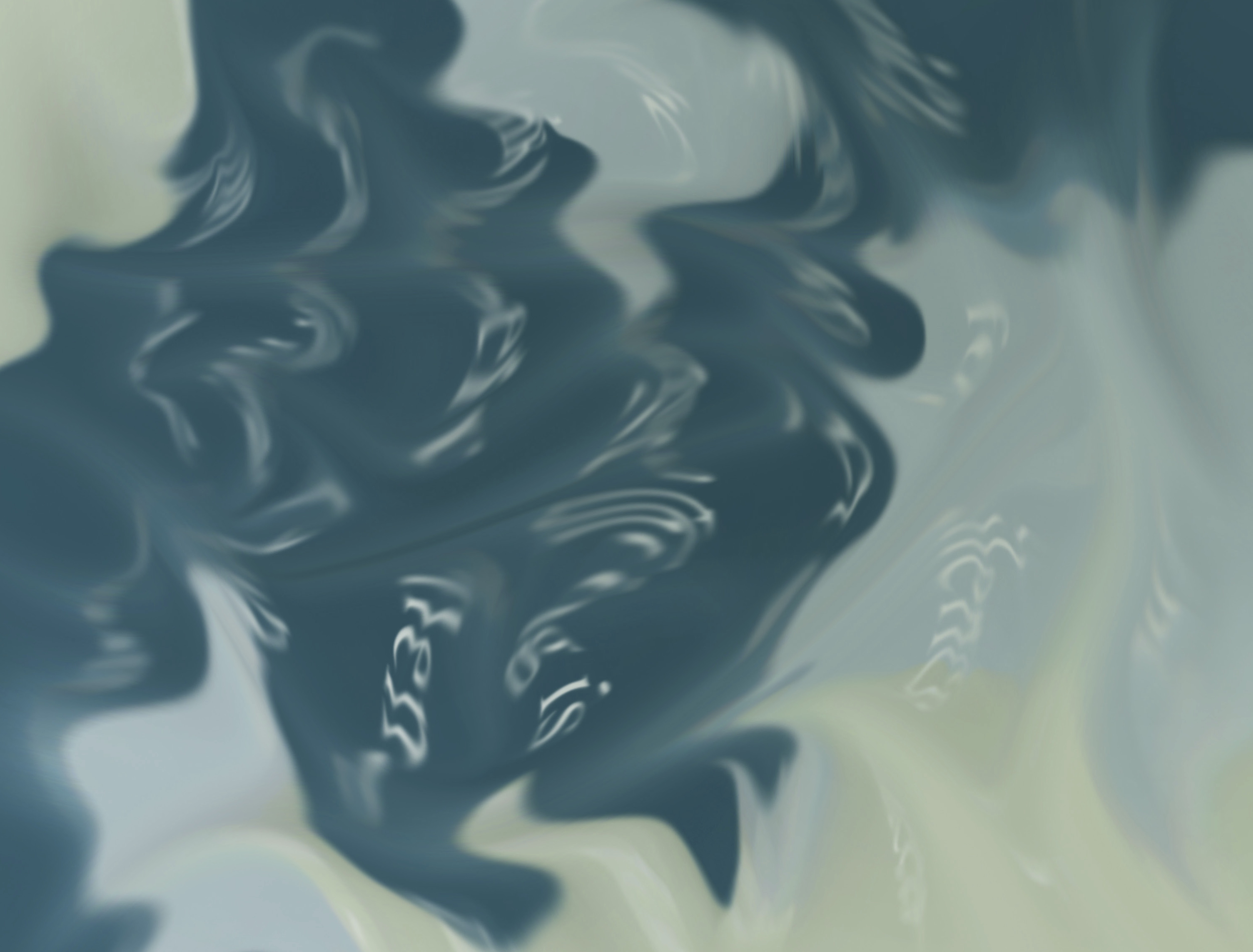
Morphology- back of large front cover
Image
Type as Image small cover
Image
Back of small cover-Morphology
Image
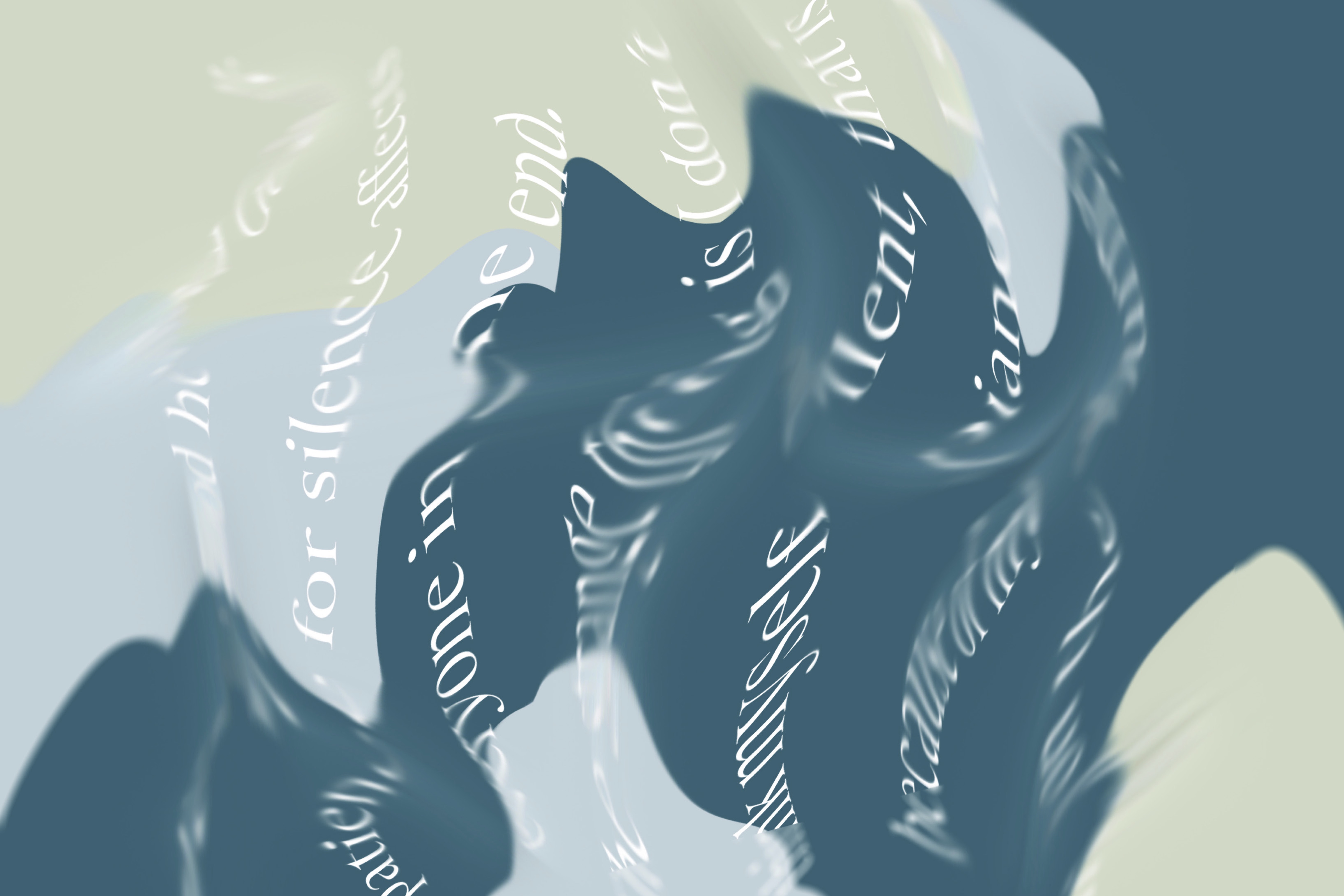
Inside spreads of book
Image
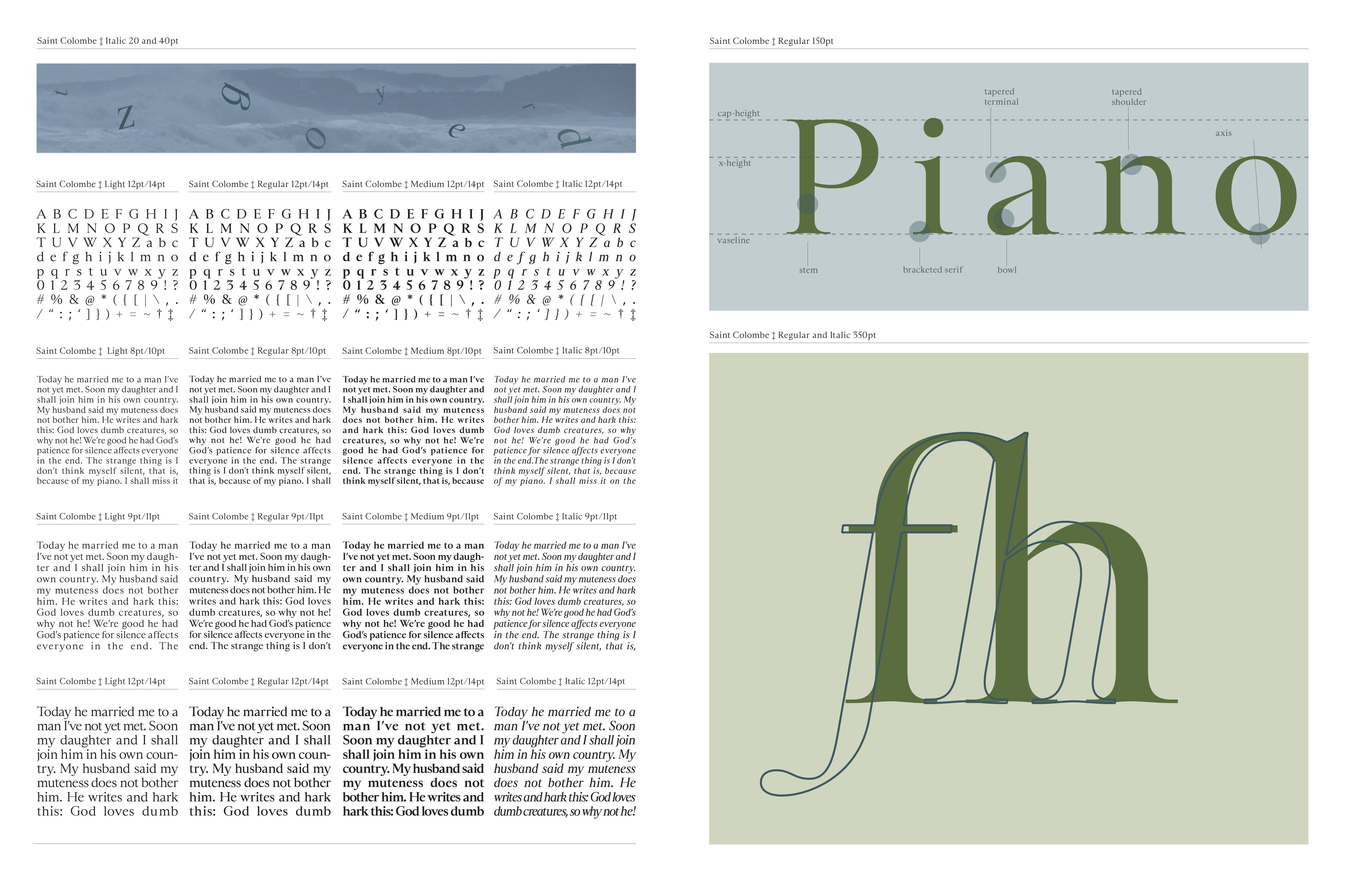
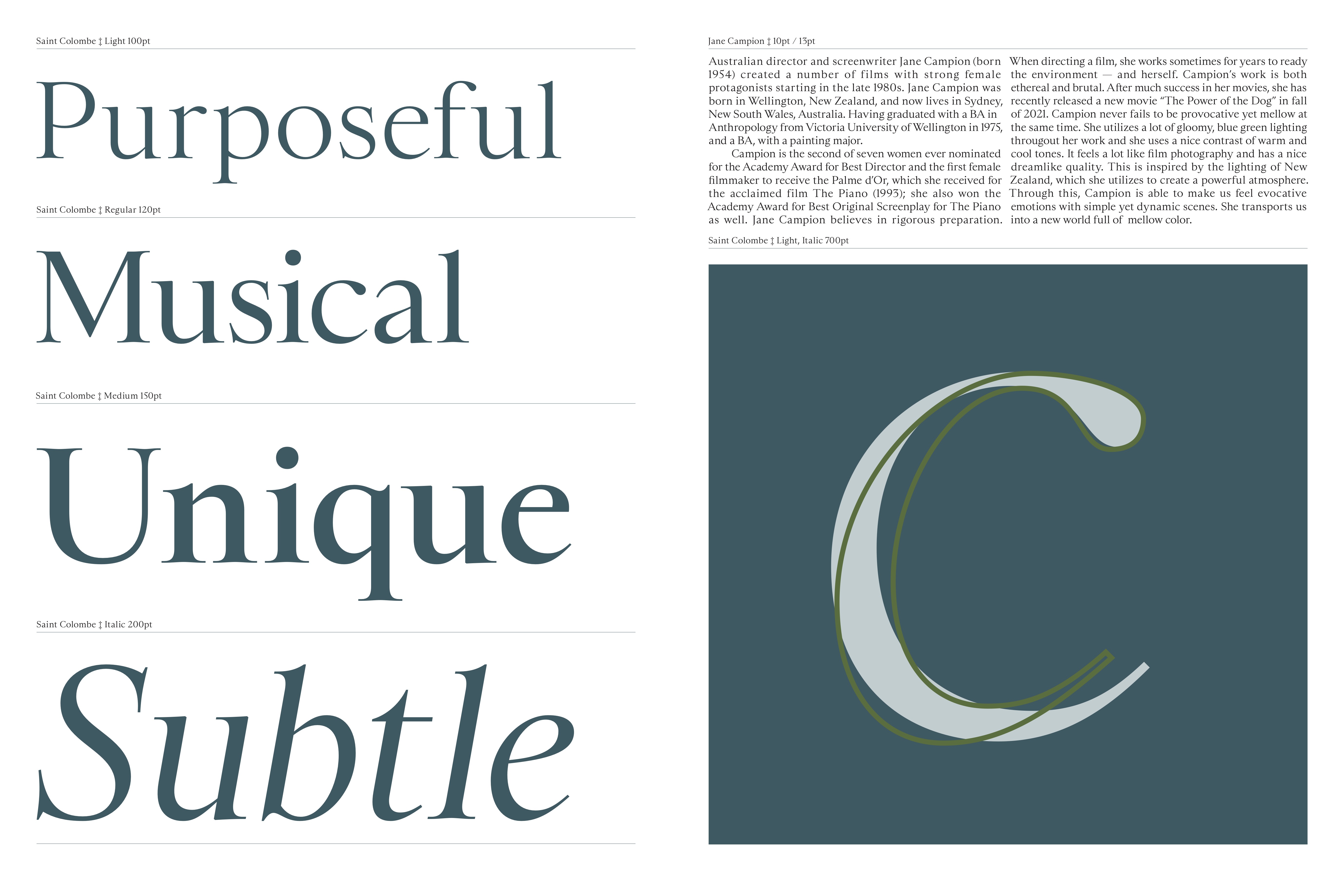
From this spread I learned how hard it was to type set Saint Colombe, the spacing was very hard to control but I learned a lot about how as a designer we can change things to make our design fit.
Image
Image
Image
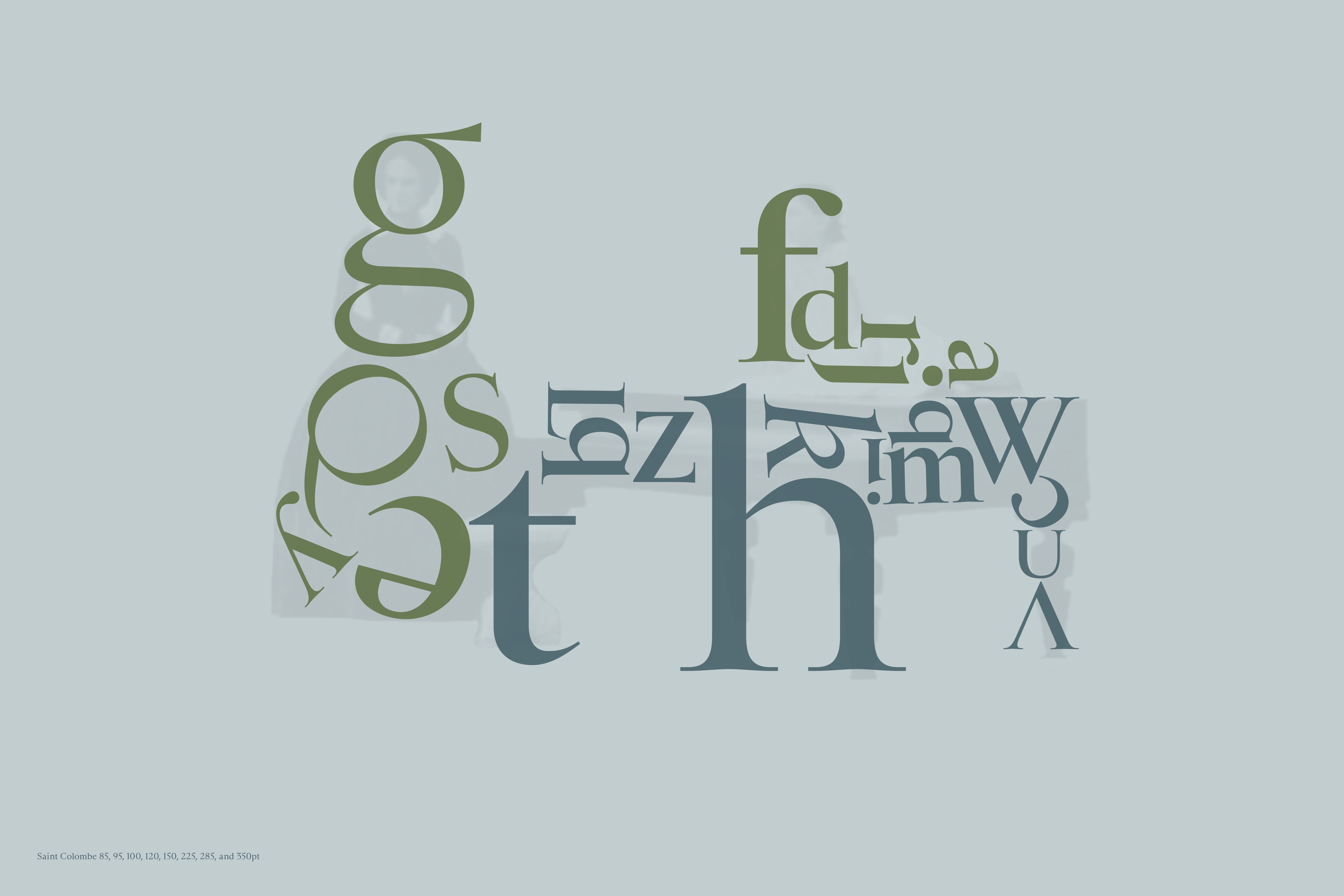
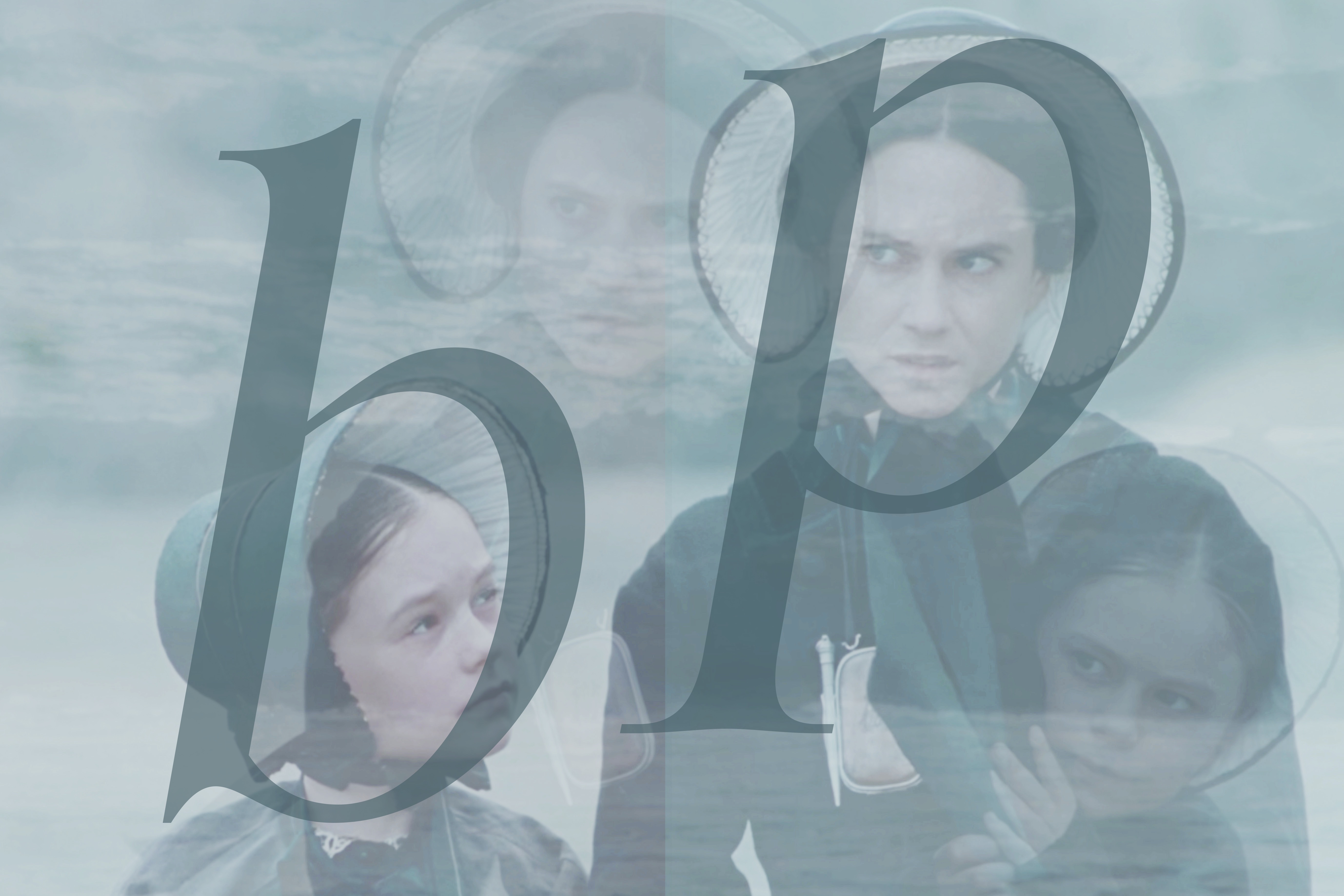
This is probably one of my favorite spreads of the book. I really wanted to use the type to create the shape of the characters and the piano. Using this ghosted image really worked and still keeps the focus on the type.
Image