Image
Image
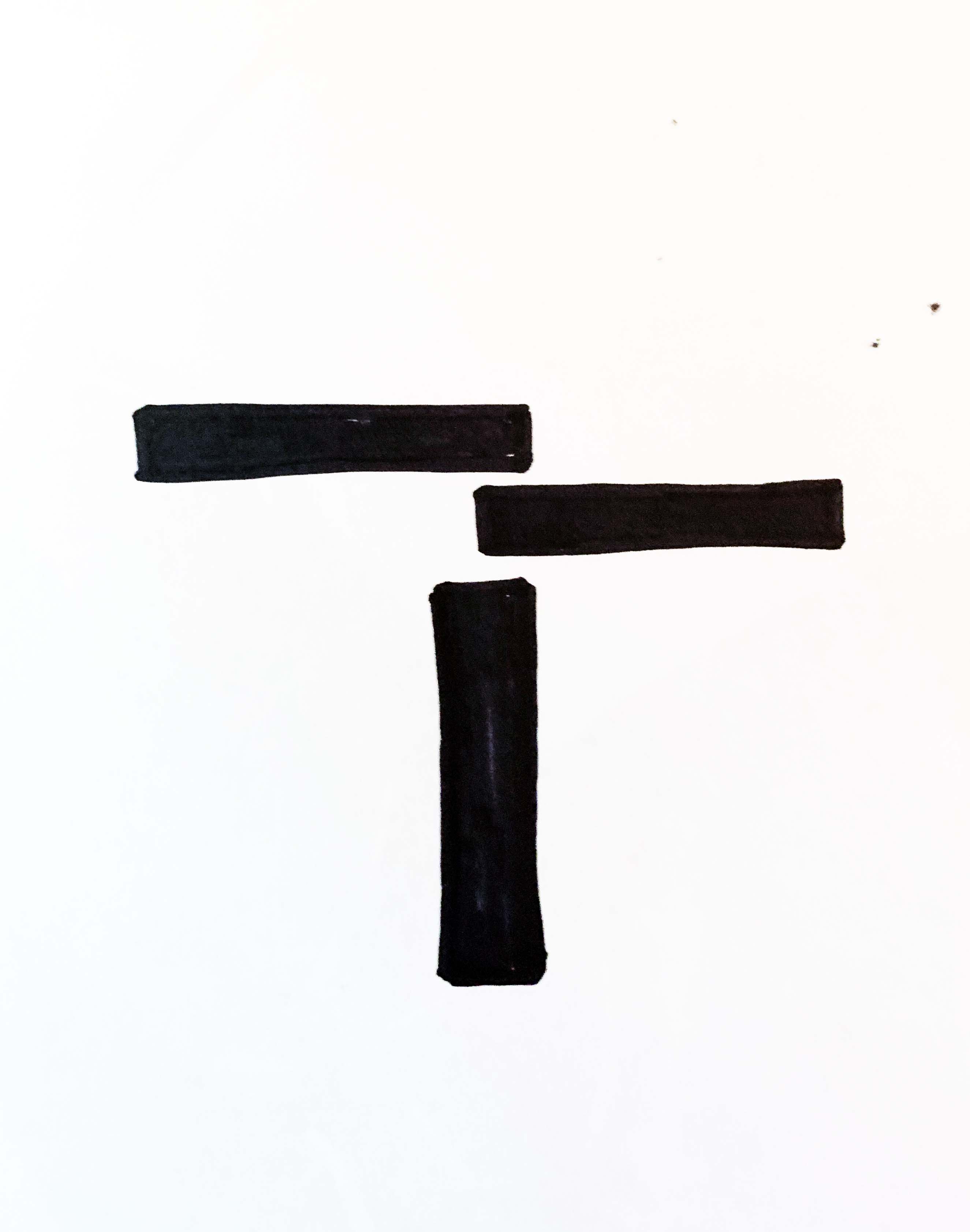
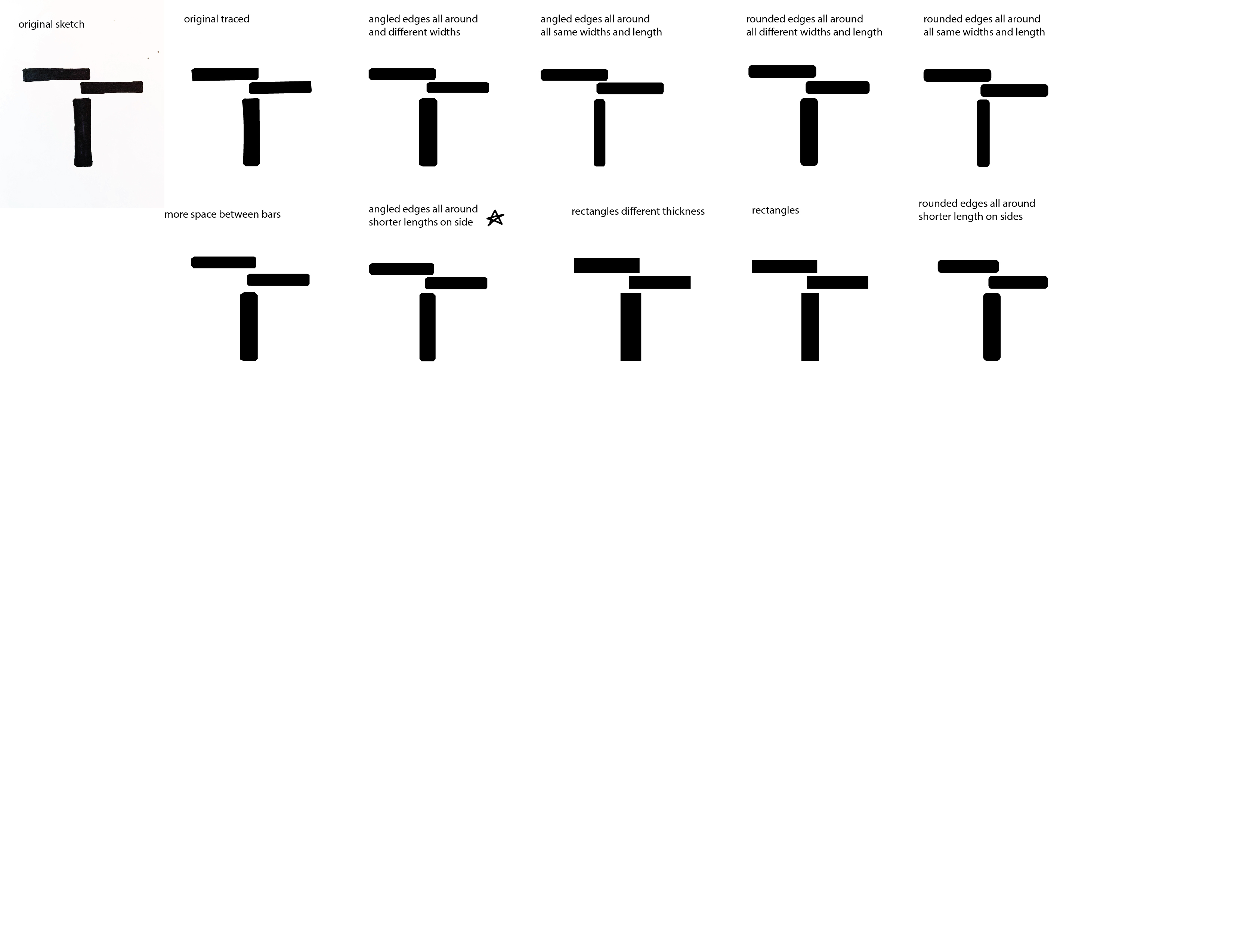
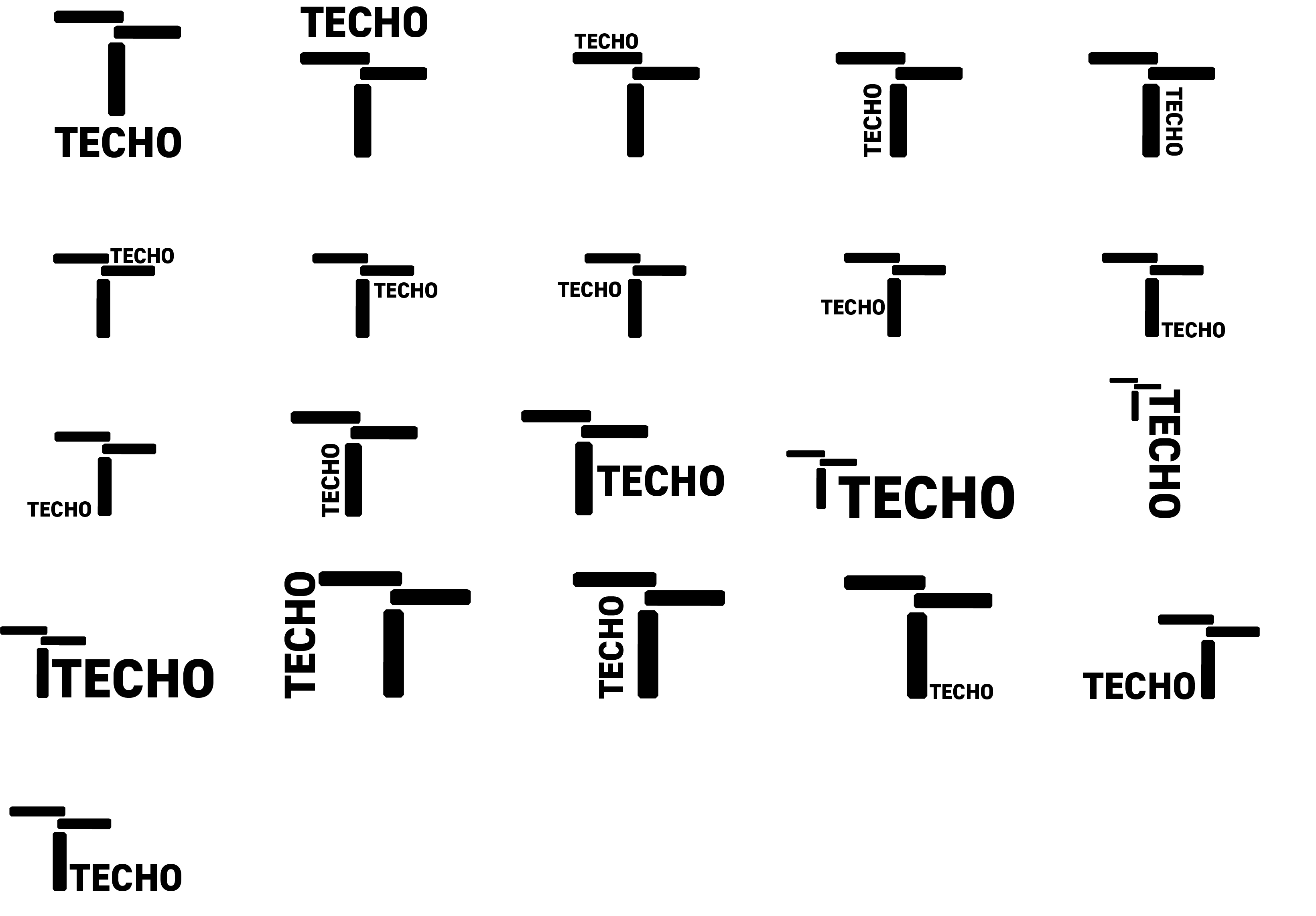
Original sketch from a quick exercise at the beginning of class where we combined a symbol bank and a specific letter or idea to create a new symbol.
Image
Image
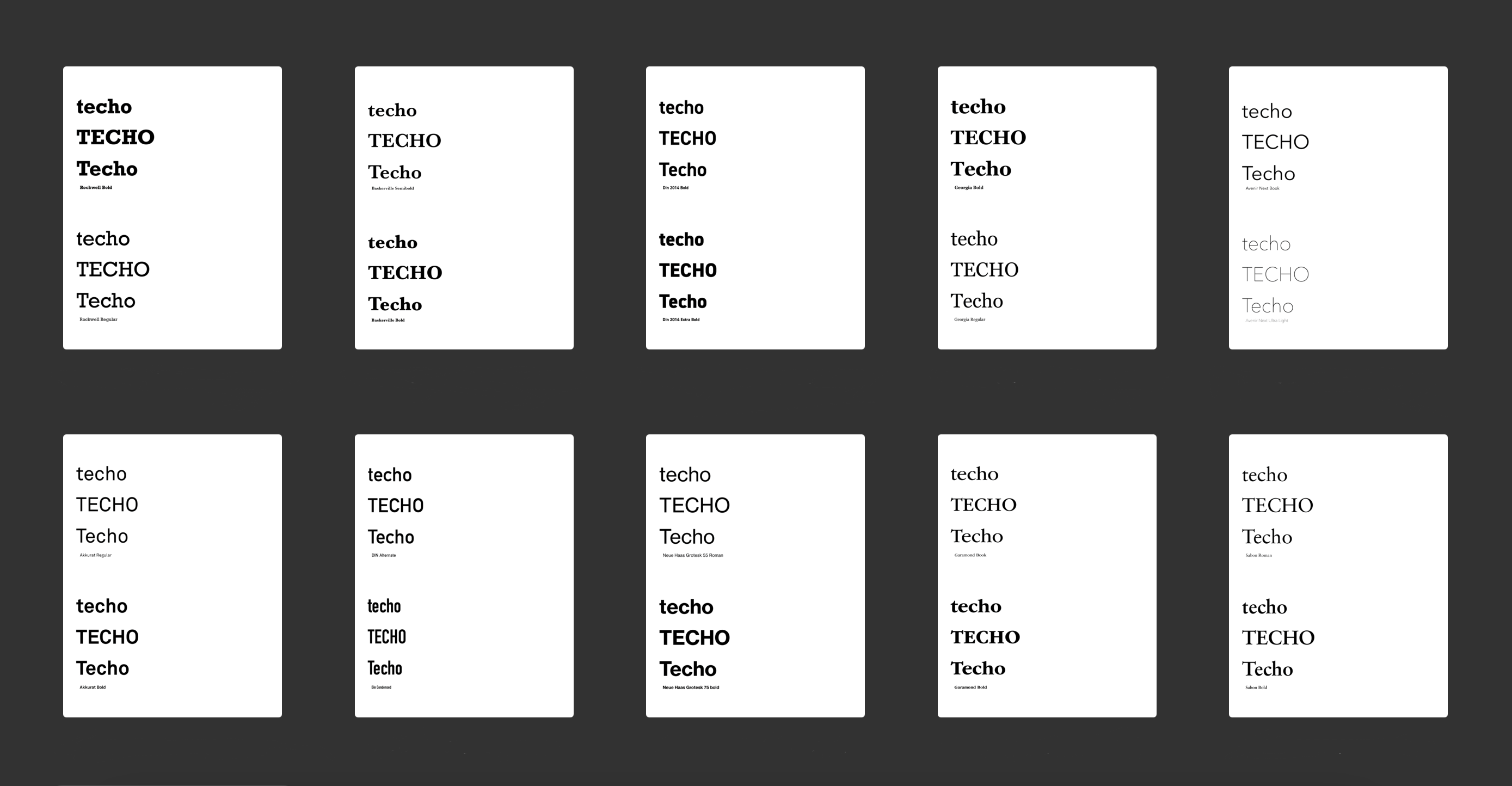
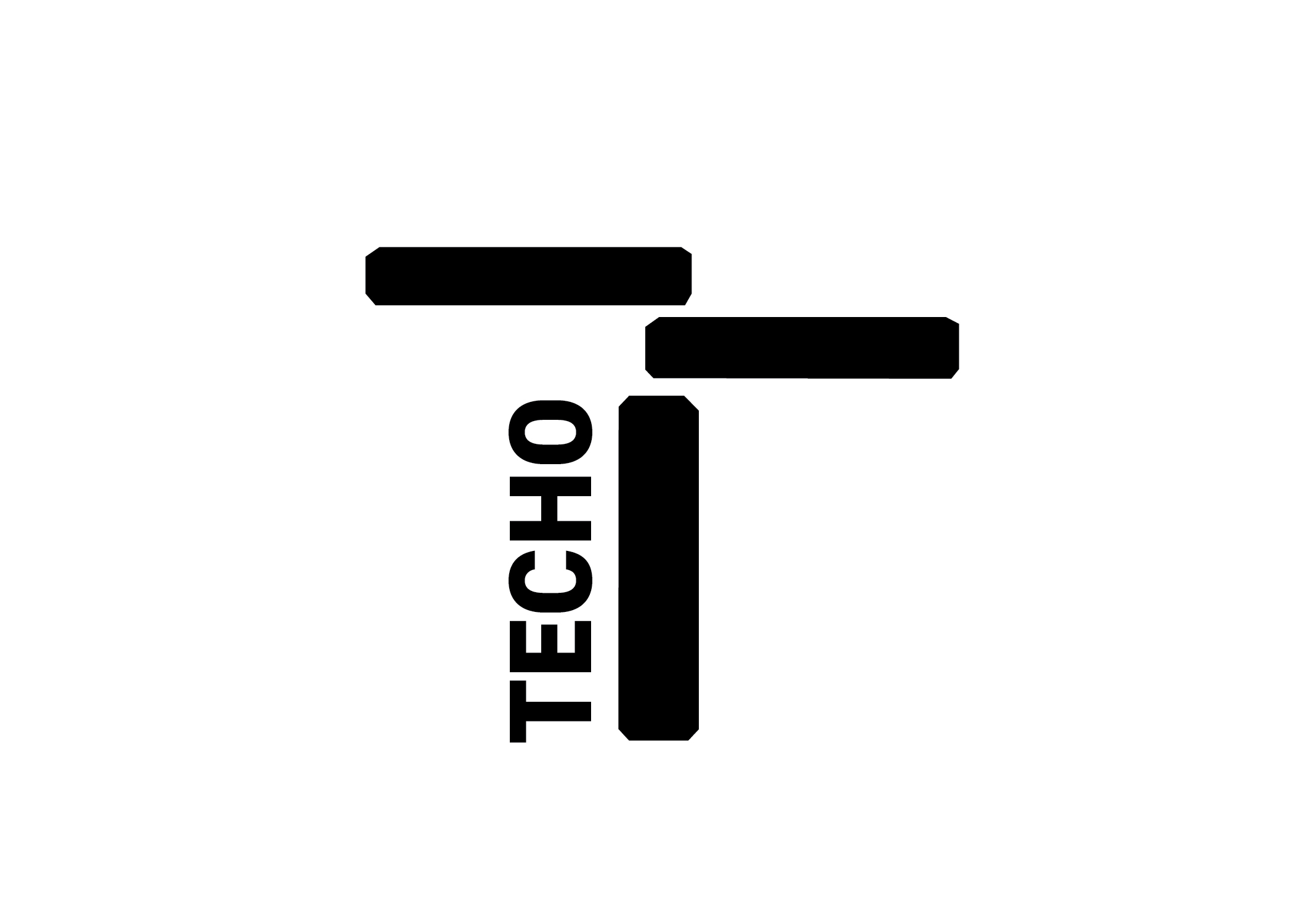
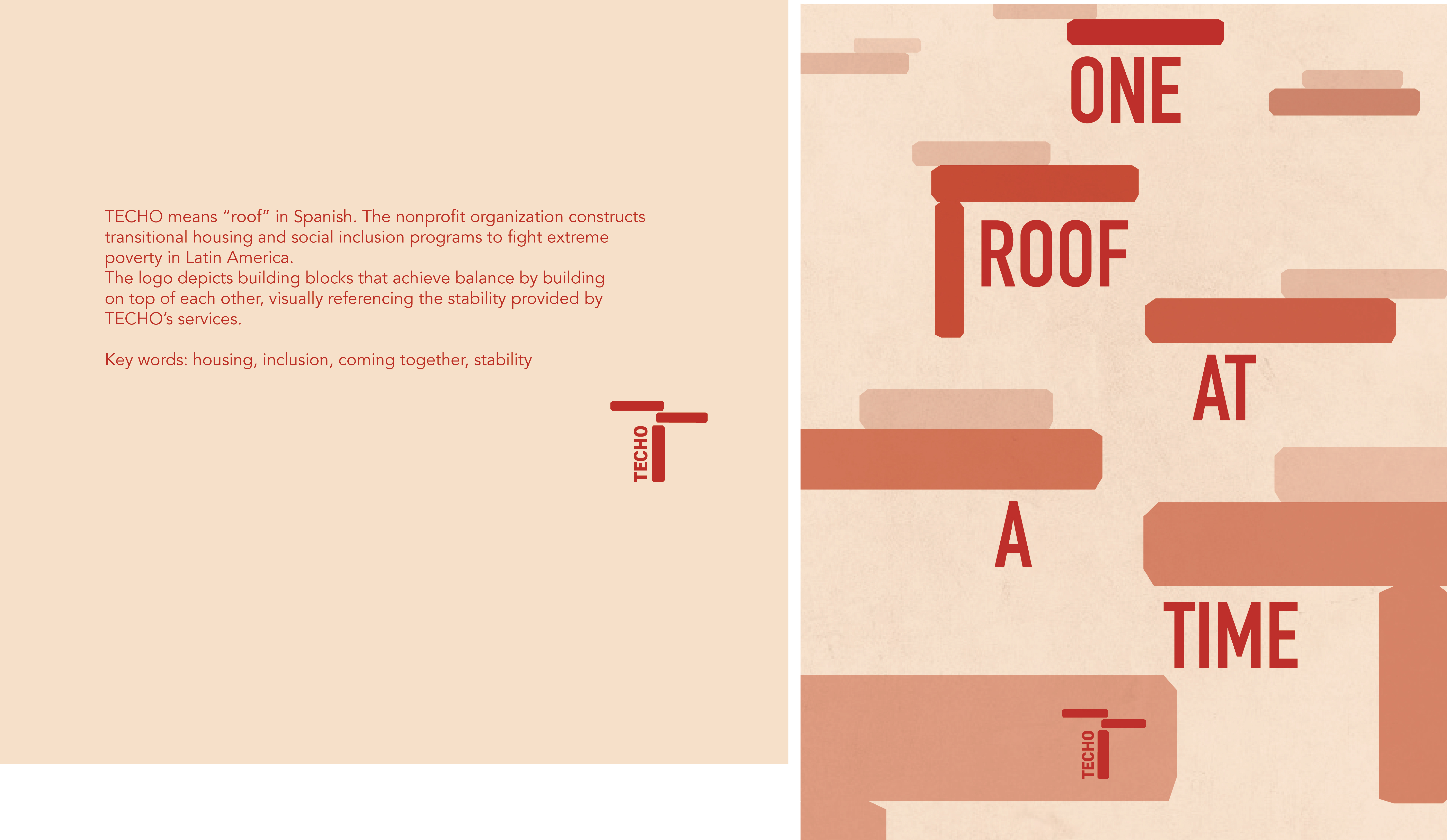
Type Exploration
Image
Image

Image
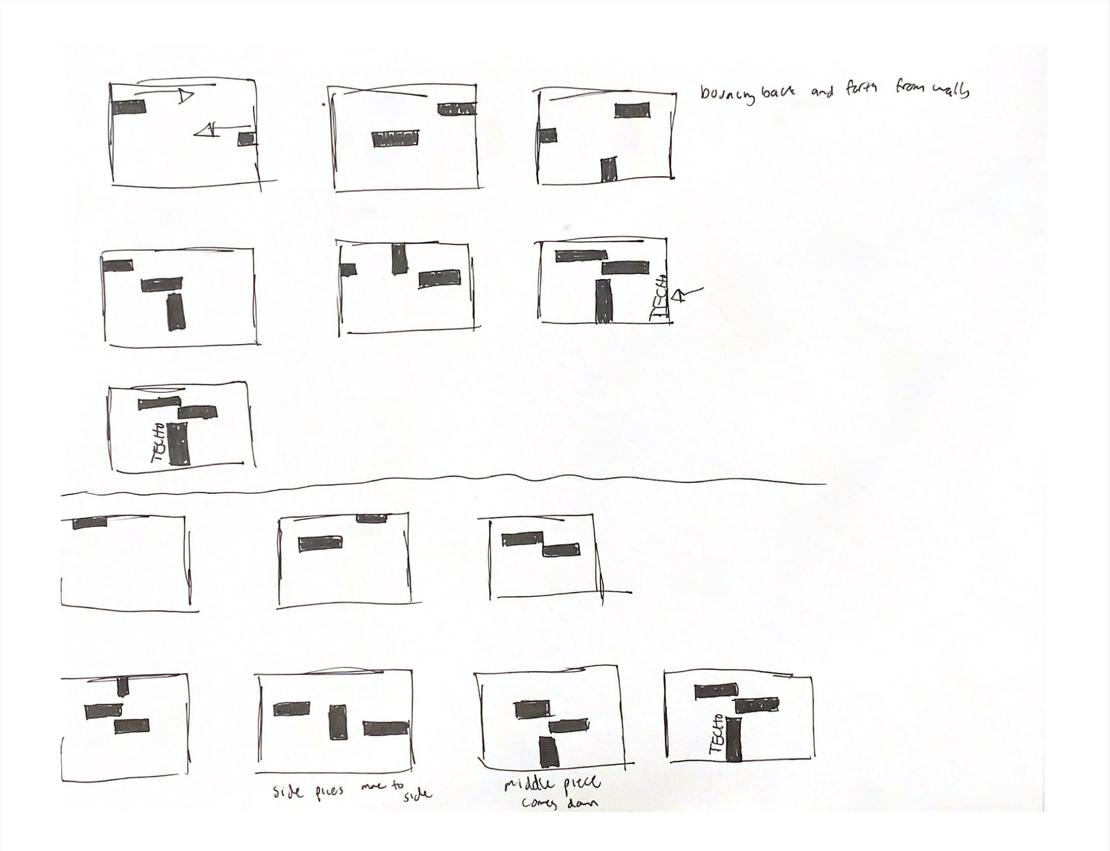
Sketches for motion piece
Image
Image
Image
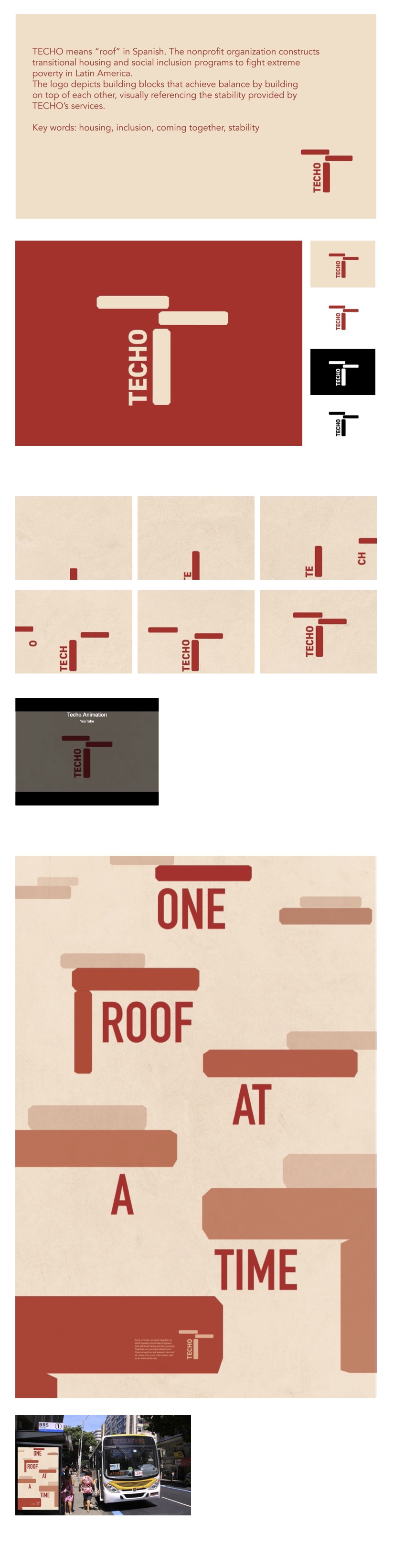
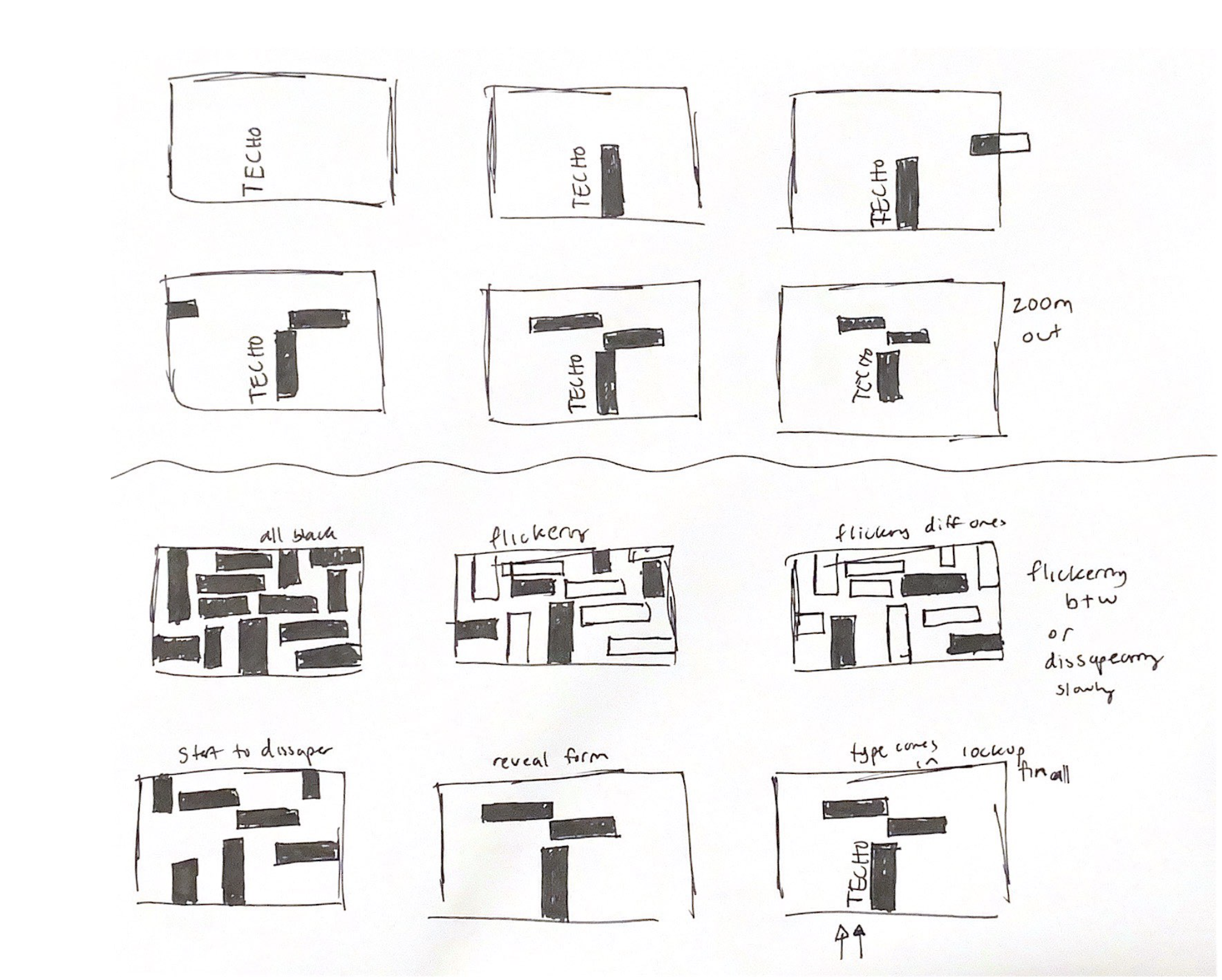
Storyboard for motion piece
Image
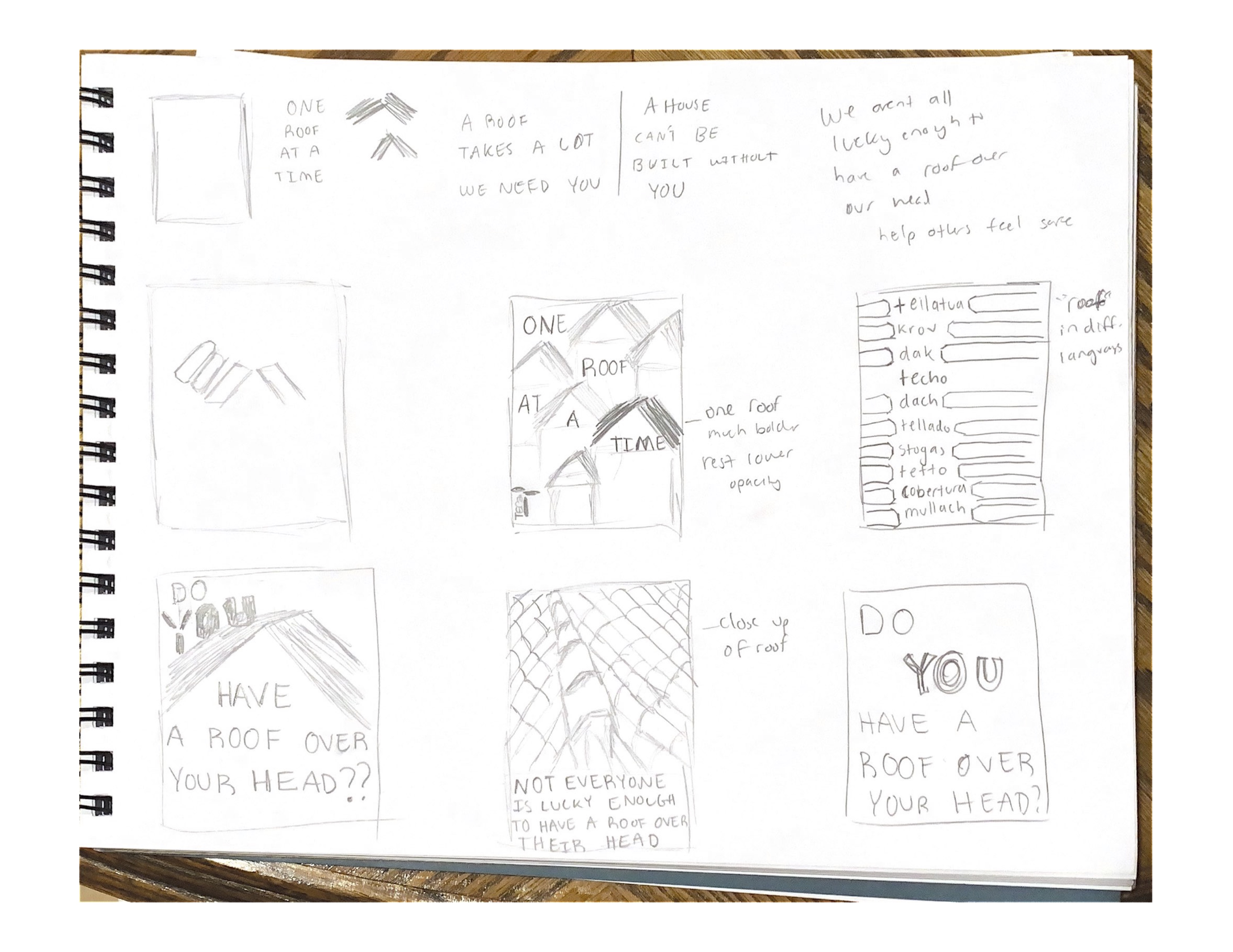
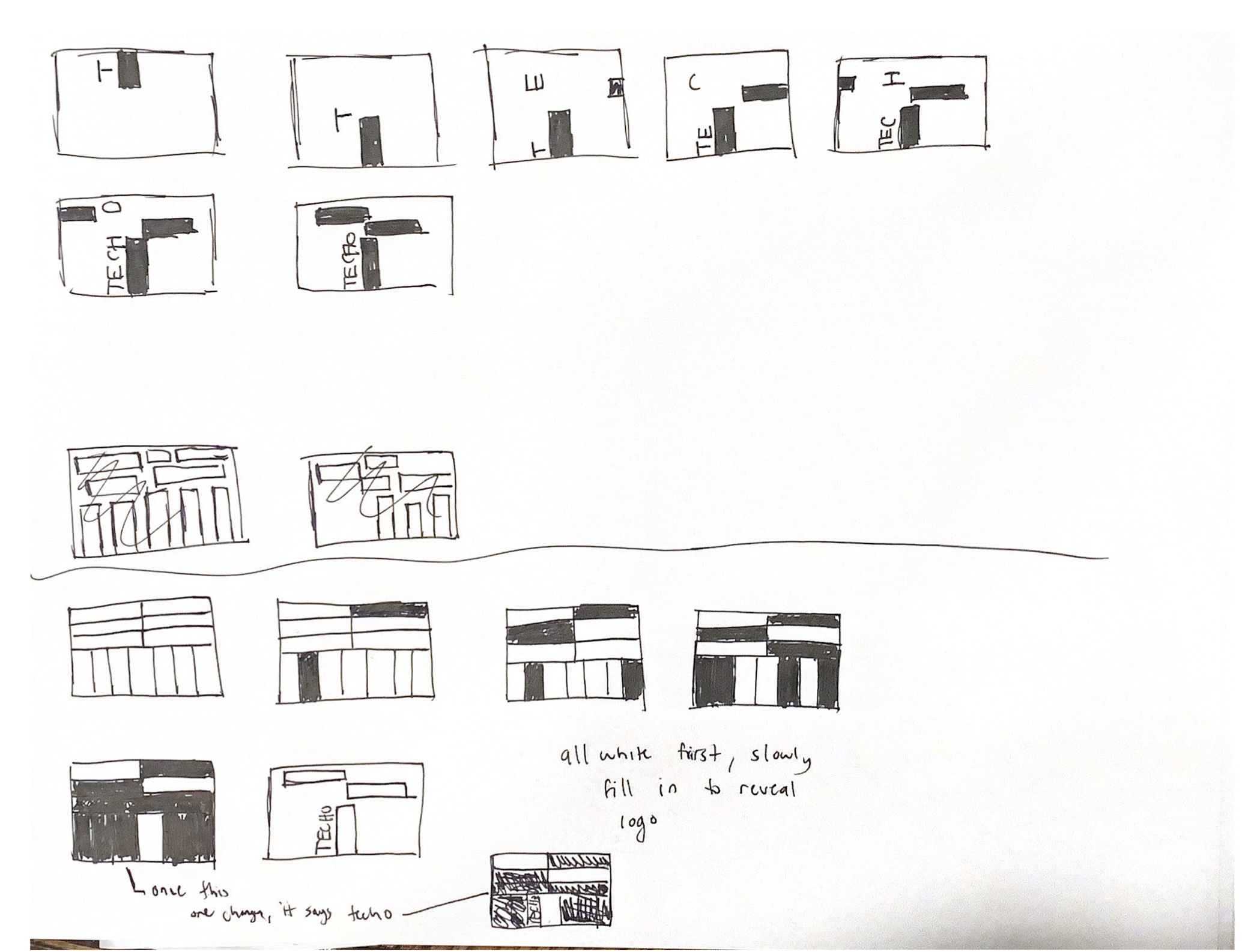
Sketches for poster
Image
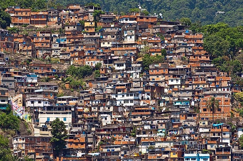
I realized I was sketching the roofs like the roofs we have in America but not like the roofs in Latin America. So this image of favelas was my main inspiration for my final poster.
Image
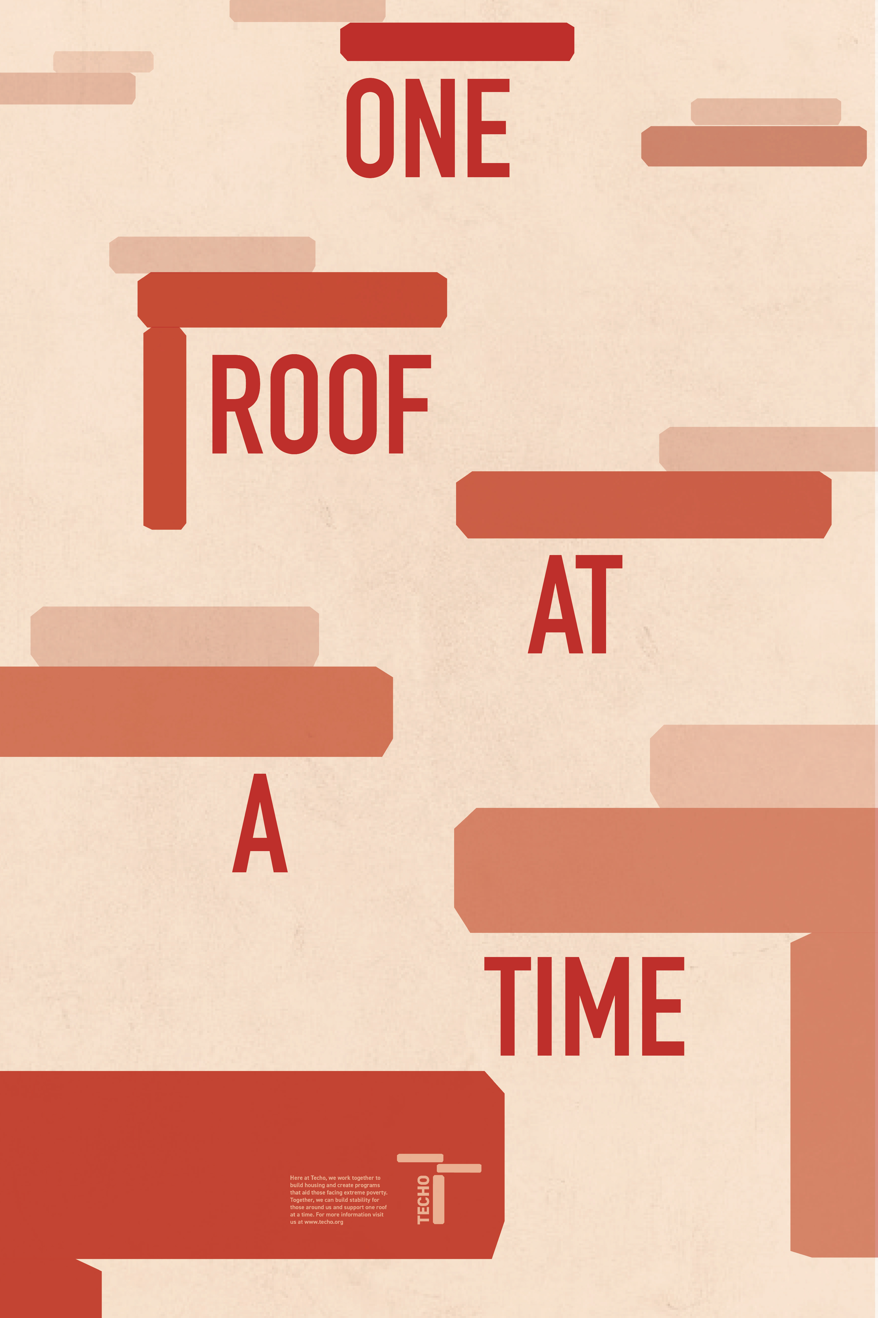
This is my final poster which is a take on the favelas but in a simplified manner, utilizing the shape from the logo.
Image
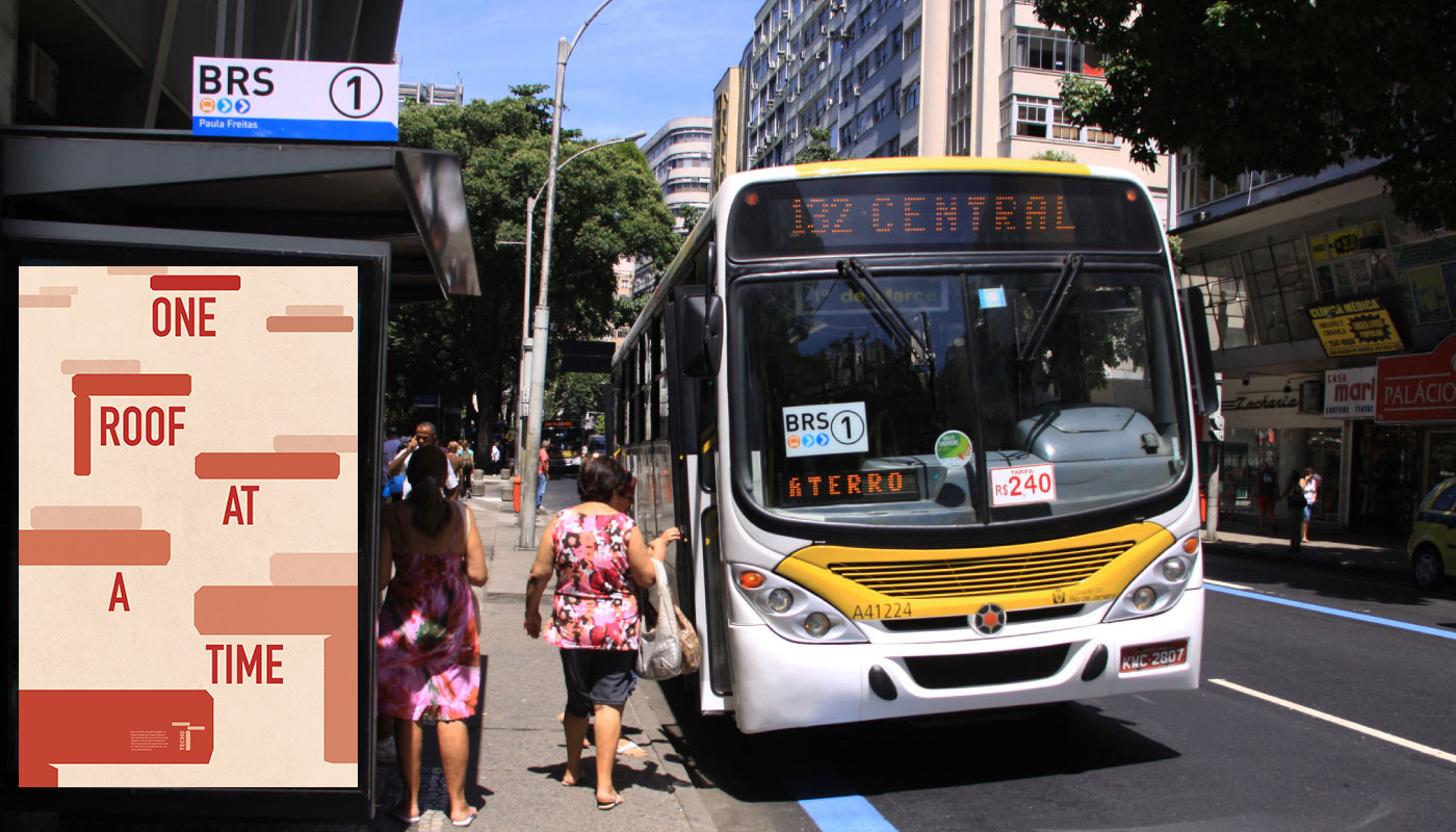
Here is my poster in a place you would actually see it, in Rio de Janeiro next to a bus stop.
Image