Graduates

Winnie Chang

MFA in Graphic Design - 3 Yr Path — Graduate Graphic Design
Course:
Grad Typography 4
Faculty:
Stephen Serrato
Term:
2025 Spring

Fragmenta

Fragmenta explores how memory can be visualized through design by translating emotion and time into form. The goal was to create an exhibition identity that feels poetic yet structured, inviting viewers to reflect on how fragments shape personal stories and how these moments linger, overlap, and evolve into the narratives we carry forward through our lives and experiences.

Process:

Fragmenta started from exploring memory as fragmented and constantly shifting. The design direction focused on creating a personal and imperfect visual language through handwritten typography and diary-inspired layouts. The catalogue was developed as a journal-like object, using hand binding, handwritten titles, and footnotes placed alongside text. Overlapping images and compositions were used to reflect how memories layer and interrupt each other, while posters were treated as individual fragments with varying tones and textures.

Learning Outcomes:

This project developed a stronger understanding of how design can communicate emotion and personal narrative through material, typography, and layout. It explored non-linear thinking and the value of imperfection in creating more human and relatable experiences. Working with physical processes like hand binding also deepened awareness of how tactile decisions influence perception. Overall, the project emphasized creating systems that allow variation while still maintaining a clear conceptual direction.

Tags:
Branding,
Identity Design,
Publication Design,
Typography
Image
Exhibition entry.
Image
Image
Image
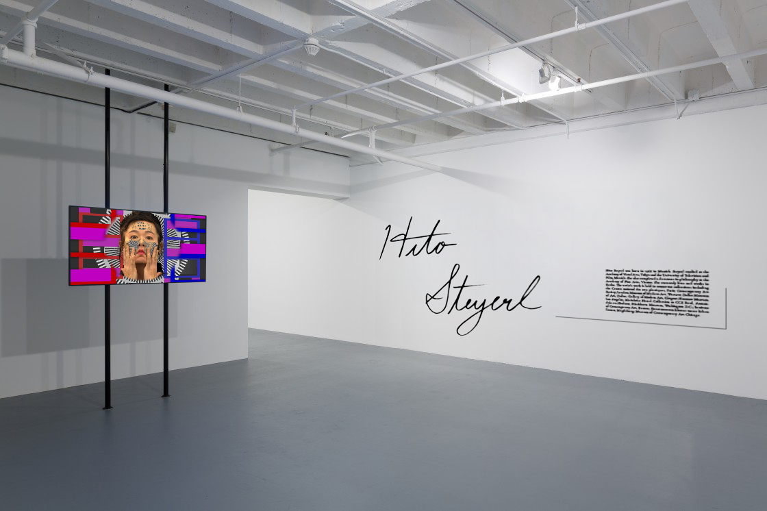
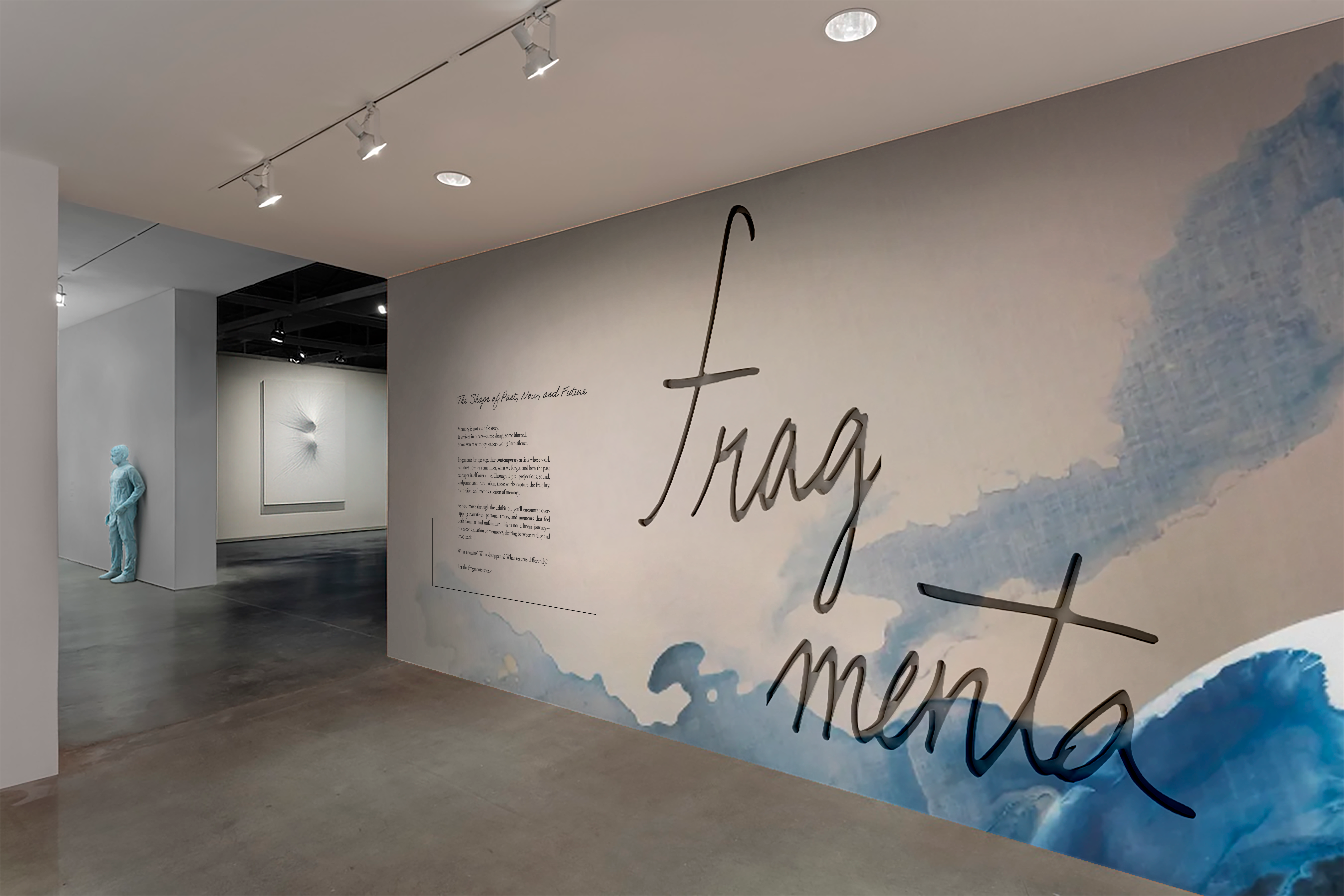
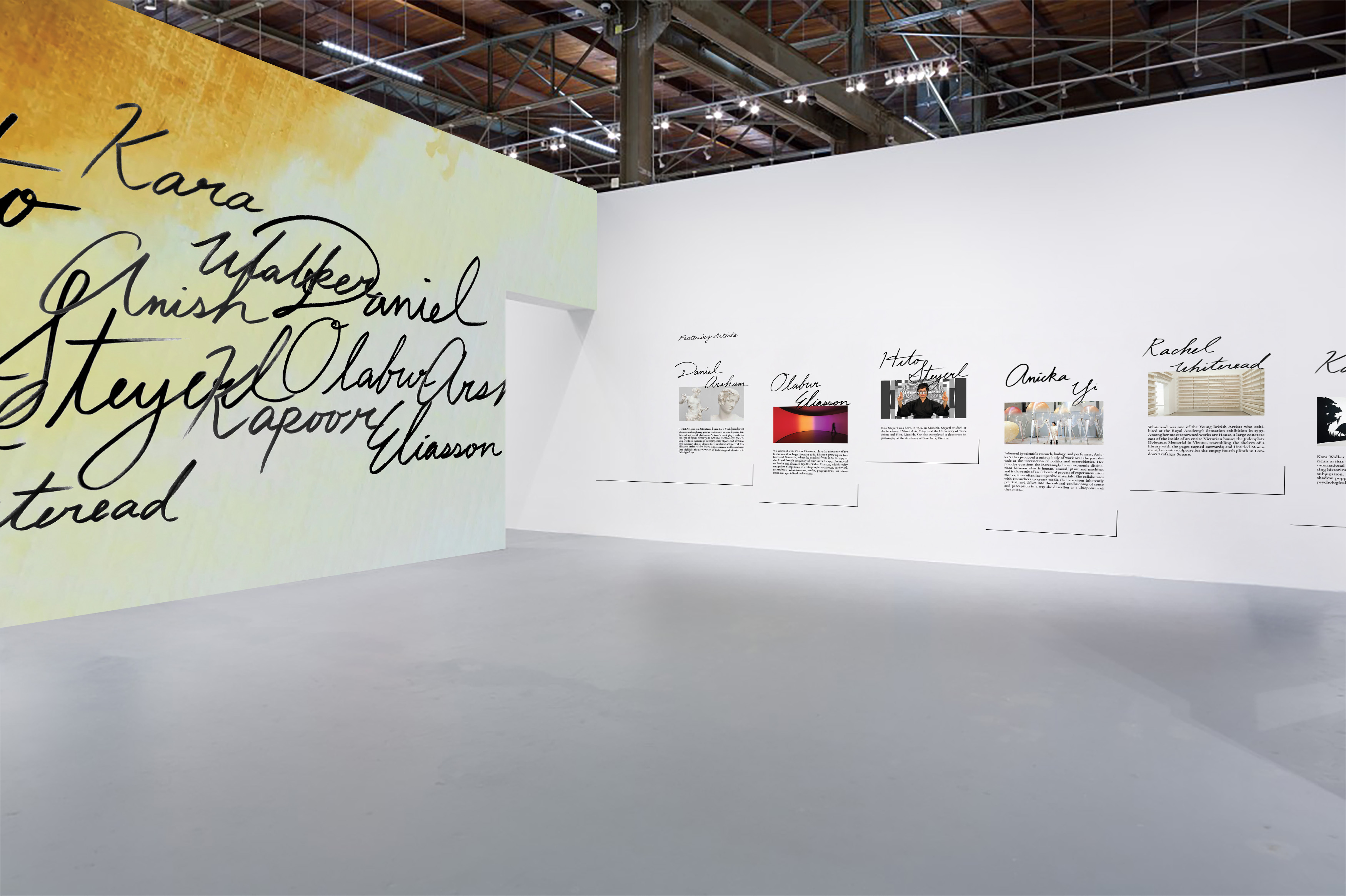
Large-scale wall graphics translate the theme of fragmented memory into spatial form through layered textures and shifting transparency.
Image
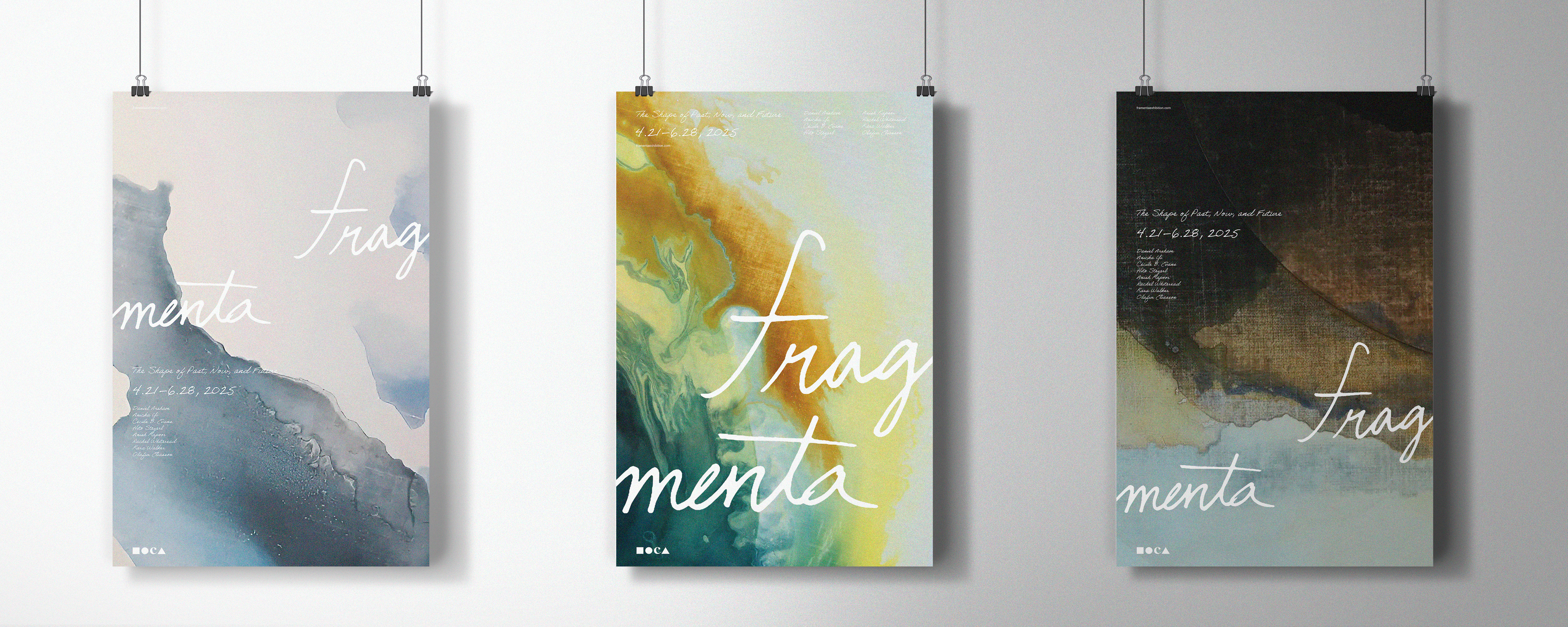
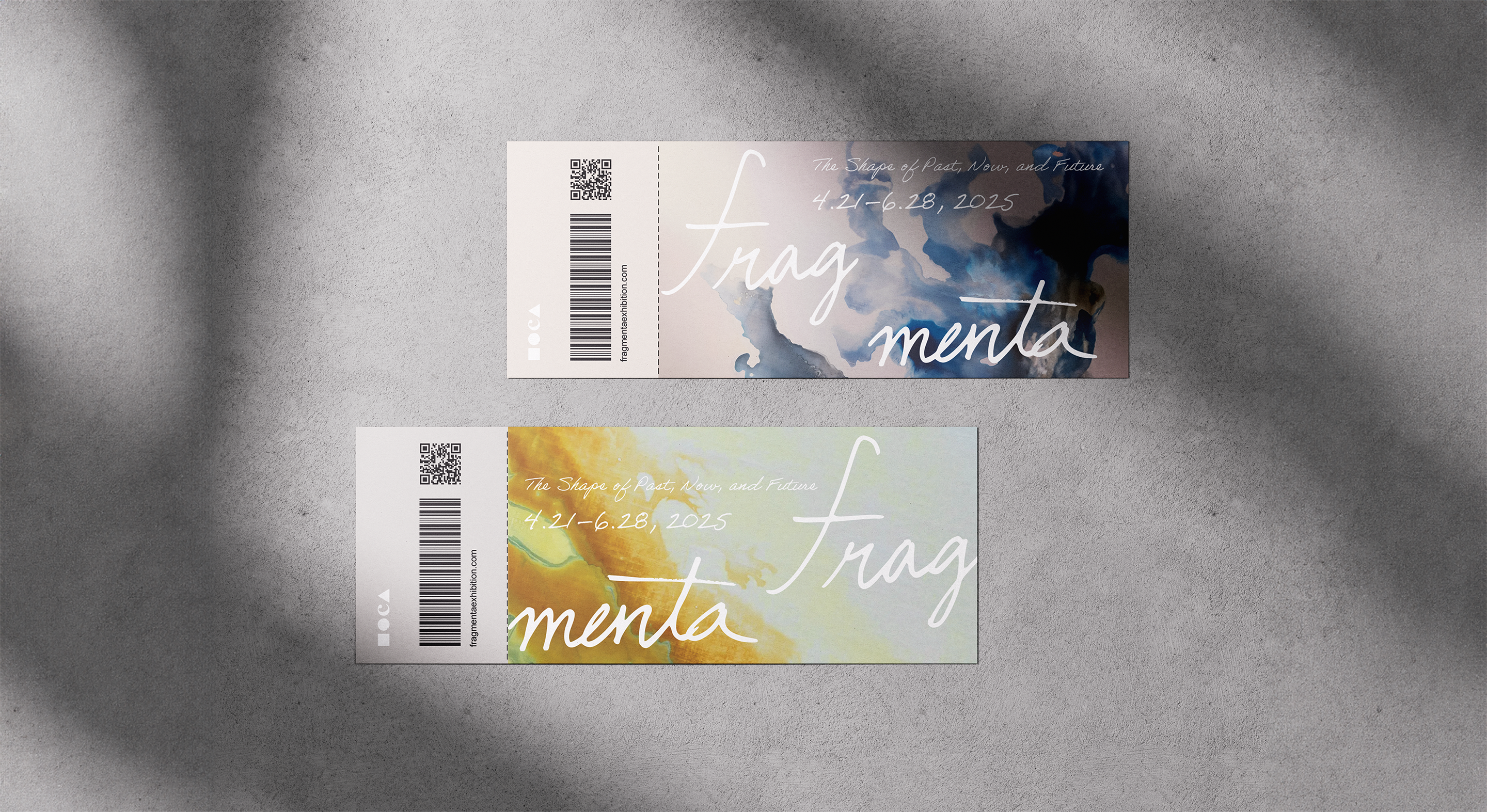
The poster series uses layered watercolor backgrounds to express the shifting textures of memory. The fluid gradients and subtle washes suggest how moments fade, overlap, and resurface, creating a visual atmosphere that mirrors the emotional depth of the exhibition.
Image
Image
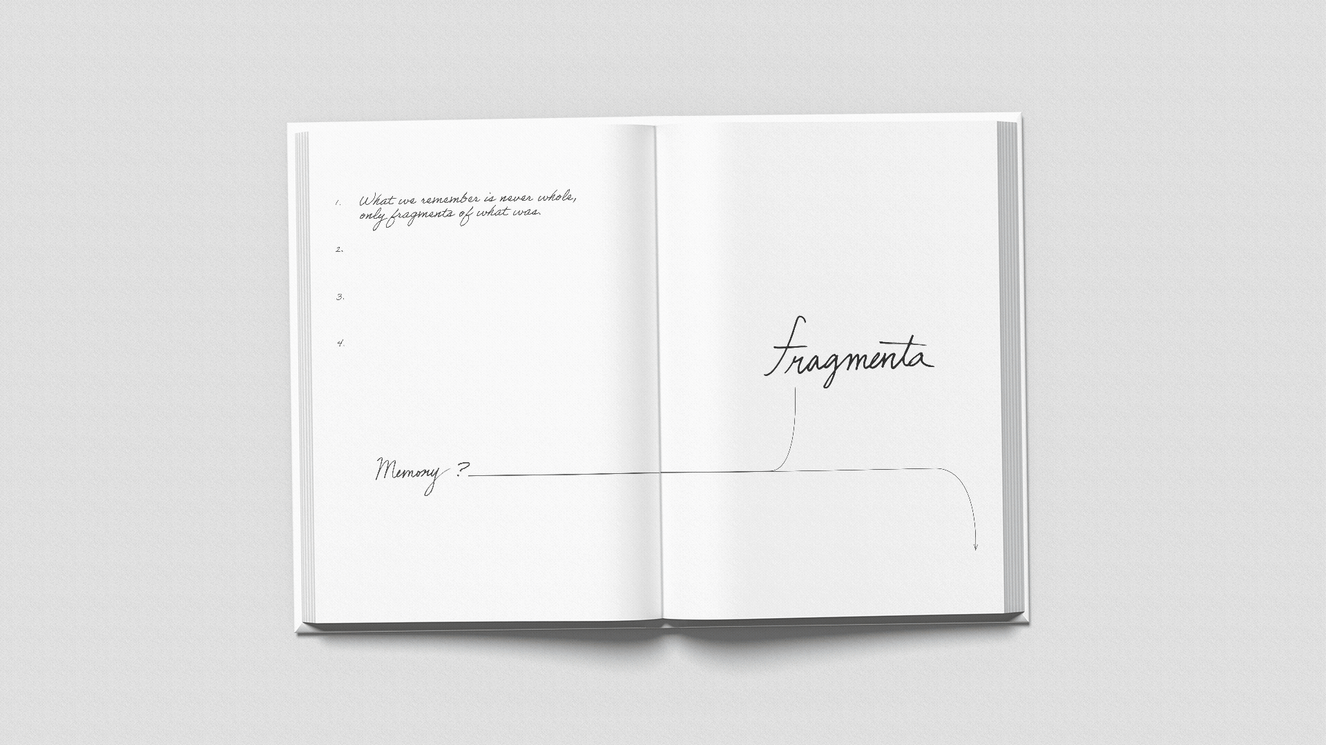
The exhibition catalogue is designed as a publication that feels personal rather than formal. It takes on a diary-like format, using handwritten elements, layered layouts, and annotations to reflect how memories are recorded and revisited. The pages unfold as fragments, with images and text overlapping to create a non-linear reading experience that extends the exhibition.
Image