Image
The current Trader Joe’s logo feels heavy and sharp. It doesn’t fully reflect warmth, playfulness, or accessibility — which are the core strengths of the brand.
Image
Image
So I explored a new logo direction that brings back the warmth and friendliness of Trader Joe’s. Softer curves, smoother spacing, and a lighter feel make it more approachable and modern while still keeping the charm people love.
Image

Whimzo’s logo is soft, playful, and full of personality. The curved shapes and the sweeping “z” give the brand a sense of motion and imagination, while the clean letterforms keep it approachable and warm. It feels creative, friendly, and perfectly aligned with the idea of exploring new worlds through making.
Image
Image
Image
Image

Image
Image
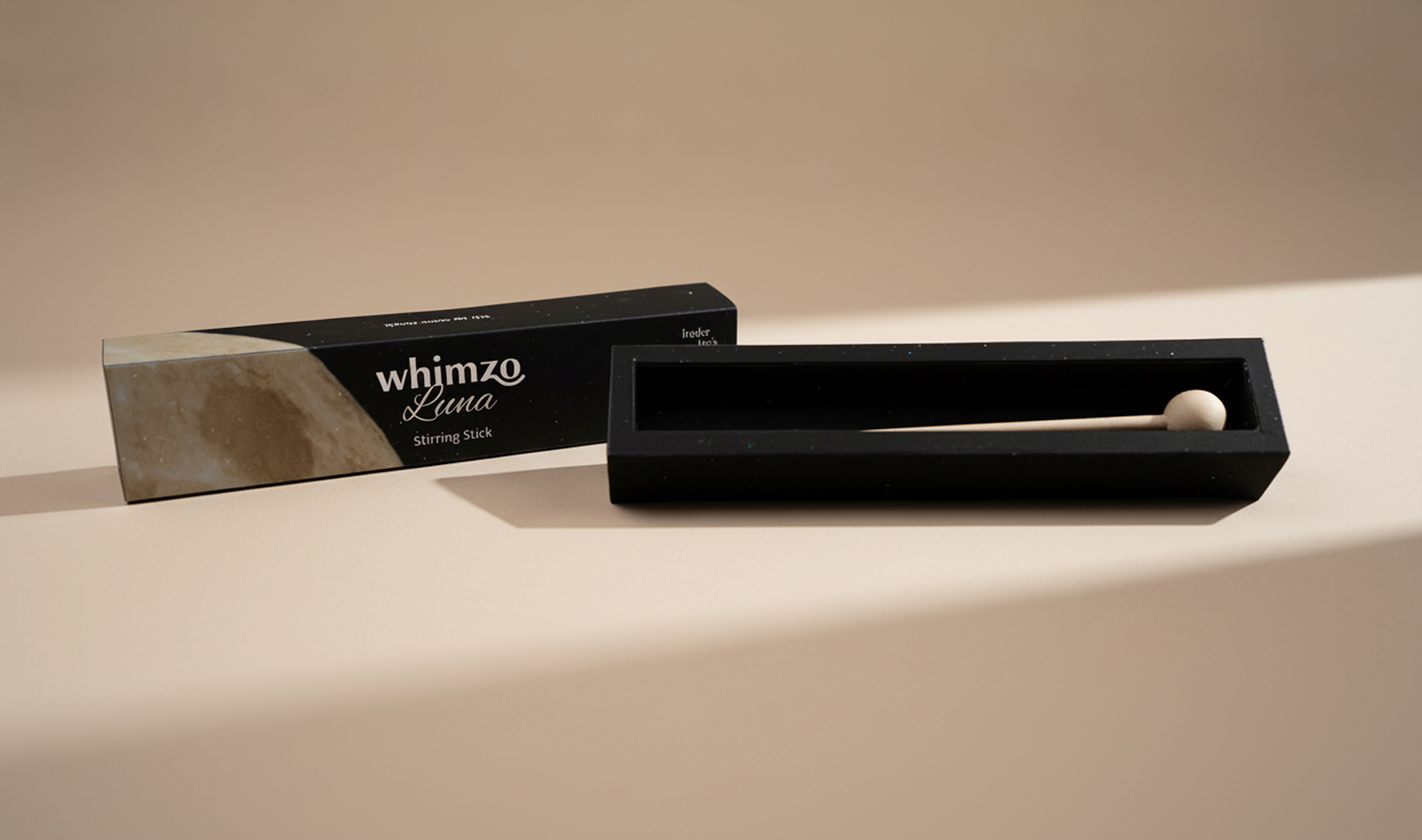
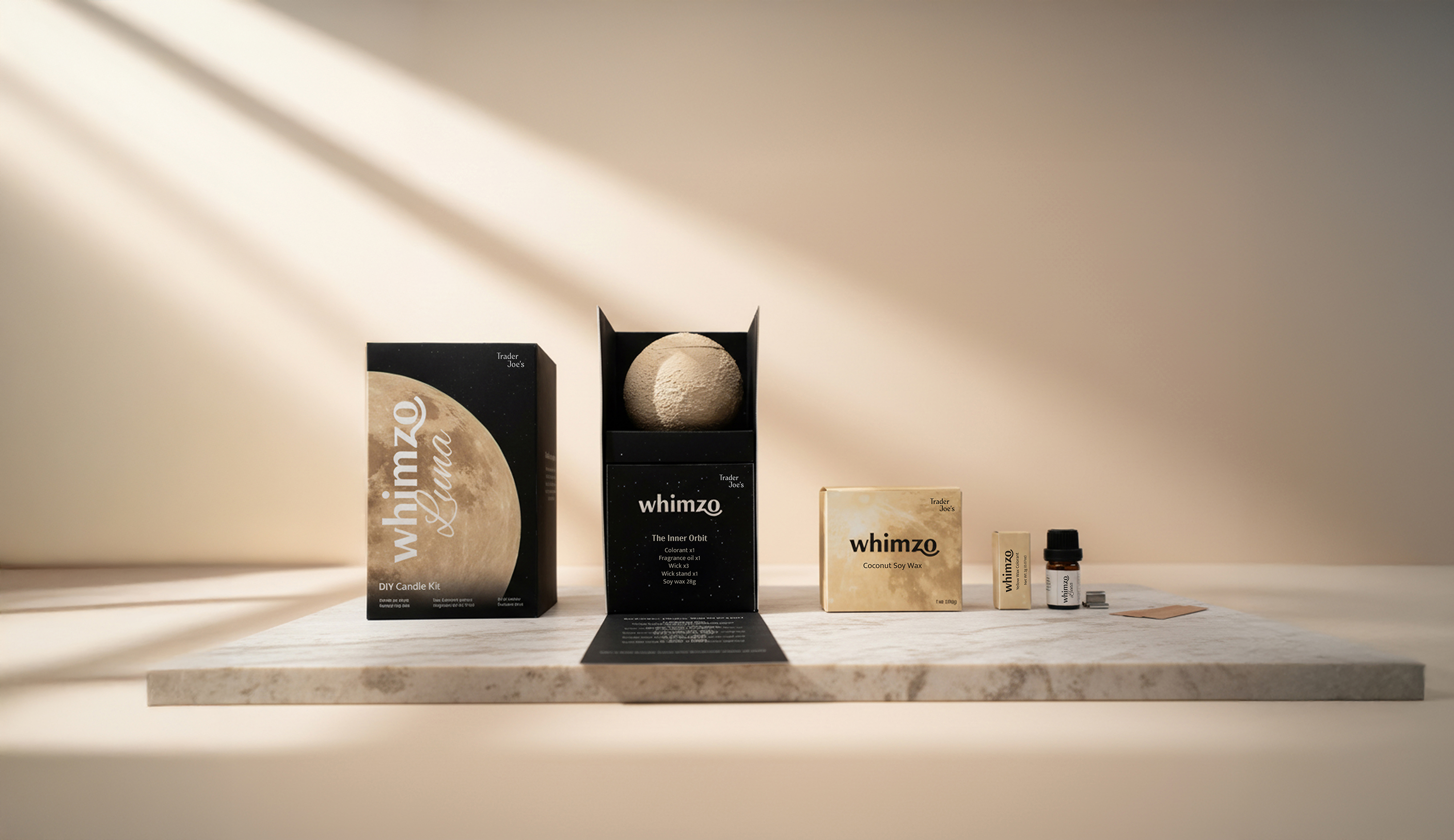
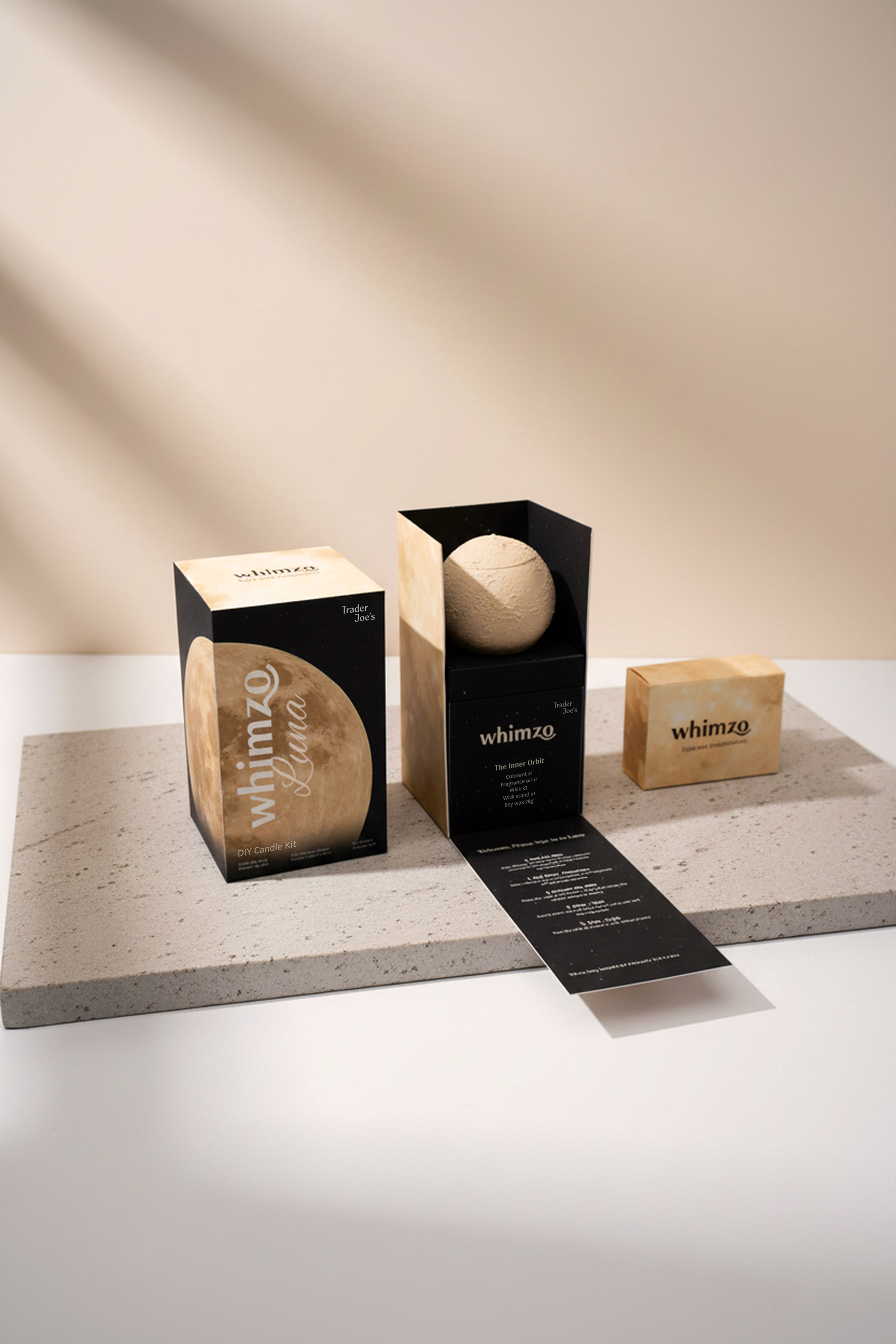
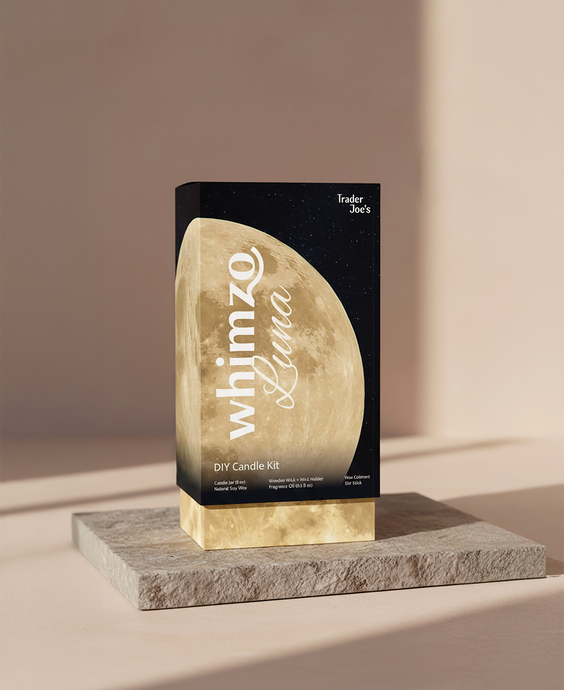
Whimzo packaging.
Image
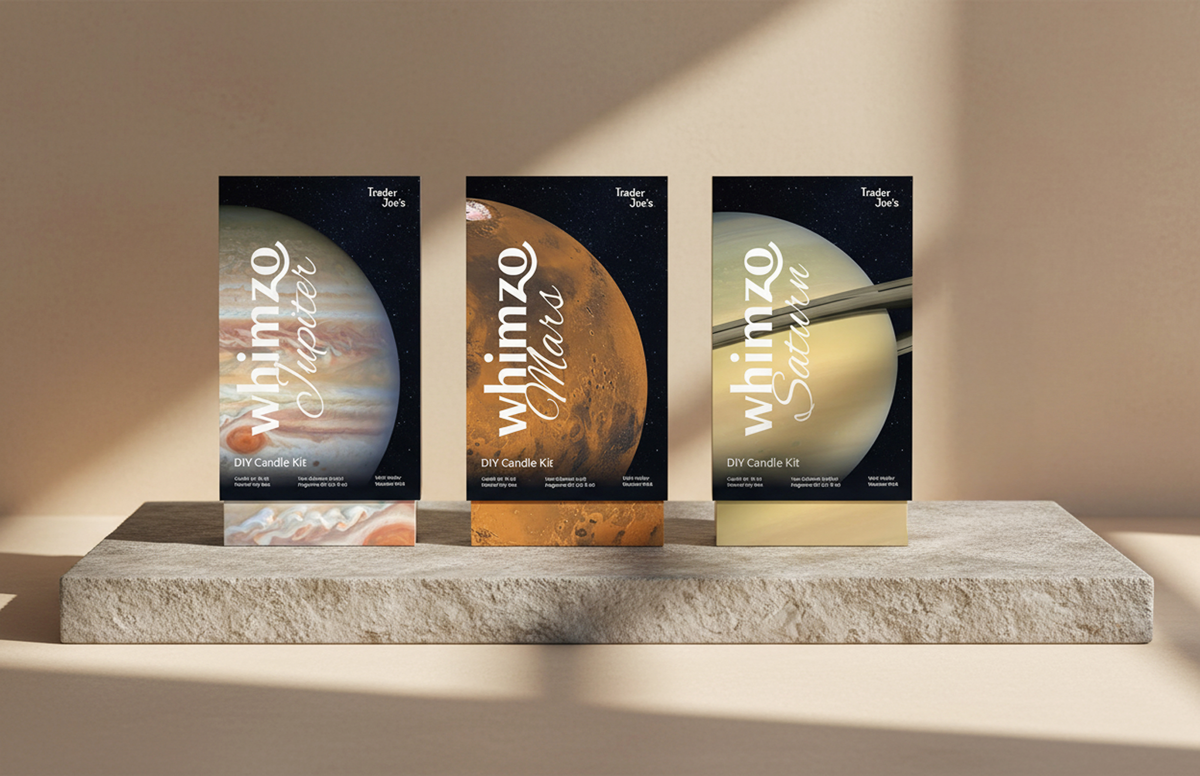
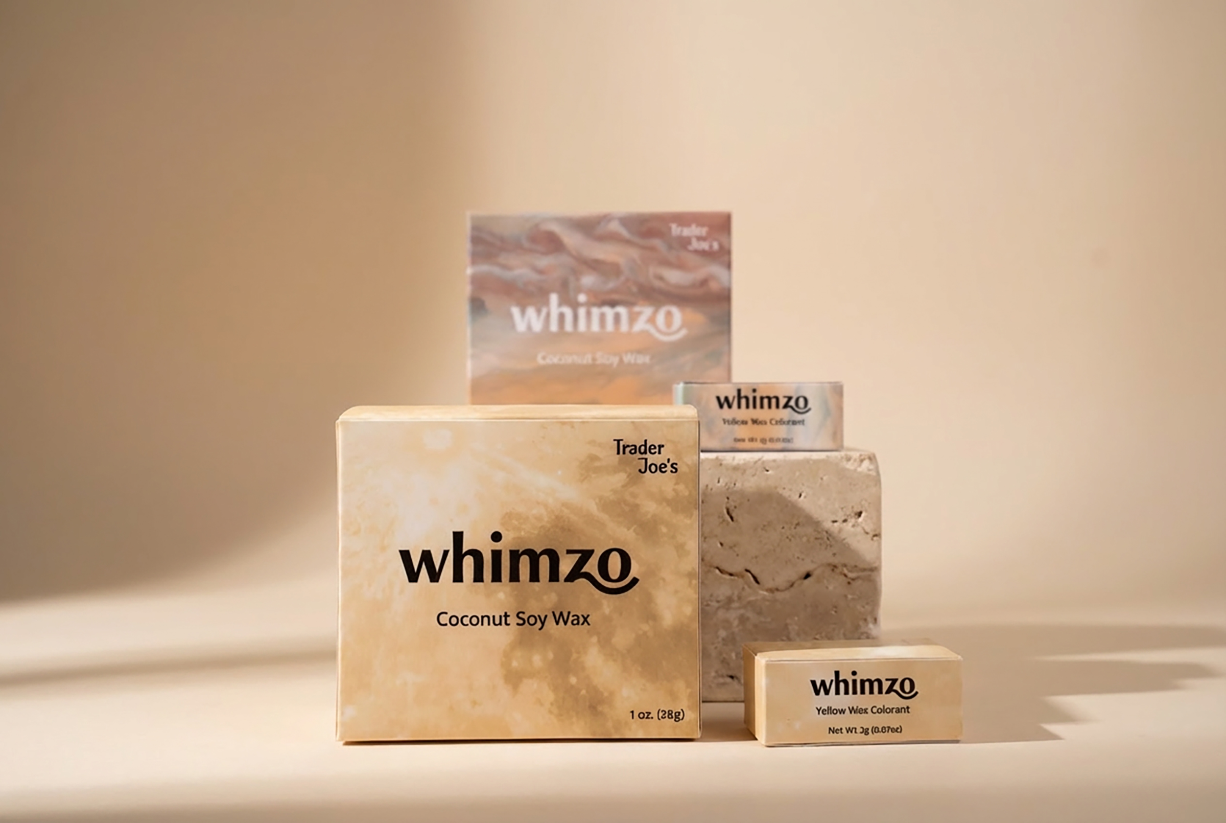
Product line extension.
Image
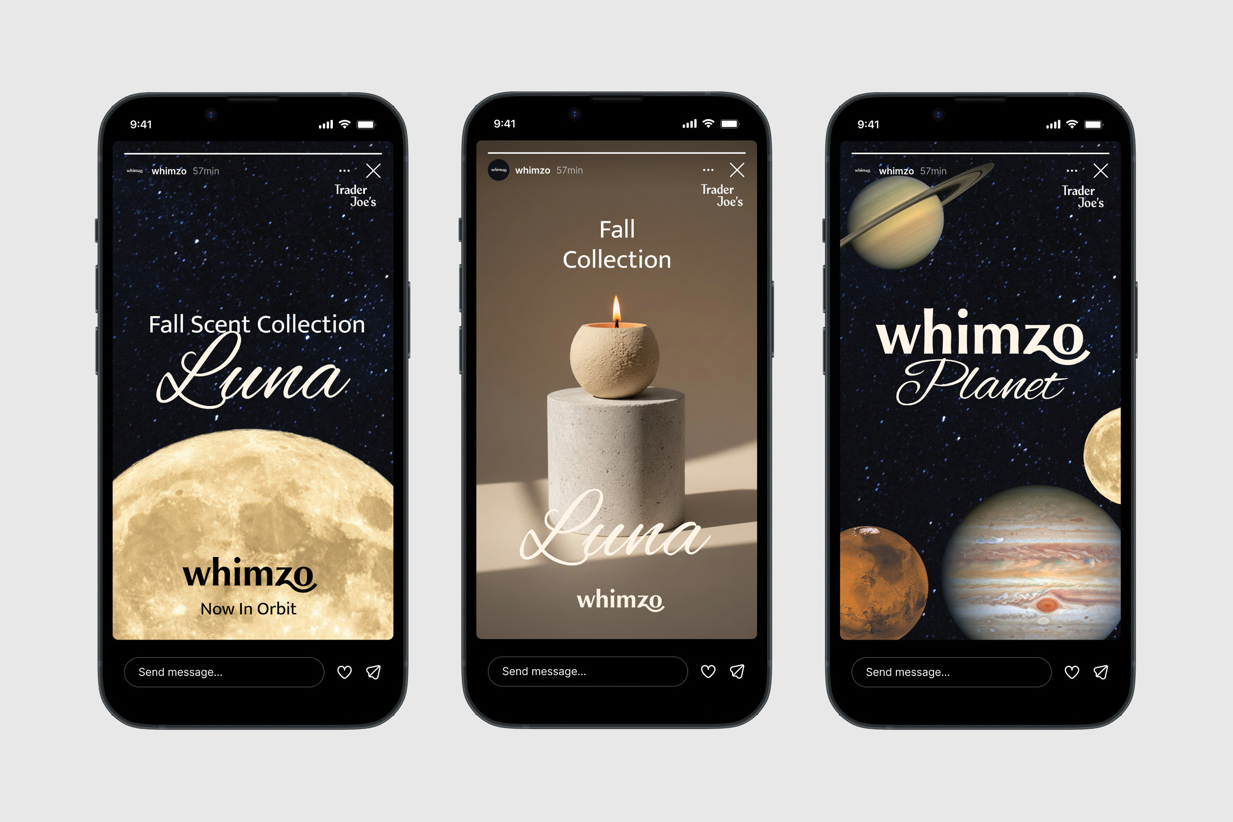
Our social media story.
Image
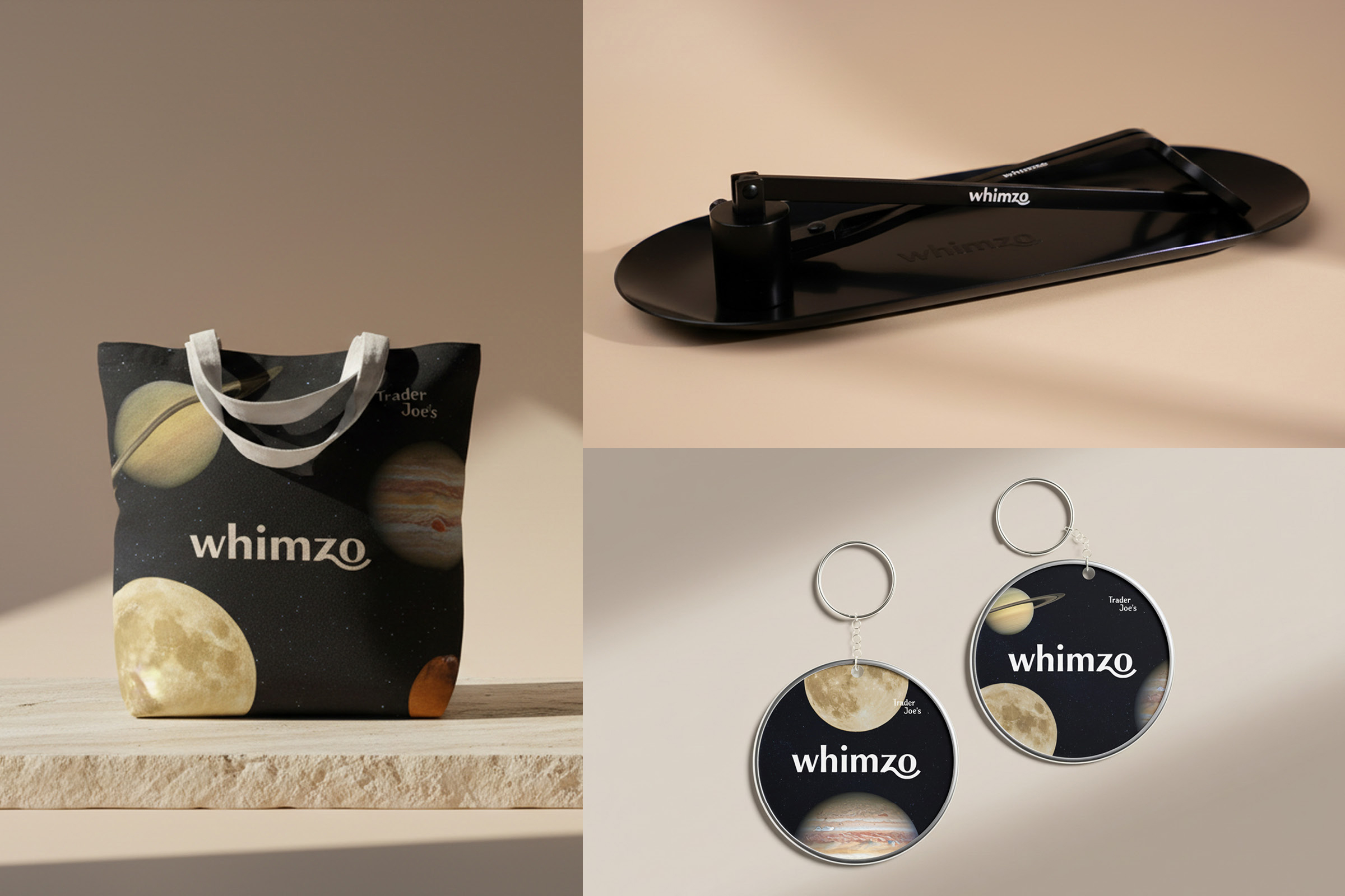
Our candle care set & merchandise.