Image
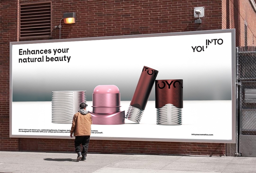
the trimmed corner on this logo reflects INTOYOU's philosophy – is welcoming the viewer with an inviting gesture
Image
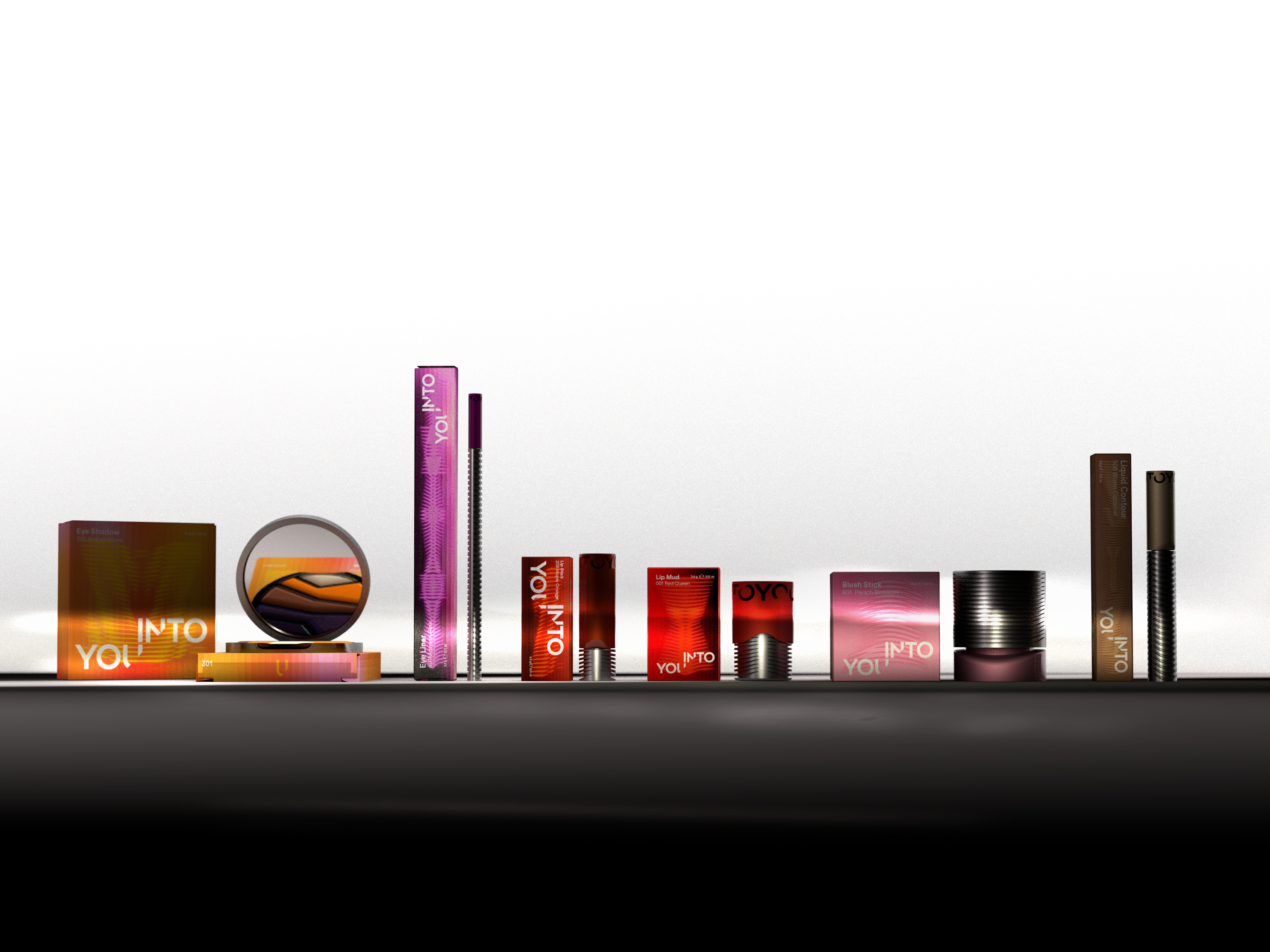
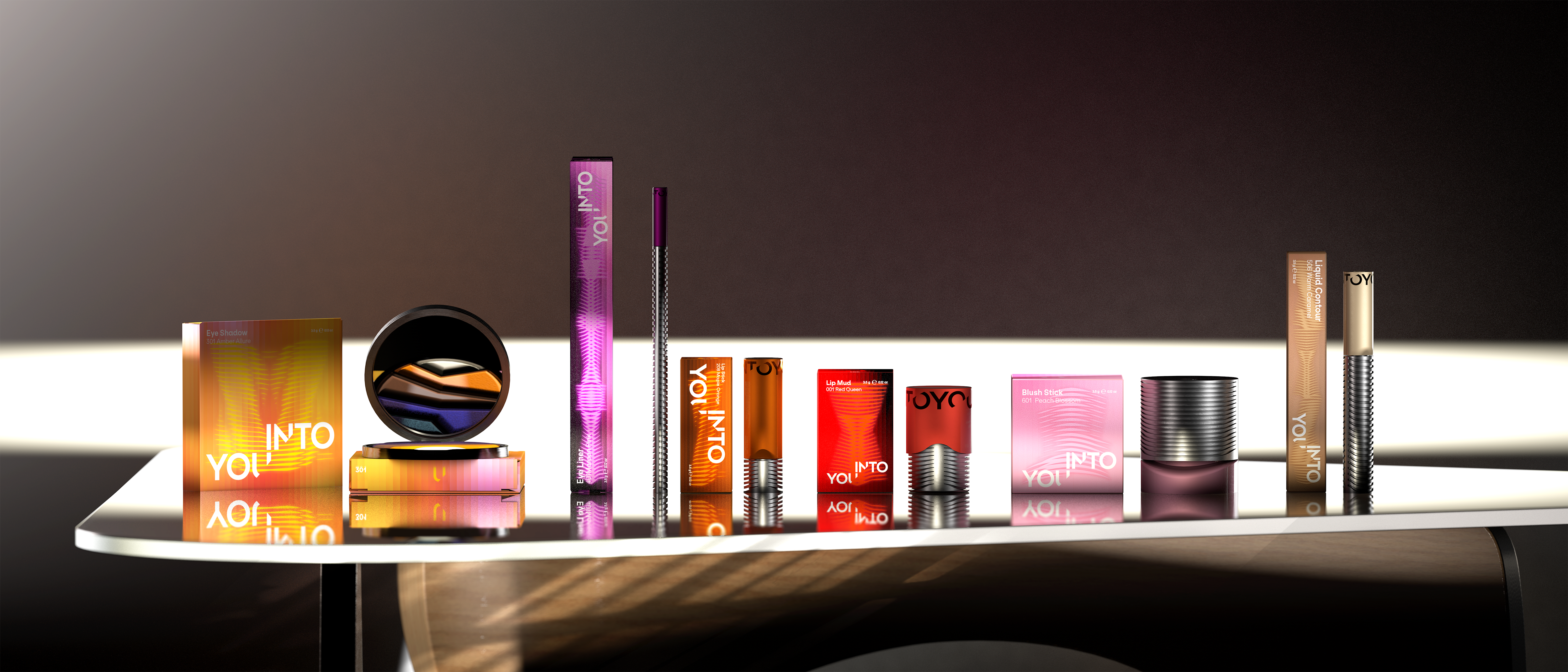
The goal for rebranding is to establish a long-term sustainable packaging solution and align the visual expression with the brand's DNA.
Image
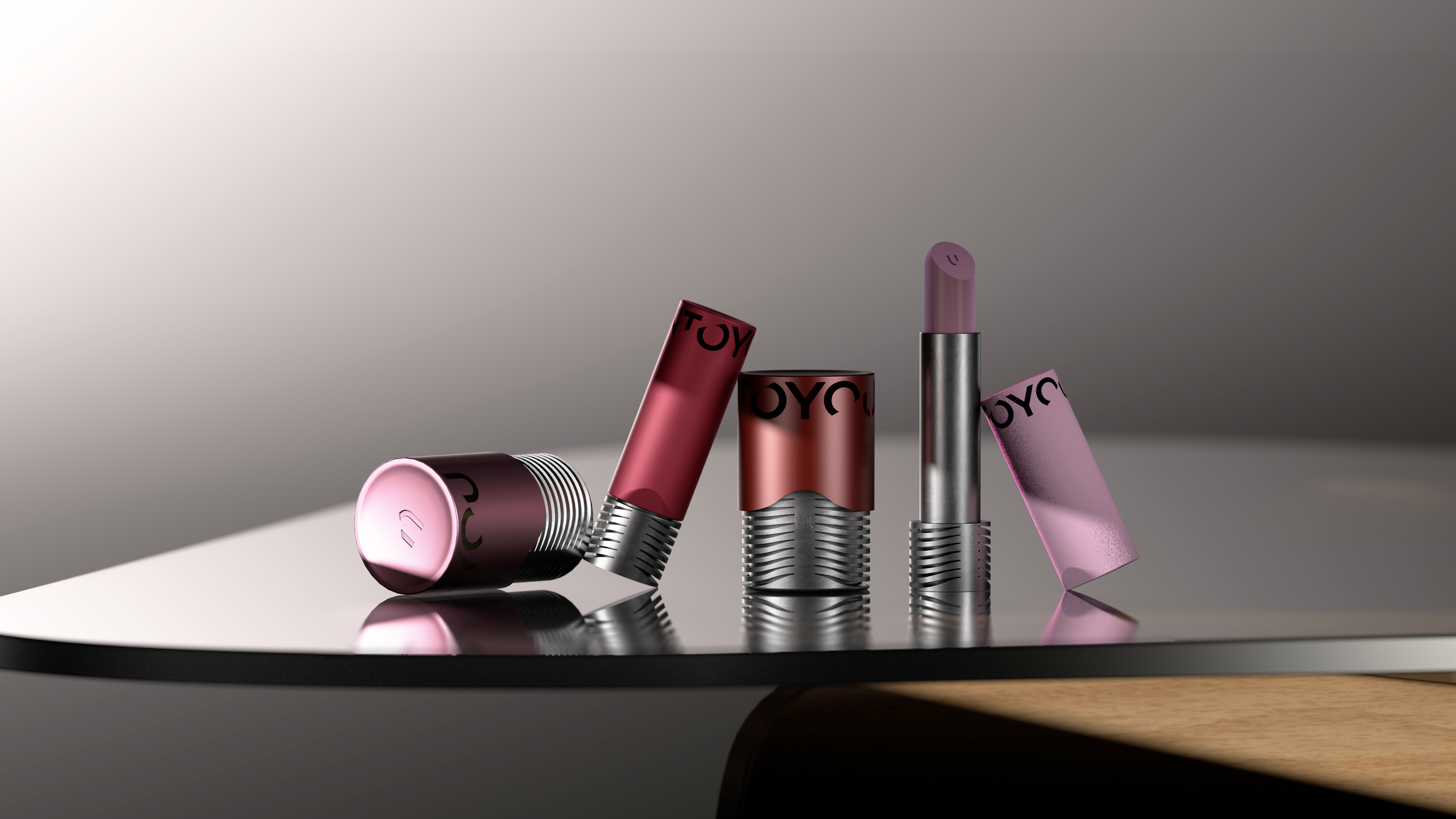
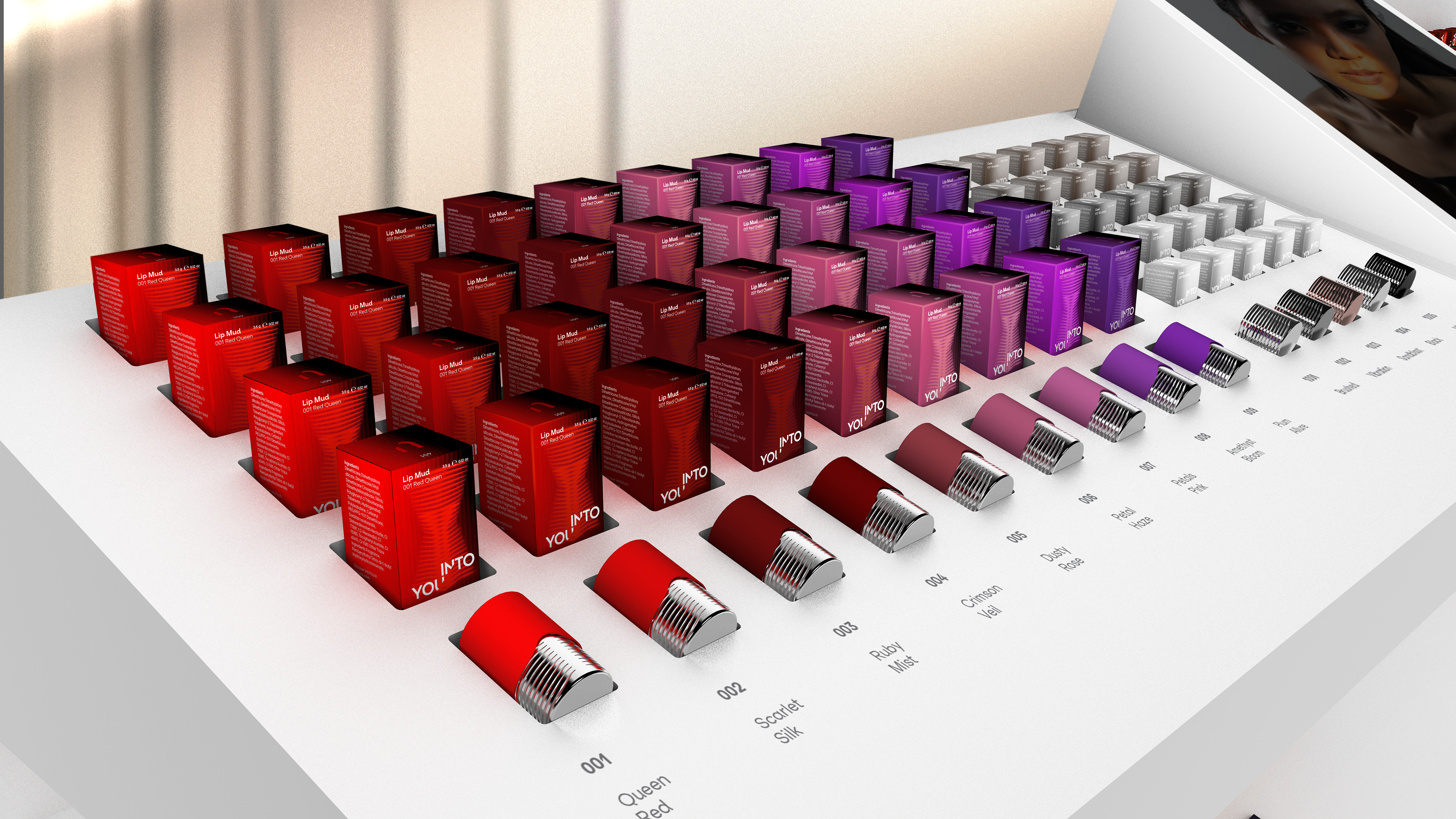
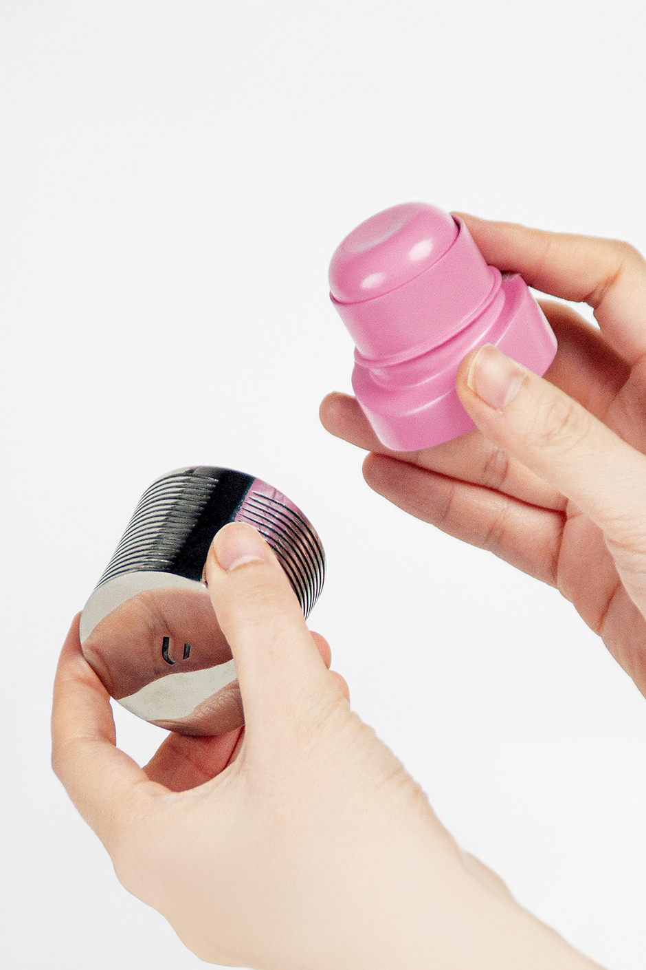
Sustainability is embraced by elevate beauty products as cherished 'accessories.' Using slightly heavier, 100% recyclable stainless steel, it offers superior corrosion resistance and a luxurious feel. reflecting the brand's commitment to "long-term use" and "jewelry-like texture".
Image
Image
Image
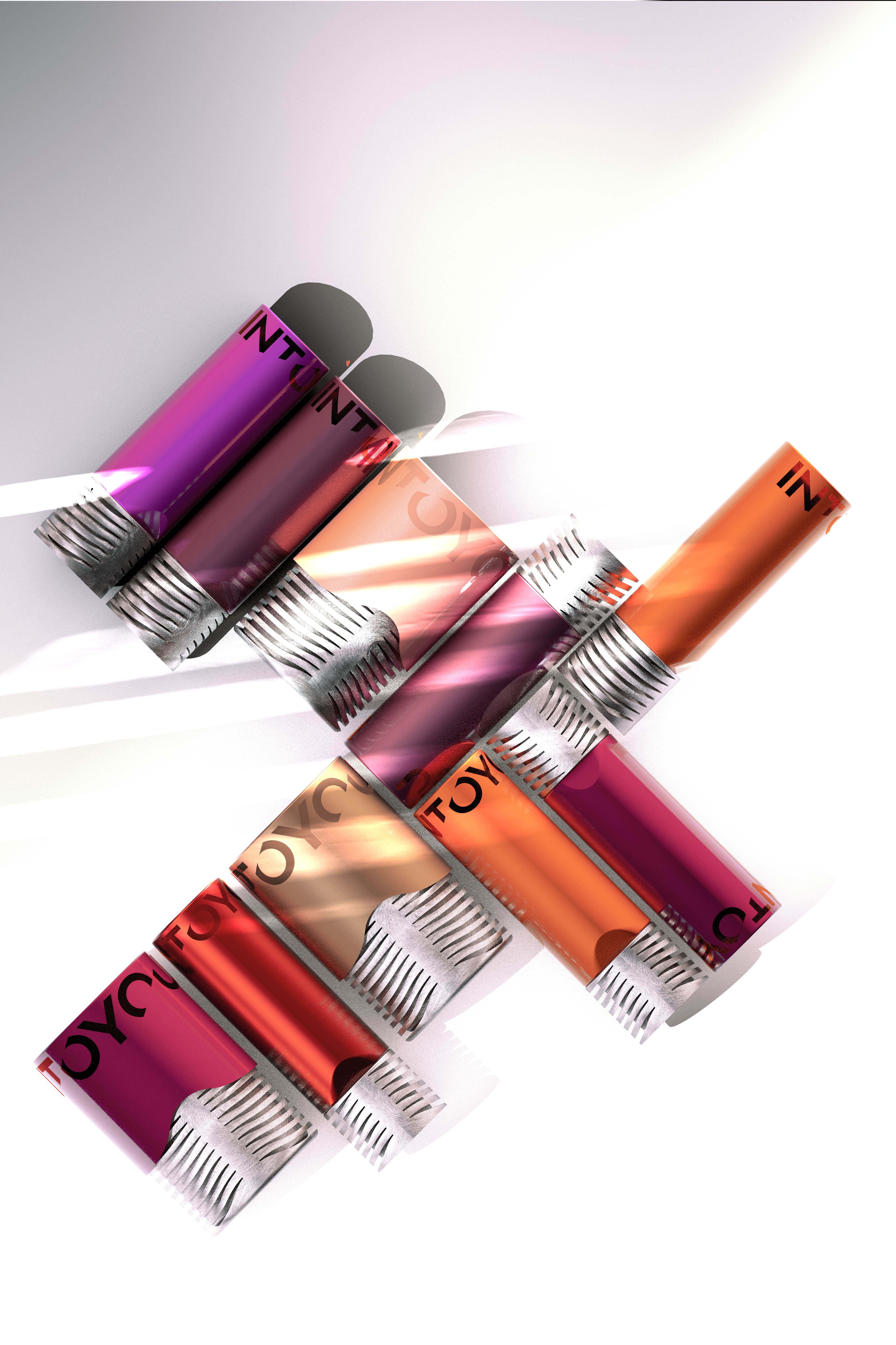
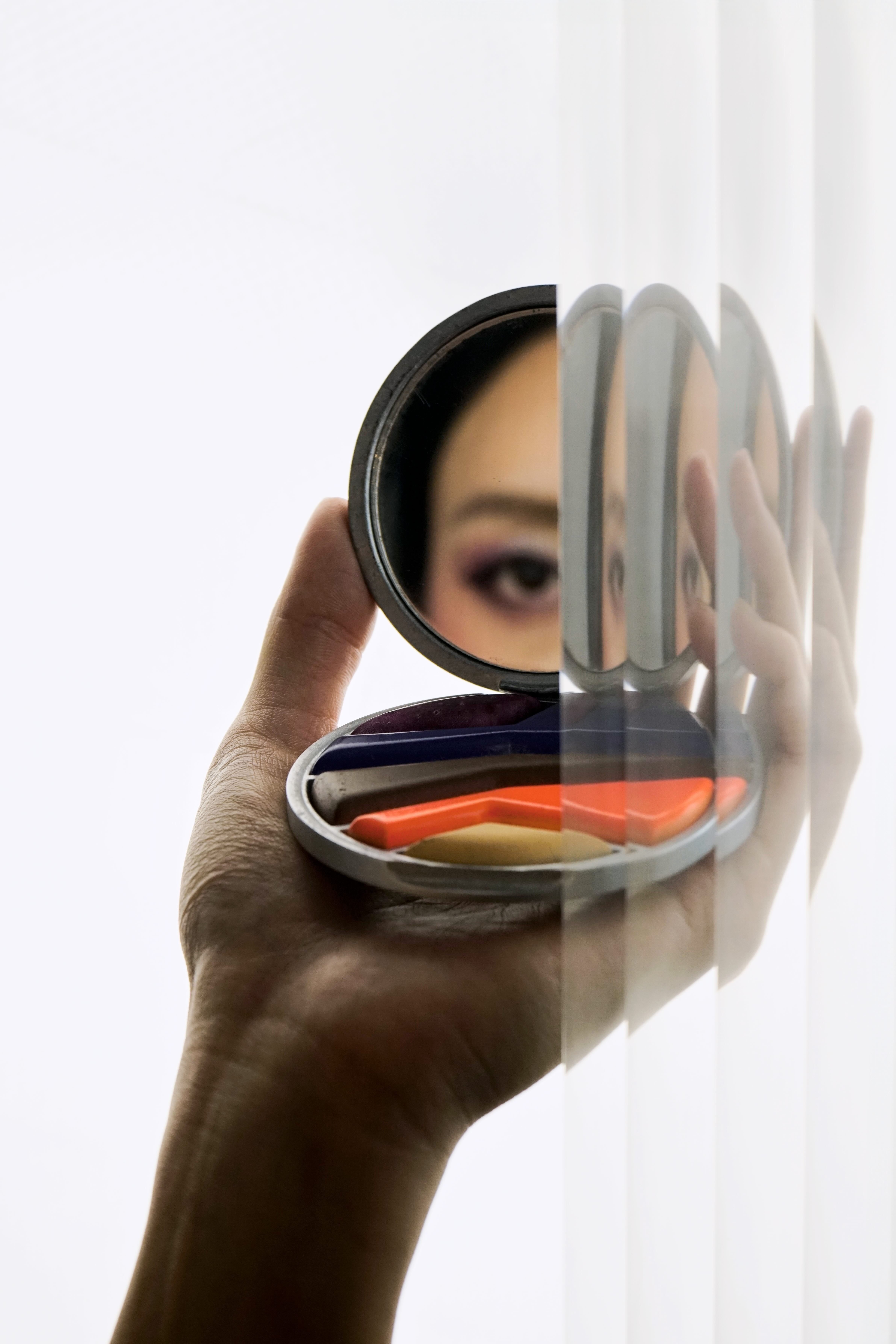
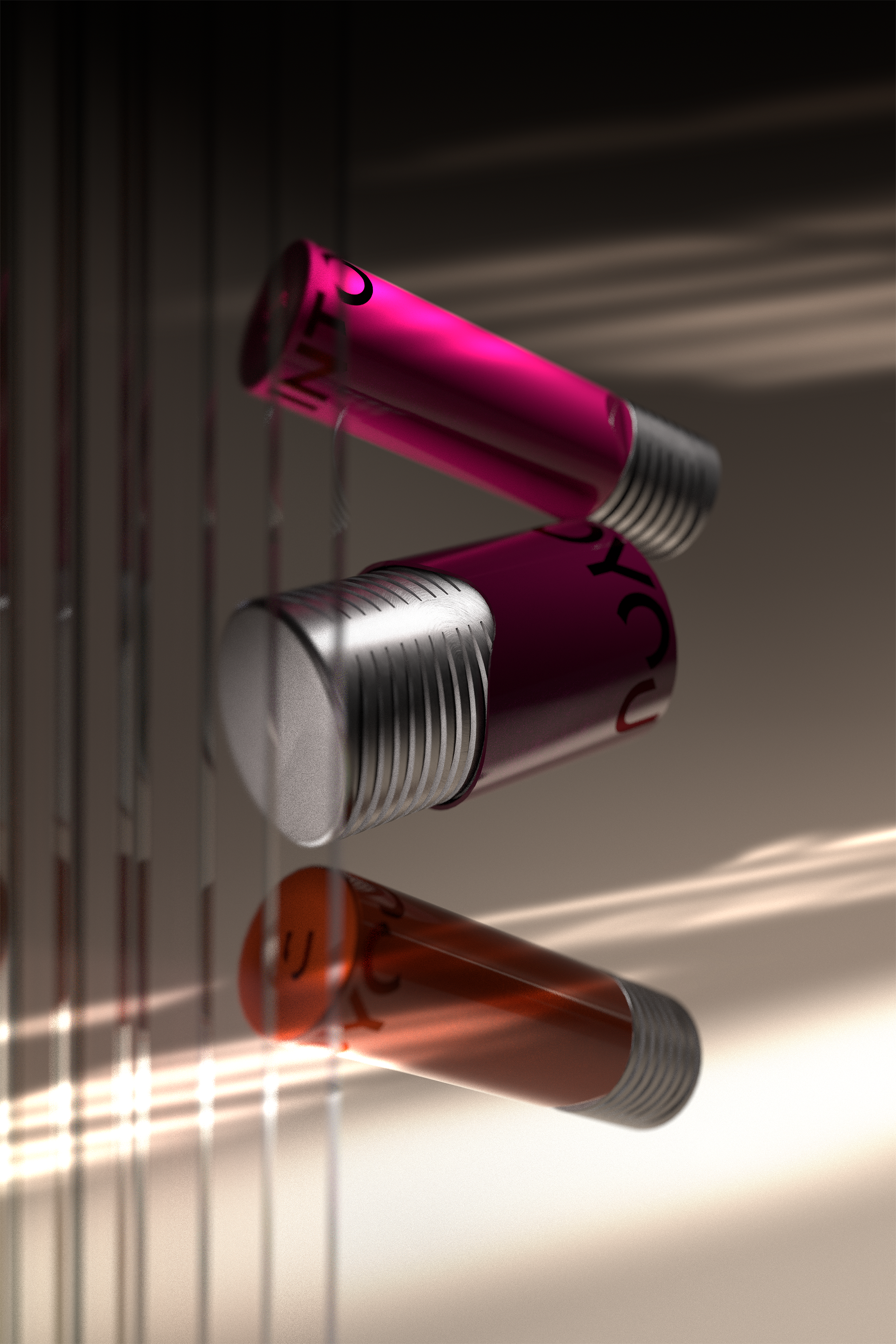
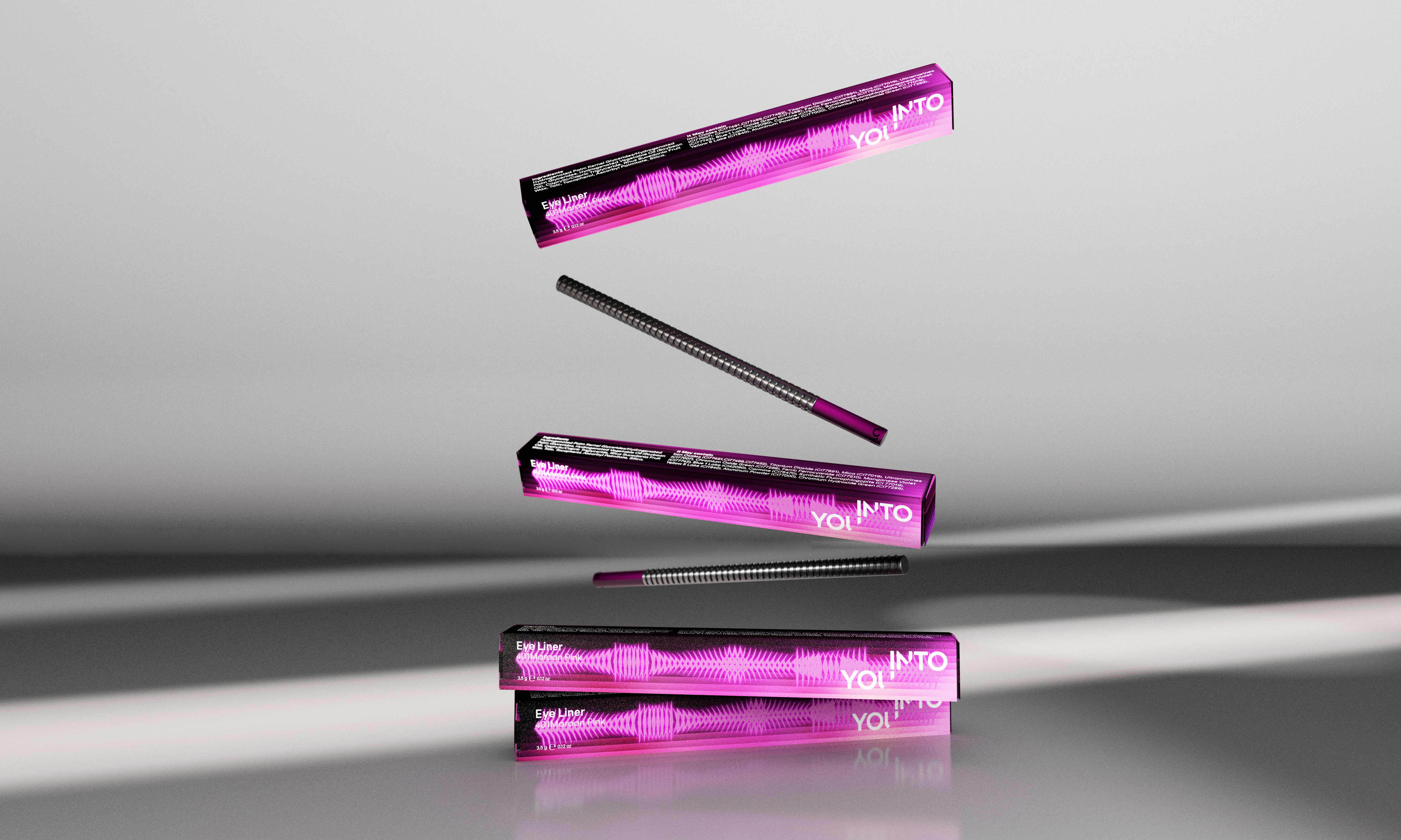
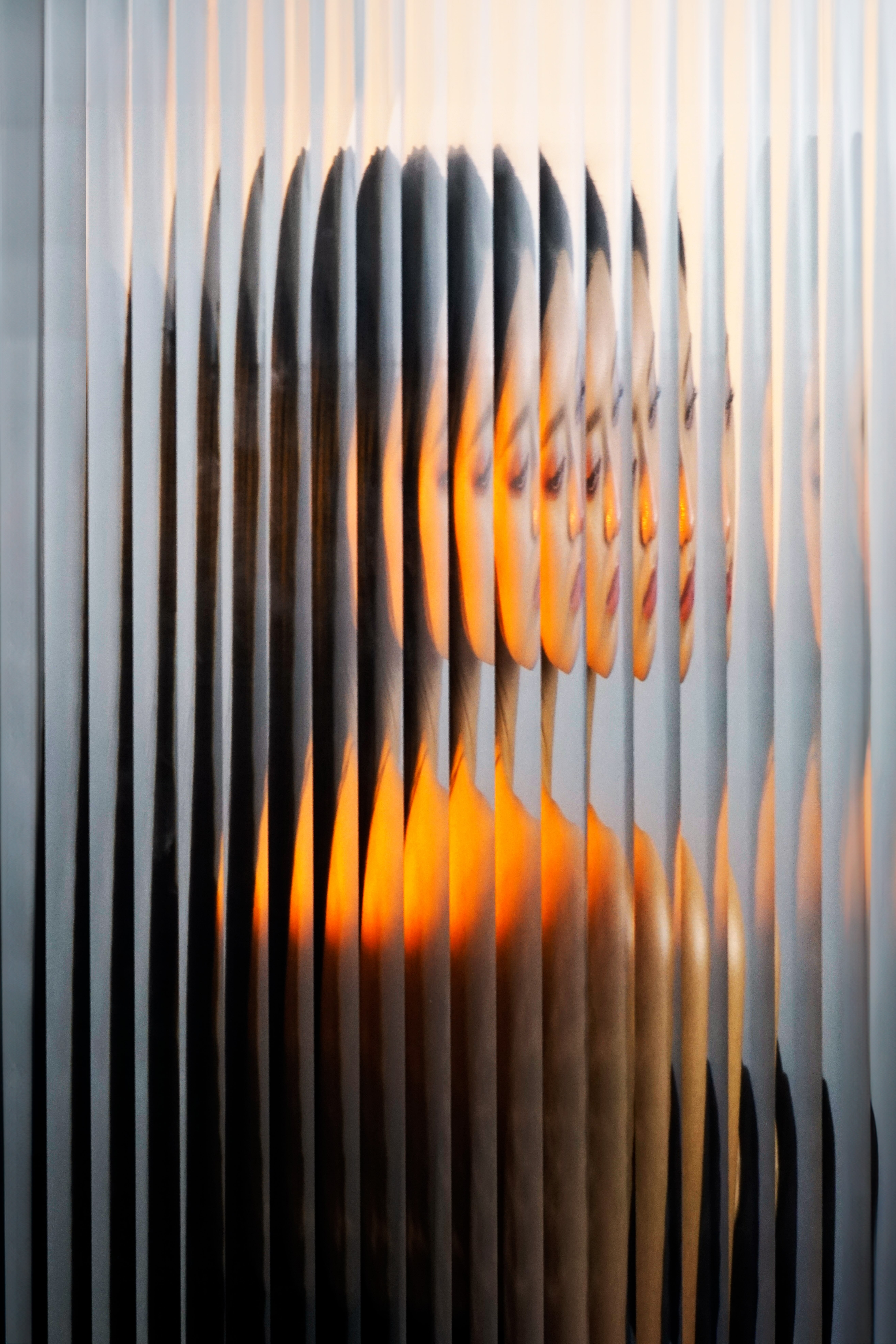
The stripe pattern on the packagings is inspired by moiré patterns, a unique visual effect that only appears when light interacts with it. This decision reinforces the concept of "light" in the visual identity.
Image
Image
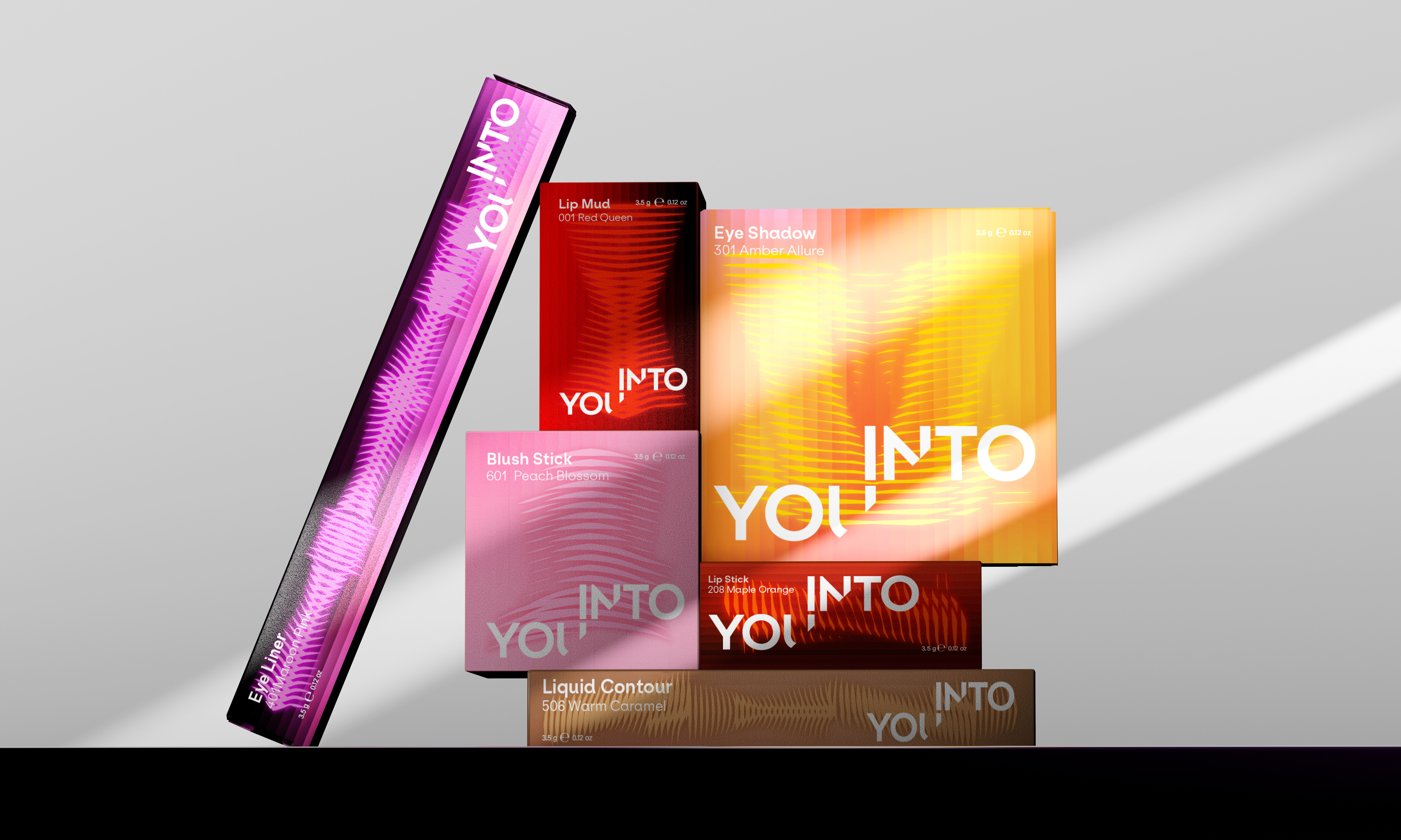
Outer package family (Light is also the visual respond of brand attitudes, which is—confidence, authentic, and expressive)
Image
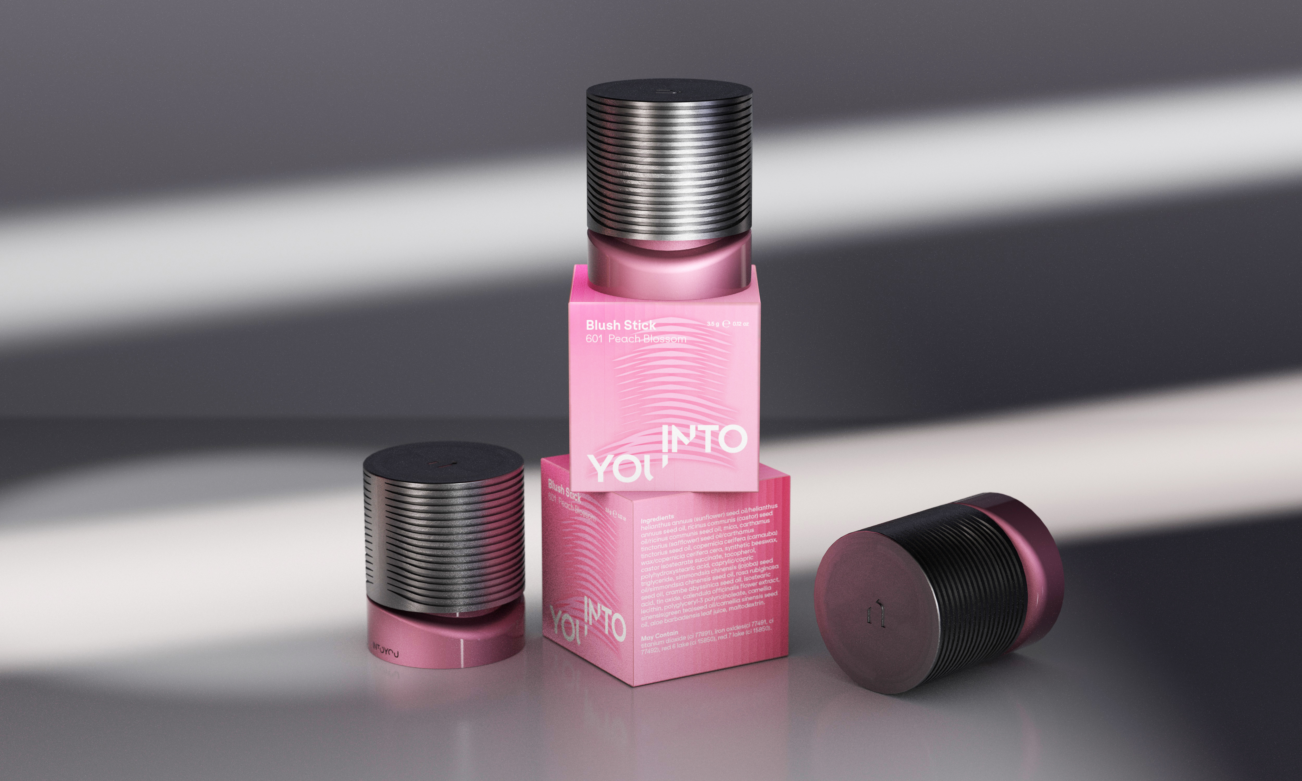
Blush
Image
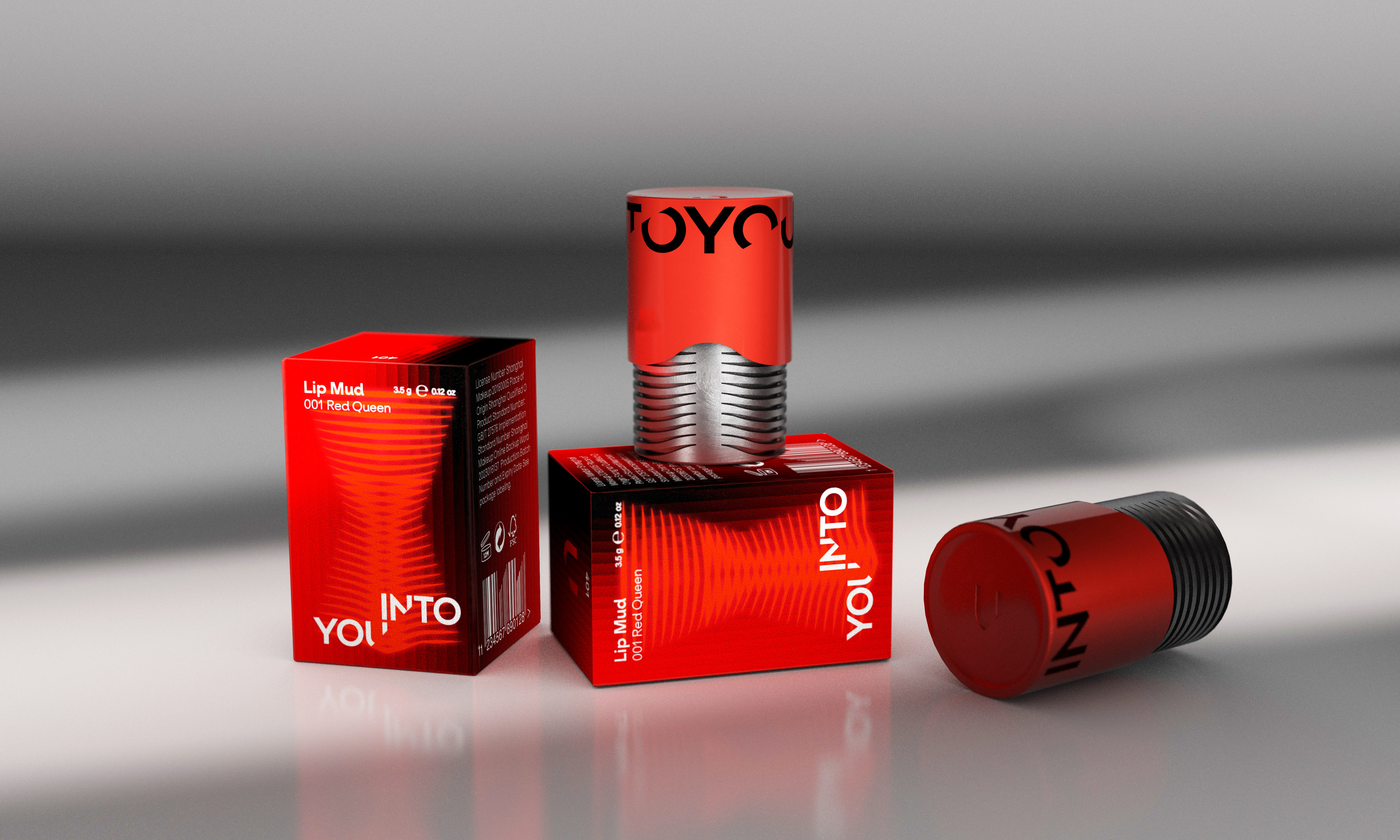
Lip Mud
Image
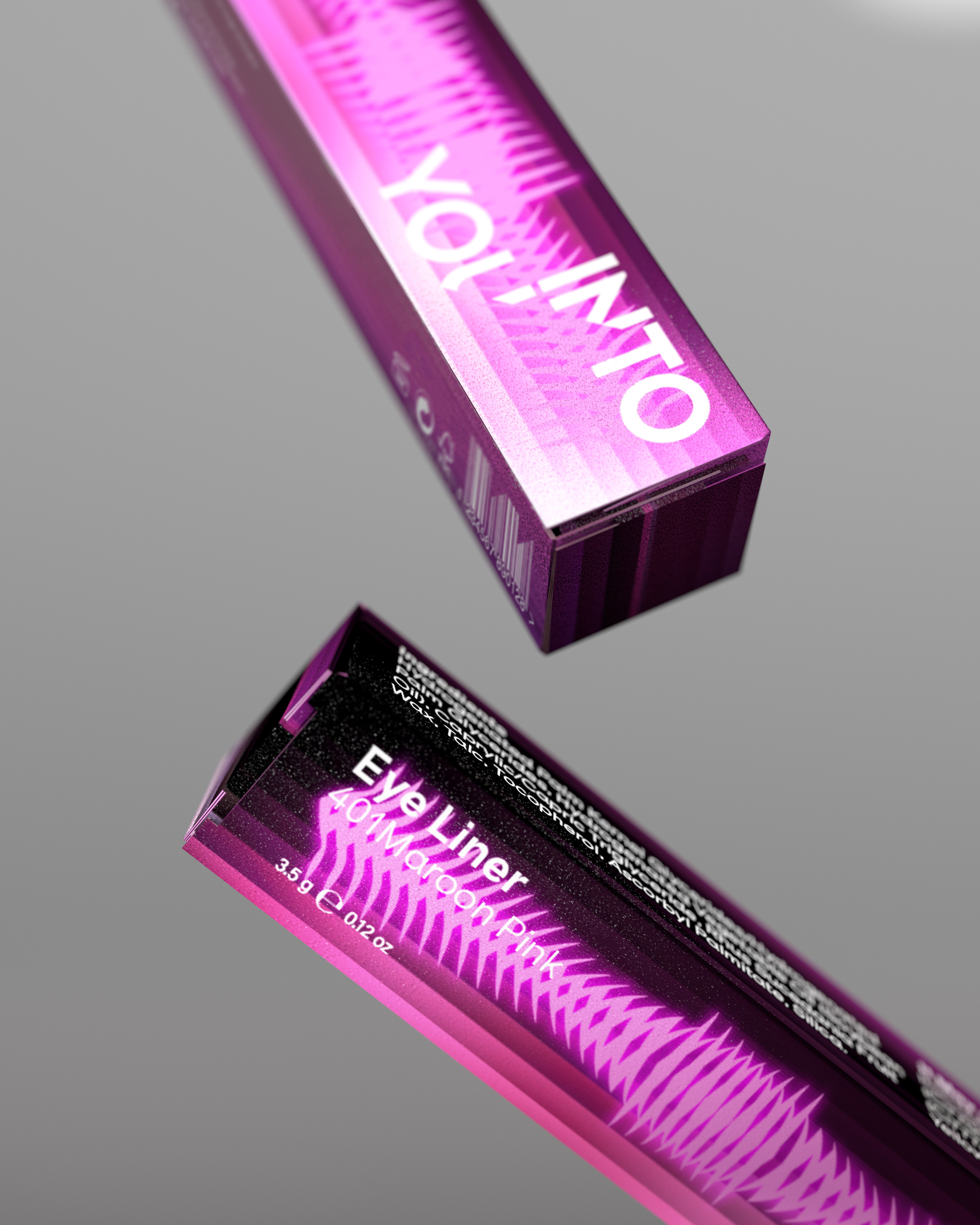
Closeup shot of eye liner
Image
Image
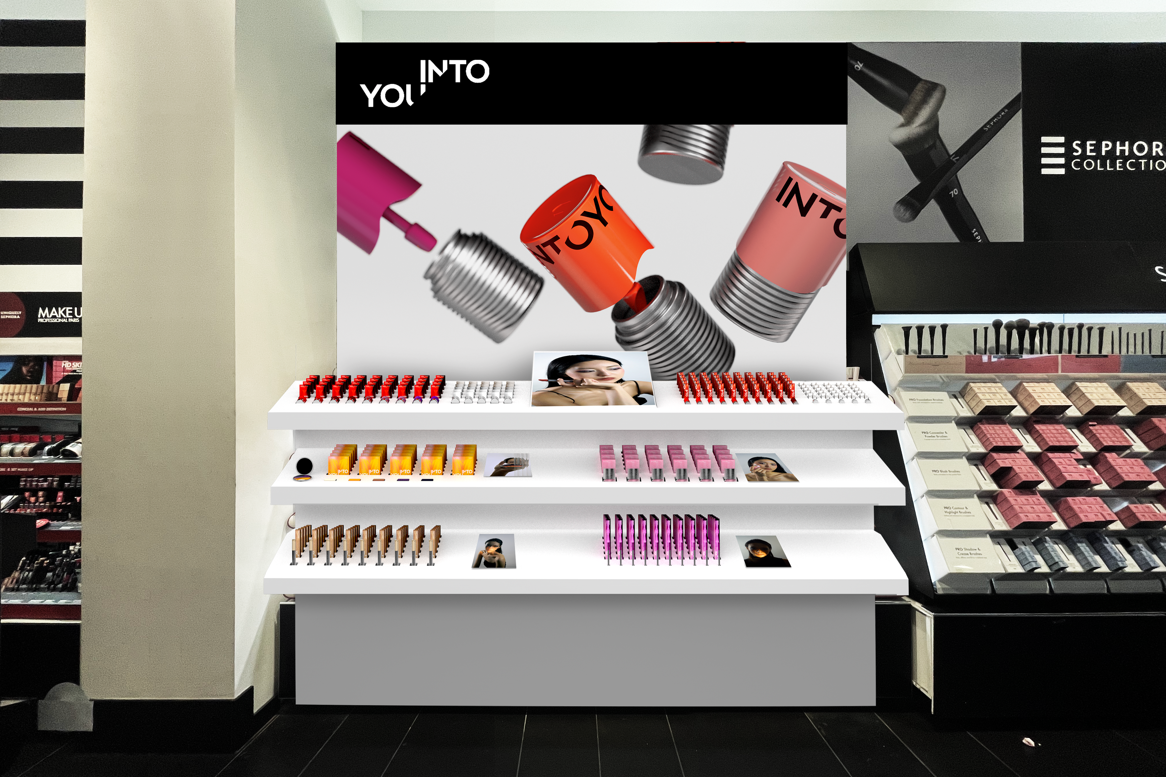
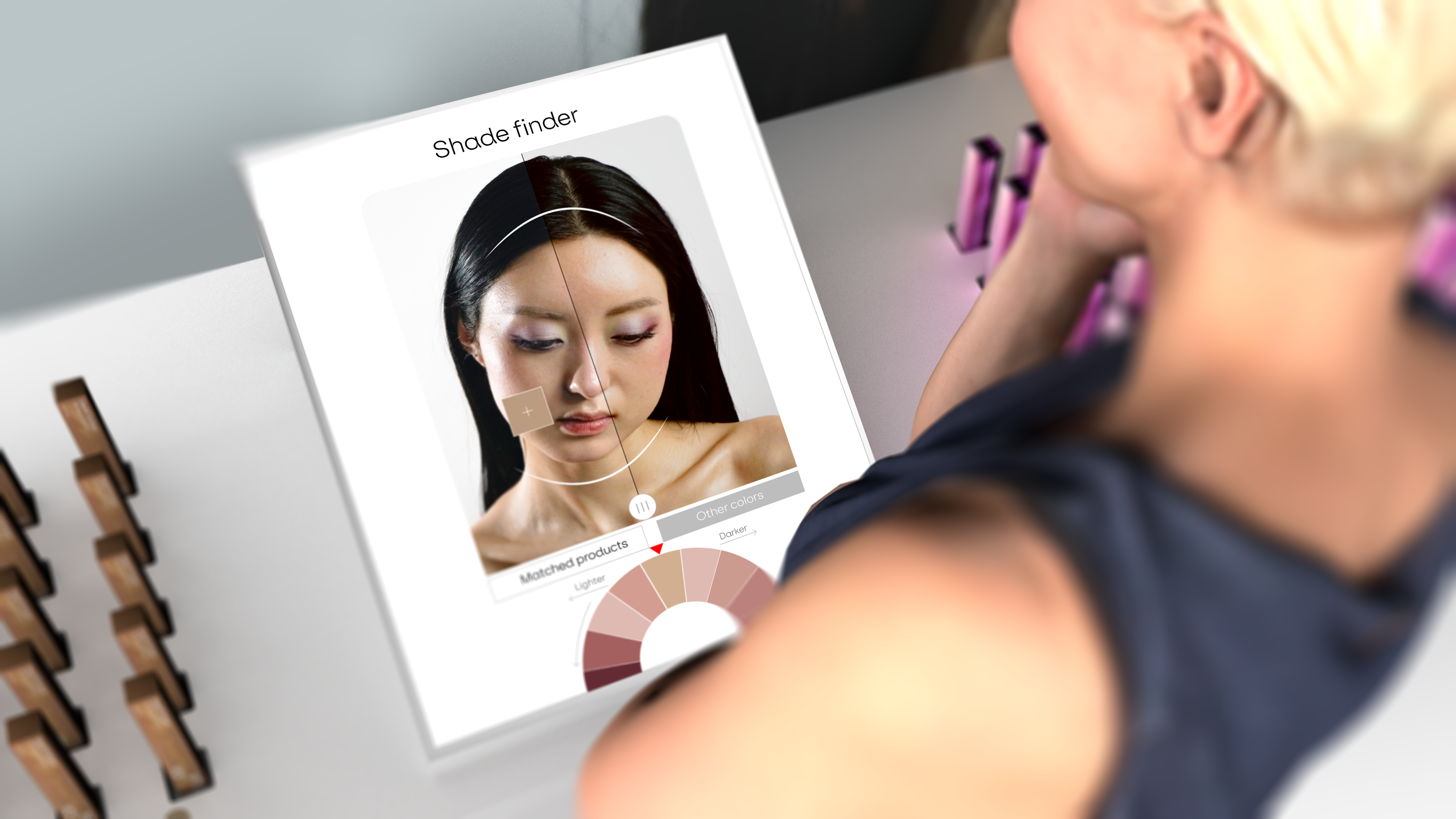
To addresses the challenge of the retail store's hierarchical problem, I also redesigned a clearer display system as well as the interactive screen in the retail is the respond of meeting consumers' expectations for educational content to guide product selection.
Image
Image
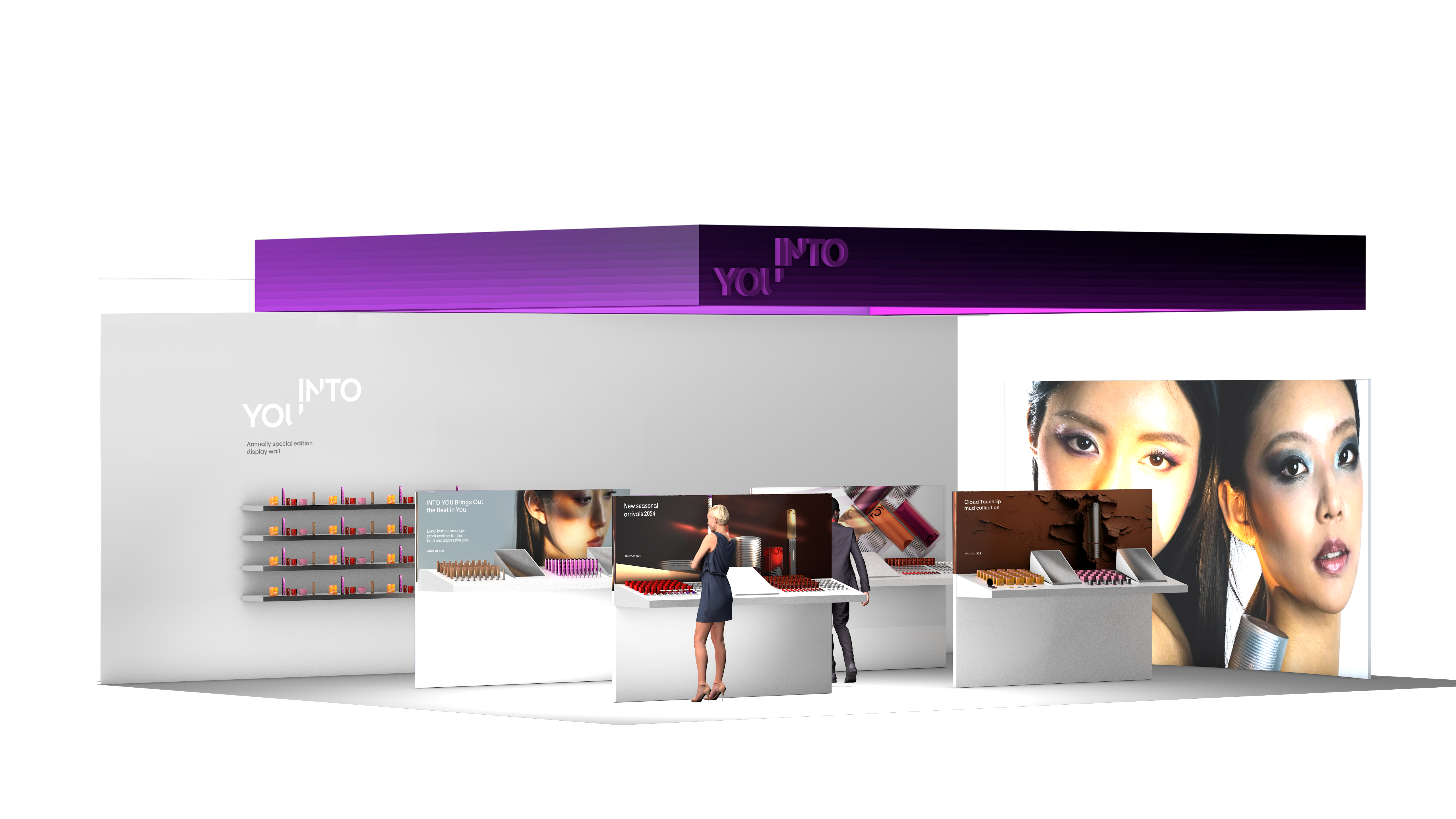
Retail overview
Image
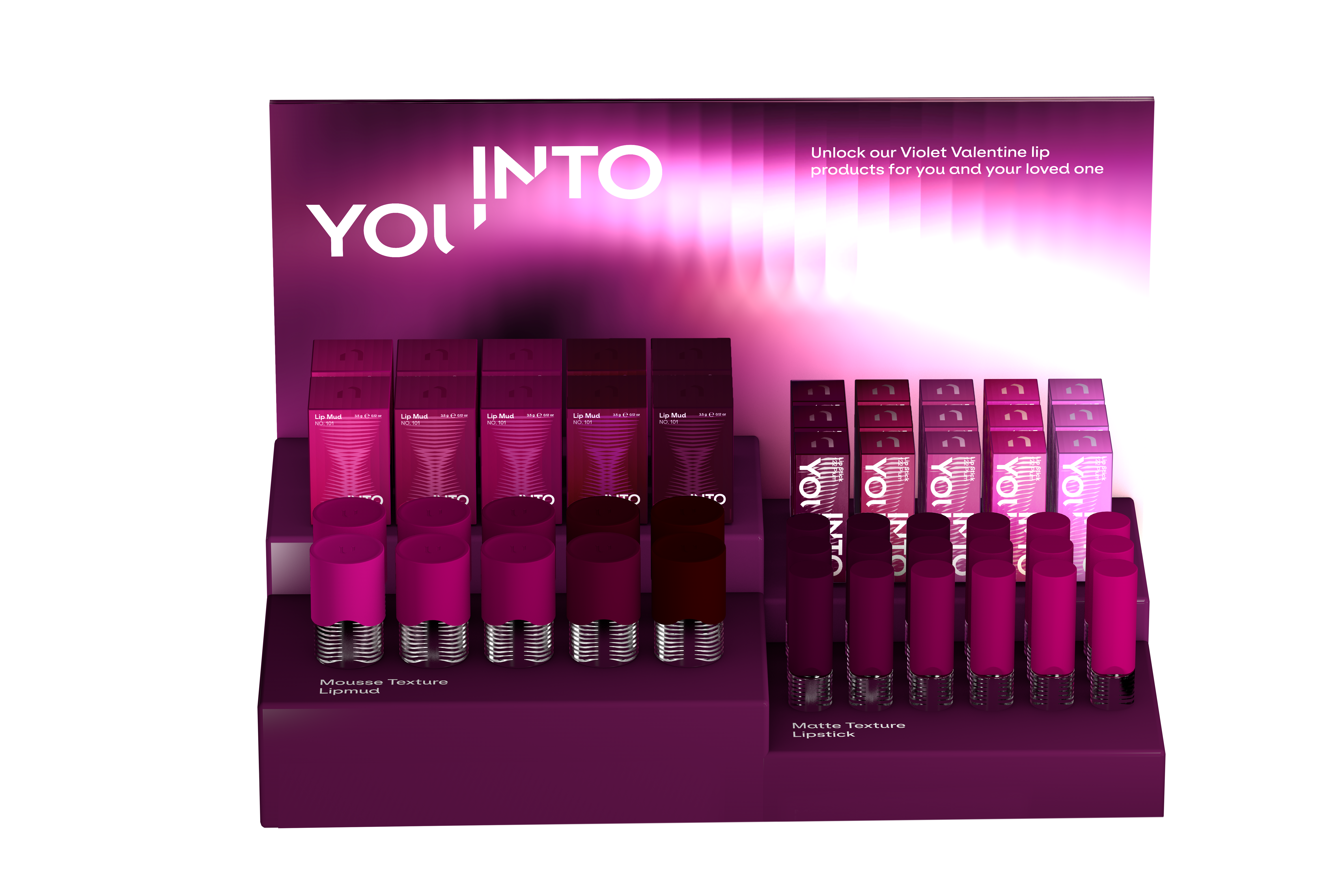
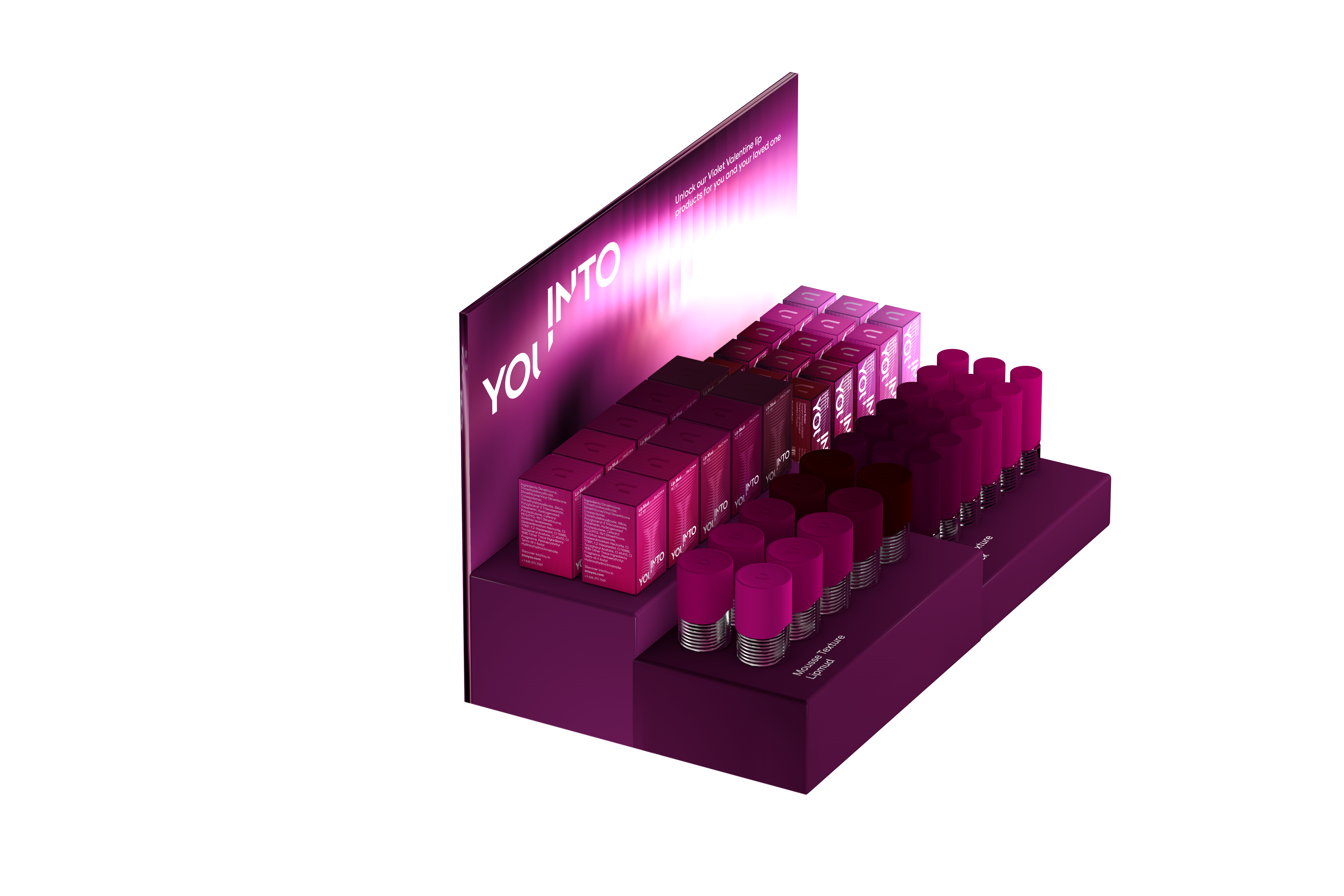
Counter top seasonal design
Image
Image
Image
Image
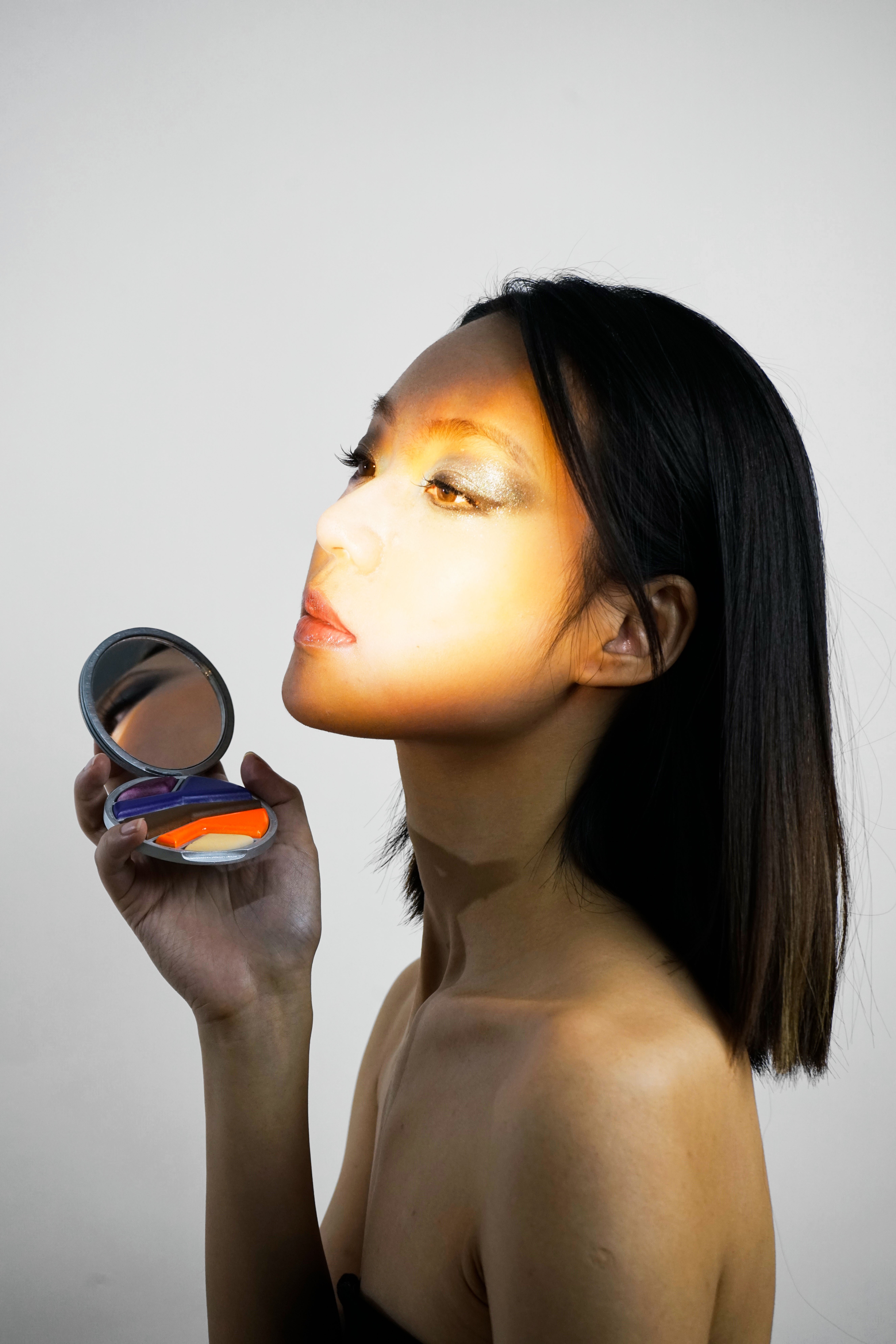
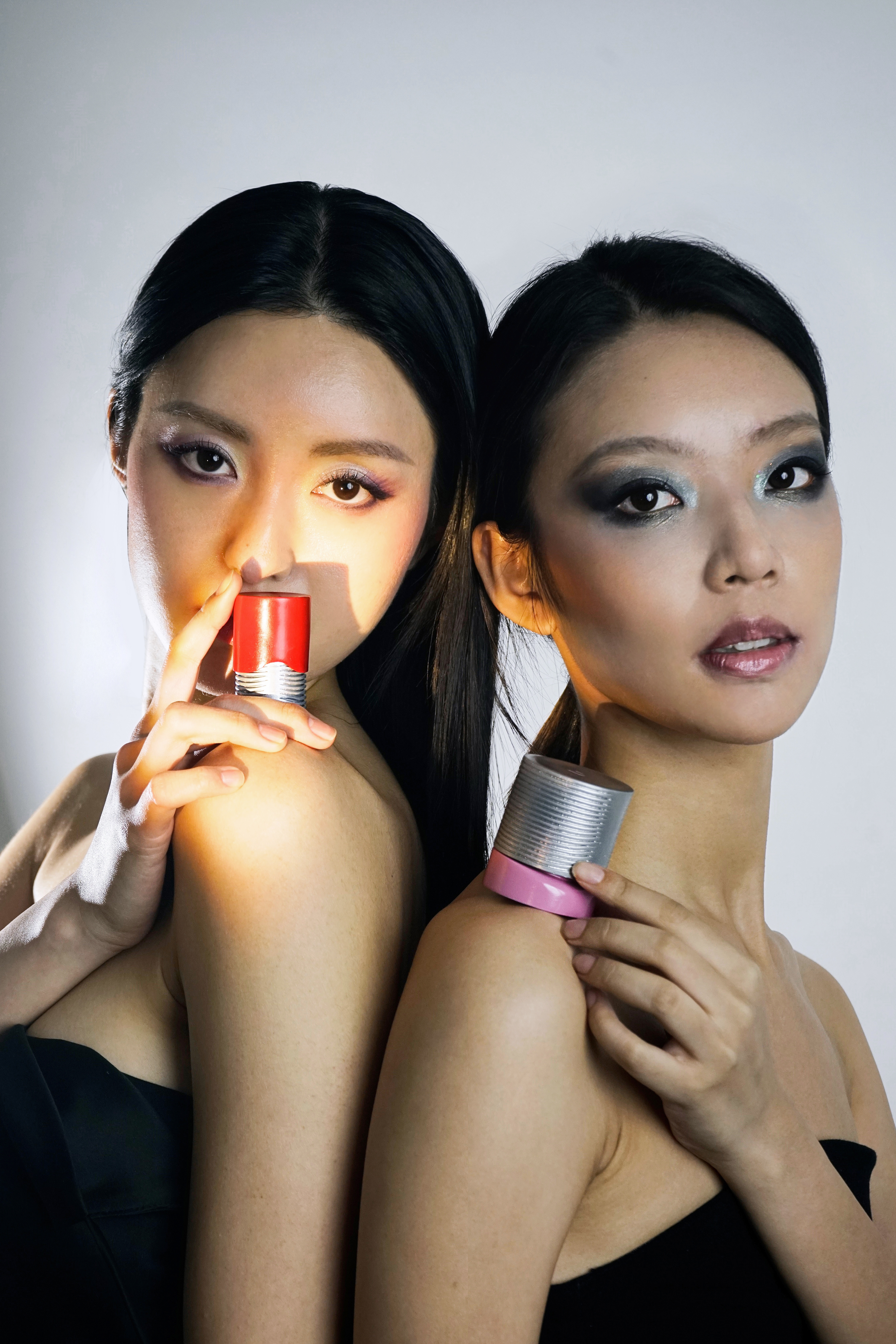
The curated and stylized photography is focusing on The reeded glass and linear light effects to align with the theme of light
Image
Image
Image
Image
Image
Image