Image
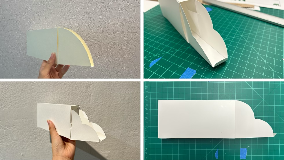
I started to explore various package structures to bring the design to life.
Image

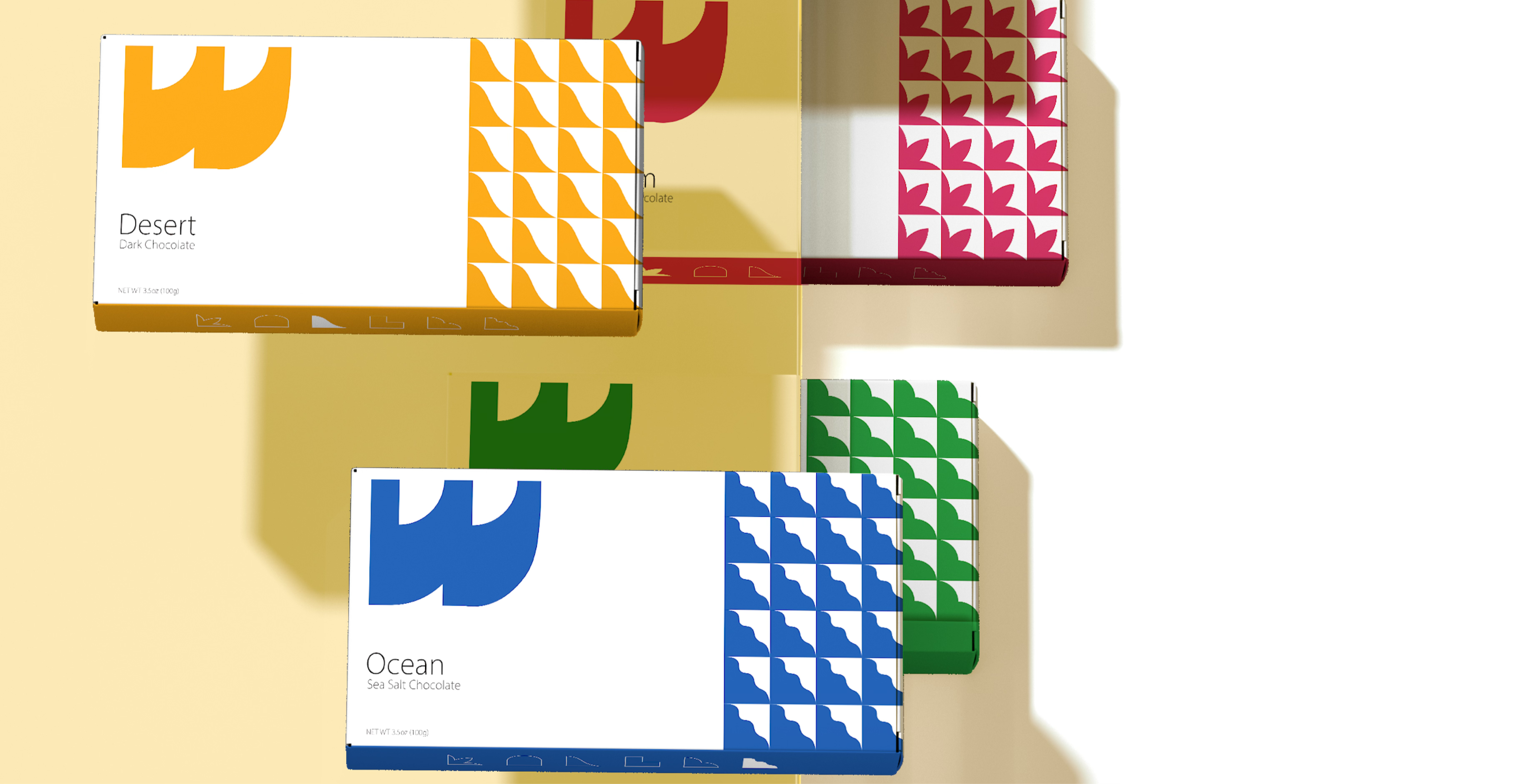
The design features landmarks from six continents, with each flavor named after a landmark.
Image

These landmark-inspired shapes were designed to fit within a quarter-circle frame that matches the package's opening mechanism.
Image

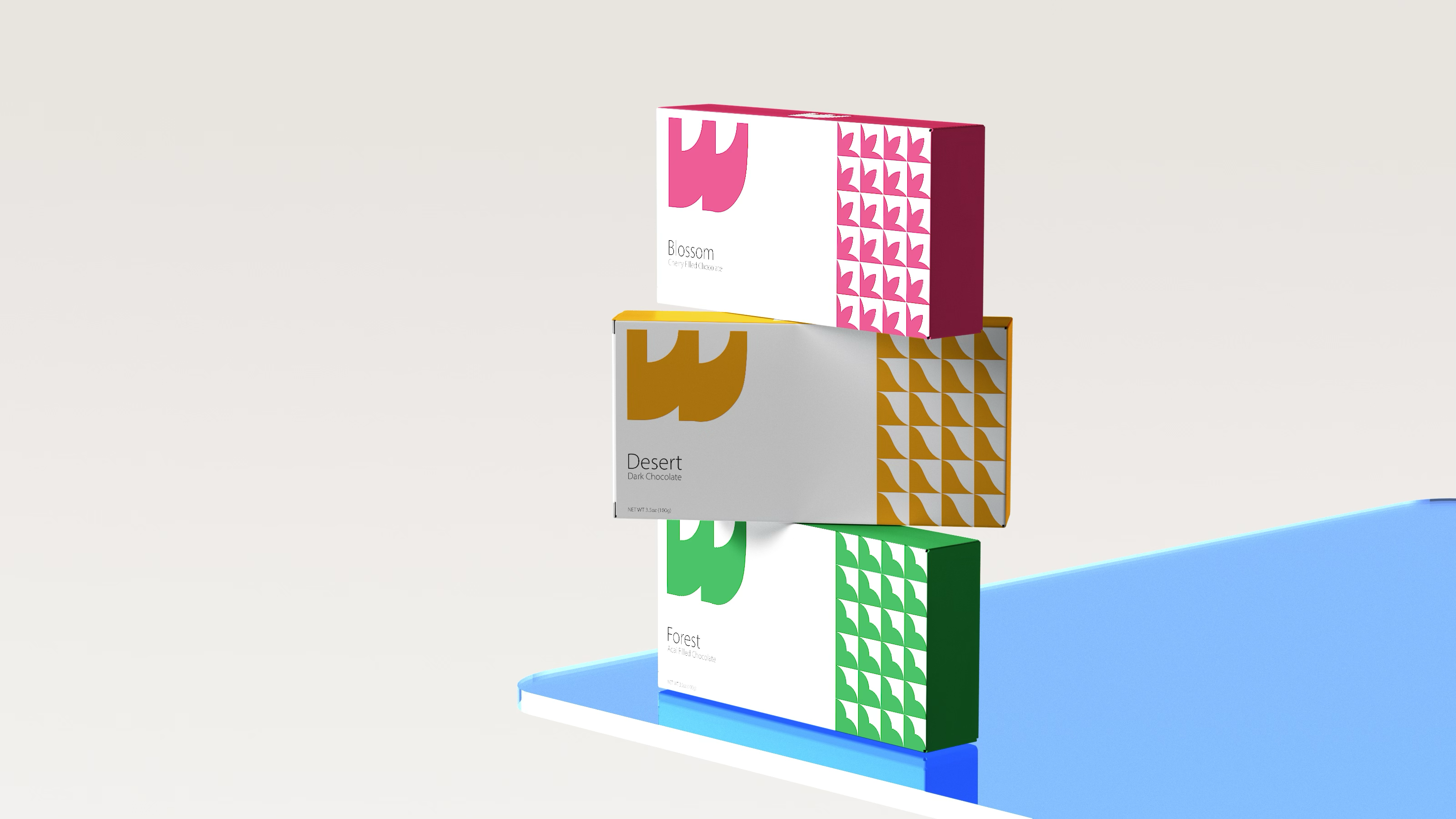
These landmark-inspired shapes, based on quarter-circles, are used in the 'W' logo for consistent branding.
Image
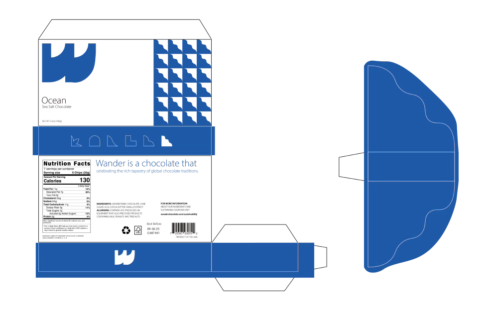
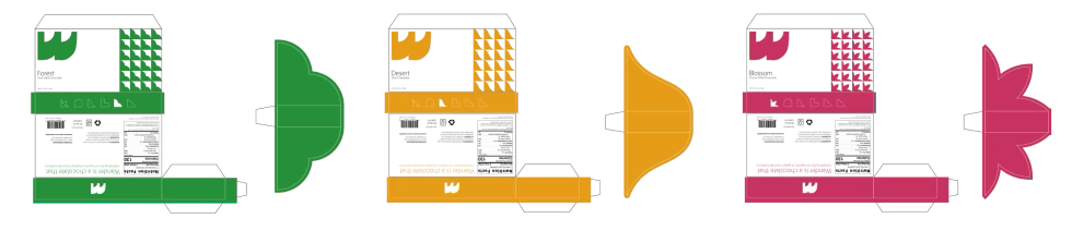
The package design uses smaller, repeated patterns that match the opening style. The back shows cultural information about each flavor.
Image
Image
Image