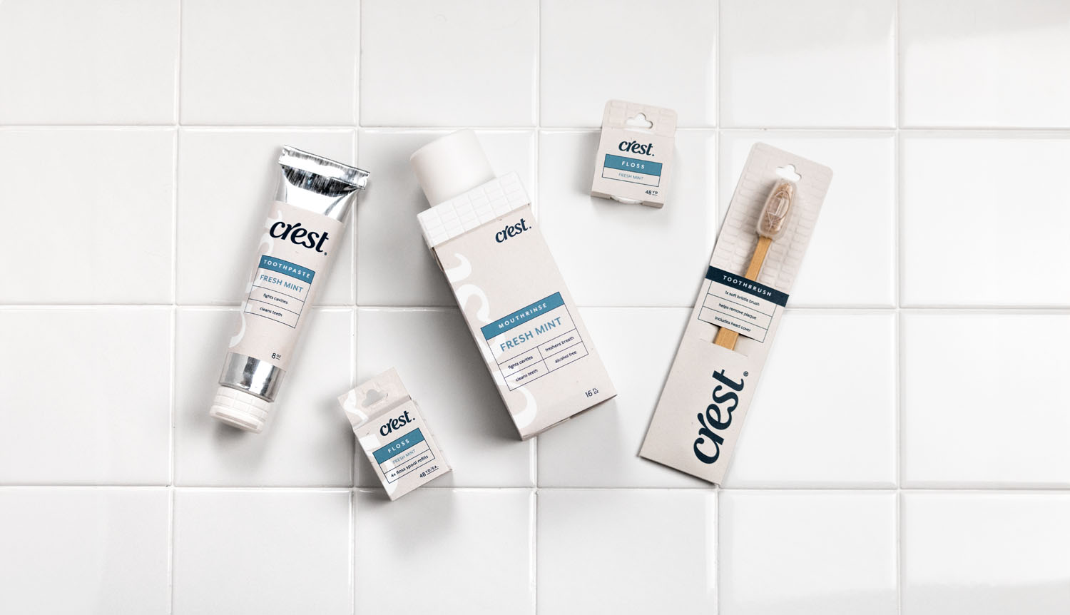
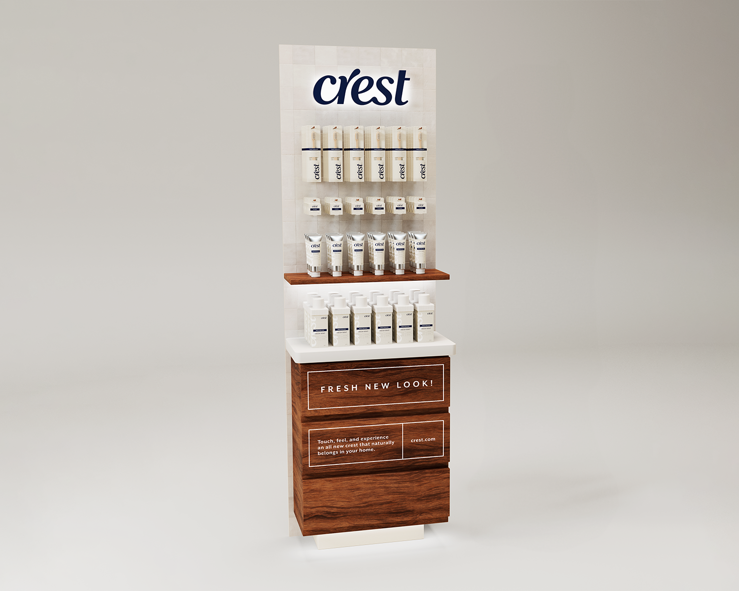
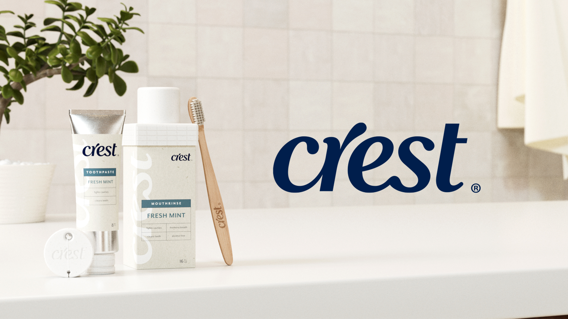
This redesign reimagines Crest to feel at home in the bathroom, using familiar visual cues like white tile textures, a neutral color palette, and organized, drawer-like layouts. A more organic, flowing logo references water and pastes, bringing softness to the brand. The result is a cohesive system that blends in effortlessly, prioritizing harmony over disruption.
Learning Outcomes:
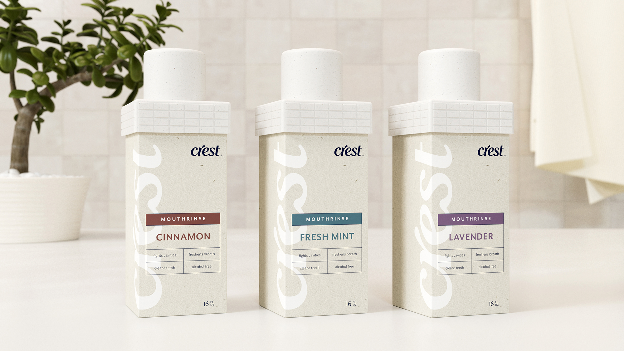
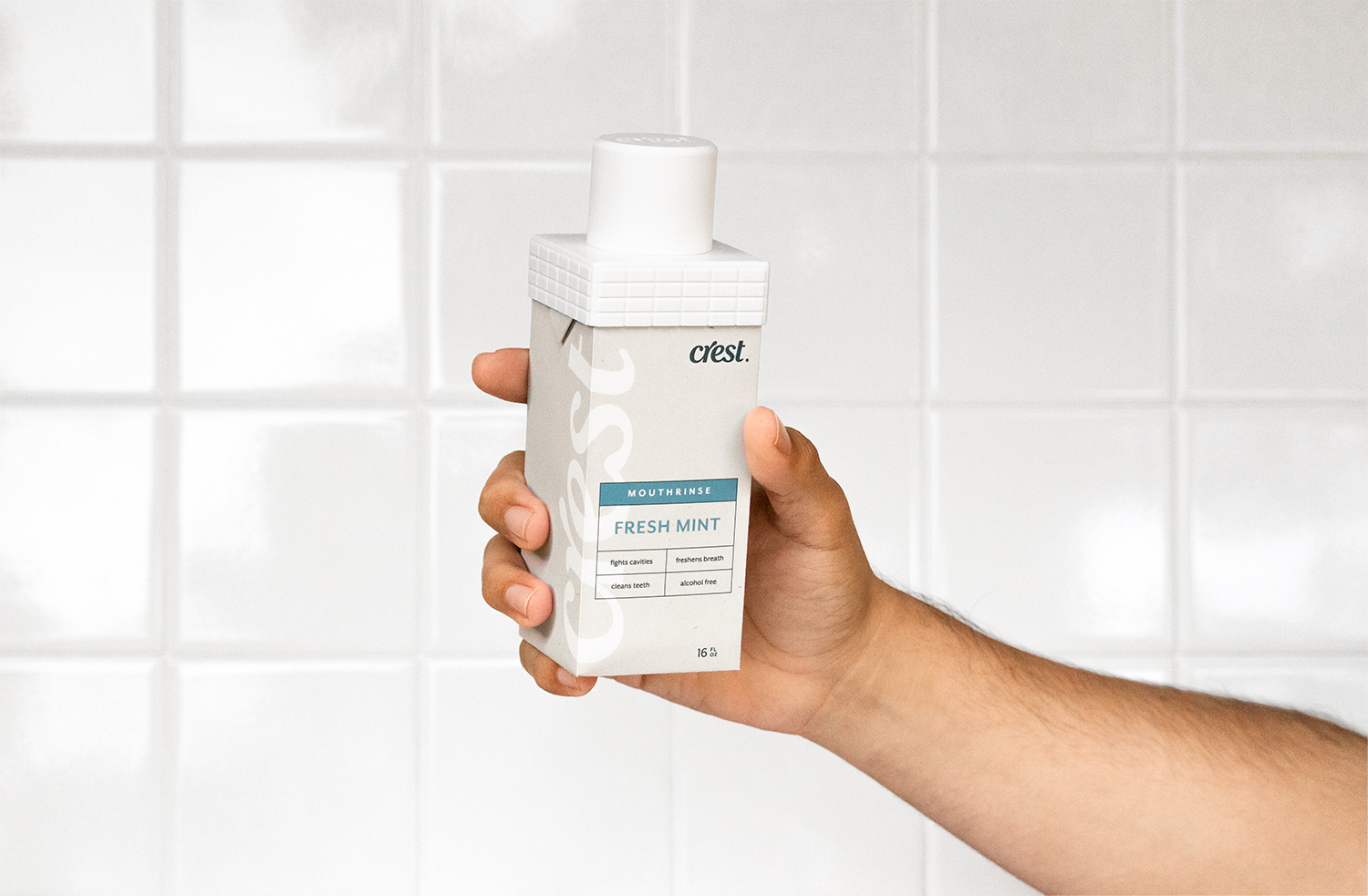
The project was an exercise in establishing a graphic language and system that can be used and applied across a family of products. It also pushed me to think of new materials and/or methods of packaging that can help reduce the use of plastic in a category that is heavily reliant on it.